Analyzing an Artist – Jacob Lawrence
 Part of Lesson 2 is to look at designs in terms of basic elements of art. I chose Jacob Lawrence, as I have always been drawn to his paintings, both for story and simplicity. I saw a retrospective of his work at the Museum of Art in Houston the year I went to Quilt Market. All of his WWII paintings were grouped together, so you really got the narrative of that work.
I am very much a novice at doing this kind of critique – I always feel hampered by the lack of any formal art training, but I am curious to know why something appeals to me. So here goes. These paintings are a selection from a blog post on The Ragged Cloth Cafe, by Jane Davila.
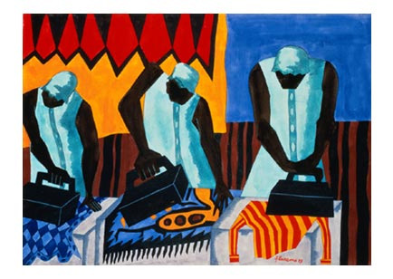
Such a simple task and so lovely in composition. The vertical lines of the figures unify the painting, as do the irons. The lines of the irons are different, indicating the various stages of pressing. You can see the tension in each woman as she goes about her task, possibly as a result of the angles of the irons and the bent/angled heads in concentration. Balance and proportion: the irons seem very large, but they may be because I am looking at them from a modern perspective. I’ve never had to use heavy irons, and perhaps they were that big. The women dominate the painting, but I like that. This is “women’s work,” and that domination shows that. There is a lot of repetition in the postures, as well as in the background. I can almost get a “sweatshop” feel, and I get an image of the women from the movie The Help working and talking together. Perhaps the repetition helps to show community. Economy: again a simple task and a simple composition, but the focus is on the main idea. I can see the blue of the upper right pulling the eye to two of the ironed pieces; same for the orange and red in the upper left. The women themselves are dressed similarly, perhaps to indicate the uniform of the job. The more I look at this the more I see the strength and movement in the women, in their arms, the irons, their heads.
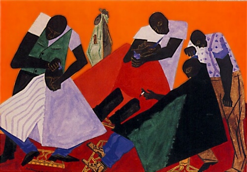
Now this next painting is one that doesn’t particularly appeal to me.
I find the colors very jarring, not at all harmonious. So many diagonals that my eye doesn’t want to rest at all. Again, a simple task at the barber shop, but there doesn’t seem to be the rhythm to the task as in the above painting. Unity/harmony: seems to be only in the main idea, that of a busy barbershop. Skin color is a unifying element. The faces seem to be the last thing you notice, just a few lighter lines. Interesting, in that may be a comment on the invisibility of the black community or the black man. Please note I am making that comment strictly from a white historical perspective. In terms of variety/tension, there certainly is a lot going on in this painting, indicating to me a very busy barber shop, and yet, now that I’ve noticed it, one man is smoking – that little bit of white draws your eye to the center of the painting. Balance/proportion: the piece seems very heavy on the bottom, big heavy dark triangles. The shampoo capes (for lack of a better term) are too many colors for my taste, and I think that’s what throws everything off for me.
Interesting exercise. I like having a selection of terms to work with, and I found I saw more in the painting the more I looked at it. But nothing beats seeing the work in person! What else can you add to the analyses? Comments welcome!

