Author Archive
Ink again……

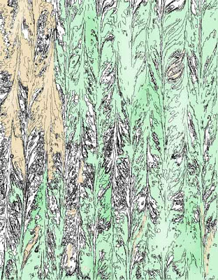
I am obviously hooked on working with the ink features, and I tried working with some judicious color. This first is with the lighter version of the marbled fabric. I didn’t like the effect of the brushes, but now I realize I could have really taken the opacity down. I started using the paint bucket, and I was really pleased with the effect. Welcome the Forest Fairy…
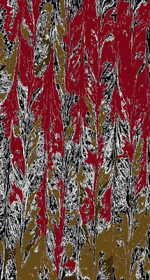
Then I went to the darker one to see what I could do. Kind of like autumn trees at night – not as happy – but I’ll keep trying some other fabrics.
Playing with Ink…

I’m taking a break from ironing all those pieces, which is really going quite well. We set them in piles of ten, so we can see a definite decrease in the number, rather than just looking at a piece at a time!
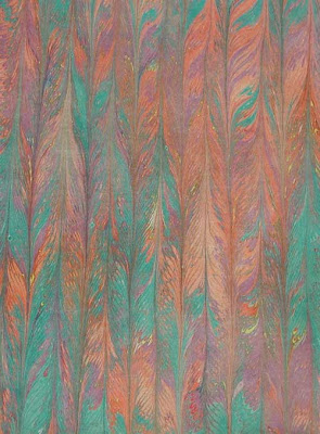
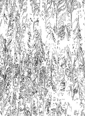
I wanted to do some more with the ink setting in Photoshop, so I pulled up a piece of marbled fabric, just to see what whould happen. Here is the original, before sharpening and smart blur.
Now here’s the piece before inverting…
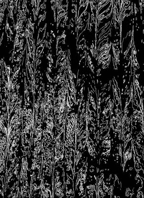
…and after inverting. Two different effects, the first looking very much like a forest, and the second like the forest through a thick early morning fog. It would be interesting to see what I could do with a light “wash” of color….
A Productive Session…

We had an extremely productive marbling session today – we have an order for 400 pieces in time to be repackaged for the Houston International Quilt Festival. We did 200 today in a whole lot less time than we planned on it taking. Now, at 11:30 in the morning, we are starting the ironing portion of the process. We’ll only need to marble one more time to complete this order, and then we have another large order for Australia to complete.
It certainly is nice getting business again. Dean has been burning sage on a regular basis – I need to do more house cleaning to add my part to the feng shui. But most of all it is great to be able to marble again like we used to. I miss the chiffon, but I can live without it, since we can do fabulous cotton and silks again. Our crazy quilt remnant bags sell well, so whenever we have mixed fabrics, we put up a couple of those.
The lady in Texas who is getitng all these pieces will be hard-pressed not to keep a bunch of them – the reds this time around worked really well, and I had good luck with some really nice autumn groupings. Now if I can just get back to some quilting. I HAVE to finish my Mesa presentation this weekend…..
Playing with Adjustment Layers

Another long week is done, and since I have huge amounts to do this weekend, I decided to play with Photoshop tonight and relax! I have to finish my presentation for the Mesa conference, including editing some new video – which I’m hoping I can do on my own – and if not, I can see Rich next Friday for help.
We’ve had a VERY good week for Marble-T. One of our eBay customers ordered a lot of remnants to repackage for the Houston Quilt Festival, and a woman in Australia ordered 10 fats of cotton and 10 fats of silk. So we have some nice money in for a change. And we also did a class proposal for Flagstaff, but I don’t think they’ll go for the price. That along with three visits to the chiropractor because of the auto accident, and it has been an extremely busy couple of days.
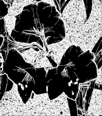
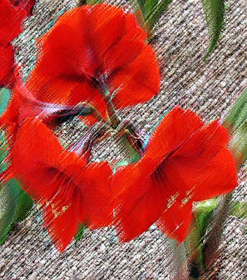
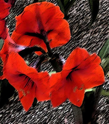
I am continuing to use this one flower for some work because there’s still loads I can learn just with this one image. Here’s the original.

This part of the lesson is working with turnng a photo into an ink drawing, which I played around with this summer. Now I followed all the directions, and I think it turned out well. I sharpened, and in fact I used the patch tool to remove some excess from the photo that I didn’t like. I can see how this will make it easier to apply certain effects, especially the pen and ink. I will continue to try this, because I really like the effect, since this is how I started drawing when I was a teen – lots of pen and India ink.
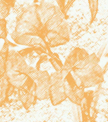
From here I tried some more filters. This is the charcoal – I am getting better at playing around with the setting within the filters to get effects I like. Along with pen and ink, I used to do a lot with charcoal pencils as a teen. I still have my sketchpad when I was doing cartoon characters in charcoal.
I wanted to see what the film grain looked like. Probably not a filter effect I will use a lot.
Now this fresco one is interesting, especially since in art class we looked at a video that talked about restoring frescos damaged by water in Italy. I borrowed an idea from the professional development on Wednesday and did a “word splash” based on words used in this video. With my seventh graders, I had huge success with their attention to the video – lots of questions on their part about restoration of art. Led to some good discussions. Fresco means fresh in both Spanish and Italian – now I understand why they were named that – because of being painted on wet “fresh” plaster.
The pastel effect is something I just can’t get a handle on – this is not a material I am used to working with. But the effect is interesting, if a little pronounced. I almost would like something less obvious.
The sponge is a cool effect. I am thinking of using sponges next week with the kids and developing some texture painting.
I tried the sumi-e because it is a Japanese effect that has similarities to marbling.
And the final one was on water paper, just because I wanted to see what it would look like.
A productive evening – and I even marked five sets of papers and recorded them during the school day!
On Getting Hit….

So I am on my way to do a workshop at Wakefield, gorgeous sunny day, all systems go – eyes seem fine. Then as I’m slowing for a light, I get smacked from behind. I need to jam on the brakes so I don’t hit the car in front of me, and I swerve into the middle lane. Needless to say I am seriously pissed.
The driver is a Mexican woman, turns out with no insurance, but the car at least is registered in Arizona. Had the police come, because I am not about to get stuck with all the bills. Had the fire department come check me out, all while Dean is trying to search through the emails to find Wade’s number so I can call and tell him I will be late. Blood pressure was ridiculously high. It figures when I start driving again that this happens. Called insurance, called the attorney – took most of the afternoon, and I figure I will be out on Monday to see the chiropractor. I hate missing school at this point, because the amount of work to prepare for a sub would be crazy. Not too achy today – we’ll see how it goes.
(*&$%(*&(*&$
More on Masks…

I continued to work on masks, and I took the original flower picture. First I changed the hue to blue, and then I painted with black to return the bulk of the color back to the original red. Then I did another saturation layer to yellow and repainted with black to restore some red. I realized after that I could paint the whole picture black and then just pick small pieces to change color. It’s not a wow, but I learned from this assignment.
Finally – masks!

So I finally figured out masks. Last lessons I had trouble with that, and even with help from Suzan, I couldn’t seem to understand it. This time it’s clear. I wasn’t doing the correct type of mask.
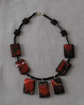
So here is the original of the necklace Alison made me for my birthday. The photo isn’t bad, but really doesn’t show the richness of the stones.
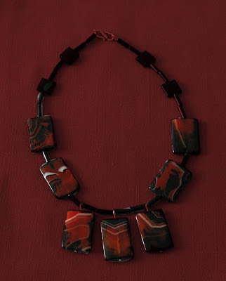
Then making an adjustment layer and playing around with brush size, I managed to get a different background that made the stones really stand out.
Studying Line

I have had a few ah-ha’s since starting to teach these art classes. As I am trying to put together lessons that look at the visual elements of art, I am struck by the importance of line in teaching kids. We have done several activities, the last looking at using scale factor to make a small drawing larger. The kids were amazed that they were able to create a larger copy of a drawing and have it look just like the original. Plus, it coincided with their math class on similarity and scale factor. Grid the original, make the next grid a scale factor larger (in this case the scale factor was 3 so we could keep it on a large sheet of paper), and then copy square by square, focusing just on the lines in that square.
Interesting the number of students who couldn’t work with the individual squares and focus in just on the lines. So many of these kids are so deprived in any kind of art education. Makes me think of growing up – never went to museums unless it was a class trip – hear hear for field trips! I can understand even more their importance, when I realize that for many kids they will only see art through school. And this is the class that seems to get cut the most often. I can see that at my school this year, compared to the art magnet school I worked at. There is no visual art program at tis school, beyond what I am doing, and it really is a shame not to have the expopsure.
I try not to be political…..

…in this blog, as I like to keep that separate. But lately politics is impinging on my art. Primarily the issues with my school district, and the fact that exhaustion seems to be the constant factor each day.
Yesterday I had the blue flu, and the irony is that I really was ill. In 30 years of teaching, this is the third time my district has come close to chaos in bargaining. The first was 1972 in Hawaii with a teacher strike. Ugly. I remember going to my depatment head ofter a nasty day on the picket line and telling her I was sorry for the crap said to her as she crossed. People have their own decisions to make. The second was in Vermont in about 93 when we were getting close to striking, and the teachers knew I would have to cross, because part of me was an administrator. They were fine with that.
The third is now. Over 40 percent of the teachers were out yesterday in our district, sending a really strong message. The offer still sucks, but I think we have their attention now. This is the most united I have seen the district teachers in a long time. And the best part is the district has so shot itself in the foot by all their financial mismanagement over the last two years in particular. For once maybe we won’t take the brunt of criticism – but I still am not reading the comments in the paper!
A New Me!

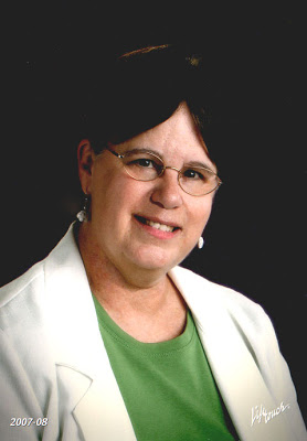
I started working again on the rest of the first lesson with LaunchPad C – chose a picture of me, since I just got my school pictures back. As usual I look middle aged and exhausted – so I figured why not? I’ll try a new version of me. Here’s the original.

And here’s after – no wrinkles, teeth are whiter, a little more lipstick. I like me!
Playing with Hue and Saturation

Well, I just started my Photoshop work again with LaunchPad C- it’s so good to be having fun again! I have done so little art for me in the last six weeks that this is a welcome break. The first lesson is on using hue and saturation, so I chose a simple flower photo Dean had taken this spring of a garden in our apartment complex.

I thought it was an okay photo – really liked it! But…then I started playing around with the sliders on layer adjustments, specifically hue and saturation. Here it is in blues.

Huge difference in effect. Here it is in red.

I wanted to try something a little more delicate, so I went for the yellows. Here’s two samples.


Then I just worked with a variety of hue, saturation, and lightness.

Still pretty darned pleased. But then I went back to the original adjustments from LaunchPad A to see the effects. This first is levels only.

Then I played around with just the curves adjustment, and I was really pleased with the results. One of them is so delicate, almost like a glass flower.
Definitely am glad I am taking this, because I’m going to have some fun again!
A Presentation…
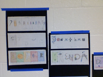
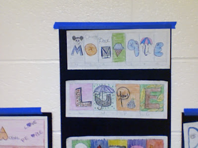
I’m at school, and I figured if I used PhotoBooth, I could snap pictures of the mounted artwork for the blog, especially since I didn’t have my camera today. So with a little finagling, I got some shots. The kids are really excited today to have work mounted and up – as more work has gone up, they have gotten more and more excited about what they are seeing. We have started having more positive comments, and no one is shy about showing their work now.
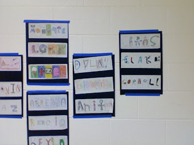
First assignment you see is the use of shape, line and color to represent their names. Each letter has to show something about them.
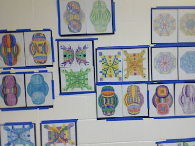
The next assignment was a color study – same line designs so the kids could see how the design would change. The first is strictly primary colors, the second is secondary colors, the third everything in the crayon box, and the fourth is a monochromatic study.
Photoshop!!!

Yea! I signed up for the third in a series of classes from myjanee.com. I figured if I had some new Photoshop stuff to work on, perhaps I wouldn’t spend so much time dealing with school work. So everything arrived today – after a really horrible day.
Someone vandalized my new art room – I went in to get set up in preparation for cleaning, only to find someone had smeared paint, toliet paper, and lots of markers all over the room. The student has been caught and arrested – one thing about my new school, they don’t mess around with discipline issues. The room is still a “crime scene”, which of course the kids are fascinated with. I don’t know how long it will take to clean up, but I figure the earliest we can get in the room is middle of next week.
I started hanging some of the kids’ work, which I think the kids are really enjoying. Several of the teachers couldn’t believe the work they were seeing – come on, the kids aren’t without talent! So even more important to get their work up for enjoyment. I need to make some posters explaining the various assignments, so there will be more understanding of the processes.
Plus, at our faculty meeting after school, there is even more for us to do – call to set up parent conferences, finish WICPs and SCIPs for students at risk (before parent conferences), get progress grades in, run progress reports, fold and stuff envelopes with the progress reports, develop a plan for involving parents of the kids on our team. And the potential for Blue Flu next Friday, in respone to the way the district has been dragging on new contracts.
Won’t be a boring school year!!
Doing a Presentation

We just finished a demo for the Tucson Arts and Crafts Association – nice group of people! We are considering joining, as we want to get together with like-minded people interested in the arts. The demo went really well, people really loved our stuff. Too bad we had nothing available to sell, as we are low on product, and we just promised some to the quilt guild on Maui. Hopefully people will get ahold of us, as we gave them coupons to fabric and ebay auctions.
It’s interesting to see how far we have come in our work when we show a retrospective of pieces. It’s time to start submitting to shows again – and find time to work during the school week!!
An Art Room Needing Artists….

So we actually have an art room, being used now mostly for storage. I brought one of the art classes down to see if they would like to rehab the room and use it. They all agreed, and now I just need permission. The light in the room is fabulous – lots of windows, great views, and some walls that could use some good murals.
We have 51 desks, so some of those need to go elsewhere. Loads of filing cabinets that need to get moved, and lots of storage that needs serious cleaning. Plus a closet full of supplies. The kids seem to think that cleaning will get them out of working on art. Ha! They’ll work even harder!!
What I would really like to see is the redevelopment of a visual arts program at the school. Given what we know about integration of the arts across the curriculum, it seems a real shame that we are not taking advantage of the room and a good curriculum.
