Author Archive
Lesson 4

Lesson 4 is about the pen tool – and sure explains why I couldn’t get it to work like a “pen.” Interesting tool- still having trouble with the little handles getting them to smooth curves, but I’m guessing that’s just a problem with practice. I opted to try some cactus – especially the century plant. I wanted a very “hard” look, and I love what I ended up with.
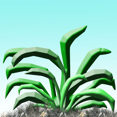
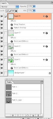
I have three separate paths – this final after I tried this on three other canvases. I was able to give each path a different color of green, and had lots of fun trying to work with the embossing to get the hardness that I wanted. Remembered to do other layers for the gradient background and the grass. The grass I checked “pattern,” forgetting which pattern I had already, and I love the effect – hard dirt. I had used the airbrush to build up lots of grass, so I think that’s what added to the extra “dirtiness” of the ground. So I accomplished a “hardness” feel to the whole drawing. Screenshot follows of what I attempted.
Minor Medical Rant….

So it has been over a week – chalk it up to a severe bout with – ta dah – strep throat. Did my primary doctor check on Wednesday when I went in? Of course not – would have been too much trouble to do a culture, especially since I could barely open my mouth. Went to the UrgentCare around the corner yesterday after a terrible night to have the PA look at me like he couldn’t believe my primary wouldn’t do something so basic – expecially since I am around sick kids all the time. He also couldn’t believe the doctor gave me such a low dose of antibiotic – which obviously hadn’t been doing anything.
I ended up being out of school for three straight days (unheard of for me) when I didn’t need to be that sick. Sheesh – next time I will insist on a strep test – but I expect to have a different doctor, so I shouldn’t have to. Think I’ll write a letter……..
Another Card…

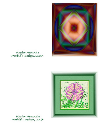
I tackled another card last night to see if I had mastered the elements of this lesson. I completed it this morning and printed it out – not bad for a start. There are still lots of places where I am not happy: sizing images at the start so they fit the card when I bring the image over. Lining things up – certainly getting better. In the practice card I printed out I saw where I would need to move the black design over further to center it.
Primarily it is in the initial sizing of images – mostly at 100 – and then when I want to import them into something else, the size becomes a problem. Well, I know I am making progress, so I can’t beat myself up on it.
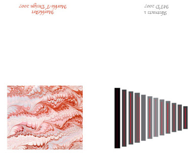
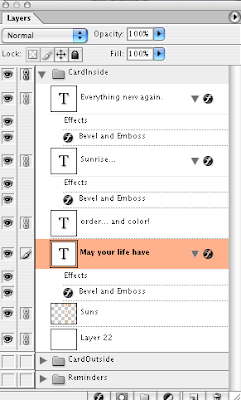
Front of the cards (I wanted to see what I would need to do to do them with a horizontal fold), back of cards, and a screen shot.
Making a Card….

Whew! This has been a tough lesson. The pattern piece has only been part of it. The last part is setting up a template and making a card. I really did struggle through the directions, but eventually got the template set up. Then I ran into problems transferring artwork to the template – another sizing issue, which I still need to work on.
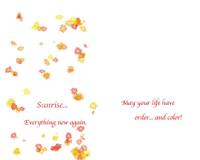
The template is set up to run two cards, but overachiever that I am, I did two distinct cards, just to try some things out. What follows is the outside of the two cards.
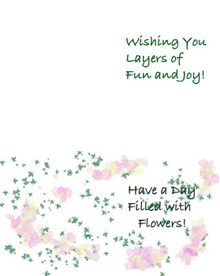
Now for the inside of the two cards.
The interlocking groups to keep layers organized is a nice piece. I think I did quite well on that! I helped out at school today with redoing a school project in Photoshop. Had to start from scratch, and I amazed the teacher with just how much I was able to do in 10 minutes time – redid the whole project, shortcuts and all! Thanks, myJanee!
Patterns Redux….

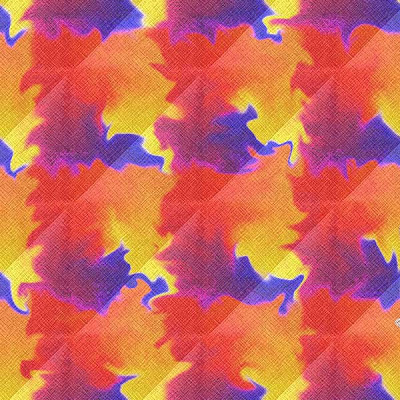
Okay, so I couldn’t stop. This one is two gradients – chrome and a blue/yellow/red – which I offset by 50 on both horizontal and vertical. You can see the offset but I like it – gives a better flow than without the offset. I also took the opacity on both layers down to about 70%. I applied several filters – noise, crosshatch, and something else. Then I finished it up with a liquify – and I like the effect – not so much as a pattern to be repeated, but as a small work of art.
More on Patterns…

Today in class we reviewed the basic types of symmetry, and I used my wallpaper example with the paw prints to look at translations – well-received by the kids. I decided after my school work was done to play around a little more to see what I could come up with – and it seems like I have the process down. With one of the patterns below (mostly grasses) I kept trying new layers for different patterns, and then tried all the layers together to see what I came up with – and I liked it.
Here are the two new patterns – I could get into designing wallpaper!
Lesson 3 – Patterns

I did some significant playing around and tried to get a simple pattern – the “basic design element” as I told my kids. After a couple of tries, I got some paw prints. This is the initial print of the pattern, and it is very obvious where the pattern begins and ends.
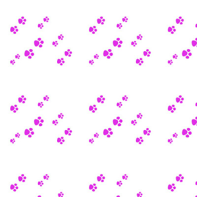
So I went back to the pattern, added more paws, and tried the offset at 50 – which I still need to play with, as I am not sure how it all works.
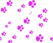
Now you can see a repetition, and it’s not obvious where the “seams” are.
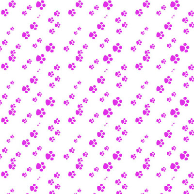
Thanks to Suzan I have a better idea of what the layer mask and the painting does. Still have to work on that one!
Thoughts on Math Class

I woke up during the night thinking about “basic design elements” in the Kaleidoscopes unit and how much difficulty the kids were having identifying this small piece. As I worked on patterns yesterday to try and create a repeating pattern, I was getting frustrated. When I woke up, I was thinking about the basic element and I was trying to do what I asked my kids to do. Once again teacher learning from students…..
I need to try and create a couple of examples to copy into a PowerPoint so I can show the kids what I am talking about. Who knew Photoshop would be so helpful to my math classes?
Lesson 2 – A New Collage

I took a look at the Salem pictures on my PC at school because the adjustments were appearing lighter than I thought they were on my Mac. On my PC, the final image looks just like I thought it should. Interesting to have to look at different monitors to see how the work shows.
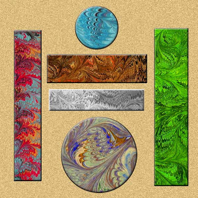
I am trying to finish lesson two, so I worked on the collage project. I wanted to work with the marbled fabric, and I definitely made progress in trying to resize and crop images. I ended up with the two circles from the same blue fabric, two of the bars from a brown, and the other two from a bluish fabric. I kept rearranging (on different layers) till I had something pleasing – looks kinda zen-like.
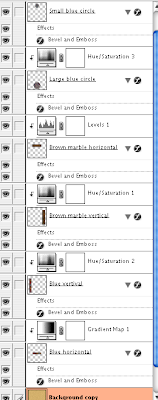
Then I started with adjustment layers for each of the marbled designs – and completely changed each one, so now it looks like six different pieces of fabric. Once I got all the adjustments done – some hue/saturation, some levels, one a gradient, I added the background with some noise. Overall a nice Asian effect for me. Then I went back to each layer and did an effect of embossing. Nice touch. After the picture is the screen shot (which I learned to do) for the adjustments.
Lesson Two continued…

As I continue with Lesson Two, I decided to choose a photo of the Salem Witch Museum, since the doorway and glass window seemed pretty dark. I wanted to see what I could do with them. Here is the original:
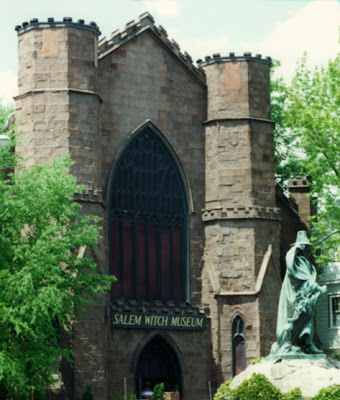
THis next is looking at the levels only on a separate adjustment layer.
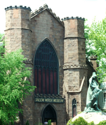
Now we look at a curves adjustment added to it, on a separate adjustment layer.
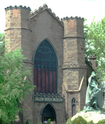
This last is levels, curves, adn the greens on an adjustment layer, in an attempt to correct the lighting, and tone done the brightness of the statue base.

And finally – just for fun – after all – it is a witch museum!
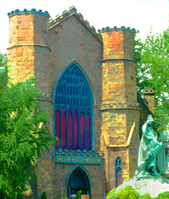
Lesson 2 – playing with adjustments

Lesson two starts out with some creative adjustments, using a layer adjustment – another new thing. I decided to work with my Tetons picture again to see what else I could so. So here is the original again –
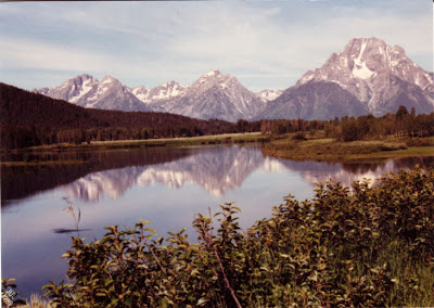
The first adjustment was to use hue-saturation – and this is cool because I love the look of black and white. This also seems to preserve a lot of the texture of the original.
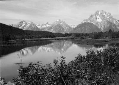
Then I decided to try the Photo filter and went for a sepia look, which again I love for the historical look.
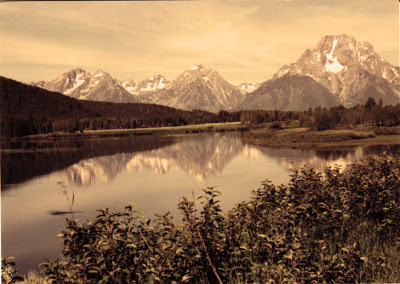
Then I decided to work with the “invert” and I like that effect. Very sci fi and icy – NASA photographers would probably look at this as an example of life on another planet!
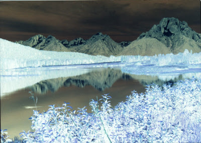
This last is a combination of hue and invert, which seems to give depth to the whole photo.
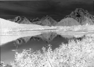
I keep learning more and more, which puts me even more in awe of what Suzan does with all her work! I was reading two Photoshop magazines this weekend – I’ve tried reading them in the past, but it’s been like Greek – this time, however, I understood most of what I was reading!
Launchpad B Lesson 1

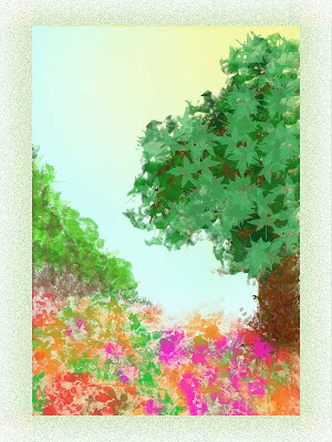
There is so much in this first lesson abut brush presets and tool presets. While I still used a lot of the same brushes as before, I found I was concentrating on what characteristics I wanted the brush to have – large, small, texture, airbrush – a lot of the brushes that look like solid lines are really interesting “scratches” when the spacing is changed. That made working with the leaf brushes much more interesting.
And I discovered how to move the gradient layers around, such as showing the sun coming through the tree leaves. I started with the blue gradient for background. Then I concentrated on a flower brush with a variety of colors for the foreground, with some vining and other background. Then I started on the tree, concentrating on the layers for the leaves – lots of colors of greens. Started on the trunk – needed to dump a few layers until I was happy with the trunk. I moved layers around to get effects like branches to show up in the back, behind the leaves.
I needed to balance the painting, even though I liked it the way it was – but I kept thinking of Bob Ross, who would always add more to his painting, even though I always thought it was fine. So I decided in his honor to add a “happy little bush” in the background. Balanced nicely and I’m pleased.
Not super happy with the frame – had an interesting problem with the 300 resolution – I needed to crop the finished painting, resize the canvas, and then work on the frame. But it’s pretty close to a wow for me.
New Photoshop!!

So I let a few days go by – I was doing so well. BUT – new Photoshop arrived yesterday from myjanee.com – I am enrolled in independent study for Launchpad B. Started reading last night – and if I thought playing with the brushes was fun before, am I in for a treat!! I know what I’m doing this weekend!!
Last Day of Vacation….
I promised myself I wouldn’t do anything with Photoshop today until I ws done with my list for school, which included a lot of loose ends, like ironing. Well…at least I got my lesson plans done.
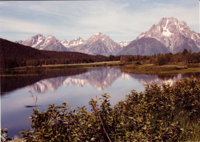
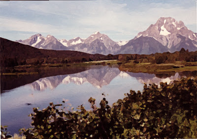
I decided to play some more with the water color effect, and I chose an original photo I had taken of the Grand Tetons from 1989 when we drove across country visiting National Parks. This looks just like a postcard, but it’s really one I took.
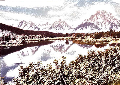
I got some different effects with the artistic filters, playing around with the different choices. These were colored pencils and pastels. I can see how you could illustrate a book with adjusting effects. This first is the watercolor effect, which I could get really hooked on.
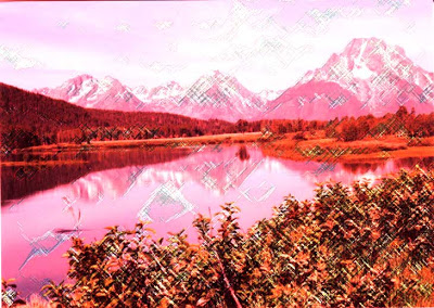
This last is playing around with some other color effect and then adding the pastels.
Still lots of fun!
Yet another tutorial….
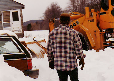
I decided to try another tutorial, this time on making photos look like watercolors. Too much fun – lots of ideas for future projects. This first is the original, without any touch-ups – from the winter of 1994 on Sleepy Hollow in Vermont – way too much snow for us to stay another winter, hence the move to Tucson.
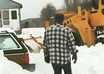
This next is with the watercolors, using the dry brush effect. Had fun looking at the pen and ink conversion of the photo, then seeing how to blend everything. This has so many possibilities.
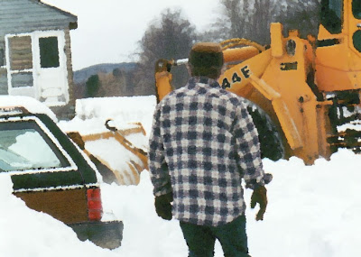
This last is the same process but using a palette knife for the watercolor effect. Plus I tried to have more of the pen and ink detail show through.
