Archive for the ‘art’ Category
Top Ten Tuesday
Lots of great stuff on line this week – some very cool eye candy to enjoy!
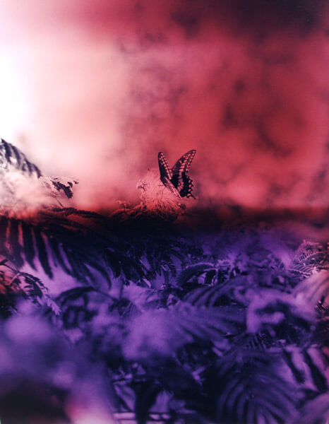
From Cool Hunting, a site with some unusual items and projects… some original artwork “Field Recordings” by Bryan Graf
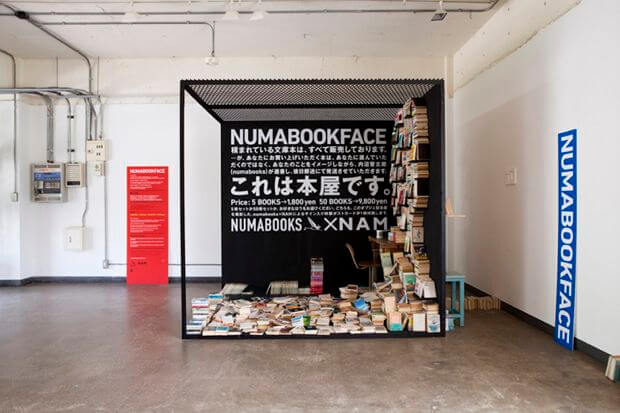
Also from Cool Hunting, one of the most unique book displays I’ve ever seen, as part of an art installation. The best pics are on the site, so check them out.
Vicki Welsh does some really gorgeous hand-dyes…here’s her latest batch for this month’s challenge. I could spend all my spare money to her weksite!
From Kate Harper’s blog – Legal Tips for the Starving Artist, and a very good review for all of us.
And even more from Kate – lots of articles on copyright and protecting our designs….I know for me this will be some serious reading this month – need to do it!
How will the price of cotton affect art licensing from Joan Beiriger’s blog – very interesting. I know that we have had to raise our prices for our marbled fabrics significantly.
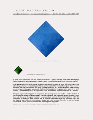
If you are where I am in looking for gallery representation, then Joanne Mattera’s Art blog is for you. She has an article on gallery red flags that is very valuable….I’ve seen a couple of these flags in the past.
Also from Joanne is this article on Rethinking Artist’s Statements, again very timely for me as I redo a lot of things on the website.
Rayela’s Art (AKA Rachel Biel) is spearheading the fund raising campaign for the Textile and Fiber Art List. This is rapidly becoming THE place to find any type of textile art on line. If you are interested in becoming part of an outstanding collection of fiber and textile art, then visit and donate, even just $10. The eye candy alone is worth the donation!
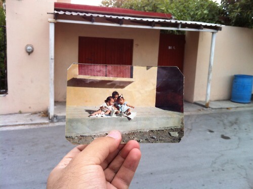
Again from The Best Article Every Day comes Dear Photograph – a really cool idea to superimpose a past photograph with the current location. Clever!
Enjoy your week – send me cool stuff you find on line!!
Work in Progress Wednesday
Sometime this past autumn, I posted a picture of a quilt completed at least 10 years ago, asking for suggestions on quilting it. I had used invisible thread (waaaayyyy before the improvements in threads) and did basic in-the-ditch quilting. Pretty darn blah. So I took ALL the quilting out, including taking the binding off, and washed it to hopefully remove the shadow lines.
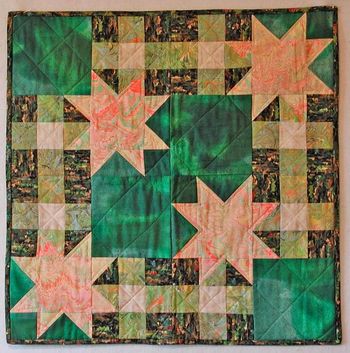
Silly me, I was thinking of having it available for sale at the art show we did in November. Well, that didn’t happen, so it moved to my “to do” list for when I retired, and then to the top of the list as I saw the studio coming together. I thought of attempting some feathers, because most of what I have done for quilting has been stippling or stitch-in-the-ditch.
Before I could start, I discovered this video on stippling, and I was hooked. Sharon Schambler had an hour-long video (actually longer) with 9 free motion patterns she has used in one of her quilts. Easy to watch and very easy to do!
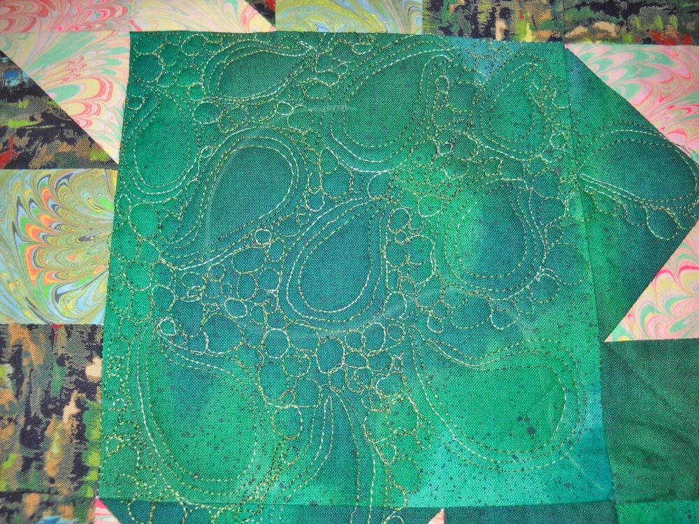
I chose the second pattern, used some variegated thread from Superior (of course – I am totally hooked!), and started. I wasn’t sure I could really do this. So voila –
I was thrilled at this point, because I realized 1) I could do this, and 2) the quilt was going to look SO much better!!
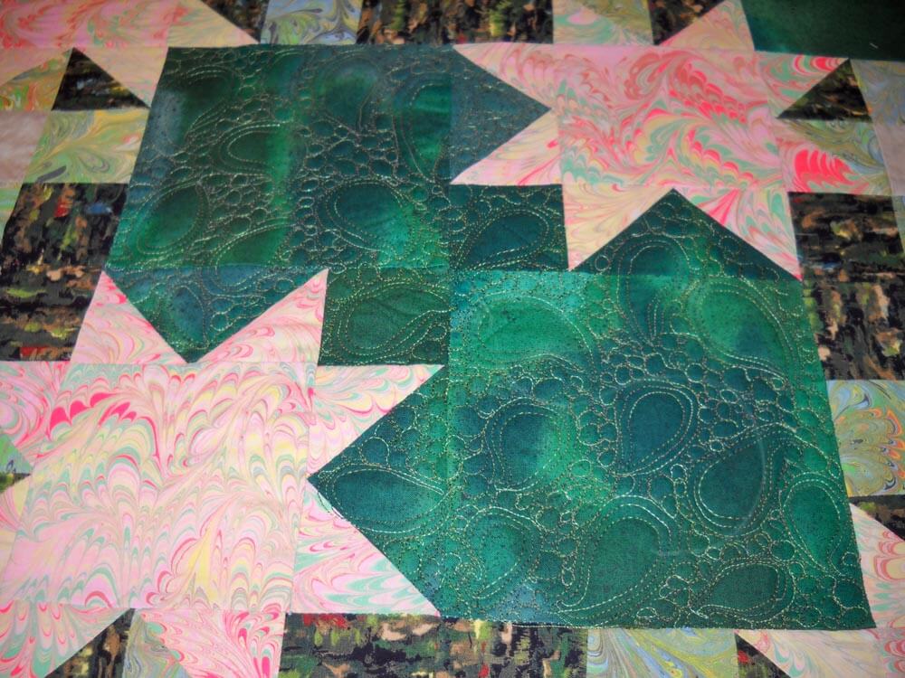
This is the completed center. I’m not going to quilt the marbled stars (unless someone has a really good idea for me?? Hint hint…). I ABSOLUTELY love it! I’m doing a variation of the pattern on some of the side strips, and it’s coming along well. Hopefully pictures this weekend…..
Top Ten Tuesday – Finally!
This is now on my desktop! I found it here at on the Kate Harper blog. After all these years of teaching, life is definitely too short to mot make art!
Now I spent the last two weeks going through all the blogs I haven’t read in two months – and mined a WEALTH of great stuff!
Zen Habits had a great and timely article on Decluttering, as I was working through all the little bits of odds and ends that I was sorting. Two key points – we don’t want to let go of the past, and we’re afraid of the future. Definitely worth a read.
From ArtsyShark – Is there a future for trade shows and sales reps – adapting to changing commerce. Lots of great points, especially if you are thinking of doing the art licensing route.
Elizabeth Barton has a fabulous blog with lots of food for thought. As I contemplate becoming more active with my work, this post of entering shows was extremely valuable. Don’t you just love the colors in this quilt?
Alyson Stanfield had a guest post on Photoshop (How to Make the Best of Your Art Photos with Photoshop) by Chris Mills. If you’re not reading the ArtBizCoach blog, you should be. – http://artlicensingblog.com/2011/05/16/how-to-make-the-best-of-your-art-photos-with-photoshop-by-chris-mills/
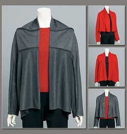
A friend of mine turned me on to online pattern sales. I haven’t sewn for myself in years, and I never thought about the pattern lines being on line. Marcy Tilton has some really nice wearable patterns – I could get hooked! Patterns on line
The Textile Blog has an interesting article on the future of hand production, starting with a video about hand-made lace production. Here’s a quote: The video deals with the seemingly age-old problem of machine versus hand production. The video itself deals with the situation in Cyprus where traditional lace embroidery is inevitably being led towards extinction by the importation of cheap machine produced lace, mainly from China. Cyprus is by no means the only area of conflict between machine and hand production and China is not the only culprit in flooding the market with cheap products.
Sites on greeting cards – I had no idea there was so much available on line. This article is also from Kate Harper and gives 6 articles on card design tips.
Also from Kate Harper’s blog (a HUGE wealth of information), much more about art licensing…..walking the floor at the Surtex licensing show.
This week’s eye candy from The Best Article Every Day – great ads for AT&T – forget the company, just look at the art work! This is a long graphic – go to the article and take a closer look – and then spend some time with all the rest – these articles are just the best!
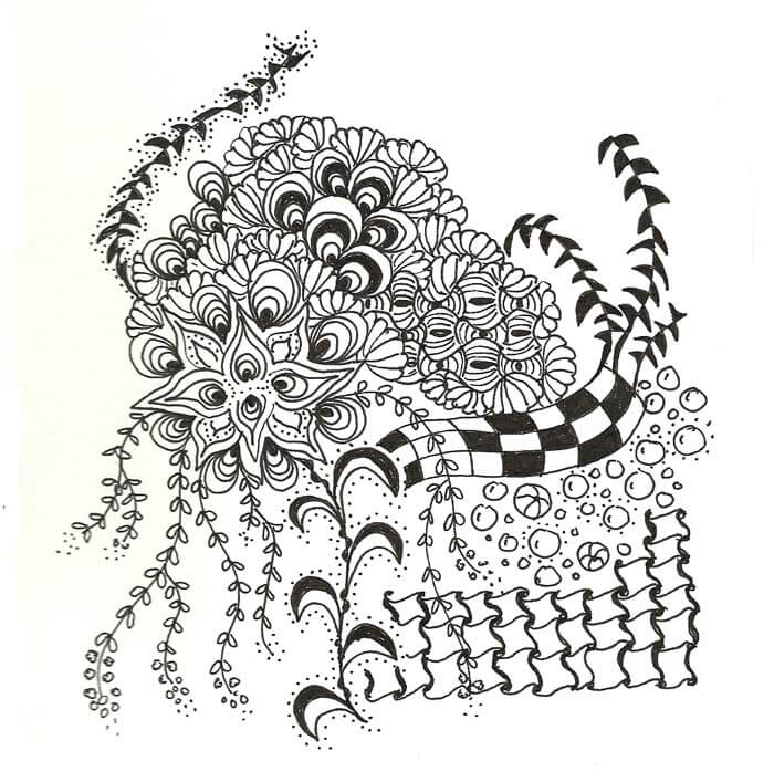
Staying Sane with Zentangles
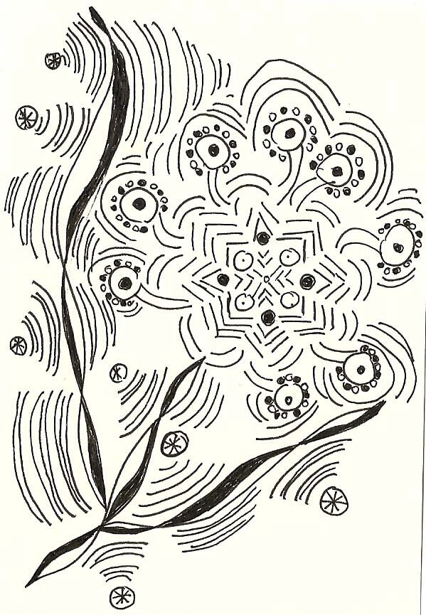
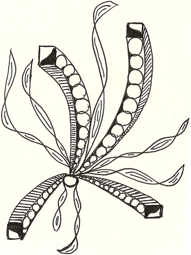
 The last couple of months have been difficult, with virtually no art getting accomplished, much to my dismay, and no doubt added significantly to feeling bummed and sad. About the only thing I was able to attempt was some zentangling. The April theme in the Sketchbook Challenge was to “go out on a limb.” I interpreted that to attempting to use more color in my zentangles, which met with a small amount of success. The second one that I did brought back to mind all the attempts at art over the years that didn’t succeed. I was faced again with my internal need to have everything “look good” when I try it. It is very difficult for me to “try” and see what happens – it still needs to “look good.” So I spent some time pondering that lesson, which didn’t help my mood much at all.
So April was pretty darn dry. I admired the zentangles of my friend, who is branching out and developing her own patterns. I was really feeling jealous, and by the beginning of May I was ready to pick up pen again. I have no idea what the theme was for May, but I did get productive…some pieces took about 90 minutes to finish, and some went really quickly. I still want to experiment with color to see what I can do.
The other thing that has been keeping me sane throughout the past month was looking on line at lots of new patterns. I knew I needed to increase my repertoire of patterns, and once I got started with new ones, I could see myself making progress with new tangles.With that bit of intro, here goes:
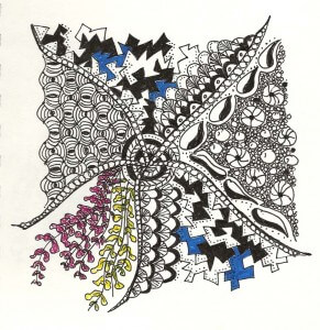
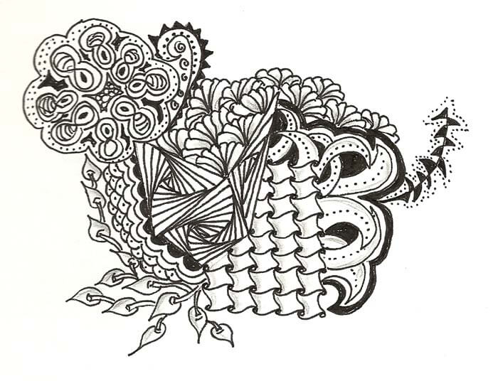
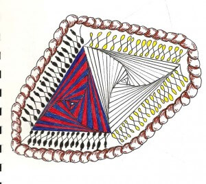 The thing I liked originally with this, before the color, was the way the paradox pattern worked with the two triangles. I thought color would enhance the pattern, and I found it just the opposite – I lost the twisting that I so love in this particular pattern.
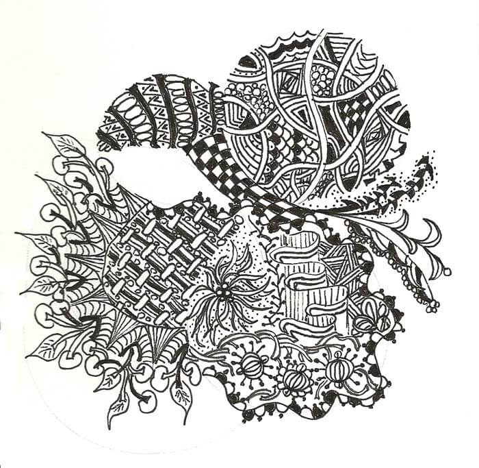
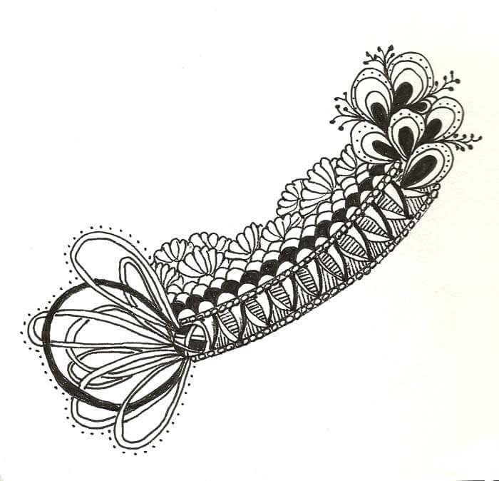
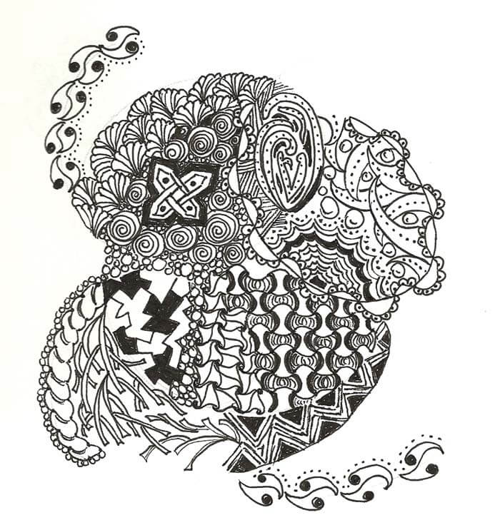 Lots of new patterns in this one.
Top Ten Tuesday
Wow, it’s been a few weeks, and a lot has happened in that time. Once again I ave fallen behind on reading blogs, so I’m sure I’ll have more goodies next week. In the meantime, there are some gems here!
From The Best Article Every Day….If the Internet Existed Years Ago – Facebook in the 70s and Twitter in the 60s…..and more….
Aslo from The Best Article Every Day – Top Astronomy Shots of 2010
From a blog Open Seed Arts, a time-lapse of the creation of a work of art.
SAQA – Studio Art Quilt Associates – online magazine. Eye candy galore!!!!
Blurberati – Picking Your Best Photo in a Series – some really good info on using the Golden Mean to help determine cropping and other great tips….
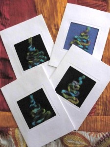
 Great tutorial from C&T Publishing on making thank-you cards.
 From JPG Magazine, their Best of Storefront pictures. Some very interesting juxtaposition….
 A trip down memory lane with some of the first commercials for common products – interesting to see how the technology changes. From The Best Article Every Day. Here’s a sample of one…
From The Personal Excellence Blog (some really good reading) comes inspiring graduation speeches. Here’s one opf my favorites – Randy Pausch.
And…from The Best Article Every Day, to round out the group, the fact that we are getting old……things that will be obsolete……
Art from the Heart – My Entry
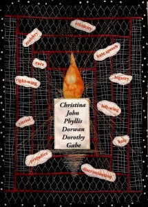 I finished my entry for Art from the Heart today. This was a tough piece to do, but it had to be done. It started last Sunday, the day after the Tucson shootings. I wanted to do the Journal Project from 3 Creative Studios, and my goal I set was to work in a 8.5 by 11 inch piece, using only scraps from my stash.
Well, last Sunday I was in deep depression over the shootings and had to work with some fabric. I pulled some blacks that looked like barriers, fencing. One looked like chicken wire, and one like barbed wire. Black and white, barriers. I used the traditional courthouse steps pattern from quilting, and then used red thread for “blood” to stitch those into place. I was staying pretty literal at that point.
From there I wanted to look at the words and ideas that continue to divide us as a country, but I didn’t want it to just be words. What about action on our parts? I printed out the words on white fabric and then sewed them to the background. If you look at the words closely, you’ll see I used a large needle with very fine thread, as I wanted the needle holes to show…like the bullet holes that wound us.
I actually had trouble coming up with the words to use. So many words I thought of are far more inflammatory than I wanted for this piece. I wanted more general terms that would not cause people to fixate on them and get angry. Yes, the vitriol is heating up, but the purpose of this piece is not to add to the anger. I included left-wing as well as right-wing, and if you look, they are on the opposite sides of the quilt. This needs to be about “us,” not “we” and “them.”
I knew I would have a candle with a flame to illuminate the darkness. Again I printed out the names of the shooting victims. I know from visiting the Vietnam Memorial how powerful names can be, and I do not want us ever to forget these six people. I want their lives to shine down on us and help us overcome these horrible things that divide us. I used three different colors of metallic threads to develop the light from the candle. It doesn’t photograph as brightly as it actually is, so I may still add more strands of candle light.
I don’t think – in fact, I know – I’m not done. There is more I need to say through fabric, but I need to get a week or so of distance for myself, as well as work on the website. Plus, I am having to think through my own issues with some of these words – monitor my own language and actions.
Work-in-Progress Wednesday
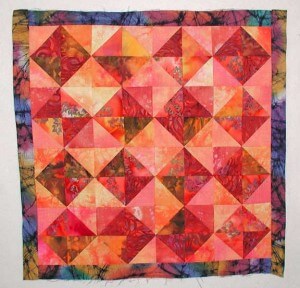
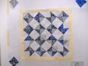
![]() Last week I show the beginnings of my Ice quilt, to complement the Desert Heat quilt I made. I went to Girls’ Night Out at the LQS last Saturday and got a lot of quilting done. I then decided what to select for the first interior border. THe cool thing with the Deat quilt is the inner border really is unexpected. The blue really sets things off nicely.
Last week I show the beginnings of my Ice quilt, to complement the Desert Heat quilt I made. I went to Girls’ Night Out at the LQS last Saturday and got a lot of quilting done. I then decided what to select for the first interior border. THe cool thing with the Deat quilt is the inner border really is unexpected. The blue really sets things off nicely.
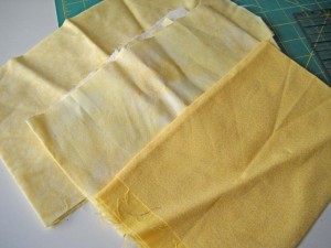
 For the Ice quilt I decided to look for a yellow to represent the very weak winter sun, especially being from New England! You can see the yellows I pulled from the stash. I decided to go with the middle one because it was pale, and there is some very interesting texture within the fabric itself, with brighter yellows in a few places.
 Here is the finished center. It is fairly “cold” and rigid, which of course is what ice is. Hopefully by next week I’ll have the flying geese borders on as the next step.
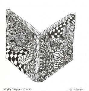
 Also this week I have been having some fun with the Sketchbook Challenge. I uploaded my first pic to Flickr and got some very nice feedback. I was so pleased with the first one that I had trouble sleeping, because I kept thinking of more things that are “highly prized,” and I wanted to get to work on them. So far this week I have a zentangled book, which I love!
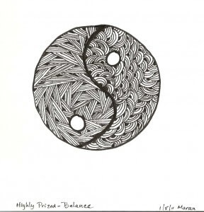
And then, since I am working on trying to keep balance in my life, I went for the yin-yang symbol. I kept only two patterns, one straight and one curved. I’m liking what I can accomplish with these patterns. I think a music note and the comedy/tragedy masks might be next.
Send me some links to see your sketches if you’re doing the Challenge. You can click on the link on the right to get to information about the Sketchbook Challenge. I am also thinking of looking into 3 Creative Studios for their Journal Quilt Challenge, and potentially their color challenge. I just want to keep myself motivated and try some new ideas, but no pressures on me – if I do it, fine, and if not, fine also.
Revisiting China – Part 1
![]() One of my projects as a result of our recent move is to sort and organize slides and pictures: one because of the need for the extra space, two to eliminate anything that still has smoke from our fire 20-plus years ago, and three to find a way to enjoy all these memories. Now that I have a home for “recycling” slide mounts and boxes, I am ready for this project. Slides are sorted into a slide box we had been given years ago and never used; there’s one drawer of China slides and a second drawer of personal slides. I’m starting on the China slides.
One of my projects as a result of our recent move is to sort and organize slides and pictures: one because of the need for the extra space, two to eliminate anything that still has smoke from our fire 20-plus years ago, and three to find a way to enjoy all these memories. Now that I have a home for “recycling” slide mounts and boxes, I am ready for this project. Slides are sorted into a slide box we had been given years ago and never used; there’s one drawer of China slides and a second drawer of personal slides. I’m starting on the China slides.
How to organize? One of the most impressive memories from this trip in 1978 (before normalization of relations with the US) was the visits to the schools, so that’s where I am starting. Some background: I was teaching middle school science at the time in Phoenix, Arizona, when I became involved with the US-China People’s Friendship Association, a group working to bring about normalization (the recognition of “Red China”) as a legitimate country. This has been a passion of mine for years, since early high school, and especially influenced by a book by William Lederer (senior moment – lost the name) about the “truth” about Chiang Kai-Shek. I won a number of debates in high school based on the strenghts of my pro arguments, which didn’t make me any more popular. Oh well, I WAS right.
In 1978 I was selected as one of 20 people from the western part of the United States to travel for 3 weeks in China. I had never been anywhere, and China was at the top of my travel list. I was in heaven! I was gone for nearly a month, have a full notebook of interviews and impressions, and probably well over a thousand slides (all of which are being weeded down to the best. Each place we visited (fron Guangchou – the “old” Canton” to Beijing) we were able to meet and ask questions. I was in charge of all the school stops, since I was the only teacher in the group. It was the most amazing adventure.
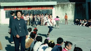
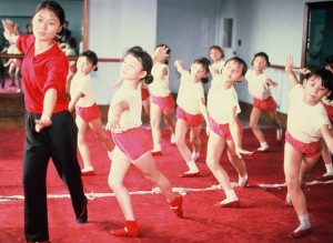
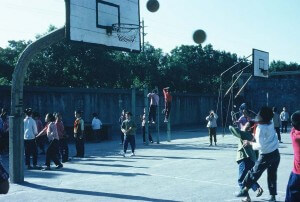 Our first visit was an elementary school, and the playground looked suspiciously like the typical US school ground. Teachers were wandering around, organizing activities, like tug of war. Notice the blues and grays for colors, especially on the adults. We were there at the end of the Cultural Revolution; the Gang of Four had just been imprisoned. Bright colors were a “western” problem, and we had been asked in doing our packing to look at basic browns, blues, and grays for colors, pants, no dresses, to respect the Chinese. We only saw bright colors on the children, until we hit Tokyo on our way back – our senses were literally assaulted with color.
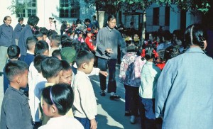 If you notice make-up on the children, it’s because many of them were going to be performing for us during our visit. We were treated to amazing displays of arts and athletics, and at the time China was not a player in sports on the world stage. We all know that has changed.
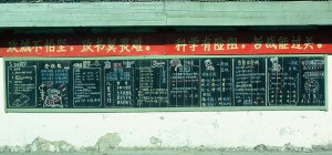
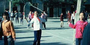 I was particularly taken by the blackboard at the end of the playground, with all the announcements. It was pristine; no damage, vandalism, or the like. One of the questions I asked at our first meeting with the teachers and administrators of the school was how they dealt with vandalism. I ws asked to rephrase the question, and then asked to define vandalism. The teachers looked at each other, not understanding the word…or the concept. The reply was “why would anyone want to destroy what they need?” Why indeed….
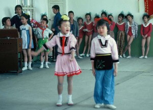
 We saw all types of entertainment, from the little singers, singing songs of leading the good life according to Chairman Mao….
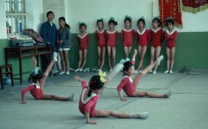
 …to guymnastic displays of all ages. Look carefully at their equipment. Floors covered with skinny rugs, bare walls – nothing like we would expect for building athletes.
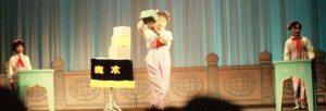
 Some performances were more formal. This was a group of young ladies performing basic magic tricks for us, and they were very good. Stage presence was something I remarked upon at the time, and I still think it’s pretty amazing how poised they all were. I know how difficult it is to develop that in young children during theater.
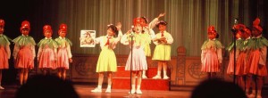
 This dance/song number talked about importance of water and work to develop a good cotton crop.
 This is the classroom that sticks with me so many years later. Sixty students in the classroom, no textbooks in sight. If you look closely, you will see double-digit multiplication problems on the board. No paper visible among these second graders. Students would raise their hand with a solution they had worked out in their heads, be called upon, come to the front of the room, and respond. We don’t even begin teaching basic multiplication facts until third grade….
 We had certificates made up of our trip before we left the United States. We brought along a Polaroid camera to take pictures of our hosts and the group, which would then be affixed to the certificate. This is still one of my prized possessions. (I’m second row on the left….)
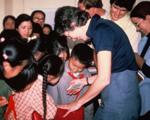
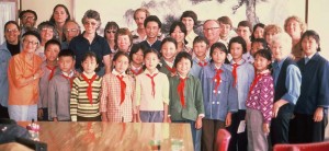 The children crowded around us to watch the picture develop – absolute magic!
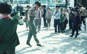
 Shanghai, as well as most other cities, had what were called Children’s Palaces, a place for students to go after school for more activities. A good many of them were focused on the arts, but many others were practical. Here’s one of our group members playing – of all things – Chinese jump rope.
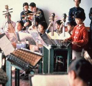
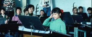
 Lots of musical instruction, as well as impromptu concerts for us.
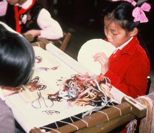
 The needlearts are very strong in China at that time, especially needlepoint.
 Lots of martial arts demonstrations….
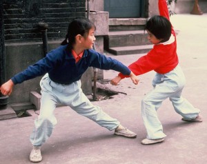 …and every where we went we were sent off to applause. For so many people we were the first Westerners they had ever seen.
Ballet had been banned during the Cultural Revolution, so it was encouraging to see this, and then one evening a classical ballet performance.
This is going to be wonderful, retracing this amazing trip. I will be culling the best of the slides to put together in a photo book so that I can look at these images more often. I’ll post more as I proceed with this project…and a glimpse of a China just beginning to modernize and embrace capitalism.
Photoshop Friday – Ginko Tree
I haven’t had a chance to do too much with playing around with the latest group of pictures from the Botanical Gardens, and there’s so much I need to plan out for these pictures. So today, after sorting through slides and doing some general organization, I decided to play.
We have one lone ginko tree at the Gardens, and it was nice and yellow when we were there over Thanksgiving weekend. I didn’t realize until I was looking at the photo that I had gotten some shafts of sunlight. Here’s the original, which I really like.
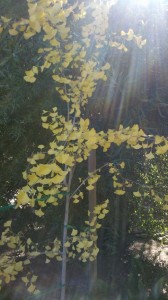 I didn’t realize that there were some surprises in the upper right corner as a result of the sunlight.
 I love the shadows of the ground cover in the background. But you know me, I’m not content to just leave a picture alone, especially since I have plans down the road for some of these pictures. So….
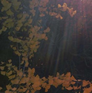 I don’t remember what the filter was, but it’s even more ethereal.
Now back to the whole shot….with a bunch of filters……I’m really partial to the sponge….
 …but then I went very abstract…..
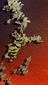 …again, very Asian in its simplicity, and I can see it in fabric……
Some other Photoshop Fridays you might like:
October – some of my favorites
Top Ten Tuesday
This project starts January 1, and you can read about it here. I’m trying this, as I don’t usually have a lot of luck with long-term on-line projects. But as luck would have it I bought a small sketchbook to practice my zentangle patterns, and as I was cleaning boxes and sorting for the studio, I discovered lots of different size sketchbooks tucked away. So I am ready….whatever that means for me……
The last time I did a Top Ten, the focus was on A Note from Your Mother. Their last three posts have been interesting. If you have nature lovers or collect nature-inspired art, you might be interested in their Endangered Species Print Project. Plus, read the post on the decline of the glorious tiger…only 3200 left in the wild.
I read The Future Buzz on a regular basis, particularly his posts on viral images across the web. His collection for 2010 is amazing, and there are links to several other collections. There’s a great one on probability that will work for math class, humorous ones, and ones that make us think. The graphics are spectacular.
Bonnie Samuel’s Blog looks at TAMMACHAT Natural Textiles, a fair trade, social enterprise to support weavers and artisans in Thailand and Laos. These artisans are indigenous people who are carrying on the traditional arts of silk and cotton textile production creating beautiful fabrics and wearables.
For those of you who love sarcasm and the news, if you aren’t reading The Borowitz Report, you should. His latest column interviews the devil about the obscene bonuses paid Goldman Sachs executives this year. As the devil said, “best investment” he’s made.
From Cedar Canyon Textiles (The Paintstick Place) comes an interesting blog post on the importance of ritual, a reprint of a blog from the Harvard Business Review. Just one of the gems:
“Each time we pause, notice, and offer respect for an activity, it reminds us to appreciate and focus on what we’re about to do. And by elevating each activity, we’ll take it more seriously. We’ll get more pleasure from it. The people with whom we work will feel more respected. And we’ll feel more self-respect.”
I discovered this blog like I find many others – just following interesting links. This has a tutorial for coasters, which just sparked an idea. This week I actually went through every piece of fabric, sorted and ironed, looking for inspiration for new projects. I rediscovered a few patches from a Quilt University class that I figured I should keep, as they were interesting alone, but I wasn’t sure exactly what I’d do with them. Now I know!
From Dumb Little Man (that’s the name of the blog….) comes Seven Important Questions to Ask Yourself Before the End of the Year. Excellent way to reflect on the past 12 months.
 Alphabet Photography – really interesting concept, and lots of great images to browse. They are for sale, but the crative nudge from them is wonderful!
And finally, some eye candy – a great literate romantic spy novel, The Tourist….and Johnny Depp – ya can’t go wrong!
You might enjoy some other Top Ten Tuesdays……
Art Every Day Month – Week 2
This has been an interesting week, in that while I only have four zentangles to show, I have been exploring the wealth of patterns and information available on line. I have found myself in odd moments trying out new patterns. It seems that there is way more to this than “doodling,” as I am finding out. There are identifiable patterns, and I am enjoying trying these. Some I am having more success with than others, but they’re all fun to do. I can see how using patterns enables you to enter a zen state much faster, and you relax more within the art.
Here’s some websites to explore:
The Original Zentangle site and their blog
Plus, go to Flickr and just explore…whch I did on my new Droid, and now I believe what the sales person said about using up your battery…..
That said, here’s my work this week. I am particularly interested in the added element of shading. I definitely want to explore this more.
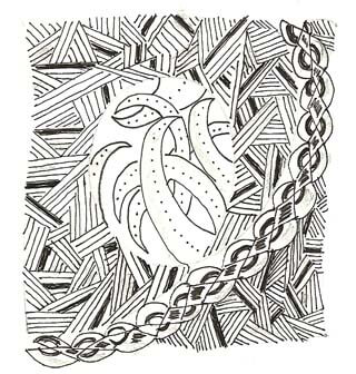
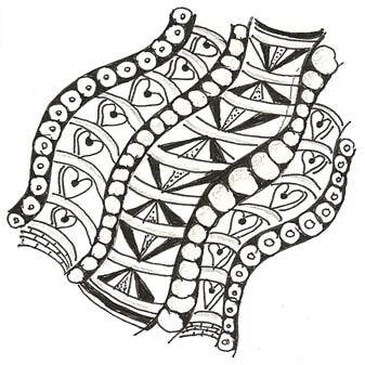
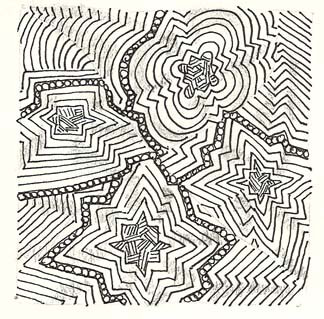
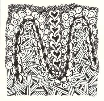 Anyone out there doing these? I’d love to see your work!
Friday Photoshop – on Saturday….
 You might remember this zentangle from last week, and I said I was dying to try some Photoshop effects with it. Well, here’s one night’s work this week, in between grading linear graphs – this was MUCH more fun!
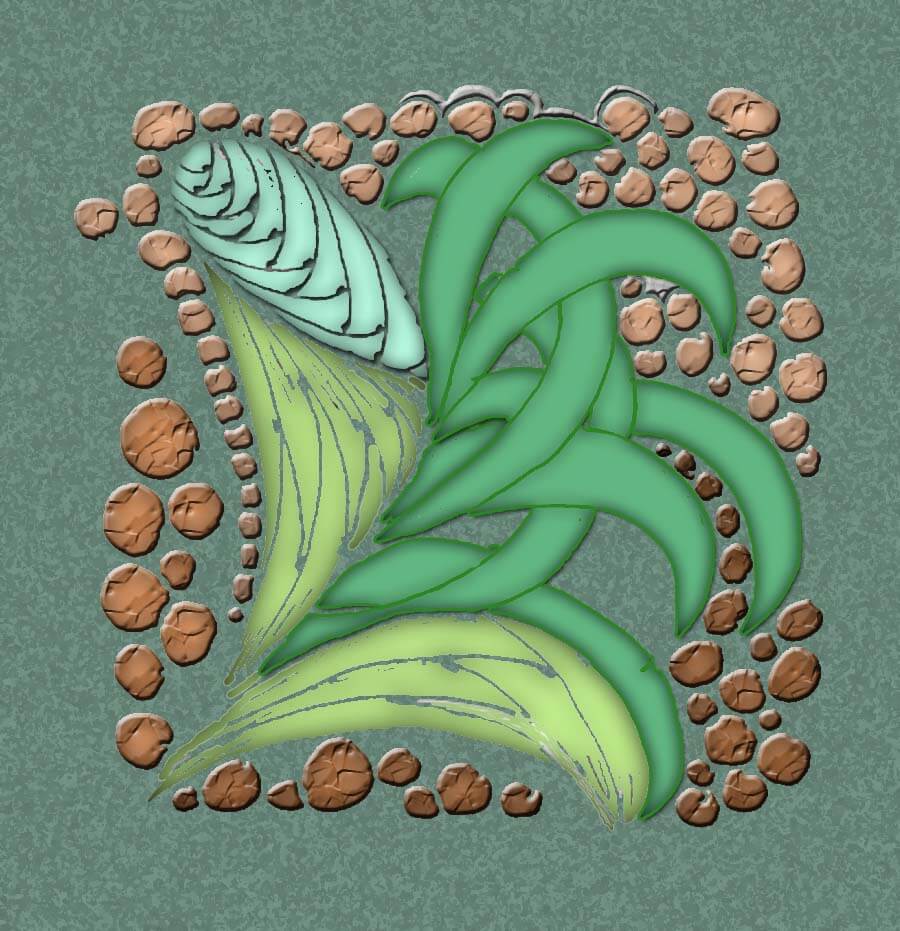 I love them both – they are each so different. This week I have been roaming the net looking for zentangle patterns. I hadn’t realized that part of this art is set patterns that enable you to really “zen out,” as I put it, into the drawing mode. I’ll have some new zentangles up on Sunday for my week of Art Every Day Month, plus on Tuesday’s Top Ten I’ll list a bunch of the sites I’ve found.
This week also saw me playing with some of the new photos from the Tucson Botanical Gardens. Here’s the original of the one I started play with:
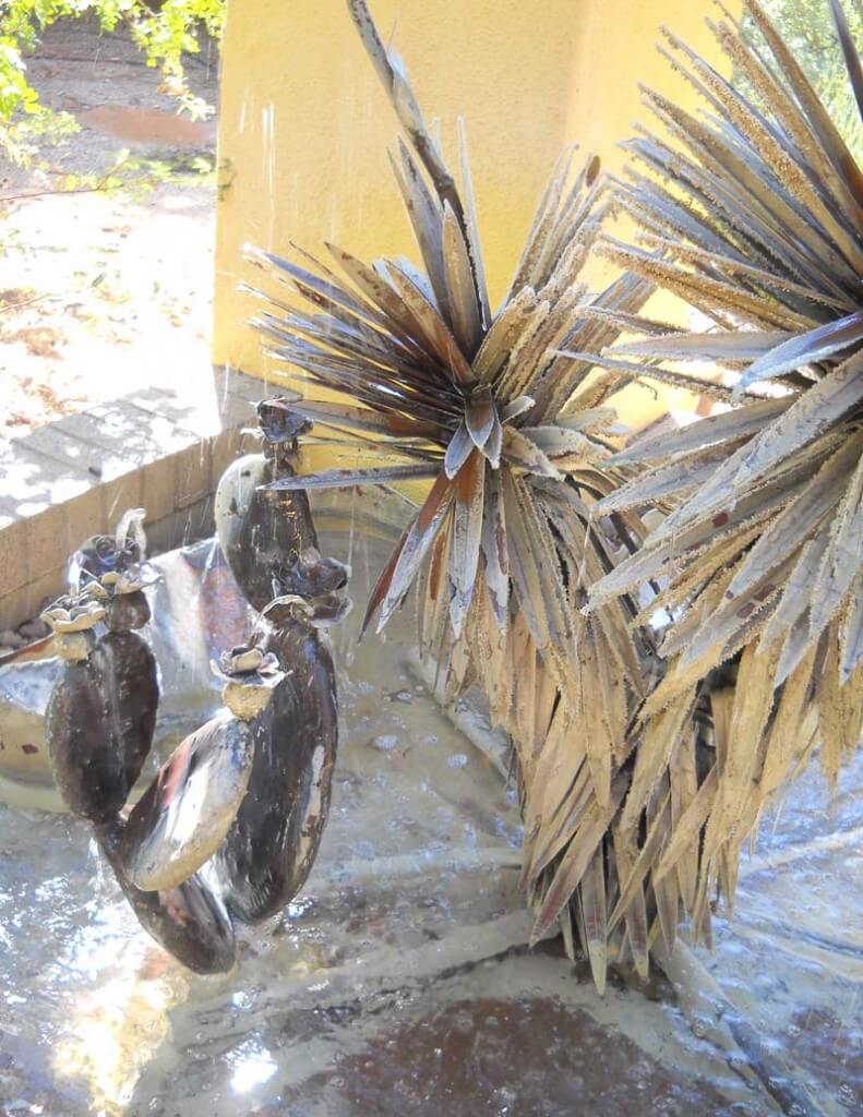 This metal fountain is part of the Zen garden, and one of my favorite places to sit and be with nature. I was able to capture water movement in this one, which I really liked.
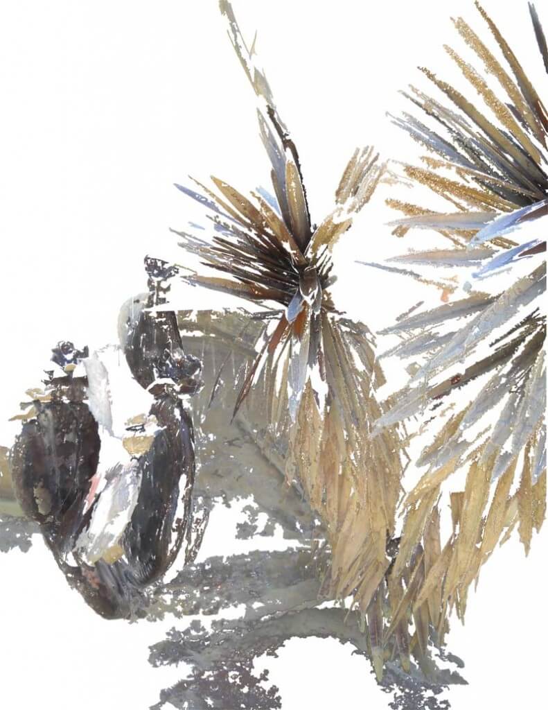
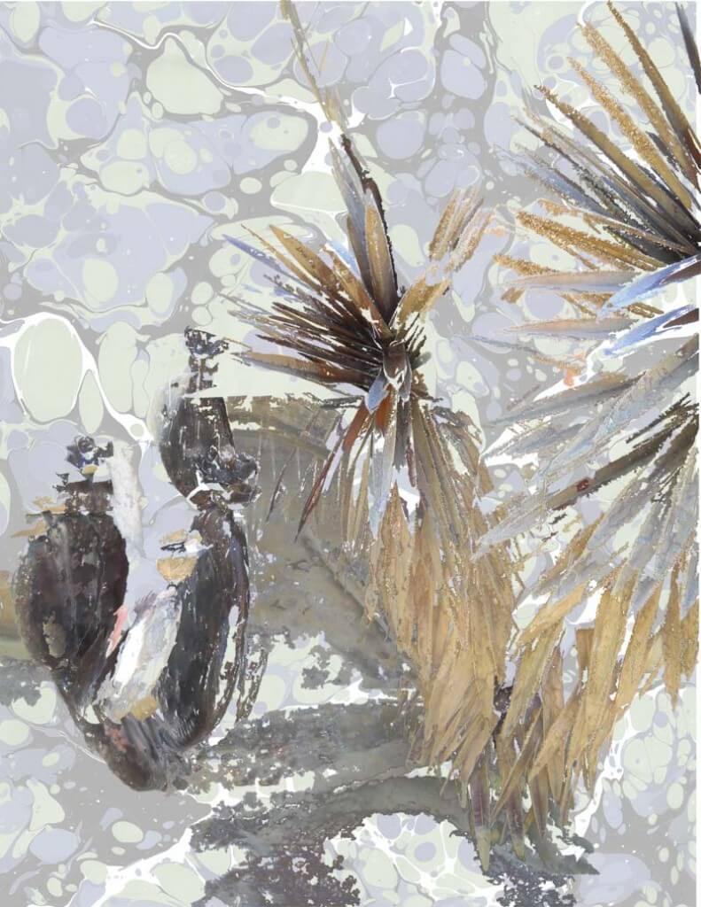
One of the things I have been doing in my attempt to create some collages is using my magic wand and capturing several sections of the photo, ragged edges and all – gives it more of a water color effect, which I do like. Here’s what I captured from this photo:
I love this just the way it is, but I kept going….Here’s the marbled fabric I chose to go in the background.
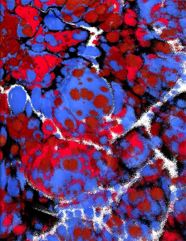 I know what you’re thinking…but wait, there’s more……
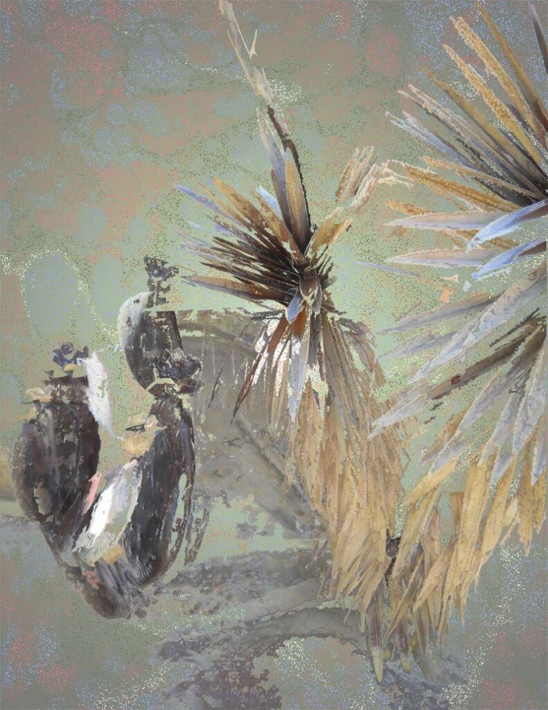
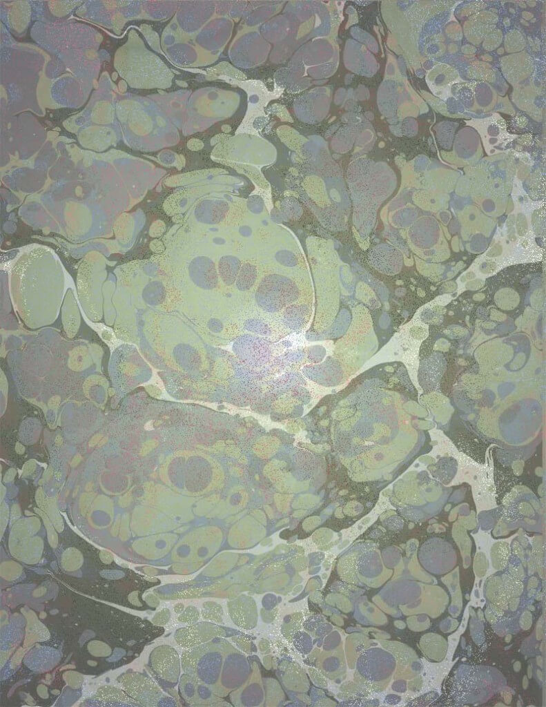 Same fabric photo, but with a gradient overlay that brings it closer to what I’m after with the fountain. Now I’m putting them all together….
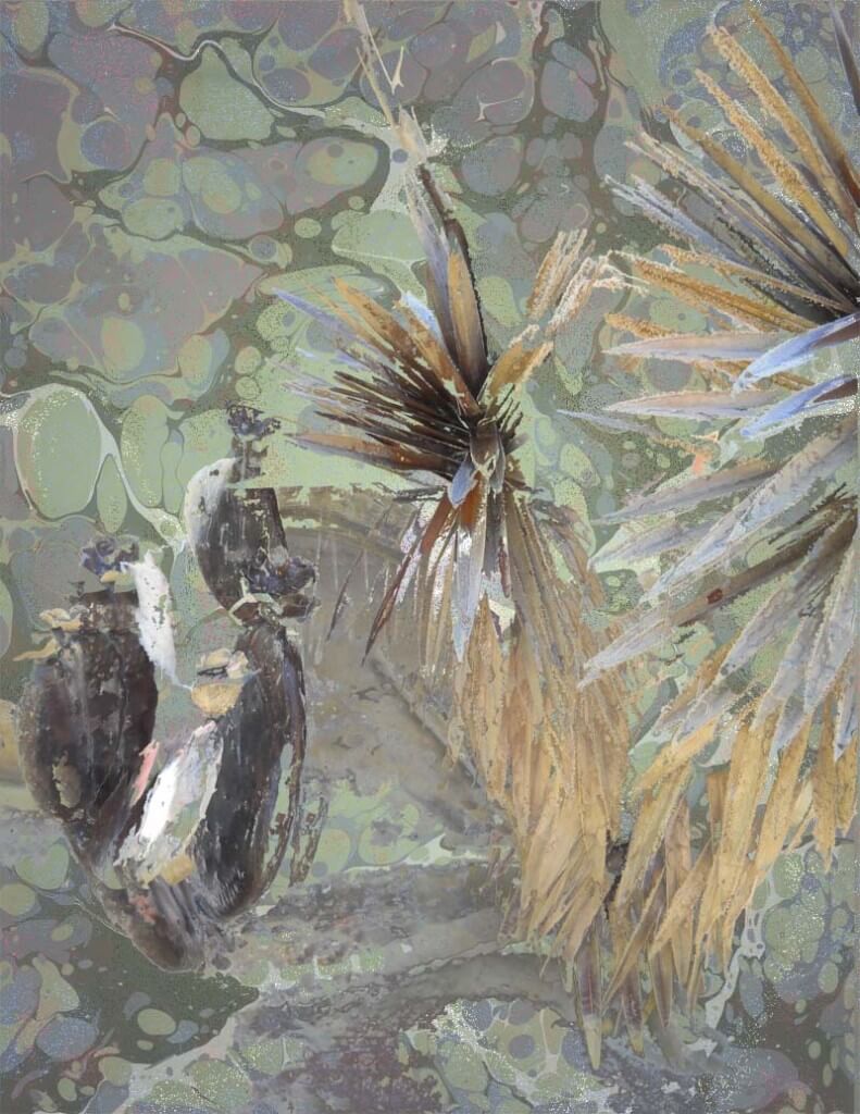
This is the final, which I think I really like. I’m torn between the first one and this one. I’ll probably do prints of both! Weigh in – let me know which one you like the best!
Marbled Papers Galore!
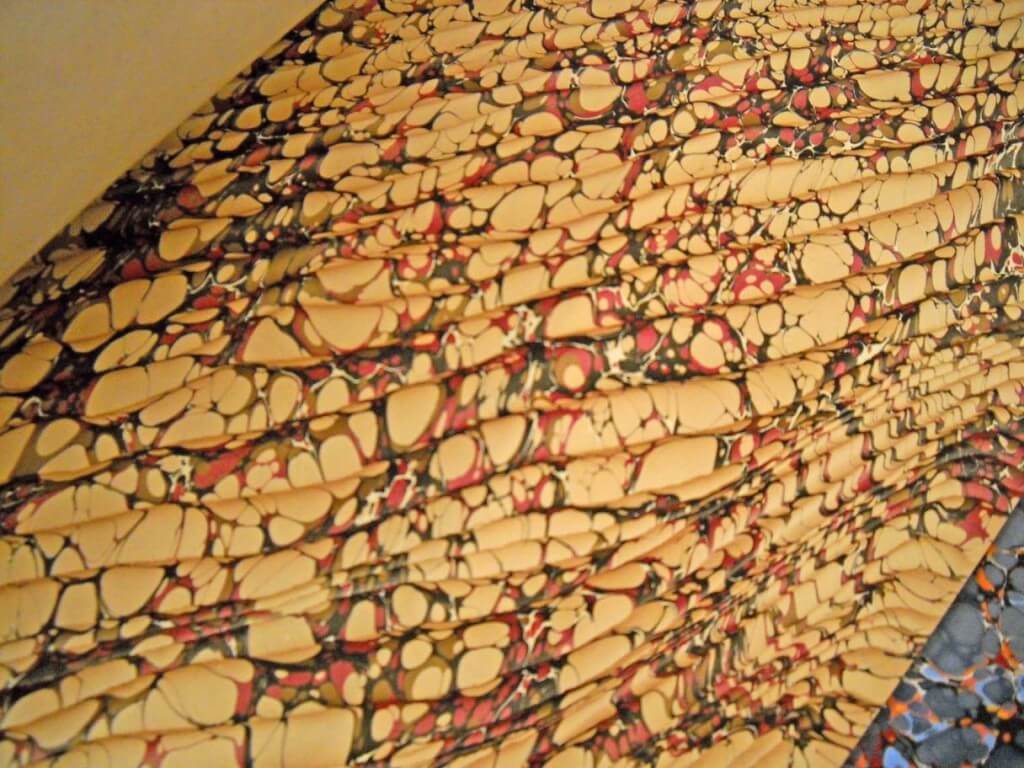
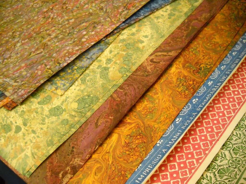
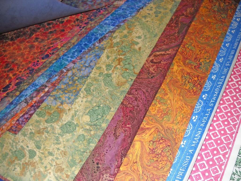
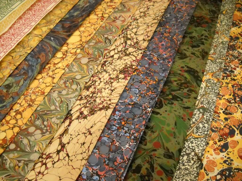
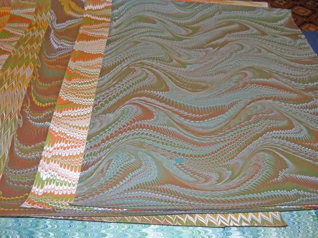
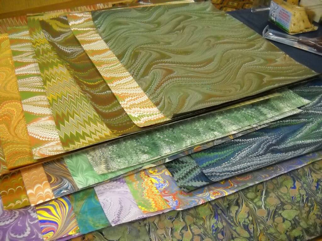
![]() A friend called on a Saturday morning a few weeks ago to let us know of a bookbinder’s conference in Tucson, with great marbled papers. We headed over to the Radisson to find the annual Guild of Bookworkers Conference. Oh, my, the marbled papers were scrumptious. One of the marblers was from New Mexico, Pamela Smith, and her work was amazing.
A friend called on a Saturday morning a few weeks ago to let us know of a bookbinder’s conference in Tucson, with great marbled papers. We headed over to the Radisson to find the annual Guild of Bookworkers Conference. Oh, my, the marbled papers were scrumptious. One of the marblers was from New Mexico, Pamela Smith, and her work was amazing.
Plus, there was another amazing lady there with marbled papers, whom I have forgotten, plus a couple of companies with really gorgeous stuff. Apologies for no names, but I did have permission to take the pictures. Hiromi Paper had a catalog that I picked up, because I’m always curious, and I found fascinating information about the art of paper making in Japan. This could lead to a serious new hobby…but right now I just want to take some of those marbling patterns and get them on cloth!
And now for the eye candy. You can click to get larger pics and see the incredible detail.
Monday Marketing – Packaging, Part 2
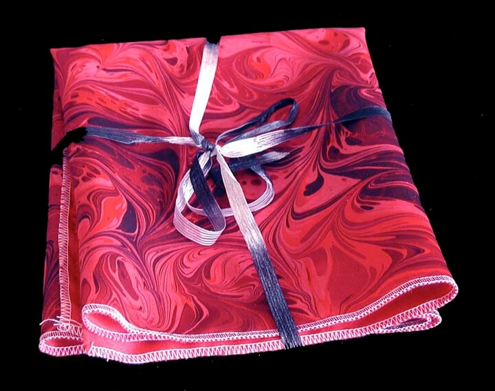
Since my post on the packaging two weeks ago, I have sold a couple more pieces of the new fabrics I listed, along with how they would be sent, like in the photo above. I also have started looking a lot more closely in the stores at packaging for different items. Now money is an issue, so there isn’t a lot to purchase “extras,” but that doesn’t mean you can ignore the packaging.
For our upcoming show on November 20, all our fabric is wrapped with ribbon, and we purchased colored tissue paper to wrap purchases – not a great as a box, but better than a plastic recycled bag. Because we deal with fabric, I looked into how my local quilt shop packages – and believe me, they do a great job! Lots of rolled fabrics by colors, which makes a great small package. For large fabric purchases they have special white bags with “ribbons” at the top, made from strips of recycled colored papers. You walk out of that store feeling special.
Moda Fabrics started the trend for “jelly rolls” of fabrics, and they have their own “Bake Shop” to capitalize on this idea.
Robert Kaufman fabrics has a great idea for packaging – certainly an eye-catcher:
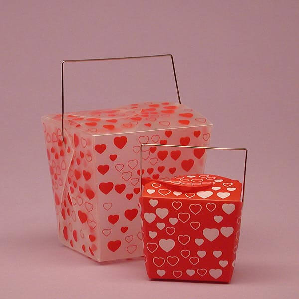
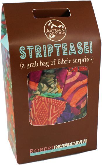 Further exploration gets us to the gift boxes from PaperMart. Loads to choose from, but I think the key is to be classy and as original as possible. I do like the “take-out” boxes.
Also from PaperMart – I like these because I could roll fabrics and stand them on end in these.
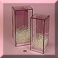 I still have a lot of thinking to do concerning the whole subject of packaging, with less than 2 weeks to go to the show. I’ll do what I can for now, but I’m looking ahead to other shows, plus our Etsy and Ebay sales to make sure our customers get really attractive packaging with their purchases.
How do you package? Any interesting ideas or materials that you use?
You might also be interested in these posts:
Monday Marketing: It’s the Packaging, Stupid!
So Many Outlets, So Little Time!
Art Every Day Month – Week 1
 Ah, the zentangle….at least my interpretation of them. I hope to do a class with a certified zentangle teacher after the first of the year, as i have learned that there are some set patterns that help you “zen” out. But I have been enjoying my version of them – trying to do one a day for the month of November – Art Every Day Month.
Herewith my doodles for the first week – have started experimenting with some color (less is more for me) and some shading – which I just can’t resist.
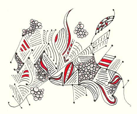
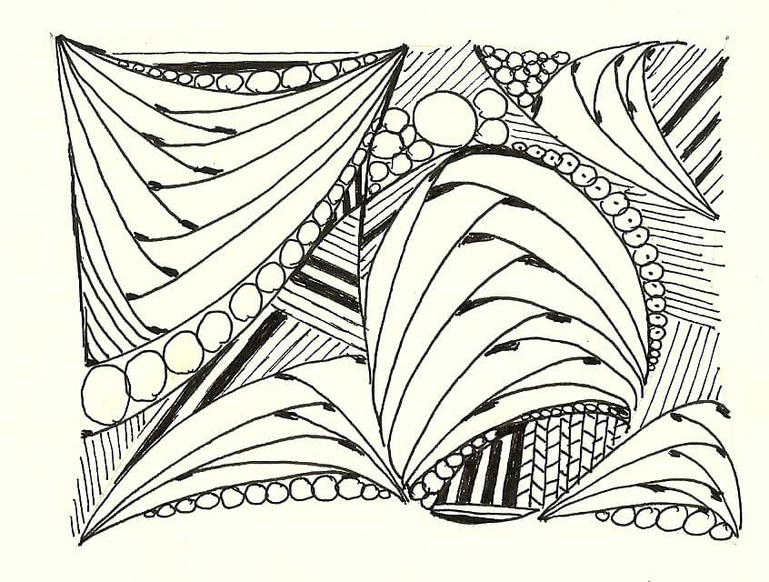
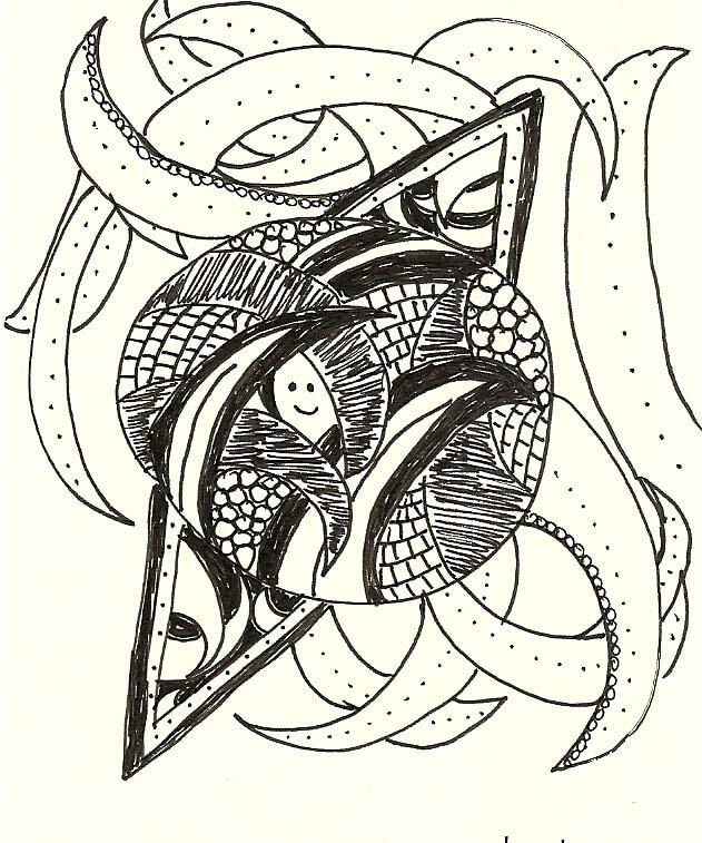
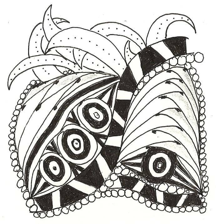
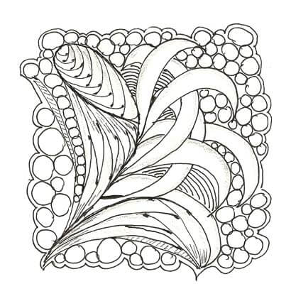 I am looking forward to putting some of these into Photoshop and see what happens. Here’s the link to last year’s zentangles: here, and here, and here, and here, and here.
Anyone else out there trying this? Anyone doing Art Every Day Month?





![strangebeauty_thumb[2]](https://www.marbledmusings.com/wp-content/uploads/2011/06/strangebeauty_thumb2.jpg)

