Archive for the ‘art’ Category
So Long October……

So October is gone……one long month of doctor appointments because of the accident, an eye infection, you name it – it’s hit. Nothing like a lot of stress to play havoc with your system.
I am so trying to get rid of the art class and try to focus in just on the math. No luck. But the kids have been creating some nice art pieces. More on that…..
On Going Back to School…

There’s more trepidation than usual as summer draws to a close (yeah, the beginning of August, and “summer” is over….) for the start of the school year. Some of it is new school, some of it is lack of decision making, some of it is still having to move classrooms, and some of it is the loss of free time. As usual, I’ve noticed that I get more “artsy” productive as I begin to run out of free time, when I could have done so much more over the last 10 weeks. This has really become a habit, and it’s one that needs to change.
I’m productive for a short spell, as I’m aware of running out of free time. Yet I can’t get myself started earlier, and I can’t sustain the impetus beyond the first week of school. Not good as an artist. I did get lots of loose ends done as we spiff up in time for holiday shopping, and yes, all of that was needed. But I’m still not making any concentrated new art.
At least I have figured this out and put it into writing – maybe that will help me move ahead.
I did do about an hour’s worth of quilting yesterday on the ice piece. The quilting is soothing, yet at the same time boring. I love quilting the chevron pattern, but I keep thinking about when it will be done and I can look at adding embellishments. It seems like I will be quilting that forever, and yet I can get a huge amount done in only 30 minutes. So again I need to change the mental mindset of what it will take to finish this piece. And I still need to finish the dress I started…….
This will be a hard year at school – there, I’ve said it. I am trying (somewhat successfully) to just let go of a lot of loose ends concerning the start of school – like no technology set up, computer not having internet, no books. But I kept telling myself that I can do this. I just finished “Good to Great” about businesses, and I am trying to see what I can do to implement those steps. I think I’m approaching a Level 5 leader, I know my hedgehog concept – the best possible learning environment, attitude, and skills to help all my kids succeed. I have looked at the Stockdale Paradox – I can do a great job with the kids, but the reality is the test schores are low and test scores are the focus this year.
Stay tuned….
Glacier 2

There is something very satisfying about quilting marbled fabric, especially this pattern. This is a traditional chevron pattern, and it is the basis for many more complex patterns. I love the lines to this pattern, and they are very easily quilted – almost a zen-like feel with the sewing machine. Use the walking foot and then just quilt.
I’ve been doing a lot of quilting with the stone, freeform, and chevron patterns, although the Pele piece on our website is much more complex. Quilting the nonpariel and wave patterns really take some thinking and some very slow free motion to get the stitching accurate. I need to set some more pieces with those patterns.
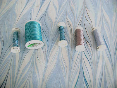
As I was quilting last night (to John Denver’s greatest hits – good quilting music), I was thinking about the decisions in this piece. I used the light gray about every three inches to hold the fabric in place. The stitches pretty much disappeared. I used the darker gray to accent the black in the piece. Then I started with the variegated rayon, and those stitches really popped. I may decide to actually stretch this piece and frame it when done, so that there aren’t any ripples in the fabric.
Once again I found myself judging the piece based on some beginnng quilting lines. Nothing fantastic yet, but I have just begun. So I need to put the critic to bed and out of my mind.
Glacier 1

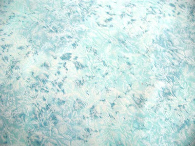
I have decided to document this new piece that I am working on. I have had the fabric for almost two years. It came about as a result of an online group of partners, Sarah and Karen. We were looking at mythology, and I had some ideas for a piece that would be very wintery, in looking at the seasons. This piece came out very icy, and I knew it would make a great glacier or iceberg. But that was as far as it went. It has been in my mind as a piece for the Cordova Fish Follies show, and I was trying for it this year – never made the deadline.
In the meantime I was collecting possible stones for the piece. At the gem show I found some aquamarine that I thought would work well to accent the berg. Then two rows later was some amazing craquelated quartz, and I bought two strands, all for this piece.
Today I finally found the piece – hidden in a drawer of “never sell” pieces. And the background is a piece I bought three years ago for something totally different. So here goes – the iceberg fabric.
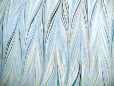
The backing fabric –
And the threads – there are four potentials, two variegated and two that are some shiny shades of grays. It will be interesting for me to decide which thread goes where – usually I have one thread for the whole piece.
Suggestions are greatly appreciated!
Today’s Batch of Fabrics

The fabric from today is just so gorgeous, I had to do some playing around with it! The blues ocean piece you see is a good half-yard in length, and this is just a small crop of a really cool spot. The levels helped bring out the white that is in the piece. This is a very watery, ocean effect, which Patty wanted to remind her of a special spot along the coast in California.
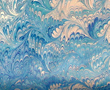
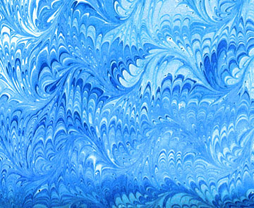
This is the piece with more of a blue cast, thanks to a photo filter. Much more watery, deeper ocean with sunlight on it.
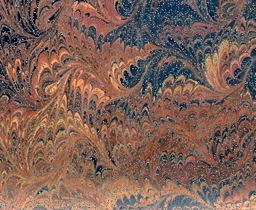
This is the copper gradient, with the dissolve effect just slightly added. A forest, with just a light snowfall?
I embossed this first, and then looked at manipulating the colors – to me it reminds me of Folklorico dancers twirling around and around.
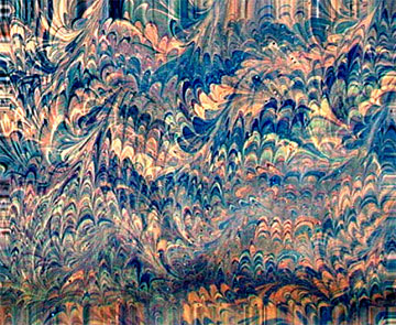
Again, this one reminds me of dancers enjoying themselves .
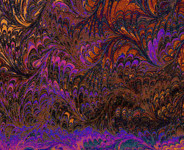
Marbling Madness…

It is amazing how much fun you can have marbling. We did the big tray today, and for three hours everything worked perfectly. The silk, the satin – nice, clear, crisp patterns. Both of us were working well with colors. Did some unusual stuff, tried to come up with some other ideas for marketing the work. It’s so good to have everything working again. Now we are talking about doing some colored cottons again, to get back to our sets of fat quarters that we used to sell.
I’ll post some pictures tomorrow – I am looking forward to playing the the satin piece in blues we did for Patty. But I wanted to write today – I’ve had the blog for 6 months, and I’ve really been enjoying it. I like the artistic record I have of the year so far. I feel like I have actually accomplished something artistically!
Back again….
I managed to let almost three weeks go by, what with still being sick and finishing out the school year. I am still waiting on my final for the last Photoshop class, before I sign on for the next one. I still need to do some playing with the tutorials to stay in practice. So what I have here is some playing around with all the skills to adjust the new piece that now is winging its way to its new home with our surrogate son.
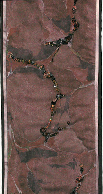
The piece is called “The Road Not taken,” with thanks to Robert Frost. It is a traditional stone pattern, marbled on a piece of brown faux suede. The paths are quilted and then embellished with a series of semi-precious stones – tiger eye and a couple of types of jasper, as well as some small seed beeds in a shiny bronze.
Here you can see a close-up of the marbling, the quilting, and the stones. I did nearly finish another piece, but I have to search for more yarn to make more foam. Hopefully this week I will get it posted.
Working with Paths…

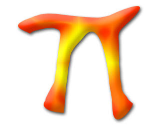
Interesting lesson 5 – working with vector graphics and continuing to work with paths. Just when I felt all amuddle, I finally created a pi-shape, saved it as its own shape, and started playing with a shape layer. Now I think it is beginning to come together. With the creating of the shape, I tried playing around with the pen tool more and realized I just had too many points. I worked at adding and deleting, using the convert pen tool, and I finally ended up with a Pi I could like. Once again I have to remind myself that I can’t learn and understand everything about paths all at once.
It was cool to open the shape library and see the Pi already there. I opened it and worked with a shape layer. I noticed that as you chose a style, all of a sudden in the layers, everything that had been done to create that style showed up – you didn’t have to do anything else. I got up enough courage to play with the style layers and came up with some interesting ideas.
What finally gave me the “wow” in this lesson was realizing I could create the basic math symbols (and they may already be out there!) in preparation for some math t-shirts next year.
Lesson 4

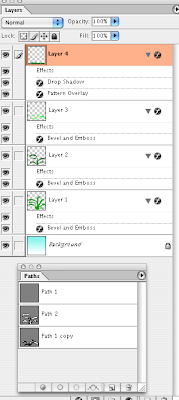
Lesson 4 is about the pen tool – and sure explains why I couldn’t get it to work like a “pen.” Interesting tool- still having trouble with the little handles getting them to smooth curves, but I’m guessing that’s just a problem with practice. I opted to try some cactus – especially the century plant. I wanted a very “hard” look, and I love what I ended up with.
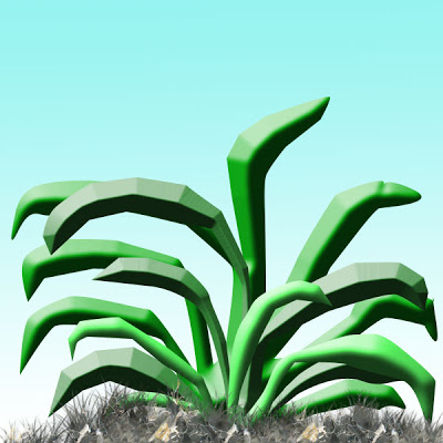
I have three separate paths – this final after I tried this on three other canvases. I was able to give each path a different color of green, and had lots of fun trying to work with the embossing to get the hardness that I wanted. Remembered to do other layers for the gradient background and the grass. The grass I checked “pattern,” forgetting which pattern I had already, and I love the effect – hard dirt. I had used the airbrush to build up lots of grass, so I think that’s what added to the extra “dirtiness” of the ground. So I accomplished a “hardness” feel to the whole drawing. Screenshot follows of what I attempted.
Lesson Two continued…

As I continue with Lesson Two, I decided to choose a photo of the Salem Witch Museum, since the doorway and glass window seemed pretty dark. I wanted to see what I could do with them. Here is the original:
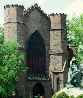
THis next is looking at the levels only on a separate adjustment layer.

Now we look at a curves adjustment added to it, on a separate adjustment layer.
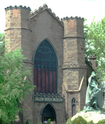
This last is levels, curves, adn the greens on an adjustment layer, in an attempt to correct the lighting, and tone done the brightness of the statue base.

And finally – just for fun – after all – it is a witch museum!

Lesson 2 – playing with adjustments

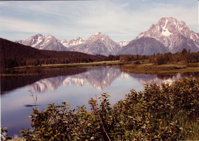
Lesson two starts out with some creative adjustments, using a layer adjustment – another new thing. I decided to work with my Tetons picture again to see what else I could so. So here is the original again –
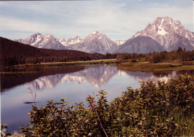
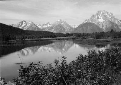
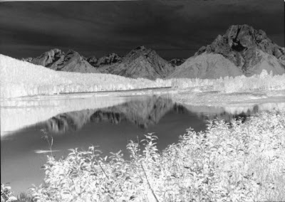
The first adjustment was to use hue-saturation – and this is cool because I love the look of black and white. This also seems to preserve a lot of the texture of the original.
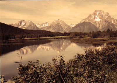
Then I decided to try the Photo filter and went for a sepia look, which again I love for the historical look.
Then I decided to work with the “invert” and I like that effect. Very sci fi and icy – NASA photographers would probably look at this as an example of life on another planet!
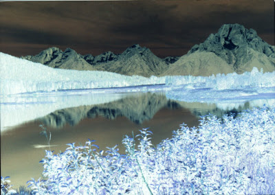
This last is a combination of hue and invert, which seems to give depth to the whole photo.
I keep learning more and more, which puts me even more in awe of what Suzan does with all her work! I was reading two Photoshop magazines this weekend – I’ve tried reading them in the past, but it’s been like Greek – this time, however, I understood most of what I was reading!
Launchpad B Lesson 1

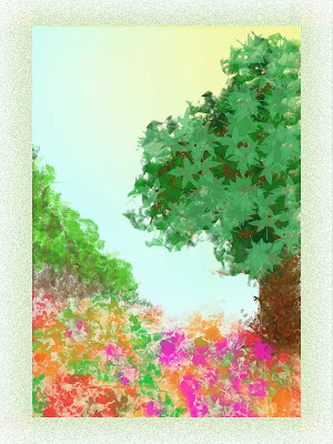
There is so much in this first lesson abut brush presets and tool presets. While I still used a lot of the same brushes as before, I found I was concentrating on what characteristics I wanted the brush to have – large, small, texture, airbrush – a lot of the brushes that look like solid lines are really interesting “scratches” when the spacing is changed. That made working with the leaf brushes much more interesting.
And I discovered how to move the gradient layers around, such as showing the sun coming through the tree leaves. I started with the blue gradient for background. Then I concentrated on a flower brush with a variety of colors for the foreground, with some vining and other background. Then I started on the tree, concentrating on the layers for the leaves – lots of colors of greens. Started on the trunk – needed to dump a few layers until I was happy with the trunk. I moved layers around to get effects like branches to show up in the back, behind the leaves.
I needed to balance the painting, even though I liked it the way it was – but I kept thinking of Bob Ross, who would always add more to his painting, even though I always thought it was fine. So I decided in his honor to add a “happy little bush” in the background. Balanced nicely and I’m pleased.
Not super happy with the frame – had an interesting problem with the 300 resolution – I needed to crop the finished painting, resize the canvas, and then work on the frame. But it’s pretty close to a wow for me.
Last Day of Vacation….
I promised myself I wouldn’t do anything with Photoshop today until I ws done with my list for school, which included a lot of loose ends, like ironing. Well…at least I got my lesson plans done.
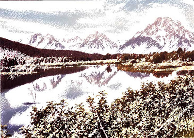
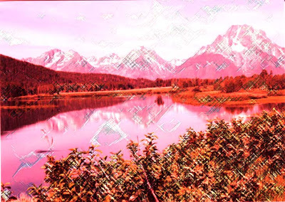
I decided to play some more with the water color effect, and I chose an original photo I had taken of the Grand Tetons from 1989 when we drove across country visiting National Parks. This looks just like a postcard, but it’s really one I took.
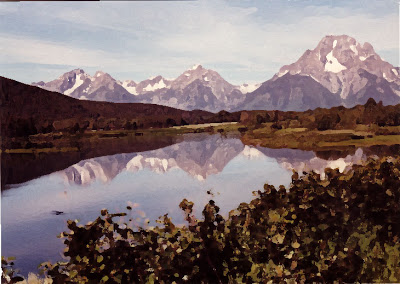
I got some different effects with the artistic filters, playing around with the different choices. These were colored pencils and pastels. I can see how you could illustrate a book with adjusting effects. This first is the watercolor effect, which I could get really hooked on.
This last is playing around with some other color effect and then adding the pastels.
Still lots of fun!
Yet another tutorial….
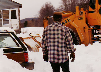
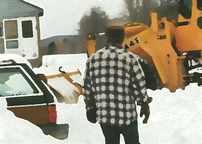
I decided to try another tutorial, this time on making photos look like watercolors. Too much fun – lots of ideas for future projects. This first is the original, without any touch-ups – from the winter of 1994 on Sleepy Hollow in Vermont – way too much snow for us to stay another winter, hence the move to Tucson.
This next is with the watercolors, using the dry brush effect. Had fun looking at the pen and ink conversion of the photo, then seeing how to blend everything. This has so many possibilities.
This last is the same process but using a palette knife for the watercolor effect. Plus I tried to have more of the pen and ink detail show through.
Making Progress…

Once again I have to say I am really hooked on Photoshop. The effects and possibilities really stagger the mind – however cliche that is. But first, some notes about our marbling session. We did about four yards of fabric, bath worked well, we just need to be on the lookout more carefully for bubbles before we lay the cloth. We did a custom piece for a woman working on a quilt with a “tornado” feel – the colors were perfect, and we got in some good swirls for “vortex” effects. The fat quarters worked really well, and I love the old-fashioned Japanese silk we still have – that stuff marbles like a dream. I also had done some work on serged edges in preparation for a larger silk order, and those seemed to work well- lightweight silk, cotton serging on the edges to be sure it takes the paint and hides the “hem.” So we seem to be ready to go once that order comes in. Both of us are sore today, as the physical process of marbling can be tough.
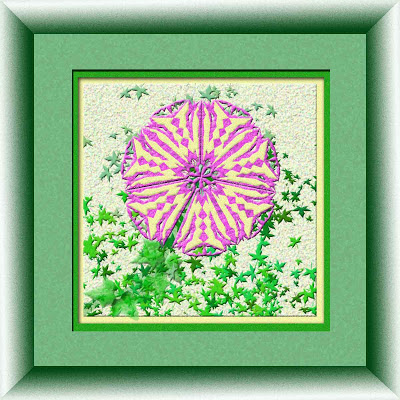
Then yesterday afternoon I spent more time on – three guesses – Photoshop. I made some changes to my flower, particularly changing the colors and adding a frame. I was pleased – it’s almost to a “wow” for me. Here’s the final product:
Then I started the gradient tutorial, as I don’t really understand that whole manipulation. I was pleased with the final output, once I started playing around. This is a very mathematical manipulation, judging from what I am reading. One color is read, a formula applied, and then final results look totally different. I’m uploading a couple of different variations of the same piece, with layers added and subtracted. I am enjoying the tutorials, but I want the next lesson!!!


