Archive for the ‘color’ Category
The Art Making Begins…..
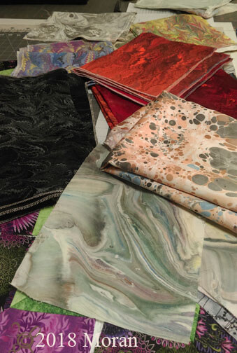
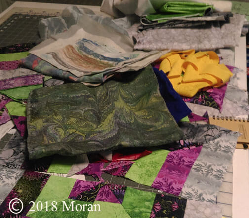
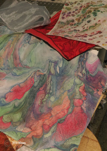
I finally decided yesterday I had to make a major list/inventory of all the “wannabees” or “in progress” art pieces. What follows is what was available in one drawer and the top of the storage table. The left has four amazing pieces of Kona cotton for a volcano series, plus the dotted brown piece is another half-yard unpolished satin for another river rock piece. Below is the current purple piece, plus some black poly-linen for art pieces and below that is a piece of silk done att he bottom of the marbling tray – it’s now a very large digital piece, but this one still exists for me to do something with it….
Now for the list once I had evverythingout and listed:
Mardi Gras lap quilt, silk FQ Botabical, small strata, orange cotton strip, cotton left-over pieces, black-purple poly-linen, greenish denim, clam shell black, blue ultrasuede, purple silk, green silk, 3 black linens, black chevron, brown silk, volcano (4), 3 FQ left-overs, 8 x 10 leftover, circular left-over, yellow linen, large black poly-silk wave pattern, purple-yellow silk, applique pillow top, Guilin (in progress), Wetlands 2 (in progress), wouthwestern pot hanging (in progress), iceberg hanging (in progress).
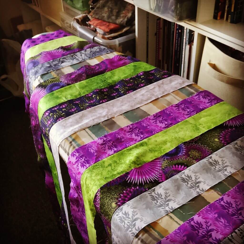
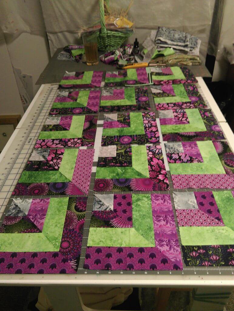
Then it was thinking about “balance” in the various shows coming up, so I decided the place to begin is with another large wall-hanging – Mardi Gras. In progress pictures…this is of the first step, arranging strips light and dark – from four sets of purple strips I bought two years ago at Keepsake Quilting, just for this.
I had 25 blocks with dark on the outside, and 25 blocks with light on the outside.
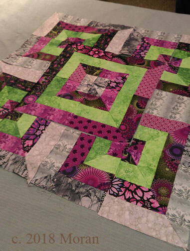
This is the center block with the purple dark as the border – I felt it emphasized the purple and decreased the brightness of the grays.
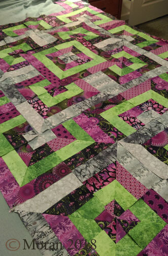
Almost the whole layout completed – blocks and rows are numbered and ready for the bext step of sewing them into a finished top, then deciding borders – I already have a quilting design in mind – lots of concentris overlapping circles to offset all the straight lines, and in gold thread for Mardi Gras.
Lots to do betweennow and end of March!
PS – there are four items on the “need to do” list by fall – not for shows….
Personal Color Studies
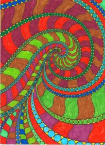 Been house-sitting/parent sitting for the past week, with no real access to projects, so I pulled out the markers and coloring books – which I haven’t touched in over a year – that craze passed quickly! It kept me occupied through a bunch of hours of the Hallmark Channel…a refreshing change, but after three movies I realized I’ve written those plots before.
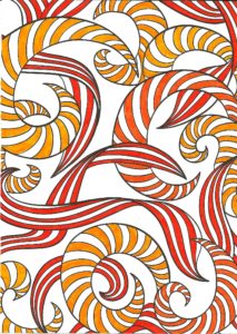
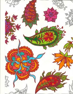
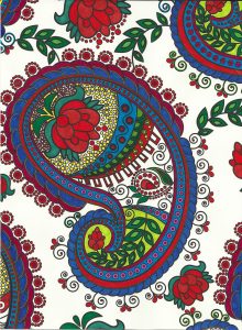
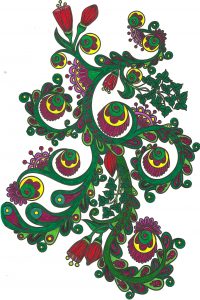
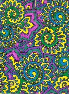
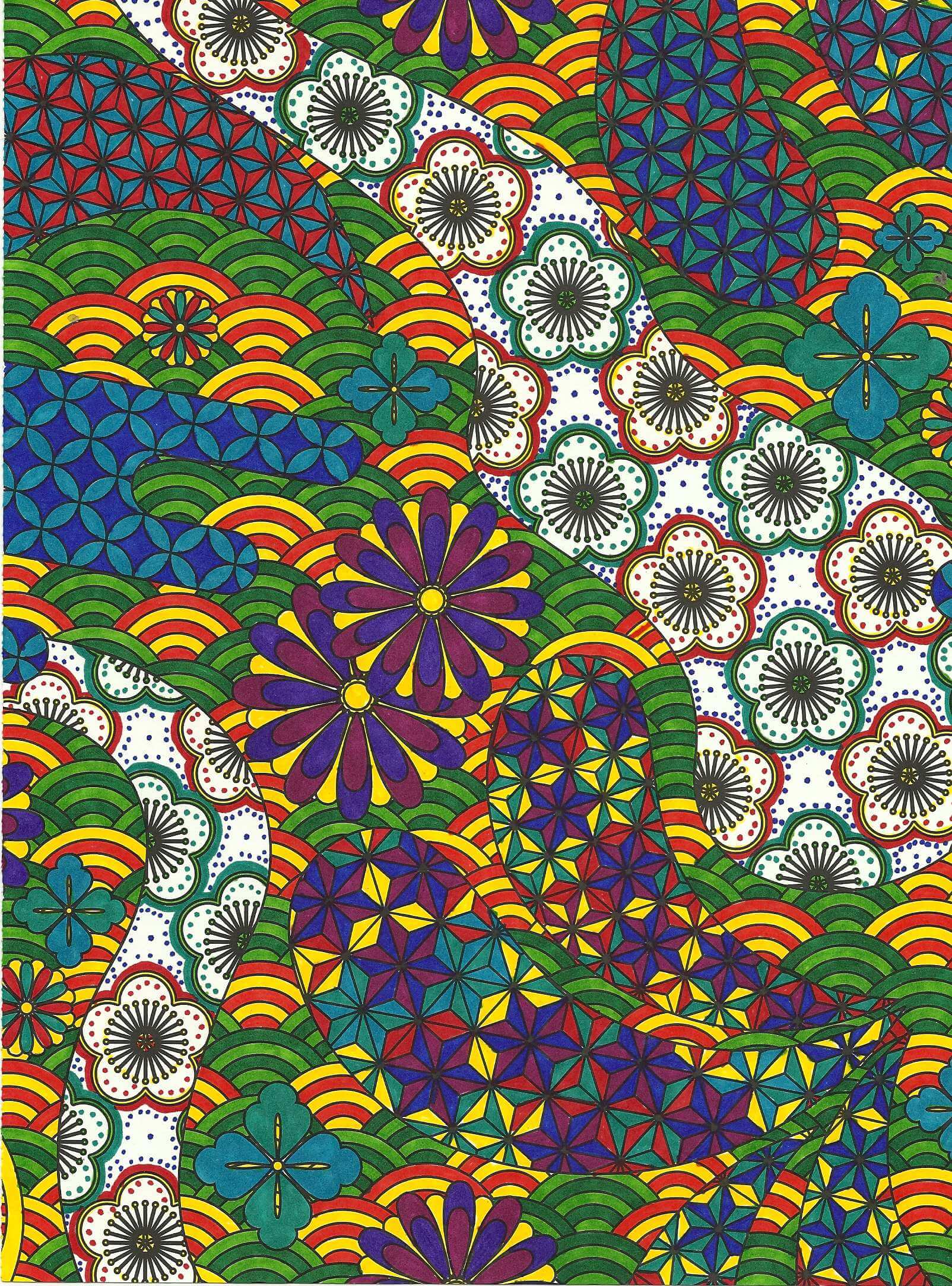
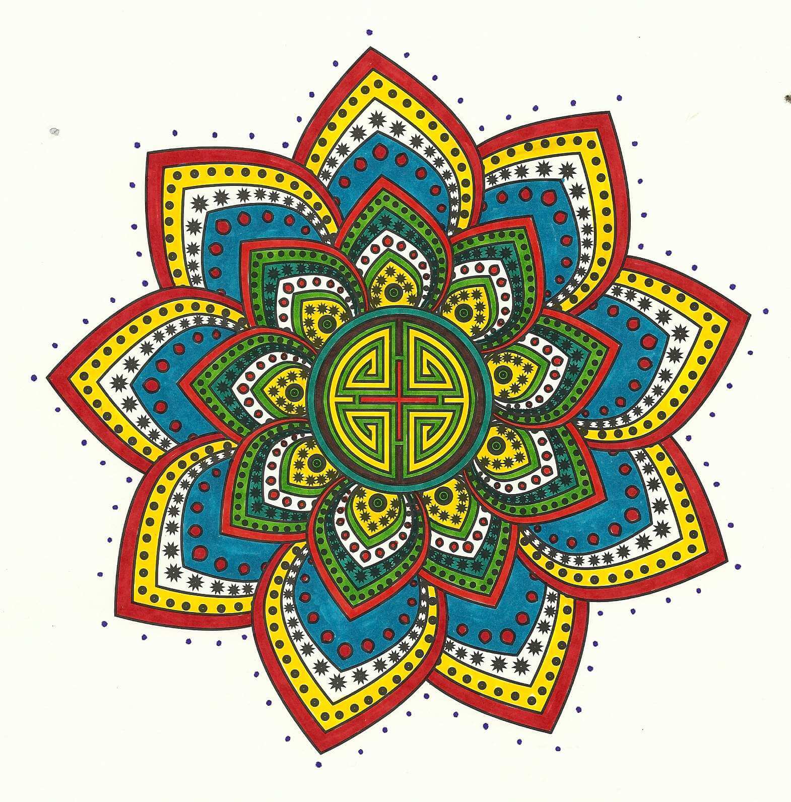
The “have to be perfect” part of me was busy at work until I said “WAIT! These are color studies, you are just playing, yada yada yada….” I still can get stuck (very easily, it seems) in a rut of criticism. So the first of my efforts is on the left. Once again I realize how much I can appreciate white space (literally)…and I got smacked in the face with a focal point – usually my trouble spot. My eye in this one went right to the light blue when all was finished. I had done all the small circles first, and then accented around them with yellow. Overall I am pleased with the various color combinations – trying out some other colors for a change.
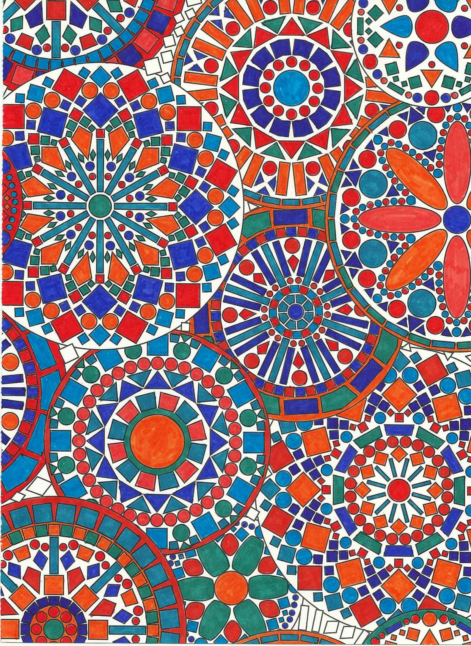
Number 2 – two colors, although I started with the intent to do blues and oranges – a favorite combo from a year ago when I was playing. As you can see, I only used two and then STOPPED – I do have trouble knowing when I am at the end….Very Cat in the Hat effect, I think. I do like it. It was hard to stop and not add some other color – but I do find this pleasing, and that’s what this exercise was about….right??? “Of course, right!” (Nod to “Fiddler…”)
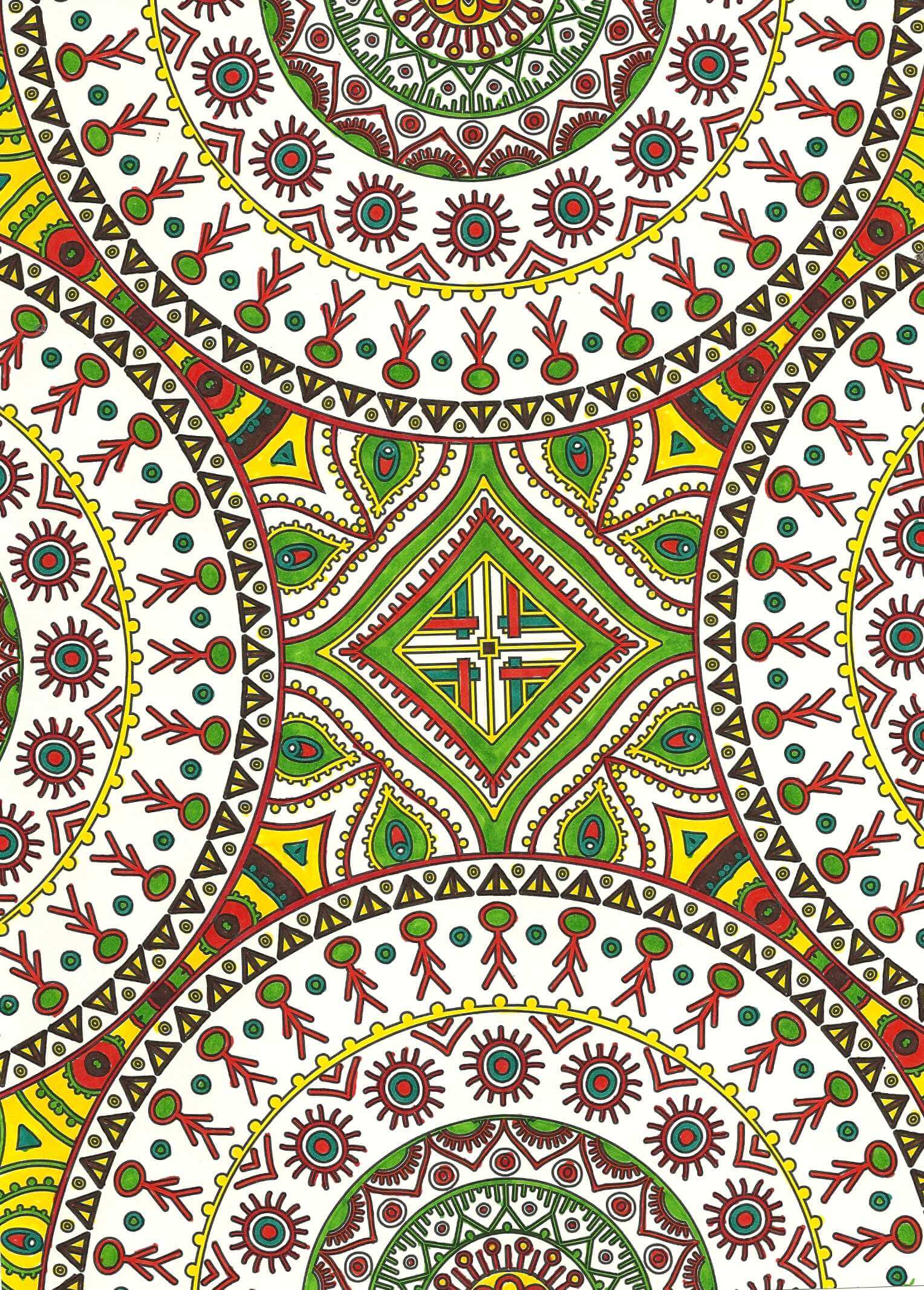
I was also pleased with the white space on this next one. In other colors – more subdued browns and golds – it would remind me of William Morris. As it is, would be a nice wall paper border – too much for a full wall!
Interesting choice of colors on my part – I’m not really an orange/violet person, but I am really starting to like ORANGE – need more in my stash!!
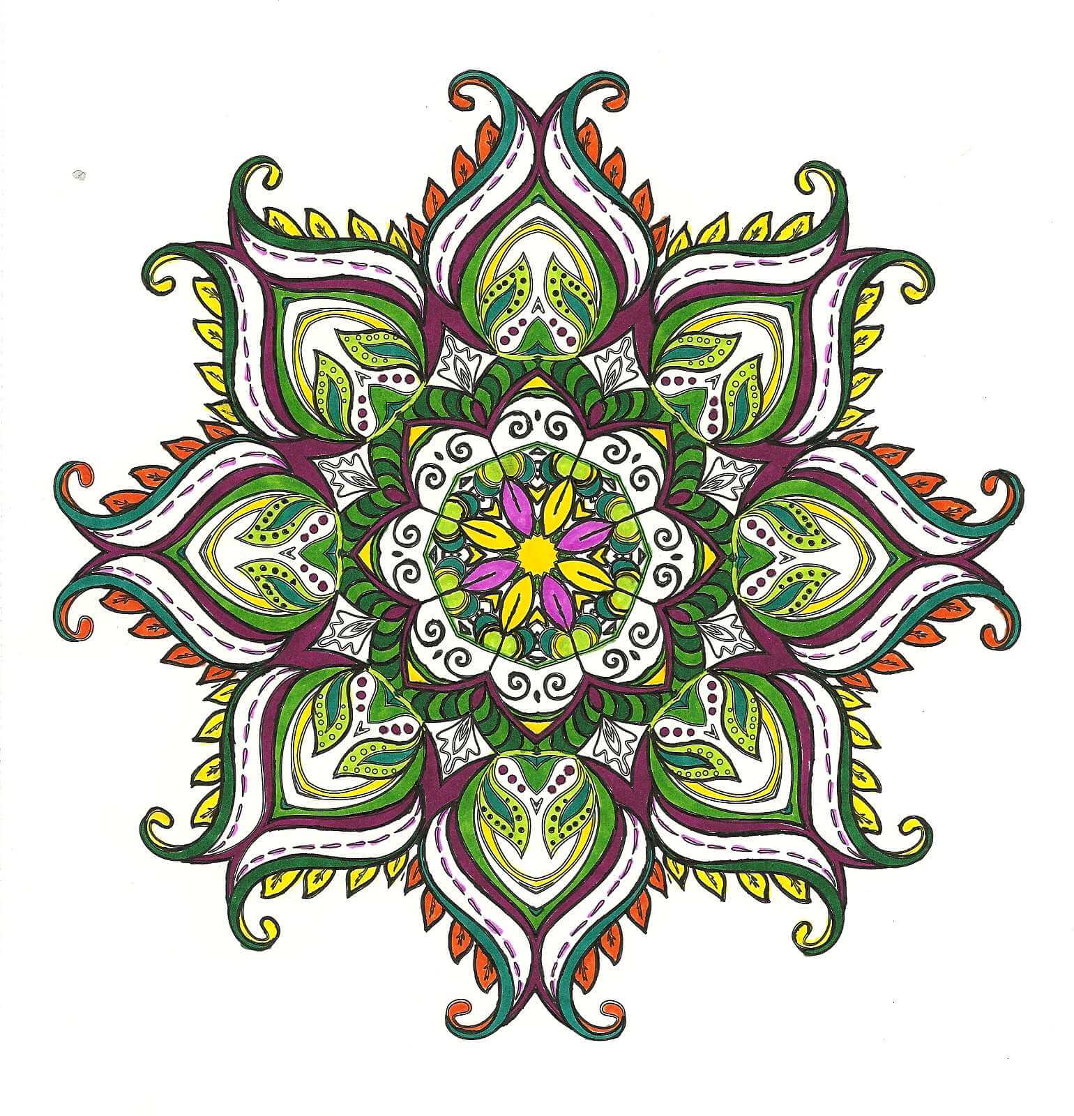
Last piece – not finished but happy with where it was going. Biggest issue….I keep wanting to fill in some of the white space in the little pockets between the ribbons. I get into the “If I don’t like it, I’ve ruined it” mode, which makes no sense, since this is an exercise…..ah, how that inner critic can be so busy!!
Till next time when I don’t have other projects – no more color studies….except winter is coming….lots of time for activities away from the sewing machine be=ut still inside……
Deconstructing and Redesigning
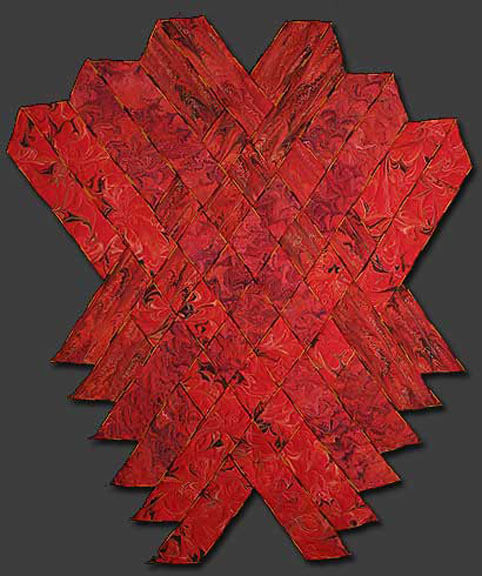
For over 13 years this piece has been known privately as “Ode to the Fire Goddess Pele” as a result of my time in Hawaii. It’s official title is Gaia 2: Beginnings. Our biggest problem has been that it was meant to hang on it’s own, but we were unable to figure out a simple – and not intrusive – hanging system. So for the last year, since we have been showing our work in Vermont, we’ve talked about mounting the piece – somehow. Here’s the story of the creation of the original piece.
That led to me deciding to completely redo the piece – ev.er.y.thing. It took two weeks of night time by the television to get all the machine quilting pulled out. In the 13 years since this was finished my machine quilting skills are SO much better. I will say that my original tension was so bad that in many places all I had to do was pull a thread and I had many many inches come right out.
My new plan is to requilt it, change the edging, mount it on a large piece of black fabric, quilt the black fabric, and then add a sleeve. I need to have all this accomplished by May, as I plan to enter it into the “Abstraction” show in Saranac Lake this summer.
Right now I have 12 strips still with serged edges. I found a FABULOUS piece of red and gold fabric in my stash, and (hoping I have enough) I will put the binding on over the serged edges. It looks really good so far.
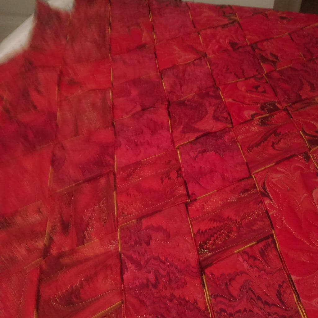
A close-up of the original weaving with the serged edges.
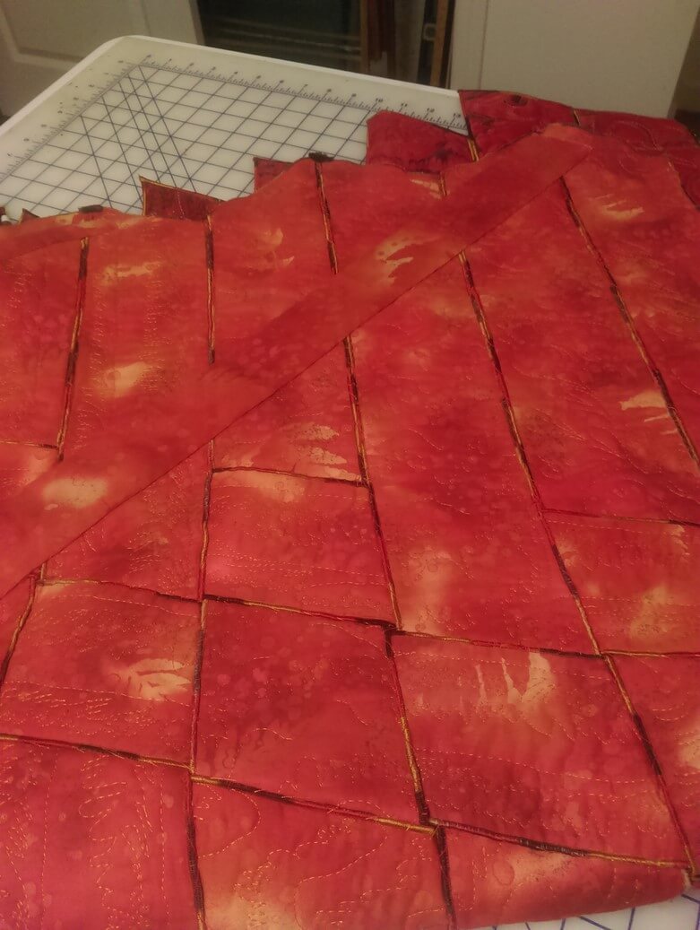 A close-up of the back with all the hand-stitching to hold all the pieces tight and together (oy, did that take a while….)
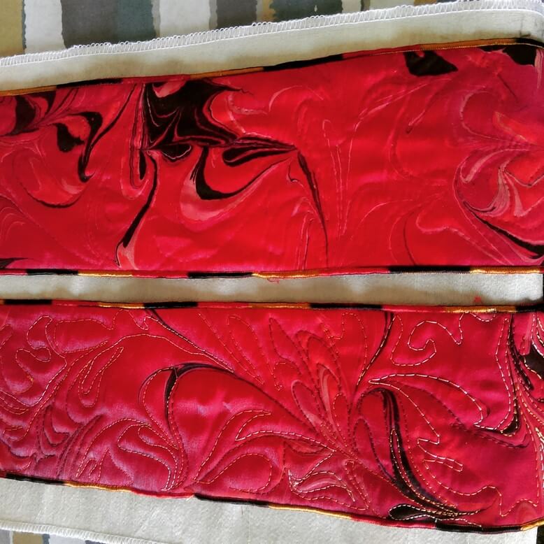 Before and after – original stitching, and after the frog stitch….
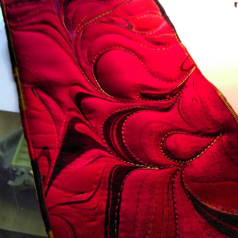 The beginning of new free motion quilting….
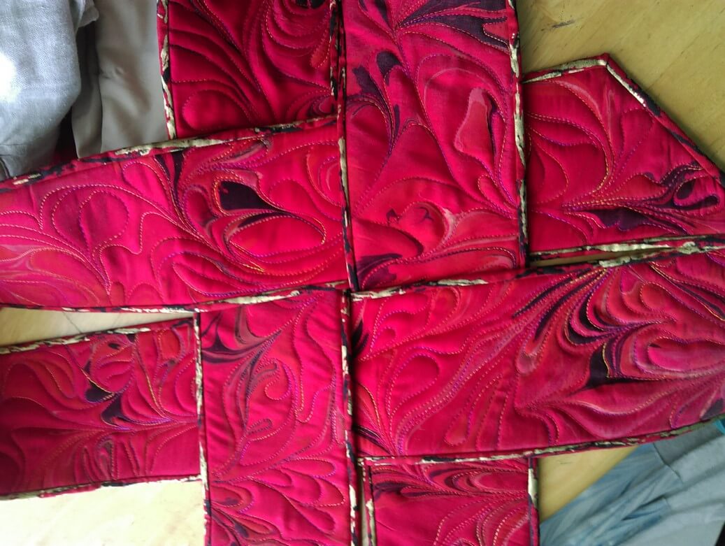 A look at the new binding and how it will work with the weavings.
This piece will also have a new name: Revolution. More on that as I get further along in the quilt.
REALLY Good Photography!
Our photography has definitely improved over the years, but we still have issues. I reconnected with a friend from 25 years ago, and he came to photograph our pieces in the library show we had this past August. OMG – they are amazing. Bill Kneen, a Richmond, Vermont photographer, does pretty amazing work. (email me for his information) We’re going to use him for our major pieces. So here goes – a really good look at a few:
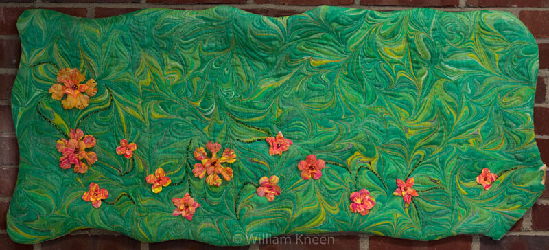
Wetlands 1 – the color is so true, and the texture really shows through.
This is green cotton lame, and it’s been really hard to get the sheen that Bill achieved.
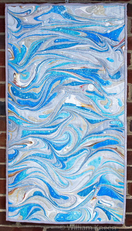
Glorious true colors! So excited that this shows so well.
This piece was really hard for us to photograph – looked washed out and not really a good sense of the desert – now it is!
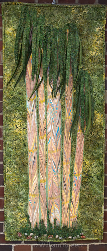
Bamboo Jungle – again, very true colors – you can see the dimension in the leaves.
THANKS, BILL!!!!
More Lessons from the Coloring Books – Part 1
Throughout all the stress of medical issues this winter and early spring, I resorted a lot to coloring at night – one BIG take-away from the coloring is that it controls my appetite….no small thing. But I’m learning something almost every piece I do. You can catch up with what I learned so far here.
So here are some pics – and lessons learned.
One of the things I’ve been playing with is amount of white space. You can see in the above that not everything is colored. Pus, I was trying to play around with oranges and color combinations, like mixing colors that are close together. I love the way the turquoise is accented. No point in doing the edges – I was concentrating on the center – which is an interesting move for me – to just let things “be” without having to “finish” everything.
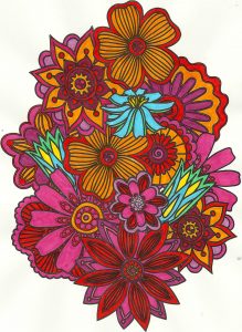
Again with the reds, oranges, purples, but I decided to add an unexpected color – my fiber work tends to lack strong focal points – so I added the blue – makes the piece. I also rotated the scan because the “bottom” was too heavy when on the “top.”
Here’s where I figured I really need to spend some time with colored pencils, especially when I can do shading – which I love doing with regular pencil. And again the oranges and reds.
I left white space with this, and I discontinued finishing the design – it was getting too busy. Here’s where I kept hearing Tim Gunn’s voice to “edit.” The yellow in here really glows.
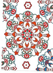 This was playing around with oranges and blues – a combination I am starting to like a lot. Lots of white space, and I used the designs on the edges to play with color combinations. The lower right looked too much like a super-hero costume for me……
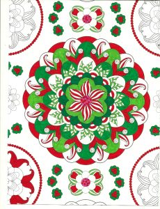
Christmas colors – meh. These were better than some I tried. The colors – for me – need to be true, but I am happier with mottled shades of reds and greens.
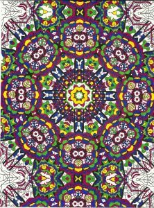
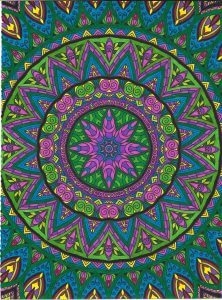
Interesting as I was working with what colors glowed – the yellows, but especially the purples in the center. I also discovered differences in black – flat and shiny, which I should know because of all the black fabrics out there. Overall a fun design, but it bugs me that the books consistently cut off complete designs.
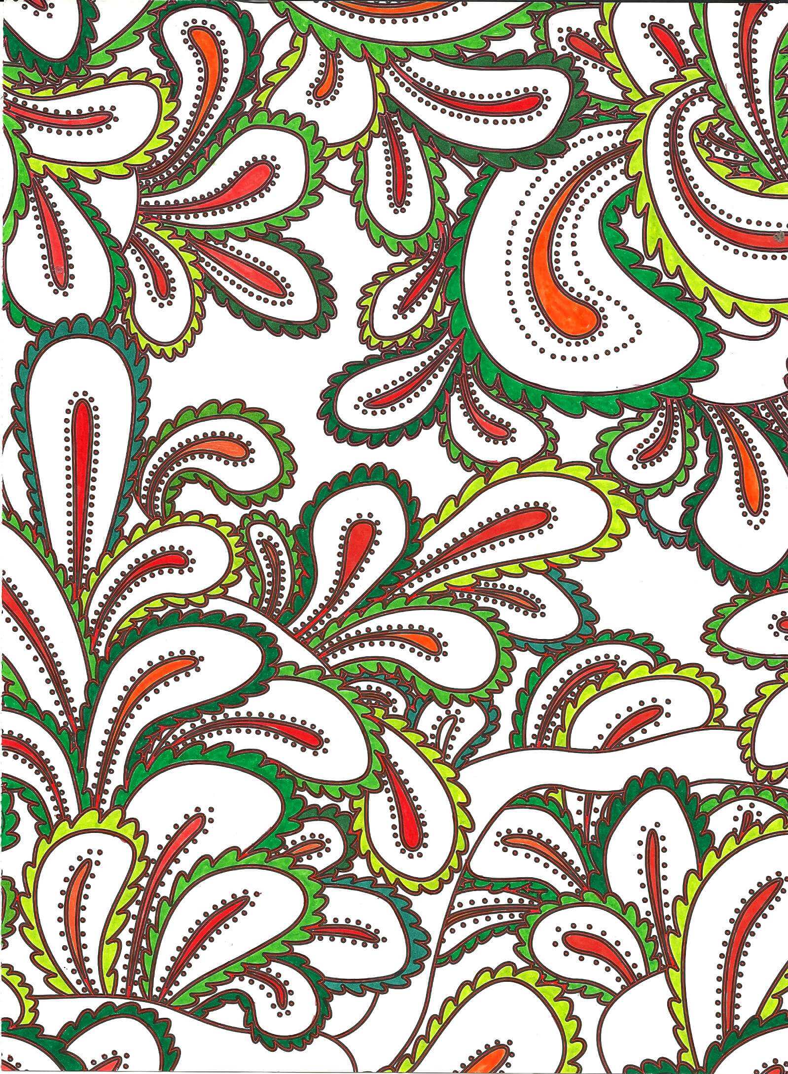
Blues, reds, greens and white space. I am finding not everything needs to be colored. I find this quite pleasing.
Love the delicacy of this one. Even though the design is completely filled in, there is an airiness to it.
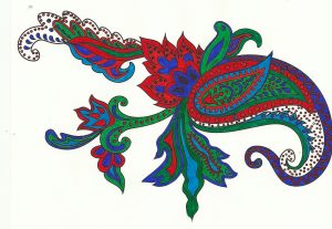
Same for this design – and I really like the colors – very vibrant.
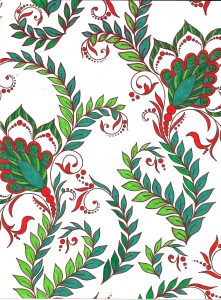
Again oranges and greens – would make a great wall paper.
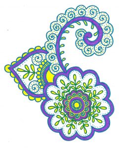
Nice and lacy – I like incorporating some of the zentangle motifs when I feel there is too much white space.
The original dominant color here was going to be the pink-purple, but yellow won out. Interesting to me how that happens.
Really need to spend some time with colored pencils, but I SO like the intense color of markers. Like I said before, surprising for me, since they are so unforgiving.
I definitely can see some of the effects of the coloring in the most recent fiber work – more on that to follow.
Lessons from the Coloring Books
I received two “adult” coloring books for Christmas and have been enjoying myself immensely. Once I got past the old bugaboo about what this would be, I realized I could learn a lot about color theory from these pieces. And learn I did….
First, I discovered why I thought coloring was boring when I was younger. Sheesh, crayons and a picture. No challenge there. Just like I found Barbies incredibly boring. Plus I didn’t have great crayons – I lusted after big boxes – and I do have many colors of sharp pointed crayons now.
Second, I love symmetry and working with color within the symmetry. These pics have been perfect for that. I’m using markers – very unforgiving as a medium, but then so much of my earler work was pen and ink – even more unforgiving.
Third, I learned a lot about color. I like color. I like bright color. I need me my white space – a challenge on some of these designs. I need a variety of color items. Marker – yes, bought a bunch more. Also, love me my Pigma pens from my zentangle work.
Here are my discoveries – love being self-taught! The odd-numbered ones are from a book on zen coloring. The even-numbered ones from a book called Mendhi – very different in approach. I do them alternately – learning from each type and applying lessons learned from the one before it.
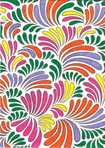
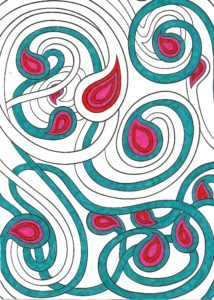
The amount of white space really through me. The colors are very saturated and I opted to leave nothing blank…but the two paths going through the design were way too white and off balance. So I took a few ideas from my zentangle work – aura and echoing, along with dots. Really like how it came out.
I opted to keep some spaces white for balance. I happened to see samples of the designs in the front of the book but didn’t use any of the examples. I’m enjoying making my own decisions, which in most cases work out for the end result. You’ll notice the same color families appearing in the designs. Added the dots to frame the design.
Left a lot of white space on this one. I have some solid sections separating the main designs, and this kind of threw me. I used a brown that was much darker than the surrounding colors, and it drew my eye immediately to it. Did not like that, and part could be my bias as the designer. So I attempted to spread out the brown throughout the whole design. Much happier with the overall effect.
Love this one! There were a lot of very skinny outlines throughout this, so I went for my black Pigma pen, which I discovered made everything very crisp. Yellow, purple, green, but I think the orange works well on the outside. Really like how this one developed.
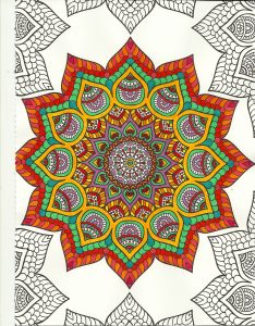
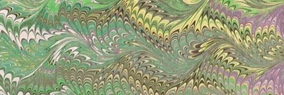
Blues and oranges – shades of them. Have never really worked in this color family before and I like it. Depending on color placement, some of the oranges look red – interesting to me, although it shouldn’t be because we deal with that all the time in marbling. Some of the blues looked green. Overall, I am planning on doing a mandala quilt using some of these designs, as I really like how it all worked out. Great balance, and I LOVE the geometry of it all.
A lot of red Pigma pen outlining – nicely enhances the design. Greens and oranges, and even with the red, doesn’t look too holiday for me.
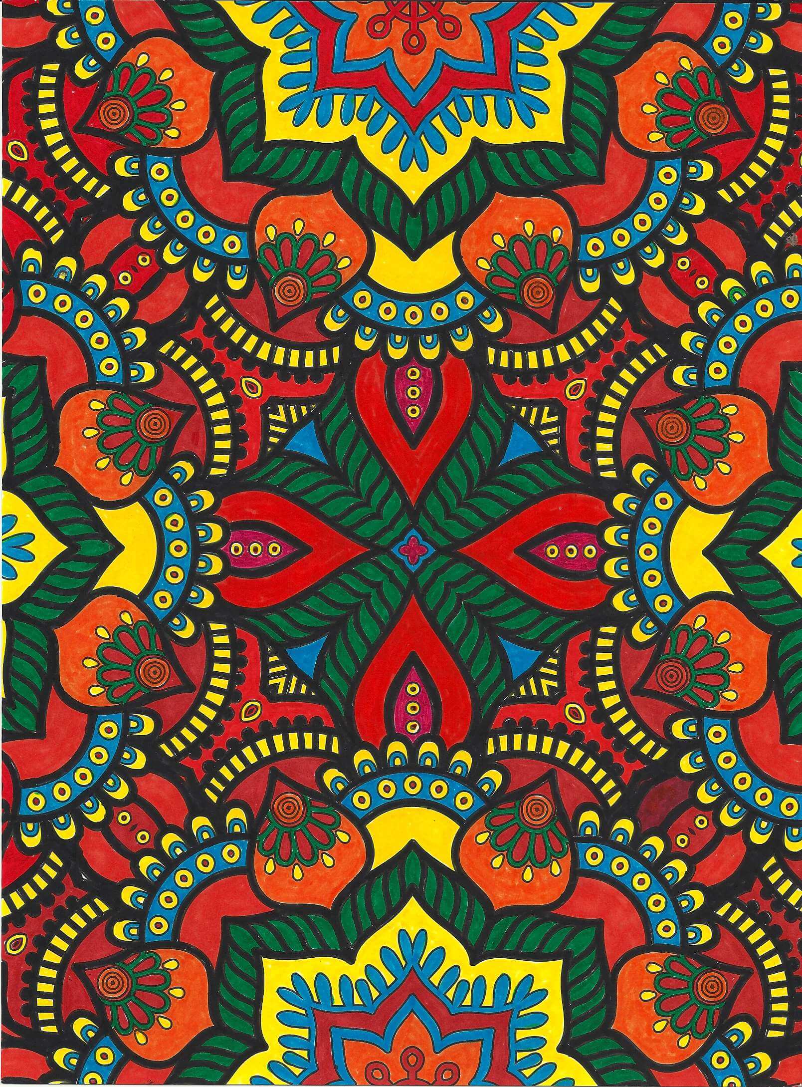
Again very saturated, primarily reds, yellows, and oranges. I didn’t want to leave the white space of the outlining – wasn’t sure I would like it. So I opted to go with a mosaic look, using black. I completed the center first and really thought I had made a mistake with that amount of black, but I am learning to make decisions as I go along and not worry about it partially done. I am very pleased with how it all came together.
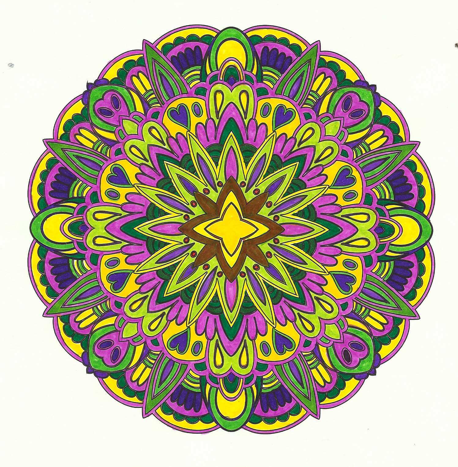
Purples, yellows, and greens. Glad I had a variety of markers. I originally put an orange around the yellow center, and my eye kept getting drawn to it. Didn’t like that, so I thought I would see if I could add green over it – turned brown, and I wasn’t happy. However, the brown fades into the background and throws the eye outward in the design. Interesting lesson learned there.
Lots of new skills,lessons learned, and enjoyable hours – there are more coloring books in my future!
Top Ten Tuesday
Well, it’s only taken about three months to get back to the blog, but I have been saving some great stuff, mostly pretty light-hearted. Here goes:
The Atlantic has a great series on photos from World War Two. Here’s a peak at women during the war, of all races and ethnicities.
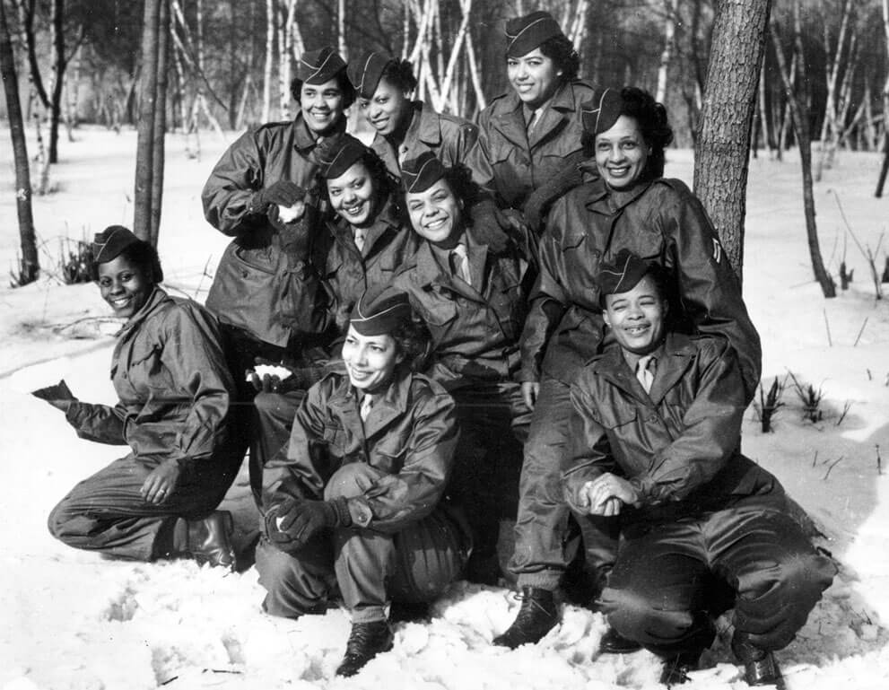
Members of the Women’s Army Corps (WAC) pose at Camp Shanks, New York, before leaving from New York Port of Embarkation on Feb. 2, 1945. The women are with the first contingent of Black American WACs to go overseas for the war effort From left to right are, kneeling: Pvt. Rose Stone; Pvt. Virginia Blake; and Pfc. Marie B. Gillisspie. Second row: Pvt. Genevieve Marshall; T/5 Fanny L. Talbert; and Cpl. Callie K. Smith. Third row: Pvt. Gladys Schuster Carter; T/4 Evelyn C. Martin; and Pfc. Theodora Palmer. (AP Photo)
From The Smithsonian, a look at the role of artists during World War Two.
TimeLapse from Time Magazine and Google presents a look at various places around the planet and how they have changed. Check out what is happening to our planet.
TIME and Space | By Jeffrey Kluger
Spacecraft and telescopes are not built by people interested in what’s going on at home. Rockets fly in one direction: up. Telescopes point in one direction: out. Of all the cosmic bodies studied in the long history of astronomy and space travel, the one that got the least attention was the one that ought to matter most to us—Earth.
That changed when NASA created the Landsat program, a series of satellites that would perpetually orbit our planet, looking not out but down. Surveillance spacecraft had done that before, of course, but they paid attention only to military or tactical sites. Landsat was a notable exception, built not for spycraft but for public monitoring of how the human species was altering the surface of the planet. Two generations, eight satellites and millions of pictures later, the space agency, along with the U.S. Geological Survey (USGS), has accumulated a stunning catalog of images that, when riffled through and stitched together, create a high-definition slide show of our rapidly changing Earth. TIME is proud to host the public unveiling of these images from orbit, which for the first time date all the way back to 1984.
From AllMyFaves comes a new look at piano lessons – could be intriguing! Looks to be an interesting app….
Really cool video from Vimeo on reactions from astronauts on their trips into space.
You know I love flashmobs – here’s a cool new one! Rembrant – who knew?
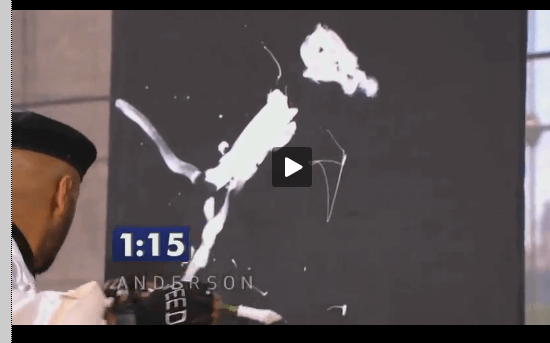
I’d forgotten about saving this next one – Anderson Cooper Show doing a take-off an America’s Got Talent – the Speed Painter. Well worth your two minutes!
The Shanghai World Expo Closing Ceremony…..amazing colors, graphics, movement…..those “chairs” aren’t really chairs……
Wonderful act from Vegas!
And finally, from Tastefully Offensive, comes People vs. Winter….since in some places in this country winter hasn’t left……
Top Ten Tuesday
I cannot get over just how quickly this year is flying by. It’s nearly the end of November.I enjoy doing these posts because all the great stuff I find is now in one place where I can easily get at it! Here’s this week:
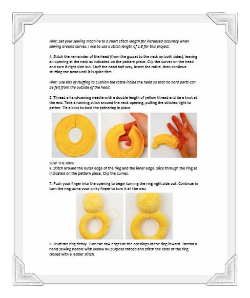
Some hints for pattern writing – something I’m very interested in, as I finish us two new ones.
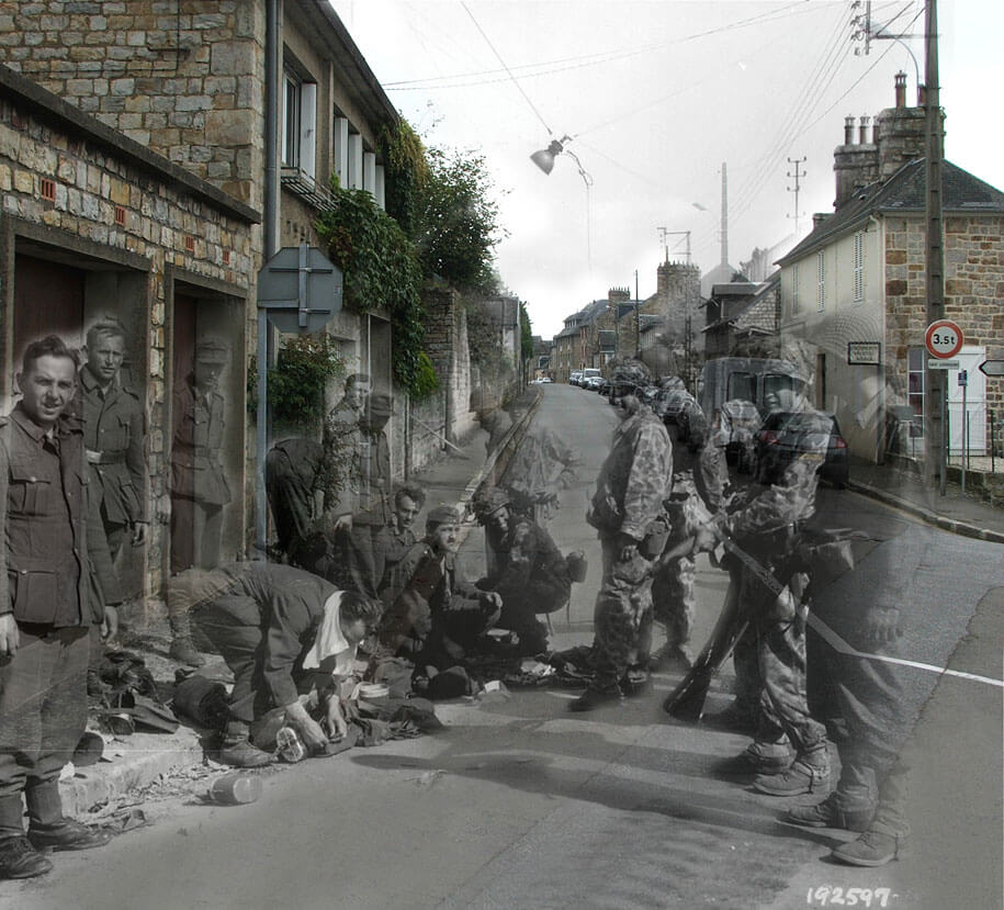
From The Best Article Every Day comes an interesting look at past and present: World War II photographs superimposed on the present. Quite intriguing.
Also from The Best Article comes their Thanksgiving offering on “humanity.” Wonderful pictures.
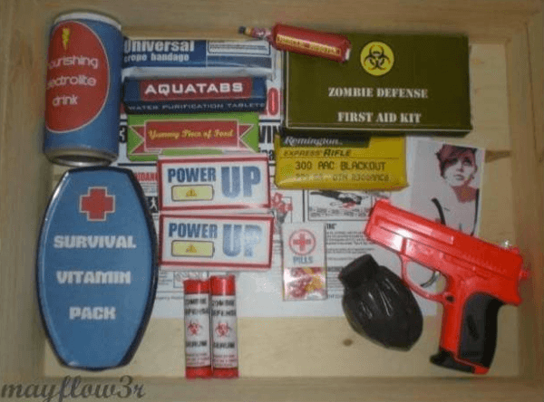
Now here’s a mom with a great idea for a gift….not that I believe in zombies. From The Best Article Every Day, which you must read to see the whole transformation process of basic sweets……
From Dumb Little Man – advice about protecting yourself while working from home – not quite what you think!
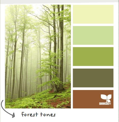
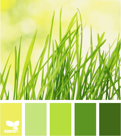
From Design Seeds, another great color combination – this one is so restful. And I would love a quilt out of this.
I love Morgan Freeman. The Shawshank redemption is my absolute favorite movie. Here he is in a new add for marriage equality – very eloquent.
From the 365 Project, yet another set of gorgeous pictures.
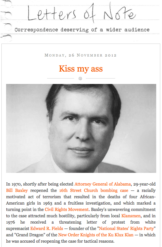
Wonderful little piece of history from the civil rights movement from Letters of Note. Short, succinct, and in your face…..
And…finally, in honor of holiday food season, one of my favorite videos by Vi Hart, recreational mathematician. How CAN you optimize your potatoes and gravy?
Have a great week! Let me know what you find online that’s really cool.
Top Ten Tuesday
An interesting web week…watched a lot of humor on YouTube, as well as a lot of math videos for my algebra class. Here’s one on exponential functions in real life – earthquakes.
A tour of the Google Data Center – colorful, just like the logo!
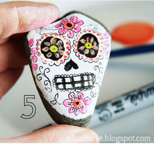
How cool are these! From Alisa Burke – stone sugar skulls!!
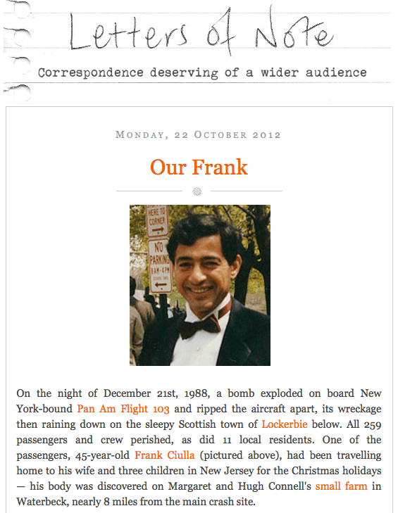
This from Letters of Note is heartbreaking. A reminiscence of the Pam Am explosion over Lockerbie, Scotland.
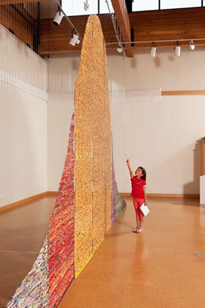
Interested in education issues? Harriete talks about a show opening that deals with standardized testing. If you are at all familiar with the bell curve, you’ll appreciate one of the art works.
This juggling is fabulous!!!! One ball, who knew?
A whale of a tale, from the Great Whale Conservancy – beautiful story.
Put Johnny Carson and Dom DeLouise together, along with some raw eggs, and it’s just hilarious! They don’t make ’em like this any more!!
If you are not familiar with Design Seed, check out the interesting color combinations – some colors I would never have thought to put together.
And finally, if you haven’t visited Craft Gossip, you need to put it on your lists. Posts every day, and then some! Lots of great craft ideas to try, especially for and with kids.
 That’s it for this week. Send along great links that you find out there on the web!
Top Ten Tuesday
So I am not a video gamer. Couldn’t even master Pac-Man, and I hurt my wrist trying Frogger. Plus, I hate the amount of violence in video games. This week I discovered an article about a gun-free video game. Who knew? Called the Unfinished Swan, it has lots of elements of art within it. Fascinating.
“Ian Dallas was a comedy writer who cut his teeth at the Yale Record, then The Onion, before moving into TV and working on Comedy Central’s Drawn Together. But his plan was always to make video games. So he went to grad school and created a prototype for an unusual game wherein players are confronted with a white void of a world to which they give form by splattering paint around to reveal the objects and environment around them. ”
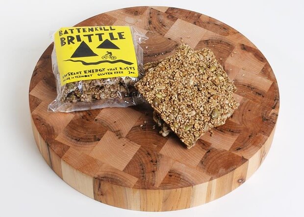
I’m finally working through all the cool things from Cool Hunting. Here’s a neat item from Vermont: Battenkill Brittle, gluten-free energy bars, and they look yummy.
Here’s a wonder of the world a lot of people don’t know about: The amazing Bay of Fundy in time-lapse.
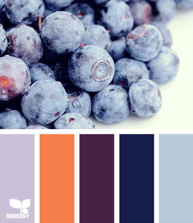
Have trouble with deciding what colors look good together? Check out Design Seeds – a collection of pictures that have identified the color palette within. Lots of inspiration here.
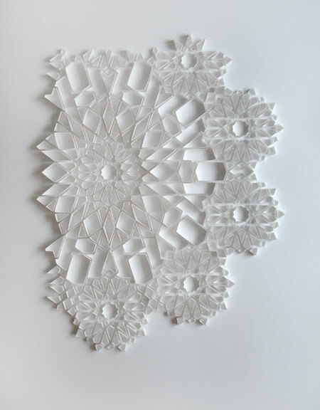
From Origami Joel comes another very interesting paper artist, Matt Shlian. Absolutely beautiful!
The Biological Advantage of Being Awestruck – beautiful video from my friend Amethyst, who minored in the philosophy of science. It sounds like she did some incredibly interesting reading in those classes! I could take those classes now…..
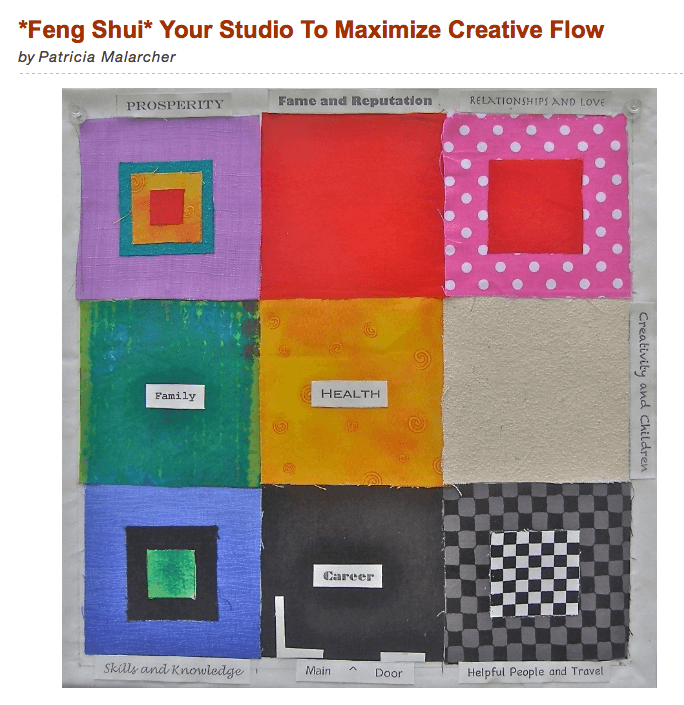
This is an interesting blog from the Surface Design Association on feng shui for your studio. I need to reread this at lenght, and I also think I will investigate the books she mentions efore I look at repurposing the garage into a wet dye studio.
 Jamie Ridler guides artists to authentic creative living. Here’s a post about learning from the Olympics that has some really good thoughts in it. Olympic Lessons for Non-Athletes – Or What I Learned from the Olympic Games.
If you are running a small business, hopefully you know about Handmadeology – an online collection of articles on all aspects of marketing. Some really great stuff here….and I say that even though I write a regular blog for them!
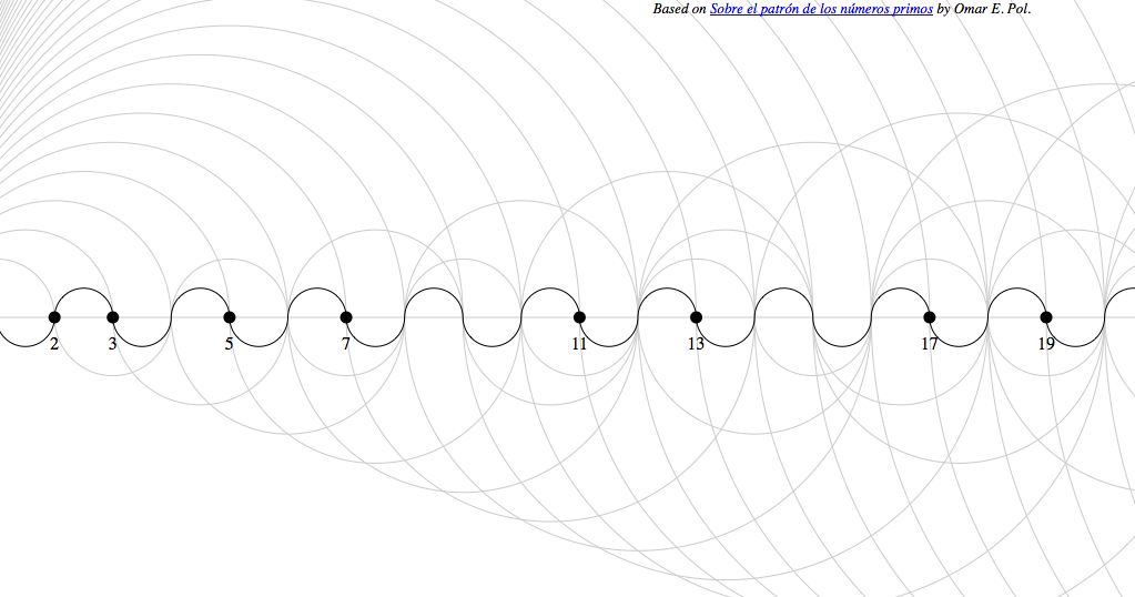
Finally, for all my math friends – Prime Number Patterns. I can SO see a bunch of quilts from this!!
Have a great week! Let me know what cool things you find on line.
Second Design Photo Analysis
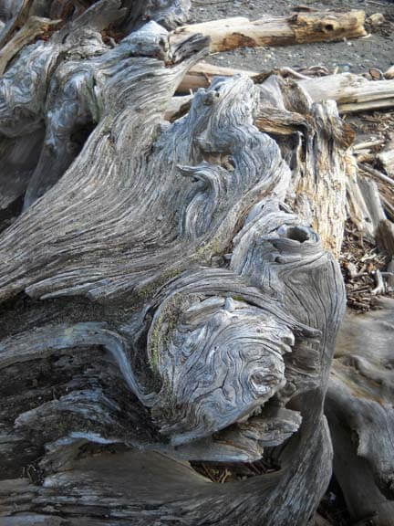
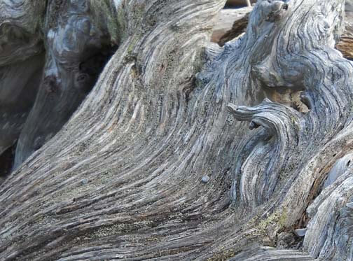
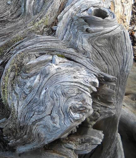
I worked with another photo last night, and I didn’t have nearly the success with adjustments and filters as I did with the first photo. Now I need to think through why that is so. Here’s the new photo – driftwood from Vashon Island in Puget Sound.
Well, crap….seems like I did it again in saving…or not saving. I need to remember to save everything as a psd file first to preserve the layers, and then save each piece individually. Okay, bottom line, nothing really spoke to me with the different adjustments, so I need to think through why that is so.
Is it because this is a fairly abstract image to begin with, mostly line and color? Perhaps that is why I am so fascinated with tree bark to begin with. The lines, shadows, differing colors to create the texture. And this picture, knowing it is driftwood, also reeks of a hidden history after being tossed in the water and then left high and dry. But how would I create some of that mystery?
What initially prompted me to take a picture of this? Probably all the smooth curved lines and the knot.
Looks like all kinds of interesting lichen within all those folds. The colors are so subtle, but at the same time I see a nice interplay of line and shadow.
I look at that knot and see a captured sea spirit. The more I look at this one, the more I am intrigued by it. The curves are so soft amidst all that hardness.
Now that I look at a couple of additional questions, I am stumped. Main idea? I like the thought of a captured sea spirit. Areas worth keeping? I can see leaving out everything else from these two crops. Other elements to add? No clue. But as I ponder, the first thought that comes to mind is to carry the lichen out into a border, and maybe the overall piece doesn’t need to be square or rectangular, maybe more oval so that the spirit seems encased and surrounded but is really still there. Don’t know if that is making sense….
How and where can more pizazz be added? Again, no clue. But…perhaps a lot of thread painting would be needed for surface texture.
I can see this going to sketches as the next step and seeing what develops from there. Comments?
Work in Progress Wednesday – Learning Lots!!
 Well, this has been a week of learning experiences, including running the machine needle through the tip of my finger. I’m somewhat frazzled deciding on a project, since I don’t have any looming deadlines. I do, however, have a list of projects that need doing, so I picked one from that list and then added another.
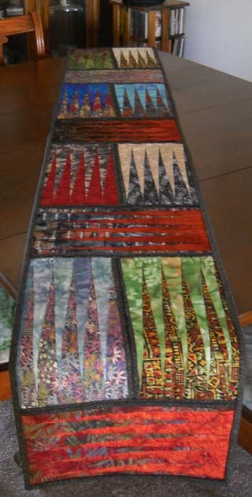
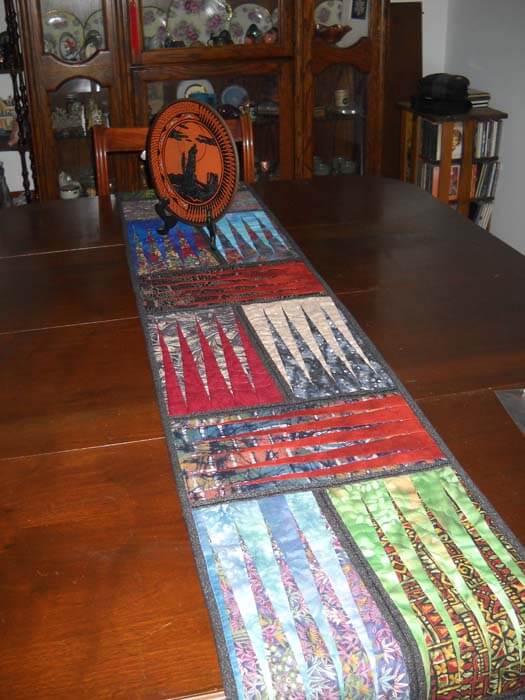
First, from the UFO list. Several years ago (going on three?) I took a class with a friend on a Judy Niemeyer pattern, Stepping Stones. You can see the pattern here. Originally it was going to be a king-sized bed quilt, but I was still teaching, so that got put on hold. When I reorganized the studio (twice), the blocks made it into the UFO pile, and when I made my list in May of projects, I listed these. But….I listed them as a potential table runner, figuring that way they would be done, and I could actually use the table runner, as we have a new dining room set (new to us – we’re babysitting it for a friend). I would also have enough for 6 placemats, too.
Well, there were loads of problems. Could I find the black fabric I was using for connector strips (three searches)? Could I do all the matching, since it had been about 3 years? How would I quilt it? What would I use for backing? I got the four completed blocks into one runner, and then I spent the next three hours taking out all the paper….note to self: you still need to vacuum. The blue I thought to use for backing was a stretchy polyester that wasn’t long enough, so plan B was leftover dark blue from another quilt back. Then I had to buy batting.
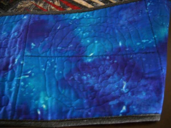
Finally everything is together and ready for quilting…..and I had no idea what to do for the quilting. Didn’t seem like feathers would work. Didn’t want to do a stitch-in-the-ditch. Tried some outlining, but I didn’t like it. Then I thought about the overall loopy pattern from the May challenge, but ended up picking all that out. I realized I would need to go with monopoly thread, so the stitching wasn’t obvious. And I was playing around with tension, including two more ripping sessions.
I tried doing some partial circles on each block, so it would look like rippled water. And then I discovered the settings on my machine were set for the decorative stitch I used in the black borders. Seems like I still had the setting on one of the decorative stitches, and I was trying to free motion and there was a lot of drag. I also discovered that I could use a variation of a zigzag stitch and still have the feed dogs up. Turns out I liked the ripple effect, and that’s what I went with for the rest of the runner. Here’s a pic:
Here’s the finished table runner, which is absolutely perfect on the table. It will work with any of the leaves when we put them in.
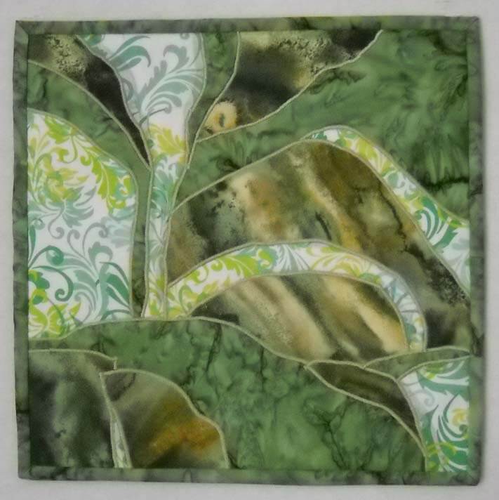
Then I was feeling somewhat at loose ends. I had been watching The Quilt Show and following the color lessons from Michelle Jackson. I decided to do the first color study, and again I learned a huge amount. The first lesson was really interesting, especially since I have a lot of trouble choosing and working with color. This was to take a monochromatic color and determine dark, medium, and light. I chose greens, because I have a lot in the stash. I discovered that when I’m choosing, I really need to analyze tones and hues. I also need to be sure there is definite contrast. The first study I did was the one where you had a light, medium, and dark, with not a huge amount of contrast. I did not have enough contrast within those three colors.
I also was working with fusing for like the second time ever, and my pattern pieces were not always meeting up. I spent a lot of time trying to make this piece look like something – going back to linear me and not being able to just work without it having to be “something.”
I finally got all the pieces ironed down, and I felt I was moderately successful. Mostly because I learned a great deal about choosing the colors. I was still trying to figure out what to do with the piece. Yes, it’s just an exercise, but the linear part of me needs it to be “something.” Ideally I want to be able to work with light, medium, and dark marbled fabric, but I can see I have a long way to go.
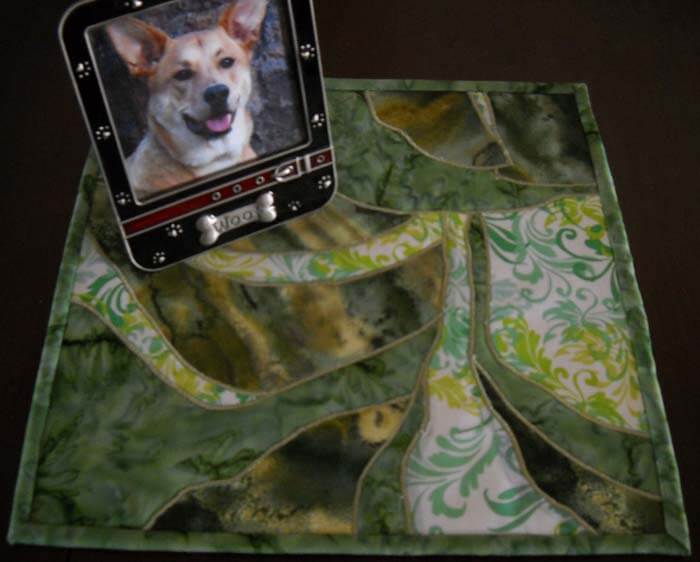
Again, I couldn’t figure out what to do with quilting it. I tried out one decorative stitch and didn’t like it. I reverted back to the satin stitch I was doing two table runners ago. All of a sudden I began to like the piece more. It began to look more “painterly,” and pretty abstract in a pleasing way. I ended up binding in, and the piece would work as a nice little runner or table mat for a vase. It’s going up in my Etsy store.
Who knows where I’m headed next? There are 6 placemats to finish…..
Top Ten Tuesday
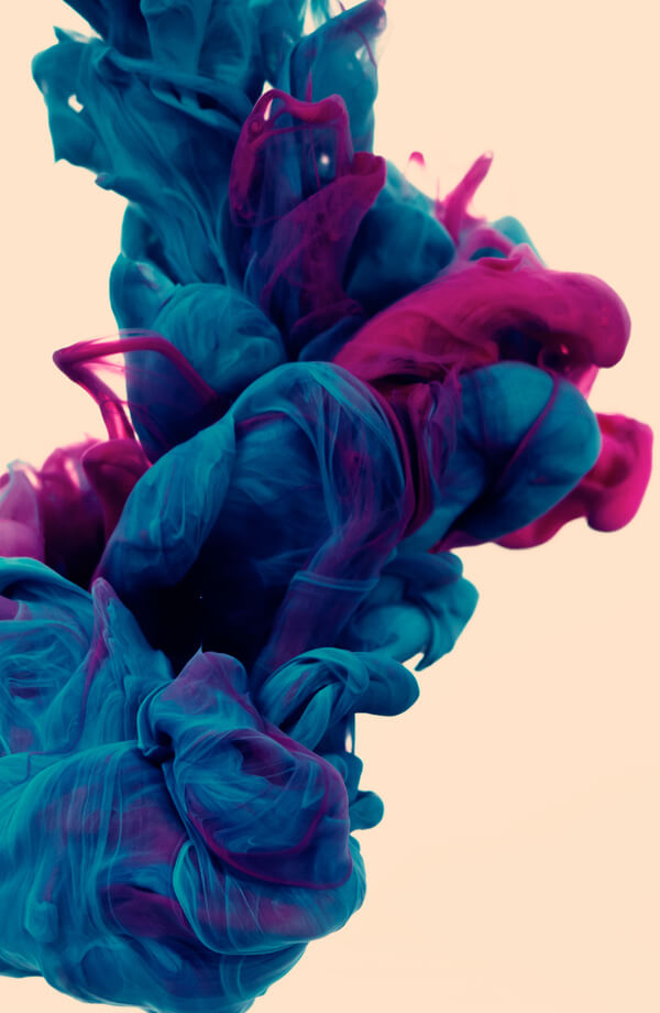
A really interesting artist, I saw his portfolio on Behance. Alberto Seveso…..doesn’t it look like the most luscious silk?
 From Bill Moyers comes a really interesting graphic on social media as our main source of news.
From Cool Hunting comes TED-ED – what looks to be some REALLY great lesson plans and ideas for teachers to really expand what’s happening in the classroom.
 From Joen Wolfrom – the most used colors in the world – Tones.
From Letters of Note comes a very timely letter from one of my favorite authors, John Steinbeck. Very interesting in light of what is happening in current affairs in Arizona. “American Democracy Will Have Disappeared.”
 Also from Letters of Note, the incomparable Harper Lee, with words that ring true today:
“Early-1966, believing its contents to be “immoral,” the Hanover County School Board in Virginia decided to remove all copies of Harper Lee‘s classic novel, To Kill a Mockingbird, from the county’s school libraries. As soon as she was alerted, Lee responded perfectly by way of the following letter, written to, and later published in, The Richmond News Leader.
Also sent, as mentioned in the letter, was a contribution to the Beadle Bumble Fund — a project set up by the newspaper in 1959 to highlight/compensate for “official stupidities,” and which subsequently gave away copies of the banned book to all children who asked.”
From the 365 Project, another set of gorgeous pictures.
4 No-Cost Etsy Shop Promotions from Handmade-ology….since I didn’t get much on yesterday’s marketing post.
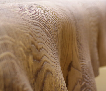
From Cool Hunting – really cool tables from the Milan Design Show. Love the texture and grain lines in this first one.
And finally, some pictures from a place most of us know nothing about…..except as a country in the news, Iran. These are gorgeous. From The Best Article Every Day…..
Be sure to look at all the pictures – Iran looks to be a very beautiful place.
And that’s it for this week – let me know what you find surfing over the next few days!
Getting an Art Critique
 I am really fortunate to have a couple of good friends who can help me with a critique when I am working on a new piece. Sometimes the piece flows, and sometimes I’m blocked in making decisions and moving ahead. It is made more complicated by the fact that I am trying to use our marbled fabrics to create unique art pieces. In surfing the web on a regular basis, I don’t see anyone else doing what I’m attempting to do with marbled fabric in the art quilt movement.
There are a lot of things to consider in developing these pieces of fiber art. Are my sewing skills strong enough? Are my quilting skills advanced enough? Does the fabric speak to us? Can the design tell an interesting story? Can I work with the principles of design?
In looking at all these questions, there are two that I am the weakest in, and this is where my group of friends can really help. Quilting skills and design principles.
Momcat is my first voice. She is a digital artist in her own right, and a self-taught expert in Greek pottery, among all the other skills in being a Renaissance woman. Suzan is my overall digital partner and a superb, published quilter and designer in her own right. Karin is a water color artist with a very strong sense of color and overall design organization. Hubby is the marbler and can see things in the designs that the rest of us miss.
I am at a point in this new piece where I needed advice. Which way should the piece hang, for one – vertical or horizontal. Usually that’s one of the last questions for me, because by the time I’m done, the piece has usually told me what it wants. With this piece, I need to decide this now, as I will need to work on the shading with a light source from the “northwest,” which is how scientific illustration is done. I was leaning in one way, and my group confirmed that. They pointed out that I already had a lot of the “shadows” developing on their own from the new orientation.
The second was size and pattern. I am fine with all the quilting on half of the piece, but the other half seems naked of color and looks like it would require some serious thread work that wouldn’t necessarily add to the overall effect. I had been thinking about potentially cutting away half of the piece. We looked at that possibility, and once we folded back some of the fabric (which had never occurred to me), we knew it needed to be tall and narrow, not wide and thick.
Now, Momcat had sent me some of her photos of rocks and lichen that Dali had painted, and I LOVED the lichen. I was initially thinking of marbling some very small silk flowers and then attaching them with some thread painting. The group didn’t like that idea – felt they were not “tough” enough for the texture of lichen. Momcat disappeared, only to come back with a small vial of green stuff that she proceeded to spread on the one or two rocks that are already green. Perfect! Upon closer look – they are very fine chopped-up pieces of old money from the Denver Mint. Who knew? I guess now this is a “mixed media” piece…..We are also thinking about using some coconut Husk or actual moss from a pet store – need to think that through.
Next question: facing vs. binding vs. frame. How do I want to finish this? I don’t see a basic binding. We talked about fabric as an inner mat and as a frame. We looked at serging the edges – which I have done with pieces in the past, much to one gallery owner’s chagrin – “wasn’t finished properly” was her verdict. But I always let the piece tell me what it wants. I am thinking this piece is telling me it doesn’t want anything more to constrain it beyond a facing that wraps to the back.
The final discussion revolved around light, medium, and dark. I know if I were to take a picture of this and turn it to black and white, everything would pretty much be medium values. I know it needs more dark, so I need to think through how to do that with thread…..or moss…..or coconut husk…..or…….actual small stones…….
I left energized, ready to complete the piece. Amazing how being with a great group of like-minded visual people can make a difference!
Top Ten Tuesday
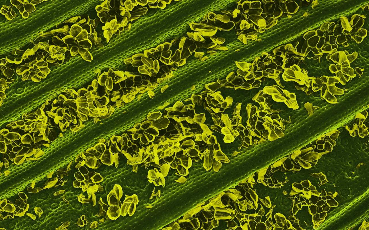
Under the category of food art comes these really interesting images, found on the Cool Hunting site. Caren Alpert goes through a lot of prep to get these amazing photos. The one below is a pineapple leaf……
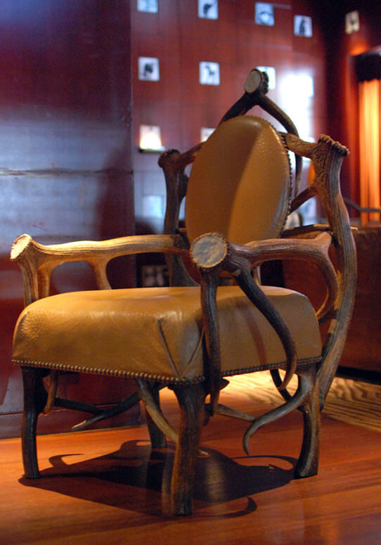
From Cool Hunting is a look at an eclectic furniture collection form a hotel in San Francisco. Some pretty cool stuff – but I’m not sure I’d sit in it!
Under the category of “Remember When” comes some “pre-internet” reminders……(are we really that old?)……..from The Best article Every Day. (This is in honor of Sheldon of BBT)…..
A very cool tutorial on making initials….color, glitter, easy instructions. From Lisa Engelbrecht.
If you are not a Twilight fan (don’t even get me started on lack of correct punctuation….) you will appreciate the poster from Mad Magazine…Breaking Wind, Fart 1. I don’t want to spoil it by putting it here……
From The Best Article Every Day comes a little bonus piece at the end….
 I can’t find really good attribution, (I think chromestory.com), but I SO LOVE Explorer – kind of sums up what I, as a MAC person, think of IE.
And from The Best Article Every Day comes the “origin” of Angry Birds…..since I got hooked earlier this fall, I found this really funny….it’s the bonus piece at the end of protecting your Facebook account (which is also interesting….).
A new site discovered from Kathy Nida – That is Priceless. Art – with captions….how did I miss this all this time?
And thanks to Kathy, again, for The Bitchy Stitcher. I LOVE. LOVE. LOVE. sarcasm. I am fairly fluent in the language, and I am always practicing in order to hone my skills. I practice often with my sarcasm twin Michelle.
And…another wonderful new blog, courtesy of Kathy – great rant on IQF!
Great week behind me, another great one to come! Life is AWESOME!
