Archive for the ‘creativity’ Category
Top Ten Tuesday – Music
What do I listen to when I’m quilting or sewing? Over the years I’ve seen lists of music that quilters listen to, and most of the artists I’ve never heard of. So there are times when I figure I’m pretty ordinary. But I love music, and I have found it really works to get me in the mood for work. For example, when I was writing my master’s thesis, almost all of it was written to the sound track of the movie Glory, a piece I had heard while walking through the mall one day. It was a year later when I saw the movie and realized some of the best, most “uplifting” music was during the bloodiest battles. I haven’t used it since! I wrote my study skills book with Yanni in the background. But when I quilt?
* 1. John Denver greatest hits – all 5 CDs. Most of the songs are perfect for free-motion quilting – great rhythm – kind of get “one with the machine.”
* 2. Josh Groban – No matter when “You Raise Me Up” comes on, I always stop what I’m doing and get refreshed.
* 3. Yanni – Live at the Acropolis – great for cutting and piecing and ironing – nice rhythms, even though a neighbor thought he was pretty bland. I don’t care – at least he’s not John Tesch.
* 4. Mozart’s Eine Kleine Nachmusik (sp?) – especially when I have some difficult sewing ahead – soothes and keeps me focused.
* 5. Anything Celtic, especially when I am sewing bindings. So easy to develop a nice rhythm and keep your mind occupied on mindless sewing.
* 6. Local radio station Mix FM 94.9 in Tucson – Seventies Saturday – lots of old favorites – just makes you feel good and want to continue working.
* 7. David Lanz – New Age music – just about anything he has done. I love just piano – again soothing when the sewing or beading is complex.
* 8. Original Broadway soundtrack for Man of La Mancha – it just makes my heart soar – even the most complex sewing becomes easy to the tune of “Impossible Dream.”
* 9. Original Broadway soundtrack for Funny Girl – I just want to sing like Fanny Brice….
* 10. Celine Dion – almost anything, but the duet with Streisand is fabulous.
This will be an interesting exercise for me – what are the Top Ten of various things I do? I’m hoping this will inspire me to keep creating. Gotta go play John Denver as I quilt…..
Trade Name!!
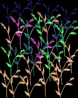
(copyright 2009 by Linda A. Moran, all rights reserved)
It is official – after almost a year of planning to do this, downloading the paperwork, actually filling it out, finally mailing it, getting it returned because I filled it out wrong, redid it, and then sent it back in, we got official confirmation of a trade name for Digital Marbling.
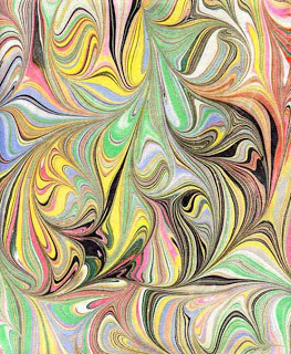
I’ve been using this in blog posts for over a year, and it describes the new direction we are taking with our fabric. Now we will scan a piece of marbled fabric (or paper), and manipulate it using Photoshop, until we have something totally unique. Today’s picture is an example. I started with a stock image from Photoshop, adding a layer at a time. Then I used some patterns I had created from the marbled fabrics and “filled” them into the flowers. Once I added the black background, the piece began to glow. I went back into the various levels and tried to accent the patterns so the texture would be more obvious. As with all the pieces I am doing, the web and different monitors just don’t do them justice. This piece at its original size is gorgeous – if I do say so myself!
Lately I have been trying new images and writing about the process, and I have alluded to Digital Marbling. But now it’s official – I just need to figure out how to put the little graphic at the end of the name! Not only am I learning how to work with Photoshop – and being pleasantly pleased with what happens as a result, I really like the fact that I am taking myself in a new direction. This week life just got in the way ofd continuing my projects.
First time reading Marbled Musings? Get acquainted here.
Art – It Feels So Good!

The kids and I were definitely on the same page today. They didn’t want to work, I didn’t want to work, they had lives outside of school, I have a life outside of school….so we talked about not giving up when we still have work to learn. I took them through everything they had accomplished in algebra 1:
*making a table, a graph, and an equation for a linear function;
*making a table, a graph, and an equation for an exponential function;
*making a table, a graph, and an equation for an absolute value function; and
*making a table and a graph for a quadratic function.
THe only thing we really have left to do is solve quadratic equations through factoring and the quadratic formula. I think they were pretty impressed with themselves, and we had a great class. No more whining – we were in this together!
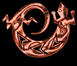
But – I still wanted to get home and work some more on the gecko from yesterday. I still felt there were a lot of ideas to try in Photoshop. So you can go back an entry and see the original image – and then look at this new one -lots of embossing, and I learned how to change the shadows from a default black to a color within the marbled pattern. I continue to be amazed at the amount of texture the marbled fabric gives the design.This one looks like a piece of copper. Another “wow,” and I foresee a series with the gecko, and maybe a few other common images of the Southwest.
Don’t forget our CONTEST!
Creativity and Photoshop – A Great Weekend!
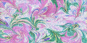
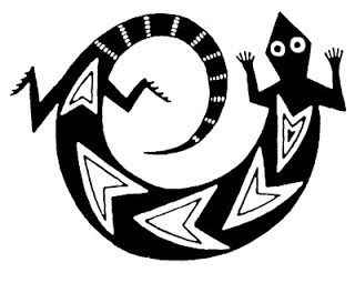
In the midst of a lot of school work, writing, and phone calls, I had time to work on another indigenous image – this one of the well-known gecko of the Southwest. We have numerous in our backyard, and they’re quite fun to watch doing their “push-ups” in the sun! This first is the original image in black and white –
Then I looked through new patterns I created and settled on the orange marbled pattern. Lots of “heat” to match the Southwest, and the detail is so perfect – nice and small, almost like skin.
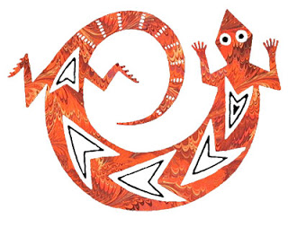
Then I started with embossing – give some life to the gecko. This was another image that fell into place; I seemed to know exactly what to do – and even more importantly, HOW to do it.
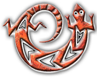
Then I went with my gradients – which I love. I have a couple of favorites – the bronze/copper one being the one on this. I tried all kinds of filters and adjustment layers, and finally the gecko said “enough.”
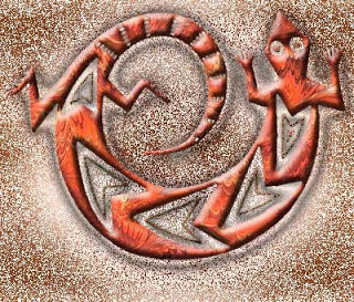
I’m very pleased with the final result.
And – I finally – last night after nearly 10 years – realized how to scan fabrics to create a quilt through Photoshop. Very cool!
Creating – Part 2

So after some errands, and a short time outside relaxing and reading (which I haven’t done in months), I went back to Photoshop, and things flowed wonderfully. This image is from the Cochiti tribe of the Southwest. Once I realized I hadn’t put pieces on individual layers, I was able to do a lot more with manipulation. Also, every background that you will see is marbled fabric. A few of the fabrics have been lightened, or hues changed, through Photoshop.
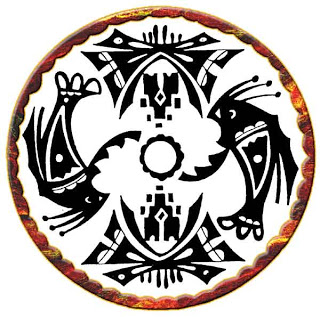
This first shows the border. I played around with embossing and a small stroke to give the border some good dimension. The stroke is done in a color sampled from the marbled fabric. It always amazes me what Photoshop can do.
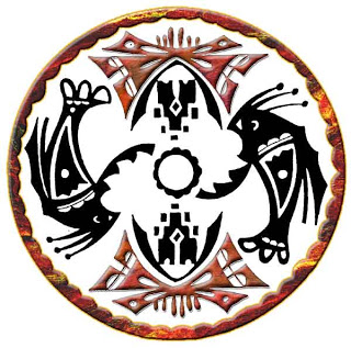
This second looks at two of the main images, done with a free-form marbled pattern. Lots of embossing, shadows, some stroking, There’s a wonderful “look” to these – very earthy.
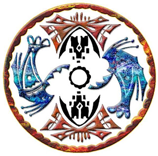
I went with a watery marbled pattern for these two, as well as some of the same layer options as above. The pattern has been lightened for the shadowing inside the figures.
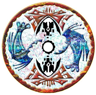
I knew when I started I wanted some marbled pattern for the center, if not the whole background. This is the Italian Vein marbled pattern lightened so it doesn’t overwhelm the foreground. Once it was there, it looked perfect.
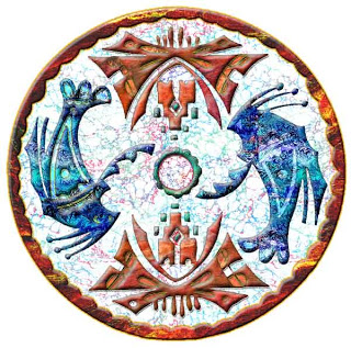
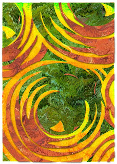
I finished off all the other little “openings,” for lack of a better term. I lightened some pieces, trying to get as much depth and texture to the whole piece. Then – I played around with the overall background. I wasn’t adverse to the white, but I wanted to see what else would work. Black was too dramatic – it seemed like the eye just wen to the black before the design. I chose a large orange pattern I had scanned, then lightened it a little, so the border would still be prominent.
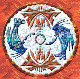
To say I’m pleased is an understatement. This meets my “wow” criteria. I tried a few other tricks in Photoshop – ready for some new ones. And – these pics don’t even begin to do justice to this piece!!
Creating – and Back to the Beginning

It’s the weekend and I want to play around some more with ideas from some indigenous images to see what happens. This is also a way for me to boost – and expand – Photoshop skills. Here’s the original clip-art image, from one of the Dover books: North American Indian Motifs. I like the Dover books because they are royalty-free and they lead to some great inspiration, using the marbled fabrics.
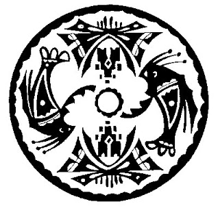
I have to learn I can’t load a jpg image to start – I need to use BMP – and then convert, which is new for me, and I am getting used to it. I also am learning how to paste one image into another blank page. The other think I have discovered today is I don’t have nearly enough marbled patterns in my pattern assortment. They all tend to be the same, so I need to scan more fabric and work on a new pattern collection – lights and darks, different hues, all from the same pieces.
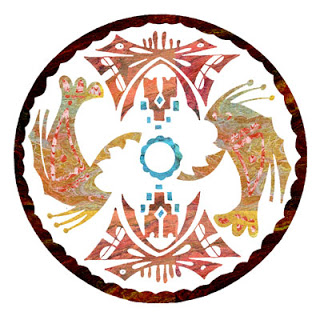
This is the first part – just important patterns. I’n not adverse to the colors, but one of the major things I discovered is when I used my magic wand, I didn’t zap the areas to a new layer, so can’t enhance each section like I would like. Right now I am pleased with colors, but it is oh so flat, and I don’t really have a good background fabric-pattern to use at this point. So for now, I’m off to scan fabrics, play with colors and sizes, and then hopefully come back, do this over on new layers, and proceed from here.
Other Photoshop journeys you might enjoy:
New Directions – this has found its way into many of our new works.
Marbled Fabrics
Don’t forget our CONTEST!
Pity Party
Normally I can handle just about anything that comes at me. I may freak out a bit at first, but then I usually pull it together and march right on. But this year all has fallen apart with my eyes. It started with the summer cataract surgery last June, that lef to major complications – huge eye pressures (like 57), three laser holes for an iridotomy that didn’t work, massive doses of prednisone, and finally an iridectomy to surgically put holes in my left eye to relieve the pressure.
Okay, I dealt with that (blood clots and all as a complication). But in September I fell at school and whacked my head on the back of a bookcase, causing hemora – screw it – bleeding – in the bad eye, and the sight was gone – what little I had there. Neither the cataract doctor nor the retinal specialist can figure out what is going on. Now I’m told my good eye is beginning to deteriorate with borderline glaucoma.
Bleech. After all these years (trust me, a lot) of working on one eye, I am having to come to terms with what further disease might mean. And just as I am really finding my way artistically, as well as taking serious time to create. I notice so much more now that I do regular artist dates. I see textures where I never used to. So I’m not dealing well right now. I will in a couple of weeks, but right now this is throwing me badly. I can’t imagine what it would be like to not quilt or sew or read or surf the web…..
Enough pity – I just needed to get it out. Tomorrow’s Friday – an art weekend ahead! And –
wait for it….
I own a calculus t-shirt! Who knew? With it’s own “Mathematical Advisory” of “graphic content” and “explicit functions.” And I actually know what they mean!!!
Artists, Creativity, and Depression

I spent some time going back through blog posts, as I have been at this over two years, and over 200 posts. I can see why people keep journals and diaries. I never have, but this blog is acting like that for me. I had to laugh at some of the early Photoshop exercises – I was pretty basic. But on the other hand, when I sometimes wonder about my skills growing with PS, I can certainly see that they have!
I was particularly taken with the interview with Eric Maisel, author of The Van Gogh Blues, about creativity and depression. I’ve had a good year, with depression really at bay, but it’s worth it to read through is insights again. I’m sharing a couple of questions with you from the earlier interview.

Me: Eric, can you tell us what The Van Gogh Blues is about?
Eric: For more than 25 years I’ve been looking at the realities of the creative life and the make-up of the creative person in books like Fearless Creating, Creativity for Life, Coaching the Artist Within, and lots of others. A certain theme or idea began to emerge: that creative people are people who stand in relation to life in a certain way—they see themselves as active meaning-makers rather than as passive folks with no stake in the world and no inner potential to realize. This orientation makes meaning a certain kind of problem for them—if, in their own estimation, they aren’t making sufficient meaning, they get down. I began to see that this “simple” dynamic helped explain why so many creative people—I would say all of us at one time or another time—get the blues.
To say this more crisply, it seemed to me that the depression that we see in creative people was best conceptualized as existential depression, rather than as biological, psychological, or social depression. This meant that the treatment had to be existential in nature. You could medicate a depressed artist but you probably weren’t really getting at what was bothering him, namely that the meaning had leaked out of his life and that, as a result, he was just going through the motions, paralyzed by his meaning crisis.
Me: Are you saying that whenever a creative person is depressed, we are looking at existential depression? Or might that person be depressed in “some other way”?
Eric: When you’re depressed, especially if you are severely depressed, if the depression won’t go away, or if it comes back regularly, you owe it to yourself to get a medical work-up, because the cause might be biological and antidepressants might prove valuable. You also owe it to yourself to do some psychological work (hopefully with a sensible, talented, and effective therapist), as there may be psychological issues at play. But you ALSO owe it to yourself to explore whether the depression might be existential in nature and to see if your “treatment plan” should revolve around some key existential actions like reaffirming that your efforts matter and reinvesting meaning in your art and your life.
Me: So you’re saying that a person who decides, for whatever reason, that she is going to be a “meaning maker,” is more likely to get depressed by virtue of that very decision. In addition to telling herself that she matters and that her creative work matters, what else should she do to “keep meaning afloat” in her life? What else helps?
Eric: I think it is a great help just to have a “vocabulary of meaning” and to have language to use so that you know what is going on in your life. If you can’t accurately name a thing, it is very hard to think about that thing. That’s why I present a whole vocabulary of meaning in The Van Gogh Blues and introduce ideas and phrases like “meaning effort,” “meaning drain,” “meaning container,” and many others. When we get a rejection letter, we want to be able to say, “Oh, this is a meaning threat to my life as a novelist” and instantly reinvest meaning in our decision to write novels, because if we don’t think that way and speak that way, it is terribly easy to let that rejection letter precipitate a meaning crisis and get us seriously blue. By reminding ourselves that is our job not only to make meaning but also to maintain meaning when it is threatened, we get in the habit of remembering that we and we alone are in charge of keeping meaning afloat—no one else will do that for us. Having a vocabulary of meaning available to talk about these matters is a crucial part of the process.

Interested in more? Try these posts:
Part 1 Interview
More with Eric Maisel
And…don’t forget about our contest! Help us with a NAME!!
Creating – Part 1
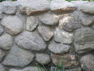
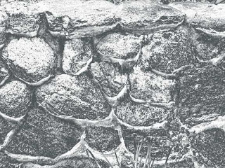
I’m going to start out trying to document the process I am going through to create some of these “garden fantasy” images. You have a basic stone wall, much more interesting in person. I have been fascinated with walls and the interplay of textures, so I want to see what I can do to make this a more interesting image. I usually start with basic adjustments, and what you see below is the application of shadows and highlights – which I only discovered a few months ago. You should see that the cement mortar holding the rocks together is now light enough to see.
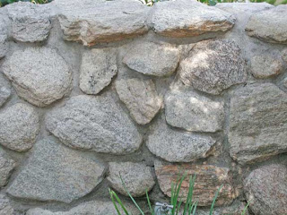
From here I usually look to balancing any color issues. I ended up with adding to the blue tint, as it makes the rock wall have some more depth. PLus, it’s more appealing to me, and it seems more like the actual wall on the day we were at the gardens.
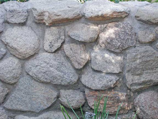
This next is intriguing – I tried a hue filter, and it looks as if a few of those rocks are bottom-lit – it’s somewhat intriguing.
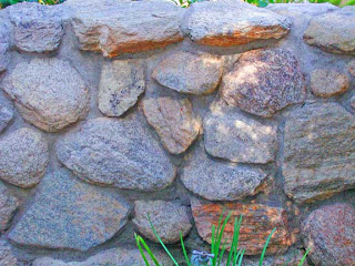
I love gradients. When I finally started to work with them, I discovered interesting effects. This one looks like underwater, with bioluminescence on the rocks – or are they shells of some underwater life form?
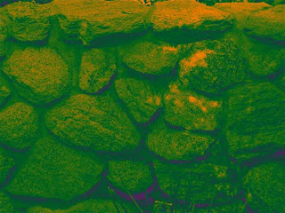
This is another gradient that reminds me of satellite imagery from space. I can see snow, and the popping up of land forms – which seems like it should be reversed, but now I feel like I’m in the “definitely intriguing” area.
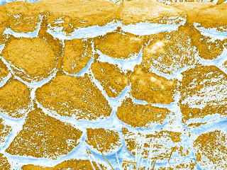
Oohhh, dinosaur eggs! Looks fairly menacing – from yet another gradient.
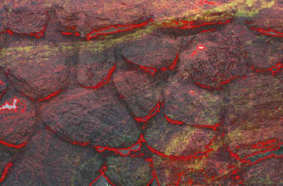
Now I feel like I am really in the realm of fantasy. I added a marbled pattern after selecting the rocks and adding them to another layer. I also cropped out the grass at the bottom. I used a stroke in a fine orange, and now this wall looks like a volcanic eruption, with the magma just below the surface. This is where I’m going to continue.
Comments welcome – what else would you suggest?
And – check out our contest!
Contest Time!
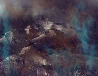
I will preface this by saying I have never done this – either contest or gallery show, so it’s all new! But as you can see from a previous post, I m in need of a title to unite all our work. There are three (and possibly a fourth, who is a photographer) of us putting this together. The only restriction from the park gallery is that the focus has to be Southwestern, which is not a problem at all. And – I want something more exciting than “Southwestern Art.”
That said, we have fiber art from marbled fabrics, digital manipulation of images, both with and without marbling, and some great stand-along photography of the Southwest. You can see some examples here, and you can scroll through older posts. Plus, The Art of Fabric, our website, has examples of fiber art. The image at the top of this post is an example – and the drama is lost on this size! The show isn’t just about marbling, which would simplify our title tremendously, but in the directions some of the marbling is taking us, as well as digital experimentation with Photoshop. We are trying to be unique in the marbling niche, and the digital work seems to be providing that.
But – we also don’t want the show to be exclusively digital marbling. Consequently, we want suggestions. And to the winning suggestion, you will get a four-pack of note cards with original digital marbling images. You get to see some of our new work before too many others do.
So comment away – if there are several title suggestions that are the same, the one submitted first will be judged the winner. I’ll keep an ongoing commentary as we develop the show, piece by piece – even if it is 4 years away. We will be ready!
Additional examples of art work – scroll through the past posts – there is usually some art work that is included in each posting.
The Digital Generation
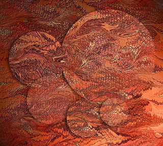
I have spent a little bit of time today surfing sites on creativity – just to keep up with what’s new on the Net. I came across this from hypography – a forum for science and technology: Will the Digital Age Destroy Creativity? Certainly provocative!
One thing about teaching at the high school level. I have become very aware of digital devices and teenagers. My students still can’t understand two things: why I always know when they are texting (head down, hands in lap, not listening), and why my phone doesn’t do anything more than make a call. I’ve been reading a lot about the changing technologies and their impact in the classrooms, and I am trying to understand and utilize more of what the kids know and can do with these new digital devices.
But I gotta tell ya – I truly believe there is more to life than always texting or having earphones stuck all the time. And loud? I tell the kids if I can hear their iPod it is definitely too loud! I wonder about hearing loss in the next decade. I wonder about the ability to read a book, rather than opt for music – not that I have anything against music. I’m enjoying all the portable availability of lots of tunes.
This takes us back to the initial question: is the digital age destroying creativity?
For me personally, an unqualified NO! My artwork is taking advantage of technological wonders – Photoshop, blogging, eBay, networking, and the like. But I still like my quiet time, and I still will always want to own books. However, I don’t always want to be “on call” with a phone/computer that never lets me rest. I just want to let hubby know if I am going to be late, or if the bus is delayed – those kinds of things.
Marc Prensky writes about what he calls “Digital Natives, Digital Immigrants.” I would definitely qualify as a digital immigrant – I’m new to all this. I’m adapting (all right, to a point), and I love what I can now do.
But – what about this current generation? They’re immediately on their cells or listening to music. Are they so plugged in that they will be content with texting and always listening to music? BUt am I so much of a dinosaur that what I think truly is valuable is outmoded and ancient?
What do you think? Is the digital age destroying creativity?
Nine Blogs I Read Regularly
I wrote in an earlier post about the struggle to balance the need to make art and be creative, along with the need to build a business. If I am going to create, then I have to ensure I don’t get bogged down on the computer – which as we all know is extremely easy to do! So – here’s a list of what I read regularly – for inspiration, humor, and just plain fun:
El Milagro Studio – Anne Lockard, she of the Fiber Pirates, does some pretty amazing church banners. Plus she’s an incredible lady, and I just love hearing about her adventures.
TED – ideas worth spreading. Not really a blog, but this is an outstanding place to see videos on creativity and “ideas worth spreading.” Everything is inspirational.
Enchanted Revelry – I first “met” Tristan on the QuiltArt list, and he’s a theater geek from way back – as am I – but Tristan actually still does theater – and I gave up directing middle schoolers years ago (something about age…). Tristan is into all kinds of arts – and his vintage pictures are fabulous.
The Future Buzz is great to subscribe to – lots of ideas on marketing, plus some great photos. This link is specific to creativity: how to be more creative – it’s one I reread regularly.
The Summer Tomato – upgrading your healthy style. I stumbled on this blog as a result of a blogging class I am taking, and I loved Darya’s crisp, clean photos and healthy eating ideas. This isn’t your “diet” page, but a lifestyle change.
Penelope’s Trunk – this is a link to another specific article: how to build a career as an artist.
Dr. Matt Lyon is a former student, and I was delighted to find he is in alternative medicine. His posts are always thoughtful and thought-provoking.
Learn Me Good is a great way for me to appreciate the humor in our lives as teachers, to celebrate what doesn’t work in the classroom, and to generally keep up-to-date with education and teaching in the blogosphere.
Fiber Arts/Mixed Media – my second social media group, outside of Facebook. Already picked up lots of ideas, as well as some potential art shows to enter this year.
THoughts on Gardening

I am not a gardener. Never saw the appeal in gardening – too much dirt under the nails. Walk around and look at plants? You must be joking. Did planting in Phoenix around our house, but caliche is an interesting clay to plant in. Had a nice backyard in Tucson at our house, but never did much with it.
Now I can see the appeal. We spent another morning at the Tucson Botanical Gardens, and it’s just gorgeous in spring. Now I understand the appeal of just walking and looking, especially here in the desert. I had no idea just how many different plants that flower are planted here from South Africa and Australia. The blooms are so different.
The iris garden is almost in full bloom, with not a tiny iris to be seen. I find myself staring at the mix of colors and the changing textures. The garden has become a kind of art walk for me. I notice things I’ve never seen before. We’ve been to the gardens probably 5 times in the last two months – each time there are new things – blooms, budding cacti, trees – that I haven’t noticed before.
Julia Cameron writes in The Artist’s Way about the importance of regular artist’s dates. This has become a regular date walk. Jasmine smells today, two weeks ago alive with the scent of orange blossoms. The saguaro hotel with the birds flitting in and out, the cactus blossom loaded with feeding hummingbirds.
I need to be sure that in developing this “Garden Fantasy” show that I balance the flowers – not just what I see and like from the East, but the unusual variety that is Tucson. Maybe I need to change the name to “Desert Fantasy” to capture some of the surprise people have at seeing some of these plants in the desert.
Orange Blossoms
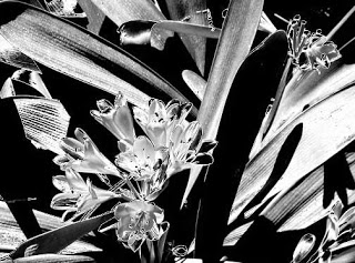
I plan to continue with these, hoping for feedback and some strokes of inspiration. I fell in love with gradients early on in my Photoshop work, once I figured out how to play with them. The effects can be really intriguing, especially if you keep running through the various selections. I’m very partial to the copper gradient, but it made the flowers on this one look very indistinct. There’s something about black and white/gray that is so dramatic. Probably why I love Ansel Adams.
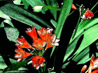
I discovered the fresco filter with an earlier piece and I really like the effect – sort of like water color, but not quite. I had learned that “fresco” was a type of painting done on wet plaster, and then the paint would dry with the plaster and become part of the wall. I love the “vagueness” that comes with this filter. The orange color is also deeper with this image.
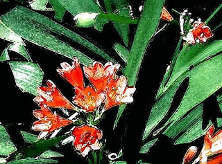
I like the dry brush, but not with this image. Nothing really seems different, not a hint of “wow.” But one thing about Photoshop is that you never really know when something will work out. And – the orange washes out….

The crystal filter here is interesting – seen close up, almost as individual pixels, reminds me of the hydrangeas from back East, which I always loved. In terms of fantasy? I think the gradient achieves that, but I’m thinking I’m not done with this set of images….
New Work

In the midst of talking about learning, and folks on Facebook celebrating their 100th posting, I thought I would go back to the beginning of this blog. It was originally set up to record my work in a beginning Photoshop class. Now it has become my creative journal, and as I build my audience, I really am hoping to get feedback on a regular basis about some of the things I am trying. That said, here’s one of the first attempts…and I was so proud of myself!
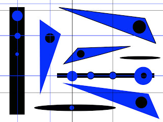
The beginning exercises were to help us learn about layers and basic drawing tools. I spent hours playing around with them. I knew I wanted to go much further, but while the initial learning curve wasn’t too bad, I felt I plateau’d with filters. I need to get back to the NAPP tutorials and try to expand what I can do. I went a long time between images, and I found I had forgotten a lot of the steps, like importing patterns from the marbled fabrics.
Dean went back the the Gardens yesterday to fnd irises and roses galore! He took some great shots. I picked this one to work with, and cropped it to this image. I’m liking the off-center images, especially since I have always been SO linear and symmetrical.
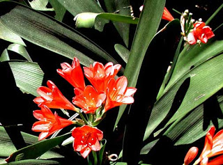
Keeping in mind I am trying to develop a set of 12 to 15 images to fit the theme of Garden Fantasy, I get the basic cropping and adjustments done, and then I start to play. So this is the first attempt-
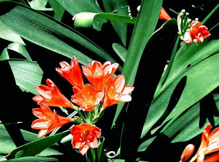
What I notice, now that I can see them both (note to self: work at tiling on the desktop…) I adjusted the bottom one to enhance the greens, and it seems like some of the deep orange was lost. I will need to relook at that. This one also has the use of the clone tool to eliminate some “flaws” on the leaves.
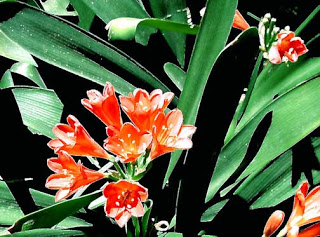
This is a filter – the blur filter, and generally I like the effect. Again, I have to watch the color – these flowers really are a deep orange. But I like the blur effect….
More tomorrow – I have papers to grade……
…..but I just discovered Picasa……
