Archive for the ‘creativity’ Category
Wednesday Work in Progress
Lots of work redoing the website – looking at old pictures, seeing how far we have come, and it’s been quite the journey. I tend to get obsessive on these things, and I am now trying to rein myself in….not every piece we’ve ever done has to be on the site, but I want a good representation. This site has served as an online portfolio, and it’s been great. Now I want to expand into other information, as well as attempt to rev up the sales portion on the site. Many thanks to web guru Suzan of Saltwater Systems – nothing short of amazing!
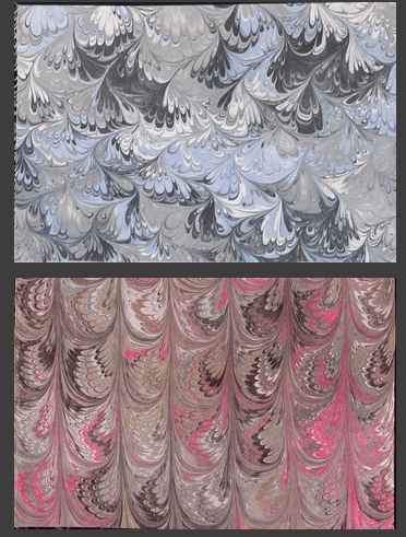
We’ve added more fabric samples so people get a better idea of what can happen with marbling. You can see that here. We could add so many more from our pile of “Never Sell These,” but this gives a good idea.
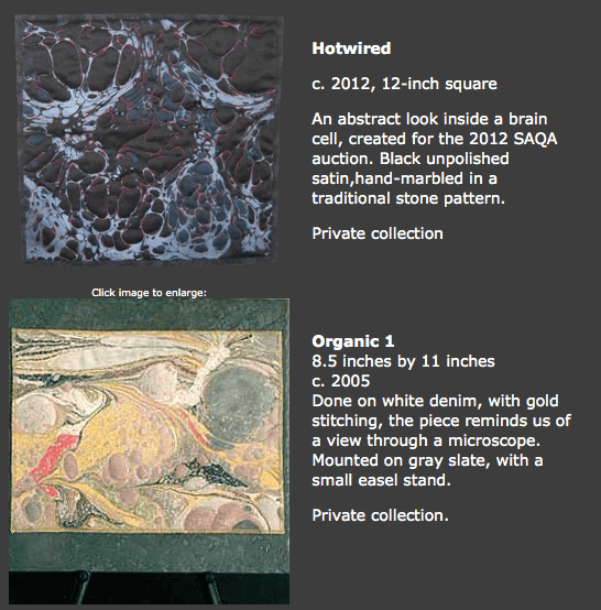
Also, I’ve added small pieces we’ve worked on to the Small Works page. I do like working in a 12-inch-square format, and I want to do more of that when some of the bigger projects are finished.
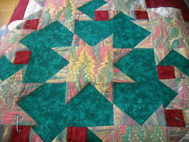
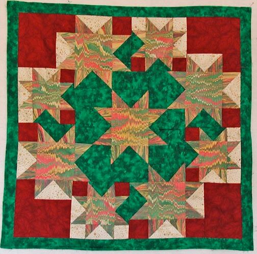
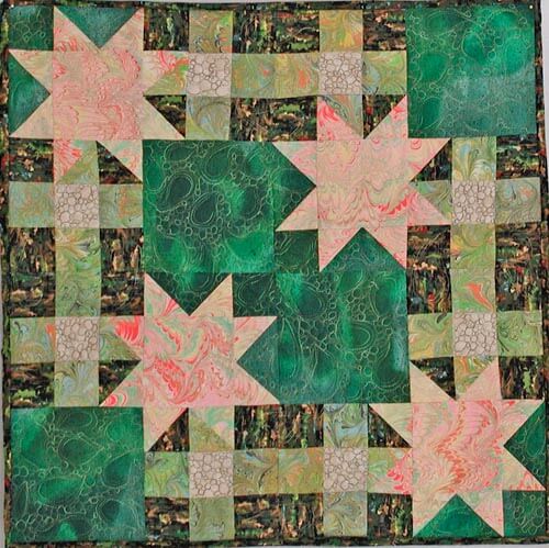
My Nature series has really grown, and as I look at all the pieces together, I can see how I am really drawn to quilting the traditional stone pattern. I want to do more with the bouquet and nonpareil patterns, and I have the perfect piece of red cotton that has started calling me. In the meantime, I’m practicing my machine quilting on some smaller quilts. My Christmas quilt is almost redone – I succeeded in accenting the stars. I need to sew the binding, so hopefully a reveal in another couple of days.
It’s great to be so busy….we have a major order we are marbling in the next few days, and it’s a secret at this point….but it’s for a magazine feature…………….
Top Ten Tuesday
Another week and we’re half-way through November….goodness, where does the time go? Here’s some goodies from the week.
For all of us creatives, here’s an interesting little video from Behance about what we do:
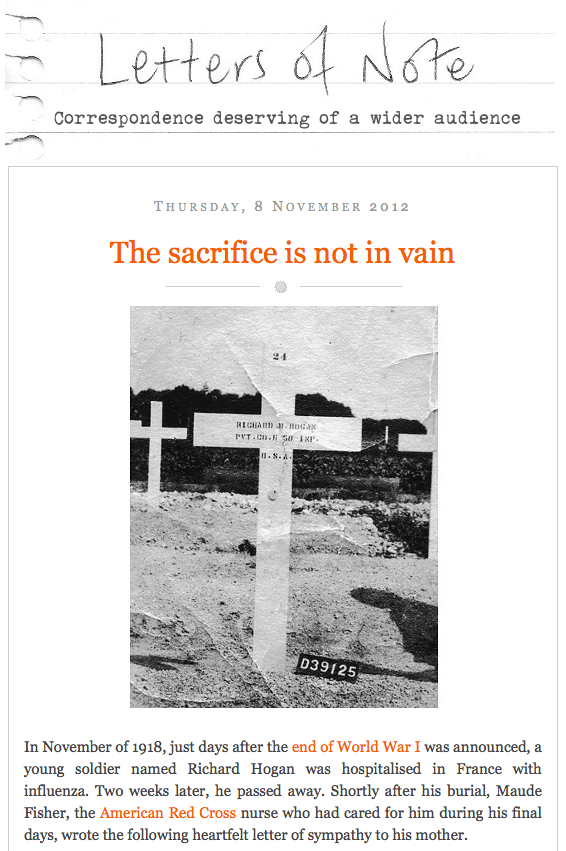
In light of Veteran’s Day is this beautiful, heart-wrenching letter about loss.
Ode to our neighbor to the north, Canada – some spectacular scenery in Travel Alberta.
And who doesn’t love magic? This is an interesting twist on the typical duo in an act.
And another video – this one about kites….which I could NEVER get off the ground! “One kite is controlled by his right leg, the other two by his hands. Ray Bethell, a resident of Vancouver, BC is one of the most famous kite flyers in the world. He controls three kites in a ballet set to “The Flower Duet.” When you see two tails together, he’s flying two of the kites next to each other. At about 3:00, all three are together. Notice at the end where he lays two of the kites down, one on top of the other and the third —-well, you just have to wait to see what he does with that one.”
Here’s a book I need to get, since all things about the brain fascinate me. Found this on the TED blog: Brain Power. Looks absolutely fascinating.
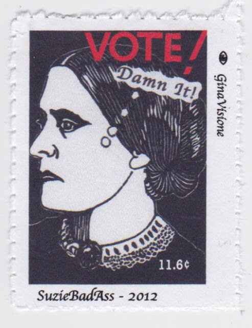
A great fiber art find – love her stamps! “GinaVisione works and plays in San Francisco, CA., a re-transplanted native. Her primary work is focused on maximizing the available rehabilitation service and independence options to all persons with visual impairments and blindness, however, this often spills over into her artwork. She is a printmaker with linoleum carvings and monotype image techniques, but she is also very active in the MailArt (including arti-stamps!) and letter writing networks around the world (SF Correspondence Co-op, Letter Writers Alliance, PostCrossing, to name a few). Gina really enjoys the amazing levels of creativity that artists share in her mailbox daily! Check her out on Flickr: http://www.flickr.com/photos/ginavisione/“
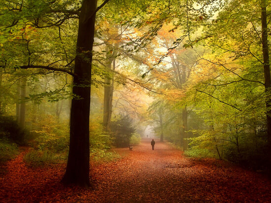
Once again from the 365 Project, some really gorgeous photography.
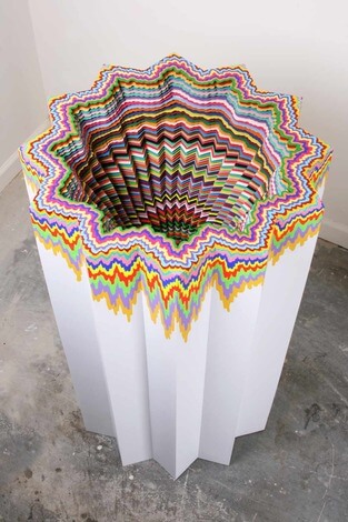
From Cool Hunting comes the work and an interview with a very interesting artist, Jen Stark – lots of color here!!
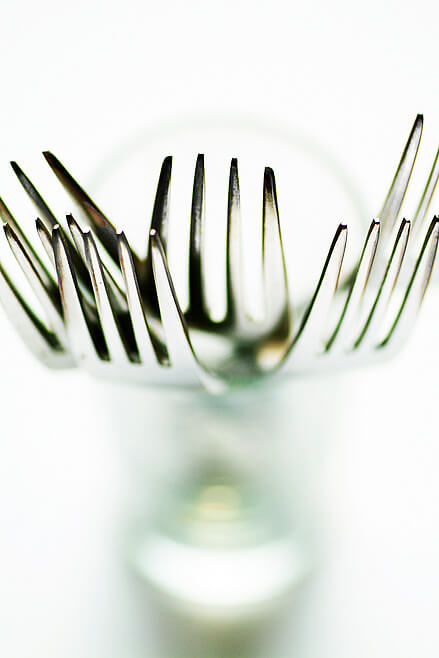
And finally, from JPG Magazine, the simple fork……
Have a great week! Let me know what you find on line that’s cool!
More Superb TAFA Eye Candy – GORGEOUS!!!
I am so enjoying getting to know my fellow artists on the Textile and Fiber Art List. There is such a wealth of talent on this list – over 450 artists from 35 countries. And the list keeps growing! If you are at all involved in fiber and textiles, you owe it to yourself to belong to this growing, important organization. We’ll just be getting better and better! Here goes some new members:
From Beryl Moody: “I’m a weaver, spinner, dyer and knitter and use the natural beauty of my surroundings on Banner Mountain (my home) as inspiration for my work. My handwoven and knitted works are all one of a kind and I often use yarns spun and dyed by me in my creations. I design my own weaving designs with computer software and then translate that design to the loom in colors and textures that are unique to each piece I weave. Each year I take on new challenges to explore new aspects of fiber art. I find that this keeps me thinking in new directions and keeps my work from becoming static.” Banner Mountain Textiles
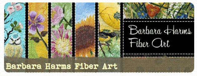 From Barbara Harms: “Coming from an art background, I was attracted to the colors and textures of fabric.This drew me into the world of quilting. I loved every step in the process. In time my inner artist began to emerge.I missed the complete freedom of expression and creativity that art affords.Quilting is an art form. Still it does have it’s limitations. I found inspiration from the many quilt and fiber artists who pushed the boundries which separates art and quilting, creating a new art form. I began to experiment as well. Silk painting could be called the backbone of my work.That’s the starting point.After I have dyed or painted my silk, the result generally determines the direction I will go with this piece.With the backdrop in place, I begin to build layers of color and texture,using applique, thread-painting and quilting. I love using the traditional techniques of quilting in a non-tradtional way to create a contemporary art quilt.I have the best of both worlds and I’m able to satisfy my need for creative expression. It’s my goal to keep expanding my expertise in new areas, be fearless and try new things keep my work fresh.” Barbara Harms Fiber Art
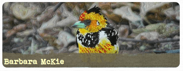 From Barbara McKie: “My work tends to be grouped in several themes: nature, particularly floral and birds with landscapes, but also other animals including people, often with a whimsical element, and abstraction with surface design elements are often included. I combine all types of fabric manipulation: painting with dyes on fabric, and disperse dye computer transfers, shibori, immersion died fabric, and more recently thread painting. I often include trapunto in my work. Almost all of my work is for sale, and I have many more pieces on my website www.mckieart.com I also do commissions. All of my work consists of white fabric that I have manipulated in some way to create the design, and most works contain computer imagery from my garden or from my travels based on my own photography printed on polyester fabric. I like to combine realism with abstraction in many of my pieces.” Barbara McKie
 From Barbara Olson: “Milestones in my career are having my piece “In The Beginning” chosen as one of the best 100 American quilts of the century. Another is the book I authored “Journey of An Art Quilter” being published. I present art quilt workshop and creative development lectures. “ Barbara Olson
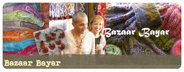 From Abit and Catherine: “Textile smitten (treasure hunter + global nomad designer/writer) = a creative force for bridging cultures. Together we combine our talents into Bazaar Bayar, a workshop in Istanbul’s Old City, to support local unsung artisans: women who still weave, knit, and crochet in the traditions of timeless Turkish handcrafts. Our mission:
- Saving ‘endangered’ handmade textiles,
- Reviving + reinterpreting disappearing handcrafts,
- Employing local women artisans,
-
Promoting cultural exchange between Turkey + our global visitors.
Bazaar Bayar
Enjoy, and be sure to visit the list any time you want – there are a lot of artists to admire!
Work in Progress
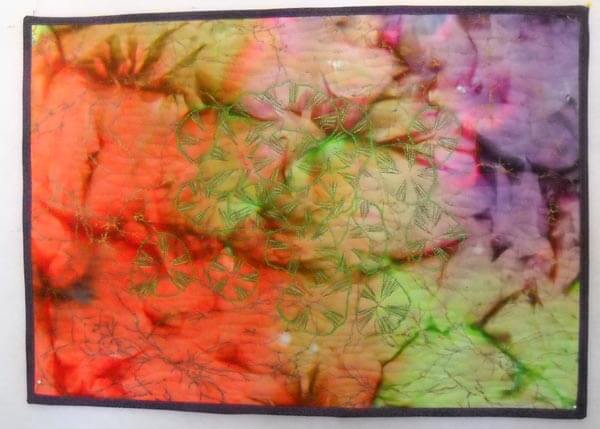
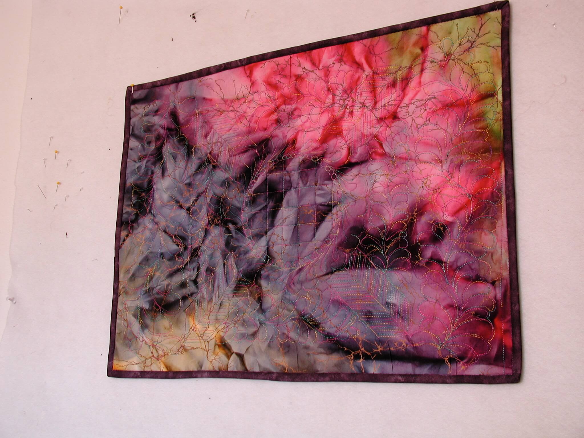
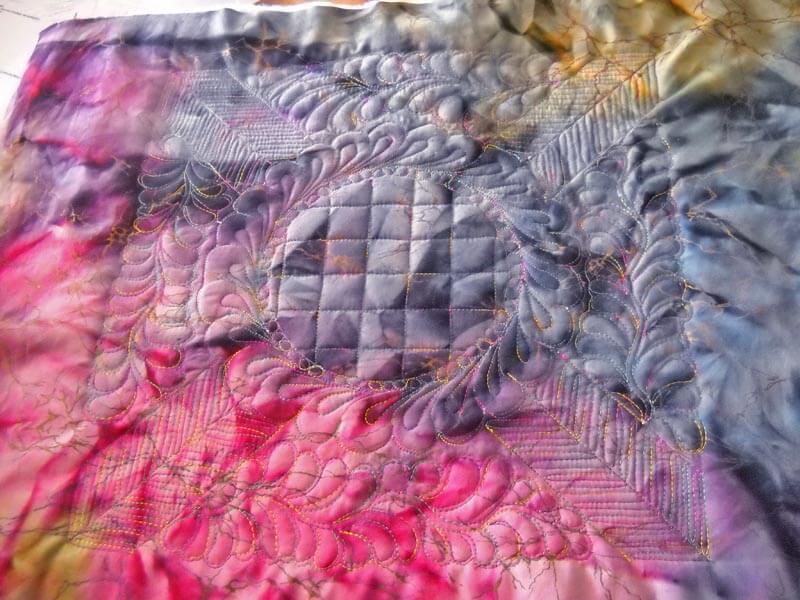
I definitely have work in progress…I just never manage to get it up on a Wednesday….so here goes anyway. I finished my table topper for my bed stand, and I was really pleased with how it turned out. I used ideas from the October and November FMQ challenges. First time I used a stencil when I wasn’t hand quilting, and I tried all kinds of techniques, including a not-really-successful trapunto, but I’m learning. Both table toppers are bound in the same purple, even though the designs are totally different on both of them.
This is hubby’s topper.
From Last month:
I was very pleased at how it worked out. My first experiment with water-soluble thread was somewhat successful. But the amount of free motion I managed to do really surprised me. We still have two dresser scarves from the same set of fat quarters. I have an idea for hubby’s using some of the techniques I’ve seen in Diane Gaudynski’s book, but that will have to wait till after the holidays. I am still working on the last table runner for my second mom, due next week in time for Thanksgiving, so that’s the next priority.
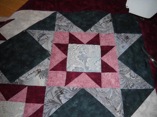
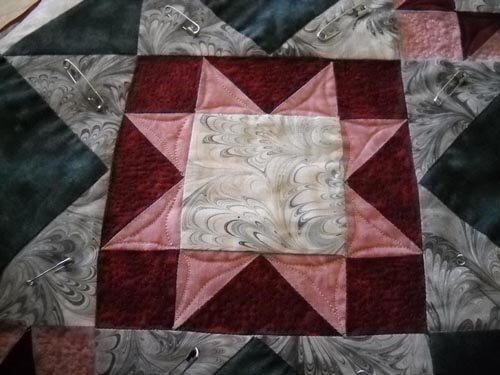
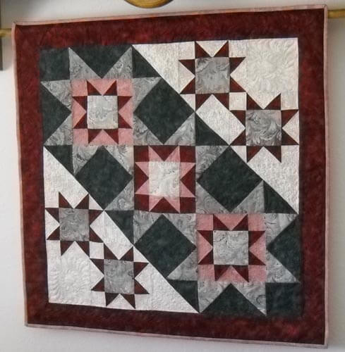
However, I had to take some sewing time strictly for myself. I took this ten-plus-year-old quilt apart late summer, and I finally am getting to redoing it for the holidays, plus turning it into a new tutorial for quilting marbled fabric, this time the nonpareil pattern, a very traditional marbled design. It was just quilted in the ditch and looked really blah…..
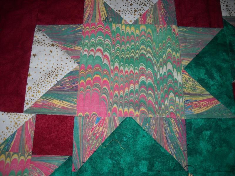
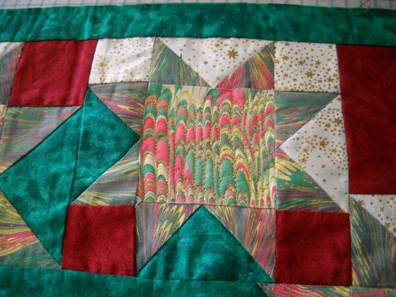
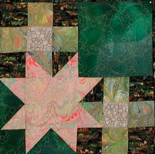
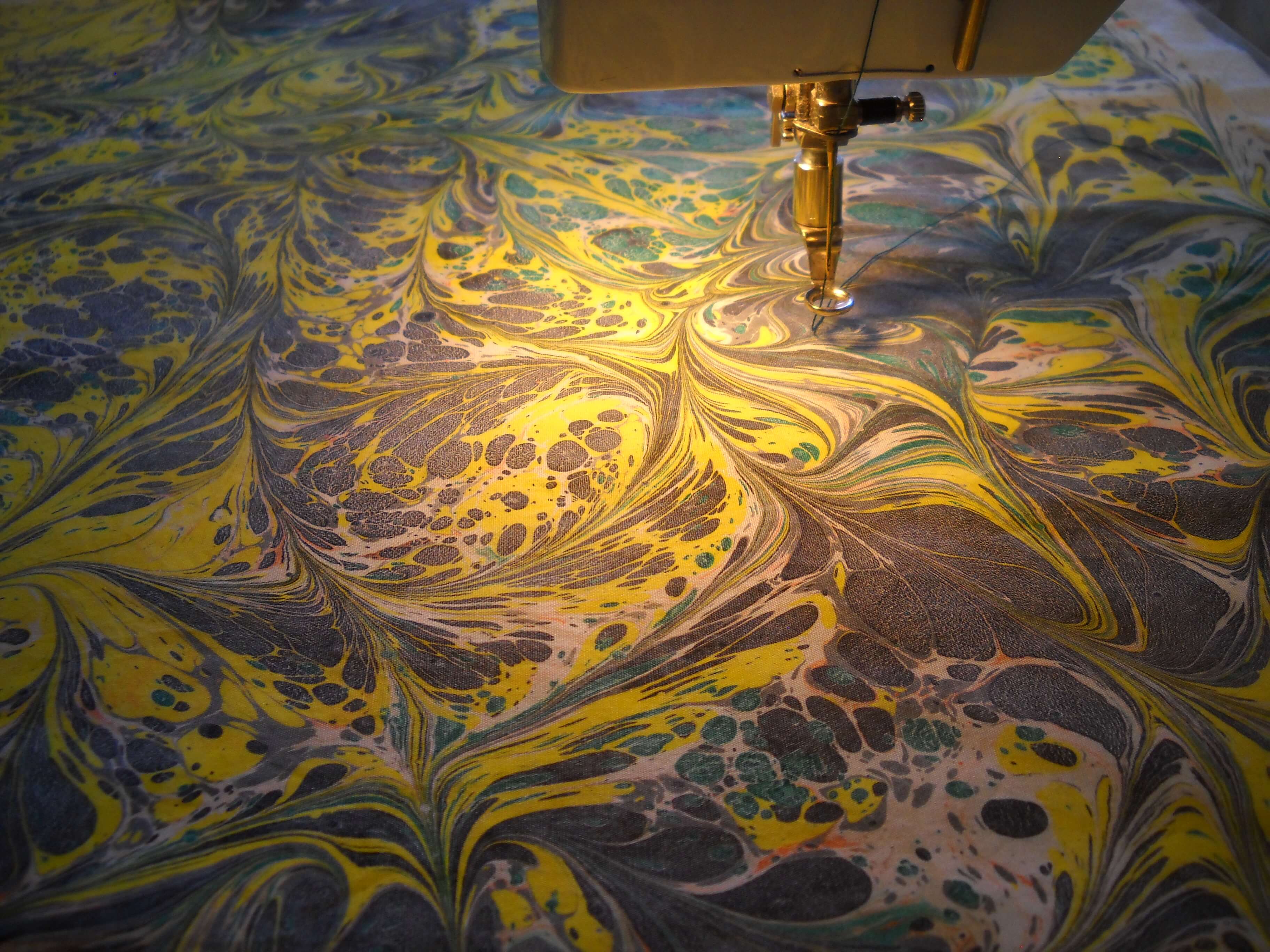
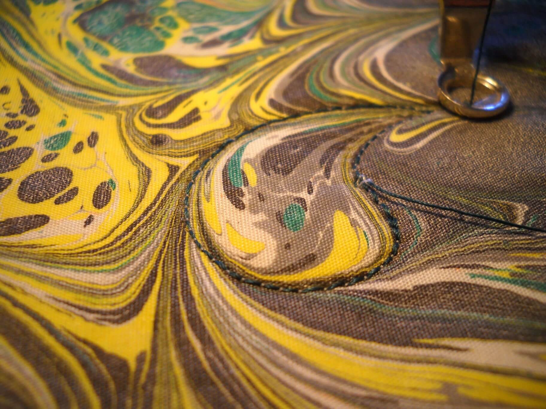
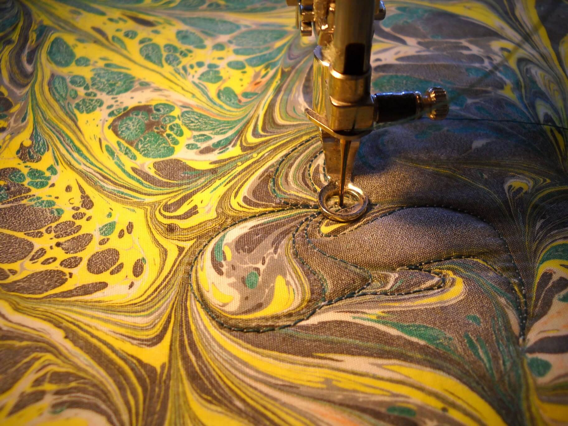
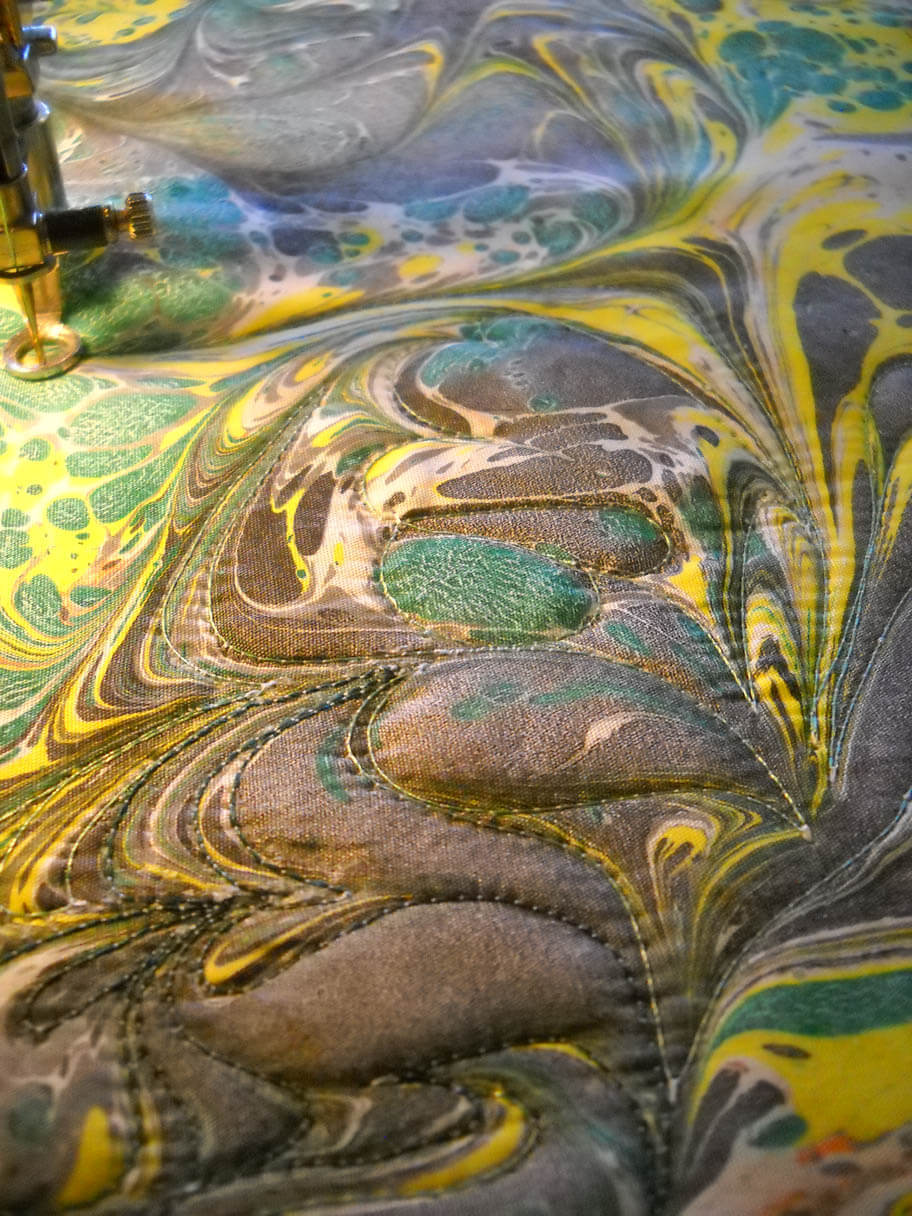
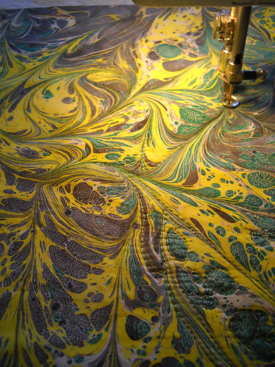
Now I have some photos of quilting the marbled fabric in the center of each of the stars. I really want them to pop out.
I’ve just started quilting the center of the star.
I’ve got the centers of the stars done now, and I am doing micro-stippling in all the green. Going pretty fast, which bodes well for getting the tutorial completed! Hopefully more time tomorrow….
TAFA Tour – Up Close and Personal with Handmade Paper Paintings
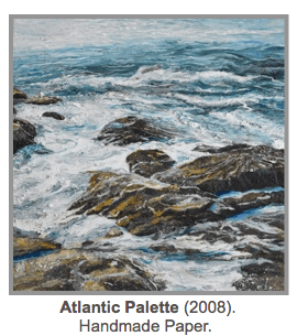
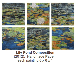
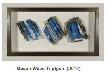
 What a find on the Textile and Fiber Art List! Meg Black, from Massachusetts, creates paintings from paper. One page on her blog describes this painstaking process, and it is absolutely fascinating. You would think these pieces had been painted from scratch! Her bio indicates she is “one of a handful of painters working in this exciting medium, something of a pioneer, internationally recognized by galleries and collectors. Her focus on nature and the environment yields stunning landscapes, seascapes, New England scenes and garden views.” Just take a look at a couple of her pieces:
This one is so realistic and reminds me of the Atlantic near the New Hampshire shoreline. Now I love lily pads, and I love collections, so this next is absolutely perfect for me:
Meg also does abstracts, and the colors are intriguing.
You also can view a tour of Meg’s studio:
Now the rest of her profile is available for you to peruse. Some amazing eye candy from Meg Black!
Using Marbled Fabrics in Quilts
When we started marbling, we were hooked from the very first piece. The problem was…what do we do with the fabric? Each piece was so gorgeous it was hard to cut into it. We knew we had to get over that mindset. Folks consistently asked, “What do you do with the fabric? I don’t know how to use it.” Confession time – I wasn’t quite sure either. I saw a book and thought marbled fabric would look cool. Now it was “put up or shut up.”
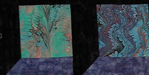
I was a beginning quilter with virtually no good color sense…that was hubby’s field. I figured black goes with everything, so my first quilt was an attic window pattern.
This was a nice way to show off smaller pieces of marbling, but I had to stretch further. It took a number of years before I stopped being afraid of any color except black. I started a Block of the Month, using blocks from Judy Martin. I became more daring…this time it was not black…..but other solids. I built the designs on the colors in the marbling. My January block had a definite “coolness,” so I looked for solids with some texture that would work. I started to expand design ideas and felt that traditional blocks could be the key to using these fabrics.
Now another confession…..when I first started doing quilting, I was pretty much “stitch in the ditch”….with metallic threads, no less. The quilt above is 12 years old, and I took it apart (oy) and used my newly acquired FMQ skills. I didn’t stitch the marbled blocks, as I wanted them to stand out.
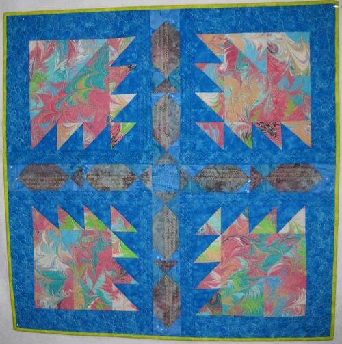
The completed quilt – marbled fabrics within traditional blocks. You can read more about the actual quilting here.
I was hooked on finding some great traditional blocks that could spotlight marbling and go together harmoniousl. Summer……..I had some great neon orange cotton, a nice piece of Moda Marbles, but I needed additional fabrics so the quilt wasn’t overloaded with green. I stretched with the print fabrics I added to complement the marbled fabrics.
There’s lots of machine quilting throughout, but the marbling has been left on its own. (I also took this quilt apart…. kind of obsessive. But as quilters, we KNOW what we want. More about the quilting here).
At this point, I had a great piece of marbled fabric that said “I want to be fish.” I found a traditional block that could be used as fish. Thus the “fish quilt” was born (you can read about that quilting here). This time I quilted the marbled fabric by following the lines of the pattern and used stitches from my workhorse Bernina.
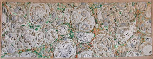
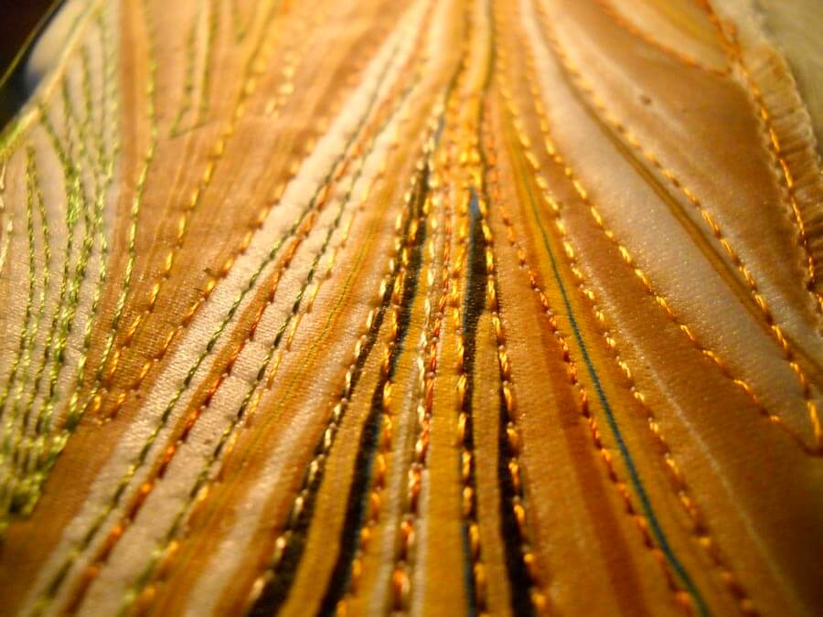
I started getting very bold – it never occurred to me to just quilt the marbled fabric itself. This was a major breakthrough. Traditional is fine, and I still work with traditional patterns, but quilting the marbled pattern gives a completely different look to a quilt. This quilt, “Nature 1: Rock Garden,” became my first quilt accepted into a juried show, “Expressions in Textiles.” It is very zen-like, and the quilting emphasizes the rock garden and sand.
Go traditional or go contemporary. Don’t be afraid of the marbled fabrics. They can be the spark that makes your quilt.
TAFA Eye Candy – Part 5
 I have so enjoyed doing these posts each week. I get so inspired by color and design from the over 450 artists on the TAFA list…..and I’ve only been through 20 artists! And now, Rachel, our list mom and guiding light, has taken photos from us and set up a TAFA gift store on Zazzle. Gorgeous stuff!! More items going up all the time.
And now some more artists…..
 “The mission of Zeni Design Studios is to create simple designs using luxurious and sometimes unexpected combinations of textiles that my customer will enjoy for many years to come. As a result, all of my designs have the customer in mind throughout the design and fabrication process. Environmental Commitment – In an ongoing desire to respect the environment, when available, organic, up-cycled, environmentally friendly and socially responsible materials are used. ” Zeni Design Studios
 “The Yeiser Art Center, founded 1957, is a non-profit visual arts gallery located in the historic Market House in downtown Paducah, Kentucky. Exhibitions and events organized by the Yeiser are designed to serve citizens of and visitors to our region and feature quality works by established and emerging artists. Our permanent collection, exhibited periodically, is at the core of our educational mission to provide a variety of visual arts experiences to students of all ages.” Yeiser Art Center This is a must-visit for our trip east next summer!
 “I’ve been tatting over 30 years, and designing and selling tatted jewelry since 2004. Magazine articles featuring my tatted jewelry have appeared in Bead&Button (April 2012) and Belle Armoire Jewelry (Winter 2009). I am the author of the book Tatted Jewelry published 2011 by Annie’s Attic, as well as 2 self-published books: Up and Tat ‘Em (2010) and Boutique Tatting (2008). I teach an online Shuttle Tatting course at http://www.craftsy.com/shuttletatting and hope to help many people learn to tat. ” Yarn Player
 “Inese Liepina graduated from the School of the Art Institute of Chicago with a Bachelor of Fine Arts degree in 1980. Inese relished her years at SAIC and attempted to learn techniques in as many disciplines as possible. Majors were in fiber/fabrics and ceramic sculpture. Inese has explored glass blowing since 1991 while working as a fashion, textile, and interior designer. In the late 70’s SAIC emphasized originality along with an mentality of “breaking the rules” in art. This influence follows Inese in all her work, and she studied glassblowing technique only to learn how the rules can be broken to fit her ideas. ” Wrapture by Inese
 “Like so many others, I was brave and comfortable with my creativity when I was younger, but misplaced that understanding as I became an adult. A diagnosis of cancer re-ignited my passion through a wonderful program called Art as Medicine, offered by the Cross Cancer Institute to patients, health care professionals, and their supporting friends and family. I once was a professional musician, and have re-discovered my love of singing through the vocal music program, but also my love of creating things with my hands. I am very involved now in building a cancer wellness and support facility called Wellspring Edmonton that will supplement our overburdened cancer care system, and where I hope to help others touched by cancer to express their feelings through arts-based programs. ” Wooly Boulevard
Enjoy! More next week……
Monday Marketing
 A definitely busy week! I’ve been list-making for four weeks now, trying to keep track of everything that HAS to be done, NEEDS to be done, and WANTS to get done! I finally had to admit that I can’t take the Craftsy class with Cindy Needham I want until after the first of the year, because there are too many things going on that need to be finished up by the beginning of December.
Etsy has been selling well, and we need to get a LOT more fat quarters done and in the shop. The website should undergo some major revisions this week, and I’ll finish all the little cosmetic things I still need to do….pictures, descriptions, order form…..I get REALLY picky when it comes to having every possible loose end covered. EBay has also finally picked up, after a nonexistent summer. And we need more remnants for that site.
Craft Gossip ran our tutorial, and the number of newsletter subscriptions jumped. The newsletter will be going out on Sunday this month – trying a new delivery date to see if the “open ratio” is better. We have a guest post with C&T Publishing on Friday, full of pictures using marbled fabrics in quilts, both contemporary and traditional. Still have a few things to finish up on that post. We had an inquiry from a major magazine about fabric, so we worked on samples over the weekend and will get them in the mail tomorrow, along with notes about the fabrics.
Finally got a thread order done, and I should have a bunch of new threads for a couple of new projects by Friday. I need to put the binding on my bed stand runner, as the quilting is done for this month’s free motion challenge. I need to do another blog post for Handmadeology, this time on the importance of having product available whenever you do a demo. Might seem like basic knowledge, but we did a lot of years of demos without bringing anything to sell!
Quilting Marbled Fabric – A Tutorial
Ever since we started marbling in 1993, people have asked us “What do you do with the fabric? It’s too gorgeous to cut in to.”
We’ve made lots of quilts, both traditional and art-quilts so that folks can see how marbled fabric can fit into a quilt or wearable garment. That got us started, but there was always the feeling that we could be doing more with the fabric itself. A friend took a fat quarter to “play with,” and the following week she came back with a gorgeous piece of completely quilted marbled fabric….simply by following the line of the pattern.
Well, that was truly the beginning of taking marbled fabric and really working with it in a quilt. My first attempt was to work with a freeform pattern, just following the lines of the pattern. This uses the stone pattern, as well as a beginning chevron pattern, both of which are easy to follow.
This piece, “Gaia 1: Interdependence,” used a free motion foot, as well as a regular basic stitching foot. Because the strips are relatively narrow, and the batting was thin, I chose not to use a walking foot. Your mileage may vary; if you are comfortable with a walking foot, by all means use one. I find I almost exclusively use my regular foot and my free motion foot.
Here is an example of quilting a line using a regular foot. I like having the even stitches, which I don’t always get with my free motion quilting (and no stitch regulator….).
You can have a great piece of marbled fabric, but sometimes it just needs something. I’m finding that more and more…it is an addiction…..
Getting Started
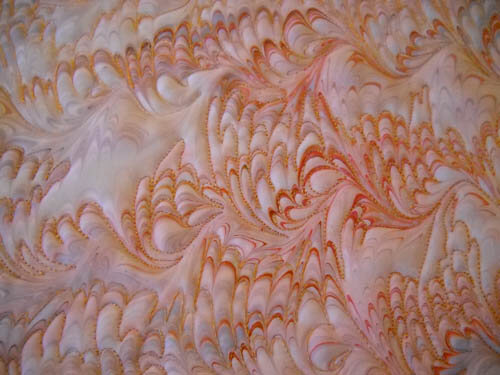
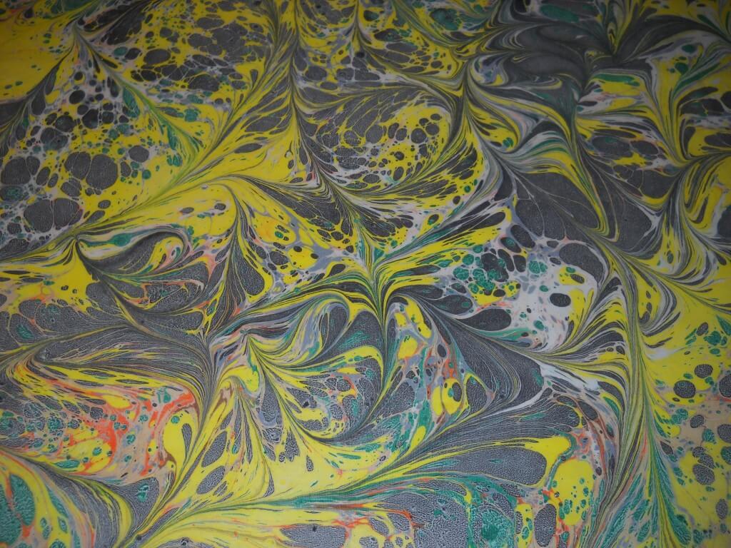
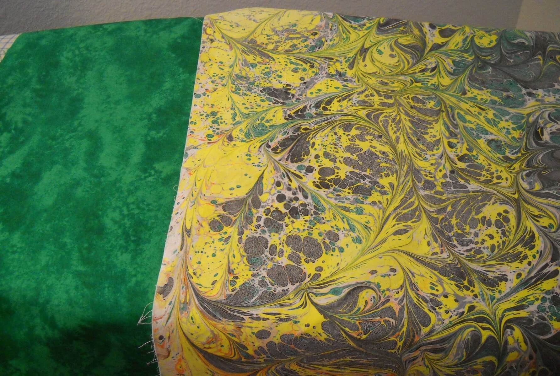
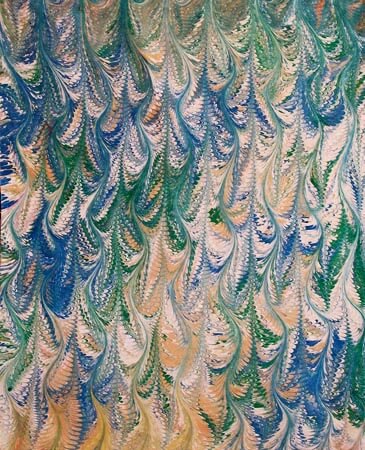
You need a piece of marbled fabric. We’re starting with a freeform pattern, made by creating the stones by dropping paint on the carrageenan bath. Then using a stylus, we swirl the paint around the whole piece. This gives us the effect you see here. This also involves the first very basic marbling pattern, the very organic-looking stone. From this pattern, using a variety of different combs and rakes, you can get very complex patterns. But let’s start with this pretty basic pattern.
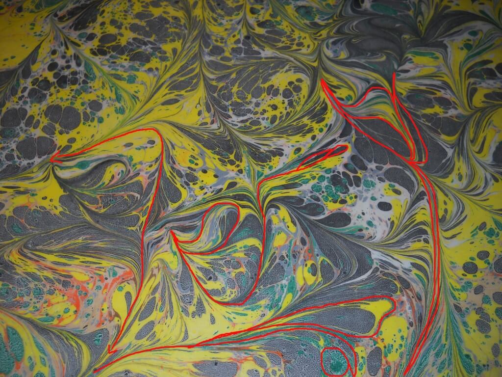
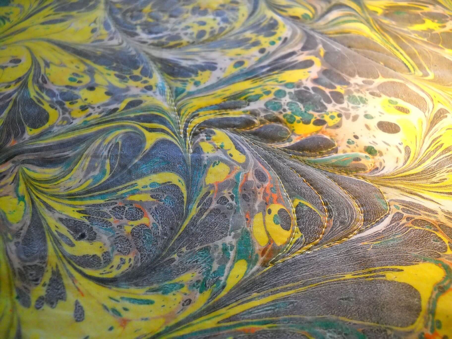
When you have a marbled pattern, look at it closely for lines that lead to other sections of the pattern. This is a different type of free motion quilting. You aren’t deciding the whole quilting schema, like in most regular quilting; you are just analyzing and deciding where you want to go with your thread. A pattern like this one has gentle curves to it, unlike more complex marbling patterns. This is a good one to start with.
Using this next picture, see how you can travel from one end of the pattern to another. Once you’ve studied a pattern, you can decide if you will do individual sections or travel across some pattern lines to do a new section. With this first marbled pattern, you have several possibilities. You can outline the little stones. You can follow most of the curved lines. You can do a combination.
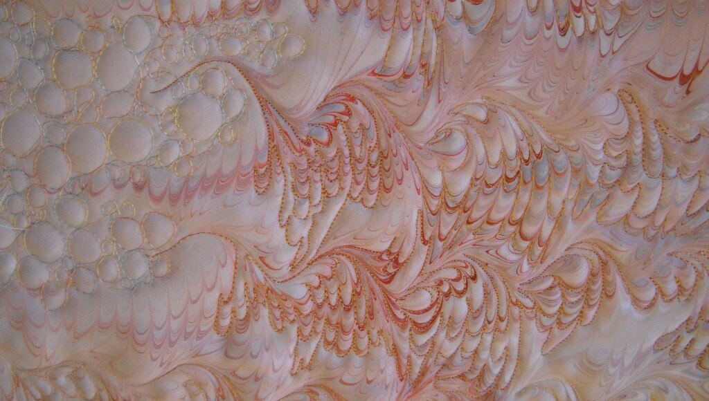
Some marbled patterns are pretty intense, and you end up doing a lot of quilting in very small areas. These take more control, but the results are fabulous.
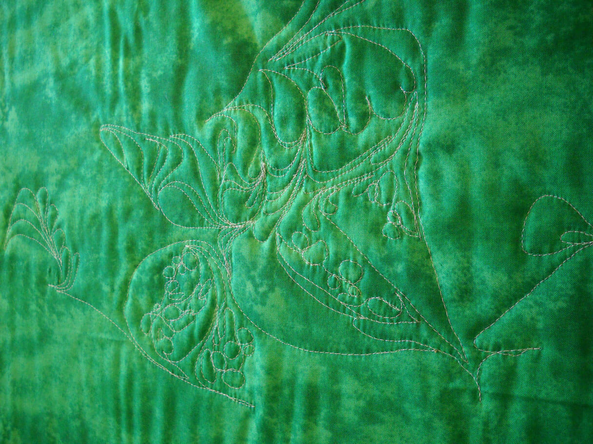
You have some decisions to make at this point: backing, batting, thread choices. I chose a green cotton for the backing so it would play off the green in the marbling. I used a left-over piece of Fairfield cotton low-loft batting, and Superior Thread’s Bottom Line in the bobbin. I chose a white thread, because for the purposes of this tutorial I wanted you to see the design aspect on the back. You get some very interesting quilting effects on your backs.
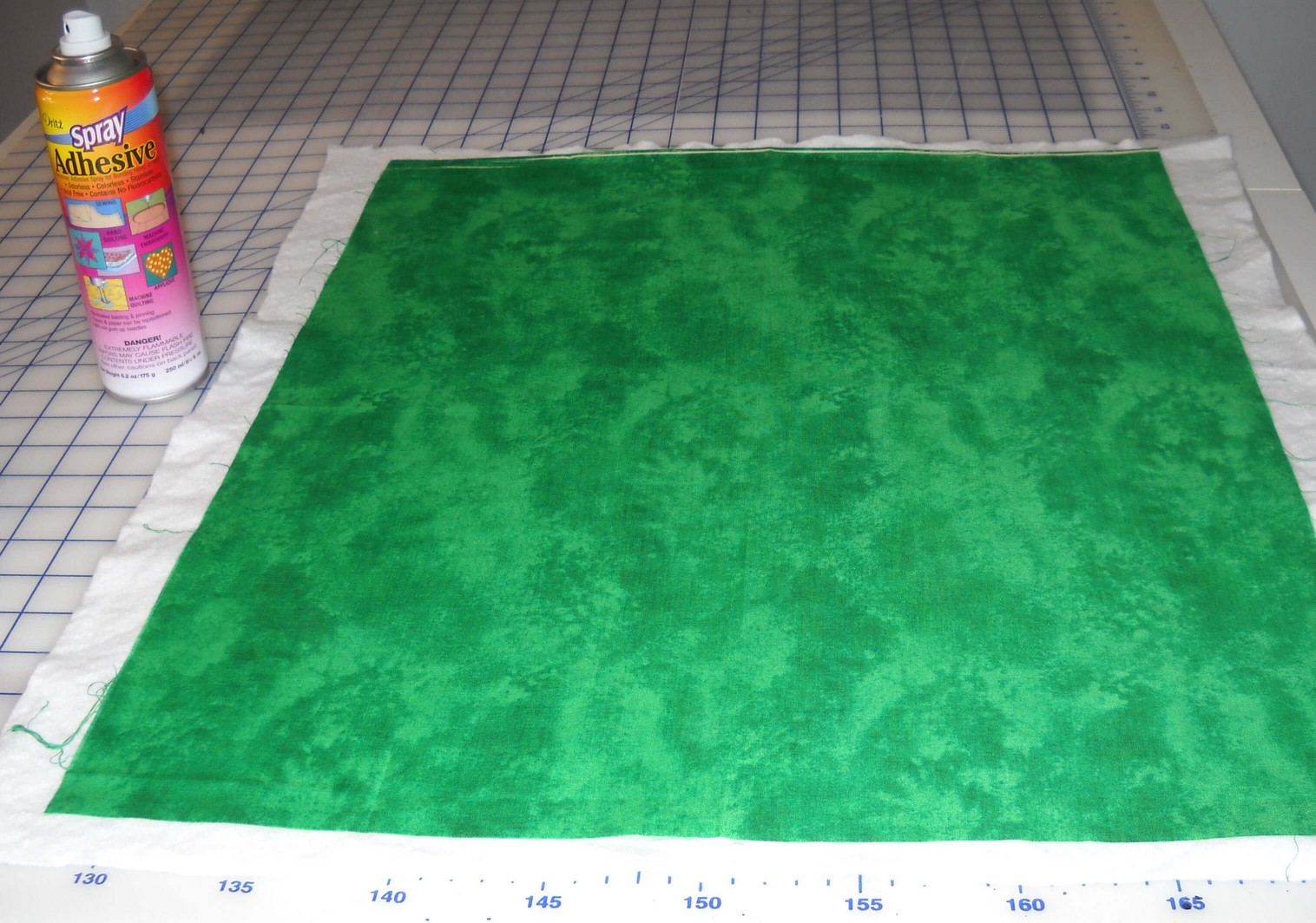
When I put my pieces together, especially if they are small, I spray baste top and bottom to the batting. For larger pieces I also use safety pins.
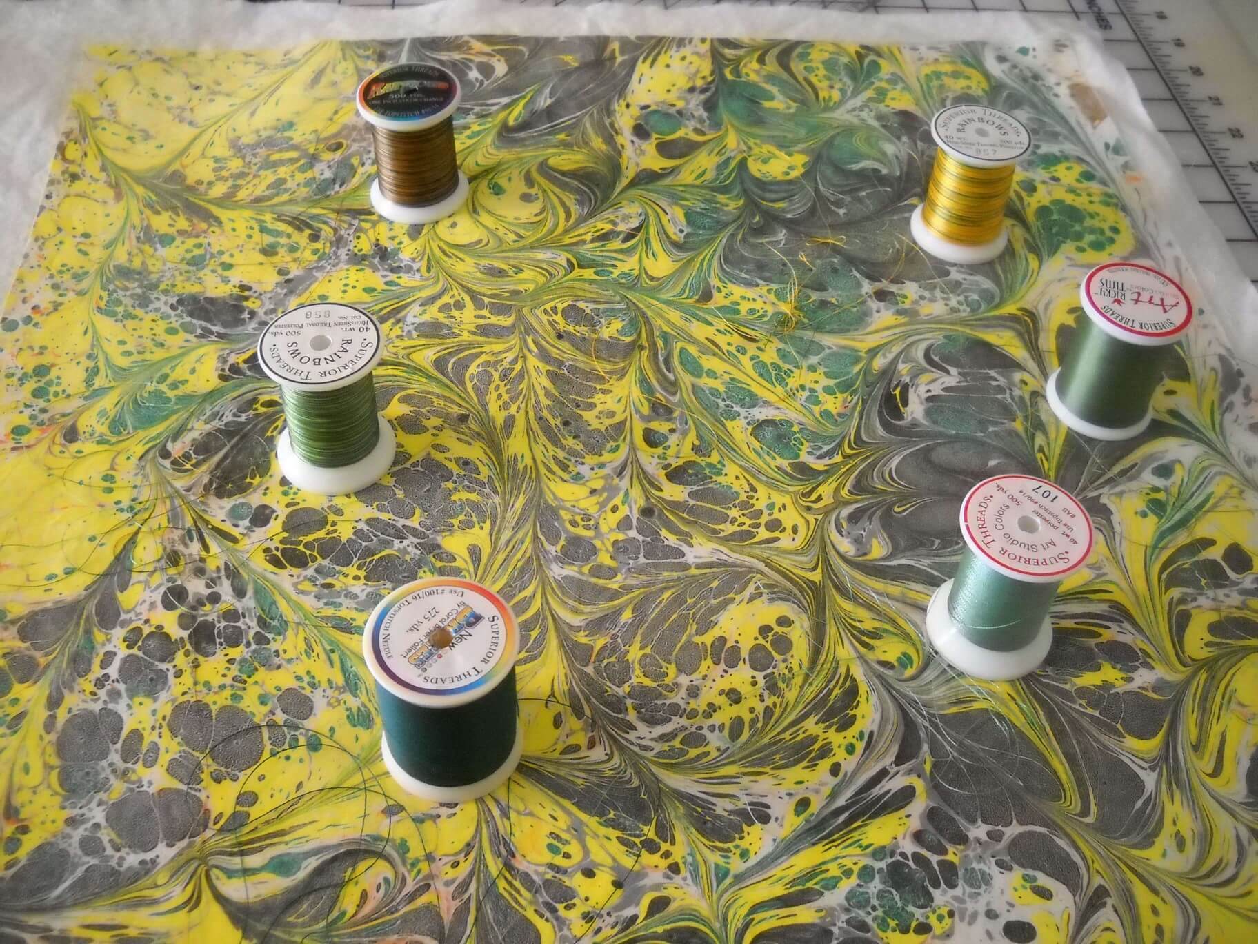
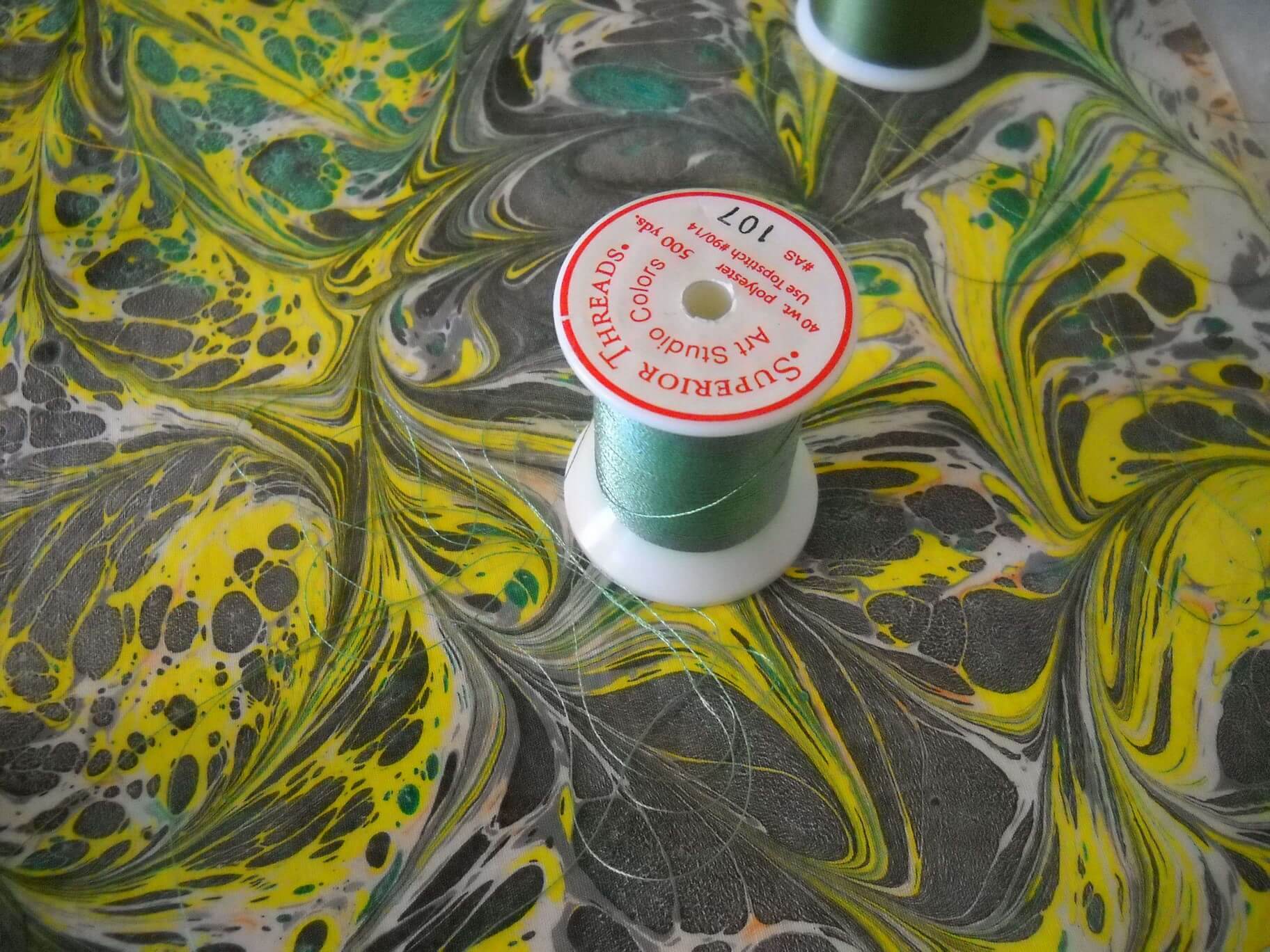
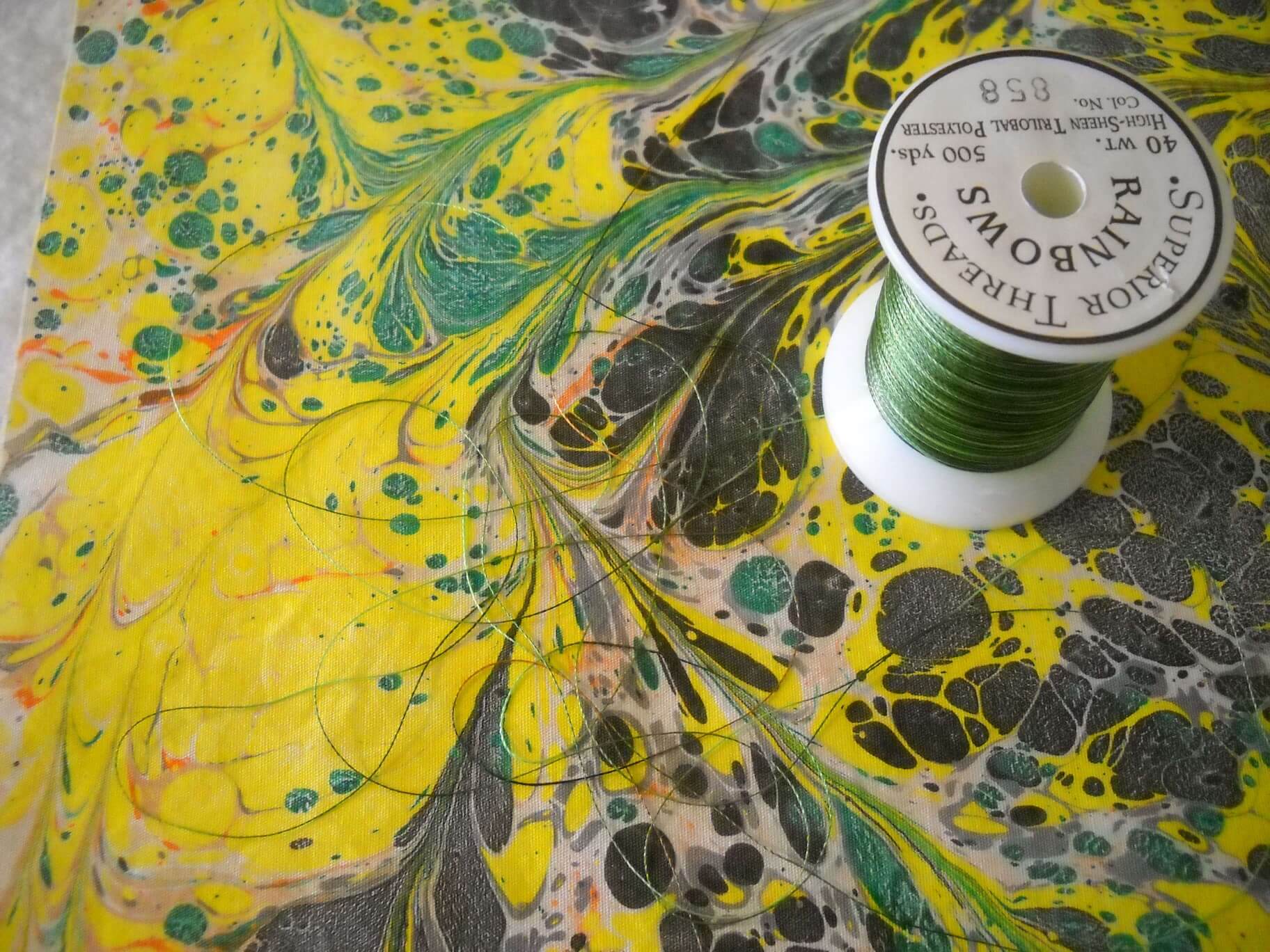
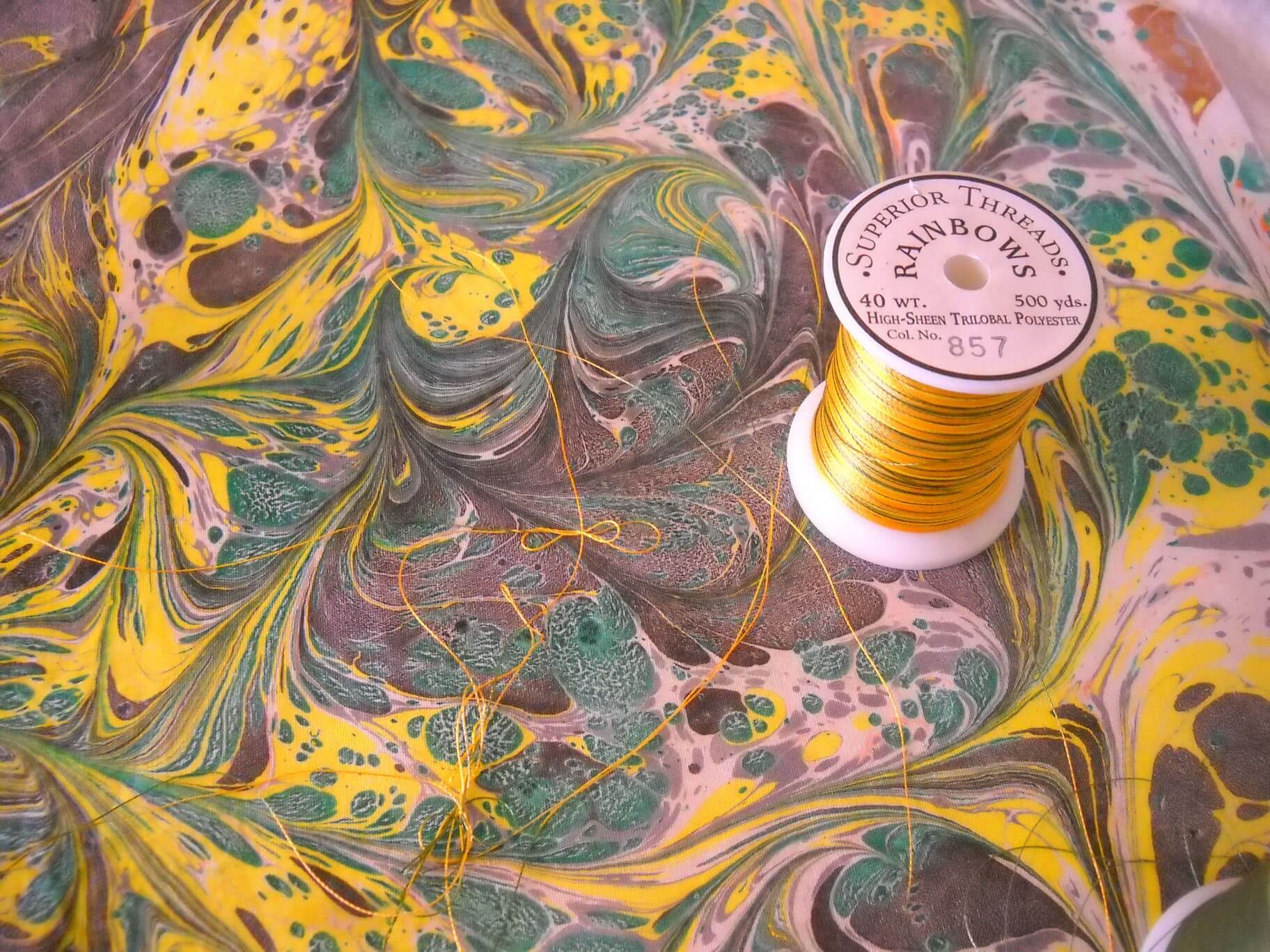
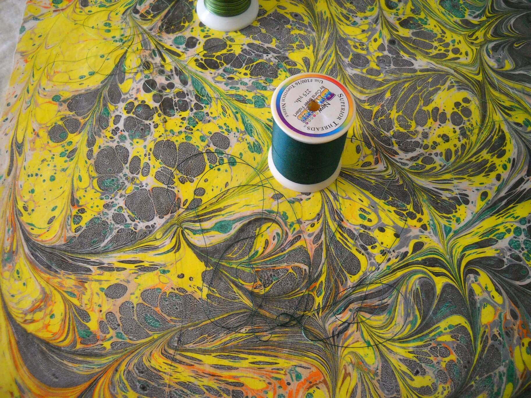
All of these are various threads from Superior. I am a bit of a thread snob, as I only use Superior Thread and needles (their titanium needles are pretty amazing). Ever since I did the School of Threadology in St. George, Utah, I have been hooked on their threads…and I NEVER have thread break. The threads above are Rainbows, Brytes, and Art Colors.
I thought this bottom thread, Bryte, would work the best, so that’s what I started with. I thought the dark green would emphasize, but not be obvious.
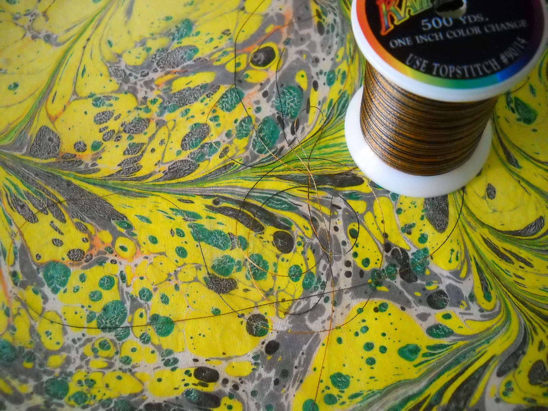
I checked my tension, according to Dr. Bob’s thread guide for Superior Threads. Then I picked a place to start the free motion, did about an inch, and checked my tension again.
You can see how I just followed the basic line of this first swirl. I usually pull my threads to the back and tie them off or bury them, depending on how the piece is going to be used. With the next photo, you can see how I chose another swirl and followed that particular curve.
You can move around the fabric and pick different areas to quilt, but if you are going to quilt the whole piece, continue quilting out from the area where you started.
I also decided to change colors of thread, as I wanted something lighter to accent the pattern. Don’t hesitate to do this if you feel it will add to your design.
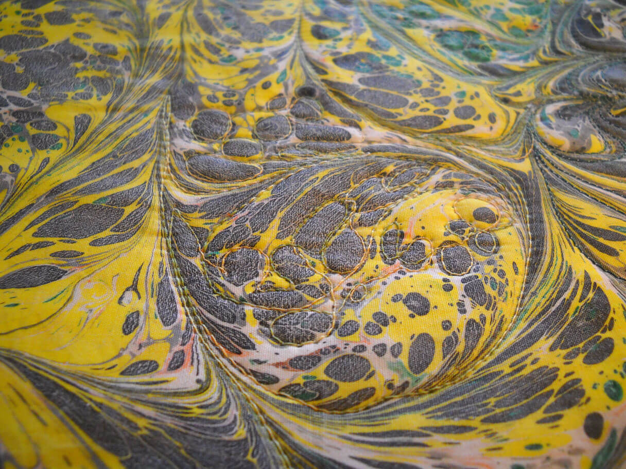
In this next example, I have changed thread color again, and this time I am outlining the smaller circles. The circles are part of the “stone” pattern, which is the first layer of paint in developing a marbling pattern. The circles take more control in your free motion, but you get great results in texture. You will want to plan your “traveling” stitch as you move from small circle to small circle.
Every now and then take a look at your back. Check for tension, secure your knots, and just admire the developing design. I used white in my bobbin because I wanted you to see the actual stitching on the back. You may choose something else, but the backs of marbled quilting can look spectacular.
Hopefully you will enjoy this technique. Email us with questions, and we are always interested in seeing your finished projects. To get you started, you can order fat quarters in this swirl pattern at a discount from us. Just email deanm@marbledfab.com, and tell us you want the quilting special fat quarter for this tutorial, and give us an idea of the three or four colors you would like. Cost is $6.00 per fat quarter, plus $2.00 shipping and handling, up to three fat quarters.
Keep in mind that this marbled quilting works best if you have some definite contrast with your color choices.
Copyright 2012 by Linda Moran and Marble-T Design, LLC. You may NOT reproduce this handout/post in any format without express permission from the author or Marble-T Design, LLC.
Top Ten Tuesday
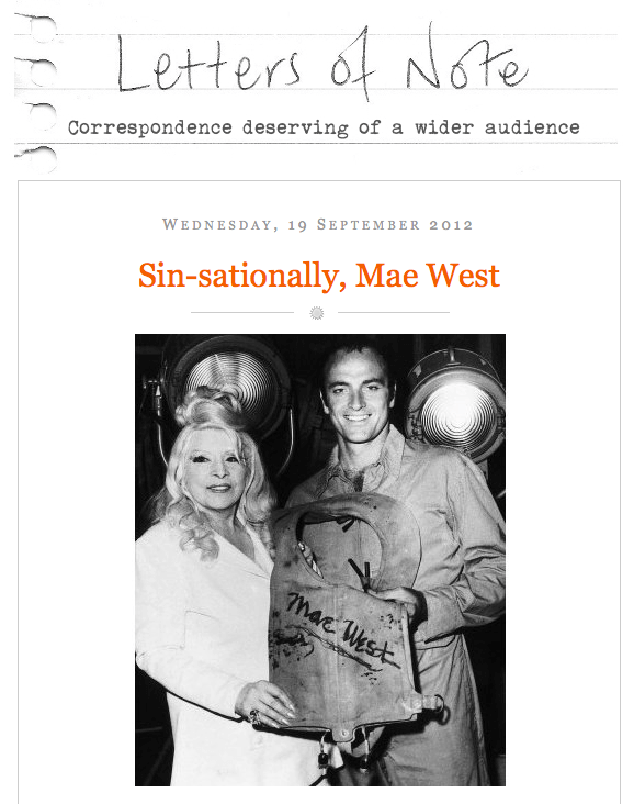
Back again! I do love reading Letters of Note, and this is a gem from Mae West to the RAF, during WWII.
From the TED Blog comes this interesting explanation of how we get plugged in to the internet worldwide. Pictures show what it means to lay cable across oceans.
This next bothers me tremendously. From Scheiss Weekly, Mamacita talks about education in words and thoughts that I really love. Here’s her take on textbook publishers who have sanitized Anne Frank: The Diary of a Young Girl. Did you know that Prentice-Hall got actual permission from Anne herself to change her diary entries?
These are some amazing nature photos! Not all have attributions, but I love what the author of the page says – nothing better than nature porn….
I am finding some amazing nature shots and video through StumbleUpon. This one is A.MA.ZING. The Aurora…. I’m just including the link because it automatically plays the sound….
Here’s a great time-waster – and lots of design possibilities. First design when you go to the page….
Weave Silk – an integrative, magical silk artwork. Another time waster that is absolutely fascinating.
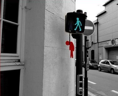
From Designer Daily comes “20 Awesome Examples of Street Art.”
From Alternative Reel – a great list of Top Ten categories for movies…..interesting browsing! Just a few of the categories…..
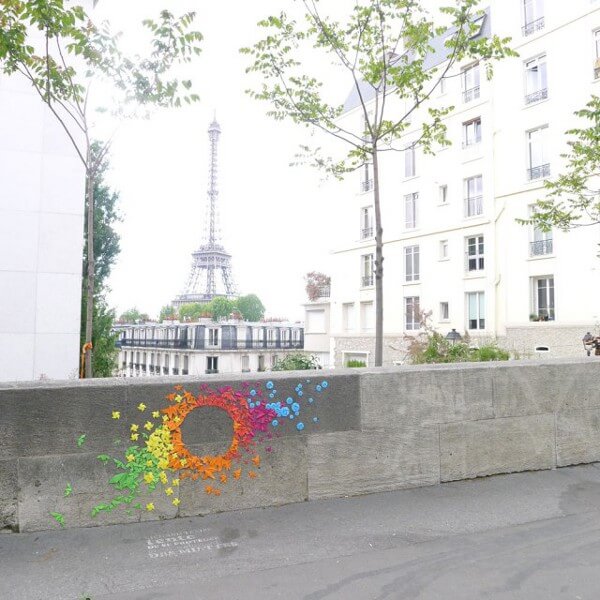
And finally...Rainbow Origami Street Art. Just cool.
I have just discovered the joys of StumbleUpon….check it out and sign up. Lots of amazing stuff! Till next week – send me links to really cool stuff on line!
Second Design Photo Analysis
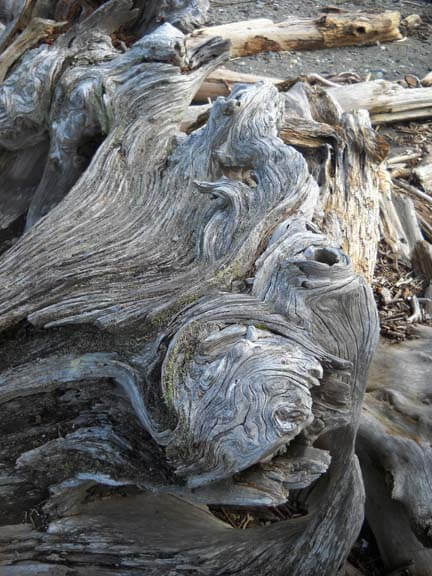
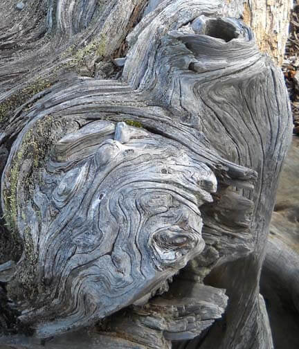
I worked with another photo last night, and I didn’t have nearly the success with adjustments and filters as I did with the first photo. Now I need to think through why that is so. Here’s the new photo – driftwood from Vashon Island in Puget Sound.
Well, crap….seems like I did it again in saving…or not saving. I need to remember to save everything as a psd file first to preserve the layers, and then save each piece individually. Okay, bottom line, nothing really spoke to me with the different adjustments, so I need to think through why that is so.
Is it because this is a fairly abstract image to begin with, mostly line and color? Perhaps that is why I am so fascinated with tree bark to begin with. The lines, shadows, differing colors to create the texture. And this picture, knowing it is driftwood, also reeks of a hidden history after being tossed in the water and then left high and dry. But how would I create some of that mystery?
What initially prompted me to take a picture of this? Probably all the smooth curved lines and the knot.
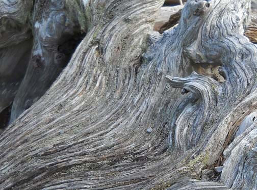
Looks like all kinds of interesting lichen within all those folds. The colors are so subtle, but at the same time I see a nice interplay of line and shadow.
I look at that knot and see a captured sea spirit. The more I look at this one, the more I am intrigued by it. The curves are so soft amidst all that hardness.
Now that I look at a couple of additional questions, I am stumped. Main idea? I like the thought of a captured sea spirit. Areas worth keeping? I can see leaving out everything else from these two crops. Other elements to add? No clue. But as I ponder, the first thought that comes to mind is to carry the lichen out into a border, and maybe the overall piece doesn’t need to be square or rectangular, maybe more oval so that the spirit seems encased and surrounded but is really still there. Don’t know if that is making sense….
How and where can more pizazz be added? Again, no clue. But…perhaps a lot of thread painting would be needed for surface texture.
I can see this going to sketches as the next step and seeing what develops from there. Comments?
Trying to Learn Something About Value…..
…that could also read “something OF value,” but I want to focus in on the issue of value and color in design….something I know I am really weak on. I’m choosing a couple of pics that I really like for design composition and playing around with Photoshop filters to see what they tell me about the composition. This is different from how I usually approach working with Photoshop….play around until I get something that says Wow. This time I’m looking at the elements of the picture and trying to see how they change and why I like – or don’t like – the design.
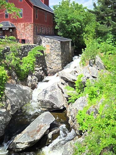
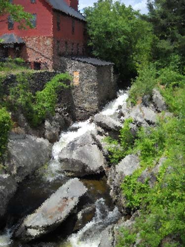
Here’s my first photo, taken in Jericho, Vermont two summers ago, at the Old Mill, which houses much of the history of hubby’s family.
I love everything about this picture: the greens, the mill red, the flowing water, the fact that I’ve got it composed in thirds. And you can’t see that right behind me is very busy Route 15. So what did I learn from this exercise?
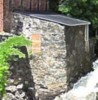
Primarily I am much more aware of the basic lines in the composition. The lines don’t change, but the focal point does, depending on the filter or effect I used. There is one example that I would consider making up in cloth, as I find it intriguing, and I’ve never tried anything like that. The others are just interesting to analyze. Here goes:
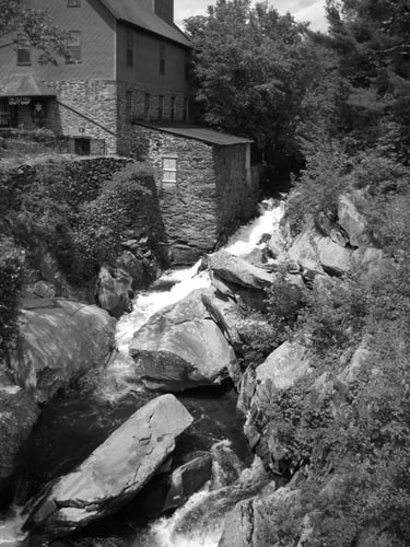
I love black and white. After three weeks in Seattle this spring, I developed a whole new appreciation for shades of gray (no, not the book……). I want to take this photo and play around with a few sections of rock to see what I might be able to sketch.
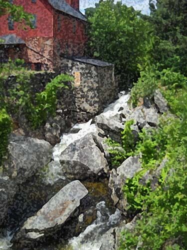
This is the “sponge” filter, and it’s one I really like. Shadows and subtle colors really come out in this filter. Once again I am amazed at all the shades of green there are. There’s more shading in the mill, as opposed to the original, but the movement of the water is lost.
This is the “find edges” filter. Interesting to see where basic pieces of fabric would be. I think I can also see the dark, medium, and light of the photo.
Accented edges filter. More of a pattern to follow if I wanted to recreate this. I did a small cropping that I could see in a 12 x 12 piece. I’m liking the shadows.
This is the “patchwork” filter, and I could see making this up as a larger wall quilt. The filter allows you to make the squares larger or smaller, but I am really curious to see how this would work up in piecing. I need to print this out larger and use my little red rectangle and look at the values closer.
Well, I have managed to lose my original with all the filters listed on it, so c***. What I like about this above photo is the additional shading that is present in the rocks, and in the red portion of the mill. Lots more texture, and I could see using some colored pencils to enhance the fabric pieces.
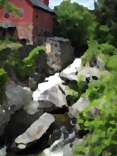
I believe this is a watercolor filter, and I like it. I can see looking for specific fabrics for this piece, rather than trying to do lots of little pieces togather. I could see just cutting pattern pieces and fusing them into place. I like the softness.
Palette knife, I think. I like the general clumps of color, and as I reflect on this, I could see making this into a small abstract. The image is still recognizable, and I like how you can see an actual pattern to follow in putting this together.
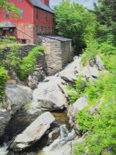
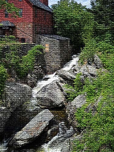
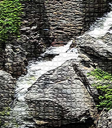
This is mosaic tiles, and I like the effect better than the patchwork photo above. I’d have to spend some time thinking about how to get the “grout” effect…..maybe a mottled gray color with texture in it as the background piece, and then the tiles cult at somewhat irregular edges so the grout shows through. I cropped a piece to see….
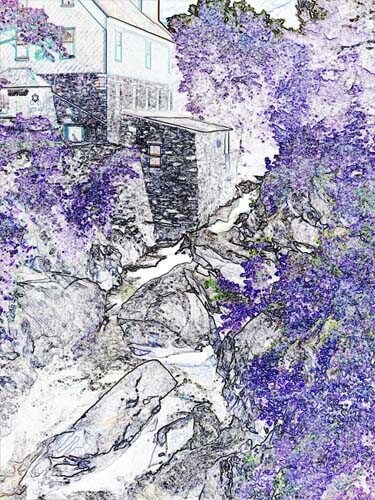
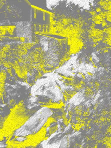
This is an inversion adjustment, and I like these because I always see something different when the colors are completely different. The yellow accents the shape of the edge of the mill in a way you don’t notice in the original photo. The rushing water doesn’t show up at all.
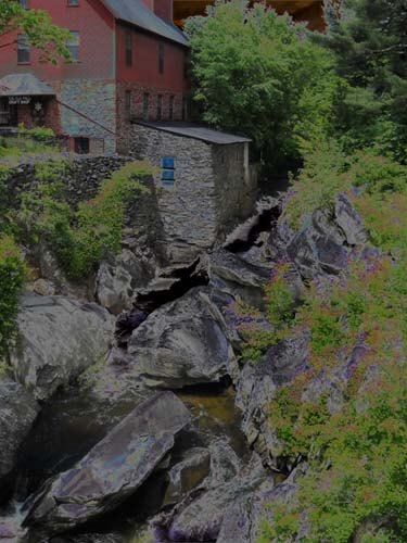
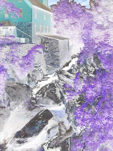
Forgot the adjustment, but the amount of purple really accents the amount of green in the original photo. And I like the way the shapes of the rocks are accented.
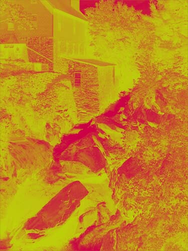
This is a red/yellow gradient, and I like playing around with gradients. Very other-worldly, but I don’t see taking this piece any further.
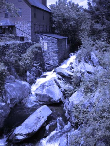
I saw some quilts a while back that were based on Joen Wolfrom’s color tool. People chose a color and then worked solely in the range of that color. Results were pretty dramatic. This is a color filter in a deep blue. I think I would print this out and take it fabric shopping and see just how well I could pick out various blues and other shades that have a blue cast to them.
That’s my first study, and I definitely need to do more of these. I feel like I have a better understanding of the composition of the original picture. Next up, my wrought iron photo….
Crazy? Maybe Yes, Maybe No……
Crossroads.
Had dinner last night with a really good friend to discover she had a rough week, nearly turned upside-down. And her former boss has medical problems (like being the 179th case of an artery problem since 1745). All of a sudden my depression didn’t seem that all important. And I left dinner feeling hugely better and came home to hit the machine for an hour, making good progress on a new small piece.
This was the culmination of about a week of wondering if my art quilt had made it into a fairly prestigious show. Antsy for the whole week, as I knew all the decisions had been made, and I was wondering why we hadn’t heard anything. I was trying to stay positive, as I believe if we send negative thoughts out into the universe, we will be repaid with negativity. Hard to do when I already was 0 for 2 in submitting work this year. I kept thinking “third time’s the charm.”
At 4 PM I had the email. Not good news. Very nice rejection letter – I’ve had loads of those over the years, especially in writing. The very first fiber show I entered I was accepted in, and I think had I been able to keep up creating work without having to worry about a teaching load, I would be in better shape as an artist, with many more shows on the resume. But that was not to be. I looked at the accepted list, and it seemed like it wasn’t the same-ole same-ole list of people who always make it into shows. That was encouraging, at least. Out of 128 entries, 20 were accepted.
Once I heard that, instead of feeling better, I think I got a little angry. Had I known that so few pieces were going to be accepted, I really don’t think I would have entered and saved the 40 bucks. The odds are definitely against you with those numbers.
The thing is, I do think this piece is exceptional. It’s unlike anything I’ve done so far, and it certainly met the theme – I felt it did. Your reaction to the stigma of mental illness. Have suffered from depression and needing drugs to help me through the last years of teaching, I know how the brain can react in stress situations. It’s nothing we can see, but it’s there. So I chose to look at mental illness from a single brain cell that is misfiring. I thought in the overall collection of pieces this would be one very organic “don’t forget the brain’s role in all this” statement.
And let’s face it, no one is working with marbled fabrics like I am. I think I was able to show with this piece that you can a textile that isn’t often used and manipulate it into a statement. It seems like “different” is what art quilt shows are looking for, and this piece was quilted to emphasize the message, not quilted just for the sake of showing off quilting skills (which is what one quilt show seemed like that I attended – and this January show wasn’t an “art quilt” show).
So now it’s a case of really thinking through what I want to focus on for the next couple of years, while I still have the vision (literally) to create pieces. While working toward a specific show and deadline works for me, especially when I have to really think through the creation of a piece from idea to finished product, maybe it isn’t where I need to be. Bottom line, I want our business to make some money. That means more online product and outlets. Smaller quilt pieces are selling in my Etsy store, so I need to create more of those (and three are right now in the works). And I want to continue to learn and take classes, which isn’t possible when I’m trying to meet a lot of deadlines. I want my work in galleries, and I want to be able to travel and do some teaching of marbling. I need to take the time and think through new possibilities.
Which means that karma and the universe may be showing me why the piece was rejected (and maybe not……).
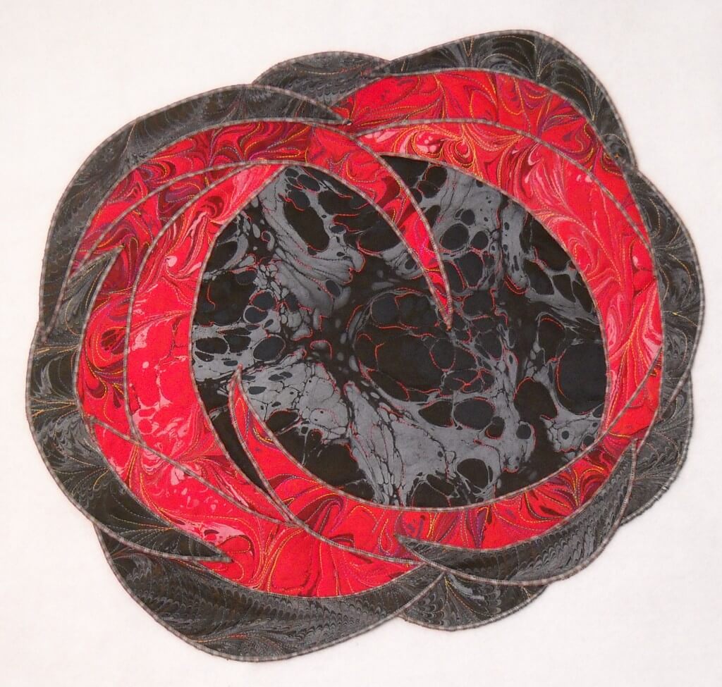
Without further ado, here’s the quilt in its online debut. “Misfiring Synapses,” 17 x 21 inches, unpolished red satin, black satin, Superior Threads, batting, cotton backing.
PS – may just have lined up my first gallery……
Work in Progress Wednesday – Learning Lots!!
 Well, this has been a week of learning experiences, including running the machine needle through the tip of my finger. I’m somewhat frazzled deciding on a project, since I don’t have any looming deadlines. I do, however, have a list of projects that need doing, so I picked one from that list and then added another.
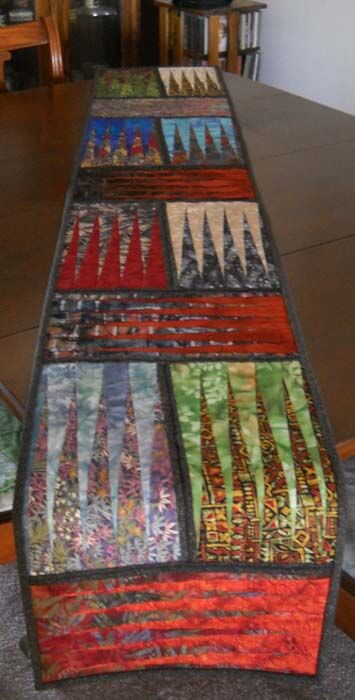
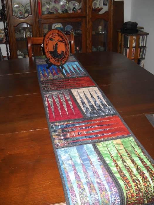
First, from the UFO list. Several years ago (going on three?) I took a class with a friend on a Judy Niemeyer pattern, Stepping Stones. You can see the pattern here. Originally it was going to be a king-sized bed quilt, but I was still teaching, so that got put on hold. When I reorganized the studio (twice), the blocks made it into the UFO pile, and when I made my list in May of projects, I listed these. But….I listed them as a potential table runner, figuring that way they would be done, and I could actually use the table runner, as we have a new dining room set (new to us – we’re babysitting it for a friend). I would also have enough for 6 placemats, too.
Well, there were loads of problems. Could I find the black fabric I was using for connector strips (three searches)? Could I do all the matching, since it had been about 3 years? How would I quilt it? What would I use for backing? I got the four completed blocks into one runner, and then I spent the next three hours taking out all the paper….note to self: you still need to vacuum. The blue I thought to use for backing was a stretchy polyester that wasn’t long enough, so plan B was leftover dark blue from another quilt back. Then I had to buy batting.
Finally everything is together and ready for quilting…..and I had no idea what to do for the quilting. Didn’t seem like feathers would work. Didn’t want to do a stitch-in-the-ditch. Tried some outlining, but I didn’t like it. Then I thought about the overall loopy pattern from the May challenge, but ended up picking all that out. I realized I would need to go with monopoly thread, so the stitching wasn’t obvious. And I was playing around with tension, including two more ripping sessions.
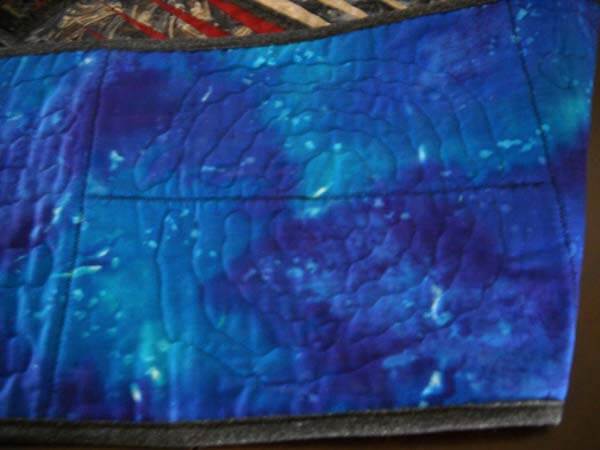
I tried doing some partial circles on each block, so it would look like rippled water. And then I discovered the settings on my machine were set for the decorative stitch I used in the black borders. Seems like I still had the setting on one of the decorative stitches, and I was trying to free motion and there was a lot of drag. I also discovered that I could use a variation of a zigzag stitch and still have the feed dogs up. Turns out I liked the ripple effect, and that’s what I went with for the rest of the runner. Here’s a pic:
Here’s the finished table runner, which is absolutely perfect on the table. It will work with any of the leaves when we put them in.
Then I was feeling somewhat at loose ends. I had been watching The Quilt Show and following the color lessons from Michelle Jackson. I decided to do the first color study, and again I learned a huge amount. The first lesson was really interesting, especially since I have a lot of trouble choosing and working with color. This was to take a monochromatic color and determine dark, medium, and light. I chose greens, because I have a lot in the stash. I discovered that when I’m choosing, I really need to analyze tones and hues. I also need to be sure there is definite contrast. The first study I did was the one where you had a light, medium, and dark, with not a huge amount of contrast. I did not have enough contrast within those three colors.
I also was working with fusing for like the second time ever, and my pattern pieces were not always meeting up. I spent a lot of time trying to make this piece look like something – going back to linear me and not being able to just work without it having to be “something.”
I finally got all the pieces ironed down, and I felt I was moderately successful. Mostly because I learned a great deal about choosing the colors. I was still trying to figure out what to do with the piece. Yes, it’s just an exercise, but the linear part of me needs it to be “something.” Ideally I want to be able to work with light, medium, and dark marbled fabric, but I can see I have a long way to go.
Again, I couldn’t figure out what to do with quilting it. I tried out one decorative stitch and didn’t like it. I reverted back to the satin stitch I was doing two table runners ago. All of a sudden I began to like the piece more. It began to look more “painterly,” and pretty abstract in a pleasing way. I ended up binding in, and the piece would work as a nice little runner or table mat for a vase. It’s going up in my Etsy store.
Who knows where I’m headed next? There are 6 placemats to finish…..
Monday Marketing – Keep Your Chickens Flying
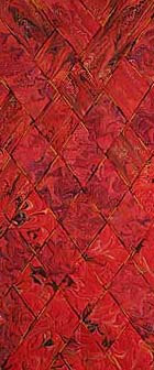 Love the headline. This article comes from Fine Art Views blog, and the message for me is very timely, and hopefully it will resonate with many of you. Here’s a quote from the article:
“Keeping the chickens flying means you will find a way to make it. The old farmer took the risk to haul double the amount his truck would carry. He knew he would have to keep half of the chickens in the air. It’s sorta like us juggling our budget to make ends meet. You are facing two choices, give up or find a way to keep your chickens flying.”
I think so many of us are trying to figure out new ways of working and diversifying so we can make it as artists. Lower prices, develop new products, try something completely different, double down our marketing efforts…..we will find ways to make it.
Sometimes you need to look at networking with others. I’ve written about The Textile and Fiber Arts List before. This is an amazing group of textile and fiber folk from around the world. $75 membership, one time only, no renewals. Lots of marketing opportunities. We are not alone in our work, even though it seems that way as we work on our art, stitch by stitch. We need community, and TAFA is a great way to begin. Consider it your professional organization for your resume.
 And while we’re at the motivation stage, here’s an article from Dumb Little Man. Everything just kind of goes together.
 Here’s hoping to a productive art-making week – and art-selling week – for all of us.
Ps – any spelling errors are from one-fingered typing – put the needle through my finger……

