Archive for the ‘design’ Category
Top Ten Tuesday
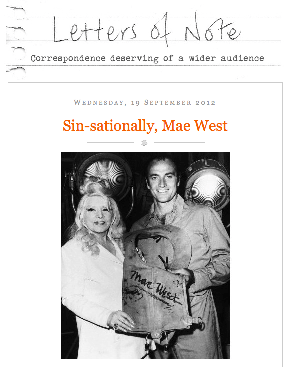
Back again! I do love reading Letters of Note, and this is a gem from Mae West to the RAF, during WWII.
From the TED Blog comes this interesting explanation of how we get plugged in to the internet worldwide. Pictures show what it means to lay cable across oceans.
This next bothers me tremendously. From Scheiss Weekly, Mamacita talks about education in words and thoughts that I really love. Here’s her take on textbook publishers who have sanitized Anne Frank: The Diary of a Young Girl. Did you know that Prentice-Hall got actual permission from Anne herself to change her diary entries?
These are some amazing nature photos! Not all have attributions, but I love what the author of the page says – nothing better than nature porn….
I am finding some amazing nature shots and video through StumbleUpon. This one is A.MA.ZING. The Aurora…. I’m just including the link because it automatically plays the sound….
Here’s a great time-waster – and lots of design possibilities. First design when you go to the page….
Weave Silk – an integrative, magical silk artwork. Another time waster that is absolutely fascinating.
From Designer Daily comes “20 Awesome Examples of Street Art.”
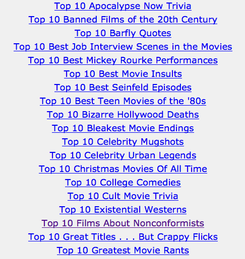
From Alternative Reel – a great list of Top Ten categories for movies…..interesting browsing! Just a few of the categories…..
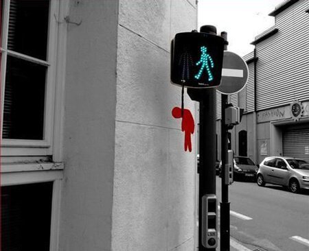
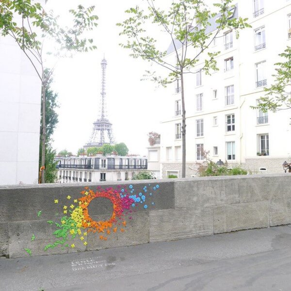
And finally...Rainbow Origami Street Art. Just cool.
I have just discovered the joys of StumbleUpon….check it out and sign up. Lots of amazing stuff! Till next week – send me links to really cool stuff on line!
Analyzing an Artist – Jacob Lawrence
 Part of Lesson 2 is to look at designs in terms of basic elements of art. I chose Jacob Lawrence, as I have always been drawn to his paintings, both for story and simplicity. I saw a retrospective of his work at the Museum of Art in Houston the year I went to Quilt Market. All of his WWII paintings were grouped together, so you really got the narrative of that work.
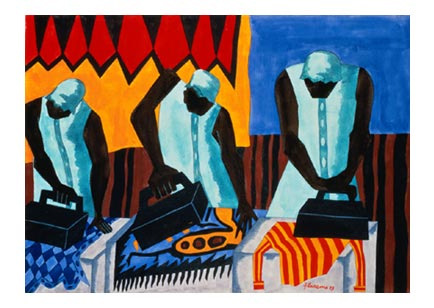
I am very much a novice at doing this kind of critique – I always feel hampered by the lack of any formal art training, but I am curious to know why something appeals to me. So here goes. These paintings are a selection from a blog post on The Ragged Cloth Cafe, by Jane Davila.
Such a simple task and so lovely in composition. The vertical lines of the figures unify the painting, as do the irons. The lines of the irons are different, indicating the various stages of pressing. You can see the tension in each woman as she goes about her task, possibly as a result of the angles of the irons and the bent/angled heads in concentration. Balance and proportion: the irons seem very large, but they may be because I am looking at them from a modern perspective. I’ve never had to use heavy irons, and perhaps they were that big. The women dominate the painting, but I like that. This is “women’s work,” and that domination shows that. There is a lot of repetition in the postures, as well as in the background. I can almost get a “sweatshop” feel, and I get an image of the women from the movie The Help working and talking together. Perhaps the repetition helps to show community. Economy: again a simple task and a simple composition, but the focus is on the main idea. I can see the blue of the upper right pulling the eye to two of the ironed pieces; same for the orange and red in the upper left. The women themselves are dressed similarly, perhaps to indicate the uniform of the job. The more I look at this the more I see the strength and movement in the women, in their arms, the irons, their heads.
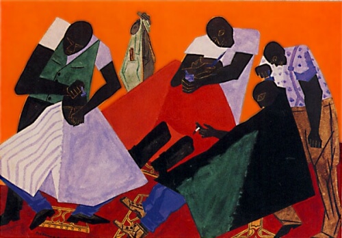
Now this next painting is one that doesn’t particularly appeal to me.
I find the colors very jarring, not at all harmonious. So many diagonals that my eye doesn’t want to rest at all. Again, a simple task at the barber shop, but there doesn’t seem to be the rhythm to the task as in the above painting. Unity/harmony: seems to be only in the main idea, that of a busy barbershop. Skin color is a unifying element. The faces seem to be the last thing you notice, just a few lighter lines. Interesting, in that may be a comment on the invisibility of the black community or the black man. Please note I am making that comment strictly from a white historical perspective. In terms of variety/tension, there certainly is a lot going on in this painting, indicating to me a very busy barber shop, and yet, now that I’ve noticed it, one man is smoking – that little bit of white draws your eye to the center of the painting. Balance/proportion: the piece seems very heavy on the bottom, big heavy dark triangles. The shampoo capes (for lack of a better term) are too many colors for my taste, and I think that’s what throws everything off for me.
Interesting exercise. I like having a selection of terms to work with, and I found I saw more in the painting the more I looked at it. But nothing beats seeing the work in person! What else can you add to the analyses? Comments welcome!
Design Class Continued……
 I’ve fallen a bit behind in my class through Quilt University, but I got myself somewhat back on track these past two nights, and I am learning some fascinating things through these exercises. First, I would never have attempted going beyond a basic picture or design like this on my own. It’s a case of “I don’t know what I don’t know.” These exercises are really stretching me, and what’s coming out is definitely intriguing.
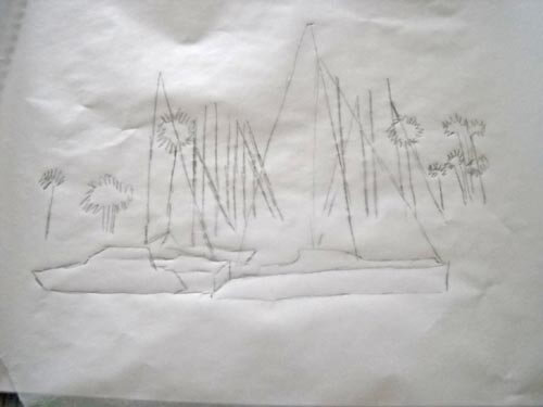
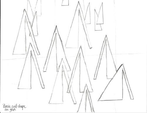
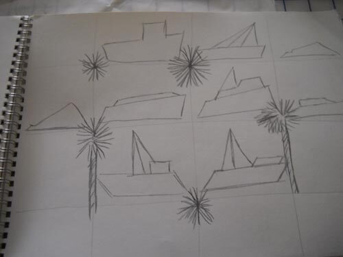
So here are the three basic pictures/sketches I have been working with and what has happened with them.
For this week I needed to take a basic design element and create a pattern with it on a grid. I chose a triangle for a sail, with a longer rectangle for a type of mast. As I was adding the pattern to the grid, I decided to flip the pattern, make some of different sizes, and make some small ones for depth in the distance.
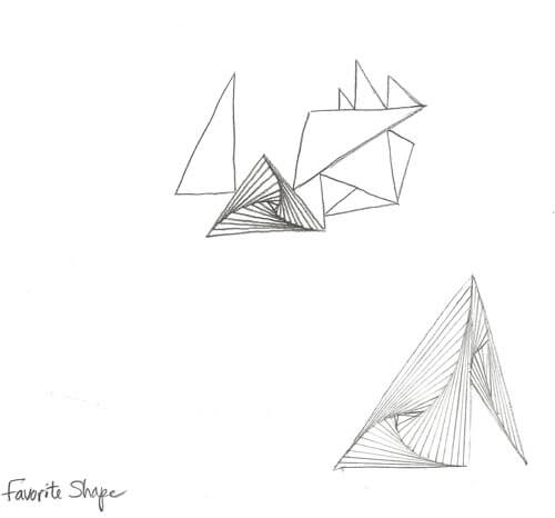
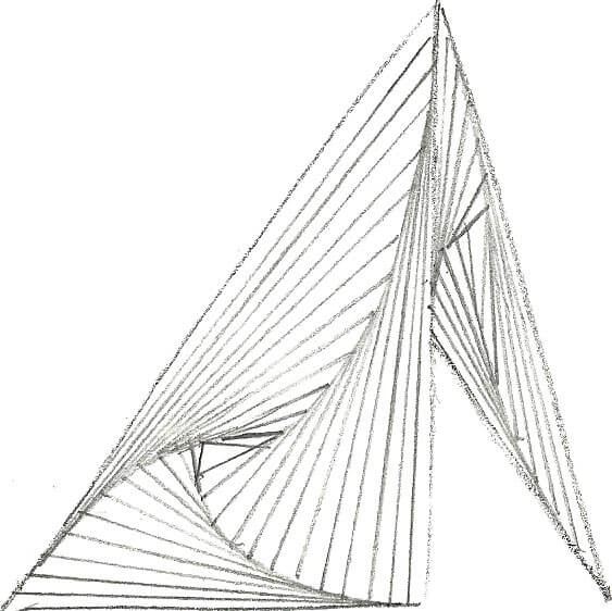
It may not seem like much, but it was quite the departure from how I work, and I can definitely see possibilities with this sketch. From this point, we took a basic shape (again the triangle) and just worked on creating triangles. At one point I decided to fill in one of the triangles with a favorite zentangle, Paradox. It looked so cool, I decided to see what the sail pattern would look like. Again, definite possibilities.
I think there’s huge potential here.
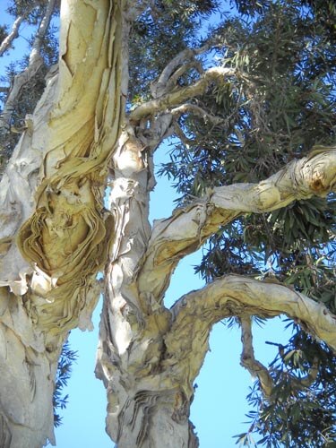
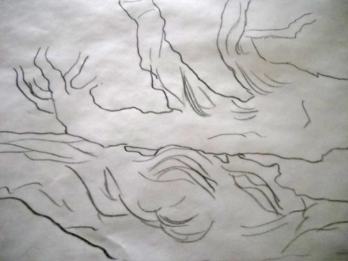
Now here’s the second picture and sketch, a tree from Spanish Landing Park in San Diego.
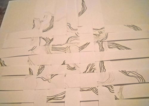
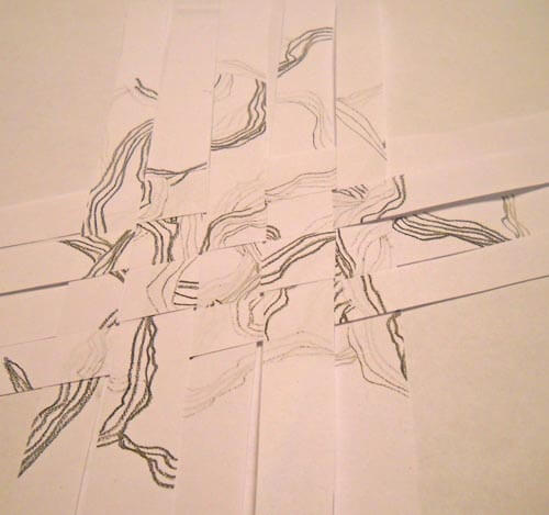
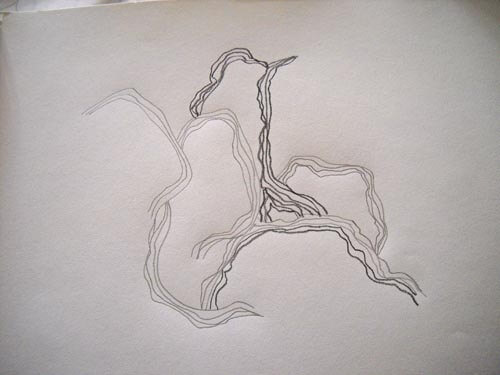
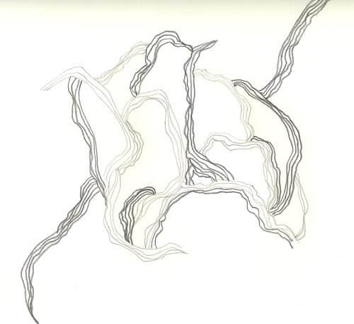 I worked with three different weights of pencils, and I really like this, plus as I work more with it, it is giving me some ideas for the driftwood piece. From here I sliced the piece in to strips and then wove them back into a new design. Very interesting activity.
I didn’t really care for this one, as I felt there was too much negative space.
This seemed better, and while I know I am supposed to concentrate just on creating designs, I find myself thinking about moving into fabric, and I have a hard time imagining how this would happen with this design.
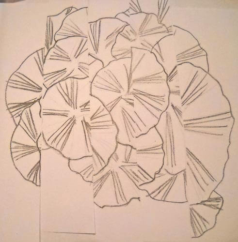
Here;s the sketch and the picture for the third one.
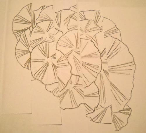
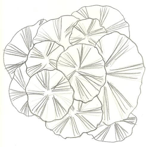 This time I tried a different technique: I sliced the sketch and then put it back together, with each slice up or down of the other pieces.
With this one I could definitely see the idea of reflecting water.
There is a lot more to this lesson, and I think tomorrow I am going to look at more of the photos I shot in San Diego and evaluate them according to the principles of art. Then maybe I will feel like I have a better idea of the terminology and can try some new sketches.
Continuing Lesson 1
 I have been ruminating on finishing this first lesson in my Quilt University class, especially since I am now a week behind due to our vacation in San Diego. But it was not wasted time, even though I never opened the sketch book. The exercises I had done at the beginning caused me to start looking at my surroundings in terms of line and shape, focal points, unusual camera angles, and textures. I ended up with a lot of unusual shots, just to remind myself of what caught my eye.
Last night I sat down with my selected pictures, tracing paper, and my sketchbook to see just what I could come up with. First, here’s the original picture, from sitting in Spanish Landing Park and admiring all the boats, and masts, and straight lines….and triangles……
I cropped the picture and then used tracing paper to get basic outlines. I am not comfortable sketching freehand with this activity – it kind of intimidated me at first.
What I liked about this was that I could definitely see the trapezoids, triangles, and straight lines. From here I tried a grid to repeat some design elements.
Not happy with this – not at all pleasing to me. Probably because the exercise itself is so new. So worried – like always in the past – about what this was going to look like. Then I went to my triangles and straight lines:
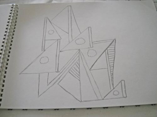 This has got possibilities, but it would seriously need reworking. I might pick up tree color in the sails. Once again, I can see just how linear I am in the design….
From here I went to the photo of what hubby and I called “our tree” at Spanish Landing Park, since we sat next to it for three days. Here’s the original:
I ended up turning this on its side for the outline – something I NEVER do with a picture…..and I liked it!
I already could see some possibilities in this, and at this point I was kind of amazed at how my thinking was changing. In the past I had always looked at trying to work with the whole composition, instead of just pieces of it.
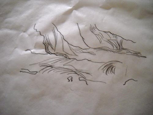 Here’s the close-up, and as I was trying to add some texture, it occurred to me that all the lines were pretty much ovals…..the beginning of inspiration and a real change in my thinking, which led to this…..
I LOVE this! The linear part of me was going to do all the ovals equidistant apart, but I had trouble with that in the second line and I realized the wonkiness of the “in and out” of the line gave me even more texture. Then when I changed pencil hardness I was really hooked……which led to “Oh, my, I need more thread and yarns….” I think I’m on to something. Plus, this was so freeing. This process really works, and I can see working this activity much more.
So then I went to another photo:
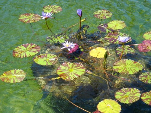
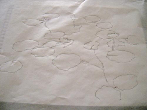
This was taken in Balboa Park, the reflecting pools near the Botanical Gardens. LOVE these lily pads, especially the variegated leaves. Here’s the outline.
And here’s the close-up:
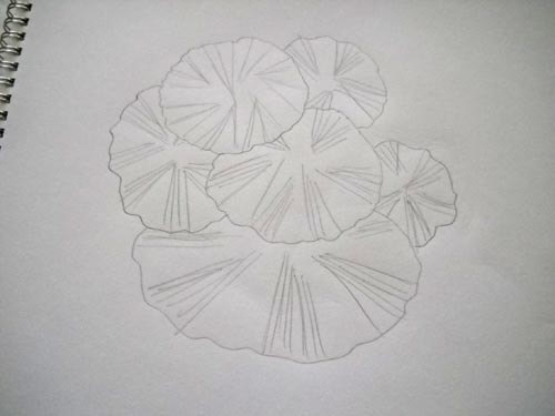
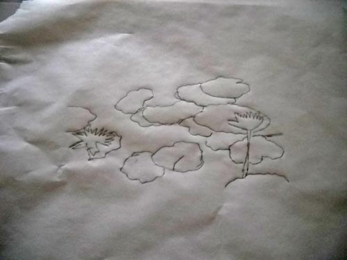 I really like the shape of the lily pad, so I decided to use not-quite-regular circles. I ended up with this, and again, really happy with it. I already know what stitches I would use….and again, I need more thread…..
I have a couple of additional photos I want to do this exercise with, and I can see myself using it a lot. I had ideas come out that I wouldn’t have seen otherwise. Definite progress.
Second Design Photo Analysis
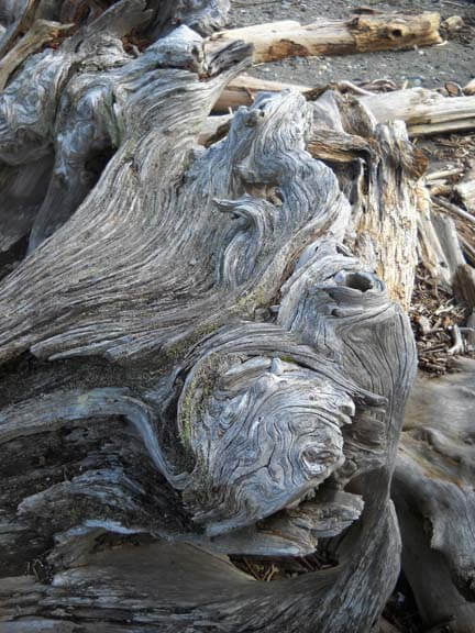
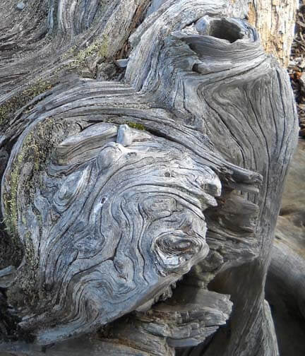
I worked with another photo last night, and I didn’t have nearly the success with adjustments and filters as I did with the first photo. Now I need to think through why that is so. Here’s the new photo – driftwood from Vashon Island in Puget Sound.
Well, crap….seems like I did it again in saving…or not saving. I need to remember to save everything as a psd file first to preserve the layers, and then save each piece individually. Okay, bottom line, nothing really spoke to me with the different adjustments, so I need to think through why that is so.
Is it because this is a fairly abstract image to begin with, mostly line and color? Perhaps that is why I am so fascinated with tree bark to begin with. The lines, shadows, differing colors to create the texture. And this picture, knowing it is driftwood, also reeks of a hidden history after being tossed in the water and then left high and dry. But how would I create some of that mystery?
What initially prompted me to take a picture of this? Probably all the smooth curved lines and the knot.
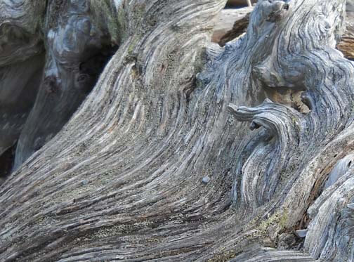
Looks like all kinds of interesting lichen within all those folds. The colors are so subtle, but at the same time I see a nice interplay of line and shadow.
I look at that knot and see a captured sea spirit. The more I look at this one, the more I am intrigued by it. The curves are so soft amidst all that hardness.
Now that I look at a couple of additional questions, I am stumped. Main idea? I like the thought of a captured sea spirit. Areas worth keeping? I can see leaving out everything else from these two crops. Other elements to add? No clue. But as I ponder, the first thought that comes to mind is to carry the lichen out into a border, and maybe the overall piece doesn’t need to be square or rectangular, maybe more oval so that the spirit seems encased and surrounded but is really still there. Don’t know if that is making sense….
How and where can more pizazz be added? Again, no clue. But…perhaps a lot of thread painting would be needed for surface texture.
I can see this going to sketches as the next step and seeing what develops from there. Comments?
Trying to Learn Something About Value…..
…that could also read “something OF value,” but I want to focus in on the issue of value and color in design….something I know I am really weak on. I’m choosing a couple of pics that I really like for design composition and playing around with Photoshop filters to see what they tell me about the composition. This is different from how I usually approach working with Photoshop….play around until I get something that says Wow. This time I’m looking at the elements of the picture and trying to see how they change and why I like – or don’t like – the design.
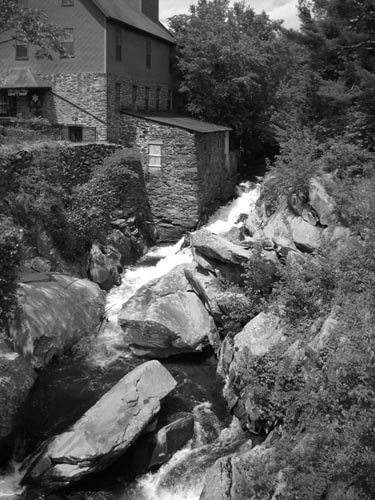
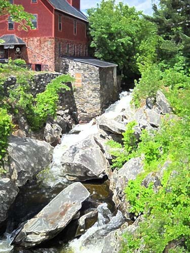
Here’s my first photo, taken in Jericho, Vermont two summers ago, at the Old Mill, which houses much of the history of hubby’s family.
I love everything about this picture: the greens, the mill red, the flowing water, the fact that I’ve got it composed in thirds. And you can’t see that right behind me is very busy Route 15. So what did I learn from this exercise?
Primarily I am much more aware of the basic lines in the composition. The lines don’t change, but the focal point does, depending on the filter or effect I used. There is one example that I would consider making up in cloth, as I find it intriguing, and I’ve never tried anything like that. The others are just interesting to analyze. Here goes:
I love black and white. After three weeks in Seattle this spring, I developed a whole new appreciation for shades of gray (no, not the book……). I want to take this photo and play around with a few sections of rock to see what I might be able to sketch.
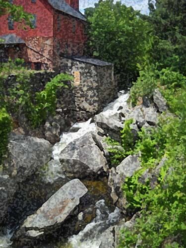
This is the “sponge” filter, and it’s one I really like. Shadows and subtle colors really come out in this filter. Once again I am amazed at all the shades of green there are. There’s more shading in the mill, as opposed to the original, but the movement of the water is lost.
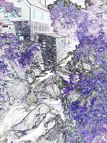
This is the “find edges” filter. Interesting to see where basic pieces of fabric would be. I think I can also see the dark, medium, and light of the photo.
Accented edges filter. More of a pattern to follow if I wanted to recreate this. I did a small cropping that I could see in a 12 x 12 piece. I’m liking the shadows.
This is the “patchwork” filter, and I could see making this up as a larger wall quilt. The filter allows you to make the squares larger or smaller, but I am really curious to see how this would work up in piecing. I need to print this out larger and use my little red rectangle and look at the values closer.
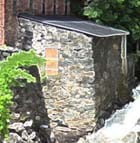
Well, I have managed to lose my original with all the filters listed on it, so c***. What I like about this above photo is the additional shading that is present in the rocks, and in the red portion of the mill. Lots more texture, and I could see using some colored pencils to enhance the fabric pieces.
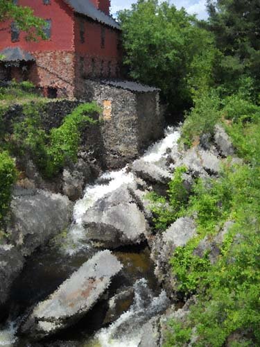
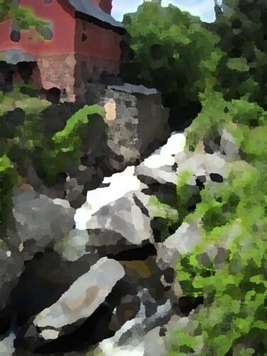
I believe this is a watercolor filter, and I like it. I can see looking for specific fabrics for this piece, rather than trying to do lots of little pieces togather. I could see just cutting pattern pieces and fusing them into place. I like the softness.
Palette knife, I think. I like the general clumps of color, and as I reflect on this, I could see making this into a small abstract. The image is still recognizable, and I like how you can see an actual pattern to follow in putting this together.
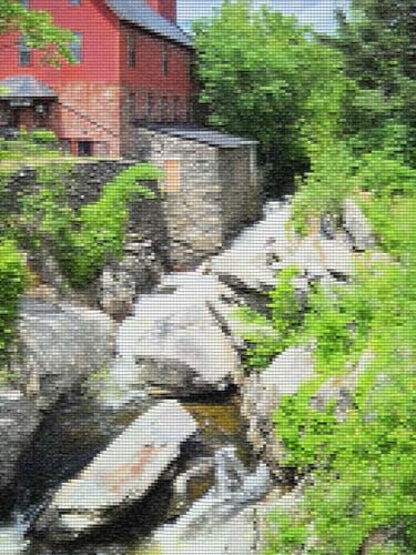
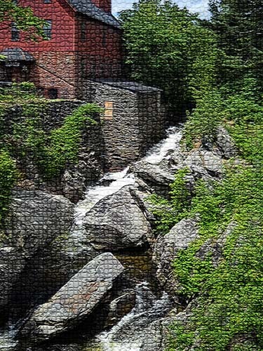
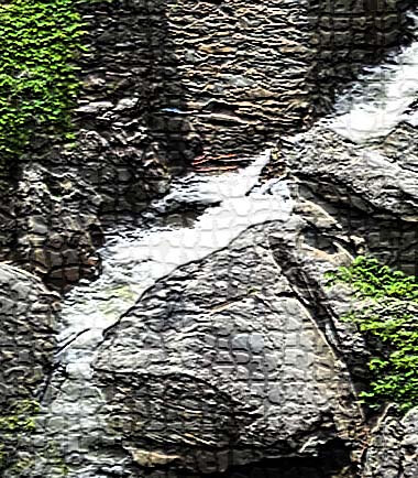
This is mosaic tiles, and I like the effect better than the patchwork photo above. I’d have to spend some time thinking about how to get the “grout” effect…..maybe a mottled gray color with texture in it as the background piece, and then the tiles cult at somewhat irregular edges so the grout shows through. I cropped a piece to see….
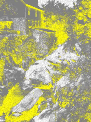
This is an inversion adjustment, and I like these because I always see something different when the colors are completely different. The yellow accents the shape of the edge of the mill in a way you don’t notice in the original photo. The rushing water doesn’t show up at all.
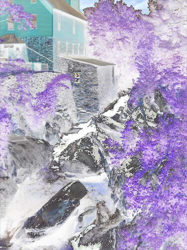
Forgot the adjustment, but the amount of purple really accents the amount of green in the original photo. And I like the way the shapes of the rocks are accented.
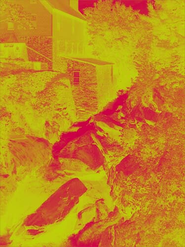
This is a red/yellow gradient, and I like playing around with gradients. Very other-worldly, but I don’t see taking this piece any further.
I saw some quilts a while back that were based on Joen Wolfrom’s color tool. People chose a color and then worked solely in the range of that color. Results were pretty dramatic. This is a color filter in a deep blue. I think I would print this out and take it fabric shopping and see just how well I could pick out various blues and other shades that have a blue cast to them.
That’s my first study, and I definitely need to do more of these. I feel like I have a better understanding of the composition of the original picture. Next up, my wrought iron photo….
Work in Progress Wednesday – Learning Lots!!
 Well, this has been a week of learning experiences, including running the machine needle through the tip of my finger. I’m somewhat frazzled deciding on a project, since I don’t have any looming deadlines. I do, however, have a list of projects that need doing, so I picked one from that list and then added another.
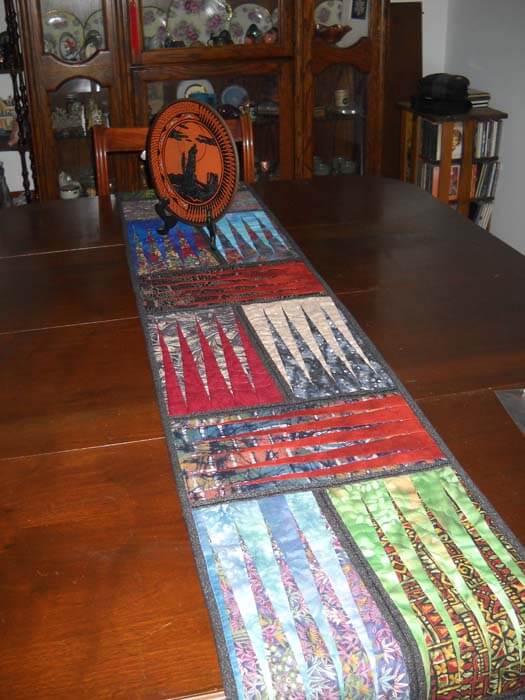
First, from the UFO list. Several years ago (going on three?) I took a class with a friend on a Judy Niemeyer pattern, Stepping Stones. You can see the pattern here. Originally it was going to be a king-sized bed quilt, but I was still teaching, so that got put on hold. When I reorganized the studio (twice), the blocks made it into the UFO pile, and when I made my list in May of projects, I listed these. But….I listed them as a potential table runner, figuring that way they would be done, and I could actually use the table runner, as we have a new dining room set (new to us – we’re babysitting it for a friend). I would also have enough for 6 placemats, too.
Well, there were loads of problems. Could I find the black fabric I was using for connector strips (three searches)? Could I do all the matching, since it had been about 3 years? How would I quilt it? What would I use for backing? I got the four completed blocks into one runner, and then I spent the next three hours taking out all the paper….note to self: you still need to vacuum. The blue I thought to use for backing was a stretchy polyester that wasn’t long enough, so plan B was leftover dark blue from another quilt back. Then I had to buy batting.
Finally everything is together and ready for quilting…..and I had no idea what to do for the quilting. Didn’t seem like feathers would work. Didn’t want to do a stitch-in-the-ditch. Tried some outlining, but I didn’t like it. Then I thought about the overall loopy pattern from the May challenge, but ended up picking all that out. I realized I would need to go with monopoly thread, so the stitching wasn’t obvious. And I was playing around with tension, including two more ripping sessions.
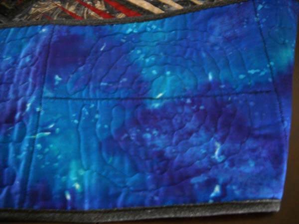
I tried doing some partial circles on each block, so it would look like rippled water. And then I discovered the settings on my machine were set for the decorative stitch I used in the black borders. Seems like I still had the setting on one of the decorative stitches, and I was trying to free motion and there was a lot of drag. I also discovered that I could use a variation of a zigzag stitch and still have the feed dogs up. Turns out I liked the ripple effect, and that’s what I went with for the rest of the runner. Here’s a pic:
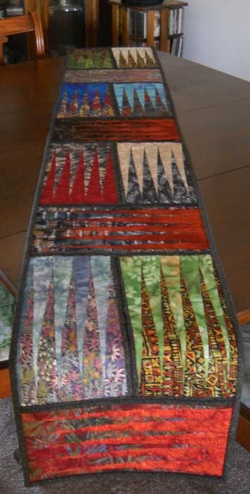
Here’s the finished table runner, which is absolutely perfect on the table. It will work with any of the leaves when we put them in.
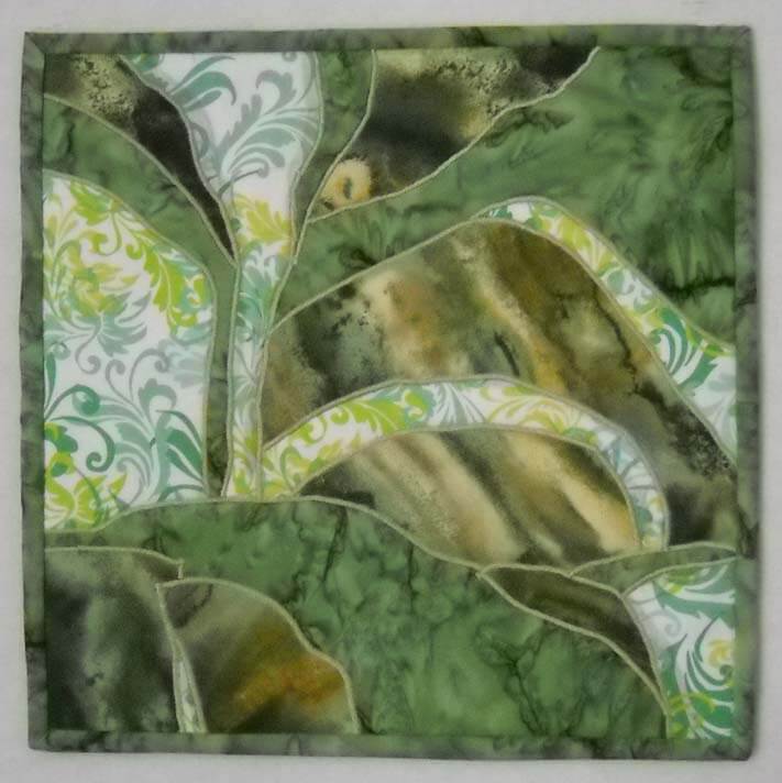
Then I was feeling somewhat at loose ends. I had been watching The Quilt Show and following the color lessons from Michelle Jackson. I decided to do the first color study, and again I learned a huge amount. The first lesson was really interesting, especially since I have a lot of trouble choosing and working with color. This was to take a monochromatic color and determine dark, medium, and light. I chose greens, because I have a lot in the stash. I discovered that when I’m choosing, I really need to analyze tones and hues. I also need to be sure there is definite contrast. The first study I did was the one where you had a light, medium, and dark, with not a huge amount of contrast. I did not have enough contrast within those three colors.
I also was working with fusing for like the second time ever, and my pattern pieces were not always meeting up. I spent a lot of time trying to make this piece look like something – going back to linear me and not being able to just work without it having to be “something.”
I finally got all the pieces ironed down, and I felt I was moderately successful. Mostly because I learned a great deal about choosing the colors. I was still trying to figure out what to do with the piece. Yes, it’s just an exercise, but the linear part of me needs it to be “something.” Ideally I want to be able to work with light, medium, and dark marbled fabric, but I can see I have a long way to go.
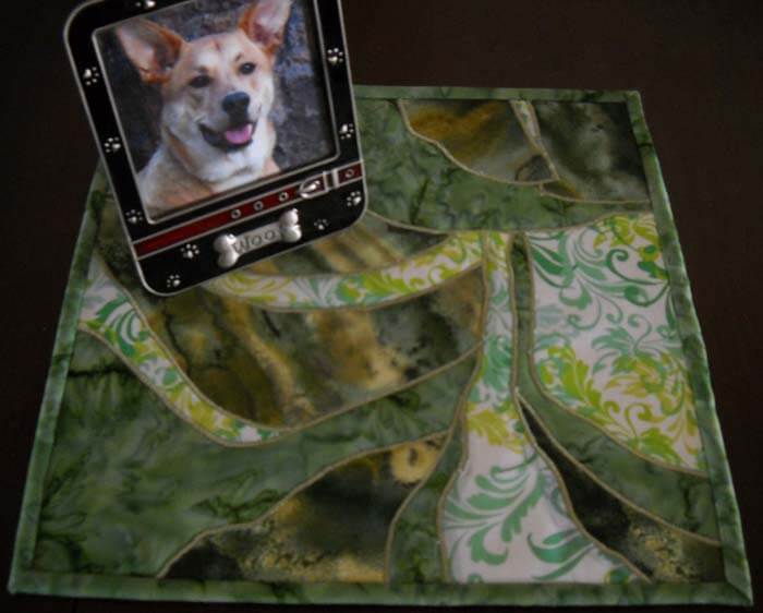
Again, I couldn’t figure out what to do with quilting it. I tried out one decorative stitch and didn’t like it. I reverted back to the satin stitch I was doing two table runners ago. All of a sudden I began to like the piece more. It began to look more “painterly,” and pretty abstract in a pleasing way. I ended up binding in, and the piece would work as a nice little runner or table mat for a vase. It’s going up in my Etsy store.
Who knows where I’m headed next? There are 6 placemats to finish…..
Work in Progress Wednesday
Busy week! The commission piece (the triptych that wasn’t) is done, awaiting beading. As I was on the floor at yoga last Friday, I was looking at a very skinny part of the wall and thought, this would be perfect for a long piece. On Thursday night I had started the stitching on the lichen, and I absolutely loved the way they worked out, and I no longer wanted to cut the piece into three. This skinny wall section will be perfect. So over the weekend I steamed and blocked the piece, got the binding on and hand-stitched down. Love it! Took it to yoga on Monday to show her, and she is thrilled. The only thing needed at this point is some blue beads along the “stream” to add an additional color and bring the piece together. Formal pictures next week when the beading is done.
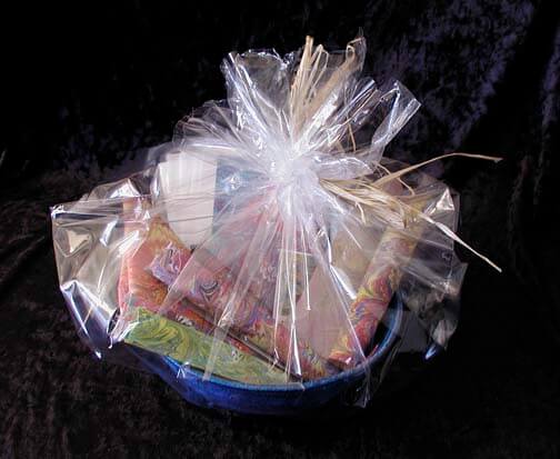
Also completed are two new fiber bowls for my gift baskets of marbled fabrics, set to go up in the Etsy store. We’re doing pictures later today so I can get the stuff up in the store. Wrapping clothesline with fabric is the absolutely perfect activity for watching television at night.
And…I am finally starting another major piece that has been brewing for a couple of months. I’ve had the backing since October, and the marbled fabric was done in September. I finally got the batting two weeks ago, and today I made the sandwich, chose thread, and started the quilting. It’s sort of a whole cloth, but not really. There’s no piecing at this point until this center medallion is done, and then I’ll just kind of see what happens. This seems to be the way I work….intuitively, guessing along the way, trial and error. Most of the time it works.
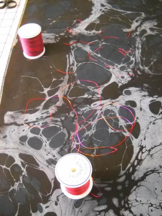
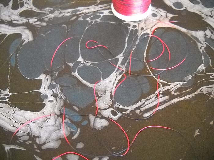
Here’s the first focus fabric….very “brain-looking,” and I’m approaching it as though these were dendrites in the brain. Doing a thread check –
– going for the one on the top, as I like the black section in the thread…looks like the nerve endings are skipping, which is the look I want. The lower thread will be in the bobbin.
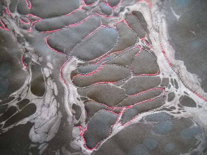
I started the stitching, and then I took everything out – not happy with tension, and I wanted to analyze the pattern yet again.
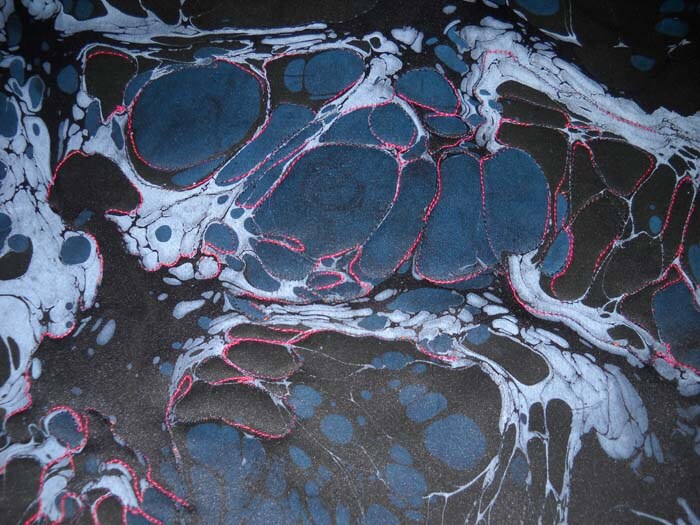
This picture, when I saw it through the view screen of the camera, made me somewhat upset. I couldn’t see the discrimination of the black and the blue through my own eyes. I am having to look at it through a photo, so I know where I want to stitch. THis is the first time that I am aware of my eyes not being true to what I am seeing and want to do. Doesn’t make me happy…..
So I took my own advice from the Monday Marketing post to just get in there and do the work…I did, and I have a lot to show for it, with more to come.
Work-in-Progress Wednesday
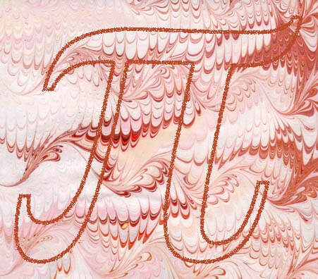
Happy Pi Day! It’s the math nerd in me celebrating……no more having to plan special activities. Now back to regular blogging….(I started this on the iPad….)
Hmmmmm…..not sure if this is going to get any better….took me forever to log in, but I think I figured out what I was doing wrong…..now to get the pictures I want…..
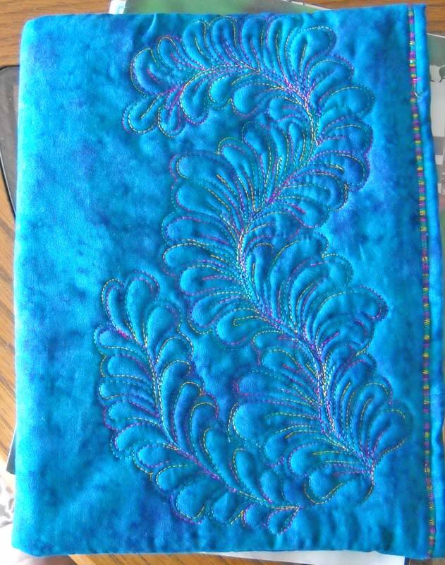
That said, it has been pretty productive when it comes to fabric, even amidst the move. I finished my iPad cover with the feathers from the February free motion quilting challenge, and I’m really happy with it. In fact, at a birthday party last night, three of my friends want one and suggested I put them in my Etsy store. Something to consider idea when we return, as the Etsy store is disabled right now, as we are taking some of the product, with us to Seattle.
The front is a great big feather. I love the ideas people are posting, so I went with some Superior Rainbow and added some extra spines.
I added a small facing, and then added velcro to the inside in three different places to hold the cover closed.
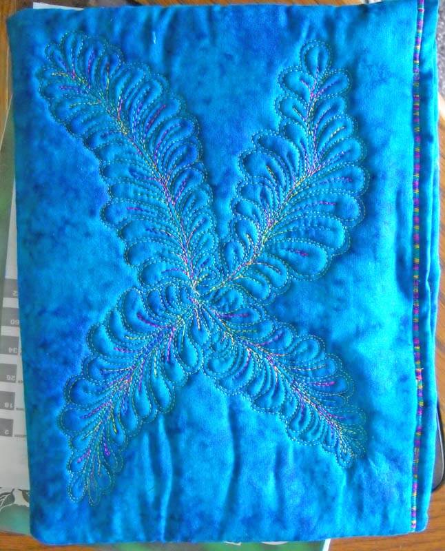 Some things i would definitely change next time around, but overall, I LOVE it….never thought I would be able to do machine feathers!
Now for an update on Visions……I didn’t get in. Plain and simple. But….I’m okay with it, despite the fact that the very first show I ever got into was a fairly prestigious one. I know that the work is excellent; it’s some of the best I’ve done. And I have more ideas just ready to go. It just seems like the only way you get validation for your work is to get it in to major shows. I will keep making work, because that’s what I want to do.
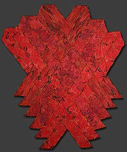
If it weren’t too old (2003), this is what I would have entered: my absolute, favorite piece ever. I won’t sell this, because I’ll never be able to make another one. It is now on the wall in our new home, as we actually have wall space for it. This is part of the Gaia series, where I do weavings with strips of marbled fabric. This is Gaia 2: Beginnings, affectionately know around here as my Pele quilt.
My machine quilting skills have come along tremendously since that piece. The fabric of “The Shallows” was created about the same time, but it has just been in a drawer, waiting for the right time, which I figured was now.
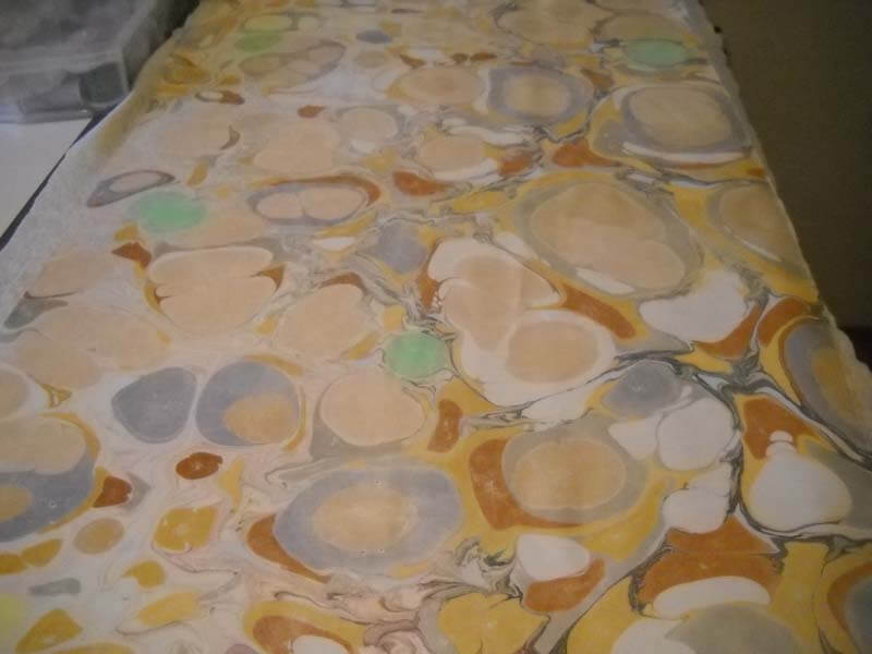
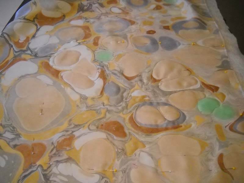
Here’s the fabric at the beginning – it looks pretty bland.
It’s a pretty large piece of marbled fabric.
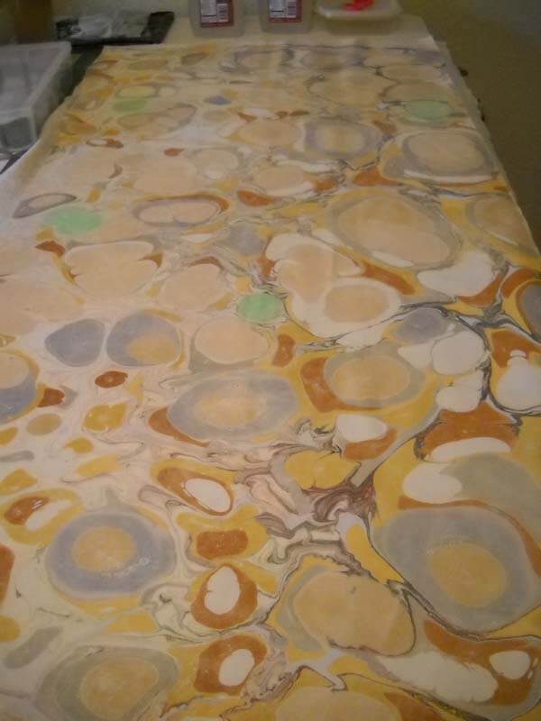 Making some early decisions on thread and backing. Everything was done with Superior Thread – Bottom Line in the bobbin, a mixture of King Tut and Rainbows and Art Studio for all the rocks and shading. (I never did take a pic of the back…..)
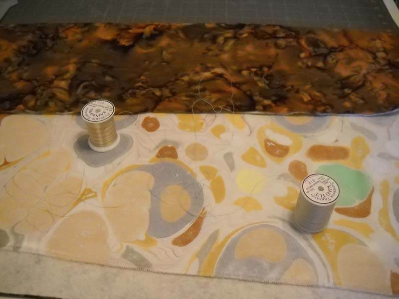 I knew how I wanted to start, but I wasn’t thrilled with how the fabric looked, after not seeing it for so many years. I thought in my mind it looked far more interesting. But I started anyway.
Already I could see improvement in texture, so I figured I would be okay. But I was worried about the green spots, which were originally designed to be some kind of leaf….now I was thinking lichen. I also wasn’t happy with the amount of white showing…needed to do something with that.
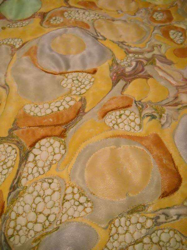 At this point I am becoming quite enthused with how things are shaping up…..but that’s a LOT of pebbles, and it took most of December to get the pebbles where I wanted them, without affecting the “veining” left from the marbling.
I was also starting to think about shading, which I guess is more thread painting than free motion. I consulted with my art mom to get advice on scientific shading, in which the light source always comes from the northwest. So I needed to start thinking about shading all those rocks…..at this point I became very aware that there are a LOT of rocks. YOu can see some of the beginning shading here.
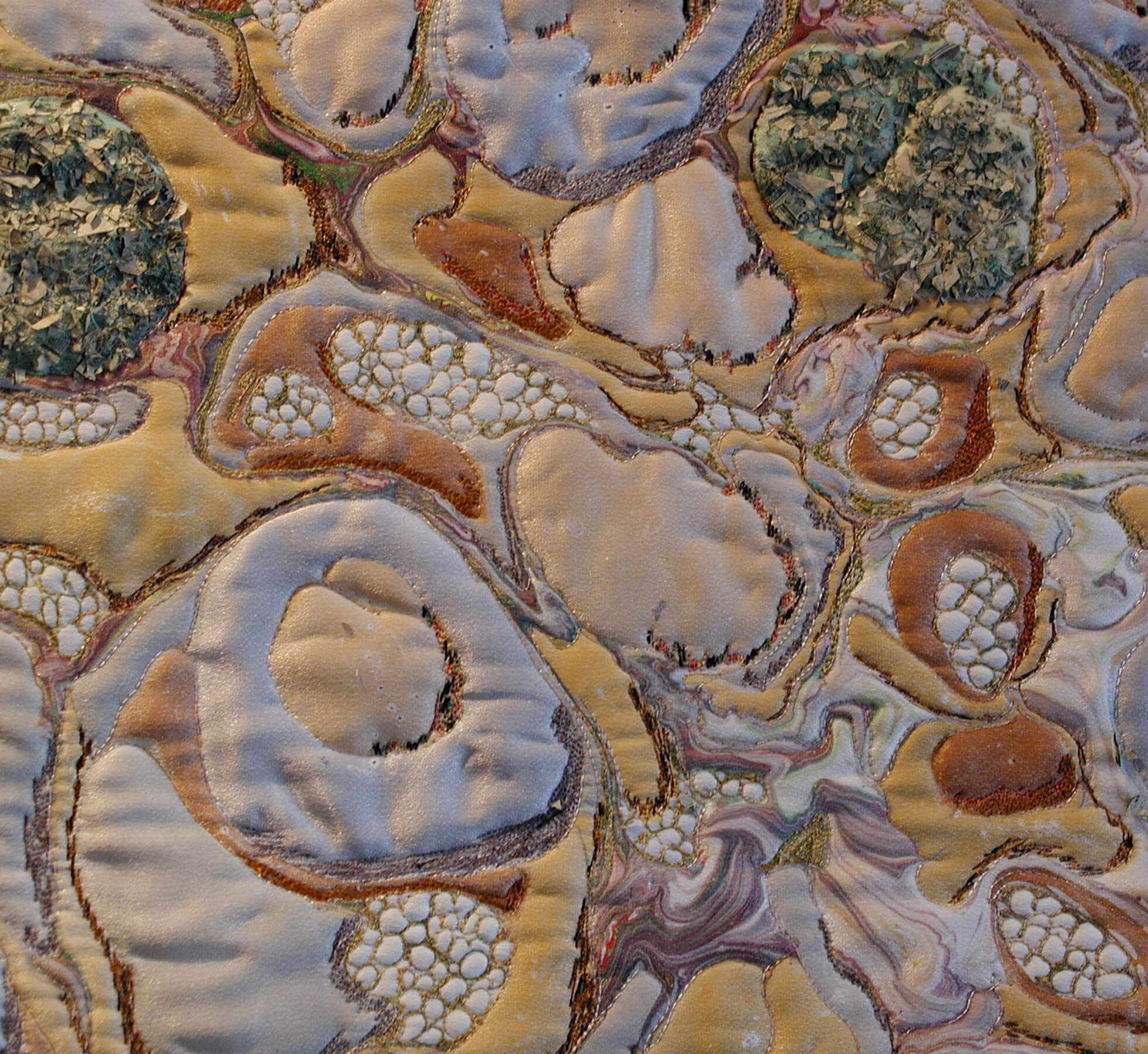
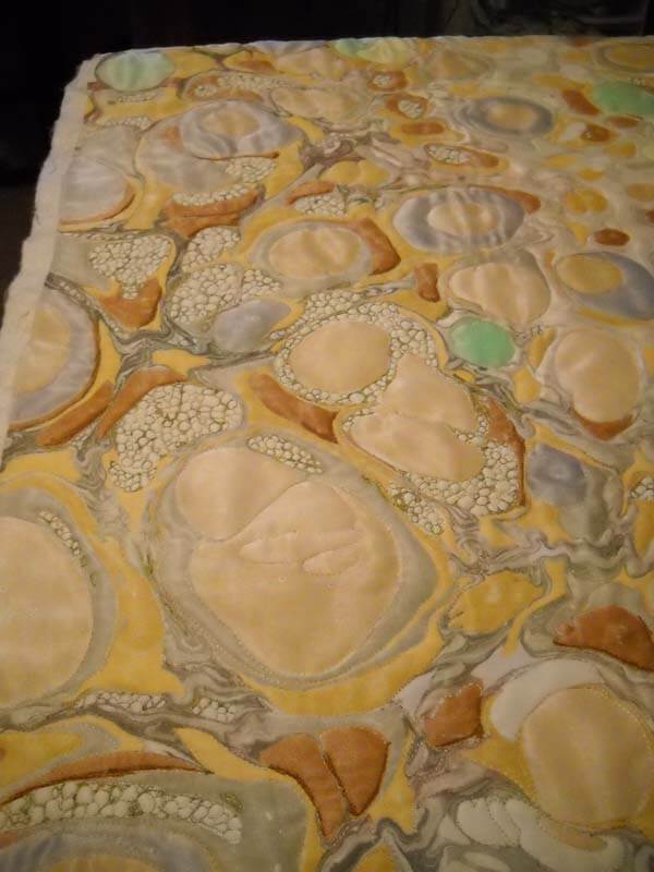 So January hits and I’m aware of my deadline, knowing I need to leave time for photography. I’m shading, and doing pebbles, and thinking about trimming. About one-fourth of the right side is cut off, as the proportions seemed much better without it – and a lot fewer pebbles that had to be completed…. I needed to think through the lichen, and if you look closely at the detail, it’s shredded money – perfect texture!
And finally: The Shallows
It’s a far cry from the original fabric, and it is now proudly hanging in our new home.
Top Ten Tuesday
I found a bunch of new, interesting art sites this week, plus the Free Motion Quilting Challenge started – you can see the badge on the right side, and it’s not too late to sign up. I’m looking forward to practicing a new pattern each month.
A new blog – The Creativity Post – looks to be very interesting, and I love the stuff on brain research.
“ The Creativity Post is a non-profit web platform committed to sharing the very best content on creativity, in all of its forms: from scientific discovery to philosophical debate, from entrepreneurial ventures to educational reform, from artistic expression to technological innovation – in short, to all the varieties of the human experience that creativity brings to life.”
Here’s a screen shot of some of their most popular entries:
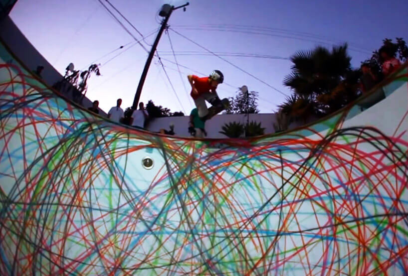
From DesignBoom comes a spray-painted-skate-boarded-swimming-pool-design, complete with video…..really cool!
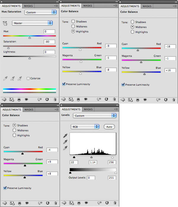
From PSD FanExtra comes a tutorial on designing t-shirts. This is very step-by-step – I think even I could do it (but maybe with a dog instead….).
Another MAD Magazine countdown of great blog covers…..Jerry and Joe and their new gig….
If you love dogs….well, even if you don’t, this is an adorable video of two dogs in a “restaurant,” waiting to order…..
And…MAD Magazine’s #1 blog cover – has been my favorite since I first saw it. Boehner vs. Obama and the DEBT…….Think Harry Potter……
A new blog I discovered by an Australian quilter, Emma at Sampaguita Quilts, with her finished quilts for 2011 – some luscious ones for eye candy! I love this one –
Another new blog – 365 Project – amazing photography! This is their official Top 20 post.
And from Alyson Stanfield and the Art Biz Blog comes some interesting resolutions for the new year: 12 Artist Resolutions to Steal for 2012.
 Love this one: RESOLVE to stop fiddle-farting around on the Internet or with the TV remote control and start dedicating myself 100% to my life’s work.
And finally, a selection of Happy New Year’s from The Best Article Every Day.
 Let me know what you find that’s really cool!
Top Ten Tuesday
Another Tuesday, and more goodies on the web – although it has been slower than normal, due to the holiday. Enjoy!
Here’s a great list from The Best Article Every Day – places to learn on line – for anything!
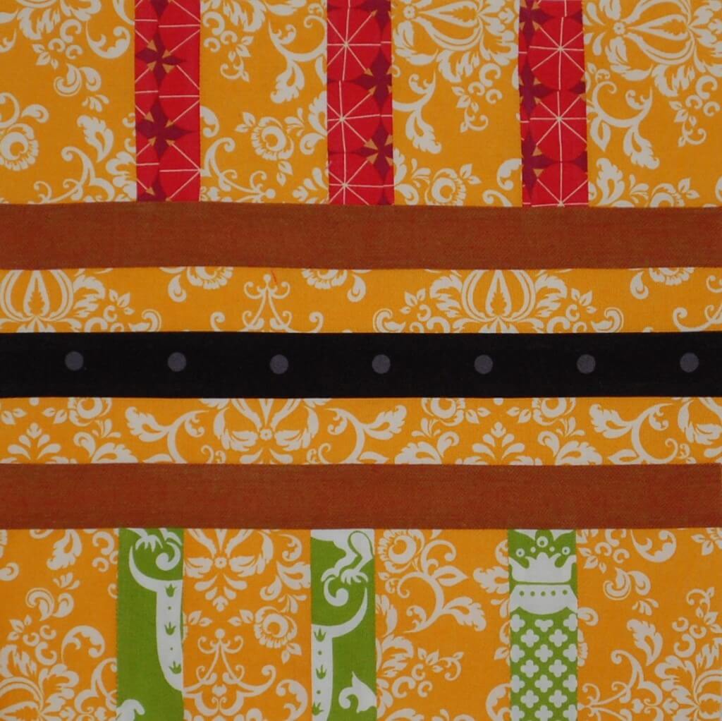
 I found this interesting block design from Generation Q magazine, by way of Scott Hansen and Blue Nickel Studios. It celebrates Kwanzaa, and it’s a striking block. Take a good look at the setting – lots of interesting design possibilities.
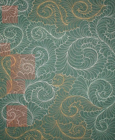
I’m taking part in the Free Motion Quilting Challenge this coming year – I really want to learn to do more with my machine. I want to learn how to do feathers….take a look at this example from Ivory Spring’s Thread Talk. She gives step-by-step instructions – I can wish……
MAD Magazine rings in the New Year with its Top Ten posts…..
“The Disturbing Similarities Between New Al-Qaeda Leader Ayman Al-Zawahiri and New Today Host Ann Curry”
From SewCalGal comes insights on free motion quilting, with a year-long challenge coming up. She says in this blog post that after a year of practicing FMQ, she’s much more capable of doing cool designs – and I concur…my FMQ has increased just from the practice. If you’re interested, go ahead and sign up for the monthly challenge – should be fun!
 From Generation Q magazine comes some creative pushes for 2012, if you like to spend this time before the new year making plans and setting goals.
 You know I love Cool Hunting – here’s some of their year-end best, in conceptual design.
“From ICFF to Art Basel, 2011 delivered a flurry of design objects for the home that while highly creative and concept-driven, didn’t compromise their utilitarian duties. From recycled plastic chairs to roman numeral inspired book shelves, the following are five of our favorite pieces of sculptural design that could just as easily pass as pure art objects.”
from Art Biz Blog, a collection of top posts from the year for your marketing pleasure!
Most Commented On
You Promise Exposure, We Want to See Results
Artists’ Day Jobs – What’s Yours?
Is There a Downside to Teaching Your Art?
…and lots more!
From Fine Art Views, an interesting challenge: Add an Art Challenge to your New Year’s Resolution List: for Smokers…..I’m thinking of adapting this for dieting….
I haven’t posted anything lately on zentangles, but I keep looking at blogs. Here’s one from The Rainbow Elephant that I think would translate really well into a quilting pattern, especially since I want to incorporate some snowflakes on a winter quilt.
Have a great week – send me cool stuff you find!
Getting an Art Critique
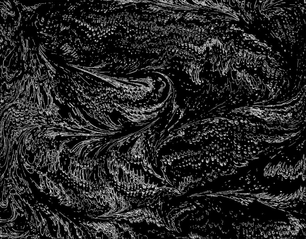 I am really fortunate to have a couple of good friends who can help me with a critique when I am working on a new piece. Sometimes the piece flows, and sometimes I’m blocked in making decisions and moving ahead. It is made more complicated by the fact that I am trying to use our marbled fabrics to create unique art pieces. In surfing the web on a regular basis, I don’t see anyone else doing what I’m attempting to do with marbled fabric in the art quilt movement.
There are a lot of things to consider in developing these pieces of fiber art. Are my sewing skills strong enough? Are my quilting skills advanced enough? Does the fabric speak to us? Can the design tell an interesting story? Can I work with the principles of design?
In looking at all these questions, there are two that I am the weakest in, and this is where my group of friends can really help. Quilting skills and design principles.
Momcat is my first voice. She is a digital artist in her own right, and a self-taught expert in Greek pottery, among all the other skills in being a Renaissance woman. Suzan is my overall digital partner and a superb, published quilter and designer in her own right. Karin is a water color artist with a very strong sense of color and overall design organization. Hubby is the marbler and can see things in the designs that the rest of us miss.
I am at a point in this new piece where I needed advice. Which way should the piece hang, for one – vertical or horizontal. Usually that’s one of the last questions for me, because by the time I’m done, the piece has usually told me what it wants. With this piece, I need to decide this now, as I will need to work on the shading with a light source from the “northwest,” which is how scientific illustration is done. I was leaning in one way, and my group confirmed that. They pointed out that I already had a lot of the “shadows” developing on their own from the new orientation.
The second was size and pattern. I am fine with all the quilting on half of the piece, but the other half seems naked of color and looks like it would require some serious thread work that wouldn’t necessarily add to the overall effect. I had been thinking about potentially cutting away half of the piece. We looked at that possibility, and once we folded back some of the fabric (which had never occurred to me), we knew it needed to be tall and narrow, not wide and thick.
Now, Momcat had sent me some of her photos of rocks and lichen that Dali had painted, and I LOVED the lichen. I was initially thinking of marbling some very small silk flowers and then attaching them with some thread painting. The group didn’t like that idea – felt they were not “tough” enough for the texture of lichen. Momcat disappeared, only to come back with a small vial of green stuff that she proceeded to spread on the one or two rocks that are already green. Perfect! Upon closer look – they are very fine chopped-up pieces of old money from the Denver Mint. Who knew? I guess now this is a “mixed media” piece…..We are also thinking about using some coconut Husk or actual moss from a pet store – need to think that through.
Next question: facing vs. binding vs. frame. How do I want to finish this? I don’t see a basic binding. We talked about fabric as an inner mat and as a frame. We looked at serging the edges – which I have done with pieces in the past, much to one gallery owner’s chagrin – “wasn’t finished properly” was her verdict. But I always let the piece tell me what it wants. I am thinking this piece is telling me it doesn’t want anything more to constrain it beyond a facing that wraps to the back.
The final discussion revolved around light, medium, and dark. I know if I were to take a picture of this and turn it to black and white, everything would pretty much be medium values. I know it needs more dark, so I need to think through how to do that with thread…..or moss…..or coconut husk…..or…….actual small stones…….
I left energized, ready to complete the piece. Amazing how being with a great group of like-minded visual people can make a difference!
Top Ten Tuesday – Eye Candy from Houston
 Someday I’ll get to the Houston Festival again, but in the meantime, I can live vicariously through blogs! Here’s some great eye candy, plus a few other goodies….and Jack Nicholson……
From Frieda Anderson comes a look at some spectacular quilts from The International Quilt Festival in Houston.
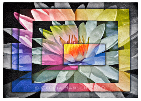
Gloria Hansen– first place!!
From the folks at C&T Publishing comes a wrap of market with some vendors that look so wonderful!
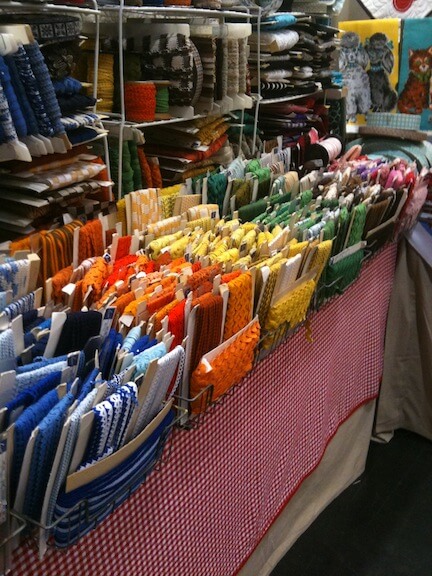 From Susan Brubaker Knapp comes another look at Houston Market.
A cool discovery on YouTube…I’m not one for music videos, but this reminds me of something the kids on Glee would have done. From Panic At The Disco comes “Ready to Go.”
From JPG Magazine comes pics from their latest – “Smokin'”. As usual, great stuff!!
From Mad Magazine comes a very different offering – a look at a USO tour. From someone who ALWAYS watched Bob Hope, this article gives good insight to life overseas serving our country.
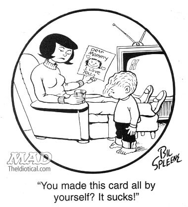
 And also from Mad comes a send-up of the Family Circus….great cartoons by Bill Spleen…..
From The Best Article Every Day comes great ways to maintain your learning. As someone who will probably never stop taking classes, there’s some great stuff here to explore.
 And now this….is really wrong – and oh so funny……suppose The Shining had been a romantic comedy…….someone with waaayyyy too much time on their hands……
Quilt, Sewing, and Gift Show
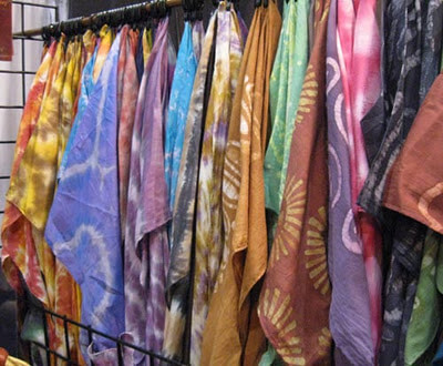
 This weekend is the Tucson Sewing, Quilt, and Craft show, which has not been publicized much. I only know about it because I had a call from a vendor trying to sell me stuff, and I found out they would be here in town. Plus, the show is at an “expo” center that’s not in a great part of town, and entrance was around the back – and not well marked. That said, I enjoyed two things about the show. One, I could go on a SCHOOL DAY!!! I didn’t have to wait until the weekend. Two, I met some really cool people and saw some unusual gadgets that I really want…..that’s always a good sign….
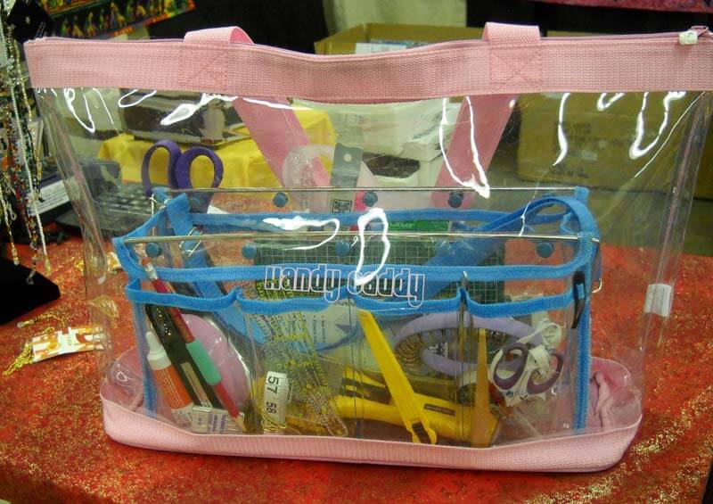
The Handy Caddy – I don’t normally buy impulse items, but I could immediately see a use for not only organizing my sewing table, but also carrying my sketch materials with me a whole lot easier than dropping everything in the bottom of my purse. The bigger tote will hold my sketchpads and assorted material for trips.
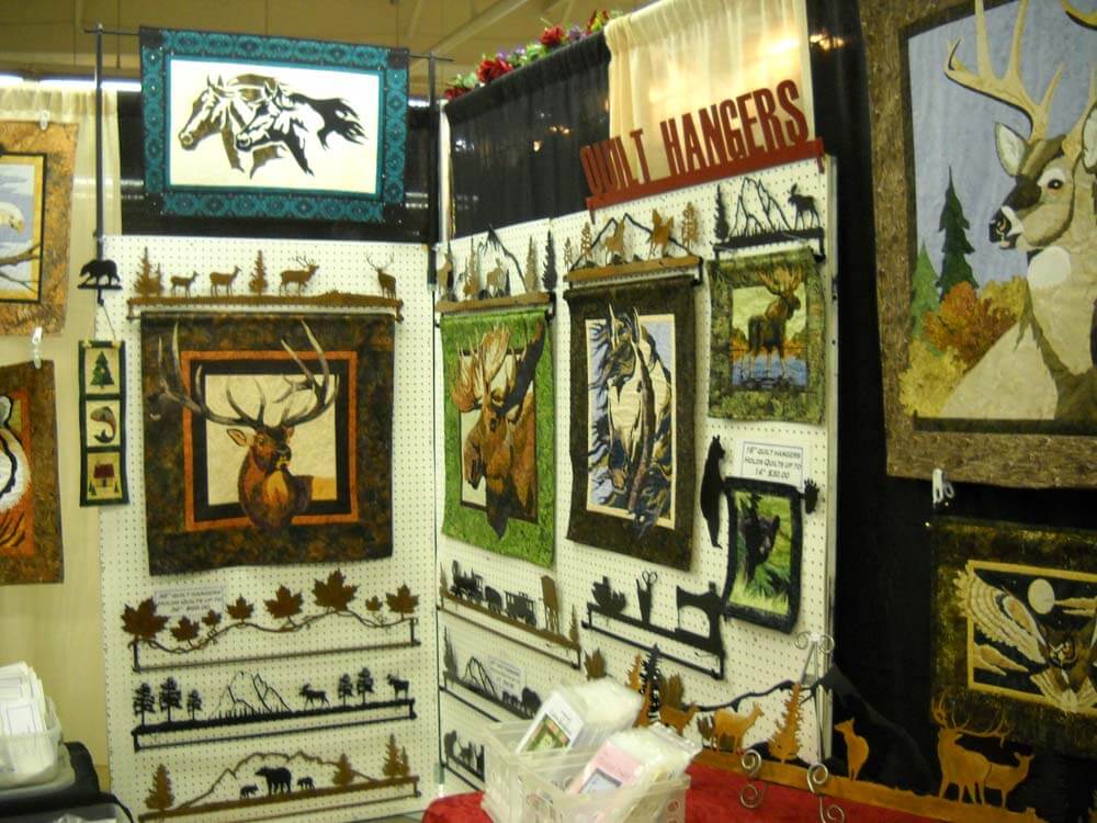
Also of interest were these really cool custom quilt hangers. I could see using these to hang pieces of fiber art for a quilt show, from Summer Sky Creations. The owner is local to us (well, norht of Phoenix, as opposed to East Coast) and can do custom work.
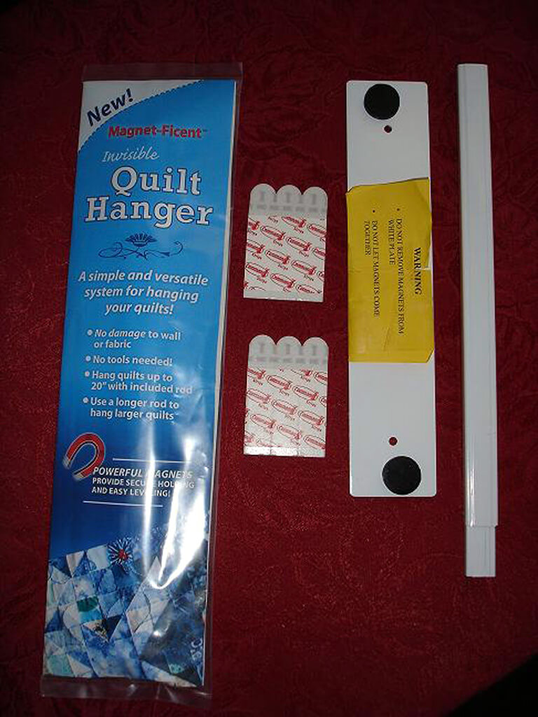
There was another quilt hanging system that uses magnets that I thought was brillian – even better for hanging shows at a gallery, and no tools needed or holes in the wall. From Rom Woodworking (check under Miscellaneous) comes Magent-Ficent: “$35.00 – Magnet-Ficent(TM) Invisible Quilt Hanger A simple and versatile system for hanging your quilts without using push-pins, screws, nails, or levels! Magnet-Ficent(TM) Invisible Quilt Hangers allow you to easily and securely support your quilt for display, yet it will appear to be floating very close to the wall with no means of support. This hanging system uses a small mounting plate attached to your wall using removable adhesive strips. ” We saw it displayed and LOVED the idea.
PS – his wooden thread cabinets are gorgeous!
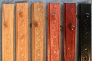
From VJ’s Creative Designs come additional quilt hangers, and they are also even more local to us – just south of Tucson. Gorgeous wood designs for hangers.
This is within the first hour, and we could already of spent lots of money. I did pass on the $300 iron (down to $200 as a show special). Loads of bells and whistles, but I really don’t need steam…..
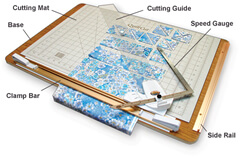
Then we saw THE cutting system….on our wish list. From Sew EZ Quilting comes this QuiltCut2 Fabric Cutting System. We saw it demonstrated, and when we get a little busier, it will help us save a lot of time preparing fabric.
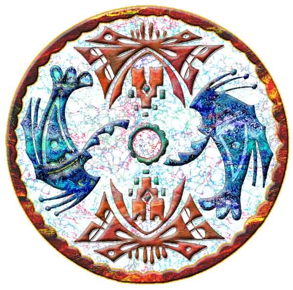
 Love this! Then I saw some GLORIOUS patterns from Pacific Rim Quilt Company that would be gorgeous in marbled fabrics. I love this pattern:
So it was a wonderful 2 hours of browsing, shopping, and talking to vendors. Now I need to go get busy!!
Top Ten Tuesday
It’s Tuesday, and here’s the Top Ten.One advantage to being on trips is I get caught up all at once and get lots of things listed for the next Tuesday! Don’t forget the bonus at the bottom from MAD Magazine!
From Dumb Little Man comes another interesting idea for organization: Try the Tag-It Approach for Increased Daily Productivity. I particularly like the parameters for tagging the tasks…like “high on irritation/nagging.”
30 Places to Buy and Sell Stock Photos, from Kate Harper’s blog of Greeting Card Design. Some great resources for photographers.

From JPG Magazine comes some great photos of their challenge “Give Me A Sign.”If you’re a serious photographer, you probably already know this site. If you just love eye candy, then follow along with their blogs.
Linda Matthews has a guest blogger on the topic of our inner critic. Here’s the start of Chris Zydel’s essay:
“I came across a startling statistic recently, which is that more than 90% of all children consider themselves to be creative yet only 10% of adults see themselves as having any creative capacity.
So what happened? How do so many of us lose our connection with the basic truth that we are all born creative and that it’s not meant to just go away once we get our adult badge?”
Alyson Stanfield has an amazing, right-on post about exposure for artists and the pitches that are thrown our way: You Promise Exposure, We Want Results. This really resonates with me, as we have had issues with folks from quilt guilds asking for donations. We no longer do that because 1) we were never thanked, 2) we never got a copy of the program or any publicity material mentioning us, and 3) our local quilt guild made assumptions about us always donating because they couldn’t afford to pay us. Sorry – I have bills to pay. So – if you’ve been in this position – and even if you haven’t – read this article!
Okay, here’s some of the coolest new fonts! Kate Harper Designs has a cool link to a blog post on typography. How can you not love a chocolate font?!?!? This is from DJ Designer Lab: 40 Beautiful Handmade Fonts.
From Lyric Kinard comes a bead tutorial that goes with her new DVD, Bead It Like You Mean It (on my wish list….). I do want to try these stacks.
From Cool Hunting comes a look at word play, “Word as Image,” much like the words we tried to decipher in class. Some interesting new revisions.
From Fine Art Views comes a blog post by Moshe Mikanovsky about 10 Ways to Use Your Smart Phone when it comes to marketing and building your business. A couple of good ideas here, and I personally need to get over being phone-challenged by my Droid. Making lists – and checking them – is probably the biggest thing I could do….
Also from Fine Art Views is a piece that really resonates with me this week, as we just got some local gallery representation. “Forget New York City – Think About Your Own Art Community.” We finally made the break-trough locally – and in a good way!
So…what have you found on the web this week? Send along a couple of links in the comments section!
BONUS: From MAD Magazine…….new Super Heroes…….Just Us League of Stupid Heroes….
















![IMG_1325_thumb[1]](https://www.marbledmusings.com/wp-content/uploads/2011/11/IMG_1325_thumb1.jpg)
