Archive for the ‘Elizabeth Barton’ Category
Free Motion Quilting – a New Design
 Oh my, have I learned some new stuff! The Free Motion Quilting challenge, hosted by SewCalGal, had a bonus tutorial by Susan Brubaker Knapp that piqued my interest. Basically you can create your own quilting design from your pictures. Well, I kinda figured you could, but once I read through this, I knew exactly how to do it. Bingo! I had loads of pictures that I would be able to use. I was having trouble with the drawing of the pattern for the August challenge; I planned to use that design on one of our bed stand runners. Now I had a new idea.
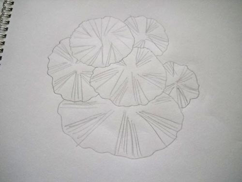
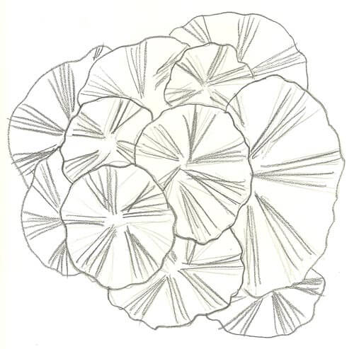
Concurrently, I am working on my Quilt University class, Inspired to Design, with Elizabeth Barton. I was looking at one of the photos I had morphed into a new design and suddenly realized I had a free motion quilting pattern right in front of me. Here’s the original picture:
Here’s the design element I developed a little further:
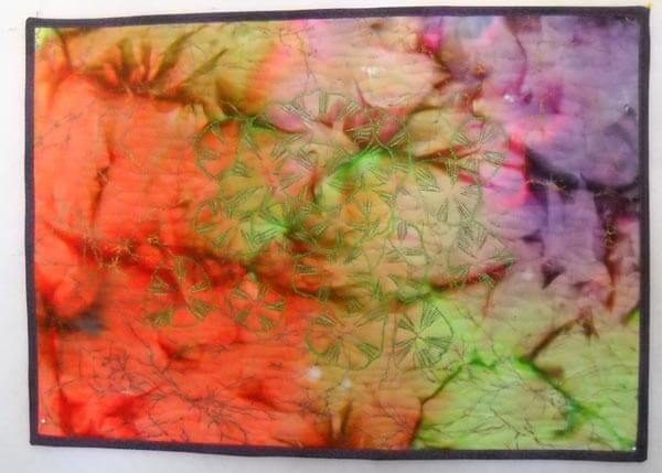
I added more pads to the design, made my pattern, and traced parts of it to the cotton. I realized, after my arms started to ache from tracing, that this was very free-flowing, so I really didn’t need to trace any more. I went with a brighter green for the outlines of the pads. Sometime in July I watched The Quilt Show episode on Stupendous Stitches, and after that I took a serious look at the other stitches on my Bernina workhorse 1008. Not many to work with, but I had one that I thought would work to give the idea of a ragged edge to the lily pad. Then I used a variegated green to do the stitching in each pad. I used a monofilament to create water waves on the rest of the background. Here it is:
Lessons Learned:
The background fabric actually worked pretty well, as did the thread colors. I wouldn’t stack the lily pads as much the next time. The most important lesson for me was going back and studying the original photo and realizing I could do much more with the interior lines. I became much more aware of that element in the original picture. I also did my binding a little differently, since I managed to cut it a half inch too thin. I used one of the stitches of a wave on the machine and made it very small. I tacked the binding down by maching, and you can’t really tell unless you’re looking at it close up.
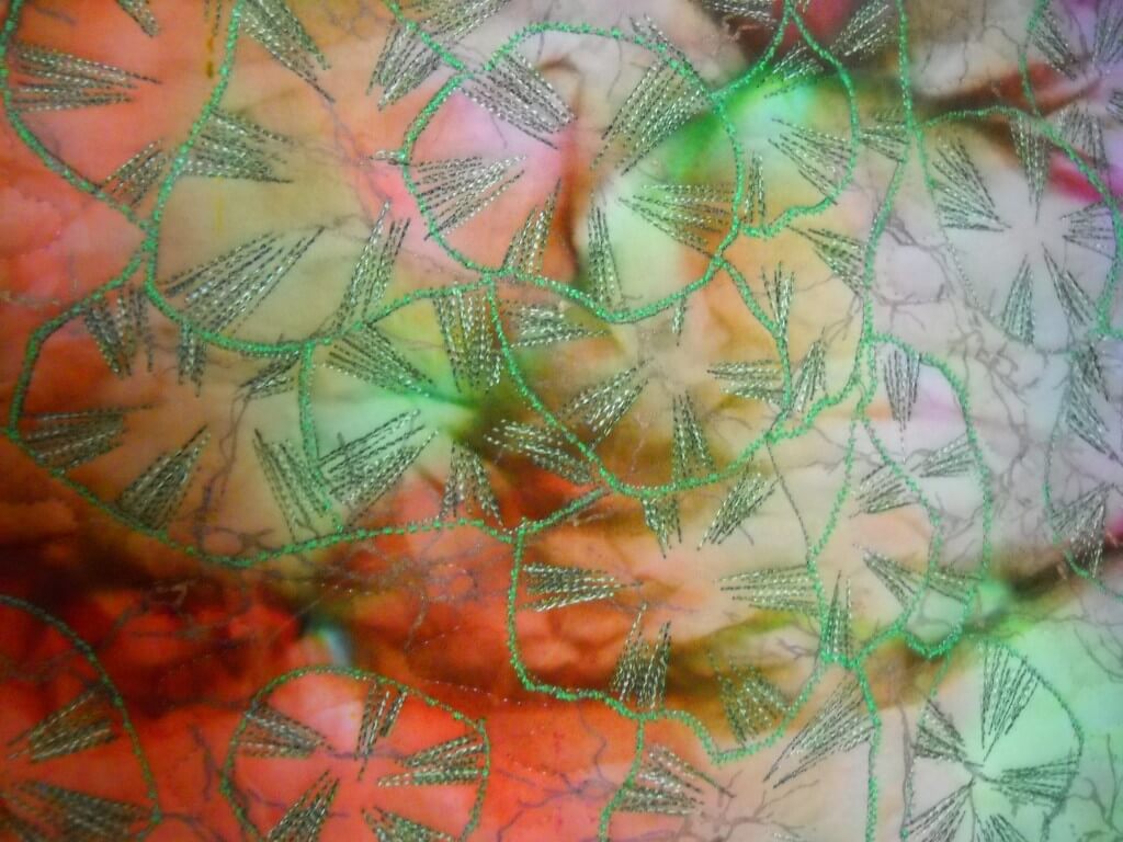
And speaking of close-ups, here is one of the pads:
For the purposes of the table runner and the learning, I’m done. Next time I would use more color within the pads, spread the pads out more, and probably add stems. Overall, I love it! Thank you, Susan and SewCalGal!!
Analyzing an Artist – Jacob Lawrence
 Part of Lesson 2 is to look at designs in terms of basic elements of art. I chose Jacob Lawrence, as I have always been drawn to his paintings, both for story and simplicity. I saw a retrospective of his work at the Museum of Art in Houston the year I went to Quilt Market. All of his WWII paintings were grouped together, so you really got the narrative of that work.
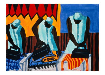
I am very much a novice at doing this kind of critique – I always feel hampered by the lack of any formal art training, but I am curious to know why something appeals to me. So here goes. These paintings are a selection from a blog post on The Ragged Cloth Cafe, by Jane Davila.
Such a simple task and so lovely in composition. The vertical lines of the figures unify the painting, as do the irons. The lines of the irons are different, indicating the various stages of pressing. You can see the tension in each woman as she goes about her task, possibly as a result of the angles of the irons and the bent/angled heads in concentration. Balance and proportion: the irons seem very large, but they may be because I am looking at them from a modern perspective. I’ve never had to use heavy irons, and perhaps they were that big. The women dominate the painting, but I like that. This is “women’s work,” and that domination shows that. There is a lot of repetition in the postures, as well as in the background. I can almost get a “sweatshop” feel, and I get an image of the women from the movie The Help working and talking together. Perhaps the repetition helps to show community. Economy: again a simple task and a simple composition, but the focus is on the main idea. I can see the blue of the upper right pulling the eye to two of the ironed pieces; same for the orange and red in the upper left. The women themselves are dressed similarly, perhaps to indicate the uniform of the job. The more I look at this the more I see the strength and movement in the women, in their arms, the irons, their heads.
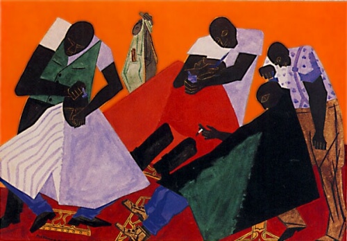
Now this next painting is one that doesn’t particularly appeal to me.
I find the colors very jarring, not at all harmonious. So many diagonals that my eye doesn’t want to rest at all. Again, a simple task at the barber shop, but there doesn’t seem to be the rhythm to the task as in the above painting. Unity/harmony: seems to be only in the main idea, that of a busy barbershop. Skin color is a unifying element. The faces seem to be the last thing you notice, just a few lighter lines. Interesting, in that may be a comment on the invisibility of the black community or the black man. Please note I am making that comment strictly from a white historical perspective. In terms of variety/tension, there certainly is a lot going on in this painting, indicating to me a very busy barber shop, and yet, now that I’ve noticed it, one man is smoking – that little bit of white draws your eye to the center of the painting. Balance/proportion: the piece seems very heavy on the bottom, big heavy dark triangles. The shampoo capes (for lack of a better term) are too many colors for my taste, and I think that’s what throws everything off for me.
Interesting exercise. I like having a selection of terms to work with, and I found I saw more in the painting the more I looked at it. But nothing beats seeing the work in person! What else can you add to the analyses? Comments welcome!
Design Class Continued……
 I’ve fallen a bit behind in my class through Quilt University, but I got myself somewhat back on track these past two nights, and I am learning some fascinating things through these exercises. First, I would never have attempted going beyond a basic picture or design like this on my own. It’s a case of “I don’t know what I don’t know.” These exercises are really stretching me, and what’s coming out is definitely intriguing.
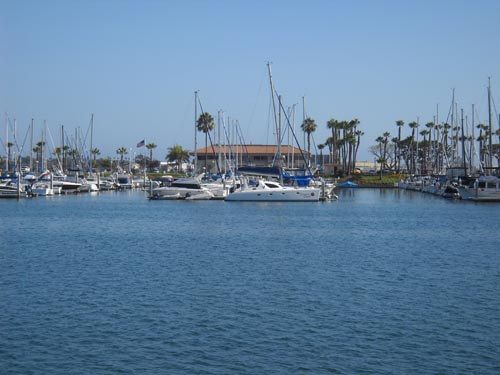
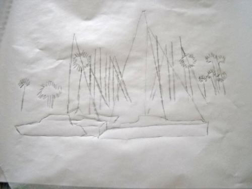
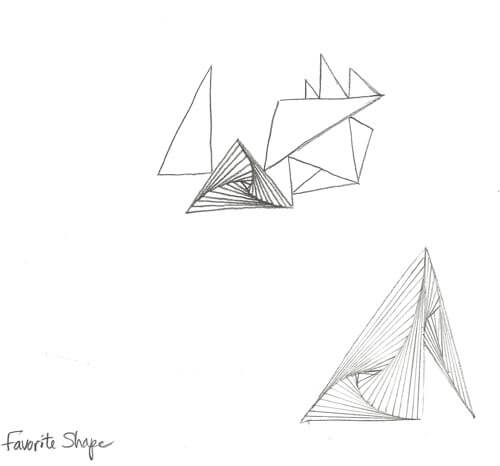
So here are the three basic pictures/sketches I have been working with and what has happened with them.
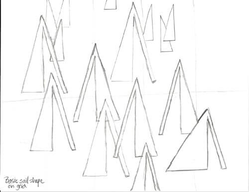
For this week I needed to take a basic design element and create a pattern with it on a grid. I chose a triangle for a sail, with a longer rectangle for a type of mast. As I was adding the pattern to the grid, I decided to flip the pattern, make some of different sizes, and make some small ones for depth in the distance.
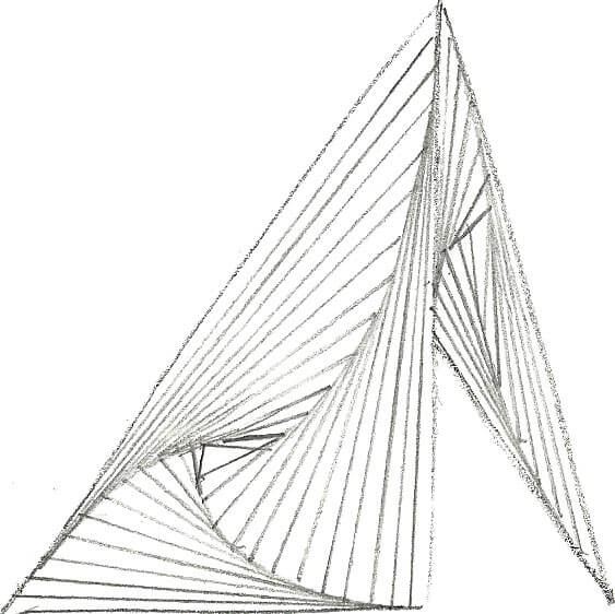
It may not seem like much, but it was quite the departure from how I work, and I can definitely see possibilities with this sketch. From this point, we took a basic shape (again the triangle) and just worked on creating triangles. At one point I decided to fill in one of the triangles with a favorite zentangle, Paradox. It looked so cool, I decided to see what the sail pattern would look like. Again, definite possibilities.
I think there’s huge potential here.
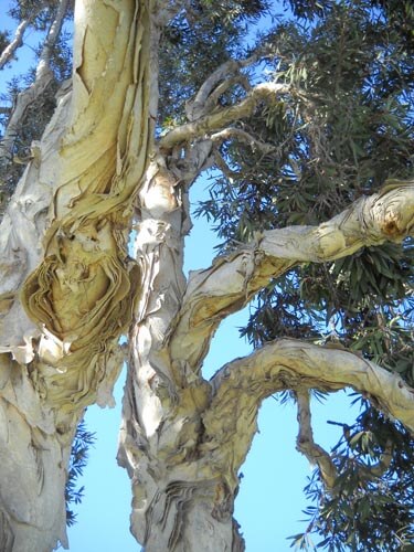
Now here’s the second picture and sketch, a tree from Spanish Landing Park in San Diego.
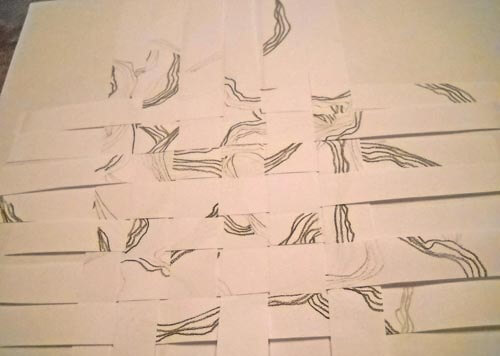
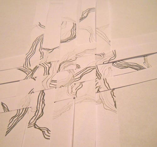
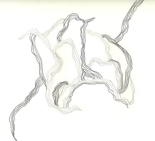 I worked with three different weights of pencils, and I really like this, plus as I work more with it, it is giving me some ideas for the driftwood piece. From here I sliced the piece in to strips and then wove them back into a new design. Very interesting activity.
I didn’t really care for this one, as I felt there was too much negative space.
This seemed better, and while I know I am supposed to concentrate just on creating designs, I find myself thinking about moving into fabric, and I have a hard time imagining how this would happen with this design.
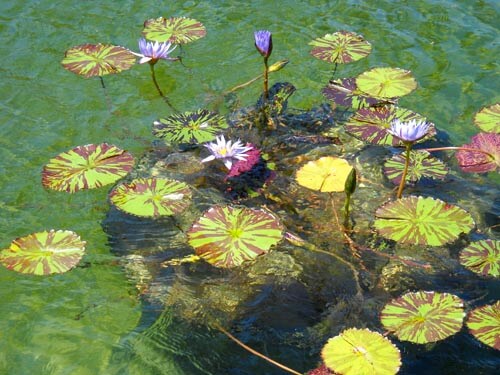
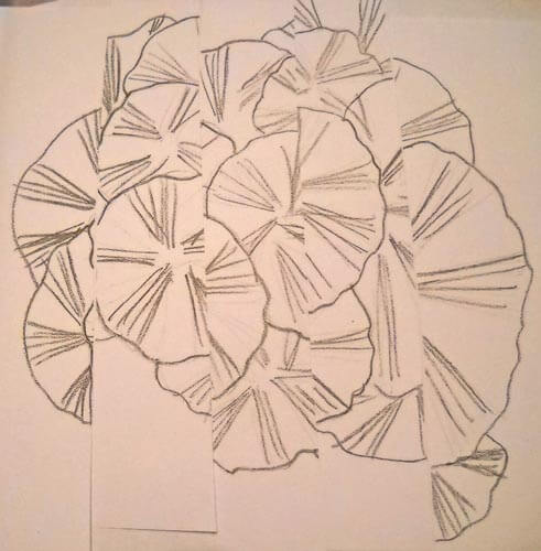
Here;s the sketch and the picture for the third one.
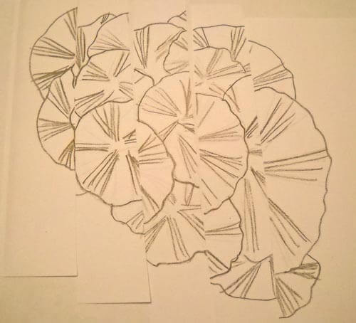
 This time I tried a different technique: I sliced the sketch and then put it back together, with each slice up or down of the other pieces.
With this one I could definitely see the idea of reflecting water.
There is a lot more to this lesson, and I think tomorrow I am going to look at more of the photos I shot in San Diego and evaluate them according to the principles of art. Then maybe I will feel like I have a better idea of the terminology and can try some new sketches.
Second Design Photo Analysis
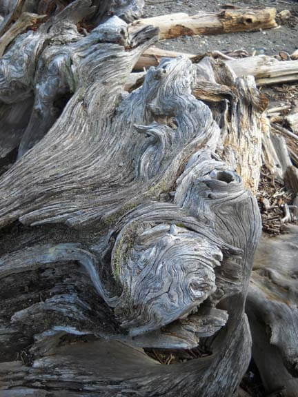
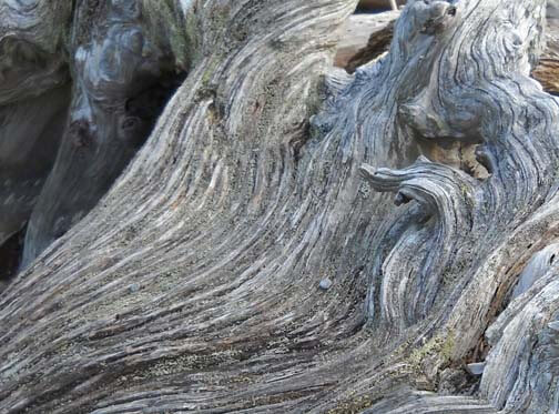
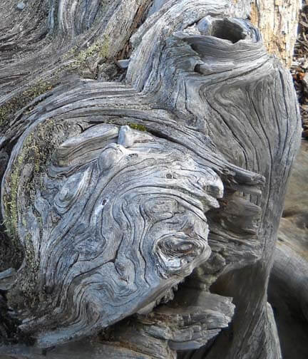
I worked with another photo last night, and I didn’t have nearly the success with adjustments and filters as I did with the first photo. Now I need to think through why that is so. Here’s the new photo – driftwood from Vashon Island in Puget Sound.
Well, crap….seems like I did it again in saving…or not saving. I need to remember to save everything as a psd file first to preserve the layers, and then save each piece individually. Okay, bottom line, nothing really spoke to me with the different adjustments, so I need to think through why that is so.
Is it because this is a fairly abstract image to begin with, mostly line and color? Perhaps that is why I am so fascinated with tree bark to begin with. The lines, shadows, differing colors to create the texture. And this picture, knowing it is driftwood, also reeks of a hidden history after being tossed in the water and then left high and dry. But how would I create some of that mystery?
What initially prompted me to take a picture of this? Probably all the smooth curved lines and the knot.
Looks like all kinds of interesting lichen within all those folds. The colors are so subtle, but at the same time I see a nice interplay of line and shadow.
I look at that knot and see a captured sea spirit. The more I look at this one, the more I am intrigued by it. The curves are so soft amidst all that hardness.
Now that I look at a couple of additional questions, I am stumped. Main idea? I like the thought of a captured sea spirit. Areas worth keeping? I can see leaving out everything else from these two crops. Other elements to add? No clue. But as I ponder, the first thought that comes to mind is to carry the lichen out into a border, and maybe the overall piece doesn’t need to be square or rectangular, maybe more oval so that the spirit seems encased and surrounded but is really still there. Don’t know if that is making sense….
How and where can more pizazz be added? Again, no clue. But…perhaps a lot of thread painting would be needed for surface texture.
I can see this going to sketches as the next step and seeing what develops from there. Comments?
Trying to Learn Something About Value…..
…that could also read “something OF value,” but I want to focus in on the issue of value and color in design….something I know I am really weak on. I’m choosing a couple of pics that I really like for design composition and playing around with Photoshop filters to see what they tell me about the composition. This is different from how I usually approach working with Photoshop….play around until I get something that says Wow. This time I’m looking at the elements of the picture and trying to see how they change and why I like – or don’t like – the design.
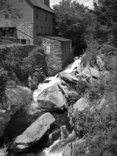
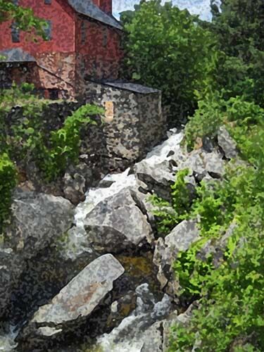
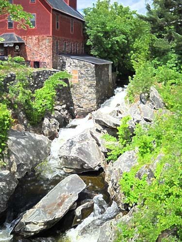
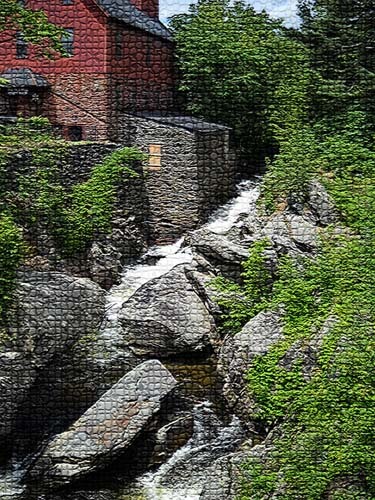
Here’s my first photo, taken in Jericho, Vermont two summers ago, at the Old Mill, which houses much of the history of hubby’s family.
I love everything about this picture: the greens, the mill red, the flowing water, the fact that I’ve got it composed in thirds. And you can’t see that right behind me is very busy Route 15. So what did I learn from this exercise?
Primarily I am much more aware of the basic lines in the composition. The lines don’t change, but the focal point does, depending on the filter or effect I used. There is one example that I would consider making up in cloth, as I find it intriguing, and I’ve never tried anything like that. The others are just interesting to analyze. Here goes:
I love black and white. After three weeks in Seattle this spring, I developed a whole new appreciation for shades of gray (no, not the book……). I want to take this photo and play around with a few sections of rock to see what I might be able to sketch.
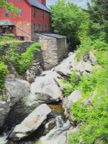
This is the “sponge” filter, and it’s one I really like. Shadows and subtle colors really come out in this filter. Once again I am amazed at all the shades of green there are. There’s more shading in the mill, as opposed to the original, but the movement of the water is lost.
This is the “find edges” filter. Interesting to see where basic pieces of fabric would be. I think I can also see the dark, medium, and light of the photo.
Accented edges filter. More of a pattern to follow if I wanted to recreate this. I did a small cropping that I could see in a 12 x 12 piece. I’m liking the shadows.
This is the “patchwork” filter, and I could see making this up as a larger wall quilt. The filter allows you to make the squares larger or smaller, but I am really curious to see how this would work up in piecing. I need to print this out larger and use my little red rectangle and look at the values closer.
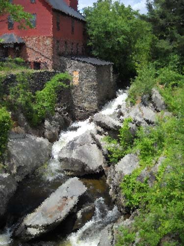
Well, I have managed to lose my original with all the filters listed on it, so c***. What I like about this above photo is the additional shading that is present in the rocks, and in the red portion of the mill. Lots more texture, and I could see using some colored pencils to enhance the fabric pieces.
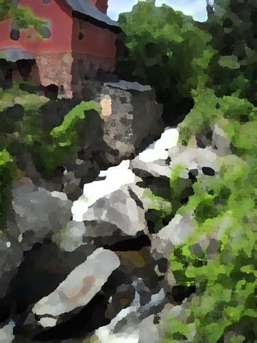
I believe this is a watercolor filter, and I like it. I can see looking for specific fabrics for this piece, rather than trying to do lots of little pieces togather. I could see just cutting pattern pieces and fusing them into place. I like the softness.
Palette knife, I think. I like the general clumps of color, and as I reflect on this, I could see making this into a small abstract. The image is still recognizable, and I like how you can see an actual pattern to follow in putting this together.
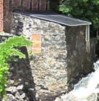
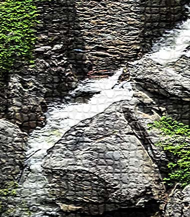
This is mosaic tiles, and I like the effect better than the patchwork photo above. I’d have to spend some time thinking about how to get the “grout” effect…..maybe a mottled gray color with texture in it as the background piece, and then the tiles cult at somewhat irregular edges so the grout shows through. I cropped a piece to see….
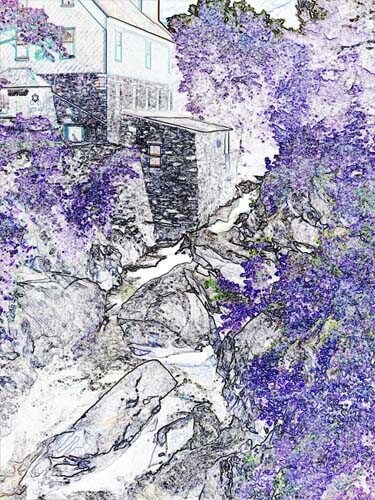
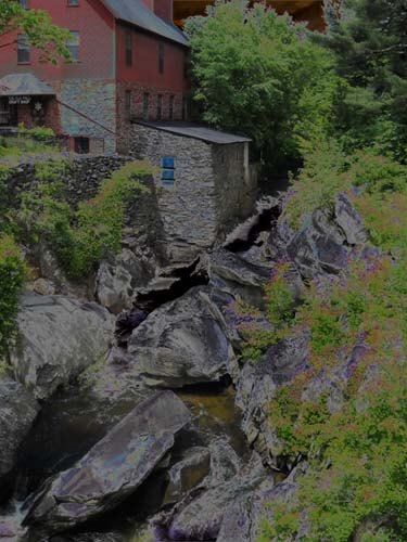
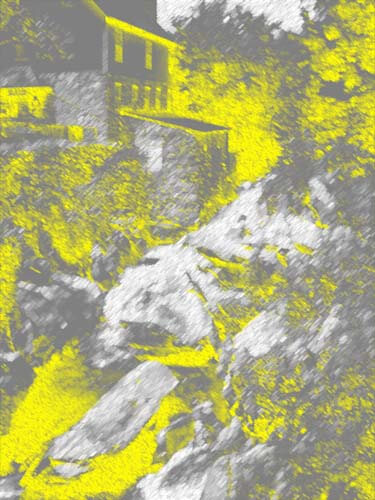
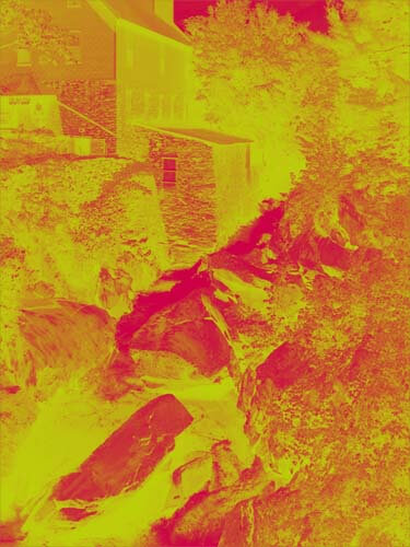
This is an inversion adjustment, and I like these because I always see something different when the colors are completely different. The yellow accents the shape of the edge of the mill in a way you don’t notice in the original photo. The rushing water doesn’t show up at all.
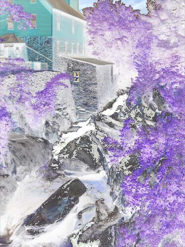
Forgot the adjustment, but the amount of purple really accents the amount of green in the original photo. And I like the way the shapes of the rocks are accented.
This is a red/yellow gradient, and I like playing around with gradients. Very other-worldly, but I don’t see taking this piece any further.
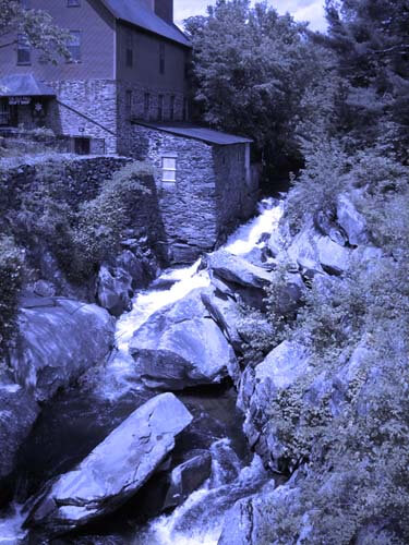
I saw some quilts a while back that were based on Joen Wolfrom’s color tool. People chose a color and then worked solely in the range of that color. Results were pretty dramatic. This is a color filter in a deep blue. I think I would print this out and take it fabric shopping and see just how well I could pick out various blues and other shades that have a blue cast to them.
That’s my first study, and I definitely need to do more of these. I feel like I have a better understanding of the composition of the original picture. Next up, my wrought iron photo….
So Where Am I as an Artist?
 Ya know, I’m not really sure. I have a few goals this year of entering a couple of shows, and a couple of proposals for galleries, but I keep wondering about the work I am doing. First of all, I really love the art that I am creating. I’ve had a love affair with fabric for years, and now that we are turning out some really great pieces with our marbling, I love it even more. But I feel like there’s a lot more.
The big change for me in how I looked at my fiber came when a quilting friend took a piece of marbled fabric and quilted it all over. I had secretly suspected there was a lot more I could do with embellishing the fabric, and Ellen showed me I was definitely on the right thinking track…it took me a year or so of playing with threads and the sewing machine and my ideas to create something that I really felt was good – and different.
I’ve written before about entering shows and getting rejected. Hey, it happens. It’s to be expected. Wjen I objectively look at work accepted into shows (like it’s really possible to be totally objective….), I am struck by how “quilty” the pieces are, even those billed as art quilts. I also can recognize styles and “names,” and I keep looking for something really different that pushes the boundaries of fiber as art. And then I always figure it’s just me and sour grapes.
Now here’s where I’m not sure just what it is I am trying to say. And this has been brought on by a post by Elizabeth Barton, an art quilter and artist and juror of art shows. “Quiltopee” was a post about a week ago that has me pondering. Here’s the beginning of her blog:
“Quilters often say they wish that “they” (critics, museums, galleries, collectors, the public) would recognize quilts as a mainstream art medium. Other media, for example photography, have developed to the extent that most museums now include photographs in their collections and display them regularly. So, why not quilts? At least part of the answer is that quilts have not developed from their early beginnings in anything like the way that other media have.”
I find this really intriguing. Art quilts seem to be the rage, and I see some pretty amazing ones. But I also see “art quilts” that seem to take everything that can be done with thread and fiber and machine quilting and throw it all together, just because you can. I subscribe to the philosophy that “just because you can do something doesn’t mean you should.” Just because you can machine quilt something to within an inch of its life doesn’t mean that’s what your piece really needs. Yet those seem to be the quilts that are getting in to shows and winning awards.
Elizabeth continues: “Contemporary art is rich, diverse, and unpredictable. While painting, drawing, sculpture, photography and crafts are still popular, new media are more likely to be seen in contemporary art shows: film, video, audio, installation, performance, text, computers. And media are frequently mixed. It’s hot to use an “old” medium in a new way: paintings that are pixilated, drawing with chocolate. But how many quilts have you seen made from chocolate? (though it’s a grand idea!).”
She goes on to say (and this is what really struck me): “But I’m afraid, and correct me if I’m wrong(!), we don’t see these kinds of things in quilts. Quilters tend to stick very much to making quilts the way they were always made. There’s nothing wrong in this, but that’s one reason why the contemporary fine art world is not very interested. They’re not so interested in paintings made the traditional way either.”
Hmmmmm. I’m doing things with fiber and marbling – an unconventional marriage to begin with – and adding thread, additional painting, unusual hangings/display means. So much so that people who look at my work don’t know what to call it….”Is that supposed to be a quilt?”
Well, no. It’s art, it hangs on the wall. You can look at it, appreciate the subject matter, mayne think about how it was made. But how does it affect you? What do you see? Forget the “why isn’t it a regular quilt?” They don’t see any underlying message to the subject matter.
Elizabeth finishes with ” I think that the answers to questions as to why art critics arn’t interested in quilts are evident in both formal and content areas: quilters don’t really want to stretch the medium to uncomfortable (if not breaking) lengths, nor do many of them want to address some of the contemporary issues evident in main stream art. As I said before, neither good nor bad, but, rather, why!”
The small fiber piece I created in response to the Tucson shootings upset a few people. The subject matter was raw; it was created during the first week after the shootings that killed 6 and left 13 wounded. One snarky comment (anonymous, of course) in our local paper said, “Where was she with a quilt to wrap up Hitler? That would have saved some lives.”
As I’m writing this post, I’m also processing. The Art from the Heart website does contain art quilts – and other media – with a message. They probably wouldn’t be accepted into any kind of art quilt show. But they are addressing contemporary issues. So am I ahead of myself? Am I pushing myself in other directions that the fiber world is ready for – the quilting world isn’t – and may never be?
I am really interested in your comments to this post, and Elizabeth’s ideas in general. You can see some of my earlier fiber work on our website. The more “message-driven work hasn’t made it up yet. One of my goals for the first half of the year……

