Archive for the ‘framing’ Category
Agape – and Values for Going Forward
Loving kindness and compassion – agape – isn’t as easy as it first appears. Each day I find myself reviewing situations where I could have responded in a better manner. I am becoming hopeful that enough individuals around the country and the world will want to bring about peaceful change. The following was in my inbox email a week ago from the Obama Foundation, and I share the bulk of it here with you as we attempt to move toward a peaceful, equitable society and world.
“A little over a year ago today, President Obama walked out of the White House for the last time as President and stepped out onto the street as a citizen.
Since then, working alongside tens of thousands of people like you, we’ve been building something new — an organization that bears the Obamas’ name, but belongs to all of us. An experiment in what it means to be an active citizen in the 21st century….
As we head into this new year together, our work will continue to be guided by your input, and by our values — the pillars that hold this organization up. Our values are what we stand for — what we all have in common….
So I wanted to share those values with you directly. They’re what drive my work each day — and I hope they serve as a source of inspiration for you, too:
Teamwork. We’re building a global community that will work together and support one another. We’re invested in the success of others, we treat each other with respect and kindness, and we will work diligently to lift each other up.
Humility. We share a passion for impacting the lives of those around us. Sometimes that means speaking up and other times that means stepping aside to create space for other voices….
Integrity…How we do our work and how we collaborate with others is just as important as what we’re seeking to accomplish.
Inclusivity. We value each other’s contributions and hold the conviction that only from diverse backgrounds and divergent points of view can we find the best solutions.
Stewardship. We roll up our sleeves, work hard, and focus on what we’re giving back to our communities — rather than what we are gaining ourselves….
Fearlessness. We have a fearless mindset. We’re not afraid of taking risks, sharing a new idea, meeting new people, or admitting when we just don’t know the answer. Something great might come out of it.
Imagination. We strive to be novel thinkers. Unconventional ideas and new perspectives are why we’re here. We’re willing to make big bets on ideas that haven’t been tried before as we aim to solve the hardest problems of our times. Be yourself, and be bold.”
David Simas, for The Obama Fountation
Art in 2016 – Part 2 Review – Small Works
A lot of smaller work was started, finished, and revised this year – part of the need to create more pieces, and part to experiment with new ideas. We also tried more framing (pretty successful) and mounting on canvas (very successful, and not that all expensive). The biggest issue seemed to be people didn’t know what to do with small wall hangings or table-toppers. By framing them we are leading our customers to see the piece on a wall, looking like artwork. This is also working well for galleries and stores with small spaces.
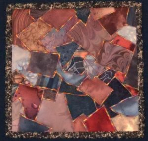
The “Chocolate Box” piece on the left was done some 18 years ago as part of a challenge on the QuiltArt list to create an 8 x 8 piece with the theme of “brown.” I pulled all kinds of browns from my stash, including some marbled fabrics, and then I zigzagged them together with the idea of creating a “Whitman’s Sampler.” I have always thought it looked very cute. I rediscovered it this summer, adding batting and backing, variegated thread in a more prominent zigzag, put on a binding, and mounted it on fabric. Lots of good feedback on the piece.
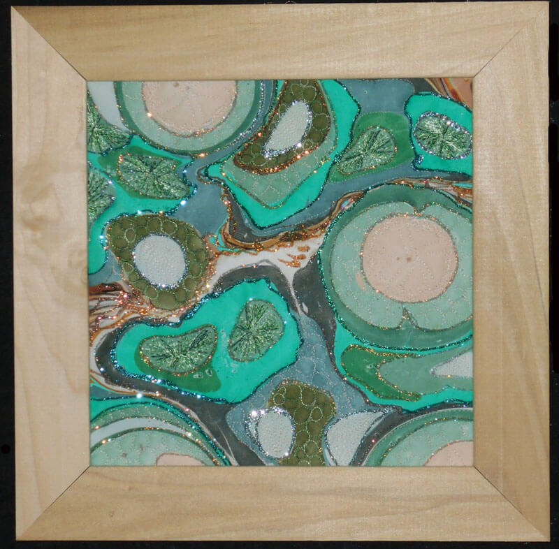
Another piece that saw framing was a small piece of marbled poly-satin that a friend (Suzan Drury of Saltwater Systems) added glitter to at least 10 years ago. Loved it, but it didn’t translate into something someone would want to buy – so on a whim I added batting and backing and then quilted it – thus “Pond 3” – a favorite topic. I learned to do sand dollars as part of a tutorial from Lori Kennedy (theinboxjaunt.com), so you will see clam shells, sea urchins, and sand dollars throughout the small piece. It looks quite striking. One thing I learned in the framing process was to move to lighter-colored frames to keep a piece from feeling constrained.
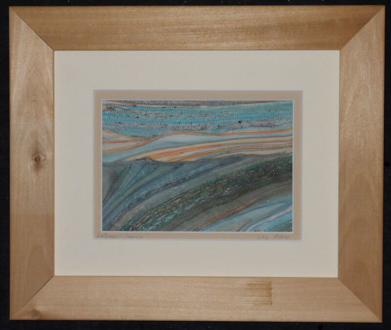
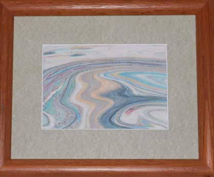
this year saw the debut of a new series – “Leftovers.” The idea for this came about when we would clean the marbling tray after a session. There were wonderful designs of leftover paint as we emptied the carrageenan. We started saving some small pieces to capture to designs – all of which are very organic and “earth strata.” Two pieces made their debut at Phoenix Books in Essex as part of a rotating display of work by the Essex Art League. There are LOTS more to come – all of which need me to stare at a piece for a while to determine how it wants to be stitched. They are all simply framed and look almost like photographs.
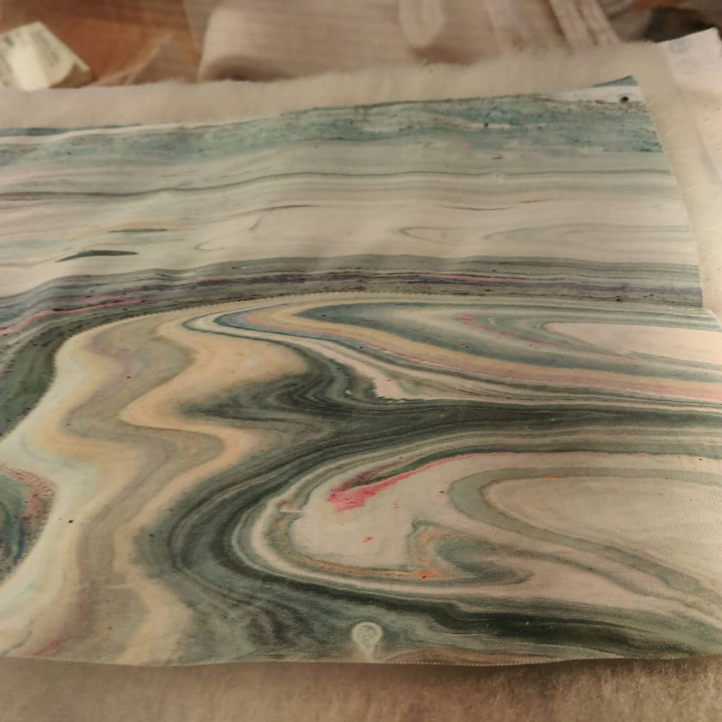
Before stitching on From Above:
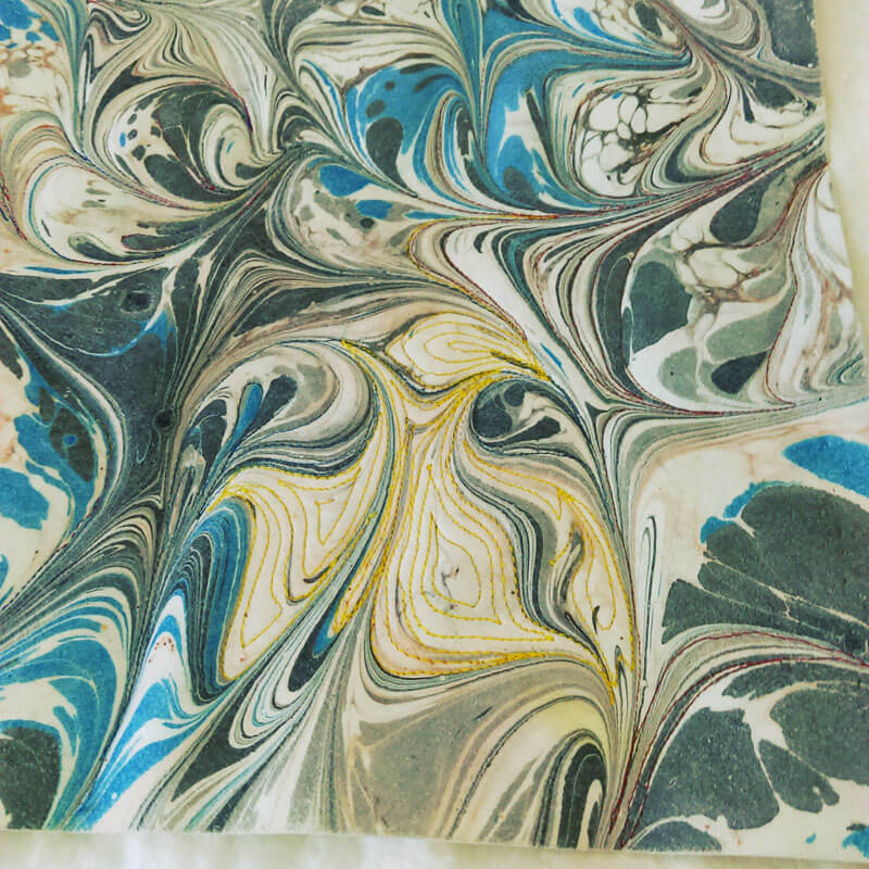
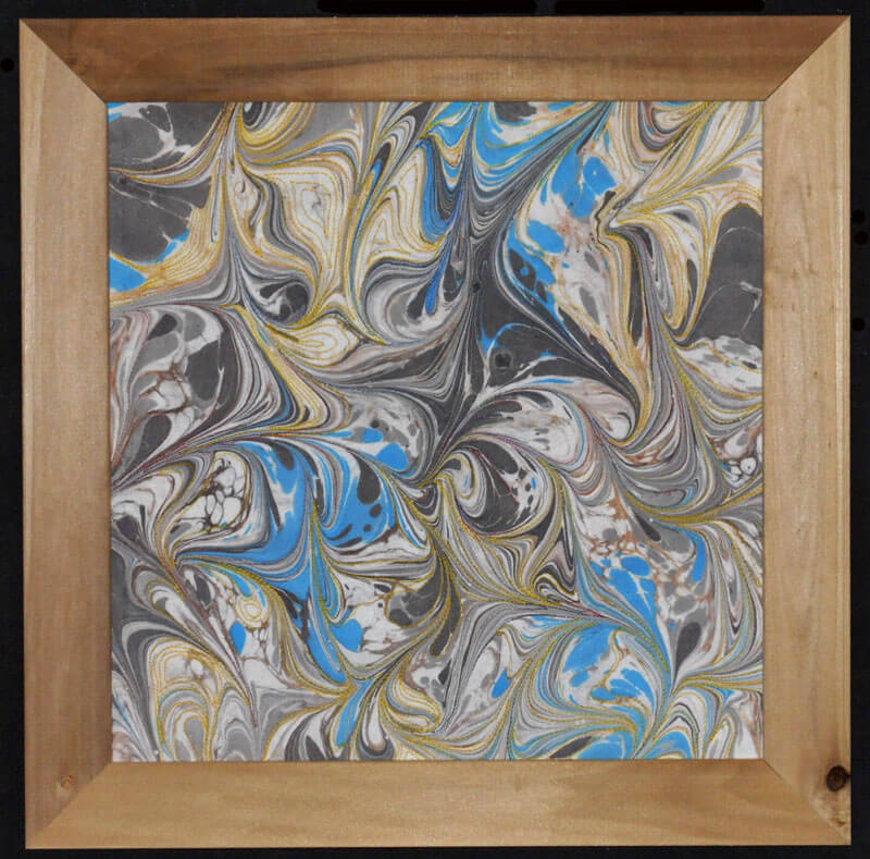
Ultrasuede marbles wonderfully. Over the past couple of years we have been doing yards of this for Bead My Love to sell at the various bead and gem shows. We get to keep a few pieces for ourselves, and this year I finally attacked quilting one – with some interesting lessons….the fabric feels like suede, but it doesn’t translate to a puffiness when quilting (note to self: use extra batting for the next piece). Also, the various colors didn’t show well, which is why I went with Superior Threads New Brytes yellow – a thicker thread. this is a 12 x 12 piece of ultrasuede. Introducing “Partly Sunny, Chance of Storms.”
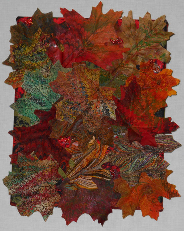
One more piece – we also started marbling flowers and leaves from the silk flower sections of the craft stores – another way to use up left-over paint in the marbling tray. Here’s “Autumn,” a collage of some marbled silk leaves. Covered canvas, 8 x 10 inches.
More next time as I continue to review the year. Comments welcome!
Photo Friday – The Botanical Gardens
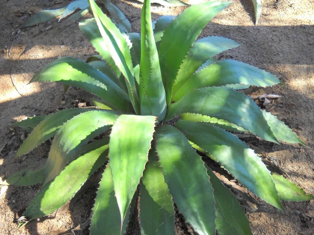
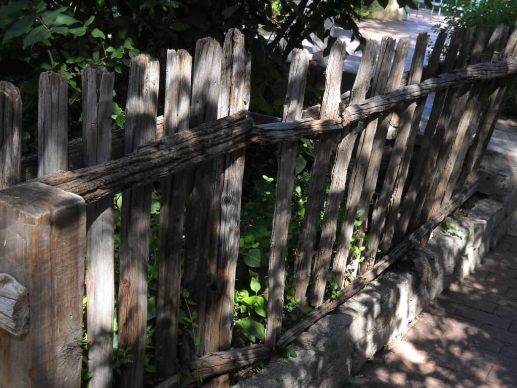
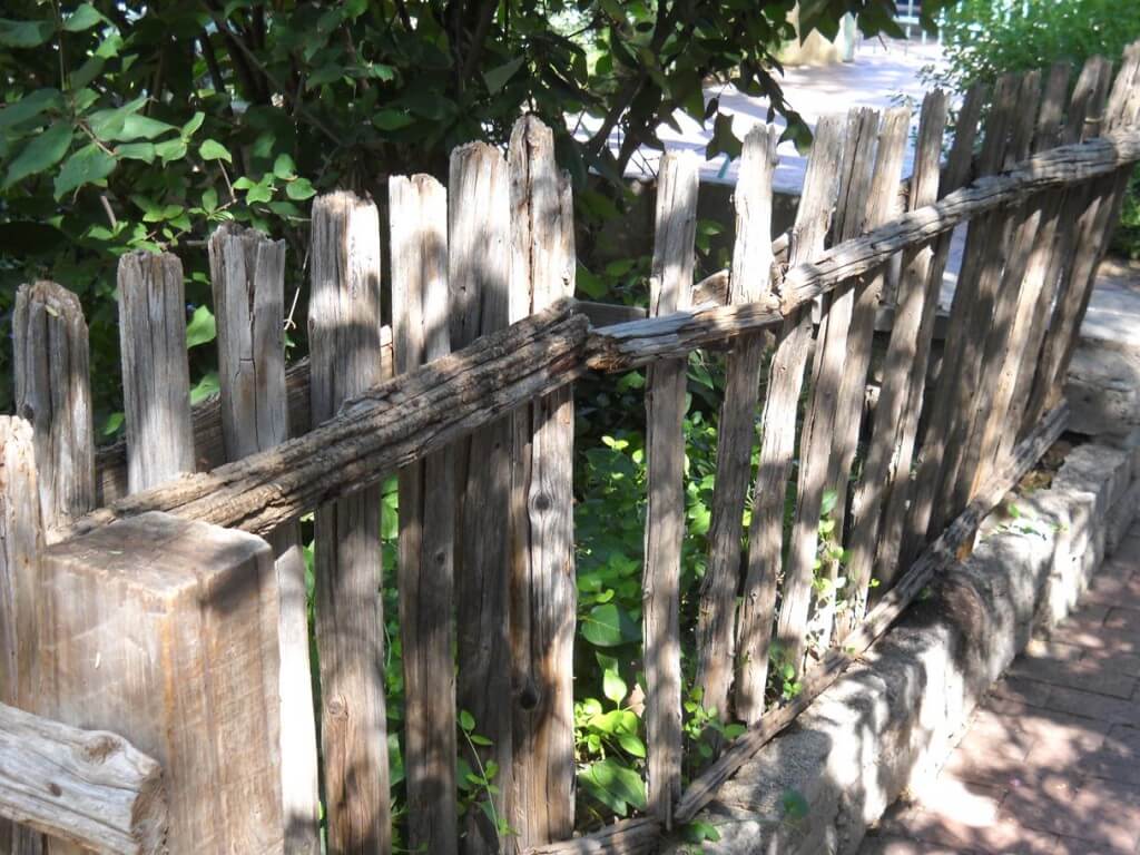
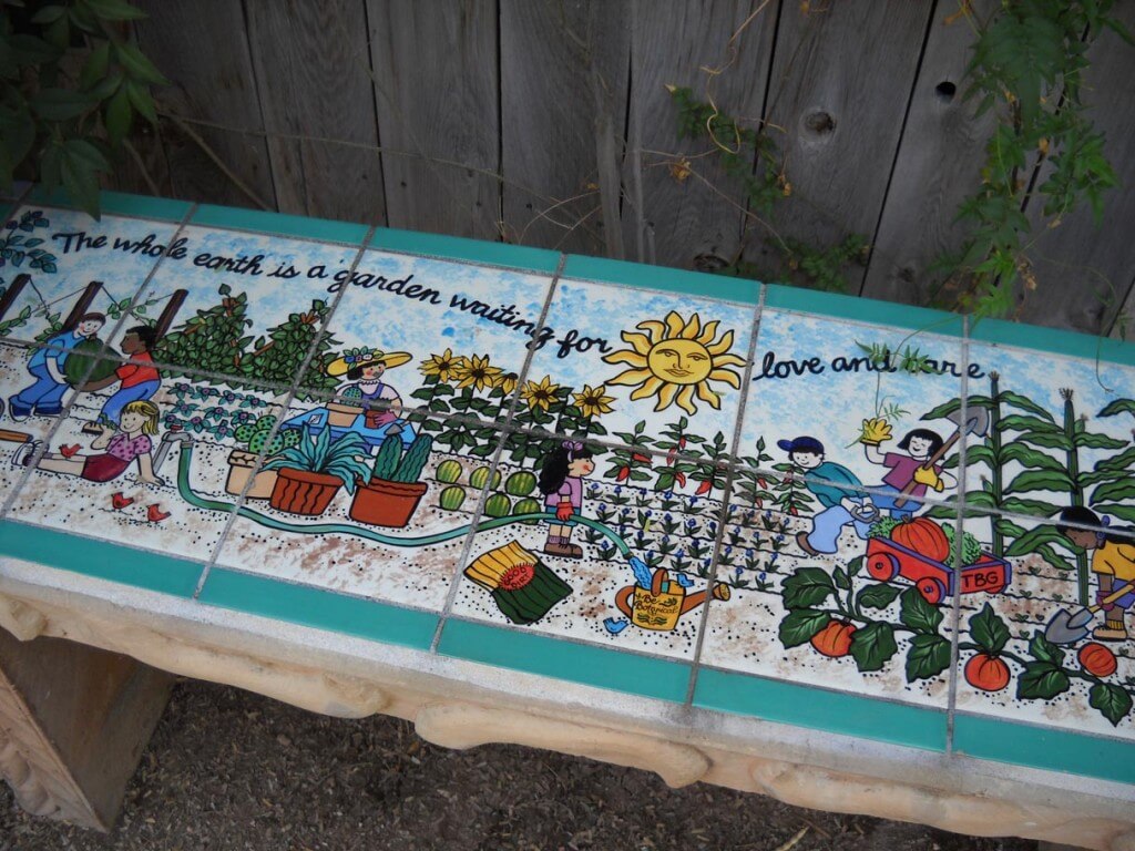
![]() It is so good to be back doing some photography, some Photoshop, and just generally playing around. Hubby and I went for a two-hour stroll through the Tucson Botanical Gardens, since it now is mid-80’s, and you can be out and about and not feel like you’re burning up.
It is so good to be back doing some photography, some Photoshop, and just generally playing around. Hubby and I went for a two-hour stroll through the Tucson Botanical Gardens, since it now is mid-80’s, and you can be out and about and not feel like you’re burning up.
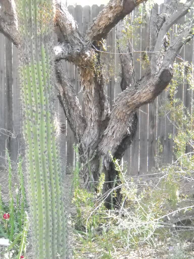
Took the camera and just looked at texture and framing. Color has not been adjusted at all. I did play around a bit with exposure…discovered that on the camera, so had to try it out.
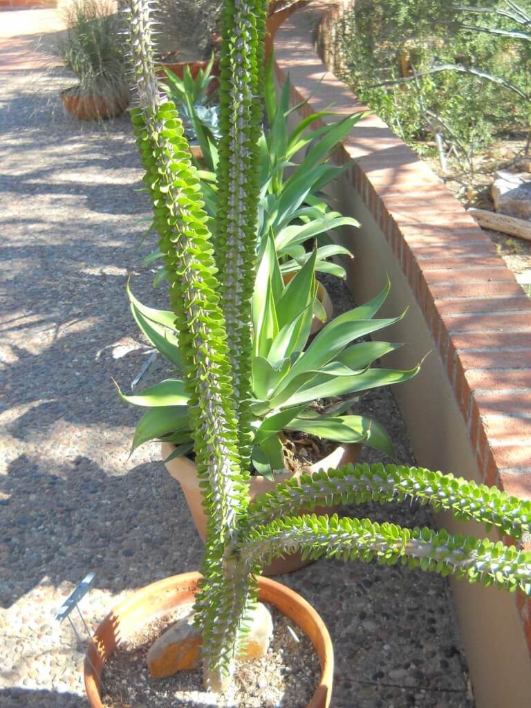
It always amazes me that no matter how many times I go to the Botanical Gardens in Tucson, I always find something new. Yes, it’s still comparatively green here in the desert, even in mid-October. Take a look, and let me know your favorites. What would you change, which ones do you like, what suggestions do you have for framing?
So what do you think?
Monday Marketing – Art Display Systems
As promised, here is the third part of Moshe Mikanovsky’s articles on preparing for art fairs. This third part looks at display systems, complete with pictures. This is great stuff! i did the same thing at an art fair – I went around and snapped pictures (with permission) of the hanging systems I saw. This is one of those areas we just don’t pay enough attention to until it is actually time to display our work. I know that as I develop more of my marbled pieces, I am more conscious of how it should and will hang as I construct the piece. So enjoy!
Art Display Systems for Art Festivals
by Moshe Mikanovsky
This article is by Moshe Mikanovsky, Regular contributing writer for FineArtViews. You should submit an article and share your views as a guest author by clicking here.
Last time, in My First Art Fair Checklist – Follow Up, I promised that I would dedicate this post for the display system at the art festival (or art fair, whichever term you prefer). My display system was of the “Made in Home Depot” variety and couple of readers commented that I should really invest in proper, professional display system.
I do agree that professionalism is key and important in displaying yourself as an artist, the respect you give your creations, and the respect you want to get from everyone viewing, and more importantly, buying your art.
But, and here I want to list several reasons, there are quite legitimate reasons why you may want to go a different route, not the most conventional or “academically” professional:
· The budget factor. Not trying to raise the worn mantra that we are starving artists, therefore we can’t afford spending money on a professional system, some of us still have budget constraint. Whether it is your first experience doing an art festival and you want to try it out before you spend into it, or you honestly prefer to spend your budget on quality art materials and framing to create the best art you can possibly do, your budget might be squeezed and not much left for the display system – which is really, just the background for your artwork.
· Do it differently. We like to say that artists can break every rule and still make great art. So why not with how you display your art? I have seen several displays that were just different and unique and that made me want to look at them. But maybe that’s not the best thing since the idea is to focus on the art really…
· Practical means. Some DIY display systems are much easier to carry and transport and therefore could be ideal for artists who travel far, don’t have a car, live in the city and use the subway/taxi/bicycles, or all of the above. Imagine trying to carry around on top of your art also a big display system, professional as it might be.
· Everything works. I have seen it myself, and I am sure many of you can testify, that also without the professional display system, artists sell their art! There are many reasons why art is sold, or not sold, at art fairs and festivals. But not having “the right” display is only one piece of the puzzle.
OK, so with no further due, here are few of the display systems I have seen during my first art show. I was amazed with the varied options I saw with only 90 artists showing in the park! I am sure there are many more excellent ways and when I’ll find more, I will keep you updated. So here we go:
The Double Twines
Couple of simple twines tied to the tent’s frame at the top and to the artwork’s back wire at the bottom. This is the simple version of The Double Chain (see below).
Pros: Very inexpensive and simple.
Cons: Can only carry one painting, which should be fairly light. Paintings sway in the wind.

Julia McNeely www.juliamcneely.com
The Double Chain
Couple of metal chains hang from the top of the tent’s frame. The hanging of the chains can be by cable ties (as seen in the pictures) or by double length of the chain wrapped around the frame. The artwork is hung on S hooks suspended at any of the chain’s links.
Pros: Inexpensive and simple. Can hold more than one painting on long chains.
Cons: I have seen paintings sway in the winds.

|

|
The Clothes-Lines
Two clothes-lines or similar twine is stretched across the width of the tent’s wall. The artwork is hanged off the clothes-lines using clothespins. Suitable for non-framed art on paper.
Pros: Inexpensive and unique look.
Cons: Might look too DIY/crafty. Doesn’t fit for all type of artwork. In this case the artwork are prints on wrinkle-free “peel and stick” cloth, so they are well protected and suited for this hanging system.

|

|
The Leaning Boards 1
Two 1”x2”x8’ wood strips, attached at the top with metal hinge. The top is leaning on the tent’s frame and the bottom is open couple of feet wide. Throughout the entire length of the wood strips, angled grooves were made in order to hang the art from. The wood can be pre-primed with white paint, or you can paint or leave natural. For extra stability, the top is tied to the tent’s frame with some twine.
Pros: Inexpensive and simple look. Can fit several paintings.
Cons: Stability might be an issue, but it seems quite stable. Need some DIY know how to make the grooves properly.

|

|

|
John Visser, http://johnvisserart.com
The Leaning Boards 2
Wide boards, in this case old barn boards (over 100 years old!), leaning on the tent’s frame. To protect the frame, a foam material was used to wrap around the frame where the board is leaning against it, and the board is secured with some twine. For hanging the artwork, wooden pegs were installed in equal intervals.
Pros: Looks really nice! Old barn boards are not a must, although they make the difference, having a very unique look. More than one piece can be hanged on each board, and as extra touch, another board was made into a narrow table.
Cons: I won’t go out of the way to find or purchase these old boards, only if I happen to have them lying around. Stability might be an issue if someone kicks the bottom of the board. Quite bulky to carry and transport. Some DIY know how is required to install wooden pegs.

|

|

|
Jennifer Toliver, www.jennifertoliver.ca
The Leaning Boards 3
This one is made of metal railing that already comes with some holes in them. The railing was tied to the tent’s frame with bungee cords. S hooks are used on the holes to hang the artwork.
Pros: Inexpensive and easy to install. More than one painting can be hanged on each railing.
Cons: The look is quite cold and industrial.

|

|
Nicky Hindmarsh, nickyhindmarsh@hotmail.com
The Fencing 1
A metal fencing stretched across the width of the tent’s wall, attached at the side with some cable ties. In order to make the fence more stable and not buckle in, a long and narrow strip of hard plastic was inserted throughout a section of the fence. S hooks are used to hang the artwork.
Pros: Metal fence is durable and can carry multiple art.
Cons: Also a cold look and a bit industrial.

Scott Brewster
The Fencing 2
Similar to Fencing 1, but using a plastic fencing. I have seen someone using the orange color fencing in the past and it looked terrible. So if you opt to use this option, try black or white.
Pros: simple and inexpensive.
Cons: Wear and tear might be high. Looks like a construction area.

The Framed Fence
In this more elaborate usage of the fencing, they were stretched over wooden frames, stapled all around with a staple gun. The frames are attached to the tent’s frame, and to each other, with cable ties. In this example the frames are quite tall – taller than the lower portion of the tent’s roof structure. The frame panels had to be separated with a gap in the middle to fit in.
Note the special feature of this setup – the noodles. In each wall mid-section, a twisted noodle in inverted U shape is attached to the fence with cable ties. The purpose of the noodles is to stretch the tent’s roof outward, so that any rain falling on the tent will immediately spill over and not remain on the roof. I believe this can be achieved with other systems as well.
Pros: Can hang many paintings in many configurations. Not too expensive to setup.
Cons: Seems bulky to carry and transport. Require DIY know-how.

Steven Crainford, www.stevencrainford.com
The Fencing Rollup
I personally loved this system! In this display the 3’x15’ plastic fencing roll was cut to 5’ lengths. Each length of 3’x5’ was attached to a 1”x2”x3’ wooden strip on each side using washers and screws. Couple of eyelet screws were attached to one of these wooden strips. These were used to hang the fence from the tent’s frame, using a couple of large size S hooks. Similarly it can be hanged with cable ties or bungee cords. The nice thing about this system is that each fence is rolled up nicely around the wooden strip for carry and transport.
Pros: Light and easy to carry. Inexpensive and fairly simple to assemble. Can hold several paintings, depends on the size.
Cons: Need to make quite a few of these to cover all three walls, which might defer the size advantage. If it is not required (as in the picture), then it’s less bulky.

Jon Muldoon, www.jonmuldoon.ca
The Concrete Wire Mesh
Concrete enforcement wire mesh size 4’x8’, hanged from the tent’s frame with twine. The artwork is hanged using S hooks.
Pros: Inexpensive and light weight. Can hold many paintings, depends on the size.
Cons: the wire mesh rusts very easily, so it must be treated somehow beforehand, either painted over with rust resistance paint, or some anti-rusting spray. Edges can poke and scratch you. Not heavy but still bulky to carry and transport.

Moshe Mikanovsky, www.mikanovsky.com
The Gallery-in-the-Park
A gallery hanging system is attached to a 1”x4” board of similar length. Eyelets screws are attached to the top of the board, which is suspended from the tent’s frame using cable ties.
Pros: Small and simple.
Cons: Depends on the gallery hanging system, only one row of paintings can be hanged. Might be more expensive than the average DYI system, but needed to be compared with other professional systems.

The Coat Hanger
This DIY coat hanger style system is constructed of a 1”x1”x8’ wood strip attached to a small board for a base. The base is held with a small weight and the top of the strip is attached to the tent’s frame with wire. Hooks are attached to the front in intervals.
Pros: Simple and inexpensive.
Cons: Does not look very stable or fit for big and heavy paintings.

|

|
Sheetal Sehgal, www.sheetalsehgal.com
The Stained Glass Window
This system is quite unique. It is constructed of a wooden frame, and metal construction built together especially for this purpose. It’s easier to have a look at the picture and see what I mean. The final look is of a stained-glass window without the glass. The artwork is suspended off the metal-work with S hooks.
Pros: Special look that gave the booth a unique design.
Cons: Need to be very handy to create. Heavy for carry and transport.

Liz Menard, liz.menard@utoronto.ca
As you can see, there are so many creative ways to hang your art in a tent! I didn’t even mention The Easels Field and The Professional Grids. I am sure there are many more ways out there. True, being professional is very important and everyone should strive to present their art in the most professional way possible but if you are on a tight budget, want to try what an art fair is all about, or just want to be a bit different, why not try one of these displays? And if you have more ideas, please share them with us; we would love to hear from you.
Cheers
Moshe
PS Thank you to all the artists who allowed my wife and I to take pictures of their displays and use them in this post.
———————————————-
This article appears courtesy of FineArtViews by Canvoo,
a free email newsletter about art, marketing, inspiration and fine living for artists,
collectors and galleries (and anyone else who loves art).
This article originally appeared at:
http://fineartviews.com/blog/20870/art-display-systems-for-art-festivals
For a complimentary subscription, visit: http://www.fineartviews.com
———————————————–
Geometric Drawings
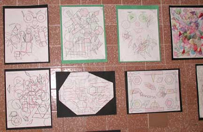
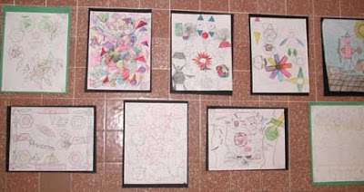
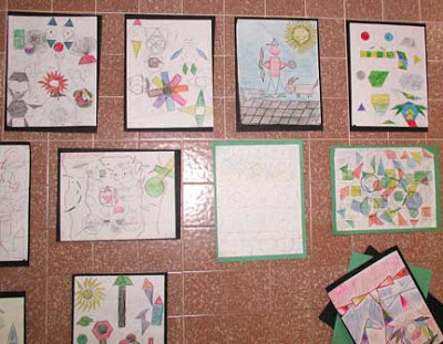
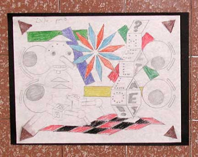
The kids are finishing up another line assignment – filling a sheet with nothing but geometric shapes until they have something they like, then adding color to the shapes.
It is really interesting to see where the kids decide to put color. Some go all out, and some do just touches. Some really get into it, and some just want to be done with the assignment. The framing was interesting – I decided to do that after each assignment, to value their work ahead of time. One or two of the kids really get creative with the framing!


