Archive for the ‘graphic design’ Category
Top Ten Tuesday
I found a bunch of new, interesting art sites this week, plus the Free Motion Quilting Challenge started – you can see the badge on the right side, and it’s not too late to sign up. I’m looking forward to practicing a new pattern each month.
A new blog – The Creativity Post – looks to be very interesting, and I love the stuff on brain research.
“ The Creativity Post is a non-profit web platform committed to sharing the very best content on creativity, in all of its forms: from scientific discovery to philosophical debate, from entrepreneurial ventures to educational reform, from artistic expression to technological innovation – in short, to all the varieties of the human experience that creativity brings to life.”
Here’s a screen shot of some of their most popular entries:
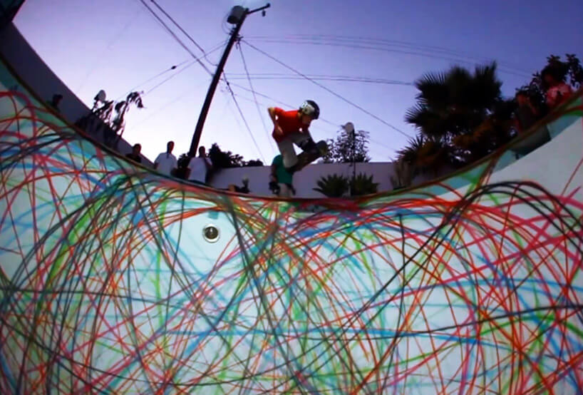
From DesignBoom comes a spray-painted-skate-boarded-swimming-pool-design, complete with video…..really cool!
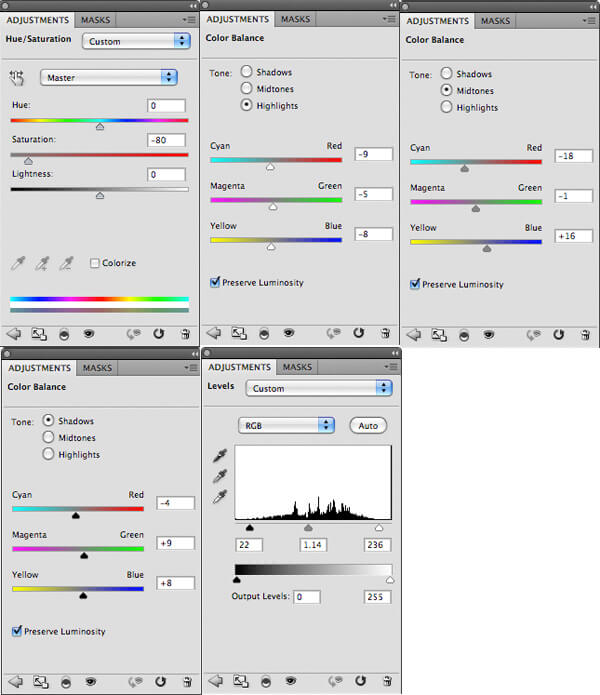
From PSD FanExtra comes a tutorial on designing t-shirts. This is very step-by-step – I think even I could do it (but maybe with a dog instead….).
Another MAD Magazine countdown of great blog covers…..Jerry and Joe and their new gig….
If you love dogs….well, even if you don’t, this is an adorable video of two dogs in a “restaurant,” waiting to order…..
And…MAD Magazine’s #1 blog cover – has been my favorite since I first saw it. Boehner vs. Obama and the DEBT…….Think Harry Potter……
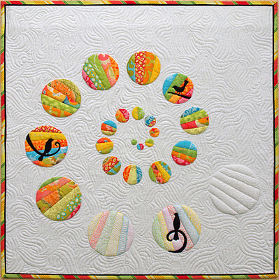
A new blog I discovered by an Australian quilter, Emma at Sampaguita Quilts, with her finished quilts for 2011 – some luscious ones for eye candy! I love this one –
Another new blog – 365 Project – amazing photography! This is their official Top 20 post.
And from Alyson Stanfield and the Art Biz Blog comes some interesting resolutions for the new year: 12 Artist Resolutions to Steal for 2012.
 Love this one: RESOLVE to stop fiddle-farting around on the Internet or with the TV remote control and start dedicating myself 100% to my life’s work.
And finally, a selection of Happy New Year’s from The Best Article Every Day.
 Let me know what you find that’s really cool!
Photoshop Friday – It’s 600 TIme!
![]() Wow, I’ve written 60o blog posts! This from someone who could never keep a diary. I guess I just didn’t have the technology waaaayyyy back when. I have new work for this Photoshop Friday, but I thought it would be fun to view some of the first posts.
Wow, I’ve written 60o blog posts! This from someone who could never keep a diary. I guess I just didn’t have the technology waaaayyyy back when. I have new work for this Photoshop Friday, but I thought it would be fun to view some of the first posts.
My first entry:
I finally did it! I set up a blog so I can write about our marbling and related art thoughts. I’ll be posting photos of the new Photoshop class I am starting. Be kind – I am learning how to take criticism!! This has been something I have been meaning to do as a way of recording process and product, and at the same time motivate me to do more fiber work. And…I can tell my students I am finally “almost” as technologically savvy as they are! (January 26, 2007…..)
I probably wasn’t convinced this would go beyond the Photoshop classes I was starting at the time. You can see my very first Photoshop drawing here. I have since changed blogging platforms, and I don’t have my backup close at hand, so the link will have to do.
Today my work is based either on photographic images I have taken or some of the marbled fabrics we have created. The piece I’m working on today is from fabric. Hubby was downloading pictures for ebay this week, and I saw this picture of fabric from a distance, and I said, hmmmm……
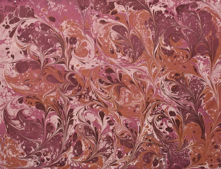
So here’s the original fabric.
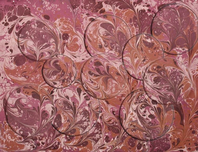
Then I started working with some shapes from each section of the fabric.
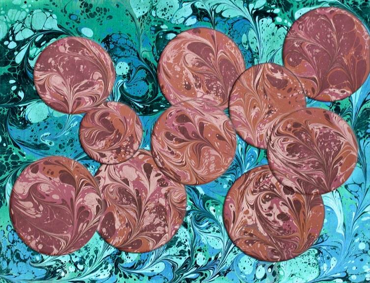
Then I felt I needed to change the background for more ocntrast.
I’m not sure this background color is going to stay…I have also been playing around with gradients, and I think one of those might work.
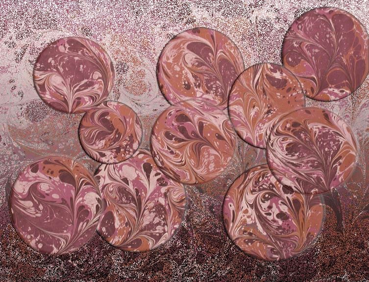 Yup, definitely like this one the best.
Comments? What do you think? What else does it need?
Top Ten Tuesday
It’s Tuesday, and here’s the Top Ten.One advantage to being on trips is I get caught up all at once and get lots of things listed for the next Tuesday! Don’t forget the bonus at the bottom from MAD Magazine!
From Dumb Little Man comes another interesting idea for organization: Try the Tag-It Approach for Increased Daily Productivity. I particularly like the parameters for tagging the tasks…like “high on irritation/nagging.”
30 Places to Buy and Sell Stock Photos, from Kate Harper’s blog of Greeting Card Design. Some great resources for photographers.

From JPG Magazine comes some great photos of their challenge “Give Me A Sign.”If you’re a serious photographer, you probably already know this site. If you just love eye candy, then follow along with their blogs.
Linda Matthews has a guest blogger on the topic of our inner critic. Here’s the start of Chris Zydel’s essay:
“I came across a startling statistic recently, which is that more than 90% of all children consider themselves to be creative yet only 10% of adults see themselves as having any creative capacity.
So what happened? How do so many of us lose our connection with the basic truth that we are all born creative and that it’s not meant to just go away once we get our adult badge?”
Alyson Stanfield has an amazing, right-on post about exposure for artists and the pitches that are thrown our way: You Promise Exposure, We Want Results. This really resonates with me, as we have had issues with folks from quilt guilds asking for donations. We no longer do that because 1) we were never thanked, 2) we never got a copy of the program or any publicity material mentioning us, and 3) our local quilt guild made assumptions about us always donating because they couldn’t afford to pay us. Sorry – I have bills to pay. So – if you’ve been in this position – and even if you haven’t – read this article!
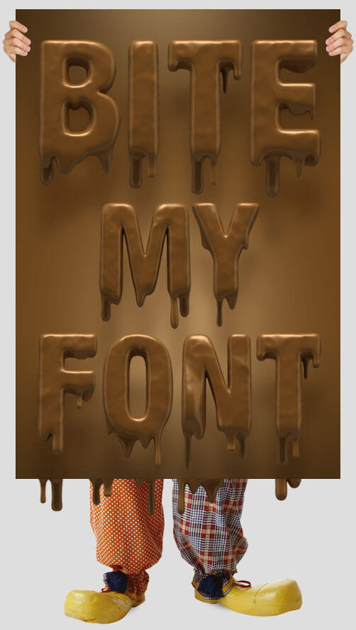
Okay, here’s some of the coolest new fonts! Kate Harper Designs has a cool link to a blog post on typography. How can you not love a chocolate font?!?!? This is from DJ Designer Lab: 40 Beautiful Handmade Fonts.
From Lyric Kinard comes a bead tutorial that goes with her new DVD, Bead It Like You Mean It (on my wish list….). I do want to try these stacks.
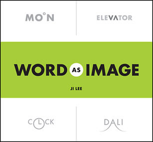
From Cool Hunting comes a look at word play, “Word as Image,” much like the words we tried to decipher in class. Some interesting new revisions.
From Fine Art Views comes a blog post by Moshe Mikanovsky about 10 Ways to Use Your Smart Phone when it comes to marketing and building your business. A couple of good ideas here, and I personally need to get over being phone-challenged by my Droid. Making lists – and checking them – is probably the biggest thing I could do….
Also from Fine Art Views is a piece that really resonates with me this week, as we just got some local gallery representation. “Forget New York City – Think About Your Own Art Community.” We finally made the break-trough locally – and in a good way!
So…what have you found on the web this week? Send along a couple of links in the comments section!
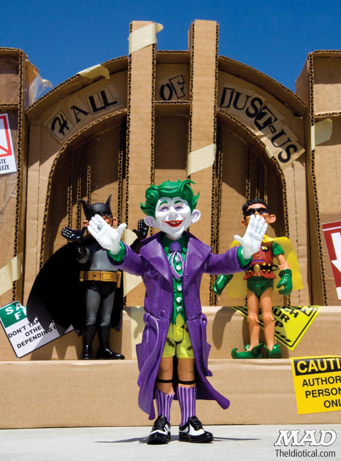
BONUS: From MAD Magazine…….new Super Heroes…….Just Us League of Stupid Heroes….
Top Ten Tuesday – Finally!
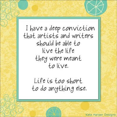
This is now on my desktop! I found it here at on the Kate Harper blog. After all these years of teaching, life is definitely too short to mot make art!
Now I spent the last two weeks going through all the blogs I haven’t read in two months – and mined a WEALTH of great stuff!
Zen Habits had a great and timely article on Decluttering, as I was working through all the little bits of odds and ends that I was sorting. Two key points – we don’t want to let go of the past, and we’re afraid of the future. Definitely worth a read.
From ArtsyShark – Is there a future for trade shows and sales reps – adapting to changing commerce. Lots of great points, especially if you are thinking of doing the art licensing route.
Elizabeth Barton has a fabulous blog with lots of food for thought. As I contemplate becoming more active with my work, this post of entering shows was extremely valuable. Don’t you just love the colors in this quilt?
Alyson Stanfield had a guest post on Photoshop (How to Make the Best of Your Art Photos with Photoshop) by Chris Mills. If you’re not reading the ArtBizCoach blog, you should be. – http://artlicensingblog.com/2011/05/16/how-to-make-the-best-of-your-art-photos-with-photoshop-by-chris-mills/
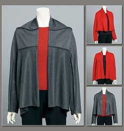
A friend of mine turned me on to online pattern sales. I haven’t sewn for myself in years, and I never thought about the pattern lines being on line. Marcy Tilton has some really nice wearable patterns – I could get hooked! Patterns on line
The Textile Blog has an interesting article on the future of hand production, starting with a video about hand-made lace production. Here’s a quote: The video deals with the seemingly age-old problem of machine versus hand production. The video itself deals with the situation in Cyprus where traditional lace embroidery is inevitably being led towards extinction by the importation of cheap machine produced lace, mainly from China. Cyprus is by no means the only area of conflict between machine and hand production and China is not the only culprit in flooding the market with cheap products.
Sites on greeting cards – I had no idea there was so much available on line. This article is also from Kate Harper and gives 6 articles on card design tips.
Also from Kate Harper’s blog (a HUGE wealth of information), much more about art licensing…..walking the floor at the Surtex licensing show.
This week’s eye candy from The Best Article Every Day – great ads for AT&T – forget the company, just look at the art work! This is a long graphic – go to the article and take a closer look – and then spend some time with all the rest – these articles are just the best!
Zentangle Party
Last Saturday a group of us (mostly our Mixed Media group) got together with a CZT – a certified zentangle teacher from the Northwest side of Tucson. With some planning, and some ooh-ing and ah-ing over zentangle designs, we spent a great three hours learning the official way to zentangle, and a whole bunch of us are seriously hooked. Our next arts meeting on March 1 should have lots of new art to look at! We ranged from age 8 to 82 at the party and had a great time – even managed to keep the chocolate fingers off the tiles.
Even though I’ve been working on “doing” zentangles for over a year, it’s only been since this fall that I started looking at official zentangle patterns. I do like working a little large, so my new ones are more a 4.5 square, instead of the 3.5 square. But first, a word about the Christmas presents I did for my second family this year. Two by three inch refrigerator magnets, based on their initials, none of which I have as pictures. For my friend Alison I did her initial as a five by seven, and I left a lot of white space, as her letter A reminded me of the Eiffel Tower, and Alison has lived in France.
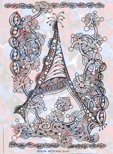
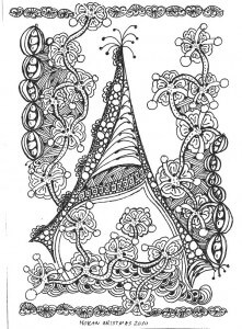 It is delicate and frilly, which Alison is not, but it just has such a great feel, and it was quite a hit. Since I couldn’t resist, I also tried a gradient on it (marbled fabric) from Photoshop.
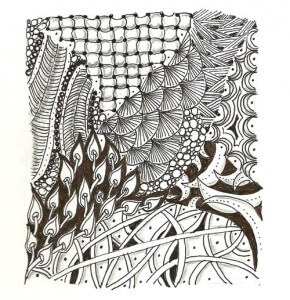
 Now for my first “official” zentangle….there are some new patterns that I can see using a lot. I also love the tools for shading to enhance the patterns.
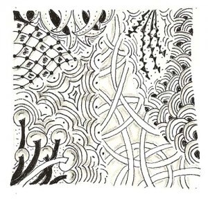 Now the ones I am doing in my sketchbook for The Sketchbook Challenge this year.
I find on these I am looking at the play of black and white, positive and negative space, and straight vs. curved. Creating a pleasing balance is definitely interesting.
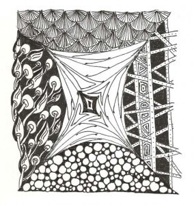
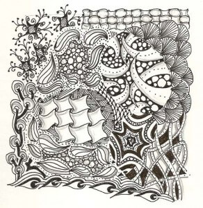 I just finished this last one, and there are a lot more official patterns invoved in this one. I want to look at creating the comedy/tragedy masks for my next one, plus continue to look at lots of new patterns. But the best part of all this is how relaxing it all is. The “zen” part really takes over your process, which is a good antidote to a lot of stress at school this year.
Work-in-Progress Wednesday
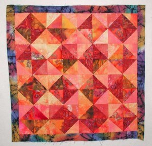
![]() Last week I show the beginnings of my Ice quilt, to complement the Desert Heat quilt I made. I went to Girls’ Night Out at the LQS last Saturday and got a lot of quilting done. I then decided what to select for the first interior border. THe cool thing with the Deat quilt is the inner border really is unexpected. The blue really sets things off nicely.
Last week I show the beginnings of my Ice quilt, to complement the Desert Heat quilt I made. I went to Girls’ Night Out at the LQS last Saturday and got a lot of quilting done. I then decided what to select for the first interior border. THe cool thing with the Deat quilt is the inner border really is unexpected. The blue really sets things off nicely.
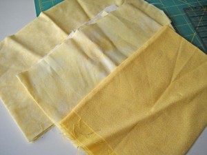
 For the Ice quilt I decided to look for a yellow to represent the very weak winter sun, especially being from New England! You can see the yellows I pulled from the stash. I decided to go with the middle one because it was pale, and there is some very interesting texture within the fabric itself, with brighter yellows in a few places.
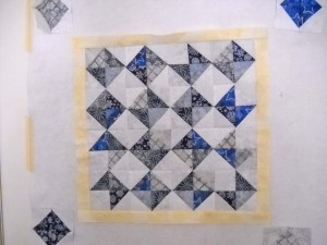
 Here is the finished center. It is fairly “cold” and rigid, which of course is what ice is. Hopefully by next week I’ll have the flying geese borders on as the next step.
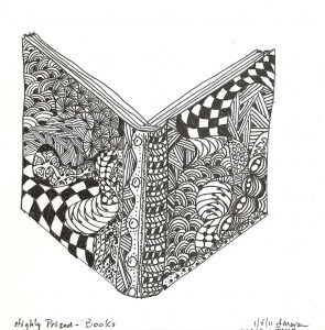
 Also this week I have been having some fun with the Sketchbook Challenge. I uploaded my first pic to Flickr and got some very nice feedback. I was so pleased with the first one that I had trouble sleeping, because I kept thinking of more things that are “highly prized,” and I wanted to get to work on them. So far this week I have a zentangled book, which I love!
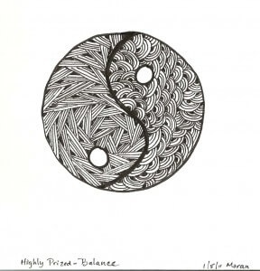
And then, since I am working on trying to keep balance in my life, I went for the yin-yang symbol. I kept only two patterns, one straight and one curved. I’m liking what I can accomplish with these patterns. I think a music note and the comedy/tragedy masks might be next.
Send me some links to see your sketches if you’re doing the Challenge. You can click on the link on the right to get to information about the Sketchbook Challenge. I am also thinking of looking into 3 Creative Studios for their Journal Quilt Challenge, and potentially their color challenge. I just want to keep myself motivated and try some new ideas, but no pressures on me – if I do it, fine, and if not, fine also.
The Sketchbook Challenge
 I hesitated to sign up for The Sketchbook Challenge, especially when seeing the sketchbooks of the people who are coordinating the challenge. Intimidating, to say the least….But I can’t let that stop me. I want to explore this idea of a sketchbook and break through some of my own barriers, the main one being that my sketch has to look like something “arty.” I’m sure I’m not alone in that thought….
Anyway, enough about them. This challenge is for me to break some long-standing barriers. I have to stop worrying about what the final product is going to look like. So I started thinking about items/things/ideas that are highly prized by me and came up with Peace. So I did a peace sign, complete with all the zentangles, since I’m really working on zentangles over the last month. And…since I had trouble going to sleep last night, I kept thinking about more “highly prized” items and how I could work on them through the zentangle process. So that’s how I’m starting. If I feel like sketching, then I will. Here’s my peace sign:
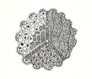 I might try playing around in Photoshop and add some color, but I am so taken with black and white and Pigma pens. It goes back to childhood, and I’m just going to go with it. I did buy some new colored markers, and I will play with those, but I LOVE the black and white effect.
I also prize books, and I am halfway through a book sketch. If I have time tonight I’ll finish that up. I must say it’s looking quite cool. But I don’t plan on keeping any kind of daily schedule with this. I may try some other challenges this year, just to get myself to expand my thinking and to diversify my skills. And I have an idea for Fish Follies this year that I need to mull.
All in all a good start to the new year.
Top Ten Tuesday
This project starts January 1, and you can read about it here. I’m trying this, as I don’t usually have a lot of luck with long-term on-line projects. But as luck would have it I bought a small sketchbook to practice my zentangle patterns, and as I was cleaning boxes and sorting for the studio, I discovered lots of different size sketchbooks tucked away. So I am ready….whatever that means for me……
The last time I did a Top Ten, the focus was on A Note from Your Mother. Their last three posts have been interesting. If you have nature lovers or collect nature-inspired art, you might be interested in their Endangered Species Print Project. Plus, read the post on the decline of the glorious tiger…only 3200 left in the wild.
I read The Future Buzz on a regular basis, particularly his posts on viral images across the web. His collection for 2010 is amazing, and there are links to several other collections. There’s a great one on probability that will work for math class, humorous ones, and ones that make us think. The graphics are spectacular.
Bonnie Samuel’s Blog looks at TAMMACHAT Natural Textiles, a fair trade, social enterprise to support weavers and artisans in Thailand and Laos. These artisans are indigenous people who are carrying on the traditional arts of silk and cotton textile production creating beautiful fabrics and wearables.
For those of you who love sarcasm and the news, if you aren’t reading The Borowitz Report, you should. His latest column interviews the devil about the obscene bonuses paid Goldman Sachs executives this year. As the devil said, “best investment” he’s made.
From Cedar Canyon Textiles (The Paintstick Place) comes an interesting blog post on the importance of ritual, a reprint of a blog from the Harvard Business Review. Just one of the gems:
“Each time we pause, notice, and offer respect for an activity, it reminds us to appreciate and focus on what we’re about to do. And by elevating each activity, we’ll take it more seriously. We’ll get more pleasure from it. The people with whom we work will feel more respected. And we’ll feel more self-respect.”
I discovered this blog like I find many others – just following interesting links. This has a tutorial for coasters, which just sparked an idea. This week I actually went through every piece of fabric, sorted and ironed, looking for inspiration for new projects. I rediscovered a few patches from a Quilt University class that I figured I should keep, as they were interesting alone, but I wasn’t sure exactly what I’d do with them. Now I know!
From Dumb Little Man (that’s the name of the blog….) comes Seven Important Questions to Ask Yourself Before the End of the Year. Excellent way to reflect on the past 12 months.
 Alphabet Photography – really interesting concept, and lots of great images to browse. They are for sale, but the crative nudge from them is wonderful!
And finally, some eye candy – a great literate romantic spy novel, The Tourist….and Johnny Depp – ya can’t go wrong!
You might enjoy some other Top Ten Tuesdays……
Art Every Day Month – Week 2
This has been an interesting week, in that while I only have four zentangles to show, I have been exploring the wealth of patterns and information available on line. I have found myself in odd moments trying out new patterns. It seems that there is way more to this than “doodling,” as I am finding out. There are identifiable patterns, and I am enjoying trying these. Some I am having more success with than others, but they’re all fun to do. I can see how using patterns enables you to enter a zen state much faster, and you relax more within the art.
Here’s some websites to explore:
The Original Zentangle site and their blog
Plus, go to Flickr and just explore…whch I did on my new Droid, and now I believe what the sales person said about using up your battery…..
That said, here’s my work this week. I am particularly interested in the added element of shading. I definitely want to explore this more.
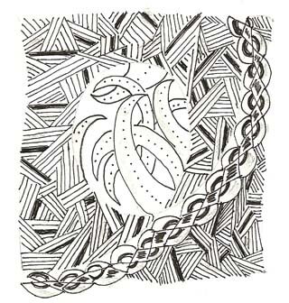
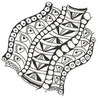
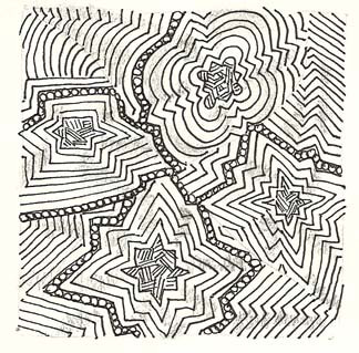
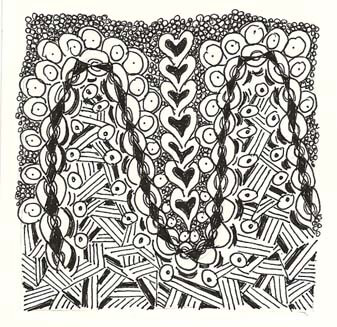 Anyone out there doing these? I’d love to see your work!
Photoshop Friday – Desert Botanicals
I haven’t done a lot lately with Photoshop Friday, and as I was thinking about it, I wanted to see the body of work I have completed that I call my Desert Botanicals series. I have been preparing cards for a November show and realized the images really looked good, so that prompted me to look at some of what I consider the “finished” ones.
Last spring was a gorgeous one in the desert, and the ocotillo were in full bloom. This was some “playing around” with a couple of gradients.
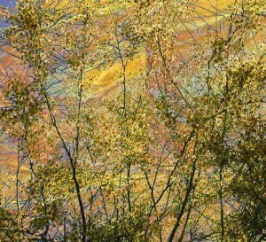 We had a blooming palo verde in our back yard, to which I added some background in a marbled fabric. Reminds me of a sunset.
 This is some kind of orange succulent from the Desert Botanical Gardens with a grdient applied to it. I am really drawn to black and white.
 This was one of my first “successful” manipulations of some succulents. I was just learning a few different tools and stumbled on this finished product. I do enjoy the “mysteries” in Photoshop.
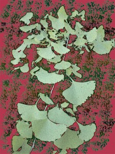 This is my newest, and I’m not sure it’s a “done deal” yet. I love the small ginko tree at the gardens, and I played with the background with some brushes.
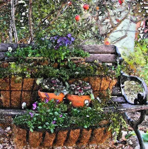 I love my garden bench. I have this in several iterations, this one with the fresco filter, for more of a “water color” effect.
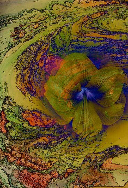 This is also in several iterations. The blossom is from a pic hubby took about 5 years ago from some spring plants. That one bloom brings such depth to the piece.
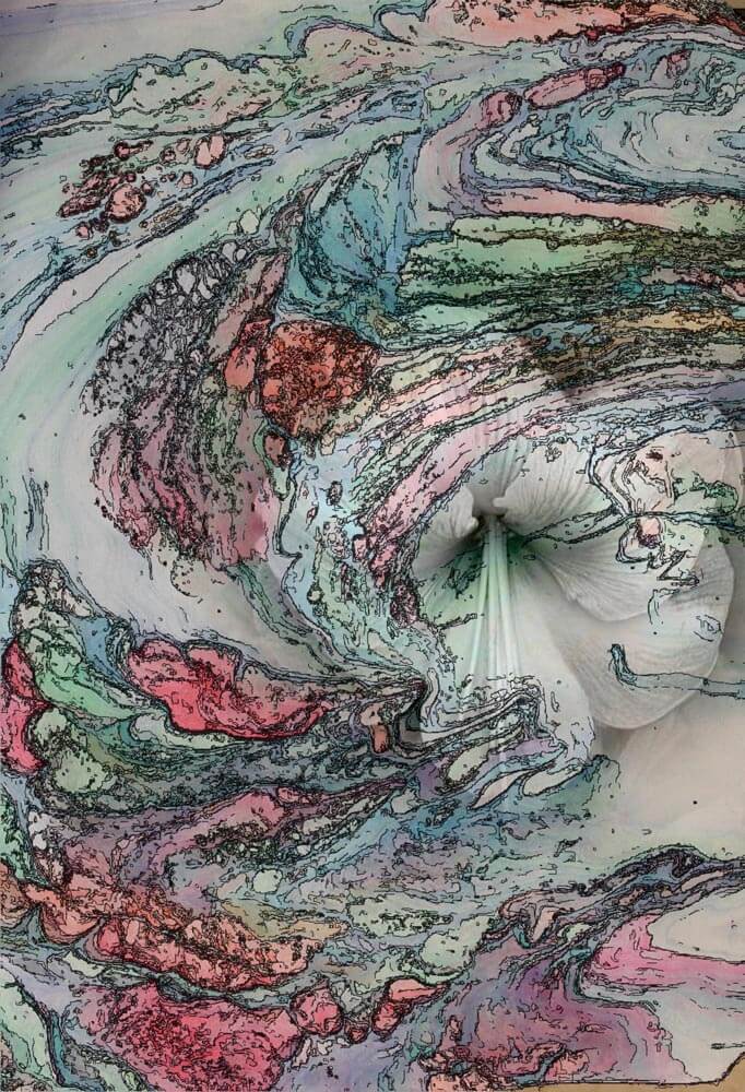 This is another version – with a very different feel to it.
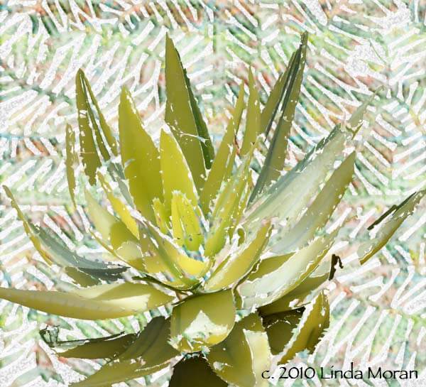 One of my favorites, of an aloe plant superimposed on the grate from one of the drainage areas in the Gardens. I added a “pattern” of marbled fabric to the grate.
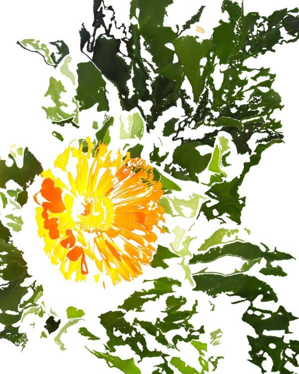 Another favorite, a composite of three different images, part of my playing around to make collages.
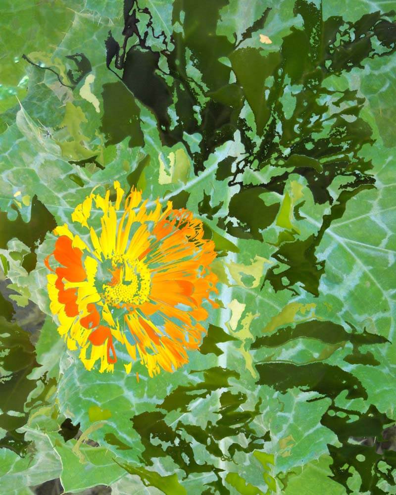 This is the one I actually printed – I LOVE that thistle leaf.
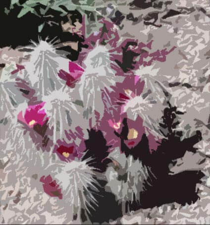 Another early one I really like. Even with all the filters, you still get the effect of cactus spines.
This is developing as a nice body of work. I am researching developing and printing these as a collection, even licensing them – one of the many things on my “to do” list. I interested in your comments – what do you like, what would you like to see more of, and any other suggestions.
ALL IMAGES COPYRIGHTED. LOOK AND ENJOY, BUT DON’T EVEN THINK OF TAKING……
Top Ten Tuesday – Cool stuff on the Web
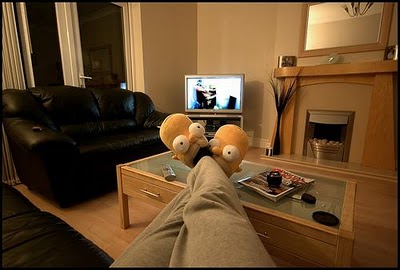 Ya gotta admit, that’s a catchy picture….the slippers on first glance look like little aliens checking things out. But this indicates it’s something cool from Dumb Little Man, which readers of the Tuesday posts will know always has something cool. This one is 30 Ways to Make TV Watching More Productive. There are some really great ideas here…for you sewing folk I would add “seam ripping stitches” – productive and therapeutic!
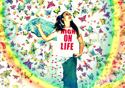 Also from Dumb Little Man, 61 Ways to find Inspiration When You’re Stuck and Feeling Down. We can always use a little practical inspiration. Number 13 suggests browsing through Flickr photos, which I have just started to do – serious eye candy. If you want marbled goodies, here’s our Flickr site:
 From Maria Brophy comes How to Create Anything Even When You’re Scared, Inexperienced, and Don’t Believe in Yourself. It’s a mouthful, but it’s all about baby steps….
From PlugIn ID comes a great article on the butterfly effect, quoting Gandhi saying “Be the change you want to see in the world.”
Problogger is a great source of ideas for writing a blog. Here’s some info on making it easier for customers to buy from you. Great ideas here.
Here’s some fabulous fiber art to look at – the fabric collages of Wycliffe Lincoln.
 These guys always have great stuff – I’ve posted from them before. This is 60 Creative Examples of Infographics. If you like data presented in a very visual manner, check this out.
 Now who among us hasn’t given some thought to making art from Post-Its? I create little cubes when I’m bored, but this kind of goes waaayyy beyond that! Check out Georgia O’Keefe…..
From Selfgrowth.com comes a really helpful article on pricing digital painting, something I’m becoming very interested in.
And finally, treating yourself like a Ferrari – something we should all do!
What have you found as you’ve been surfing?? Pass it along – I love looking at new stuff!
Quilting Designs and Illustrator – and a GIVEAWAY!
The high school I work at is the arts magnet high school for the city. The kids have some amazing opportunities in both performing and visual arts. Imagine taking a class three times a week in all the Adobe programs – all updated, where you don’t have to worry about buying the programs, getting updates, and making sure your computer always works, plus hands-on instruction rather than learning yourself. Can you say “jealous?”
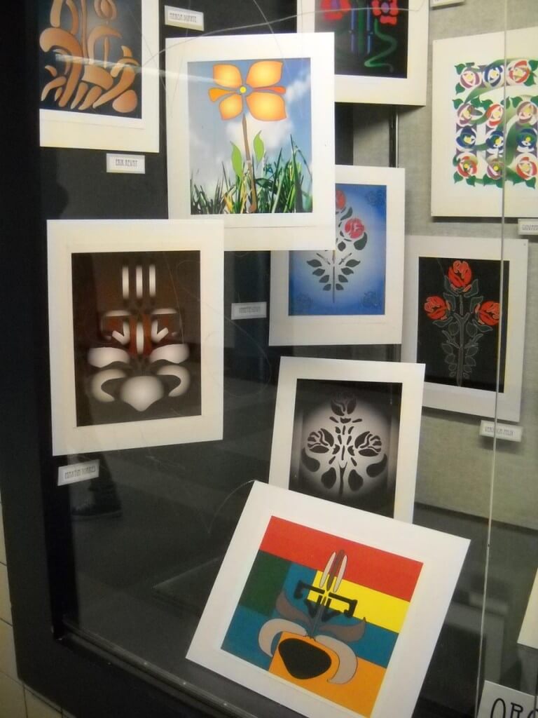
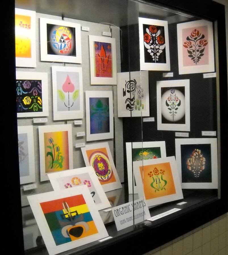
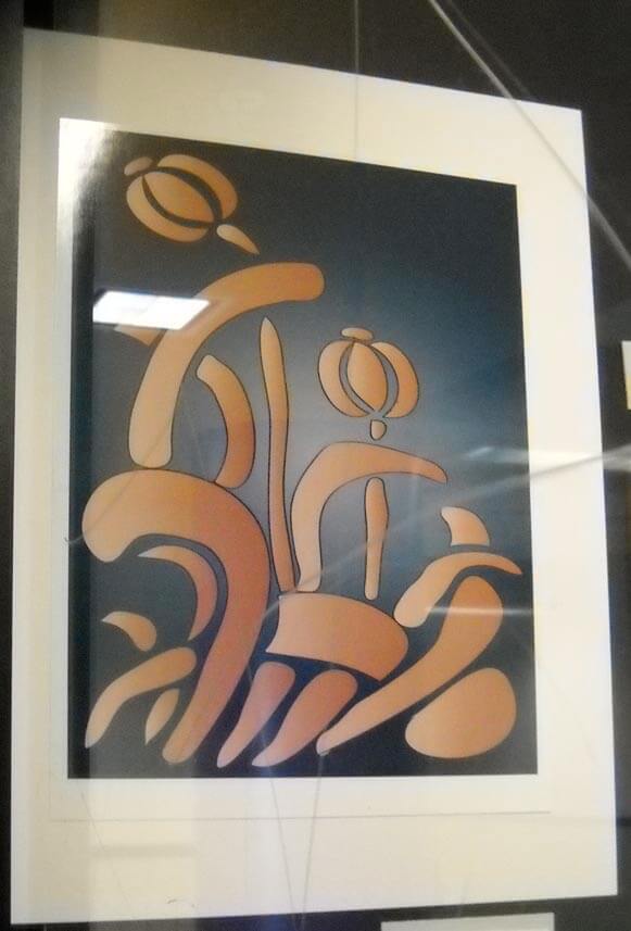
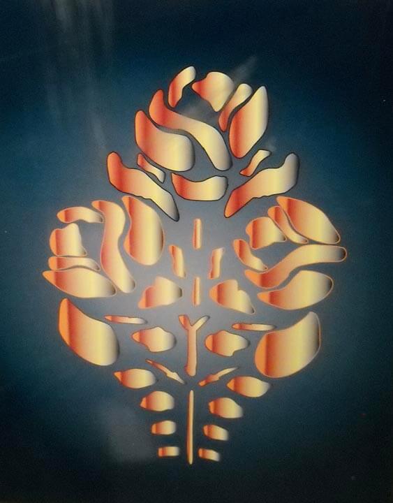
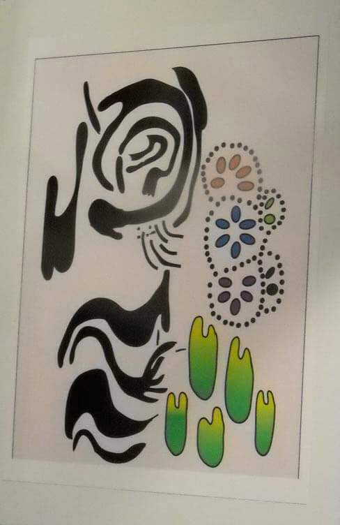
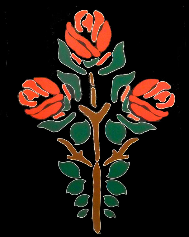
I think back to learning Pagemill waaaaayyyyy back when I was just starting my website in 1998…I still know a little code from teaching myself. Everything I’ve done has been self-taught, so I love the opportunities the kids have. About two weeks ago I walked to the end of the hallway to discover a new exhibit of student work, using Illustrator – a program I just haven’t had time to explore. The kids had to recreate some organic shapes (the pen tool makes me nuts….) and use some filters to develop their piece even further. All I could think of was what cool quilts these would make. There is glare (and the remains of some graffiti) on the showcase window, but I think you can get a good idea of what the kids are doing.
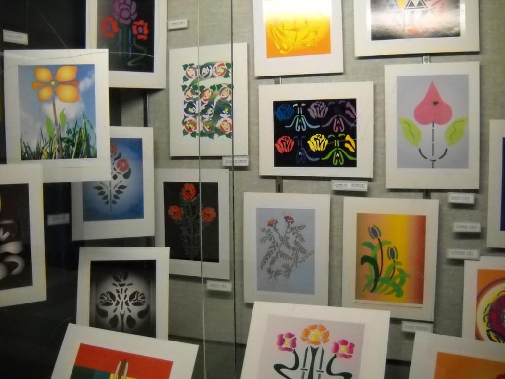
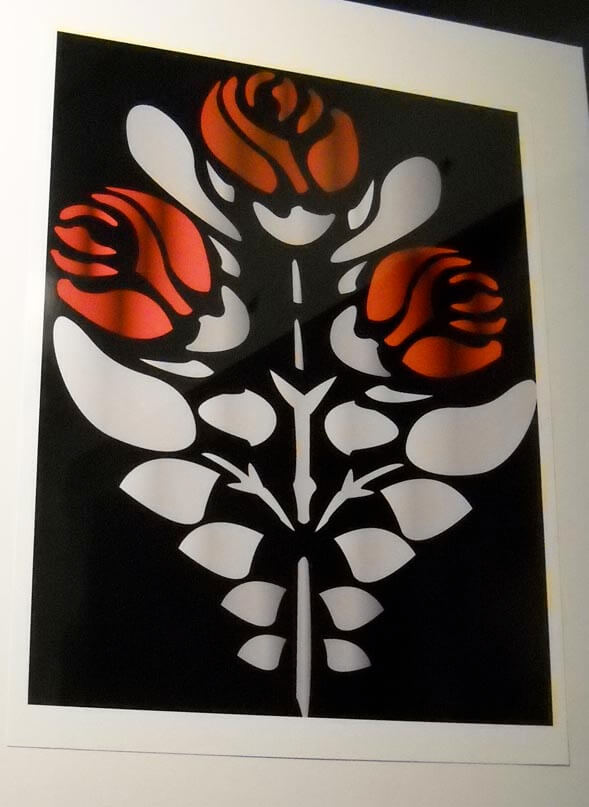 What I like about this is the blossoms. I am thinking they would look good in free-motion on a solid area of a quilt. See my dilemma below the pictures…….
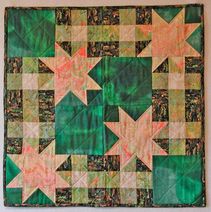
Now, speaking of quilting designs….I need some help. I have two “older” quilts that I am requilting. I took the stitches out of one while in the hospital, and I’m working on the other one. I need suggestions as to quilting. I have grown beyond stippling, but I am still having trouble with actual designs that will work with the patterns. Here’s the first – four traditional blocks with marbled stars in a neon paint.
You can see all the old quilting. When I get all the invisible thread out, I’m going to soak it in warm water to see if I can make the lines disappear. But what should I do for quilting?
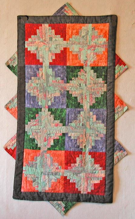
Here’s the other – a log cabin table runner done with marbled fabrics. What do you think? Just stitch in the ditch??
Leave me comments on the blog, and I’ll do a giveaway for the best suggestions for each – some digital note cards based on marbled patterns. Come on, help me out!!
Top Ten from the Web
Even though I haven’t been blogging much lately, and not reading my usual blogs, I have still managed to accumulate some really interesting websites. When I go back through all the bookmarks, I am reminded about what an awesome thing the internet is. You can find just about anything, and then some. While I so enjoy the eye candy from fiber sites, there are still so many things that interest me. Here’s a mere ten for this week. I’m going to try and get back in the habit of doing this once a week.
Cabinet Magazine – (from the website) Cabinet is an award-winning quarterly magazine of art and culture that confounds expectations of what is typically meant by the words “art,” “culture,” and sometimes even “magazine.” Like the 17th-century cabinet of curiosities to which its name alludes, Cabinet is as interested in the margins of culture as its center. Presenting wide-ranging, multi-disciplinary content in each issue through the varied formats of regular columns, essays, interviews, and special artist projects, Cabinet‘s hybrid sensibility merges the popular appeal of an arts periodical, the visually engaging style of a design magazine, and the in-depth exploration of a scholarly journal.


Sounds like a potentially great look into today’s art and culture!
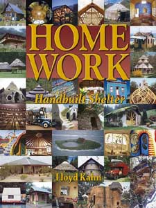
Homework – Hand-Built Shelters – (from the website) features: homes, cabins, cottages, bungalows, homesteads, sheds, shacks, huts, treehouses, bottle houses, yurts, hogans, tipis, tents, beach shacks, stilt houses, greenhouses, small houses designs, and MORE!
The sheer scope of different types of homes boggles the mind.
A Moment in Time – from the Lens project to document one moment of one day on the earth. As the site says, “make no plans for the rest of the day.” You get to look at photos from around the world, all taken at the same time on the same day – a great look at “us.”
When Graphic Artists Get Bored – a great selection of graphic art. Take a good close look – you won’t be disappointed!
 Real World Math – Using Google Earth in the Math Curriculum. Oh, to use this in the classroom – and if this had only been available when I was in school! My ideal job would be a curriculum coordinator for Google Earth. I would never be off the computer!
While I have had my own blog about teaching, I occasionally read others, like this one – A Teacher’s Education. I can so relate, and if you are a teacher and any good in the classroom, you will relate, too.
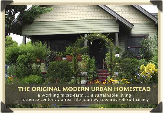
Urban Homestead – since I have become very interested in sustainability and locally grown food, I found this interesting. Path to Freedom – the Original Modern Urban Homestead.
The Scribbler – be prepared to waste lots of time, because after all, you have to get good at this – scribbling, that is…who knew it could be so much fun to just doodle – no, make that scribble, and in color – and you can save them! Here’s info about how it got started. You have been warned…..
Quantum Learning – Visiting Auschwitz – interesting blog. “Help build a world where everyone is valued irrespective of wealth, origin, colour or beliefs and conflicts are solved peacefully. Here you’ll learn how to do this in day to day life.”
And finally, Gray Eagles , a nonprofit dedicated to preserving the stories of World War II pilots. “The Gray Eagles Foundation is a non-profit organization dedicated to keeping aviation history alive through dynamic audio-visual media created to educate and inspire those from all generations. Specifically, it is our hope that our films will encourage others to share their stories, and by doing so, build family connections, foster community, and nurture a culture of multi-generational understanding and respect.” After all, the past is prologue.
Other Top Ten Website articles:
Top Ten Tuesday – Getting Here
Doodle Art

My eighth graders finished their first art assignment, doodling, then creating a small frame to move around the doodle and decide on an area they would like to frame. Then they colored inside the doodle and we posted them. The kids kept sneaking outside the classroom to see the artwork. They were all really pleased at how they did. And – I got more of the work in from this group of eighth graders. The only issue this group has is horrible language – had to deal with the F word several times in that class….
And then in my enrichment class the kids wanted to know if the true meaning of “bitch” was a female dog. So I said yes and used the word correctly in a sentence – which about made them shocked that I would. Ah, adolescents….
But the kids seem to be settling in well to art – with a good dose of the optical illusions as a way of looking at basic line. They are entranced. As we look at the use of color in the illusions, I noticed for the first time that most of them tend to use complementary colors to create the idea of movement. Tomorrow the seventh graders will have a chance to look at the paper artist – they loved the pencil lady!
No more education rants – I have a new blog just for that!





![strangebeauty_thumb[2]](https://www.marbledmusings.com/wp-content/uploads/2011/06/strangebeauty_thumb2.jpg)

