Archive for the ‘in progress’ Category
Introducing…”Sonoran Dreams”
 I am, not as so focused on completing stuff on my weeks’ lists, since I realized I can’t be a slave to getting everything done and yet not get to the important stuff – art and writing. What I realized is that I have to revise my “self-care” list to include a minimum of two hours on art-making each day – that’s what is truly important for me this year. Art during the day, writing at night – or some combination thereof….
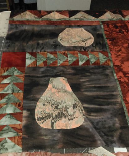
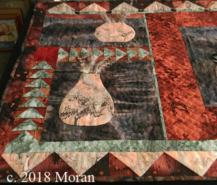
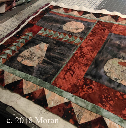
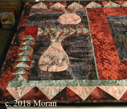
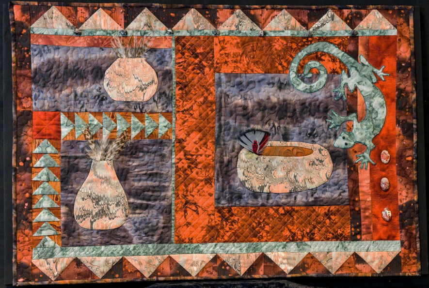
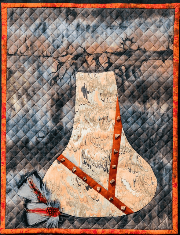
This piece at the left is the companion to the bigger piece – my ever-present “pot quilt,” started some 15 years ago. I really like how this piece came out. Simple yet elegant, just like southwestern pottery. This is “Sonoran Dreams 2.” I also have a lot of the “pot” fabric left, as well as come of the original fabrics when I started this, so I see a small series coming along this year.
The pot quilt started initially because of the marbled fabric. As soon as it was out of the marbling tray, I knew I would make some southwestern pots. I started some (what has now become) improvisational piecing – just making it up as I went along. I had two panels done and together, and the pot in the above piece appliqued. I really liked how it looked all these years later. I was on to something at the time and didn’t realize it. Finishing it just fell together – all my sewing/quilting skills had really improved, and it was easy to pull it all together. In progress –
This is the very beginning from 15 years ago, just beginning the piecing, and at the time absolutely no idea how to quilt it beyond stippling.
It’s missing the bottom row, as originally it was going to have several more panels. I’ve moved away from wall hangings that just “hang” from a rod and have moved to mounting them on canvas. I saw no need to make this larger, and the extra pot would become its own piece.
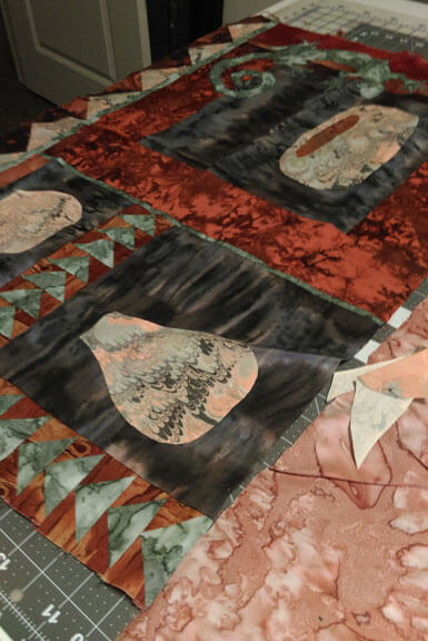
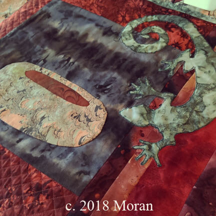
The other side – oh, how I would do the lizard differently (and I will in some other wall hangings), but I do love the “rawness” of this one.
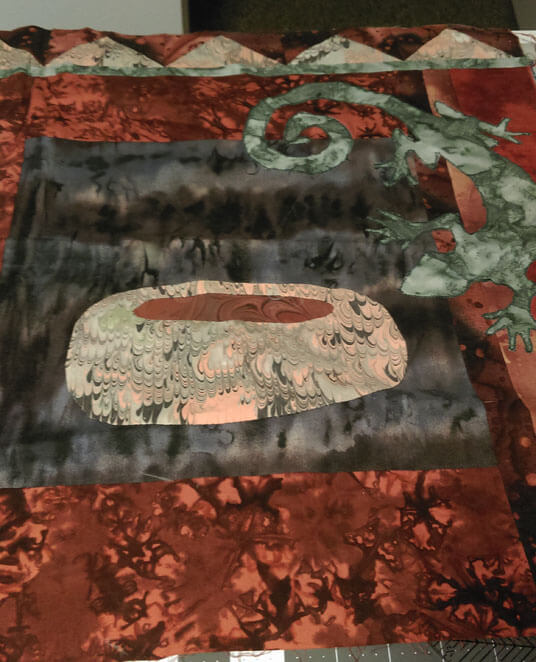
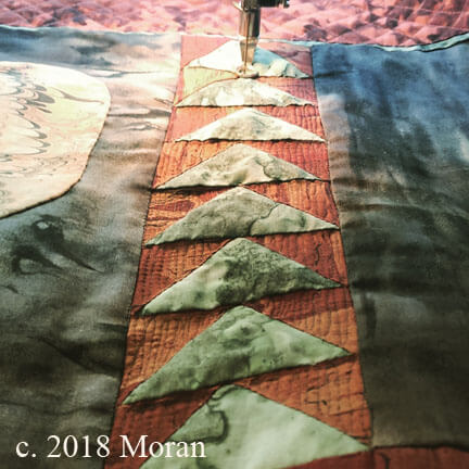
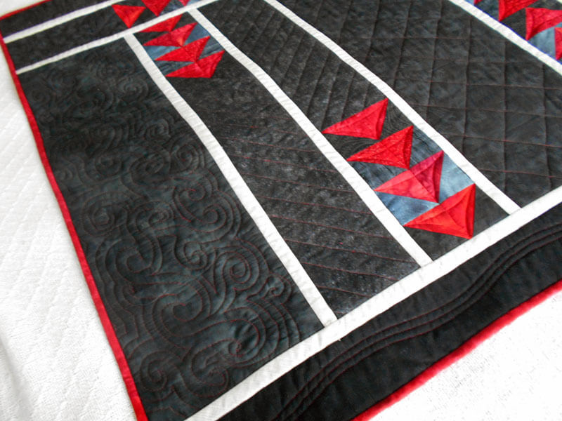
First I started with some straight-line quilting to make the triangles “pop.” I really like that effect, so I decided to do the top and bottom borders that way.
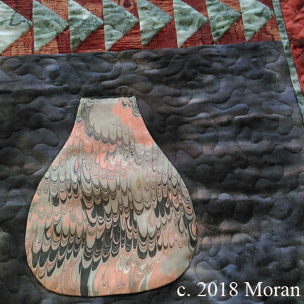
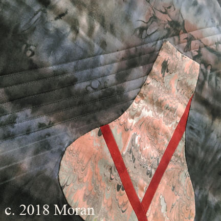
The pot with only outline quilting.
From here I did the gridlines in two places, as it reminded me of the stucco you see throughout the Southwest.
Originally I was going to quilt the lines in the pots but decided that would detract from the overall design, so I outlined the pots and stippled the background. A shiny rust thread used in the stucco, and invisible smoke thread in the stippling – I just wanted texture there.
Now there was the other side…couldn’t think exactly what I wanted to do for the longest time. Using invisible thread again, I outlined the lizard to make him stand out – did it twice (next time I’ll try a double needle – should be much smoother).
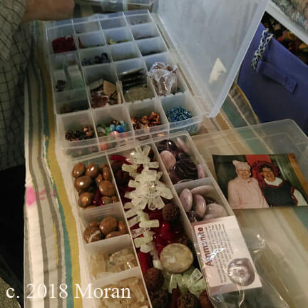
I outlined the pot and did the stippling in the background again. That just left edges – did a triangle motif in the medium brown and then attached some agates for emphasis. I LOVE my stash from the Tucson Gem Show – every year I would go with some specific types of stones in mind – mostly earth and water tones for future wall hangings.
You can see the agates on the right side, and there are bear fetishes across the top green strip.
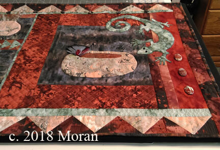 Starting the grid lines on the companion piece.
And….ta-da…..”Sonoran Dreams”
Photography by Melanie Bishop
@(*&$*&%@#)(&@!_(*^$ Frog Stitch!!
 Definitely where I am today….lots of limitations. I was so pleased with the progress on my lap quilt that I decided to make it a show piece for one of the shows this year. Greaatcolors, I had an excellent quilting design worked out….until I started sewing the blocks/strips together.
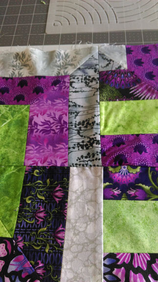
A lot of four-letter words…starting with the fact I forgot I used two different rulers to do my measuring and cutting – those “slight” differences made a YUGE difference. I took out the first two rows, tried to trim some blocks, got three new rows together…and then looked very closely….
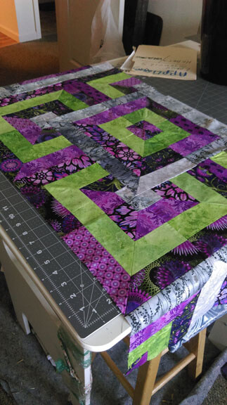
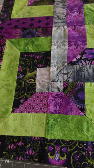
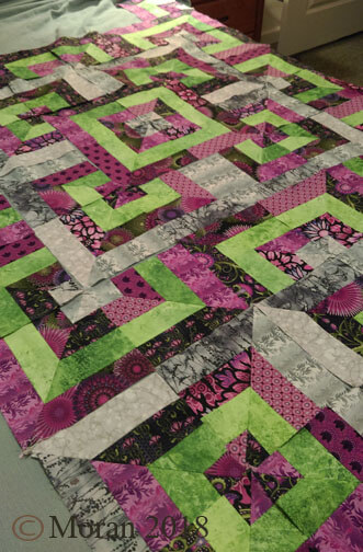
This quilt is so geometric, with so many matching points and lines that need to stay centered and aligned…I wasn’t even close. Here’s looking at what my mess is…and I show this humbly – we all make mistakes…I need to find the “good” in all of this….
From a distance, not too bad…..
Until you get really close….look at that center square – I am appalled….
…and this should have been a no-brainer….
So what’s a girl to do?
You saw my list for the shows – I have plenty to choose from, so the good news is that this will eventually become the lap quilt it was intended to be. The other good news is that after I sew another row to this, I am picking one of my marbled UFOs to finish up. Been meaning to do that for a LONG time. Till our next sewing session – enough of the frog stitch for me (rippit, rippit).
The Art Making Begins…..
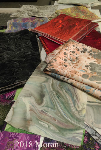
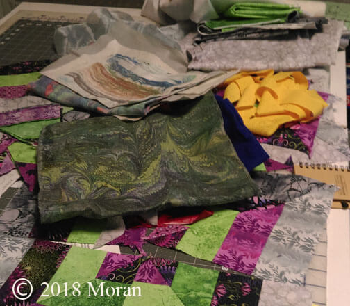
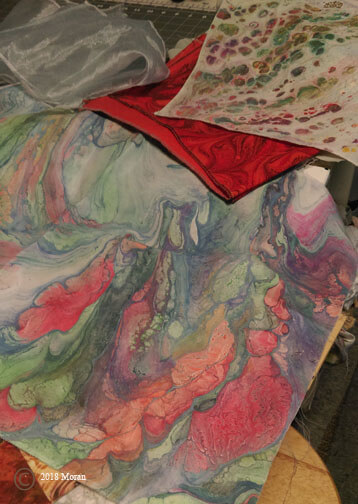
I finally decided yesterday I had to make a major list/inventory of all the “wannabees” or “in progress” art pieces. What follows is what was available in one drawer and the top of the storage table. The left has four amazing pieces of Kona cotton for a volcano series, plus the dotted brown piece is another half-yard unpolished satin for another river rock piece. Below is the current purple piece, plus some black poly-linen for art pieces and below that is a piece of silk done att he bottom of the marbling tray – it’s now a very large digital piece, but this one still exists for me to do something with it….
Now for the list once I had evverythingout and listed:
Mardi Gras lap quilt, silk FQ Botabical, small strata, orange cotton strip, cotton left-over pieces, black-purple poly-linen, greenish denim, clam shell black, blue ultrasuede, purple silk, green silk, 3 black linens, black chevron, brown silk, volcano (4), 3 FQ left-overs, 8 x 10 leftover, circular left-over, yellow linen, large black poly-silk wave pattern, purple-yellow silk, applique pillow top, Guilin (in progress), Wetlands 2 (in progress), wouthwestern pot hanging (in progress), iceberg hanging (in progress).
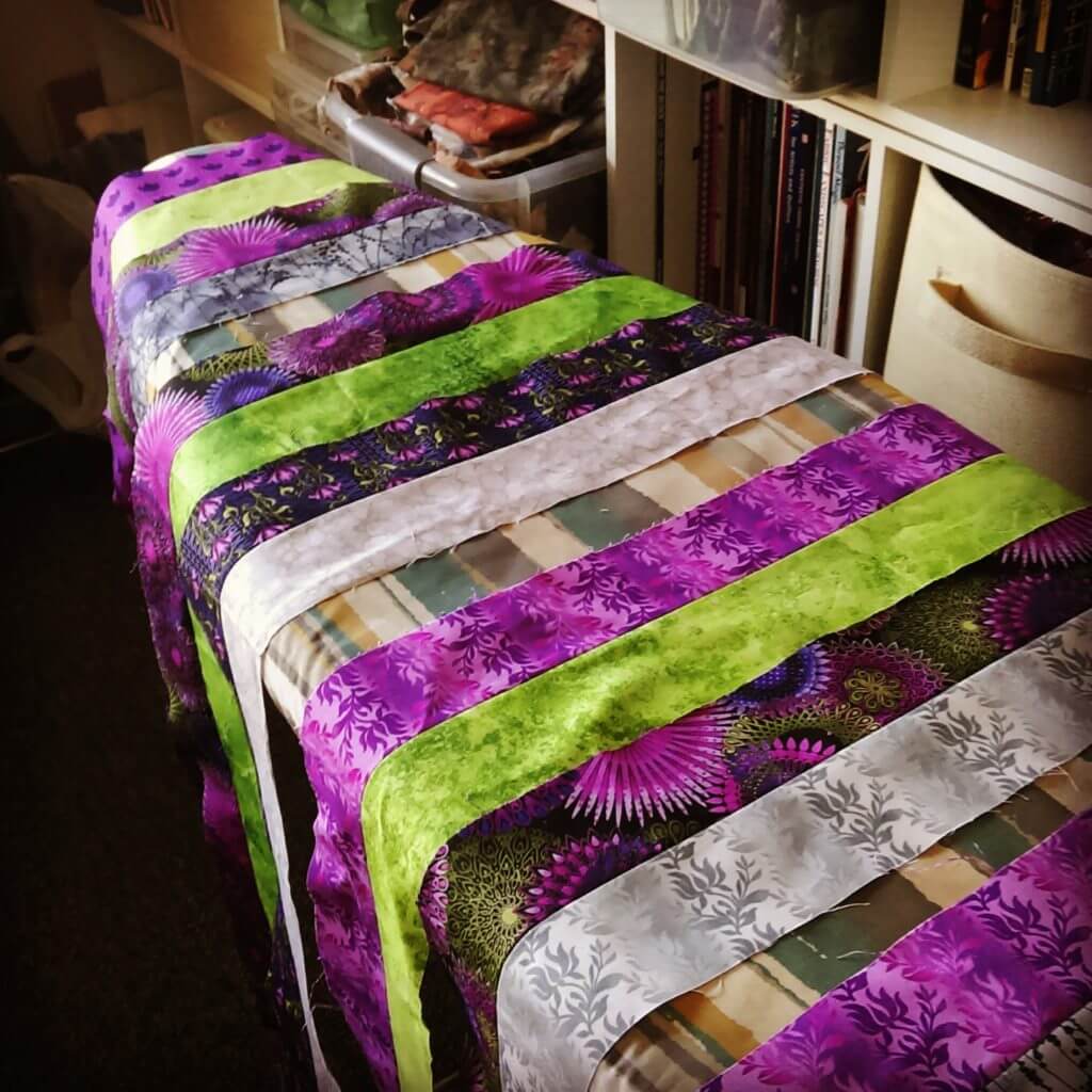
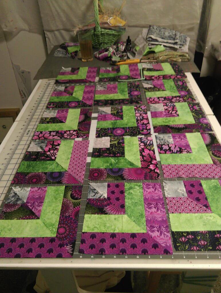
Then it was thinking about “balance” in the various shows coming up, so I decided the place to begin is with another large wall-hanging – Mardi Gras. In progress pictures…this is of the first step, arranging strips light and dark – from four sets of purple strips I bought two years ago at Keepsake Quilting, just for this.
I had 25 blocks with dark on the outside, and 25 blocks with light on the outside.
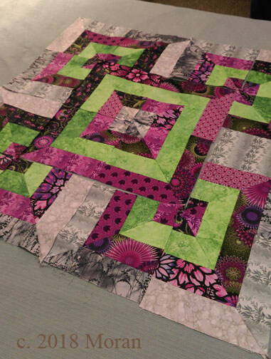
This is the center block with the purple dark as the border – I felt it emphasized the purple and decreased the brightness of the grays.
Almost the whole layout completed – blocks and rows are numbered and ready for the bext step of sewing them into a finished top, then deciding borders – I already have a quilting design in mind – lots of concentris overlapping circles to offset all the straight lines, and in gold thread for Mardi Gras.
Lots to do betweennow and end of March!
PS – there are four items on the “need to do” list by fall – not for shows….
Summer and Fall of “Enlightenment”
 Thoughts on NANOWRIMO – yes, it’s November…..been thinking about this for most of October and trying to decide what – and how – I will approach things. November 1 – I don’t have a lot of luck working through the month each day, as witnessed by the last two years of not accomplishing anything – or not even trying. So I think for this year I want to concentrate on writing my 1637 words each day – on rewrites, character studies, essays, blog posts – just getting back in the habit of writing regularly. I know two years ago I stopped on Book 2 because I had no idea where a lot of the plot was going, what the various story lines were….and then there is so much crap happening right now in the world that sometimes it seemed pointless…but my characters need some resolution, and I still have stories to tell.
So – things to write about –
* the books I have been reading since summer began
*conversations with God and the Joshua books
*science books
*where I seem to be evolving as a result of the changes in this country
*coping with changes in my life with illness with hubby
*writing concerning my art – especially blog posts – need to get regular again, as it does bring in more business, and a big show coming up
*newsletter for MTD
*pictures from this summer
*my own racism
It’s been a long while for writing a blog post, but not for doing art – a brief time off after the last baby quilt was done, and then back to a new baby quilt in September, and now three new pieces finished this week – feels good to be working again. The funny thing about the blog posts – for the last two years I have been 200 blog posts away from a 1000 posts – this year only 82. Should have been a snap, right? Well…..no. That just seems to be an impossible goal. Gonna be workin’ it this month….
We have so many shows coming up, starting with two small pieces tomorrow, two pieces for a January-April show, January/February for one of the community libraries, the US attorney’s office in Burlington, and a bunch more. While helping hubby recuperate in December from open heart surgery there will be a lot of time on the machine. I have some large pieces that need to be finished, and a major inventory to do of what goes to what show, without much repetition. Also, big art fest show in less than two weeks, and stuff to prepare for that – two patterns to write and put together, inventory for Square (and to figure that out), and the packing for the show.
There’s a l0t of good stuff going on art-wise. After all these years, we have finally found a decent way to package the fabrics – good for pictures, easy for people to see the various pieces, and we have some consistent sizes. Also, by mounting the finished pieces on canvas, we now have people thinking more about the fiber as wall art – a big jump in perception.
The three pieces from this past week – you can see in the upper portion what hasn’t been stitched. It is amazing just how much depth you get with the addition of batting and stitching. This is part of our “Leftover” series – paint left in the bottom of the tray when we clean it up. Once I add thread to it (and I used double batting for this one) it makes the piece come alive.
All the while doing this I was very aware of not having a focal point – I’ve been concentrating on that as I’m out taking pictures. It seemed like there was a consistent white stretch running from upper right to lower left – I saw it as a river, and as I used a light blue thread it started taking on some dimension, but ultimately I didn’t think the river was dark enough, and I wasn’t happy with other colors of blue that I had – so I used some of the India ink I’ve been suing for suminagashi and used a simple wash throughout the river – just the dimension I wanted.
This part for sizing/mounting canvas just didn’t seem to work. I assumed the canvas I had was an 11 x 14, and the piece was bigger than that. Hubby didn’t want to lose the lower left because of the effect, so we went and bought a 12 x 16. Turns out when we got home, that was already what I had…so it was back out for a 16 x 20. Great batik for the canvas covering, and between the binding and the extra border around the canvas, it looks like two mats for the frame. Happy with it!
Introducing: “A River Runs Through It.” $125.00 plus postage. 16 x 20 inches.
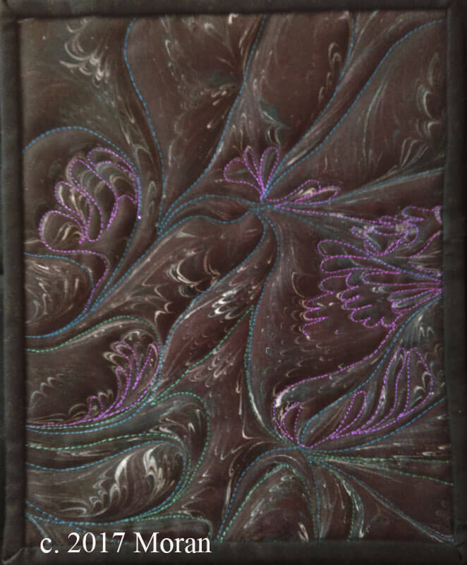
We have these wonderful polyester black linen pieces that marbne wonderfully, and I finished two of those – simple, easy to complete – not a great deal of stitching – just enough to emphasize what I want for a theme. Now they are part of a definite series – the “Moonlight” series Simple, easy to complete, and elegant.
Moonlit Garden, just starting the stitching. Finished size 8 x 10 inches.
Finished piece Moonlit Garden, $65.00 plus postage.
Finished Piece – Moonlit Winds, 8 x 8 inches. $65.00 plus postage.
Now to go through a lot of my works in progress – like the Iceberg piece – to get a couple of big pieces started/completed for show next year.
“Experimenting with Textiles”
I am currently (like right now) watching a video from the fellows who bring you textileartist.org. I’ve subscribed for several years, and they are introducing a series of videos on finding your voice with your textiles. So far, 11 minutes into the video, I can see the various paths I have taken and why I had problems with them.
First, early on in working with stitching on marbled fabrics, I felt intimidated by mo own machine quilting skills, and I felt like I needed to do a huge amount of practice on smaller pieces before I came to the bigger works I wanted to do. A cyber friend kindly said to me – do the work you want and the skills will follow….and so they did. I started weaving strips of marbled fabric after I machine-quilted them, and I didn’t look back.
Second, I’ve always experimented with lots of techniques – marbling happened to be the latest one (embroidery, knitting, crocheting, painting), but the marbling hooked and and hubby. Now I have a body of work that utilizes marbled fabric and new means of quilting and embellishing. I picked up bead work only in the sense it could add to the overall design.
Lots of ups and downs in learning and trying to determine a niche for ourselves, as well as work within limitations of what we could afford. I finally decided that what other marblers do is fine – so is our work in its own unique way. I didn’t want to marble paper – I wanted fabric – first limitation, and we made it work. We perfected our style on white fabric – very unforgiving – a second limitation.
How can I push the boundaries of the basics? Hubby and I laugh about what I have him end of trying to marble – “pushing” to do ribbon, silk flowers, canvas…all because I don’t want to waste paint in the marbling tray. Lots of additional projects opened up, mostly with embellishing what we were already creating. Any new techniques were pursued in how they could expand our marbled fiber art.
Making marbled art is expensive – a pound of carrageenan is about $50.00 now. So because of our extremely limited financial capabilities we had to work within a very tight budget – and we succeeded. Looking at a display of our work several months ago, both of us marveled at what we were able to create with so little resources.
Embracing what we can do on our limited budget led me to learn how to manipulate my 1008 Bernina workhorse sewing machine to do what I wanted it to do. Yes, I miss “needle down” and variable speed….but my skill with this basic machine has led me to teach very successful machine quilting classes to folks who think they can’t machine quilt unless they have a long-arm or other fancy sit-down machine.
In terms of skill level, I am completely self-taught, with only one marbling class from a master (Galen Berry). Everything else has been trial and error….no color theory of design, so I started with putting everything with black fabric. Hubby has the color sense, and I slowly came around to improving mine. Now I can put marbled fabrics with a range of other colors and designs. I attended a workshop with Tony Conner, water colorist extraordinaire, who talked us through a painting he created. It was like a design class with a master, listening to him talk through his decisions. I kept referring to pieces I was working on to see that I was naturally doing some of the design elements. I was trusting my “eye” and myself.
You owe it to yourself to watch the first of these videos – maybe you are new to the idea of limitations. We had natural limitations through finances imposed on us, and it led to who we are as artists now. Check out our web page to see our range of work. Find textileartist.org on Facebook and get your free video.
PS – no more pima cotton fabric, special order didn’t work because it was too light, so we “over-marbled”…and it’s good to go…..making due with a limitation……
Organizing for Marketing
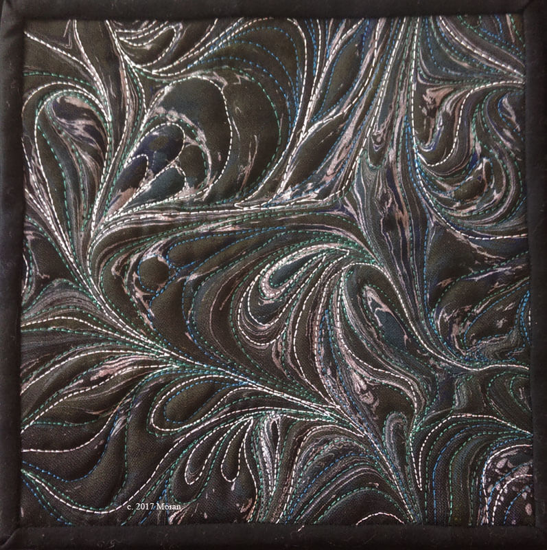
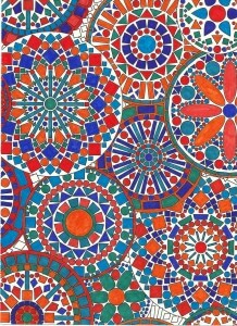 This image is from my time with adult coloring books last year – trying out colors, experimenting. I love symmetry, but then I also like something a little unusual….which is where I am right now as I approach a new project. I really need to develop more sources for passive income. I’m taking a free class right now from Convertkit on Product Creation – great ideas, and after two weeks of reading the information (a daily lesson), I decided to start at the beginning and develop a series of products that are useful to others. Hence, Organizing for Marketing.
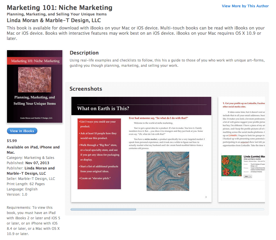
The title is going through some revisions – still not catchy enough for me. But I already have all this content – in an iBook that isn’t selling – and yes, I really haven’t done much to market it in the three years it’s been available (or is it four? Funny how time stretches out when you’re not teaching….).
So this is my first brainstorming at trying to make sense of what I want in this ebook product. I am very good at marketing and creating and organizing, so it makes sense to focus right there. When I reviewed the book last night, there is enough information to make it into three or four smaller ebooks and develop a continuous stream of ideas and techniques for people.
The first key is targeting my market. I work in fiber and textiles – pretty much a niche market when looking at the art world, although we are slowly making progress into mainstream. Thus I want to focus this on those of us who do art that is generally out of the mainstream. What can we do to get our work looked at, sold, appreciated?
Here’s my accountability checklist for this coming week, ending Tuesday, May 16, with my initial thoughts:
- Determine revised structure of the ebook. I need to break up the information in the original book into smaller segments for action, and increase the information included in each of the segments.
- Determine my ideal customer for this book. Who is my audience…artists without a lot of money to spend on marketing, artists with unique products, artists who have issues getting organized and accomplishing tasks.
- Write two additional blogs this week – what questions do you want answered in a marketing book for those of us working in a niche market, and how would this be different from all the other marketing books out there? I need to make sure I start getting feedback from folks to help direct my work.
- Evaluate ebook publishing sources and ease of use. CreateSpace seems mostly for print; research it more fully. Kindle seems easy and quick to do. IBooks seems too limiting, although I do have experience with that platform.
- Plan for a “bonus” for people who buy this ebook. Already thinking about many of the blog posts I’ve already done in my Top Ten series. I think these could be manipulated into a bonus, once links are checked, and focus determined. Happened to just think about expanding ideas for Top Ten for other Bonus offerings.
- Keep playing with title ideas. Suggestions certainly welcome! Organize, marketing, niche products…….
- Determine launch date for the ebook – probably beginning of August.
Feel free to give me ideas and help keep me accountable to this project! You can be in the book with your website and product for helping out.
ORIGINAL BOOK
Ready, set, go – give me feedback!
Busy Busy Busy…….Two of Seven…..
So it’s a crazy time in the studio right now – 7 projects, five of which are big ones. Two deadlines coming up this next Monday for photography…see, Kathy Nida – I’m calling the photographer ahead of time to get myself to the deadline!
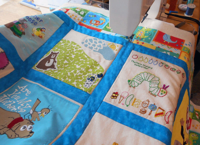
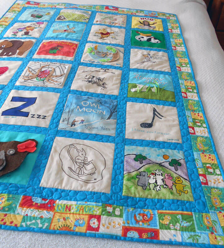
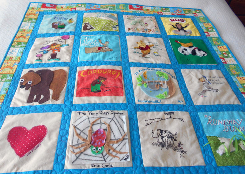
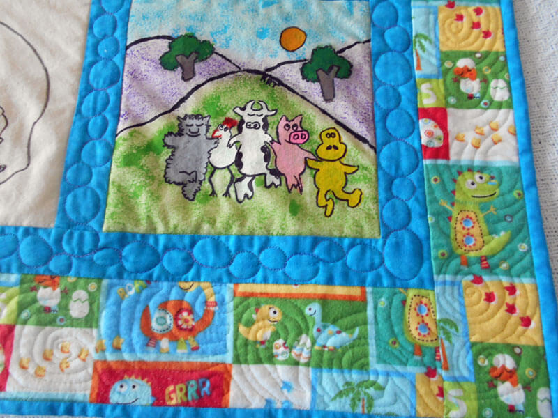
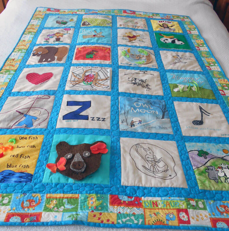
Here are the first two of the seven….I’ve been quilting baby quilts for a friend who works at the middle school we both did, me back in the mid-seventies. You can see the last baby quilt (before all the deadlines hit) here. I enjoy doing them, we usually get a free lunch together, and it gives me a chance to practice my free-motion skills – kind of like practicing free throws before you need them for the big game. You can see the children’s literature theme – the books usually stay the same, and the colors change to the new mom’s preference. ALL pictures copyright 2017, Linda A. Moran. PS – thank you, Superior Threads!
 ALL pictures copyright 2017, Linda A. Moran.
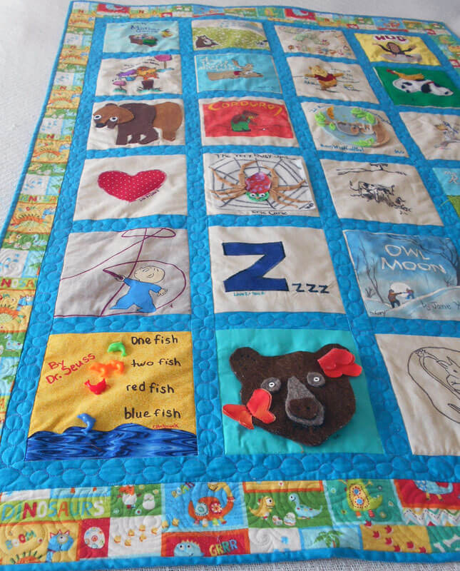 ALL pictures copyright 2017, Linda A. Moran.
Now for the next project – I decided to make quilts for my great-nieces and great-nephews when they turned 13. You can see Gracie Mae’s quilt from two years ago here. Now it’s Gavin’s turn, and I did another “modern” quilt with the colors he wanted. Again, a great chance to practice design and free motion quilting. In looking at the one two years ago, I can see the improvement in my skills. In two years I owe two new birthday quilts.
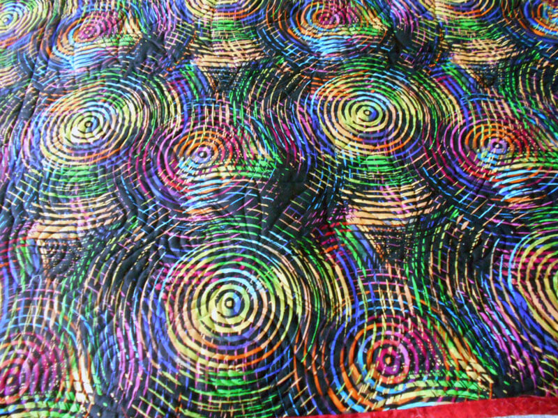
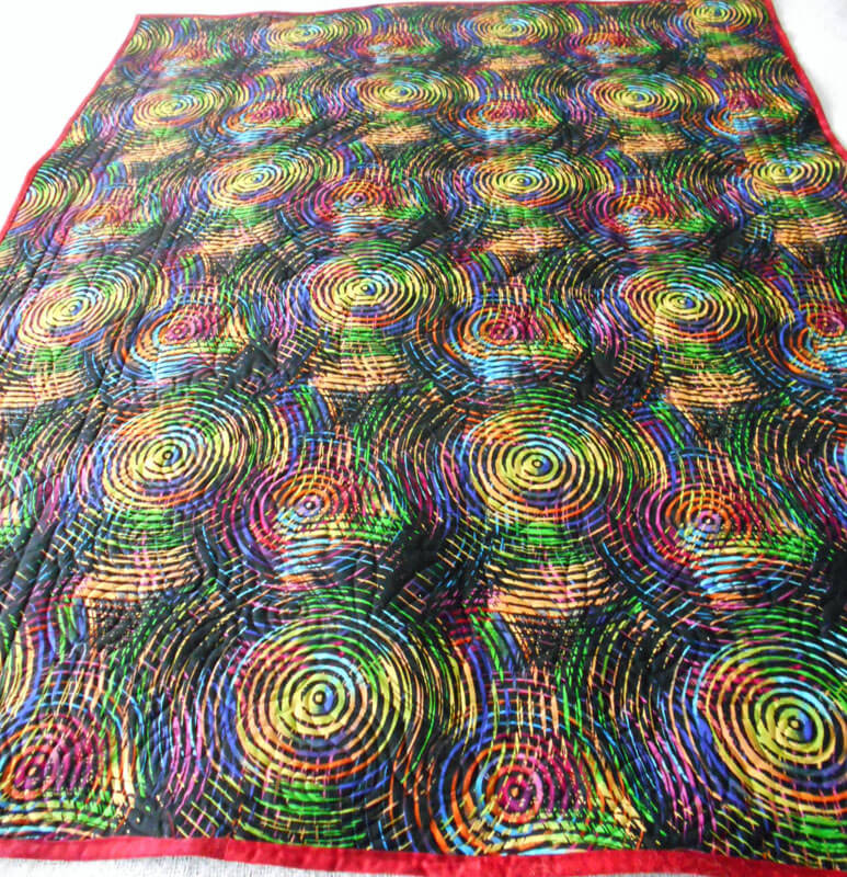 Love the backing – perfect for an adolescent boy!
 ALL pictures copyright 2017, Linda A. Moran.
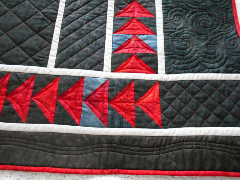 ALL pictures copyright 2017, Linda A. Moran.
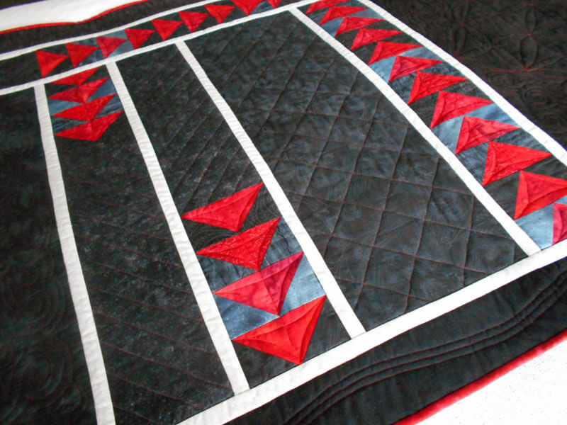 ALL pictures copyright 2017, Linda A. Moran.
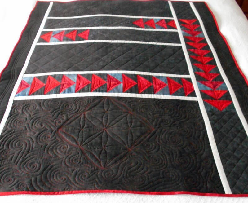 ALL pictures copyright 2017, Linda A. Moran.
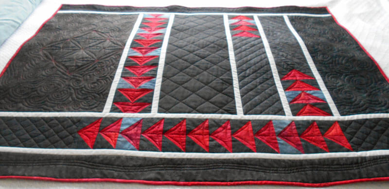 ALL pictures copyright 2017, Linda A. Moran.
I really wanna learn to use rulers like Judy Madsen…..
On to “Eruption” and the “Threads of Resistance” quilts…….
Deconstructing and Redesigning
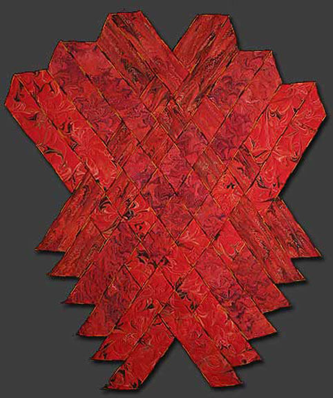
For over 13 years this piece has been known privately as “Ode to the Fire Goddess Pele” as a result of my time in Hawaii. It’s official title is Gaia 2: Beginnings. Our biggest problem has been that it was meant to hang on it’s own, but we were unable to figure out a simple – and not intrusive – hanging system. So for the last year, since we have been showing our work in Vermont, we’ve talked about mounting the piece – somehow. Here’s the story of the creation of the original piece.
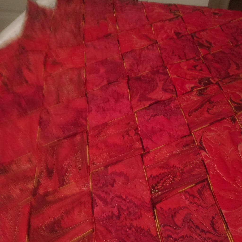
That led to me deciding to completely redo the piece – ev.er.y.thing. It took two weeks of night time by the television to get all the machine quilting pulled out. In the 13 years since this was finished my machine quilting skills are SO much better. I will say that my original tension was so bad that in many places all I had to do was pull a thread and I had many many inches come right out.
My new plan is to requilt it, change the edging, mount it on a large piece of black fabric, quilt the black fabric, and then add a sleeve. I need to have all this accomplished by May, as I plan to enter it into the “Abstraction” show in Saranac Lake this summer.
Right now I have 12 strips still with serged edges. I found a FABULOUS piece of red and gold fabric in my stash, and (hoping I have enough) I will put the binding on over the serged edges. It looks really good so far.
A close-up of the original weaving with the serged edges.
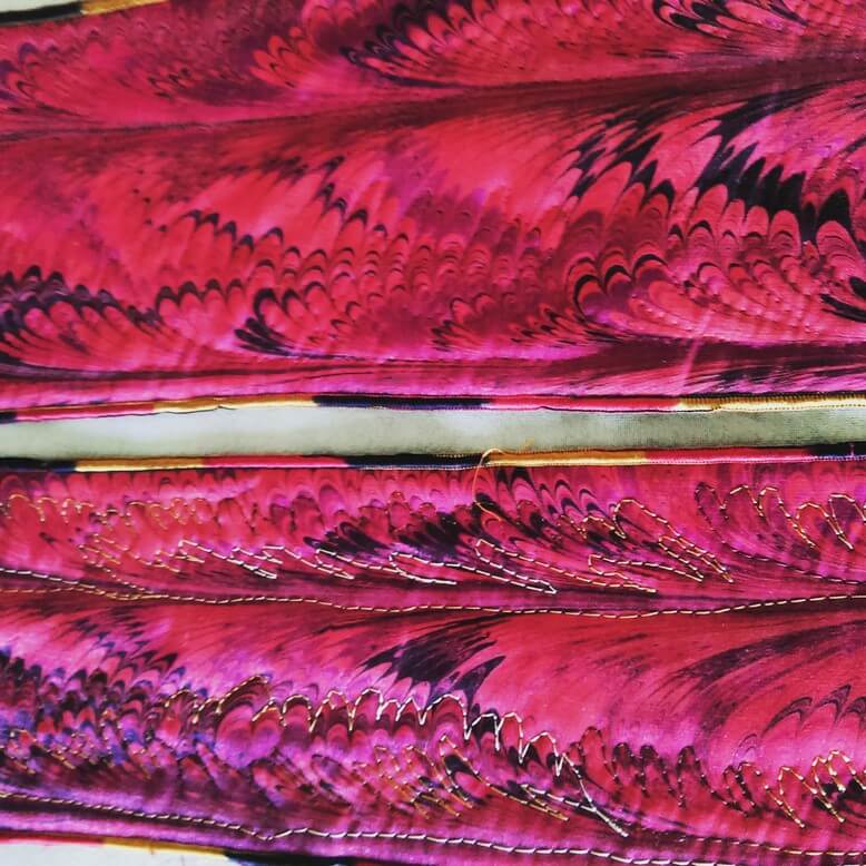
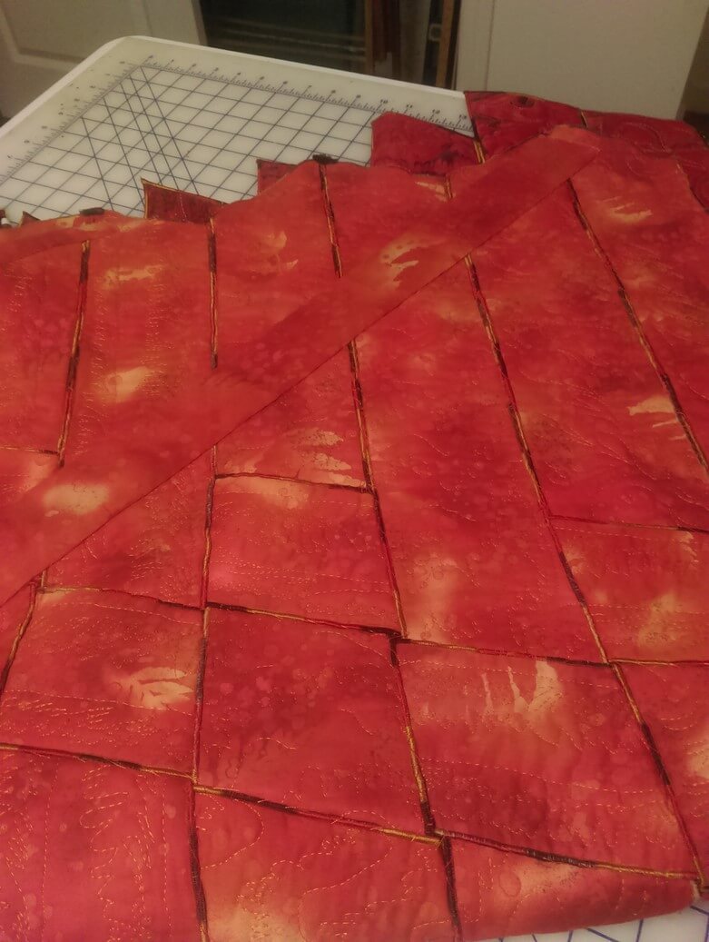 A close-up of the back with all the hand-stitching to hold all the pieces tight and together (oy, did that take a while….)
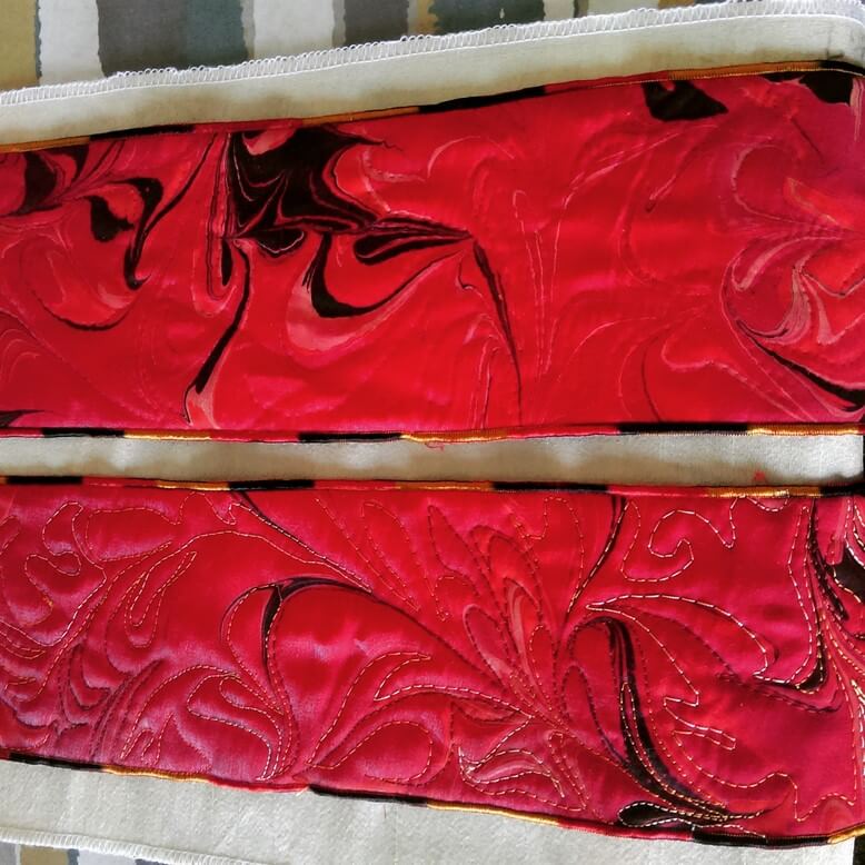 Before and after – original stitching, and after the frog stitch….
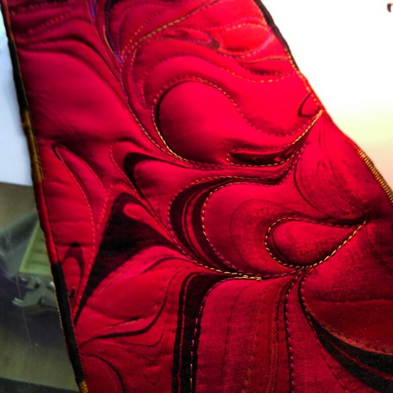 The beginning of new free motion quilting….
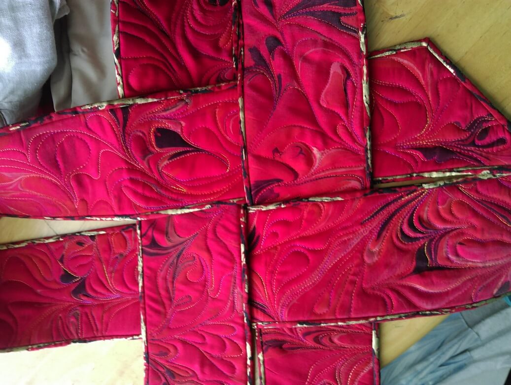 A look at the new binding and how it will work with the weavings.
This piece will also have a new name: Revolution. More on that as I get further along in the quilt.
Art in 2016 – Part 2 Review – Small Works
A lot of smaller work was started, finished, and revised this year – part of the need to create more pieces, and part to experiment with new ideas. We also tried more framing (pretty successful) and mounting on canvas (very successful, and not that all expensive). The biggest issue seemed to be people didn’t know what to do with small wall hangings or table-toppers. By framing them we are leading our customers to see the piece on a wall, looking like artwork. This is also working well for galleries and stores with small spaces.
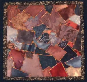
The “Chocolate Box” piece on the left was done some 18 years ago as part of a challenge on the QuiltArt list to create an 8 x 8 piece with the theme of “brown.” I pulled all kinds of browns from my stash, including some marbled fabrics, and then I zigzagged them together with the idea of creating a “Whitman’s Sampler.” I have always thought it looked very cute. I rediscovered it this summer, adding batting and backing, variegated thread in a more prominent zigzag, put on a binding, and mounted it on fabric. Lots of good feedback on the piece.
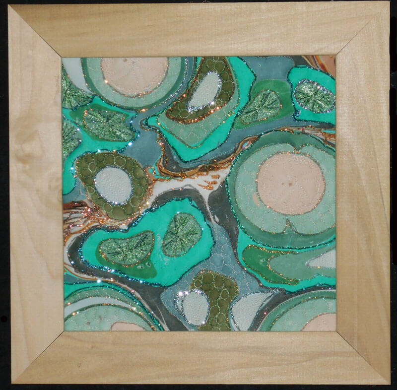
Another piece that saw framing was a small piece of marbled poly-satin that a friend (Suzan Drury of Saltwater Systems) added glitter to at least 10 years ago. Loved it, but it didn’t translate into something someone would want to buy – so on a whim I added batting and backing and then quilted it – thus “Pond 3” – a favorite topic. I learned to do sand dollars as part of a tutorial from Lori Kennedy (theinboxjaunt.com), so you will see clam shells, sea urchins, and sand dollars throughout the small piece. It looks quite striking. One thing I learned in the framing process was to move to lighter-colored frames to keep a piece from feeling constrained.
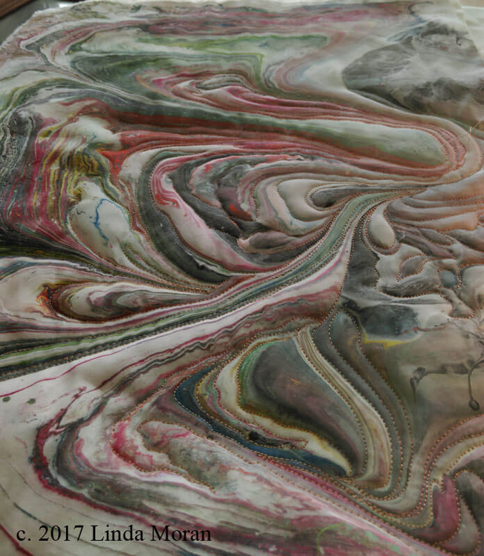
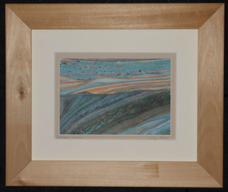
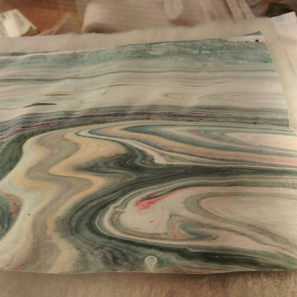
this year saw the debut of a new series – “Leftovers.” The idea for this came about when we would clean the marbling tray after a session. There were wonderful designs of leftover paint as we emptied the carrageenan. We started saving some small pieces to capture to designs – all of which are very organic and “earth strata.” Two pieces made their debut at Phoenix Books in Essex as part of a rotating display of work by the Essex Art League. There are LOTS more to come – all of which need me to stare at a piece for a while to determine how it wants to be stitched. They are all simply framed and look almost like photographs.
Before stitching on From Above:
Ultrasuede marbles wonderfully. Over the past couple of years we have been doing yards of this for Bead My Love to sell at the various bead and gem shows. We get to keep a few pieces for ourselves, and this year I finally attacked quilting one – with some interesting lessons….the fabric feels like suede, but it doesn’t translate to a puffiness when quilting (note to self: use extra batting for the next piece). Also, the various colors didn’t show well, which is why I went with Superior Threads New Brytes yellow – a thicker thread. this is a 12 x 12 piece of ultrasuede. Introducing “Partly Sunny, Chance of Storms.”
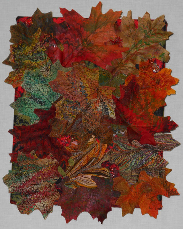
One more piece – we also started marbling flowers and leaves from the silk flower sections of the craft stores – another way to use up left-over paint in the marbling tray. Here’s “Autumn,” a collage of some marbled silk leaves. Covered canvas, 8 x 10 inches.
More next time as I continue to review the year. Comments welcome!
Art in 2016 – Part 1 Review
It has been a banner year for art – especially in the making of art. When I stopped to reflect, I realized we created more this year than any other year – some big, many small, and all taught us something! I’m doing several blog posts, since I don’t have pics for a bunch of gifts – awaiting the jpgs in the email….
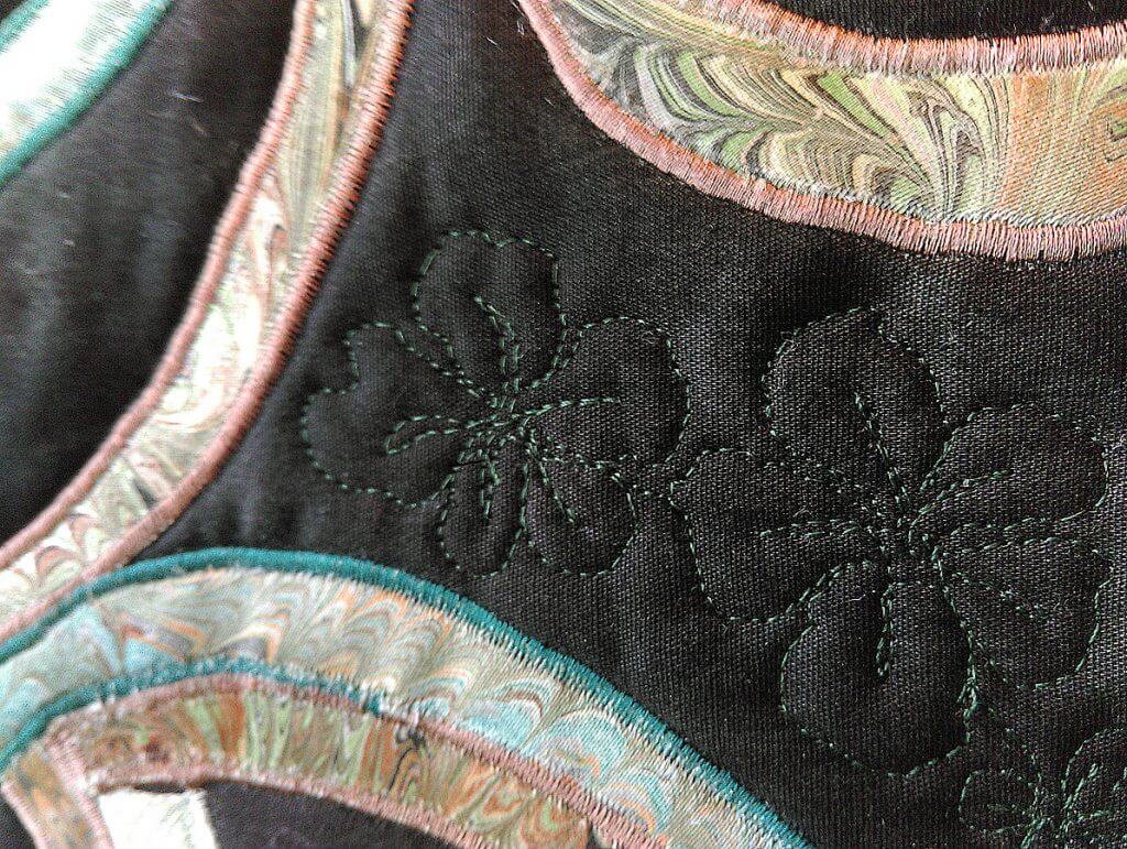
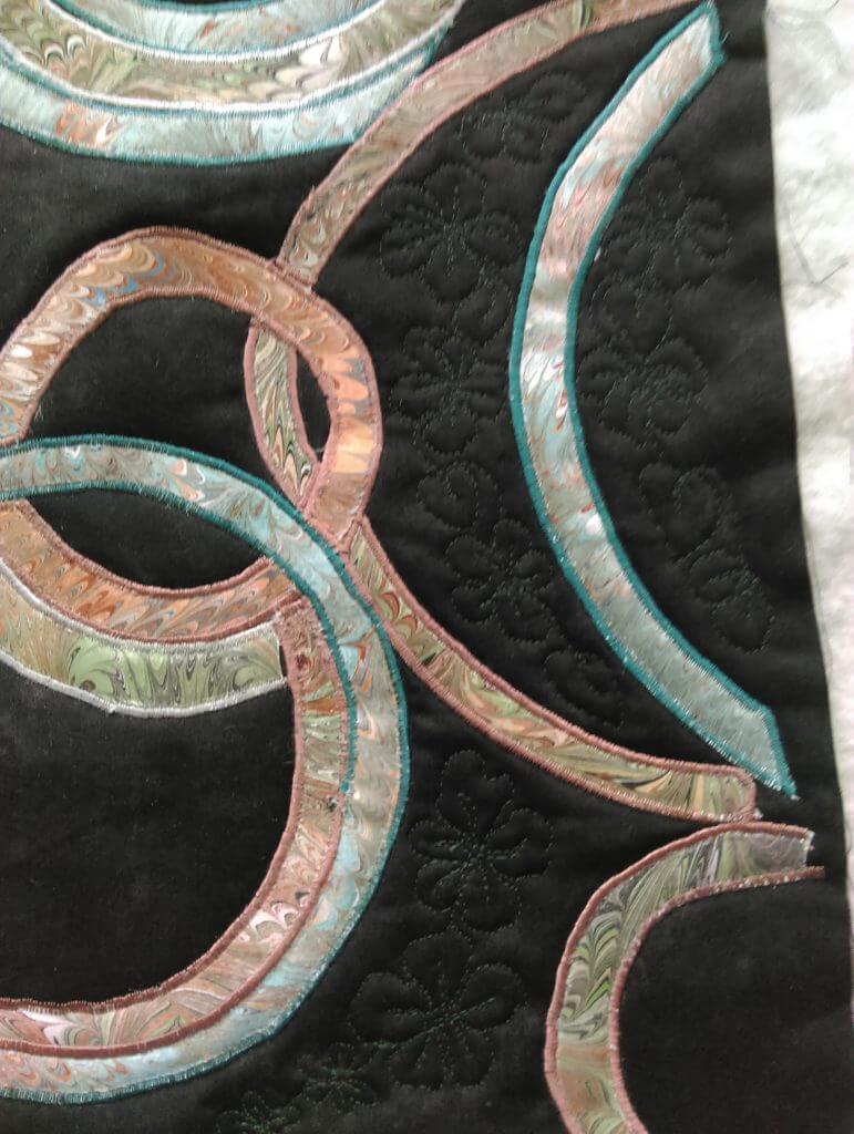
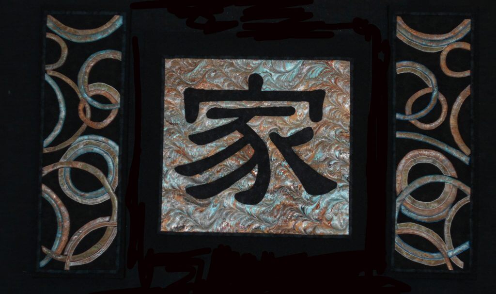
Yesterday was the presentation of a commission for dear friends of ours. It was supposed to be for their anniversary in September, but just didn’t happen….Once knee surgery was over and I could move around fairly easily, I set to work. The marbled fabric had been done since April, and I had been mulling designs since then. It was time….
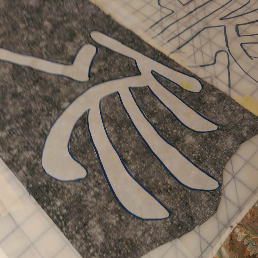
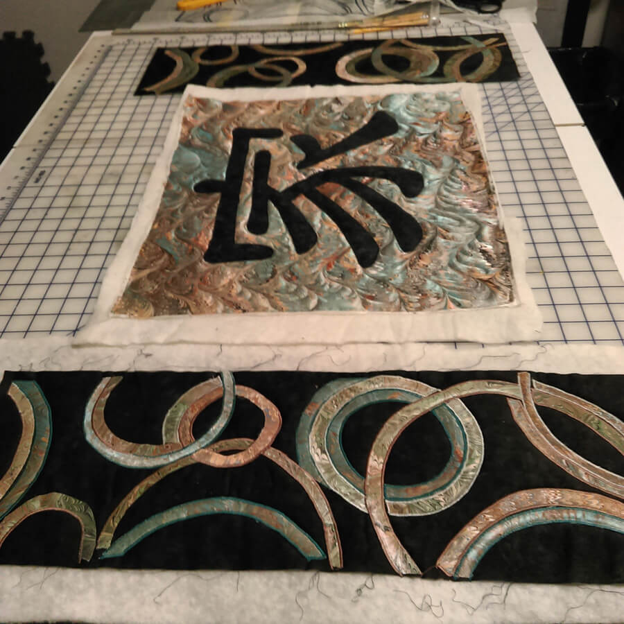
I started working with the Chinese symbol for “family,” and after just this first littyle bit, I have even more appreciation for the art quilts of Kathy Nida. This involved tracing the symbol, determining which side would be “up” when ironing onto the front of the fabric, adding WonderUnder, and then making sure it actually worked – especially since I had a limited amount of the fabric choice for the symbol. First success.
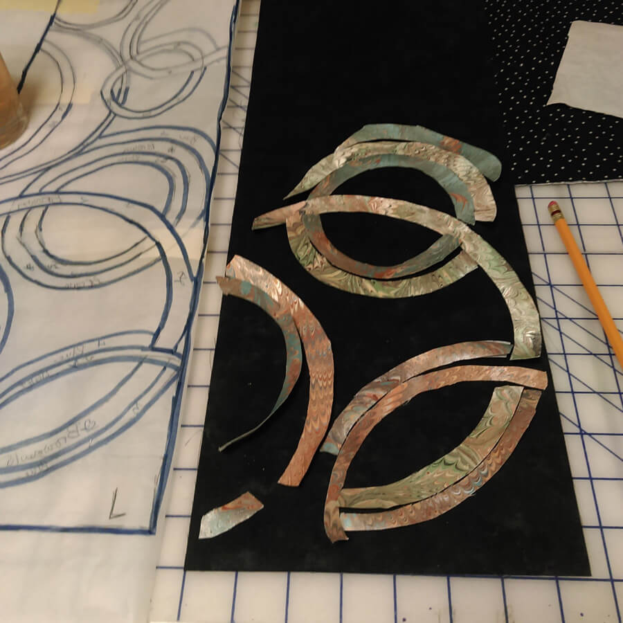
Next was creating the pattern for the side panels, loosely based on a table runner by Lonnie Rossi and definitely made my own. Same issues with being sure of right and wrong side, since there would be two panels, and the designs would mirror each other. Much angst – especially on the choice of the background – I had a peach silk that worked with the overall colors, but looked terrible with the small pieces actually on it. The fabrics were extra marbled fat quarters that didn’t make the cut in terms of main color, but they were all complementary.
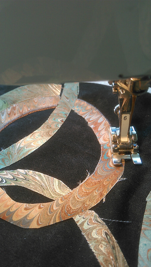
I put off for the longest time doing the zigzag satin stitch and then discovered that the fabric frayed very easily. A lot of adjustment, sharp pointy scissors, and FrayCheck got me through this section.
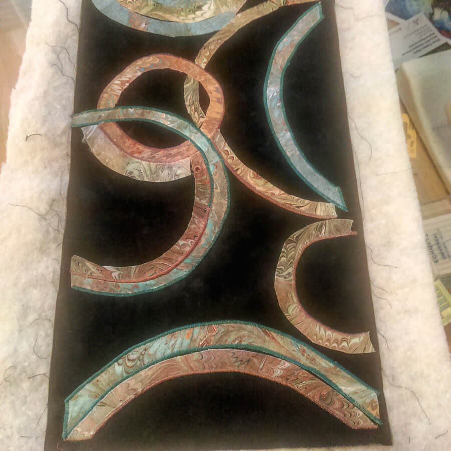
I had one panel completed and then started on the second panel. It probably would have been easier doing them both at the same time, but I wanted to be sure the idea could be executed before I was completely committer.
The request was for some apple blossoms quilted into the design – originally to be on the border….but it worked out differently. I Googled images of apple blossoms and determined a free motion pattern, and then began. As long as the petals had ragged edges, the pattern worked.
Lots of flowers over both panels – really liked how subtle the patterns are.
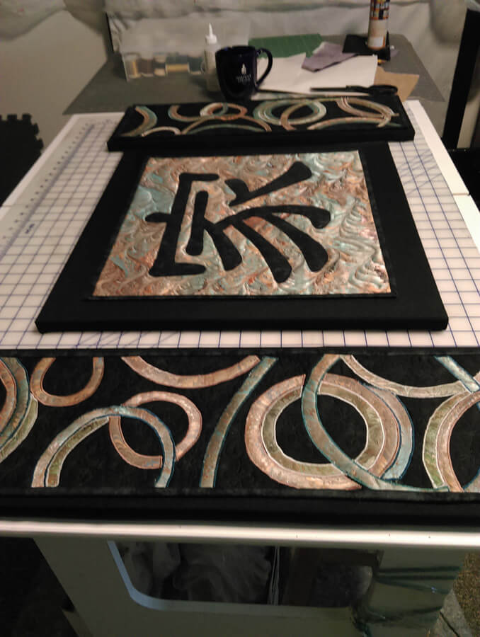
Checking to see if the three panels really do work together….
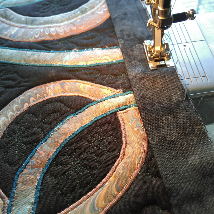
Time to square off and do the binding – the side panels had a LOT of ironing as they were becoming distorted. Note to self – allow more edging next time around…..
Preparing the canvas for mounting the panels. We have started mounting much of our work on canvas frames covered with a complementary fabric. Much sturdier, easier to hang, and people seem to view them more as “art.”
Thinking it’s going to work…….each side panel is three 8 x 8-inch canvases, mounted together and covered.
Sunday Stories – The Chakra Commission
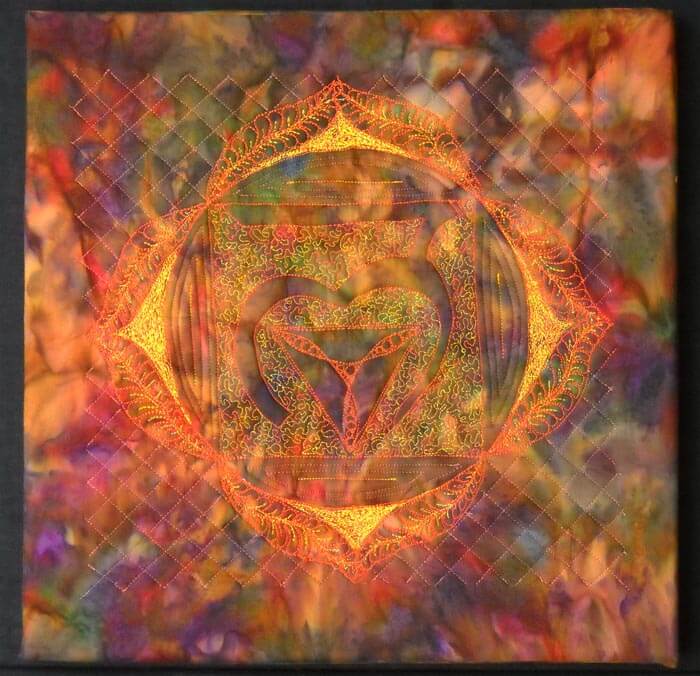
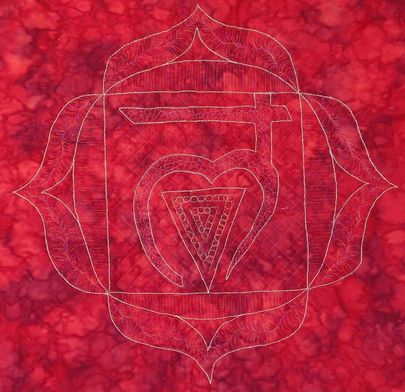
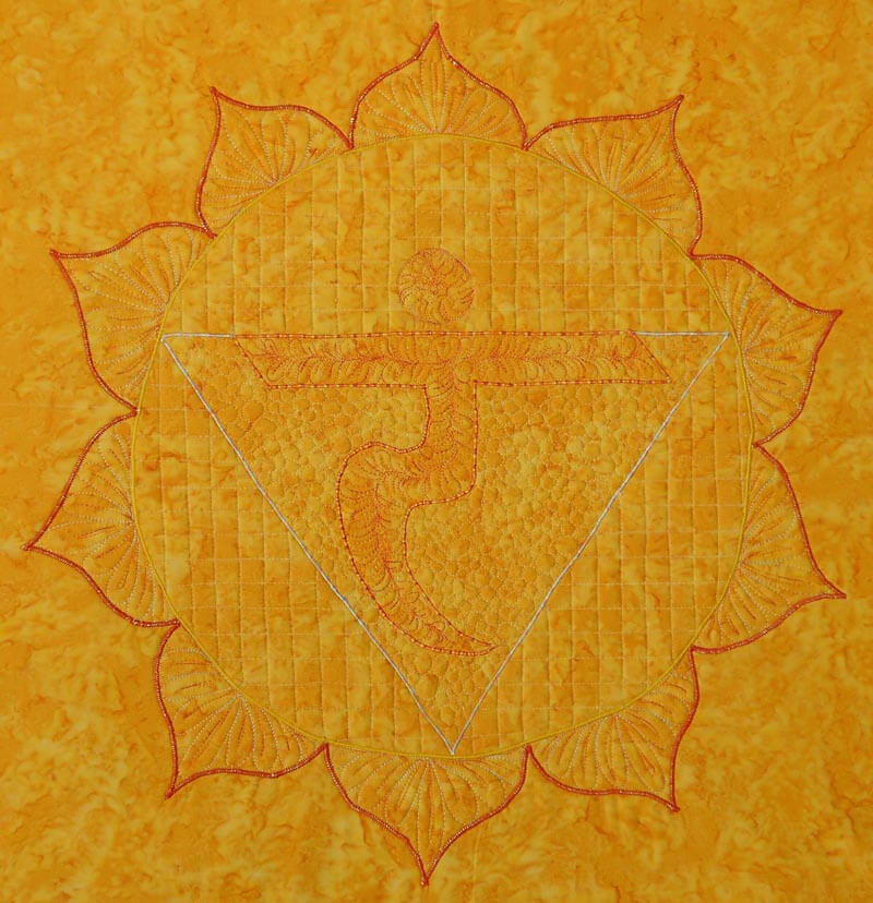
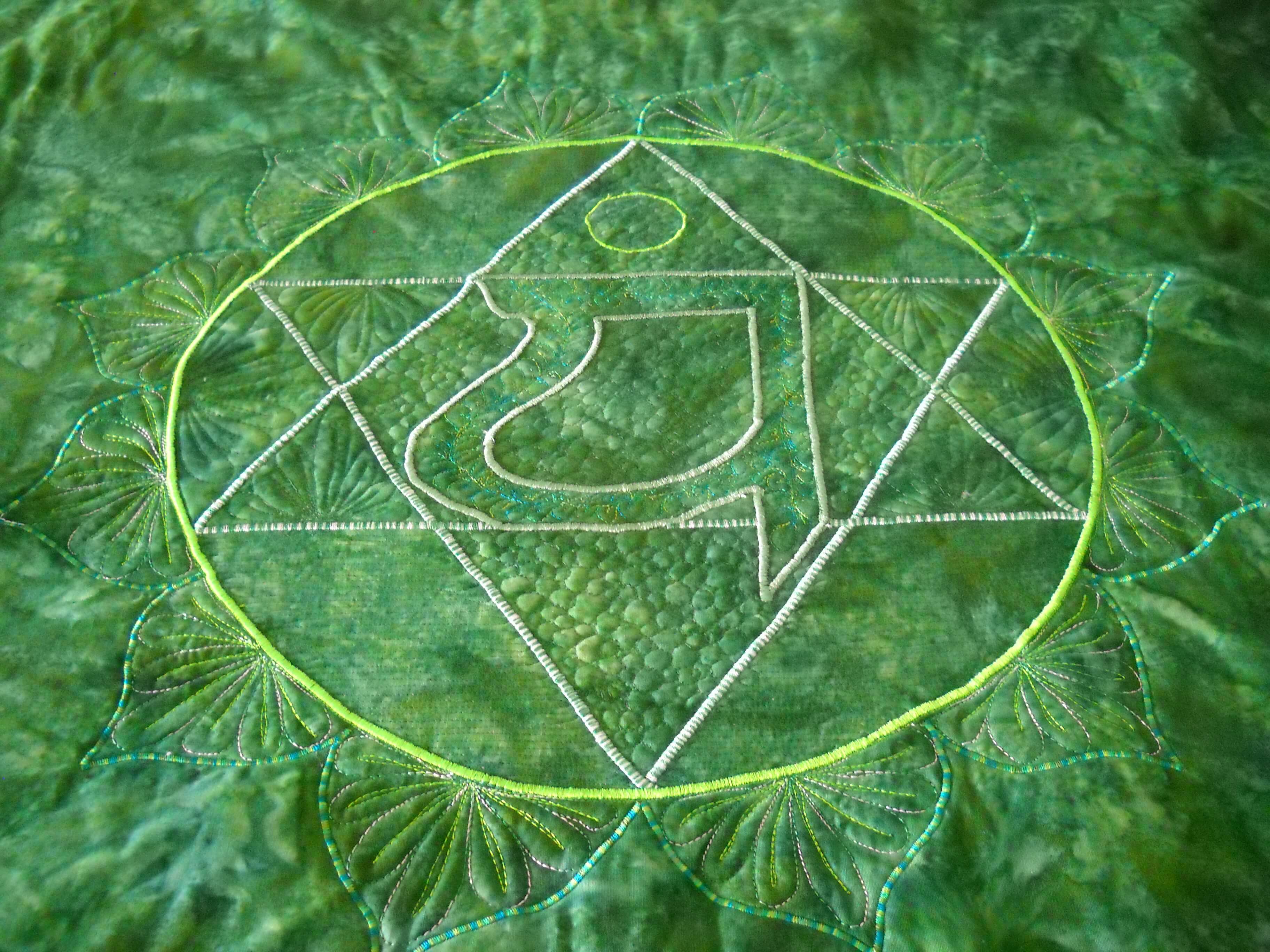
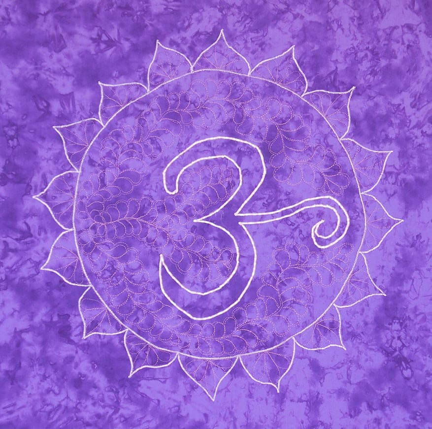
Last September my yoga instructor Susan asked me to do a series of chakras for her home, which is also her yoga studio. She had the idea to have the chakras around three sides of her “great room,” so she would be surrounded by their energies. I had previously done a small 10 x 10 inch thread-painted root chakra, and that one led to this new idea.
We debated about size, because the wall space is quite tall. Using the floor tiles as an estimate, we decided each would be 24 inches square – wrapped around four 12 by 12 inch canvases that we would put together.
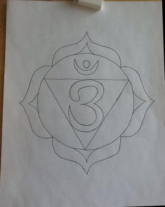
First challenge – choosing the fabrics. I wanted to purchase them all at the same time for consistency. I had thought about the Stonehenge line of fabrics, but the LQS was out of them. Susan found some hand-dyes that were what I call true crayon colors. It was a beautiful vibrant rainbow. This was when I first realized some of the attributes of the chakras. Second challenge – creating the patterns. I wanted the thread-painted chakra to finish at 20 by 20 inches, because that would give me enough fabric for wrapping the canvas. So I worked with a set of patterns from the Net and created a master set for approval. We tweaked some changes with the edges to better increase some of the symmetry. It is now the end of October and I am ready to start – I think.
In trying to explain to the copy folks at Office Depot that I wanted my design blow up to 20 inches by 20 inches, eventually we got a 24-inch-square canvas, with a 20-inch design on it. I had copies made as patterns.
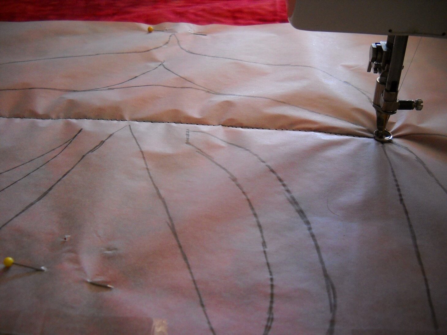
Once I had the pattern, I traced over it and then pinned the tracing paper onto the fabric sandwich. Speaking of fabric sandwiches, it too close to five hours to get seven sandwiches prepped: ironing the fabric (I cut each yard into a 30-inch square), matched it with low-loft batting, and found some unused fabrics for the backings. Then they all sat over a chair for a while.
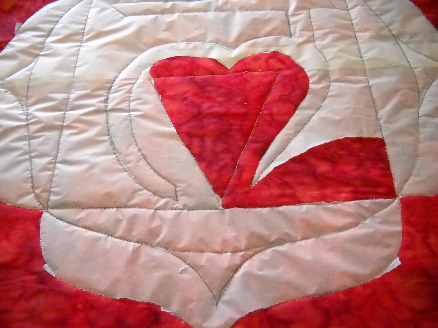
Finally around the end of November I started the actual sewing. I pinned the tracing paper carefully to the fabric sandwich and, using washable thread, I outlined the pattern. Tearing off the tracing paper took a very long while….
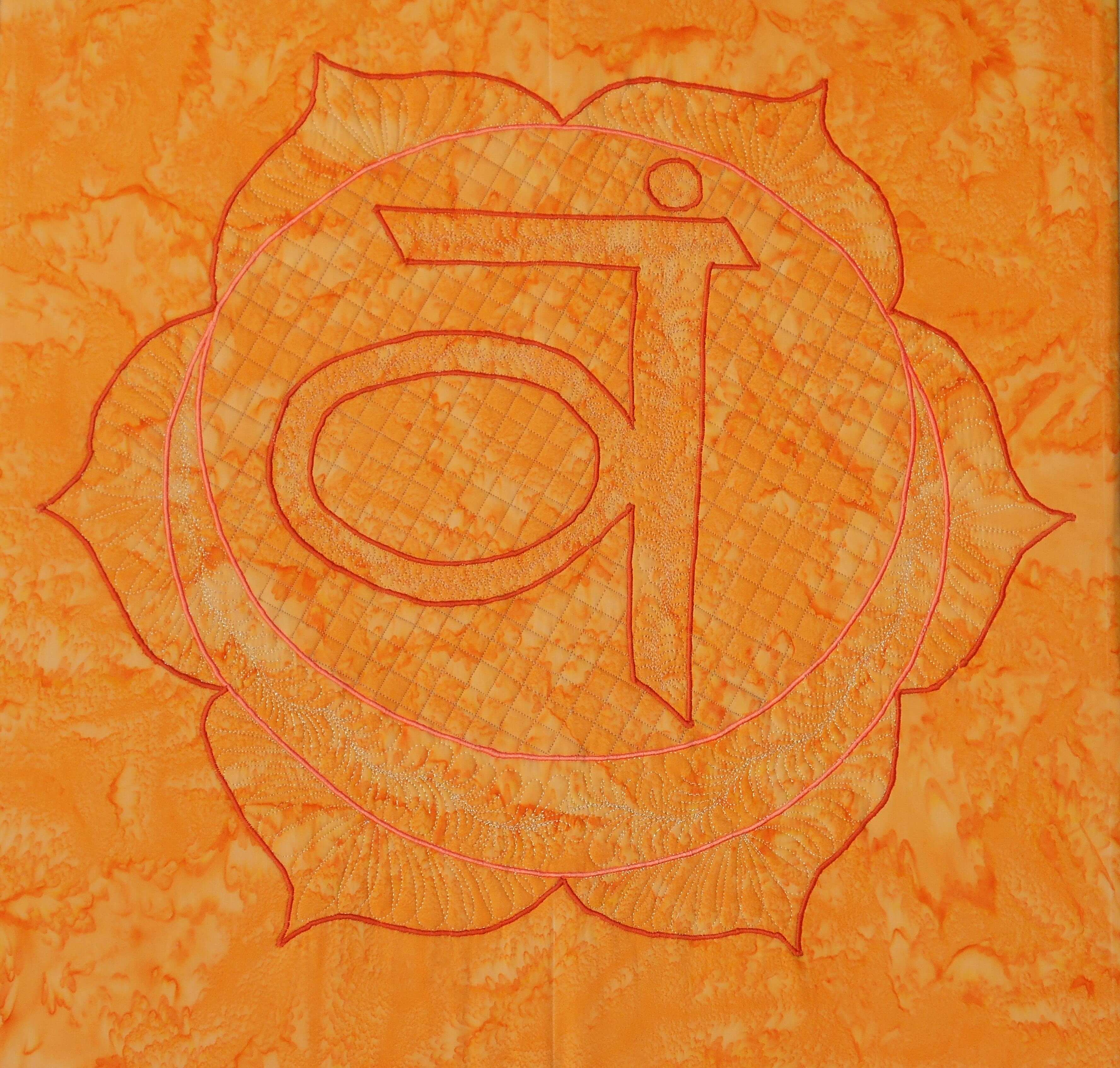
For the Root chakra, I decided to do some bobbin work with a gold thread. I was so-so pleased with the results, but not enough that I was going to continue with the bobbin work. Each of the other chakras used satin stitch on the major elements and a lot of free motion patterns for fillers. The chakras got progressively better in their sewing….until the last one – same elements but a much simpler design.
I thought about redoing the Root chakra, since it didn’t seem to fit with the others. But the more Susan and I talked about how these were developing, the more I liked the first and the last. As I worked on them, I added more quilting elements that added to the design. I used colors in the same family as the background fabric, with hopefully enough contrast. Up close they were all looking gorgeous. From a distance, they faded away. That bothered me for a while, but I realized as I was working on them that everything in the design was meant to be meditative. Up close, you could lose yourself in the design. From a distance, the more you looked the more your saw.
Susan summarized it pretty well. The root chakra is our beginning, and it can be very shaky and unsure. We develop from there, with whatever impurities becoming who we truly are. The crown chakra, the seventh, is the Divine, and as such doesn’t need to be ornate. The Divine in us can be very simple and beautiful.
So here they are, in order.
(Have to find this one – will update……)

I learned a lot. There are some stitching patterns I would change. I would probably use a much lighter background fabric and have the stitching pattern show more. Yet they move in complexity, much like the chakras do. I one I am missing is the one I think is the best design, yet in viewing it, the design seems very faint. The more you look, the more you see. This is also the chakra that is my weakest, so I find that fascinating. My yoga instructor is extremely pleased. The room is surrounded by color and it just vibrates. And she says she can easily meditate on whichever one she wants or needs. A very happy conclusion.
Second Design Photo Analysis
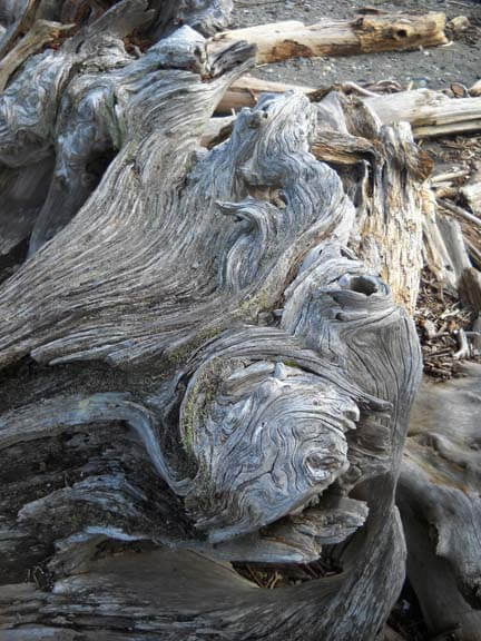
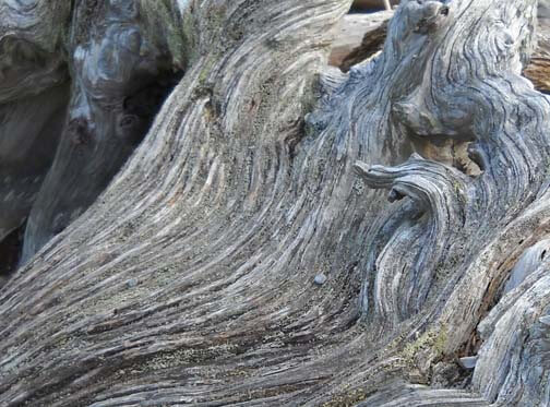
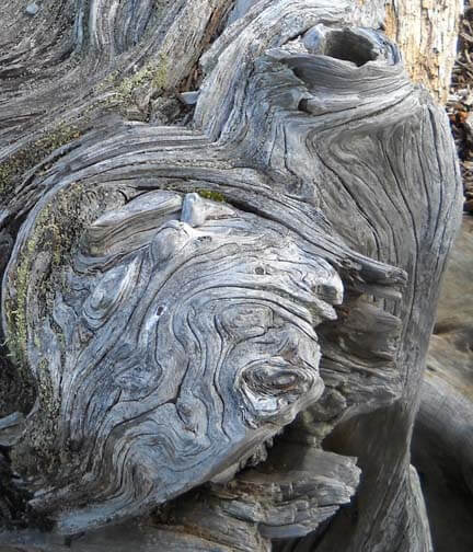
I worked with another photo last night, and I didn’t have nearly the success with adjustments and filters as I did with the first photo. Now I need to think through why that is so. Here’s the new photo – driftwood from Vashon Island in Puget Sound.
Well, crap….seems like I did it again in saving…or not saving. I need to remember to save everything as a psd file first to preserve the layers, and then save each piece individually. Okay, bottom line, nothing really spoke to me with the different adjustments, so I need to think through why that is so.
Is it because this is a fairly abstract image to begin with, mostly line and color? Perhaps that is why I am so fascinated with tree bark to begin with. The lines, shadows, differing colors to create the texture. And this picture, knowing it is driftwood, also reeks of a hidden history after being tossed in the water and then left high and dry. But how would I create some of that mystery?
What initially prompted me to take a picture of this? Probably all the smooth curved lines and the knot.
Looks like all kinds of interesting lichen within all those folds. The colors are so subtle, but at the same time I see a nice interplay of line and shadow.
I look at that knot and see a captured sea spirit. The more I look at this one, the more I am intrigued by it. The curves are so soft amidst all that hardness.
Now that I look at a couple of additional questions, I am stumped. Main idea? I like the thought of a captured sea spirit. Areas worth keeping? I can see leaving out everything else from these two crops. Other elements to add? No clue. But as I ponder, the first thought that comes to mind is to carry the lichen out into a border, and maybe the overall piece doesn’t need to be square or rectangular, maybe more oval so that the spirit seems encased and surrounded but is really still there. Don’t know if that is making sense….
How and where can more pizazz be added? Again, no clue. But…perhaps a lot of thread painting would be needed for surface texture.
I can see this going to sketches as the next step and seeing what develops from there. Comments?
Work in Progress Wednesday – Learning Lots!!
 Well, this has been a week of learning experiences, including running the machine needle through the tip of my finger. I’m somewhat frazzled deciding on a project, since I don’t have any looming deadlines. I do, however, have a list of projects that need doing, so I picked one from that list and then added another.
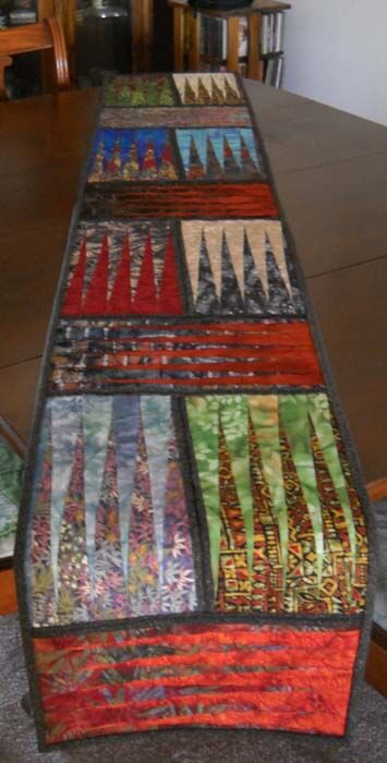
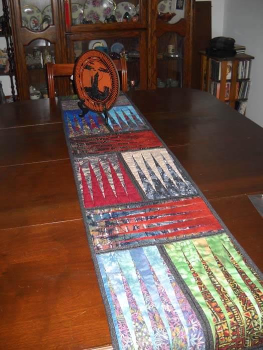
First, from the UFO list. Several years ago (going on three?) I took a class with a friend on a Judy Niemeyer pattern, Stepping Stones. You can see the pattern here. Originally it was going to be a king-sized bed quilt, but I was still teaching, so that got put on hold. When I reorganized the studio (twice), the blocks made it into the UFO pile, and when I made my list in May of projects, I listed these. But….I listed them as a potential table runner, figuring that way they would be done, and I could actually use the table runner, as we have a new dining room set (new to us – we’re babysitting it for a friend). I would also have enough for 6 placemats, too.
Well, there were loads of problems. Could I find the black fabric I was using for connector strips (three searches)? Could I do all the matching, since it had been about 3 years? How would I quilt it? What would I use for backing? I got the four completed blocks into one runner, and then I spent the next three hours taking out all the paper….note to self: you still need to vacuum. The blue I thought to use for backing was a stretchy polyester that wasn’t long enough, so plan B was leftover dark blue from another quilt back. Then I had to buy batting.
Finally everything is together and ready for quilting…..and I had no idea what to do for the quilting. Didn’t seem like feathers would work. Didn’t want to do a stitch-in-the-ditch. Tried some outlining, but I didn’t like it. Then I thought about the overall loopy pattern from the May challenge, but ended up picking all that out. I realized I would need to go with monopoly thread, so the stitching wasn’t obvious. And I was playing around with tension, including two more ripping sessions.
I tried doing some partial circles on each block, so it would look like rippled water. And then I discovered the settings on my machine were set for the decorative stitch I used in the black borders. Seems like I still had the setting on one of the decorative stitches, and I was trying to free motion and there was a lot of drag. I also discovered that I could use a variation of a zigzag stitch and still have the feed dogs up. Turns out I liked the ripple effect, and that’s what I went with for the rest of the runner. Here’s a pic:
Here’s the finished table runner, which is absolutely perfect on the table. It will work with any of the leaves when we put them in.
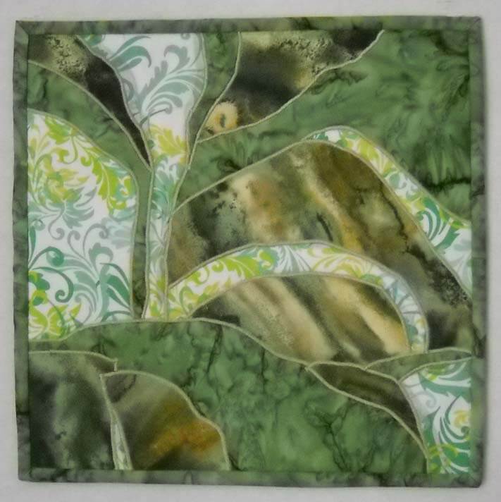
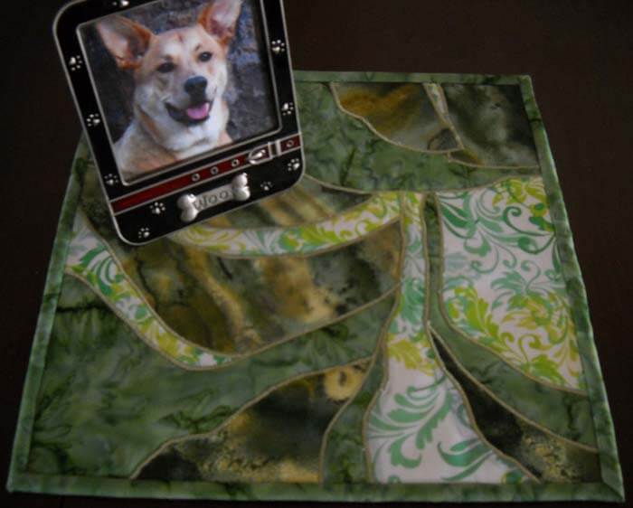
Then I was feeling somewhat at loose ends. I had been watching The Quilt Show and following the color lessons from Michelle Jackson. I decided to do the first color study, and again I learned a huge amount. The first lesson was really interesting, especially since I have a lot of trouble choosing and working with color. This was to take a monochromatic color and determine dark, medium, and light. I chose greens, because I have a lot in the stash. I discovered that when I’m choosing, I really need to analyze tones and hues. I also need to be sure there is definite contrast. The first study I did was the one where you had a light, medium, and dark, with not a huge amount of contrast. I did not have enough contrast within those three colors.
I also was working with fusing for like the second time ever, and my pattern pieces were not always meeting up. I spent a lot of time trying to make this piece look like something – going back to linear me and not being able to just work without it having to be “something.”
I finally got all the pieces ironed down, and I felt I was moderately successful. Mostly because I learned a great deal about choosing the colors. I was still trying to figure out what to do with the piece. Yes, it’s just an exercise, but the linear part of me needs it to be “something.” Ideally I want to be able to work with light, medium, and dark marbled fabric, but I can see I have a long way to go.
Again, I couldn’t figure out what to do with quilting it. I tried out one decorative stitch and didn’t like it. I reverted back to the satin stitch I was doing two table runners ago. All of a sudden I began to like the piece more. It began to look more “painterly,” and pretty abstract in a pleasing way. I ended up binding in, and the piece would work as a nice little runner or table mat for a vase. It’s going up in my Etsy store.
Who knows where I’m headed next? There are 6 placemats to finish…..
Thoughts on Entering Juried Shows……
 I’ve written that one of my goals for this first quarter of the year is to create some new artwork to enter into a few select juried shows. Joanne Mattera had a really interesting blog post on Monday about entering shows: When Do You Stop Entering Shows?
 Certainly timely for me. Her checklists of questions to ask yourself are excellent. I had success about 10 years ago with a series of shows I entered, especially Expressions in Textiles, which was more an early art-quilt venue. I would consider this my first prestigious show. I have success entering a show in Alaska each year, which is an art show, and fortunately for me they like fiber entries. I stopped entering a lot of shows from about 2006 on for two reasons: I was teaching full time and had very little time for creating art, and entry fees were expensive (moderately so nbow, but I must say, being able to do online entries is a blessing). The entry fee was groceries. Then I entered an art quilt show two years ago and was rejected. Aside from being P.O.’d, when I looked at the artists selected, they were the “same ole – same ole” quilt artists whose work is very recognizable. That’s when I figured I wasn’t going to play with the “big girls” any more. I needed to make work for me.
Hence my decision to try for Visions and a SAQA show this year….there, I’ve said it. Big time. If I am selected, these will be two huge pieces for my resume. Which brings me back to Joanne’s article. “But at a certain point—a tipping point, let’s think of it—you want to see your exhibition experience evolve into opportunities in which you are invited to participate.”
Yup, that pretty much says what I am aiming for. Joanne goes on to say: “Indeed, most dealers looking at an artist’s resumé want to see that evolution. ‘When I see a string of juried shows on a mid-career artists’s resume, I have to ask, ‘Where’s the progression?’ says a dealer I know.”
I know I’m making progress in creating art, and I want to be mindful of shows that would add value to my resume and future opportunities. Quilt shows aren’t going to do it for me. Some art quilt shows? Visions, SAQA, Tactile Architecture…..probably. I’m not interested in dealing with the “quilt police.” My work is not mainstream quilting, although that’s a skill I use. A number of years ago we had our work in a now-defunct fiber gallery in Scottsdale. At the time I was doing different things with my “bindings.” I was serging or facing the edges of my art quilts because the technique helped enhance the message of the piece. The gallery owner – a fairly traditional quilter who worked with bright fabrics and called them art quilts – was appalled that I didn’t have regular bindings on my quilts, and she wouldn’t take a couple of pieces without regular bindings. Well, to my way of thinking, a binding would have constricted the design in a way I didn’t want.
Those pieces are now all in private collections, and I’m still spreading my wings as an artist, trying all different kinds of techniques.
Some shows I do enter – nonjuried, no-fee art shows, where fiber will be accepted. The Tikkun Olam show was an easy show, a twelve-by-twelve piece dealing with the theme, and it could be any media. I did receive a lot of feedback about the piece and some interesting opportunities – and a lot of interesting lessons (just because you say you’re a curator doesn’t mean you’re especially good at it….). There is another show like that coming up that I plan to create work for.
In retrospect, I am on the right track. My decisions seem based in reality and forward movement for me. We’ll see how everything plays out. I am behind on my piece for the Visions show, but I have a month…..less, when I think about photography, but I’m almost there…..a solid week of sewing (which will have to be next week…) should finish it for me. And then on to the rest of the first quarter list.
Getting an Art Critique
 I am really fortunate to have a couple of good friends who can help me with a critique when I am working on a new piece. Sometimes the piece flows, and sometimes I’m blocked in making decisions and moving ahead. It is made more complicated by the fact that I am trying to use our marbled fabrics to create unique art pieces. In surfing the web on a regular basis, I don’t see anyone else doing what I’m attempting to do with marbled fabric in the art quilt movement.
There are a lot of things to consider in developing these pieces of fiber art. Are my sewing skills strong enough? Are my quilting skills advanced enough? Does the fabric speak to us? Can the design tell an interesting story? Can I work with the principles of design?
In looking at all these questions, there are two that I am the weakest in, and this is where my group of friends can really help. Quilting skills and design principles.
Momcat is my first voice. She is a digital artist in her own right, and a self-taught expert in Greek pottery, among all the other skills in being a Renaissance woman. Suzan is my overall digital partner and a superb, published quilter and designer in her own right. Karin is a water color artist with a very strong sense of color and overall design organization. Hubby is the marbler and can see things in the designs that the rest of us miss.
I am at a point in this new piece where I needed advice. Which way should the piece hang, for one – vertical or horizontal. Usually that’s one of the last questions for me, because by the time I’m done, the piece has usually told me what it wants. With this piece, I need to decide this now, as I will need to work on the shading with a light source from the “northwest,” which is how scientific illustration is done. I was leaning in one way, and my group confirmed that. They pointed out that I already had a lot of the “shadows” developing on their own from the new orientation.
The second was size and pattern. I am fine with all the quilting on half of the piece, but the other half seems naked of color and looks like it would require some serious thread work that wouldn’t necessarily add to the overall effect. I had been thinking about potentially cutting away half of the piece. We looked at that possibility, and once we folded back some of the fabric (which had never occurred to me), we knew it needed to be tall and narrow, not wide and thick.
Now, Momcat had sent me some of her photos of rocks and lichen that Dali had painted, and I LOVED the lichen. I was initially thinking of marbling some very small silk flowers and then attaching them with some thread painting. The group didn’t like that idea – felt they were not “tough” enough for the texture of lichen. Momcat disappeared, only to come back with a small vial of green stuff that she proceeded to spread on the one or two rocks that are already green. Perfect! Upon closer look – they are very fine chopped-up pieces of old money from the Denver Mint. Who knew? I guess now this is a “mixed media” piece…..We are also thinking about using some coconut Husk or actual moss from a pet store – need to think that through.
Next question: facing vs. binding vs. frame. How do I want to finish this? I don’t see a basic binding. We talked about fabric as an inner mat and as a frame. We looked at serging the edges – which I have done with pieces in the past, much to one gallery owner’s chagrin – “wasn’t finished properly” was her verdict. But I always let the piece tell me what it wants. I am thinking this piece is telling me it doesn’t want anything more to constrain it beyond a facing that wraps to the back.
The final discussion revolved around light, medium, and dark. I know if I were to take a picture of this and turn it to black and white, everything would pretty much be medium values. I know it needs more dark, so I need to think through how to do that with thread…..or moss…..or coconut husk…..or…….actual small stones…….
I left energized, ready to complete the piece. Amazing how being with a great group of like-minded visual people can make a difference!
