Archive for the ‘layers’ Category
Monday Marketing – Preparing Collections
![]() So one of my goals over these ninety days is to look at the pictures I have developed over the last couple of years, analyze the licensing materials, and determine ten collections that I can develop. According to the research I have been doing, I am going to need twelve to fifteen different collections. I have some ideas, but I need to get them organized, set up folders, look at what needs to be enlarged, adapted, and so on. I also want to see what can cross over to Cafe Press and potentially Zazzle, so I get as much mileage from some of the pieces.
So one of my goals over these ninety days is to look at the pictures I have developed over the last couple of years, analyze the licensing materials, and determine ten collections that I can develop. According to the research I have been doing, I am going to need twelve to fifteen different collections. I have some ideas, but I need to get them organized, set up folders, look at what needs to be enlarged, adapted, and so on. I also want to see what can cross over to Cafe Press and potentially Zazzle, so I get as much mileage from some of the pieces.
Whew. There’s a lot there. One of the things I learned in the lynda.com classes was about Bridge – a program in Adobe Creative Suite that let’s me easily look at all my images and organize them easily – something I really need to do.
Now to get started….and DON’T EVEN THINK OF COPYING THESE IMAGES – ask if you have something in mind.
Botanicals: I have a LOT of photos that could go for calendars, prints, cards. Interesting – as I’m writing this, I realize I really haven’t given much thought to WHAT these could adorn. I have been through numerous stores, looking at design, but I’m not sure I have really thought about extending these pictures into more than two items. Hmmm. Food for thought.
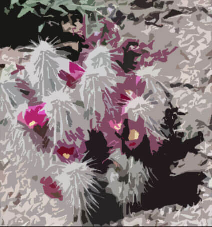 (don’t even think about copying….)
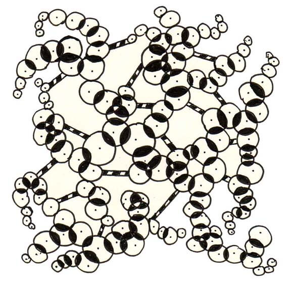
Black and White: prints, cards, kitchen items, gifts, fabric designs.
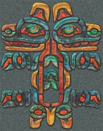
Indigenous images: I love taking regional designs and seeing how I can interpret them through marbled fabrics that have been digitized. This would make good regional products. Cards, calendars, prints, fabric (if the repeat works), gifts.
Art Deco Revisited: taking images in the public domain and embellishing them with marbled fabrics that have been digitized. Cards, calendars, prints, fabrics, gifts. The designs are from a public source, in this case the Dover book on Art Deco Designs.
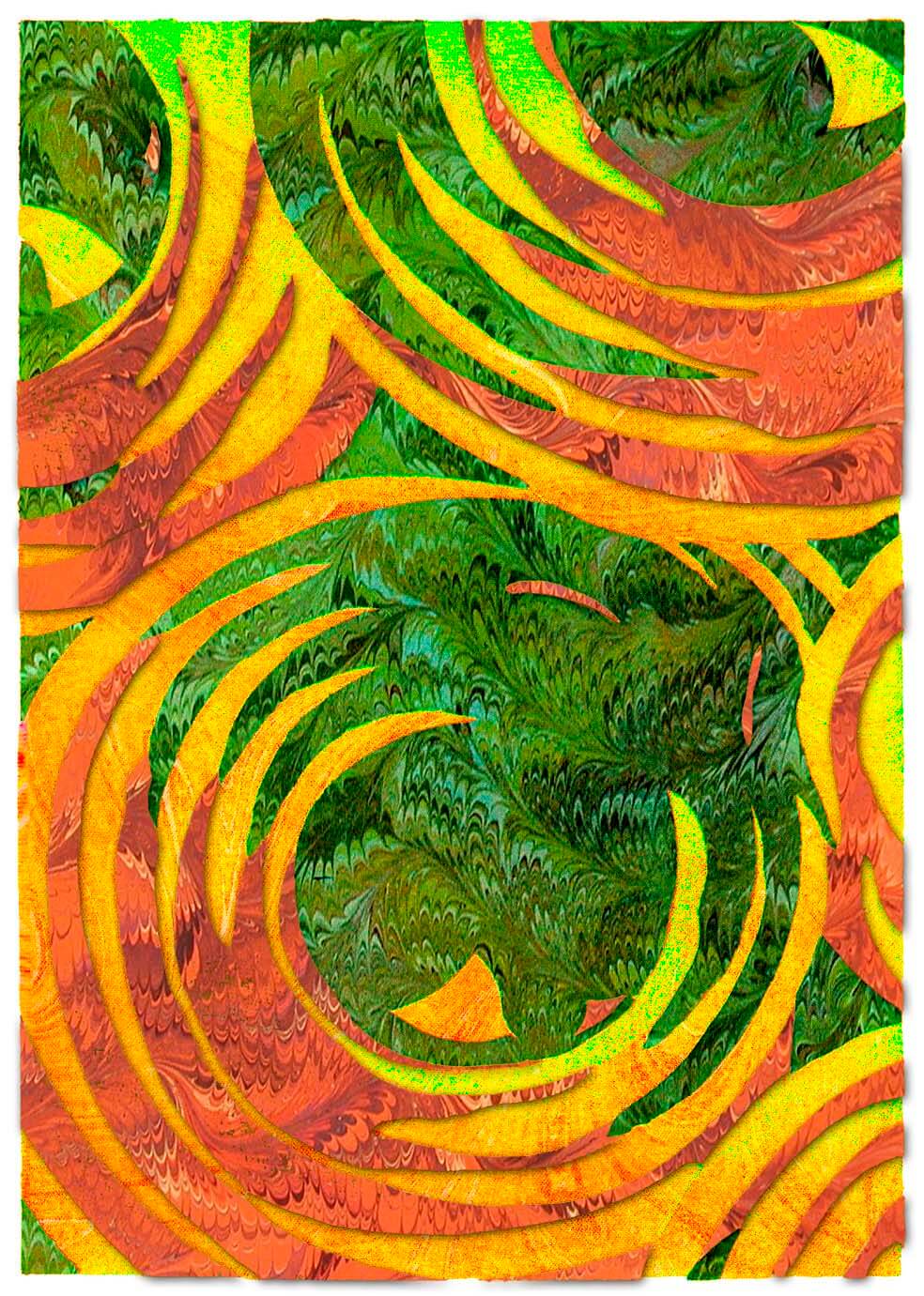
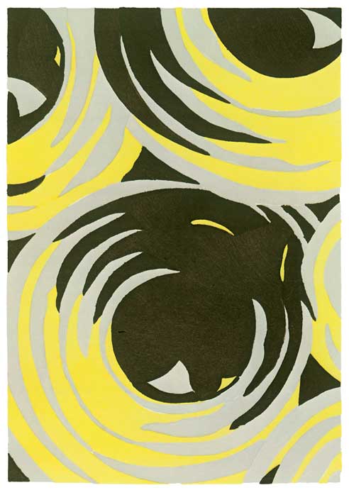 Original With the digitized marbled fabrics
Abstracts: digital manipulation of marbled fabrics to create a new design, in this case “Moons.” Prints, cards, calendars, potentially fabric, gifts.
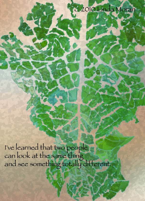
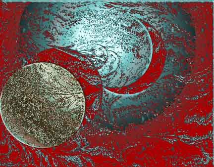 Inspirational: Taking either marbled patterns or images from nature and creating inspirational/motivational prints and cards, t-shirts, calendars.
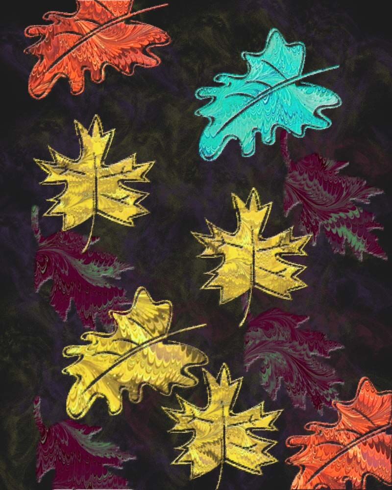
Seasons: digital marbling, as well as nature images that could be used in fabric, cards, calendars, prints. Pictures here could overlap other sections.
Nature: Places around the country and the world, cards, calendars, gifts, prints.
Southwest Designs: since I’m in the southwest, and I know how popular many of these images are. This one is already set in repeats. Lots of fabric possibilities here, as well as simple gifts.
Holidays: (valentines, etc) Got nothin’ here, and I know companies will want to see holidays, so I have a great place to start.
Interesting. That’s potentially ten collections. In my mind there were more, until I actually started listing them. Next steps: take this list of collections and go back into the stores to see how else these prints could be used. Stay tuned for the progress here.
And if you’re looking for resources, I regularly read Tara Reed, who writes an art licensing blog. Also, I have purchased materials from her about licensing (disclosure: if you purchase anything through this site, I do receive a small commission as part of her affiliate program). Also, her “Just Ask” calls are filled with great information from a wide variety of experts in the field. It’s another resource for you. July 2011 Ask Call Replay
Ahhh, The Weekend!
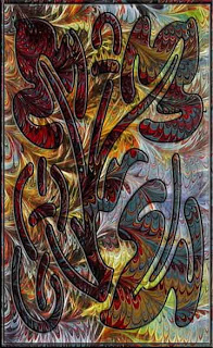
Ann wrote “Can you describe how you made the part of the image that rests on top of the marbled fabric – are they all layers in Photoshop?”
First, it’s really cool to get comments!
Second, I’m trying to remember all the steps. If any of you are interested in working in detail with Photoshop, look seriously into becoming a member of NAPP – National Association of Photoshop Professionals. There are loads of tutorials on just about anything you can think of, and they are very easy to understand.
This particular piece used marbled fabric for the background from a photo we took. Then I looked for an image in the Photoshop custom shapes. This one appealed – it just seemed like it would work with this particular piece of fabric. The custom shape was on a separate layer. One of the first things you learn in Photoshop is to make sure you do things on different layers, and then you can delete the layers, turn them off, and add more filters and “stuff” to different layers.
I adjusted the photo of the fabric to increase colors, and then I added a gradient layer (I LOVE gradients!). Then the custom image, and I started embossing, adding shadows, and just generally playing around until I had something that really appealed.
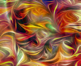
One of the things I have discovered is that the lines of the marbling pattern do some very interesting things as they are manipulated. Here’s a piece our foster son called “Ribbon Candy on Crack” – lots of playing around with color and pattern.
Line Art – mine, not the kids…..

I took the camera to school yesterday to get pictures of the art work, especially the doodles, the kids have been doing. Forgot that Rich was coming to tape, and so got involved with that. Had a great taping session, but will have to bring the camera next week.
I am slowly starting to feel better – for the last three nghts I have actually been doing some Photoshop stuff. Since I have been emphasizing line in art class, I have been thinking more about it myself. I am fascinated by what Photoshop can do with turning work into line art. So I chose a couple more pieces of marbled fabric to see what I could do with them. This could be a whole new way of moving with the fabric.
Here’s the original piece from last night:
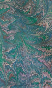
This is really a pretty piece of fabric, but it just seems too muted. Even with curves and adjustments, I can’t seem to make this a “wow” piece.
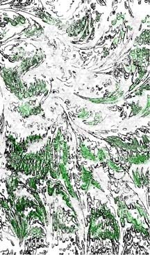
This is after sharpening and then doing the invert to get the line drawing:
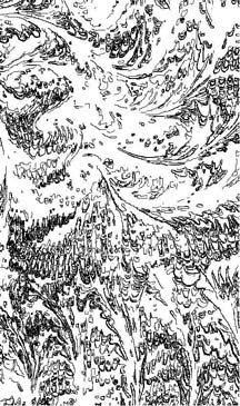
It wasn’t looking like much to me. Usually with the line drawings, once I do the inversion, then I can see a picture in it. I was puzzling on an image when Dean said it looked like a ski slope from the air. So then I started adding woods:
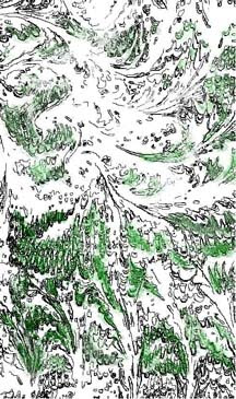
I need to do some more work here – still not satisfied. I was playing around with a number of the brushes and different colors – maybe to be more accurate I can increase the size and change the pixels to get more depth and accuracy. At this point I was wondering about getting to the snow – how could I add that against an already white background? I played with light shades of grays with blue tints, and then with the snowflake brush. Here’s what I got:
Not bad, but still needs work. I would like to darken the greens and add some more browns, so I can do a specific brush effect on the top and make it look like we are seeing through swirling snow.
