Archive for the ‘Logos’ Category
Top Ten Tuesday – Finally!
This is now on my desktop! I found it here at on the Kate Harper blog. After all these years of teaching, life is definitely too short to mot make art!
Now I spent the last two weeks going through all the blogs I haven’t read in two months – and mined a WEALTH of great stuff!
Zen Habits had a great and timely article on Decluttering, as I was working through all the little bits of odds and ends that I was sorting. Two key points – we don’t want to let go of the past, and we’re afraid of the future. Definitely worth a read.
From ArtsyShark – Is there a future for trade shows and sales reps – adapting to changing commerce. Lots of great points, especially if you are thinking of doing the art licensing route.
Elizabeth Barton has a fabulous blog with lots of food for thought. As I contemplate becoming more active with my work, this post of entering shows was extremely valuable. Don’t you just love the colors in this quilt?
Alyson Stanfield had a guest post on Photoshop (How to Make the Best of Your Art Photos with Photoshop) by Chris Mills. If you’re not reading the ArtBizCoach blog, you should be. – http://artlicensingblog.com/2011/05/16/how-to-make-the-best-of-your-art-photos-with-photoshop-by-chris-mills/
A friend of mine turned me on to online pattern sales. I haven’t sewn for myself in years, and I never thought about the pattern lines being on line. Marcy Tilton has some really nice wearable patterns – I could get hooked! Patterns on line
The Textile Blog has an interesting article on the future of hand production, starting with a video about hand-made lace production. Here’s a quote: The video deals with the seemingly age-old problem of machine versus hand production. The video itself deals with the situation in Cyprus where traditional lace embroidery is inevitably being led towards extinction by the importation of cheap machine produced lace, mainly from China. Cyprus is by no means the only area of conflict between machine and hand production and China is not the only culprit in flooding the market with cheap products.
Sites on greeting cards – I had no idea there was so much available on line. This article is also from Kate Harper and gives 6 articles on card design tips.
Also from Kate Harper’s blog (a HUGE wealth of information), much more about art licensing…..walking the floor at the Surtex licensing show.
This week’s eye candy from The Best Article Every Day – great ads for AT&T – forget the company, just look at the art work! This is a long graphic – go to the article and take a closer look – and then spend some time with all the rest – these articles are just the best!
Revisiting the Logo…
Spent some more time thinking about the logo and decided I hadn’t done it in a plain black. I like the blue of the school colors, but here it is in black. The shadow in the top can easily be done away with, but I think it give it a little more interest and doesn’t detract from the Pi.
I also decided to redo the “splash” on the coppper one to highlight the word “math.”
Finally – a Logo….
Well, it’s been a long time coming – I am working on week four of being sick with strep and who knows what else. I haven’t felt like doing anything, including Photoshop. But I finally tackled the rest of lesson 5 – I had a lot of trouble really understanding about paths and working with them, but I think it’s beginning to finally make a little sense. I realized what the problem was at work with the logo – a rasterized version that they were trying to use as a vector – turns out they finally hired someone to “fix” their problems. At least I figured that out. Good on me.
I worked on a logo for a math shirt next year. We have screened shirts for our school for the various departments, and I wanted to work on something that would fit in. So I used my Pi shape to take the place of the 2 T’s in Utterback, and I think it looks pretty cool. THis should be relativbely easy to silkscreen for a shirt.
Then I started playing with some other effects. I like the gradient with the copper because it really makes the school blue show up.
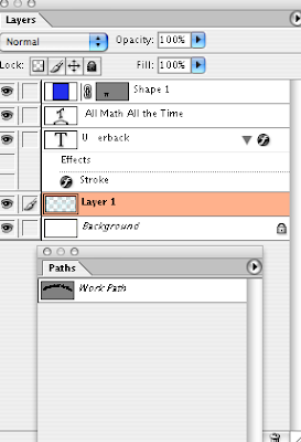
Here’s my screenshot, and now on to lesson 6.


![strangebeauty_thumb[2]](https://www.marbledmusings.com/wp-content/uploads/2011/06/strangebeauty_thumb2.jpg)


