Archive for the ‘NAPP’ Category
Photo Friday – The Botanical Gardens
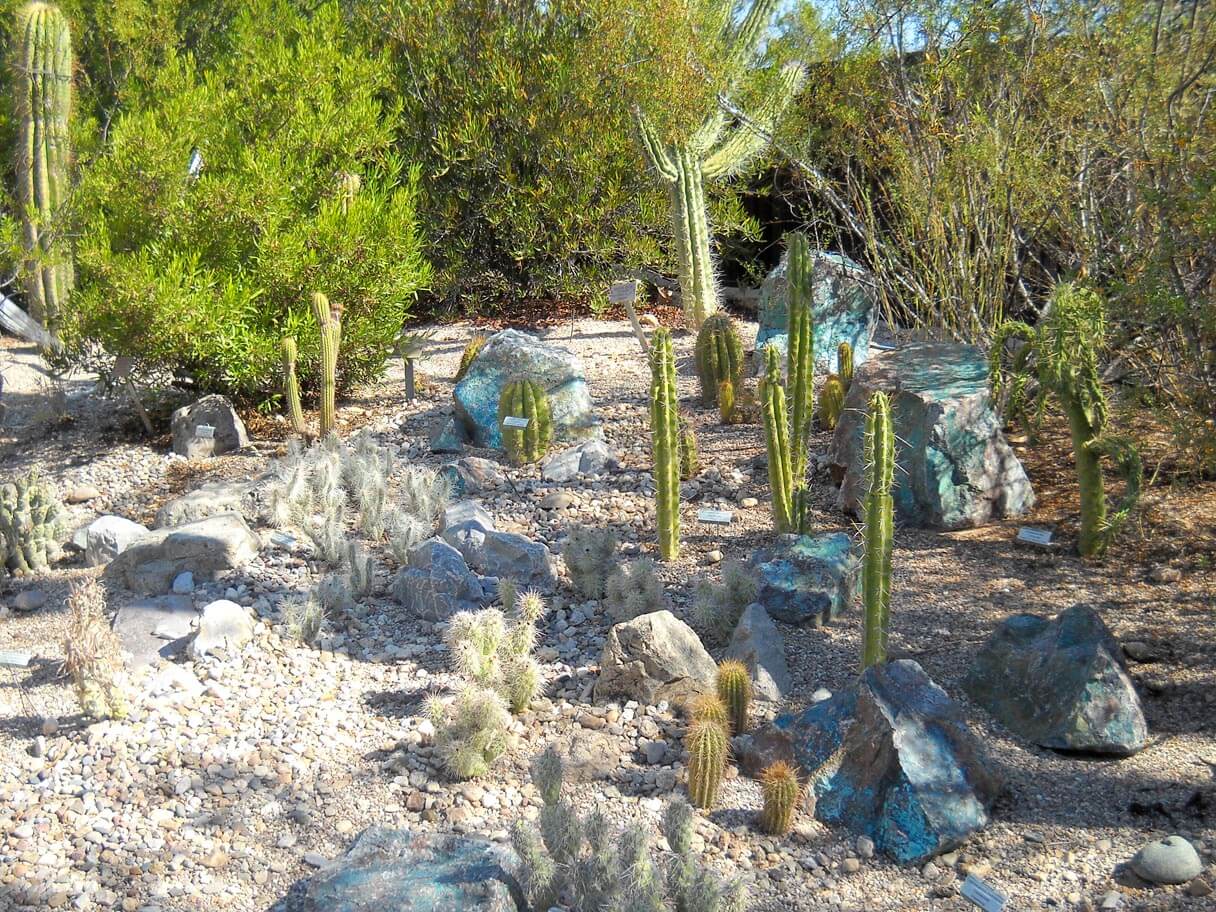
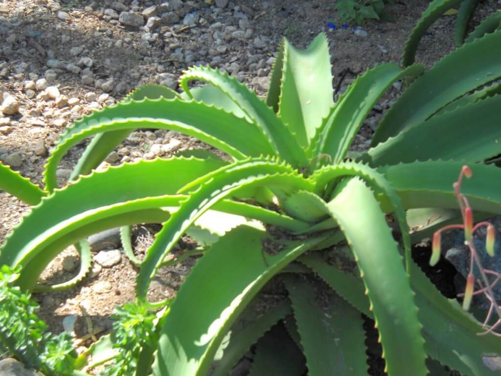
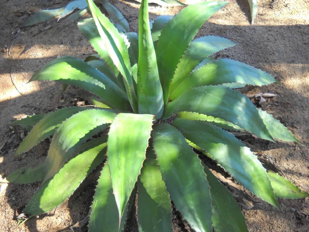
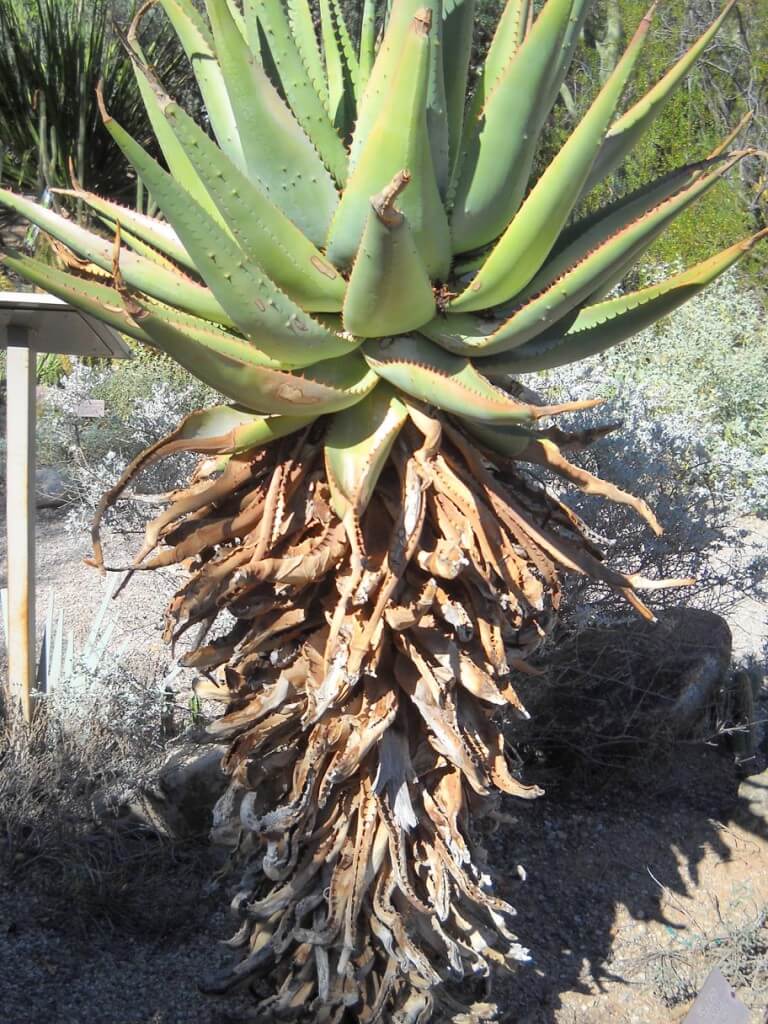
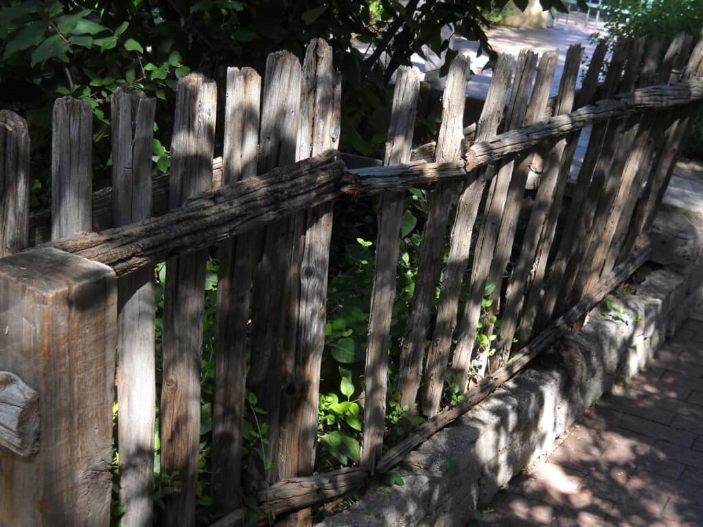
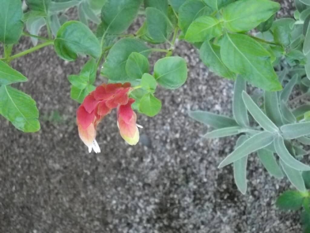
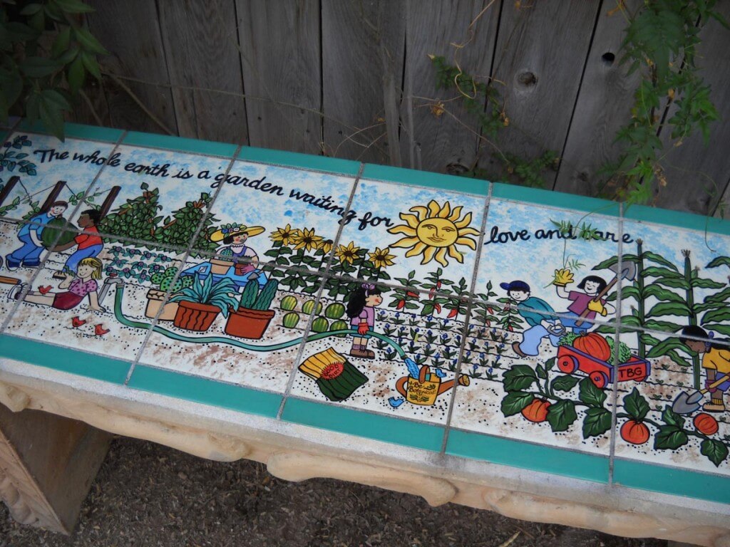
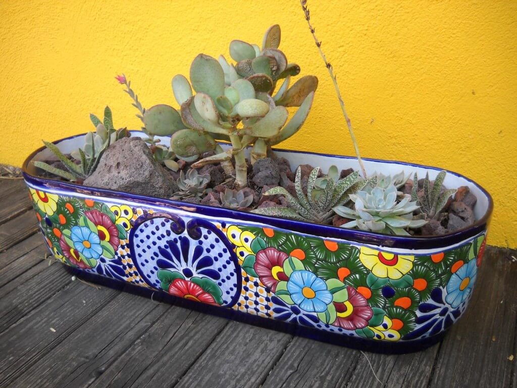
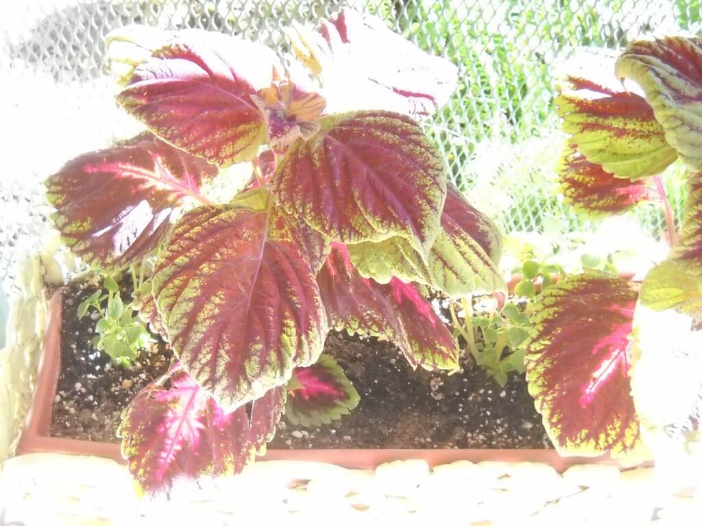
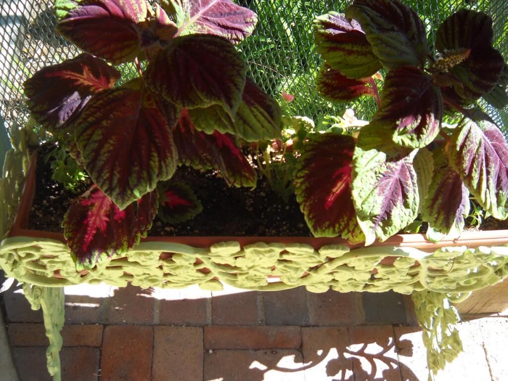
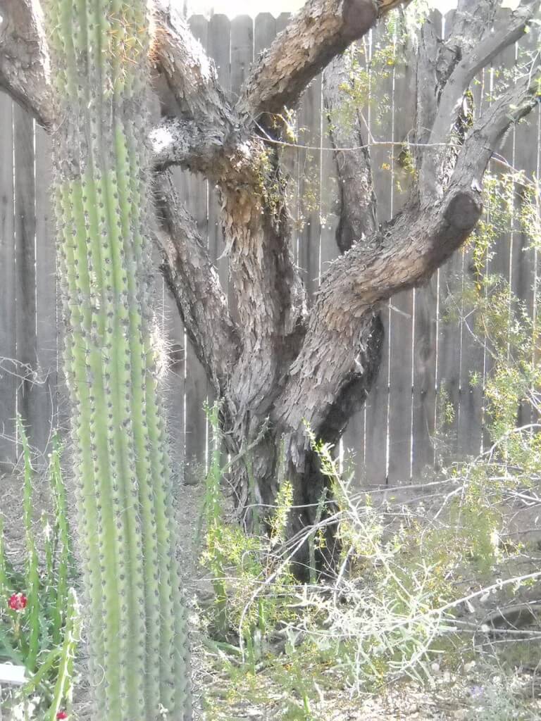
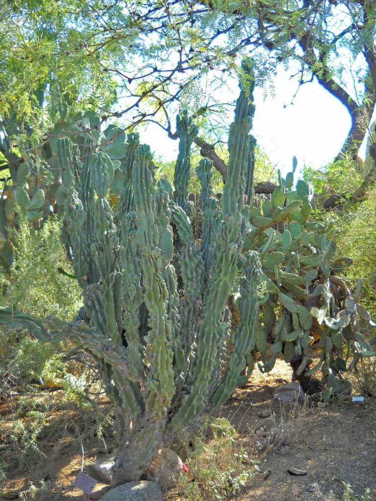
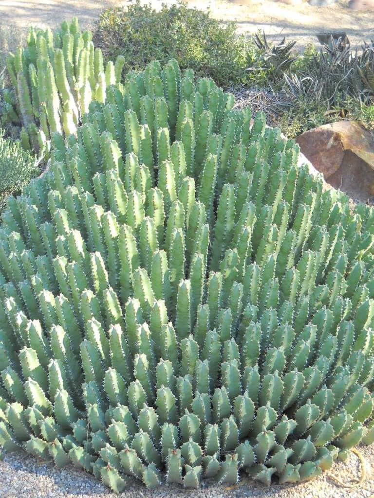
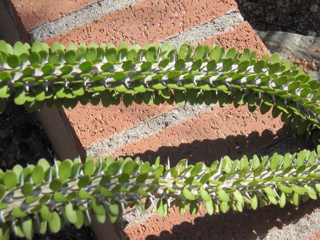
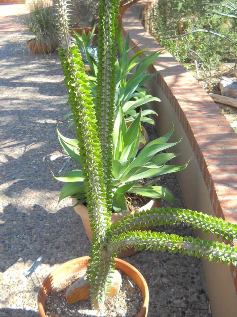
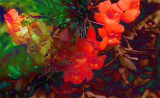
![]() It is so good to be back doing some photography, some Photoshop, and just generally playing around. Hubby and I went for a two-hour stroll through the Tucson Botanical Gardens, since it now is mid-80’s, and you can be out and about and not feel like you’re burning up.
It is so good to be back doing some photography, some Photoshop, and just generally playing around. Hubby and I went for a two-hour stroll through the Tucson Botanical Gardens, since it now is mid-80’s, and you can be out and about and not feel like you’re burning up.
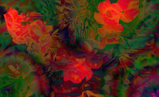
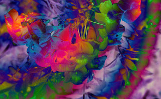
Took the camera and just looked at texture and framing. Color has not been adjusted at all. I did play around a bit with exposure…discovered that on the camera, so had to try it out.
It always amazes me that no matter how many times I go to the Botanical Gardens in Tucson, I always find something new. Yes, it’s still comparatively green here in the desert, even in mid-October. Take a look, and let me know your favorites. What would you change, which ones do you like, what suggestions do you have for framing?
So what do you think?
Thursday Thoughts – Digital Marbling (TN)
Sometimes a piece of marbled fabric just begs to be used more than once – or find rebirth in a new form. That’s how our Digital Marbling (TN) was born. Playing around with the fabric and Photoshop leads to some very interesting effects. One thing I am hoping for with all this playing around is the development of some fabric lines, so I’m working on the idea of repeats right now.
Over the last decade or so there have been several runs of marbled fabric designs among some manufacturers. While the patterns are bold and colorful, I think there is a missing element in designing marbled fabric. A variety of colorways, bolds and subtles, and patterns that look like they would be easy to work with. I know when I started making fabric in 1993 it seemed like I was only comfortable putting the bold colors with blacks and whites. I want more flexibility, and to a certain extent I have found it.
But as I work toward designing fabric, I’m using these new artistic creations as my learning. In our newsletter, I posted a pic of “Alaskan Whales,” a piece my digital partner Suzan and I had entered into a show at the Cordova Historical Museum in Cordova, Alaska. It was our first really successful digital collaboration, and I’m going to pull it apart for you.
Here’s the original piece of fabric. I am amazed at just how blah that piece of fabric was, yet there was something appealing…if just means you have to do a lot of playing around to see what happens.
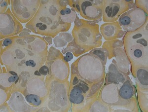 This is the same fabric with a duplicate copy and some adjustments added.
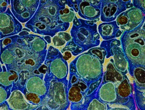 Now it’s approaching the water effect we were looking for. Then we looked for a graphic to use. We liked the whales, just rotated them a bit. We also added some adjustments: bevel, outer glow, some transparency. It looks like there are extra colors added, but it’s a transparency with some curve adjustments that adds in the extra colors. There are a few more things done to this piece, but I have an old version of Photoshop, so it doesn’t show.
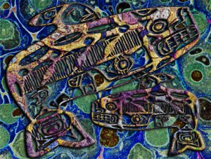 Here’s another version, saved from the layers we chose not to use…never know when you will come across something unusual with stuff you didn’t throw out, but just left “invisible….”
Who’s manipulating fabric digitally? I’d love to hear from you!
Don’t forget to become a subscriber and be entered to win some marbled fabrics. Check the box at the top right.
Photoshop Friday
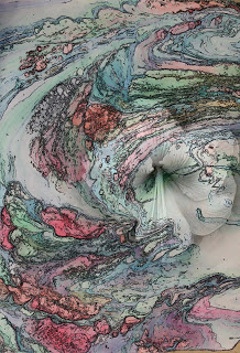
It has been a rough week. I haven’t even read other blogs since getting home from the hospital – with still no answers. It’s none of the big stuff, so I am very grateful for that. But…no trip to Colorado for the artist reception for Fabric of Legacies. I am bummed with not being able to do more traveling this summer. Right now I have to focus on getting my strength back for when school starts again in mid-August.
But I did get some time to work today on Photoshop. I chose another tutorial, this one working with colors and a filter with text to develop an interesting background. I got the basic idea, as you can see here.

This is okay – nothing great, but it was helpful in learning more about layers and gradients. In case you’re wondering, Marble-T Design is the name of our business.

With this one, I played around with the gradients and added the Italian vein marbled pattern. The overall effect is one of marble – I like how it came out.
This third one is so-so – nothing spectacular in the background, but I was very happy with the way the letters came out. I used the Italian vein pattern to fill the letters.I tried for YEARS to fill text and could never figure it out – finally!

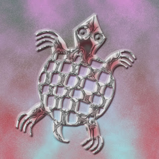
I took the background from the third one and added the turtle – did a lot of blending and playing around – couldn’t tell ya how it did the last part of the turtle, but I do like it! This has potential for the Garden Fantasy series.
Sunday Sampler – Random Thoughts

A few random thoughts for today, a nice almost too hot Sunday in the desert. Anne of El Milagro Studio posted this week about looking large and looking small, which reminded me about wabi-sabi, which loosely translated is looking for the beauty in small things. I knew I had written about this before, so I went looking (so THAT’S why we put labels on posts!), and here is the link to a two-year-old post, after a trip to Flagstaff. I still find it fascinating that a passing tourist commented on the drawing and knew it was an example of wabi-sabi.
I am playing with blending modes in Photoshop, something I stumbled on in the tutorials through NAPP. This is a whole new way to look at blending and layers, and I have had fun with this. I’ll post the results on Photoshop Friday. Oh, heck, here’s a sample….
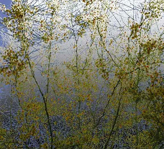
Getting ready to go to San Diego. Gotta tell ya, I am impressed with booking on line. Used to be we would take “pot luck” as we traveled, looking for a place to stay that seemed okay. Well, as age kicked in, now we need a frig for meds and decent beds. I’ve used a few online sites, but this time I really started to compare pics, rates, opinions from guests, free breakfasts, shuttles, and just what it was we wanted to do. Too much traffic for us to stay outside a city and drive in each day, especially as my eyesight doesn’t catch signs and such as quickly.
Tomorrow cooler weather awaits!
Photoshop Friday
I have finally been playing around with tutorials on the Photoshop site, National Association of Photoshop Professionals. There are over 1000 tutorials, a mine of activities to try. If you can work and teach yourself, this is absolutely wonderful. This is the original from a spring photo shoot at the Botanical Gardens. It’s already been cropped to emphasize the flowers. I decided to work just with gradients this time to see what would happen.
This has a nice other-worldly feel to it in the lower right corner. It has taken me a long time to get comfortable working with gradients. At first I started with a gradient on a whole image, and then I realized I could take part of an image, snap it to a new layer, and apply the gradient to that part only. With this flower image I decided to work with the whole image for a change.
I tried an additional gradient on top of this one and am generally pleased with the result. I like the addition of a little bit of blue in there. I have discovered that I can keep copying layers and apply more gradients on top of other gradients and then eliminate what I don’t like. The freedom to experiment this way is wonderful – not like the way so many of us learned art – we rarely started something over again, after all our efforts. This way, even with the effort, I don’t mind eliminating what doesn’t work. I realize I have still learned from the exercise.
For this last one I hid the other gradient layers and tried something totally different. I don’t think it’s as effective as the others. I like the play of colors, but I don’t care for the composition of the photo now – the emphasis on the flowers is gone. But I’ve learned….
Top Ten Tuesday – What I’m Reading….
I can never be happy with just one book at a time, especially since I do more nonfiction reading now. So here’s what’s on my nightstand right now….
* Majestic Descending by Mitchell Graham, your basic summer trash. Blown-up cruise ship, stem cell research, and a budding romance between two lawyers. Good for the beach.
* The Green Collar Economy by Van Jones. Part way through – part of a summer book club from Ideal Bite. Interesting look at trying to get the country to go green to solve environmental and economic problems. Interesting.
* The Source by James Michener. Haven’t read this since the early 70s, and it’s harder going than I remember. Interesting look at the state of Israel and what it means to be a Jew, written before the 6-Day War.
* Hot, Flat and Crowded by Thomas Friedman. I’m finishing this. The beginning was pretty depressing – the planet is in serious trouble, but the second part is much more hopeful. Some really great ideas here. I love reading Friedman – he makes economics interesting – and readable.
* The Pact by Jodi Picoult. First time reading her, my niece has read most everything and it’s on her GoodReads list. This is an interesting look at teenagers, and it makes me wonder – and worry – about more of my students.
* The World in Six Songs by Daniel Levitin. How the musical brain created human nature. Small doses to absorb it all.
*
Boom by Tom Brokaw. Finishing this – great look at the sixties and how they formed the people who are running the country now. I’ve lived the years, and the retrospect is wonderful.
*
Feng Shui for Your Garden by Richard Webster. Now that I have a backyard, I want to set up several relaxing areas.
* Kiss My Math by Danica McKellar (Winnie in the Wonder Years). This is her second book (Math Doesn’t Suck was first) and I’m getting loads of ideas of how to present some topics in a better format for my algebra students next year.
* PhotoShop User – magazine by the National Association of PhotoShop Users. At least now I understand some of the articles I’m reading – I am so improving my skills!
What are you reading? Let me know, so I can put new titles on my list!
New Work

In the midst of talking about learning, and folks on Facebook celebrating their 100th posting, I thought I would go back to the beginning of this blog. It was originally set up to record my work in a beginning Photoshop class. Now it has become my creative journal, and as I build my audience, I really am hoping to get feedback on a regular basis about some of the things I am trying. That said, here’s one of the first attempts…and I was so proud of myself!
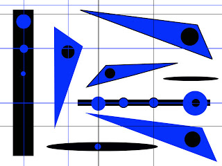
The beginning exercises were to help us learn about layers and basic drawing tools. I spent hours playing around with them. I knew I wanted to go much further, but while the initial learning curve wasn’t too bad, I felt I plateau’d with filters. I need to get back to the NAPP tutorials and try to expand what I can do. I went a long time between images, and I found I had forgotten a lot of the steps, like importing patterns from the marbled fabrics.
Dean went back the the Gardens yesterday to fnd irises and roses galore! He took some great shots. I picked this one to work with, and cropped it to this image. I’m liking the off-center images, especially since I have always been SO linear and symmetrical.
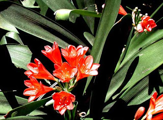
Keeping in mind I am trying to develop a set of 12 to 15 images to fit the theme of Garden Fantasy, I get the basic cropping and adjustments done, and then I start to play. So this is the first attempt-
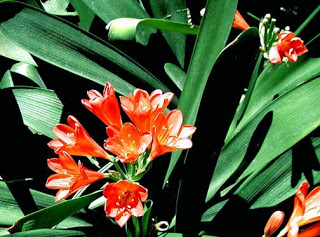
What I notice, now that I can see them both (note to self: work at tiling on the desktop…) I adjusted the bottom one to enhance the greens, and it seems like some of the deep orange was lost. I will need to relook at that. This one also has the use of the clone tool to eliminate some “flaws” on the leaves.
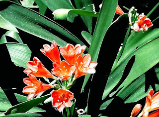
This is a filter – the blur filter, and generally I like the effect. Again, I have to watch the color – these flowers really are a deep orange. But I like the blur effect….
More tomorrow – I have papers to grade……
…..but I just discovered Picasa……
Ahhh, The Weekend!
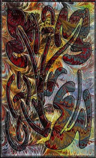
Ann wrote “Can you describe how you made the part of the image that rests on top of the marbled fabric – are they all layers in Photoshop?”
First, it’s really cool to get comments!
Second, I’m trying to remember all the steps. If any of you are interested in working in detail with Photoshop, look seriously into becoming a member of NAPP – National Association of Photoshop Professionals. There are loads of tutorials on just about anything you can think of, and they are very easy to understand.
This particular piece used marbled fabric for the background from a photo we took. Then I looked for an image in the Photoshop custom shapes. This one appealed – it just seemed like it would work with this particular piece of fabric. The custom shape was on a separate layer. One of the first things you learn in Photoshop is to make sure you do things on different layers, and then you can delete the layers, turn them off, and add more filters and “stuff” to different layers.
I adjusted the photo of the fabric to increase colors, and then I added a gradient layer (I LOVE gradients!). Then the custom image, and I started embossing, adding shadows, and just generally playing around until I had something that really appealed.
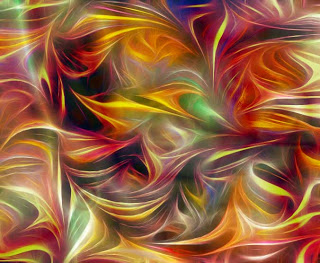
One of the things I have discovered is that the lines of the marbling pattern do some very interesting things as they are manipulated. Here’s a piece our foster son called “Ribbon Candy on Crack” – lots of playing around with color and pattern.
Not That I’m a Professional……

…but I did spend the money (with educational discount) and joined NAPP – National Association of Photoshop Professionals. And I’ve just spent the last hour exploring a bunch of video tutorials – especially on curves. Makes a lot of sense now, but like many things, I wasn’t ready for it before now. I had to play and see what I could do, and now I understand just what it does. Plus – I’m going to Photoshop World in Vegas, baby, in September!
