Archive for the ‘Photoshop Friday’ Category
Photoshop Friday
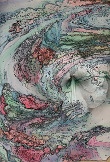
It has been a rough week. I haven’t even read other blogs since getting home from the hospital – with still no answers. It’s none of the big stuff, so I am very grateful for that. But…no trip to Colorado for the artist reception for Fabric of Legacies. I am bummed with not being able to do more traveling this summer. Right now I have to focus on getting my strength back for when school starts again in mid-August.
But I did get some time to work today on Photoshop. I chose another tutorial, this one working with colors and a filter with text to develop an interesting background. I got the basic idea, as you can see here.

This is okay – nothing great, but it was helpful in learning more about layers and gradients. In case you’re wondering, Marble-T Design is the name of our business.

With this one, I played around with the gradients and added the Italian vein marbled pattern. The overall effect is one of marble – I like how it came out.
This third one is so-so – nothing spectacular in the background, but I was very happy with the way the letters came out. I used the Italian vein pattern to fill the letters.I tried for YEARS to fill text and could never figure it out – finally!

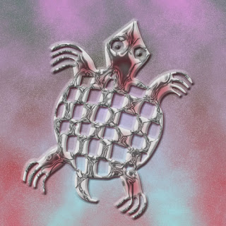
I took the background from the third one and added the turtle – did a lot of blending and playing around – couldn’t tell ya how it did the last part of the turtle, but I do like it! This has potential for the Garden Fantasy series.
Photoshop Friday
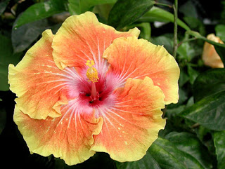
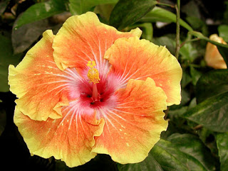
I’m still playing with blending and filters and gradients. This is one of my favorite photos. This is the original, taken at the butterfly exhibit at the Tucson Botanical gardens. It’s a beautiful flower, just as it is. I like using the photos just to learn more of the techniques in Photoshop.
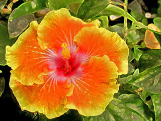
This is with a basic lighting adjustment, trying to lighten the leaves in the background. I have started focusing more on backgrounds and cropping, trying different filters to make the background more interesting.
With this I tried a filter just for the background, trying to add more interest to the background leaves. I also tried a color balance to accentuate the orange and yellow of the petals. Keep in mind I can turn any of these layers on and over at any time for different effects.
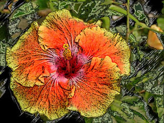
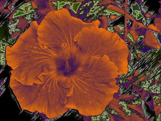
This is with a couple of filters to the background. I am practicing with the lasso tool and was able to put the flower itself on a separate layer and then work with the layer effects.
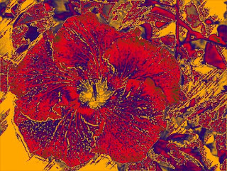
More playing with filters and gradients, going for an “other-worldly” look.
This would make really great fabric!
Let me know what you think – anything in particular that you like in Photoshop?
Photoshop Friday
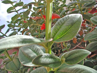
One of the more interesting plants we saw in San Diego is this tree/bush – great green leaves that were VERY fuzzy, and stalks that were perfectly cubed – really unique – and if you look closely in this photo, you can see the stalk. The only adjustment I made with Photoshop was to lighten some of the shadows (the shadow/highlight adjustment feature, which works almost every time).
I have been experimenting with blending modes and finding some very interesting effects. The first picture is a photo of a palo verde tree. It’s pretty true to what it looks like in the backyard during spring blooming.
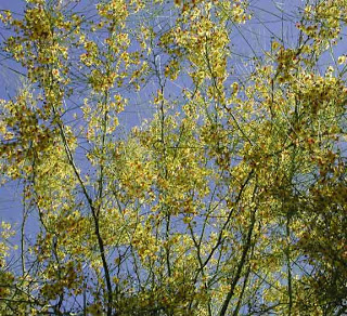
Now I added my first gradient layer and then played with the blending sliders. This is the copper/bronze gradient that I like, and I reduced the opacity in the blending mode – kind of a nice metallic effect.
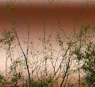
This next one changes the angle of the gradient and allows more of the original photo to come through. I like the blue effect that shows.
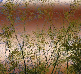
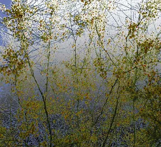
This next is a gray gradient, and it gives a foggy appearance to the trees.
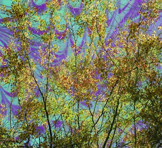
With this, I opted to try a patterned layer, based on a piece of marbled fabric. The fabric is originally orange, but with changing the size and adjusting the gradient, I got a “Northern Lights” effect. This one has potential, I think.
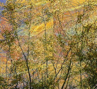
This last is my favorite, and I think has a potential “wow” factor. I need to redo it and blur some of the pattern lines so you can’t see the repeating lines. This is “Sunset,” and I really like how it worked.
Gonna try something new this weekend!
All photos copyright by the artist – write and ask for permission!
Photo Friday
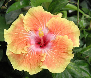
I’ve decided to keep myself on track and do a “Photo Friday” to stay focused on my Garden Fantasy idea. This shot of a hibiscus was in the butterfly exhibit at the Tucson Botanical Gardens this past January. I’ve never seen a two-tone hibiscus, and I’ve loved the flower since living in Hawaii. I’m amazed at the number of plants in Tucson and the desert. The detail and layers within this flower are amazing on their own. I love this photo, but I decided to try manipulating, mostly to practice with Photoshop.
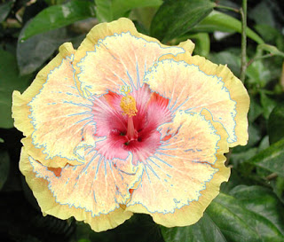
I’m getting pretty good at selecting portions of a picture to put on a new layer and just work with that. This layer makes the flower look like there are more layers to the flower than there actually are. I played around with some of the options, most of which I didn’t like. But I did finally fnd a gradient I liked….
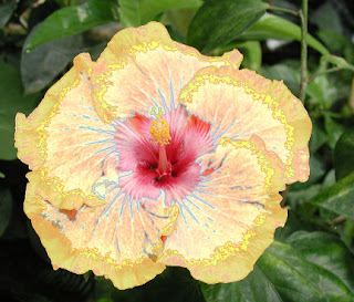
The details on this flower are just amazing. The center and the stamen are so clear – I particularly like what happened with the gradient to add the blue into the center.
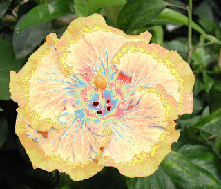
Finally I decided to look at changing the background, which I had already lightened from the mostly black original. I liked it lighter, and now that I know how to manipulate filters for a background, I am quite partial to the sponge effect.
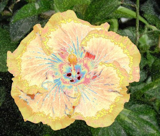
Not a wow, but I’m enjoying the practice.
