Archive for the ‘Photoshop’ Category
Lesson 3 – Patterns

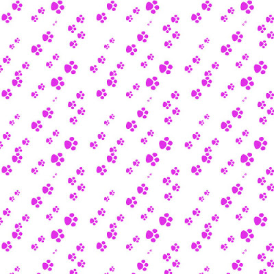
I did some significant playing around and tried to get a simple pattern – the “basic design element” as I told my kids. After a couple of tries, I got some paw prints. This is the initial print of the pattern, and it is very obvious where the pattern begins and ends.
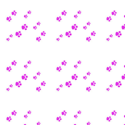
So I went back to the pattern, added more paws, and tried the offset at 50 – which I still need to play with, as I am not sure how it all works.

Now you can see a repetition, and it’s not obvious where the “seams” are.
Thanks to Suzan I have a better idea of what the layer mask and the painting does. Still have to work on that one!
Thoughts on Math Class

I woke up during the night thinking about “basic design elements” in the Kaleidoscopes unit and how much difficulty the kids were having identifying this small piece. As I worked on patterns yesterday to try and create a repeating pattern, I was getting frustrated. When I woke up, I was thinking about the basic element and I was trying to do what I asked my kids to do. Once again teacher learning from students…..
I need to try and create a couple of examples to copy into a PowerPoint so I can show the kids what I am talking about. Who knew Photoshop would be so helpful to my math classes?
Lesson 2 – A New Collage

I took a look at the Salem pictures on my PC at school because the adjustments were appearing lighter than I thought they were on my Mac. On my PC, the final image looks just like I thought it should. Interesting to have to look at different monitors to see how the work shows.
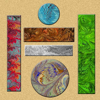
I am trying to finish lesson two, so I worked on the collage project. I wanted to work with the marbled fabric, and I definitely made progress in trying to resize and crop images. I ended up with the two circles from the same blue fabric, two of the bars from a brown, and the other two from a bluish fabric. I kept rearranging (on different layers) till I had something pleasing – looks kinda zen-like.
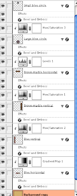
Then I started with adjustment layers for each of the marbled designs – and completely changed each one, so now it looks like six different pieces of fabric. Once I got all the adjustments done – some hue/saturation, some levels, one a gradient, I added the background with some noise. Overall a nice Asian effect for me. Then I went back to each layer and did an effect of embossing. Nice touch. After the picture is the screen shot (which I learned to do) for the adjustments.
Lesson Two continued…

As I continue with Lesson Two, I decided to choose a photo of the Salem Witch Museum, since the doorway and glass window seemed pretty dark. I wanted to see what I could do with them. Here is the original:
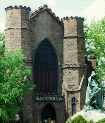
THis next is looking at the levels only on a separate adjustment layer.

Now we look at a curves adjustment added to it, on a separate adjustment layer.

This last is levels, curves, adn the greens on an adjustment layer, in an attempt to correct the lighting, and tone done the brightness of the statue base.

And finally – just for fun – after all – it is a witch museum!

Lesson 2 – playing with adjustments

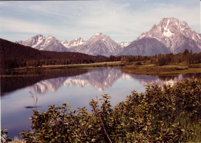
Lesson two starts out with some creative adjustments, using a layer adjustment – another new thing. I decided to work with my Tetons picture again to see what else I could so. So here is the original again –
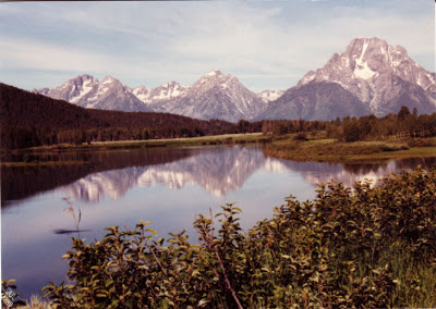
The first adjustment was to use hue-saturation – and this is cool because I love the look of black and white. This also seems to preserve a lot of the texture of the original.
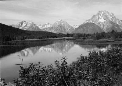
Then I decided to try the Photo filter and went for a sepia look, which again I love for the historical look.
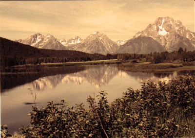
Then I decided to work with the “invert” and I like that effect. Very sci fi and icy – NASA photographers would probably look at this as an example of life on another planet!
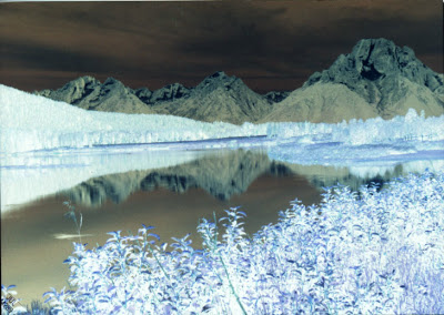
This last is a combination of hue and invert, which seems to give depth to the whole photo.
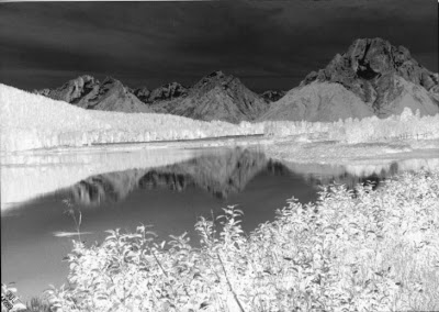
I keep learning more and more, which puts me even more in awe of what Suzan does with all her work! I was reading two Photoshop magazines this weekend – I’ve tried reading them in the past, but it’s been like Greek – this time, however, I understood most of what I was reading!
Launchpad B Lesson 1

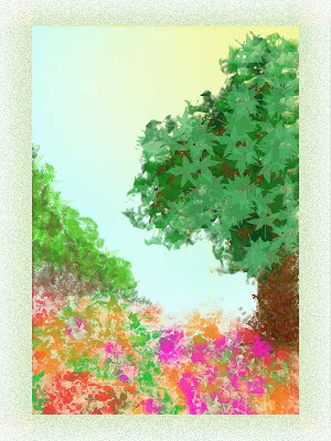
There is so much in this first lesson abut brush presets and tool presets. While I still used a lot of the same brushes as before, I found I was concentrating on what characteristics I wanted the brush to have – large, small, texture, airbrush – a lot of the brushes that look like solid lines are really interesting “scratches” when the spacing is changed. That made working with the leaf brushes much more interesting.
And I discovered how to move the gradient layers around, such as showing the sun coming through the tree leaves. I started with the blue gradient for background. Then I concentrated on a flower brush with a variety of colors for the foreground, with some vining and other background. Then I started on the tree, concentrating on the layers for the leaves – lots of colors of greens. Started on the trunk – needed to dump a few layers until I was happy with the trunk. I moved layers around to get effects like branches to show up in the back, behind the leaves.
I needed to balance the painting, even though I liked it the way it was – but I kept thinking of Bob Ross, who would always add more to his painting, even though I always thought it was fine. So I decided in his honor to add a “happy little bush” in the background. Balanced nicely and I’m pleased.
Not super happy with the frame – had an interesting problem with the 300 resolution – I needed to crop the finished painting, resize the canvas, and then work on the frame. But it’s pretty close to a wow for me.
New Photoshop!!

So I let a few days go by – I was doing so well. BUT – new Photoshop arrived yesterday from myjanee.com – I am enrolled in independent study for Launchpad B. Started reading last night – and if I thought playing with the brushes was fun before, am I in for a treat!! I know what I’m doing this weekend!!
Last Day of Vacation….
I promised myself I wouldn’t do anything with Photoshop today until I ws done with my list for school, which included a lot of loose ends, like ironing. Well…at least I got my lesson plans done.
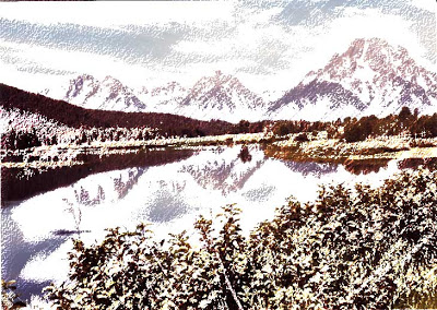
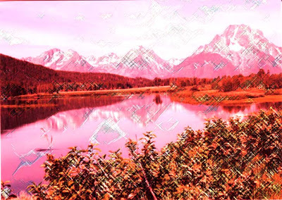
I decided to play some more with the water color effect, and I chose an original photo I had taken of the Grand Tetons from 1989 when we drove across country visiting National Parks. This looks just like a postcard, but it’s really one I took.
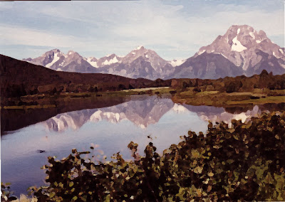
I got some different effects with the artistic filters, playing around with the different choices. These were colored pencils and pastels. I can see how you could illustrate a book with adjusting effects. This first is the watercolor effect, which I could get really hooked on.
This last is playing around with some other color effect and then adding the pastels.
Still lots of fun!
Yet another tutorial….
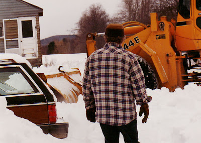
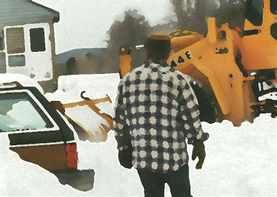
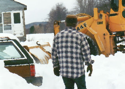
I decided to try another tutorial, this time on making photos look like watercolors. Too much fun – lots of ideas for future projects. This first is the original, without any touch-ups – from the winter of 1994 on Sleepy Hollow in Vermont – way too much snow for us to stay another winter, hence the move to Tucson.
This next is with the watercolors, using the dry brush effect. Had fun looking at the pen and ink conversion of the photo, then seeing how to blend everything. This has so many possibilities.
This last is the same process but using a palette knife for the watercolor effect. Plus I tried to have more of the pen and ink detail show through.
Making Progress…

Once again I have to say I am really hooked on Photoshop. The effects and possibilities really stagger the mind – however cliche that is. But first, some notes about our marbling session. We did about four yards of fabric, bath worked well, we just need to be on the lookout more carefully for bubbles before we lay the cloth. We did a custom piece for a woman working on a quilt with a “tornado” feel – the colors were perfect, and we got in some good swirls for “vortex” effects. The fat quarters worked really well, and I love the old-fashioned Japanese silk we still have – that stuff marbles like a dream. I also had done some work on serged edges in preparation for a larger silk order, and those seemed to work well- lightweight silk, cotton serging on the edges to be sure it takes the paint and hides the “hem.” So we seem to be ready to go once that order comes in. Both of us are sore today, as the physical process of marbling can be tough.
Then yesterday afternoon I spent more time on – three guesses – Photoshop. I made some changes to my flower, particularly changing the colors and adding a frame. I was pleased – it’s almost to a “wow” for me. Here’s the final product:
Then I started the gradient tutorial, as I don’t really understand that whole manipulation. I was pleased with the final output, once I started playing around. This is a very mathematical manipulation, judging from what I am reading. One color is read, a formula applied, and then final results look totally different. I’m uploading a couple of different variations of the same piece, with layers added and subtracted. I am enjoying the tutorials, but I want the next lesson!!!
Success on a Warm Friday….
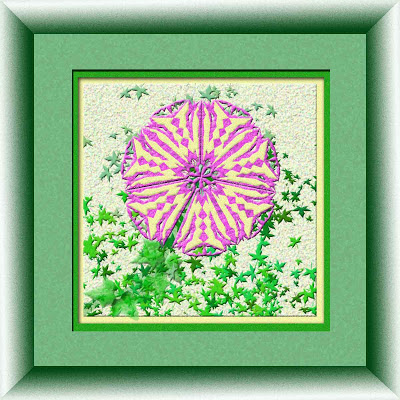
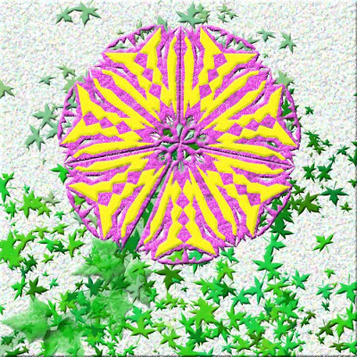
I spent a lot of time today trying some more ideas in the “snowflake” design – I ended up with a fairly nice flower and some other interesting effects – didn’t feel like it was lousy, but it certainly wasn’t a “wow” – it was just nice – and I could look at it realizing what I had learned. What I would change is the bright colors in the “flower” itself – perhaps more subdued, and I think I know how I could do that.
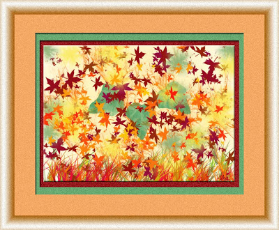
The fun part came later when I decided to try the frame tutorial from myjanee.com. A little confusing at first, but, boy, has my confidence with color improved! I started playing with mats, filters for the mats, and then tried the frame. A few missteps, but I ended up with something I really like. It amazes me just how much is in this program.
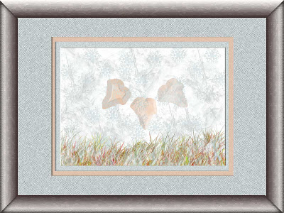
Then after dinner I just had to try framing the winter piece, with another totally different look to the frame – I started with picking up a metallic color from the last mat, but then went to the silver look, and with adding one more filter to the frame, got a burnished nickel look. I am thrilled! Tomorrow I am going to try framing the new flower, and then maybe the spring piece. And maybe another tutorial….
Pondering on Frustrations…
It’s been an interesting 24 hours thinking about art. I tried my “fix” yesterday and got it to “kind of” work. I knew what else to do to complete the fix. So I created it – but big deal. I wasn’t happy with it, I was just overall frustrated with it. Now I know rationally that all this is an excellent exercise in creativity and sticking with art. But this was the first time I had gotten “stuck” with Photoshop and didn’t have something that “wowed” me.
Why is this such a big deal? It seems to me that in the past when I have gotton “stuck,” I tend to just stop with art-making for a while. I sense all kinds of “bad” things about my art, about me, that aren’t true, but it becomes a while till I start again. I am thinking this goes back to the fact that I am a perfectionist and everything has to be “just so.” When it isn’t “just so,” then I figure I’ve made some serious mistakes and things aren’t good. I know I am still “learning” through this whole process, but I can’t get over the fact that something didn’t work out and then just move on. However, I will say that this is improving with time. The last three years I have been able to “let go” with perfectionist issues much easier.
So this is a good lesson. I still learned, even though I wasn’t happy with the product. When I am working in cyber space, no big deal – I haven’t spent any money, like working with actual thread and fabrics. Maybe as I ponder this, I will be more willing to get back to serious creating with the fabric. I feel progress in all this….
Frustrations
Now that I am on spring break, I have time to sleep and do art. But I managed to end the evening in a state of frustration because, once again, I ran into something I don’t know how to do with Photoshop. I have to keep reminding myself I have learned lots and I have to just be patient.
Last night I started with another Photoshop activity, trying to improve my skills with snowflakes. I discovered I made the sections too big, and I got frustrated, trying to figure out how to shrink the image. Then I tried a new one, made lots more progress, and discovered I had stained glass tiles rather than snowflakes – which is fine, as I am thinking of doing some math work with tesselations.
The problem came when I tried filling small areas with the paint bucket. I kept redoing the spots, and kept having the same problem. Frustrating…..
This morning as I am pondering the problem, I think I have a fix for it – I need to fill everything (on a new layer, which I kept forgetting to do last night) and then move the layer so only the color I want in the spaces I want shows. I will try that tonight.
Meantime, I have some serging to do, as we have a new silk order coming in, and I need to experiemtn with edges on silk. This could be a nice break for the business. That’s why I bought that really ugly frog in Chinatown in LA. Come on, feng shui!
Changes…
Who knew I would stay up late last night and watch The Bachelor – I need to get a grip and do art instead! That said, I was thinking today at lunch that I could take the Autumn piece that I really like and change it to be a winter piece. Maybe have a set of four that work with the same motif. So I did it when I got home – I love all the new brushes!
I an enjoying keeping track of all my successes so far this year, and actually keeping a journal of all the work I have been doing. I like the fact there will be a concrete record at the end of the year.
Playing Around on a Monday…
I hurried home from school today, wanting to enjoy the wonderful weather, sit and relax, and play with Photoshop. I guess I am truly addicted. All I know is that there is lots to practice while I wait to start another course. I am noticing that the freedom to try ideas and create something is much easier in this program, and I am wondering why. There are plenty of tools right at hand, so you don’t have to buy anything or wait for something to arrive. And you can easily erase – even better, you can eliminate layers just by “turning them off,” and still make decisions or change your mind. Much more forgiving than the pen and ink I used to work with as a teenager. Makes me wonder at how willing I was to “commit” to art when I was younger, since pen and India ink is so unforgiving – no mistakes there! And I still have a number of the pieces I did when I was younger, including the big piece I gave to my dad (and he had framed) as a Christmas present. Maybe at the time I was still exploring and hadn’t had the creativity suppressed to the point of always being a “good girl” and never trying anything out of the box. Well, that has sure changed!
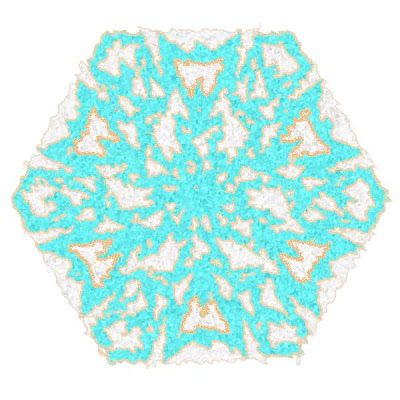
I tried the snowflake tutorial again, from myjanee.com. There are still some things I need to work on, and certainly some things that I learned. I need to work on not getting extra background as the main one. I am pleased overall with the cutouts. Then I had some fun playing with filters. And I figured out a few more ideas with the Magic Wand, so I ended up with an interesting set of colors – more desert in the colors, so hence – my desert snowflake.
