Archive for the ‘Photoshop’ Category
Saturday Special
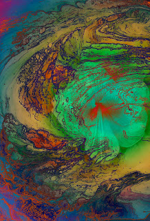
This is absolutely, positively one of my most favorite digital marbling (TN) pieces. Suzan and I stumbled on this as we were laying with a deconstructed piece of marbled fabric. Here’s the process: I take a pic or scan a piece of marbled fabric and then play around in Photoshop until I’m happy with the result. With this piece, we took it down to a basic line drawing and then started playing around with gradients. We got a great background, but we knew it needed something more.
So we went through the photo library and found a great pic of a flower hubby had taken from our yard. Voila! That was exactly the focal point we needed.
This brings me to my Saturday Special. In an attempt to market myself and my art more strongly, I am investigating a variety of venues over the internet. This Saturday you can take a look at a few gifts available from Cafe Press. My “store” is quite small, and I look to change a few items on a regular basis. I’ve tried to price items so they would make great gifts for those who either have everything or need nothing! This photo graces a personal journal, making it somewhat mystical for your writings.
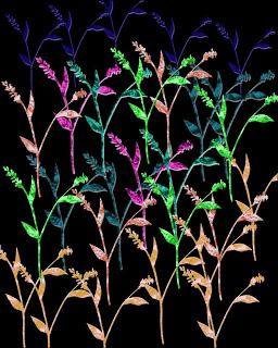
This flower image graces a small tile, a perfect gift for a housewarming. The basis of the design again is marbled fabric, this time inserted into flower images. I really like the “neon” effect of the flowers. This image will show up in a larger print down the road, because the detail in the flowers is intense.
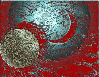
I had so much fun creating this image, one of the first I successfully completed on my own. This is part of a “moon” series, and it also started as a piece of marbled fabric, deconstructed to a basic line drawing, with a series of gradients applied. I don’t think I could achieve the detail in this any other way. The piece just glows! This is available as a set of note cards, a nice way to maintain a unique social communication.
I am very interested in hearing from those of you who sell on line. Any tips or hints to share?
First time visiting Marbled Musings? Get an overview.
Photoshop Friday
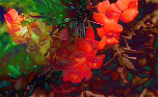
I have finally been playing around with tutorials on the Photoshop site, National Association of Photoshop Professionals. There are over 1000 tutorials, a mine of activities to try. If you can work and teach yourself, this is absolutely wonderful. This is the original from a spring photo shoot at the Botanical Gardens. It’s already been cropped to emphasize the flowers. I decided to work just with gradients this time to see what would happen.
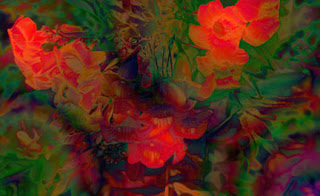
This has a nice other-worldly feel to it in the lower right corner. It has taken me a long time to get comfortable working with gradients. At first I started with a gradient on a whole image, and then I realized I could take part of an image, snap it to a new layer, and apply the gradient to that part only. With this flower image I decided to work with the whole image for a change.
I tried an additional gradient on top of this one and am generally pleased with the result. I like the addition of a little bit of blue in there. I have discovered that I can keep copying layers and apply more gradients on top of other gradients and then eliminate what I don’t like. The freedom to experiment this way is wonderful – not like the way so many of us learned art – we rarely started something over again, after all our efforts. This way, even with the effort, I don’t mind eliminating what doesn’t work. I realize I have still learned from the exercise.
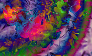
For this last one I hid the other gradient layers and tried something totally different. I don’t think it’s as effective as the others. I like the play of colors, but I don’t care for the composition of the photo now – the emphasis on the flowers is gone. But I’ve learned….
Momentum – or Lack Thereof….

Well, it’s not working out like I wanted – sick since vacation started, it’s bronchitis, no it’s not, yes it is, I don’t know, it’s an infection, it’s a virus….who knows? I kinda feel like I did when I had mono, a mere decade ago. So not much is getting done, due to no energy and sleeping all the time.
But a couple of thoughts: I remembered today why I don’t enter a huge amount of art shows. Once I’m accepted (which is great), then it’s the shipping costs….48 bucks for shipping to and from Colorado today – and let’s hope it sells. That would certainly make entering shows more worthwhile. So I think I need to limit myself to three shows a year, and try to be very selective of the shows to build the resume. Even better, arrange a couple of local shows – would at least save on shipping….Yvonna – we should approach the Gardens for a joint show….
I really miss the journaling aspect of my blog. A week without, stats have dropped, I’ve done a couple of things I wanted to for marketing, but then nothing else. We want to go away to the coast of California starting next Monday, so I don’t have a lot of time to work. I am very conscious of just how much summer there is available to me, so I want to be as productive as possible. I have had some fun with Photoshop, and here is the original shot of coleus I used for the tutorial.
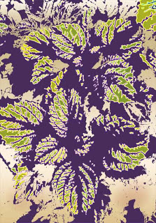
Here’s a quick “stamp” of the new brush.
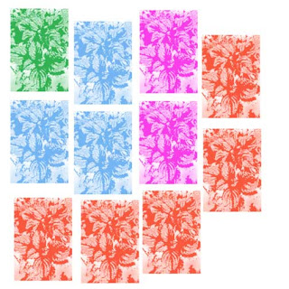
I also experimented with making a marbling stamp brush – that could be very interesting for some surface design work.
So – goals for this week: blog entries, work on commission quilt, a few new tutorials from Photoshop, call on December craft show to get scheduled, finish contest entries, and get the materials out to finish the bamboo quilt.
Top Ten Tuesday – What I’m Reading….
I can never be happy with just one book at a time, especially since I do more nonfiction reading now. So here’s what’s on my nightstand right now….
* Majestic Descending by Mitchell Graham, your basic summer trash. Blown-up cruise ship, stem cell research, and a budding romance between two lawyers. Good for the beach.
* The Green Collar Economy by Van Jones. Part way through – part of a summer book club from Ideal Bite. Interesting look at trying to get the country to go green to solve environmental and economic problems. Interesting.
* The Source by James Michener. Haven’t read this since the early 70s, and it’s harder going than I remember. Interesting look at the state of Israel and what it means to be a Jew, written before the 6-Day War.
* Hot, Flat and Crowded by Thomas Friedman. I’m finishing this. The beginning was pretty depressing – the planet is in serious trouble, but the second part is much more hopeful. Some really great ideas here. I love reading Friedman – he makes economics interesting – and readable.
* The Pact by Jodi Picoult. First time reading her, my niece has read most everything and it’s on her GoodReads list. This is an interesting look at teenagers, and it makes me wonder – and worry – about more of my students.
* The World in Six Songs by Daniel Levitin. How the musical brain created human nature. Small doses to absorb it all.
*
Boom by Tom Brokaw. Finishing this – great look at the sixties and how they formed the people who are running the country now. I’ve lived the years, and the retrospect is wonderful.
*
Feng Shui for Your Garden by Richard Webster. Now that I have a backyard, I want to set up several relaxing areas.
* Kiss My Math by Danica McKellar (Winnie in the Wonder Years). This is her second book (Math Doesn’t Suck was first) and I’m getting loads of ideas of how to present some topics in a better format for my algebra students next year.
* PhotoShop User – magazine by the National Association of PhotoShop Users. At least now I understand some of the articles I’m reading – I am so improving my skills!
What are you reading? Let me know, so I can put new titles on my list!
Photo Friday

I’ve decided to keep myself on track and do a “Photo Friday” to stay focused on my Garden Fantasy idea. This shot of a hibiscus was in the butterfly exhibit at the Tucson Botanical Gardens this past January. I’ve never seen a two-tone hibiscus, and I’ve loved the flower since living in Hawaii. I’m amazed at the number of plants in Tucson and the desert. The detail and layers within this flower are amazing on their own. I love this photo, but I decided to try manipulating, mostly to practice with Photoshop.
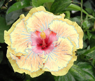
I’m getting pretty good at selecting portions of a picture to put on a new layer and just work with that. This layer makes the flower look like there are more layers to the flower than there actually are. I played around with some of the options, most of which I didn’t like. But I did finally fnd a gradient I liked….
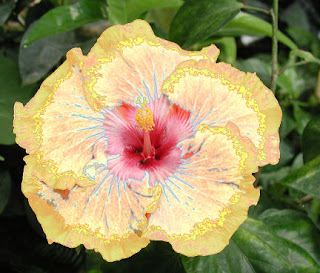
The details on this flower are just amazing. The center and the stamen are so clear – I particularly like what happened with the gradient to add the blue into the center.
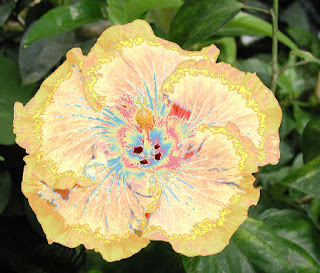
Finally I decided to look at changing the background, which I had already lightened from the mostly black original. I liked it lighter, and now that I know how to manipulate filters for a background, I am quite partial to the sponge effect.
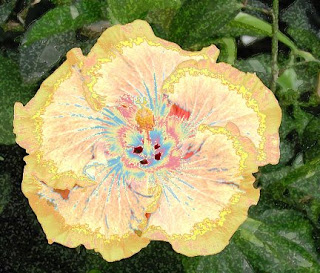
Not a wow, but I’m enjoying the practice.
Wednesday’s Work-in-Progress…
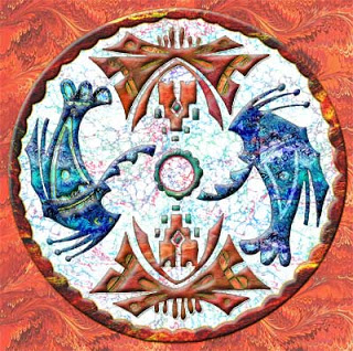
I talked about how I created this piece, and you can read about it here. But for the last two weeks I have been thinking about that light background and I haven’t been really happy with it. The eye went to the light and kept going back to the light – and I didn’t want that. I wanted focal points to be the interior images. So I decided to see about a darker background, and Voila! I’m not sure it’s finished – I think I need to look at it on a couple of different monitors – plus I think I’m going to have it printed on a tote bag from VistaPrint.
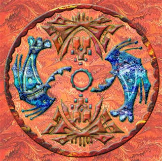
I am so enjoying working on these – some of the pieces just fall into place. I have started scanning some more marbled paper to expand the number of patterns I have. I’ll post those when I have them all scanned.
In the meantime, last weekend I worked with another native image:

I am really taken with many of these indigenous images, and I like the use of the marbled fabrics to add a huge amount of texture. From here I started adding marbled patterns for colors. I didn’t do anything with texturizing until I was happy with the colors. What you see here are the filters and blending modes after all the colors were in place.

More color –

The background was where I really started to learn a few new techniques. I finally figured out how to apply filters to just the background, as opposed to elements within the design. What I particularly like about this background is how it makes the shadows (that look clear) turn dark and look like cording.
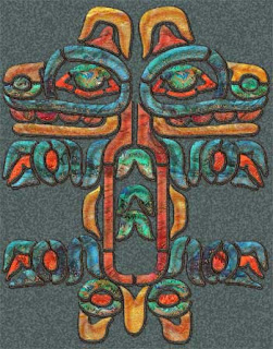
I would love to hear your views on how these are shaping up! Feel free to comment.
First time at Marbled Musings? Check out the overview.
Monday Marketing – How’m I doin’?

Two more days of school, and then summer vacation starts, which isn’t always as productive as I would like. I usually get really ambitious right before school starts again. But this spring and summer look to be a “new leaf.” Since I started in March, and then took the blogging course in April, I have been extremely productive. Let’s go back to March….and then this post.
Website has been mostly updated – still need to get the new pages up and the links checked (which I’ve done on my school page…)
CafePress and Etsy? Way more thinking than doing, but I am getting a lot closer….
Shutterfly and iBook – not there yet.
Art shows – entered (and was accepted) at one, awaiting the results on another.
Garden Fantasy work is coming along nicely, as is general digital marbling – at least three new good pieces.
Trade name finally done and OURS!
And…we took a marbling class and have improved our production techniques. So overall these two months have been excellent. Now for my goals for next week:
Get Etsy shop operating.
Set a calendar of blog topics.
Order tote bag from Vista Print to see what it’s like.
Watch at least three tutorials from Photoshop (NAPP) on blending and masking – a really weak area.
Get entry ready to be mailed to Alaska.
Trade Name!!

(copyright 2009 by Linda A. Moran, all rights reserved)
It is official – after almost a year of planning to do this, downloading the paperwork, actually filling it out, finally mailing it, getting it returned because I filled it out wrong, redid it, and then sent it back in, we got official confirmation of a trade name for Digital Marbling.
I’ve been using this in blog posts for over a year, and it describes the new direction we are taking with our fabric. Now we will scan a piece of marbled fabric (or paper), and manipulate it using Photoshop, until we have something totally unique. Today’s picture is an example. I started with a stock image from Photoshop, adding a layer at a time. Then I used some patterns I had created from the marbled fabrics and “filled” them into the flowers. Once I added the black background, the piece began to glow. I went back into the various levels and tried to accent the patterns so the texture would be more obvious. As with all the pieces I am doing, the web and different monitors just don’t do them justice. This piece at its original size is gorgeous – if I do say so myself!
Lately I have been trying new images and writing about the process, and I have alluded to Digital Marbling. But now it’s official – I just need to figure out how to put the little graphic at the end of the name! Not only am I learning how to work with Photoshop – and being pleasantly pleased with what happens as a result, I really like the fact that I am taking myself in a new direction. This week life just got in the way ofd continuing my projects.
First time reading Marbled Musings? Get acquainted here.
Welcome to Marbled Musings!

Welcome to the world of marbled fabrics, creativity and Photoshop, and the occasional comments on life. Most of the posts revolve around these topics. I’ve broken them down into categories, along with some of the keys posts in each. Feel free to browse, and come back, for I have been really increasing my design productivity.
Photoshop:
Orange Blossoms
Photoshop Transforming
Creativity:
The Digital Generation
Artists, Creativity, and Depression
Organization Queen
The Importance of Art Education
When Art Class Works
Marbling:
Adventures in Marbling
History of Marbling
History of Marbling – Part 2
Top Ten Lists:
Boo on You, Martha Stewart!
Top Ten Inspirational Books
Art – It Feels So Good!

The kids and I were definitely on the same page today. They didn’t want to work, I didn’t want to work, they had lives outside of school, I have a life outside of school….so we talked about not giving up when we still have work to learn. I took them through everything they had accomplished in algebra 1:
*making a table, a graph, and an equation for a linear function;
*making a table, a graph, and an equation for an exponential function;
*making a table, a graph, and an equation for an absolute value function; and
*making a table and a graph for a quadratic function.
THe only thing we really have left to do is solve quadratic equations through factoring and the quadratic formula. I think they were pretty impressed with themselves, and we had a great class. No more whining – we were in this together!
But – I still wanted to get home and work some more on the gecko from yesterday. I still felt there were a lot of ideas to try in Photoshop. So you can go back an entry and see the original image – and then look at this new one -lots of embossing, and I learned how to change the shadows from a default black to a color within the marbled pattern. I continue to be amazed at the amount of texture the marbled fabric gives the design.This one looks like a piece of copper. Another “wow,” and I foresee a series with the gecko, and maybe a few other common images of the Southwest.
Don’t forget our CONTEST!
Creativity and Photoshop – A Great Weekend!
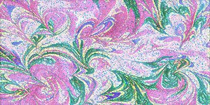
In the midst of a lot of school work, writing, and phone calls, I had time to work on another indigenous image – this one of the well-known gecko of the Southwest. We have numerous in our backyard, and they’re quite fun to watch doing their “push-ups” in the sun! This first is the original image in black and white –

Then I looked through new patterns I created and settled on the orange marbled pattern. Lots of “heat” to match the Southwest, and the detail is so perfect – nice and small, almost like skin.

Then I started with embossing – give some life to the gecko. This was another image that fell into place; I seemed to know exactly what to do – and even more importantly, HOW to do it.

Then I went with my gradients – which I love. I have a couple of favorites – the bronze/copper one being the one on this. I tried all kinds of filters and adjustment layers, and finally the gecko said “enough.”

I’m very pleased with the final result.
And – I finally – last night after nearly 10 years – realized how to scan fabrics to create a quilt through Photoshop. Very cool!
Creating – Part 2

So after some errands, and a short time outside relaxing and reading (which I haven’t done in months), I went back to Photoshop, and things flowed wonderfully. This image is from the Cochiti tribe of the Southwest. Once I realized I hadn’t put pieces on individual layers, I was able to do a lot more with manipulation. Also, every background that you will see is marbled fabric. A few of the fabrics have been lightened, or hues changed, through Photoshop.
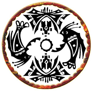
This first shows the border. I played around with embossing and a small stroke to give the border some good dimension. The stroke is done in a color sampled from the marbled fabric. It always amazes me what Photoshop can do.

This second looks at two of the main images, done with a free-form marbled pattern. Lots of embossing, shadows, some stroking, There’s a wonderful “look” to these – very earthy.
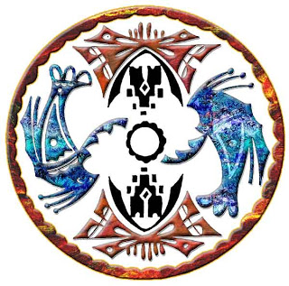
I went with a watery marbled pattern for these two, as well as some of the same layer options as above. The pattern has been lightened for the shadowing inside the figures.
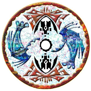
I knew when I started I wanted some marbled pattern for the center, if not the whole background. This is the Italian Vein marbled pattern lightened so it doesn’t overwhelm the foreground. Once it was there, it looked perfect.
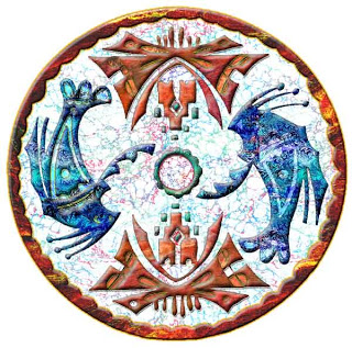
I finished off all the other little “openings,” for lack of a better term. I lightened some pieces, trying to get as much depth and texture to the whole piece. Then – I played around with the overall background. I wasn’t adverse to the white, but I wanted to see what else would work. Black was too dramatic – it seemed like the eye just wen to the black before the design. I chose a large orange pattern I had scanned, then lightened it a little, so the border would still be prominent.
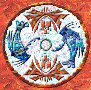
To say I’m pleased is an understatement. This meets my “wow” criteria. I tried a few other tricks in Photoshop – ready for some new ones. And – these pics don’t even begin to do justice to this piece!!
Creating – and Back to the Beginning

It’s the weekend and I want to play around some more with ideas from some indigenous images to see what happens. This is also a way for me to boost – and expand – Photoshop skills. Here’s the original clip-art image, from one of the Dover books: North American Indian Motifs. I like the Dover books because they are royalty-free and they lead to some great inspiration, using the marbled fabrics.

I have to learn I can’t load a jpg image to start – I need to use BMP – and then convert, which is new for me, and I am getting used to it. I also am learning how to paste one image into another blank page. The other think I have discovered today is I don’t have nearly enough marbled patterns in my pattern assortment. They all tend to be the same, so I need to scan more fabric and work on a new pattern collection – lights and darks, different hues, all from the same pieces.
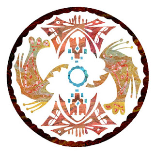
This is the first part – just important patterns. I’n not adverse to the colors, but one of the major things I discovered is when I used my magic wand, I didn’t zap the areas to a new layer, so can’t enhance each section like I would like. Right now I am pleased with colors, but it is oh so flat, and I don’t really have a good background fabric-pattern to use at this point. So for now, I’m off to scan fabrics, play with colors and sizes, and then hopefully come back, do this over on new layers, and proceed from here.
Other Photoshop journeys you might enjoy:
New Directions – this has found its way into many of our new works.
Marbled Fabrics
Don’t forget our CONTEST!
Two Years Ago…

As I work through the blogging class, I’m aware that I’ve had my blog a while (250+ posts, and over two years), and I was looking at Google Analytics today, checking on one of the clicked-on pages. Turns out it’s from almost exactly 2 years ago – check out what I was working on! Looking at this made me realize how far I have come with my Photoshop skills – I was so proud of that piece – and I still think it’s a good piece – would make a good card….ooohhhh – write that idea down….the mind has been a sieve lately.
Took a great walk this morning, out an hour, over 30 pictures of the neighborhood – they’ll follow shortly. Spring is amazing here in the new neighborhood!
Breakthrough!

I wanted to go back to my glass pics from the Chihuly exhibit at the Desert Botanical Gardens in Phoenix. My intent was to just manipulate a few and crop them to post. I hadn’t really intended to do lots more to them. Until….
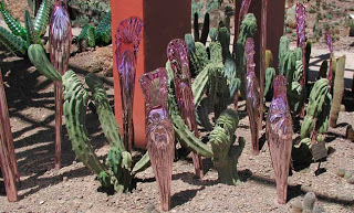
I chose this one with the purple glass. Here’s the original.
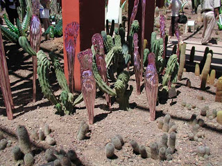
Not a bad photo, but too much distraction. The amazing glass mimics the ripples throughout the cactus. It is truly spectacular to see. I wanted to emphasize that part of the picture, but then there’s all these shadows and people in the background. I know about the cloning tool to remove unwanted things like lampposts, but I decided to go the whole way and remove the people. The more I did, the more I learned – where to sample and make it appear like there were more cactus. I started creating cactus beds where there weren’t any, and they looked natural. I discovered that I could increase the size of the photo until I was almost at the pixel level, which gave me much more control of the cloning/removal process. The signs went away, the people went away, shadows I didn’t want went away.
I found I wasn’t satisfied, because the photo kept looking better and better! I worked on the columns. I love the adobe orange and wanted to lighten the dark more. I tried some brushes, after sampling some colors – it was okay. Then with the “move” tool I clicked on the black shadows of the cactus, jumped them to another layer, and lightened through an adjustment. The ground became lighter, without sacrificing the work already done. I did that 4 different times to get shadows lightened. Then I looked at the columns again, jumped them to a new layer, same process, and smoothed out some of the cloning strokes. Lots of previous learning just snapped into place. Here’s the “finished” look at Chihuly glass:
As always comments are welcome! I know many reading this are experts at Photoshop. I’m learning, and enjoying at the same time. You can look back some of the very early posts to see how far I’ve come!
Earlier work:
Hawaiian Surf
Orange Fabric
Seasons 1
Moon Series
