Archive for the ‘Photoshop’ Category
Art Class Redux
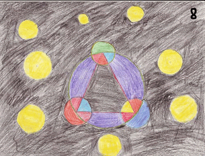
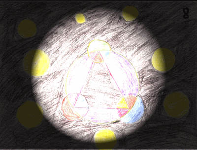
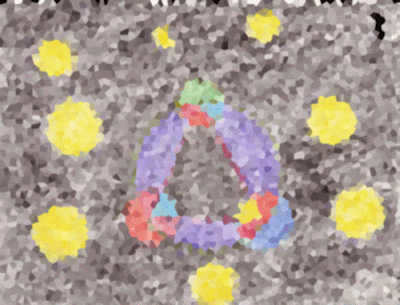
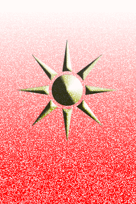
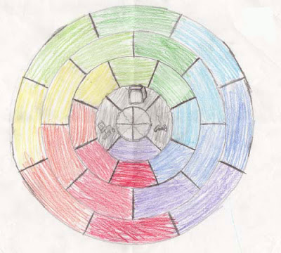
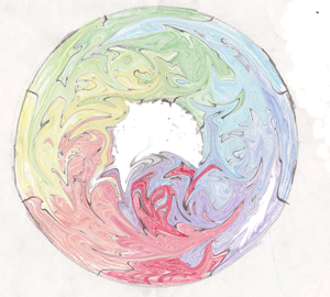
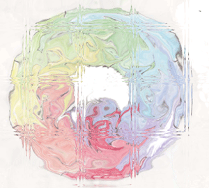
I am continuing to spotlight some student work of my seventh graders. I think next semester the kids will keep an art class blog so they can publish their work. Here is another mandala and the manipulation that was done.
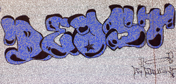
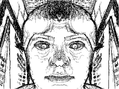
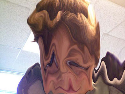
Some of the students have been doing graffiti-like drawings, and then we’ve been snapping a photo in PhotoBooth and moving it into Photoshop.
This next is just playing around with shapes and backgrounds.
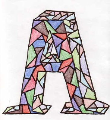
This is a cool letter from our stained glass letter project.
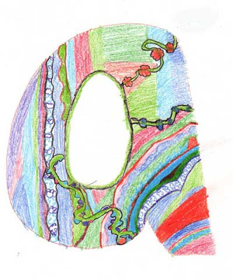
THis last is an illuminated letter from another assignment.
My Wonderful 7th Grade Art Class
I am sitting here with my wonderful seventh graders, who have been busily at work for this class period. I want to share with you some of the wonderful work they have been doing. This first is taking a photo in PhotoBooth and then moving it into Photoshop to play with filters. The first is the line drawing, and the second is a photo only a mother would love….
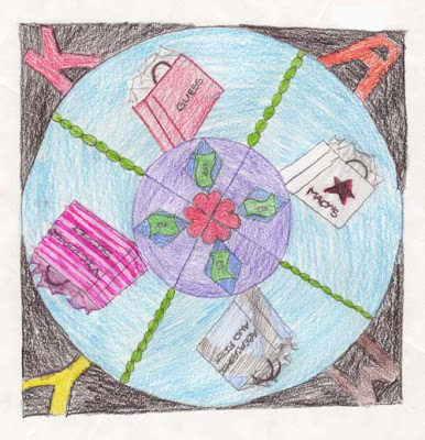
These next started as a mandala assignment – highly successful in getting the kids to represent themselves. A couple said they wanted to try putting their mandalas in Photoshop to see what would happen. Here’s two versions of one of them, with the first being the original.
This next is the mandala of a typical teenager!
On Doing an Art Show….

I decided to have an art show for my two art classes, as they need to have exposure for their art and receive comments from “their public.” So they have had to choose a minimum of two pieces from their portfolios, including one of the sketches they have done. What I hadn’t anticipated was the desire to redo some of their work.
I have been showing them Photoshop, using the Promethean board – now I see why people like the drawing tablets – I can draw much easier on the board than using a mouse. Definitely something to consider for the future. The kids have been doing digital doodles, so they can just play around with the brushes and shapes. One of the students wanted to take his mandala and manipulate it – which turned out very cool. I will need to bring this stuff over to this computer so you can view – or add tomorrow when I have the laptop on line. Others have done some graffiti drawing, which we have taken a picture of in PhotoBooth, and they have started to manipulate it. Overall, some very nice exposure for the kids, and I have had a chance to flesh out having the kids display their work.
Artsonia – an online student art gallery, available to any student with a computer – they can set up a digital portfolio. The kids have been really enjoying looking at other kids’ artwork. I plan to do more of this next semester, as I will have regular internet access.
We had a mat cutter donated, and one of the local businesses will be giving us left-over mat board, plus a demonstration of mat cutting. I am asking one of my eighth graders (who is a closet artist – not cool to let his peers know what he can do) to be my aide next semester so he can learn the mat cutting and pursue his own art.
A lot of my seventh graders want to take the art class again, but I don’t need another prep. One will be my aide for the seventh grade class. I think there have been some very nice gains in exposing the kids to the visual arts – now if we can figure out how to hang on the stone wall at the school, we should have a great show.
Lesson 4 – Photo Fixin’

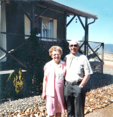
I’m finally getting back to finishing up this Photoshop class. I am definitely feeling better this week, and for a Friday night, I’m doing pretty good! This lesson is on retouching, and unfortunately all the good stuff I have I “fixed” last December when I didn’t really understand what I was doing. So some of the photos are too small, have already been lightened, and other destructive edits. I did find one of my fabulous in-laws that I’m going to work on.
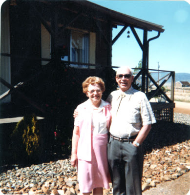
I think mom and dad are too light, there are problems with the sky, edges of the photo, and too dark for their mobile. So I started by trying to even out the blotches in the sky – which if you live in Arizona know that the sky is perfectly blue most of the time!

I was pleased with the results – a combination of brushes, clone stamp, and eye dropper for color. Then I decided I wanted to get rid of the antenna and house in the right background, as it’s kind of distracting. I eliminated the house by using the patch tool and then getting even color with the clone stamp. I increased the size to get to individual pixels so I could smooth things out and get rid of the antenna. Again I got down to individual pixels to make sure color seemed even.
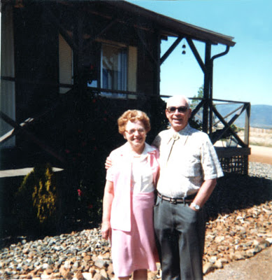
Then I started to look at lightening the house. I had a heck of a time with the mask, since it has been a while since I did it. But after about 45 minutes of repeating steps, I finally figured it out. Now you can see the dust and the age on the picture. But I think it worked, and mom and dad didn’t get too light. I did some “noise” for dust, and seemed to “flatten” the sides of the house. I wasn’t too happy – but then I added a blur for a final effect to emphasize mom and dad, and now I am pleased with the final copy.

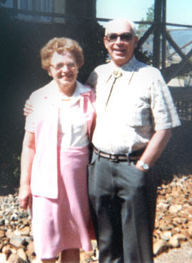
Then I felt I just had to crop the photo for a better effect.
Getting Down to Pixels…..

I started a piece last night that I thought really had potential, but I wasn’t having a lot of luck adding color with the brushes. I wanted a much lighter touch, so I thought about stuff over the night and most of today. I figured if I got to the pixel level I should be able to be extremely selective with the color. Unfortunately I didn’t make sure that I had the setting and size for print, so I will need to redo this if I want to print it out – and I’m thinking this could be an interesting entry for Fish Follies in Alaska.
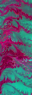
Here’s the original piece of fabric:
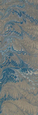
This piece was done as part of an order for Australia, but we weren’t totally pleased with it – kind of muddy. I did some work brightening and using the adjustments, so then I ended up with this, which will probably be a card:
Then I did the sharpening and the blur and the invert and got a piece that looked very much like water. So I played with some “sand” to see what would happen, and then almost pixel by pixel I added three different shades of water. I wanted to keep most of the white and just add shades, so I tried different brush sizes, shades, and opacity, with a lot of erasing! I am pleased with the result:
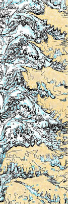
Now I am thinking if I redo this, I can make the “sand” more cliffs, and then really darken the water and have a good strong piece for Alaska.
Line Art – mine, not the kids…..

I took the camera to school yesterday to get pictures of the art work, especially the doodles, the kids have been doing. Forgot that Rich was coming to tape, and so got involved with that. Had a great taping session, but will have to bring the camera next week.
I am slowly starting to feel better – for the last three nghts I have actually been doing some Photoshop stuff. Since I have been emphasizing line in art class, I have been thinking more about it myself. I am fascinated by what Photoshop can do with turning work into line art. So I chose a couple more pieces of marbled fabric to see what I could do with them. This could be a whole new way of moving with the fabric.
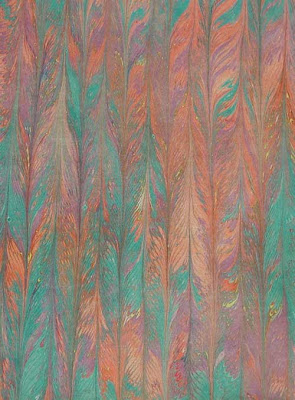
Here’s the original piece from last night:
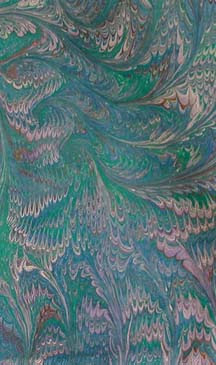
This is really a pretty piece of fabric, but it just seems too muted. Even with curves and adjustments, I can’t seem to make this a “wow” piece.
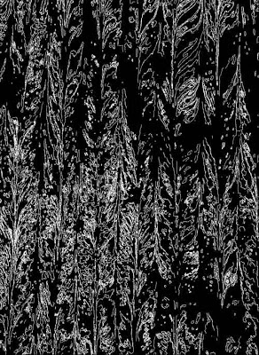
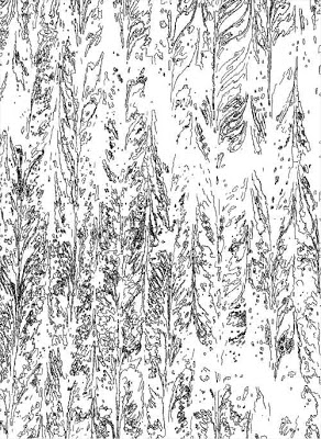
This is after sharpening and then doing the invert to get the line drawing:
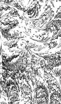
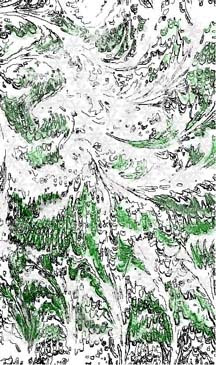
It wasn’t looking like much to me. Usually with the line drawings, once I do the inversion, then I can see a picture in it. I was puzzling on an image when Dean said it looked like a ski slope from the air. So then I started adding woods:
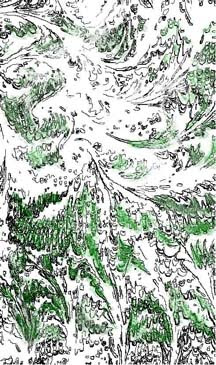
I need to do some more work here – still not satisfied. I was playing around with a number of the brushes and different colors – maybe to be more accurate I can increase the size and change the pixels to get more depth and accuracy. At this point I was wondering about getting to the snow – how could I add that against an already white background? I played with light shades of grays with blue tints, and then with the snowflake brush. Here’s what I got:
Not bad, but still needs work. I would like to darken the greens and add some more browns, so I can do a specific brush effect on the top and make it look like we are seeing through swirling snow.
Doodle Art

I was trying to come up with another idea for art class – we have done a lot with pencil and very basic elements of visual art. I just am not going to set up paints in my classroom. So I thought about doodling – which kids do so much on their papers when they are bored. I thought that maybe they wouldn’t let themselves get hung up on creating something that looked like an actual object.
They did the doodles yesterday – and today they had to follow directions on creating a small construction paper frame (including math…). They were to use the frame to isolate a part of their doodle that they really liked and then color just that part. They would mount the frame over that piece, leaving the rest of the doodle so viewers could see the whole inspiration.
We don’t have any display bulletin boards, so I decided to mount the doodles on the empty lockers outside the classrooms, and some of the kids cut out letters for “Doodle Art” in school colors. The display looks quite nice. I think the kids were quite surprised at how a simple doodle could turn into a piece of art. Some of my “harder” eighth grade boys spent a lot of time looking at the designs, pleased to show off their own. I’ll try to get pictures.
We are moving from the doodles to “digital doodles,” letting the kids fool around with Photoshop and try some of the brushes and shapes. They are much freer to try things in Photoshop since they can just delete layers.
Ink again……

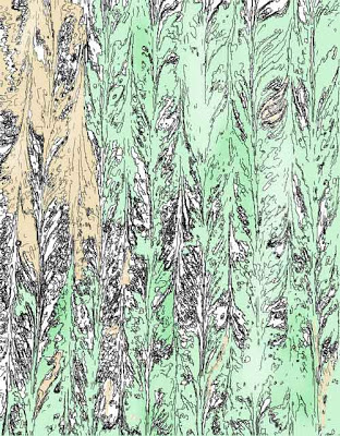
I am obviously hooked on working with the ink features, and I tried working with some judicious color. This first is with the lighter version of the marbled fabric. I didn’t like the effect of the brushes, but now I realize I could have really taken the opacity down. I started using the paint bucket, and I was really pleased with the effect. Welcome the Forest Fairy…
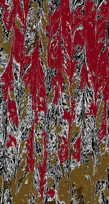
Then I went to the darker one to see what I could do. Kind of like autumn trees at night – not as happy – but I’ll keep trying some other fabrics.
Playing with Ink…

I’m taking a break from ironing all those pieces, which is really going quite well. We set them in piles of ten, so we can see a definite decrease in the number, rather than just looking at a piece at a time!
I wanted to do some more with the ink setting in Photoshop, so I pulled up a piece of marbled fabric, just to see what whould happen. Here is the original, before sharpening and smart blur.
Now here’s the piece before inverting…
…and after inverting. Two different effects, the first looking very much like a forest, and the second like the forest through a thick early morning fog. It would be interesting to see what I could do with a light “wash” of color….
Playing with Adjustment Layers

Another long week is done, and since I have huge amounts to do this weekend, I decided to play with Photoshop tonight and relax! I have to finish my presentation for the Mesa conference, including editing some new video – which I’m hoping I can do on my own – and if not, I can see Rich next Friday for help.
We’ve had a VERY good week for Marble-T. One of our eBay customers ordered a lot of remnants to repackage for the Houston Quilt Festival, and a woman in Australia ordered 10 fats of cotton and 10 fats of silk. So we have some nice money in for a change. And we also did a class proposal for Flagstaff, but I don’t think they’ll go for the price. That along with three visits to the chiropractor because of the auto accident, and it has been an extremely busy couple of days.
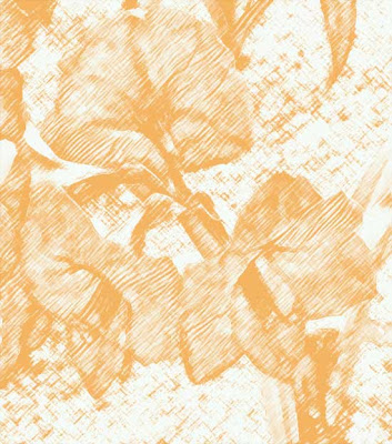
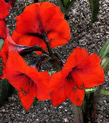
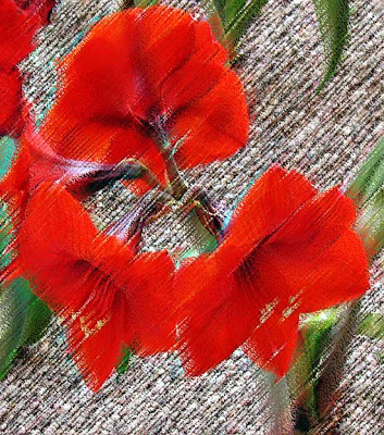
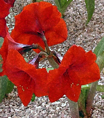
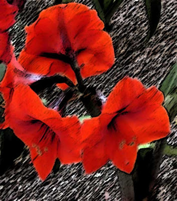
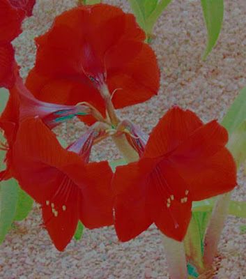
I am continuing to use this one flower for some work because there’s still loads I can learn just with this one image. Here’s the original.
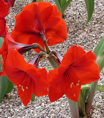
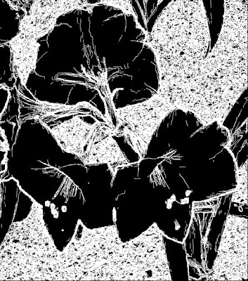
This part of the lesson is working with turnng a photo into an ink drawing, which I played around with this summer. Now I followed all the directions, and I think it turned out well. I sharpened, and in fact I used the patch tool to remove some excess from the photo that I didn’t like. I can see how this will make it easier to apply certain effects, especially the pen and ink. I will continue to try this, because I really like the effect, since this is how I started drawing when I was a teen – lots of pen and India ink.
From here I tried some more filters. This is the charcoal – I am getting better at playing around with the setting within the filters to get effects I like. Along with pen and ink, I used to do a lot with charcoal pencils as a teen. I still have my sketchpad when I was doing cartoon characters in charcoal.
I wanted to see what the film grain looked like. Probably not a filter effect I will use a lot.
Now this fresco one is interesting, especially since in art class we looked at a video that talked about restoring frescos damaged by water in Italy. I borrowed an idea from the professional development on Wednesday and did a “word splash” based on words used in this video. With my seventh graders, I had huge success with their attention to the video – lots of questions on their part about restoration of art. Led to some good discussions. Fresco means fresh in both Spanish and Italian – now I understand why they were named that – because of being painted on wet “fresh” plaster.
The pastel effect is something I just can’t get a handle on – this is not a material I am used to working with. But the effect is interesting, if a little pronounced. I almost would like something less obvious.
The sponge is a cool effect. I am thinking of using sponges next week with the kids and developing some texture painting.
I tried the sumi-e because it is a Japanese effect that has similarities to marbling.
And the final one was on water paper, just because I wanted to see what it would look like.
A productive evening – and I even marked five sets of papers and recorded them during the school day!
Finally – masks!

So I finally figured out masks. Last lessons I had trouble with that, and even with help from Suzan, I couldn’t seem to understand it. This time it’s clear. I wasn’t doing the correct type of mask.
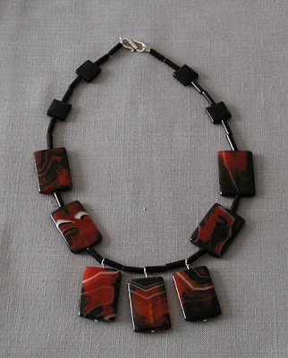
So here is the original of the necklace Alison made me for my birthday. The photo isn’t bad, but really doesn’t show the richness of the stones.
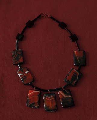
Then making an adjustment layer and playing around with brush size, I managed to get a different background that made the stones really stand out.
A New Me!

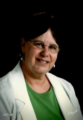
I started working again on the rest of the first lesson with LaunchPad C – chose a picture of me, since I just got my school pictures back. As usual I look middle aged and exhausted – so I figured why not? I’ll try a new version of me. Here’s the original.
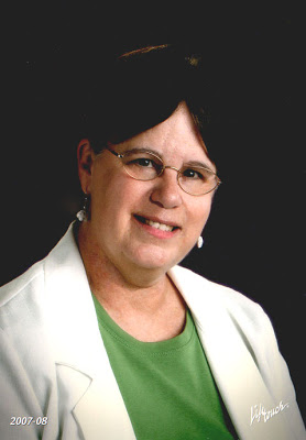
And here’s after – no wrinkles, teeth are whiter, a little more lipstick. I like me!
Playing with Hue and Saturation

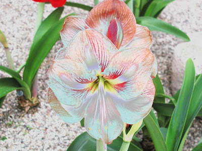
Well, I just started my Photoshop work again with LaunchPad C- it’s so good to be having fun again! I have done so little art for me in the last six weeks that this is a welcome break. The first lesson is on using hue and saturation, so I chose a simple flower photo Dean had taken this spring of a garden in our apartment complex.
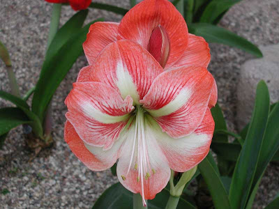
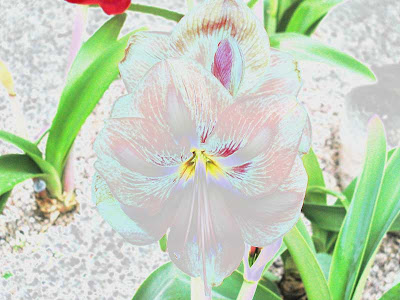
I thought it was an okay photo – really liked it! But…then I started playing around with the sliders on layer adjustments, specifically hue and saturation. Here it is in blues.
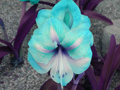
Huge difference in effect. Here it is in red.

I wanted to try something a little more delicate, so I went for the yellows. Here’s two samples.
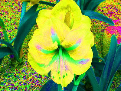
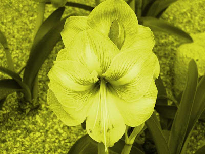
Then I just worked with a variety of hue, saturation, and lightness.
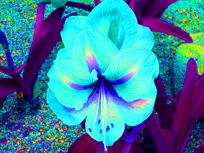
Still pretty darned pleased. But then I went back to the original adjustments from LaunchPad A to see the effects. This first is levels only.
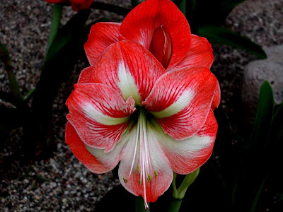
Then I played around with just the curves adjustment, and I was really pleased with the results. One of them is so delicate, almost like a glass flower.
Definitely am glad I am taking this, because I’m going to have some fun again!
On Marketing…

As I mentioned yesterday, I sent in a request in response to an offer of a free web critique, as a way of jump-startng more marbling and marketing efforts. I still have a huge business map taped to the back of the studio door, with lots of ideas on it, some of which will never happen, and some of which just need a push. We need to prepare for a demo we are giving in September, and this time we will not make the mistake of not bringing product with us to sell. And we will take pictures, have sign-up sheets, and all the other marketing pieces that need to be there to increase sales.
Part of each of the next three marbling sessions is to get materials ready to take to the demo – like scarves in preparation for holiday buying. But once again, we don’t want to just be making fabric – tough on us and lacks the creativity. When we were doing all those fat quarters for the fabric rep and the kaleidoscope guy, it was the same old routine and patterns, and we did not enjoy that. I have several pieces already backed and waiting for quilting that would make great art pieces. Just have to get to it.
And the whole idea behind the Photoshop classes is to get to a point where I am ready to create t-shirt designs. I did go online yesterday to search about creating a CD portfolio – and the site with the most amount of helpful info was the Apple site on a tutorial for iLife – which I have on my laptop. So I just need to sketch out what needs to be done and get it created. At least I know how to do a slideshow, as that seems to be the main feature. I updated the website, so all our credits and shows are current.
I have also been reading some stuff about publicizing blogs – since the two comments I have gotten on here have been spam. Have to find out about RSS feeds, and how to get other people to read this blog. Minor details…..at least I have a record of my work this year.
The other thing I was thinking about was my sketching – but more on that later.
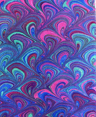
Just so you know – we can marble on cross-stitch Aida cloth – didn’t want too many entries going by without pictures. This was for a special order over a year ago.
Bursts of creativity…

We are getting ready to marble in the big tray again this weekend, and we really seem to be gearing up to do some serious work. We were shopping for embellishments today, and considered trying to marble some other fabrics. But then we reminded ourselves we really don’t want to do mostly production – we want to start getting in to some serious art.
Hence the website makeover, correcting and adding little pieces. In fact, I signed up for a free critique by a creativity coach for the website.What seemed to be the kick in the pants we needed was a visit this weekend to our favorite gallery in Prescott, Van Gogh’s Ear. Our work would be marvelous in that gallery. We have plenty of pieces ready to go, from small to large, but I need to learn how to do a CD portfolio for submission. Lots of loose ends there.
And I have completed a HUGE number of loose ends over the last few days, as I get ready for the new school year. I want to be sure that I have time to myself for art. Today we bought some embellishments, and I want to continue to work at the three pieces that need finishing touches, plus the Berg piece. And I want to take the next course in Photoshop. I need to clean the studio table to get ready for the marbling tray, so there will be several days that I can’t sew – but I can work on my Mesa presentation, as well as some more math loose ends, so I can sew in a few days.
