Archive for the ‘primary colors’ Category
Sunday Stories – The Chakra Commission
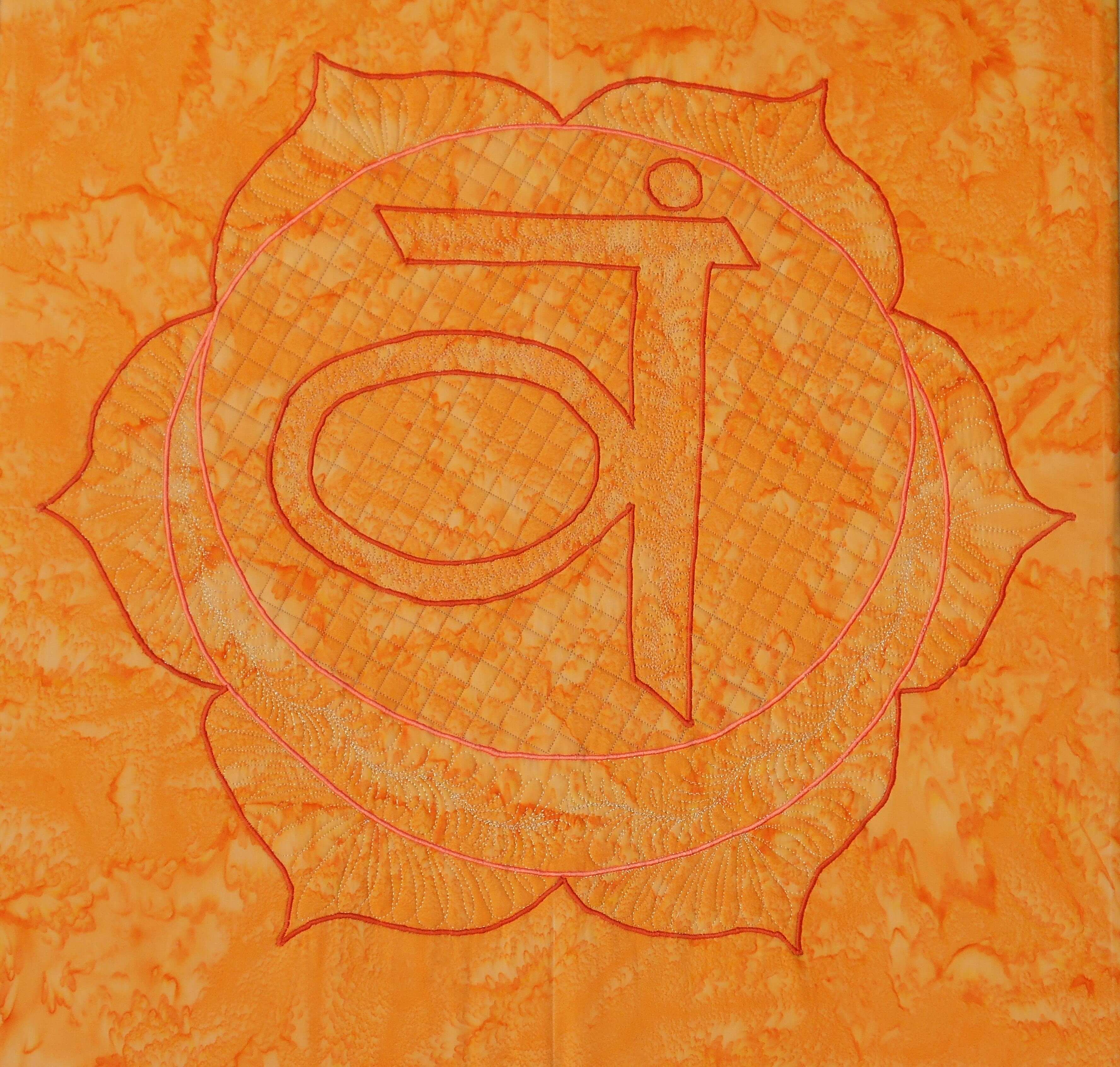
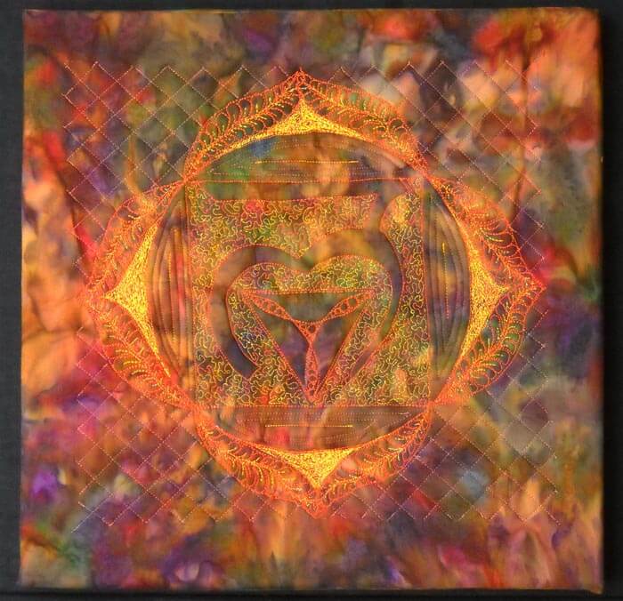
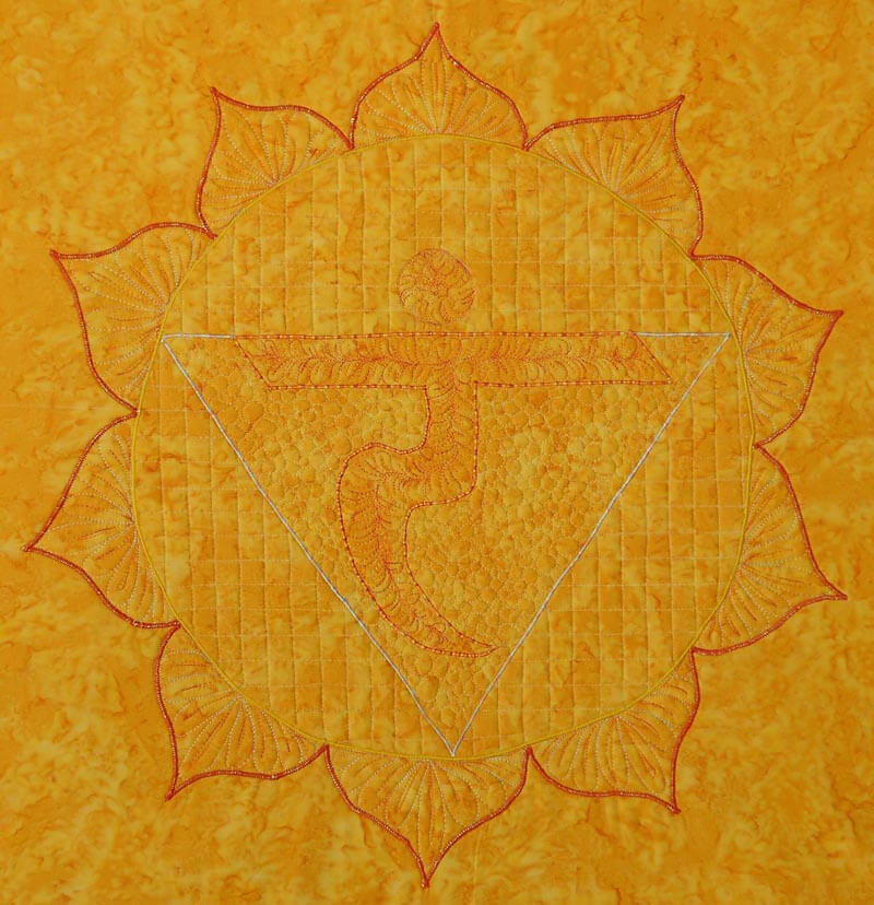
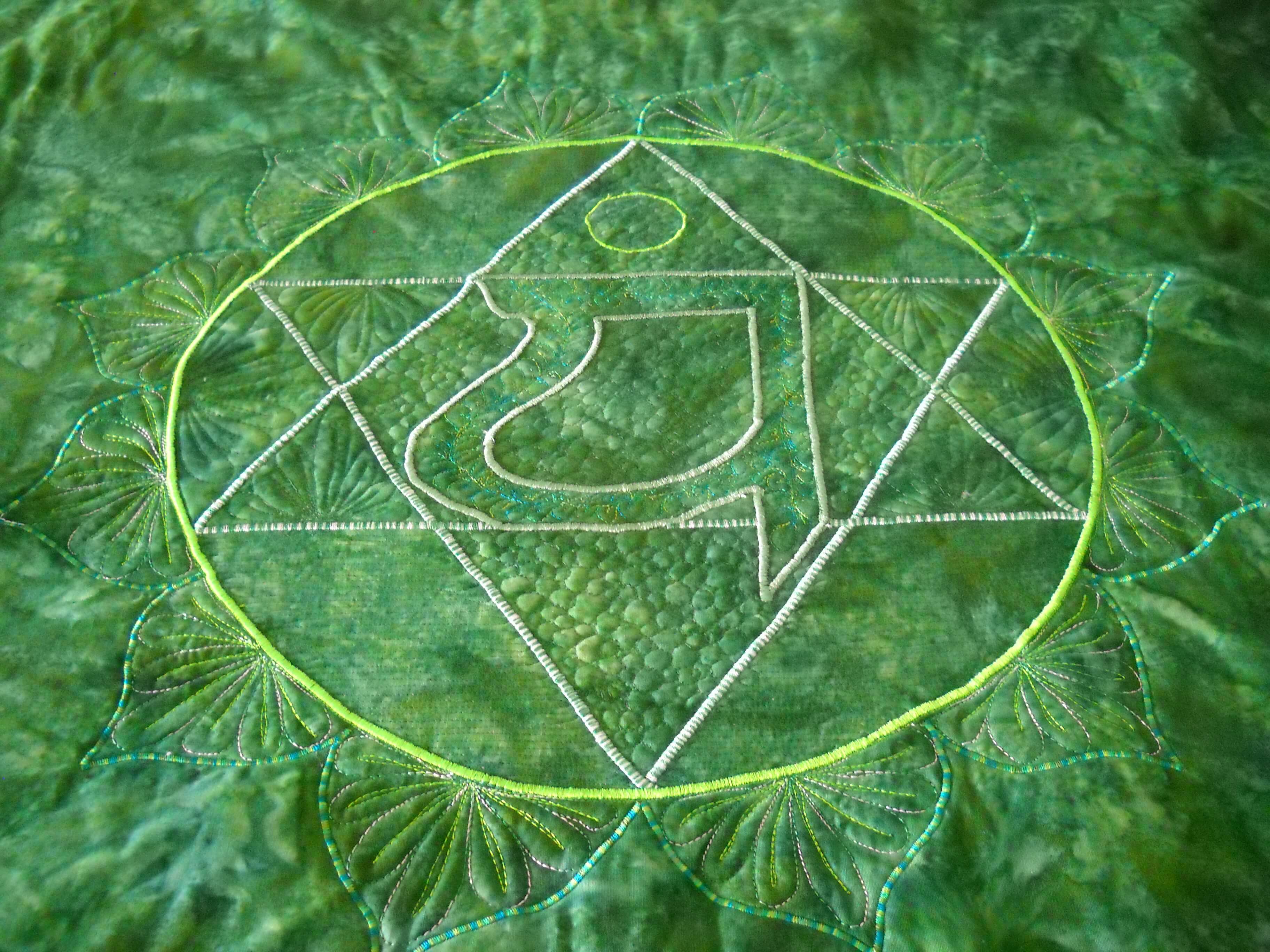
Last September my yoga instructor Susan asked me to do a series of chakras for her home, which is also her yoga studio. She had the idea to have the chakras around three sides of her “great room,” so she would be surrounded by their energies. I had previously done a small 10 x 10 inch thread-painted root chakra, and that one led to this new idea.
We debated about size, because the wall space is quite tall. Using the floor tiles as an estimate, we decided each would be 24 inches square – wrapped around four 12 by 12 inch canvases that we would put together.
First challenge – choosing the fabrics. I wanted to purchase them all at the same time for consistency. I had thought about the Stonehenge line of fabrics, but the LQS was out of them. Susan found some hand-dyes that were what I call true crayon colors. It was a beautiful vibrant rainbow. This was when I first realized some of the attributes of the chakras. Second challenge – creating the patterns. I wanted the thread-painted chakra to finish at 20 by 20 inches, because that would give me enough fabric for wrapping the canvas. So I worked with a set of patterns from the Net and created a master set for approval. We tweaked some changes with the edges to better increase some of the symmetry. It is now the end of October and I am ready to start – I think.
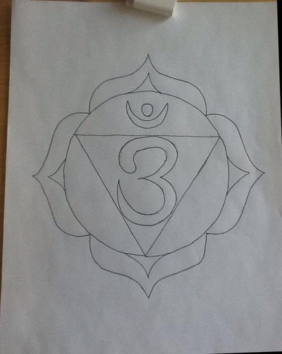
In trying to explain to the copy folks at Office Depot that I wanted my design blow up to 20 inches by 20 inches, eventually we got a 24-inch-square canvas, with a 20-inch design on it. I had copies made as patterns.
Once I had the pattern, I traced over it and then pinned the tracing paper onto the fabric sandwich. Speaking of fabric sandwiches, it too close to five hours to get seven sandwiches prepped: ironing the fabric (I cut each yard into a 30-inch square), matched it with low-loft batting, and found some unused fabrics for the backings. Then they all sat over a chair for a while.
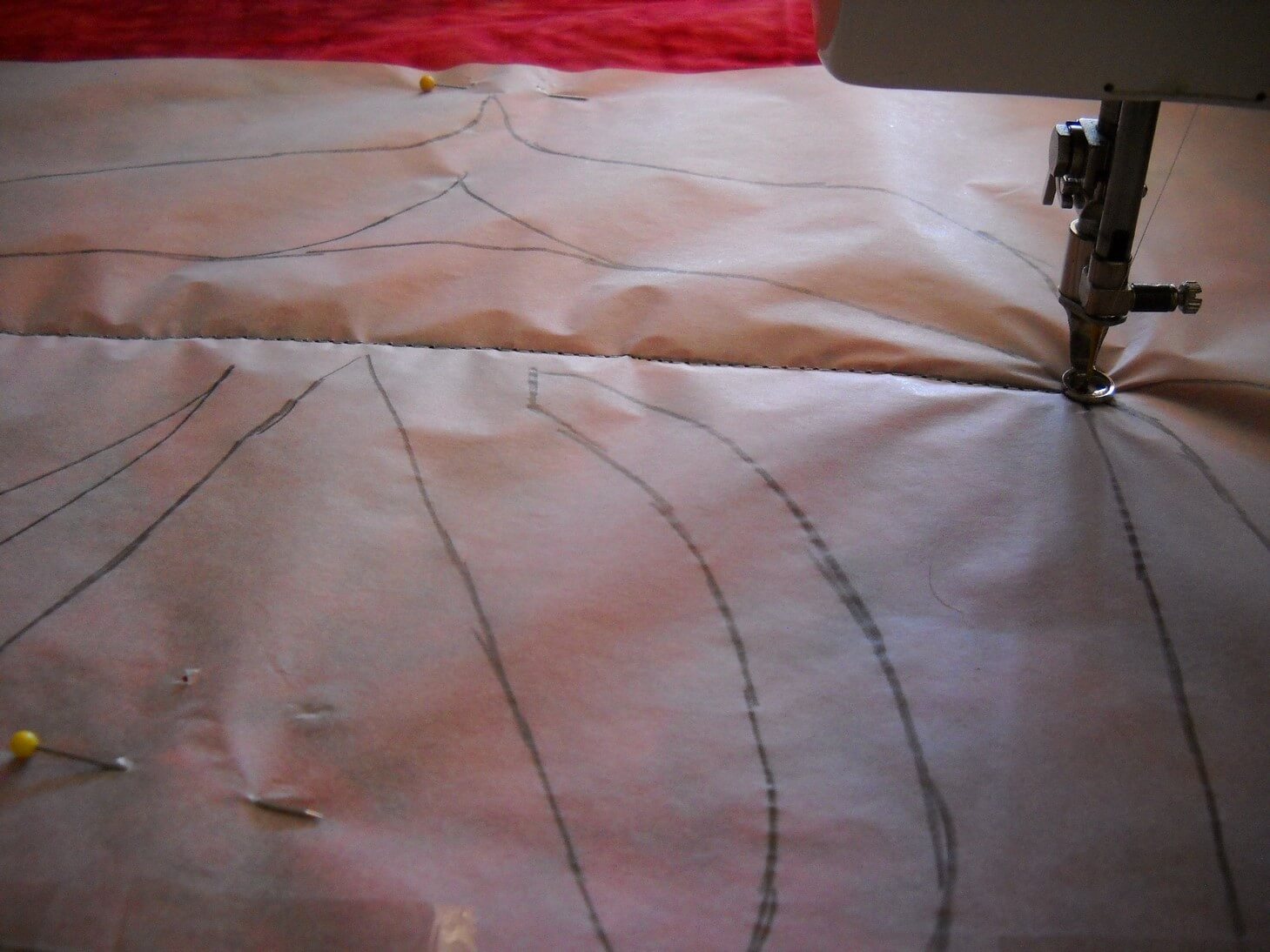
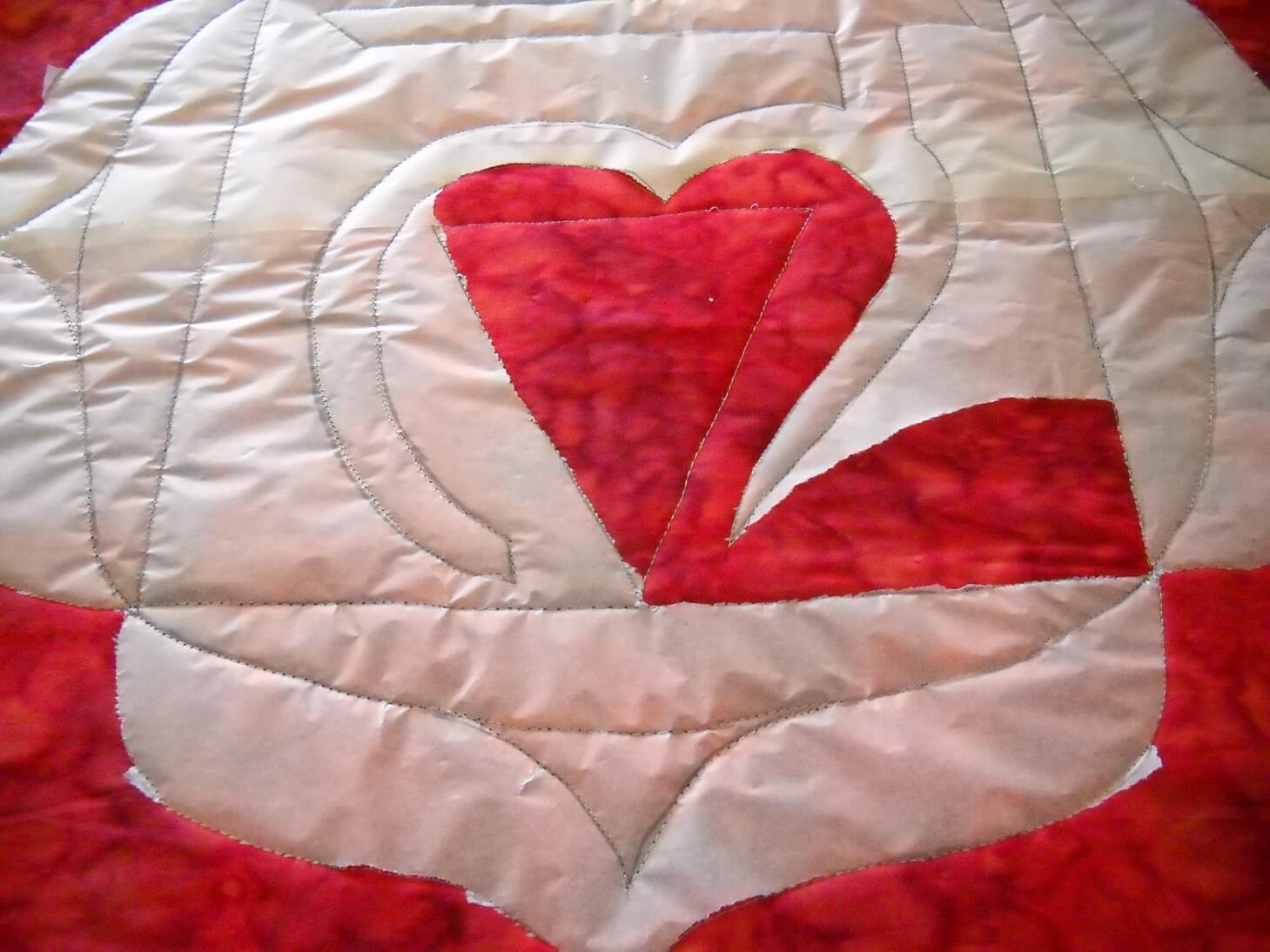
Finally around the end of November I started the actual sewing. I pinned the tracing paper carefully to the fabric sandwich and, using washable thread, I outlined the pattern. Tearing off the tracing paper took a very long while….
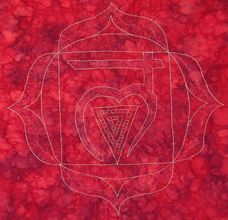
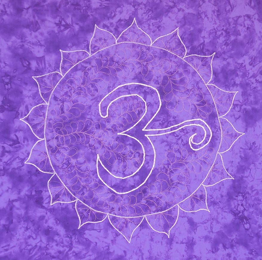
For the Root chakra, I decided to do some bobbin work with a gold thread. I was so-so pleased with the results, but not enough that I was going to continue with the bobbin work. Each of the other chakras used satin stitch on the major elements and a lot of free motion patterns for fillers. The chakras got progressively better in their sewing….until the last one – same elements but a much simpler design.
I thought about redoing the Root chakra, since it didn’t seem to fit with the others. But the more Susan and I talked about how these were developing, the more I liked the first and the last. As I worked on them, I added more quilting elements that added to the design. I used colors in the same family as the background fabric, with hopefully enough contrast. Up close they were all looking gorgeous. From a distance, they faded away. That bothered me for a while, but I realized as I was working on them that everything in the design was meant to be meditative. Up close, you could lose yourself in the design. From a distance, the more you looked the more your saw.
Susan summarized it pretty well. The root chakra is our beginning, and it can be very shaky and unsure. We develop from there, with whatever impurities becoming who we truly are. The crown chakra, the seventh, is the Divine, and as such doesn’t need to be ornate. The Divine in us can be very simple and beautiful.
So here they are, in order.
(Have to find this one – will update……)

I learned a lot. There are some stitching patterns I would change. I would probably use a much lighter background fabric and have the stitching pattern show more. Yet they move in complexity, much like the chakras do. I one I am missing is the one I think is the best design, yet in viewing it, the design seems very faint. The more you look, the more you see. This is also the chakra that is my weakest, so I find that fascinating. My yoga instructor is extremely pleased. The room is surrounded by color and it just vibrates. And she says she can easily meditate on whichever one she wants or needs. A very happy conclusion.
New Projects

I did remember the camera, but not until almost the end of art class. I snapped a few finished projects, but none of the “in progress.” The kids have started some serious work with embellishing their illuminated letters – those will be great pics. The next couple are from our color studies.
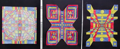
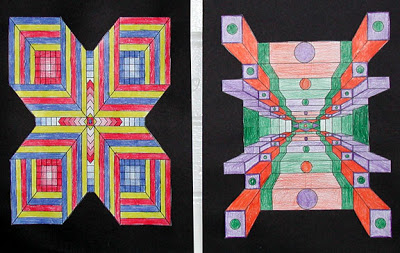
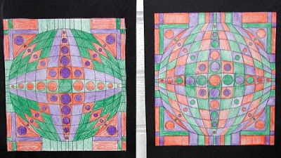
Each design (from a book on optical illusions) is either with the three primary or three secondary colors. They are arranged along one of the walls, and it is really interesting to see the variety among so many students. All the pieces had to have a line of symmetry, either horizontal or vertical, as a way of reinforcing math symmetry.
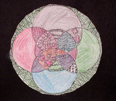
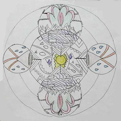
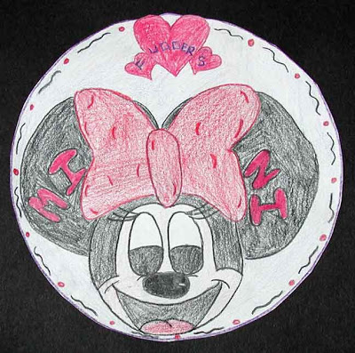
These next are some of our mandalas. The first is from my student artist who is amazing – he just draws whatever comes out of his head – I watch him in wonder! The second is from one of my girls who got really in to doing a series of lines inside each of her circles.
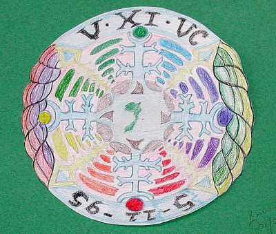
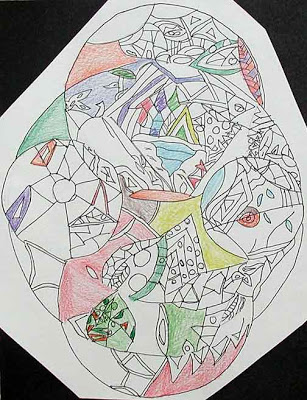
The next is from my young lady from last semester, now my aide, who has a nickname of Fudders (actually it’s Mother Fudders, but I made her clean it up for class). She loves Minnie!
This next is the young man I was talking about in an earlier post – really well done.
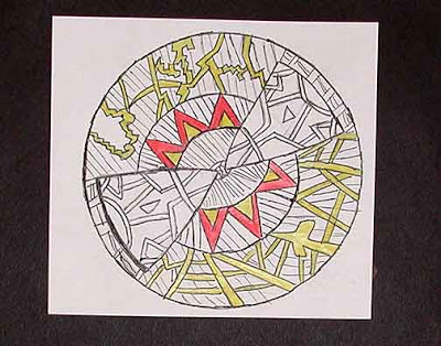
This next is one of my Somali girls who spent a huge amount of time on the lines. And another one with a lot of detail inside and very choosy on color.
