Monday Marketing – Online Business
This week I have two projects to finish, only one of which involves any marketing. The first is to finish a UFO from three years ago – my forest quilt. I’m practicing a lot of patterns learned in the free motion quilting challenge. The quilt is looking amazing – only a few boo-boos that I’m willing to worry over, but oh, the feathers on the border….yummy! They are taking a while, but it is so worth it! Maybe pictures by Wednesday…..
The marketing piece is to do final revisions on my table topper pattern – had great samples made, so I’m really excited about releasing the pattern. Mostly I need to make the pattern less wordy and more organized. But that needs to be done this week so it can be included in the next newsletter for next week, as well as my marketing plan for the holidays. Yes, I’m bound and determined not to miss the holiday season for shopping this year. Hubby has been learning the ins and outs of Etsy, so he is busy restocking the shelves. We have some GREAT fabric pieces in the store.
Readers know I have a number of places I do business on line, from Facebook, eBay, Etsy, and our website. Hubby has handled the time effort in eBay for the last 8 years, and now he is picking up Etsy. Alyson Stanfield had yet another good post on analyzing the time you spend – or need to spend – setting up your online outlets. I will say the work gets easier the longer you are at it and set up systems for posting items. Our first two weeks of posting for eBay took close to four hours for six items. Same for Etsy when we first started. You have to be willing to spend the time, have the inventory, and write good descriptions to go along with good pictures. That’s several hours a week you need to spend – or in our case, hubby needs to spend. I write up the more unusual Etsy offerings, like the small table toppers, ribbons, and the like. You also need to add in the time to post items on Facebook, tweet them, and now use Pinterest.
A lot of us are online because we are convinced it is the way to do business. For us, online didn’t cost anything beyond our time. No stores, just free sites. As long as we were willing to invest the marketing time, we were able to get these venues to work for us. We also knew the art/craft show wasn’t the route for us, being such a niche market. But…and a very big but….you can’t put stuff up and expect it will sell if you don’t do anything more than just listing items. I did drop Tophatter from my venues for three reasons: one, not really selling anything, even in the “fabric and textiles” auction; two, a HUGE time commitment, as you want to be present at the auctions to promote your item; and three, I’m not willing to be burned by uncivil people (blog post here). These are decisions you need to make, and I like how Alyson’s guest blogger spelled things out for accounting. Our business has always been the two of us. Hubby is primary marbler, I’m the designer. I handle most of Photoshop, he does accounting, eBay, and Etsy listings. Retirement has made it easier to spend more time on what we love, as I am not exhausted from the school day.
If you’re not familiar with Handmadeology, I have done (and continue to do) a series of posts on marketing your niche market. You can find them here, plus there are loads of great articles about running your business that are well worth your time.
Part 2: What is your wackiest marketing idea?
Part 4: Have you done your newsletter?
Part 5: Your Newsletter Revisited
Have a great marketing week!
Continuing Lesson 1
 I have been ruminating on finishing this first lesson in my Quilt University class, especially since I am now a week behind due to our vacation in San Diego. But it was not wasted time, even though I never opened the sketch book. The exercises I had done at the beginning caused me to start looking at my surroundings in terms of line and shape, focal points, unusual camera angles, and textures. I ended up with a lot of unusual shots, just to remind myself of what caught my eye.
Last night I sat down with my selected pictures, tracing paper, and my sketchbook to see just what I could come up with. First, here’s the original picture, from sitting in Spanish Landing Park and admiring all the boats, and masts, and straight lines….and triangles……
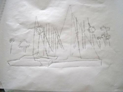
I cropped the picture and then used tracing paper to get basic outlines. I am not comfortable sketching freehand with this activity – it kind of intimidated me at first.
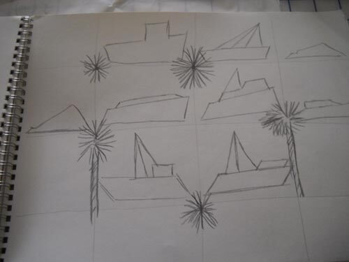
What I liked about this was that I could definitely see the trapezoids, triangles, and straight lines. From here I tried a grid to repeat some design elements.
Not happy with this – not at all pleasing to me. Probably because the exercise itself is so new. So worried – like always in the past – about what this was going to look like. Then I went to my triangles and straight lines:
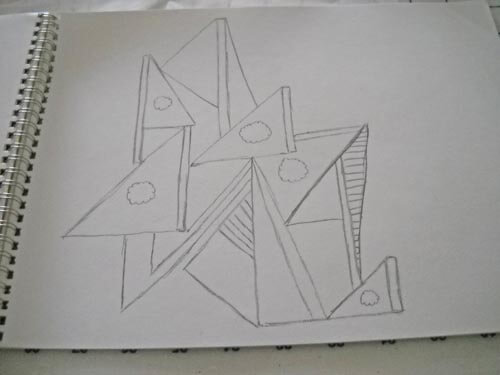 This has got possibilities, but it would seriously need reworking. I might pick up tree color in the sails. Once again, I can see just how linear I am in the design….
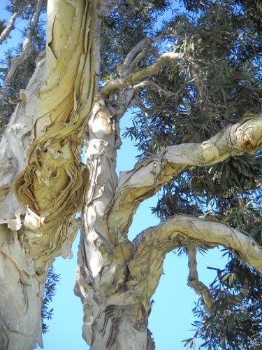
From here I went to the photo of what hubby and I called “our tree” at Spanish Landing Park, since we sat next to it for three days. Here’s the original:
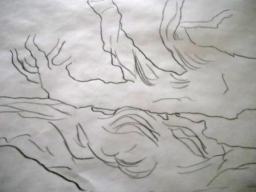
I ended up turning this on its side for the outline – something I NEVER do with a picture…..and I liked it!
I already could see some possibilities in this, and at this point I was kind of amazed at how my thinking was changing. In the past I had always looked at trying to work with the whole composition, instead of just pieces of it.
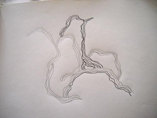
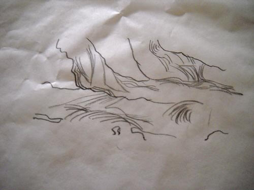 Here’s the close-up, and as I was trying to add some texture, it occurred to me that all the lines were pretty much ovals…..the beginning of inspiration and a real change in my thinking, which led to this…..
I LOVE this! The linear part of me was going to do all the ovals equidistant apart, but I had trouble with that in the second line and I realized the wonkiness of the “in and out” of the line gave me even more texture. Then when I changed pencil hardness I was really hooked……which led to “Oh, my, I need more thread and yarns….” I think I’m on to something. Plus, this was so freeing. This process really works, and I can see working this activity much more.
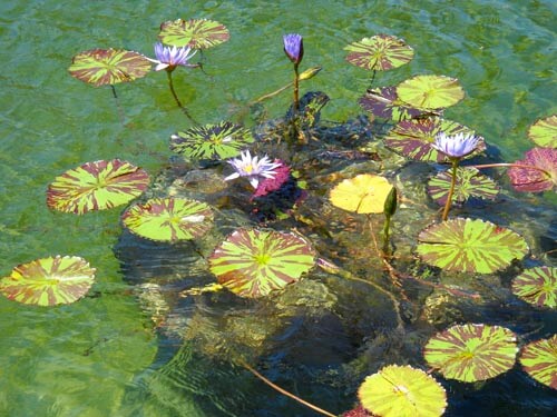
So then I went to another photo:
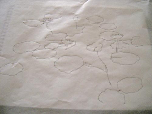
This was taken in Balboa Park, the reflecting pools near the Botanical Gardens. LOVE these lily pads, especially the variegated leaves. Here’s the outline.
And here’s the close-up:
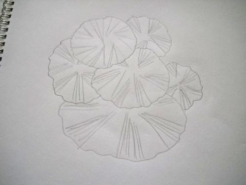
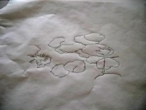 I really like the shape of the lily pad, so I decided to use not-quite-regular circles. I ended up with this, and again, really happy with it. I already know what stitches I would use….and again, I need more thread…..
I have a couple of additional photos I want to do this exercise with, and I can see myself using it a lot. I had ideas come out that I wouldn’t have seen otherwise. Definite progress.
Top Ten Tuesday
![]() Well, it has been a while, what with projects and a few days in San Diego. I have loads to work through on my blog list, so I am thinking there’s at least three posts here!
Well, it has been a while, what with projects and a few days in San Diego. I have loads to work through on my blog list, so I am thinking there’s at least three posts here!
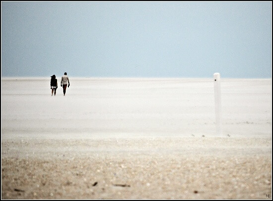
First up, from the 365 Project, some amazing photography yet again. In honor of beach time in San Diego……
From the ArtBizBlog and Alyson Stanfield comes some organizing ideas. I just happened to see her Evernote mention, and I have just started using that on my iPad, so I want to go into this post more in depth….organizing lately has been off, to say the least!
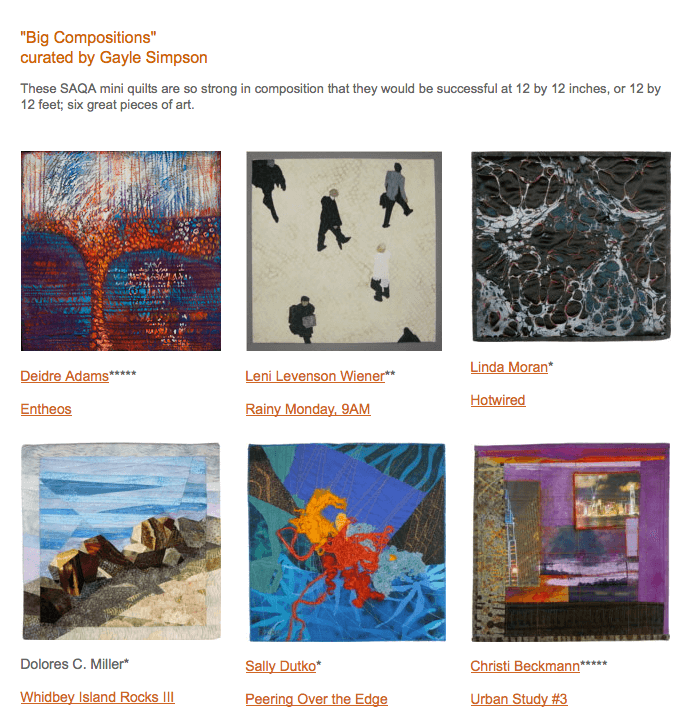
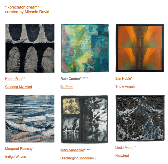
Studio Art Quilt Association (SAQA) does an auction of artwork every year as a fund raiser. This is the first year I have contributed a piece. One thing members are doing to promote the auction is doing 6-piece “collections” around a theme. I pleased to say my “Hotwired” has made it into two collections.
Here are a few more samples of SAQA collections, put together by Kathy York.
Here’s a quick video from Freida Anderson with some fusing tips, something I am just getting in to:
Jane LaFazio interviews Leslie Riley. I’ve admired both for a long time. Jane is a very successful water color, mixed media, and art quilter, and Leslie Riley is quite the motivator. Enjoy the interview!
Alisa Burke has a fabulous post on tools for sketchbooks and frequently asked questions. Lots of “I wants” in this list…it’s probably a good thing I don’t do a lot of sketching……
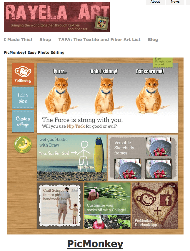
Thanks to Rachel of Rayela Art and The Textile and Fiber Art List, here’s a cool look at a new tool called PicMonkey for editing pictures easily. Rachel did some fun playing around with pictures of her own.
Here’s a wonderful sense of humor video from YouTube about European shopping bags. Some very clever designs!
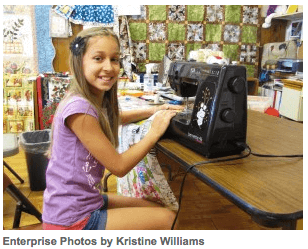
A very “enterprising” story of a 10-year-old who has started her own sewing business. You go, Lizzy!
And finally, a piece of honesty and courage from an Eagle Scout from The Best Article Every Day.
Have a great week! Let me know what you find that’s cool.
Monday Marketing
It’s Monday, and I’m trying to get back in the swing after a few days off…and actually a couple of weeks off from anything more intense than just sewing. I have been finding myself thinking a lot about this year’s holiday season….and it was 110 degrees today, so I’m thinking I’m nuts…..but the holidays are coming, and I don’t want to squander the opportunity this year. This week’s Handmadeology post will be about getting ready for the holidays.
That said, there was some great information from the ArtBizBlog and Alyson Stanfield today.
The first is about writing book reviews for your blog. I really should look at doing that, as I just picked up a couple of great ones on machine quilting, and they are making a difference in my latest quilting. It’s a distinct possibility that I will make one day a week a book review, and not necessarily about art quilts. There’s a lot of science fiction in my future….
The other blog post by Alyson is on organizing. I just downloaded Evernote to my iPad, as I needed something for word processing during tutoring. I don’t know much about the program, but if I can use it for some other organizing ideas, then I’m game to try it.
Alyson references Tim Ferriss of the Four Hour Workweek, which I read about two years ago and proceeded to get very depressed. I was still teaching at the time, so there really was no way to look at four hours. However, the one piece that really stuck with me was all his information on outsourcing. Very intriguing, especially as I am headed in to some serious research for a potential book. Interesting read if you are ready for a drastic change…..
Second Design Photo Analysis
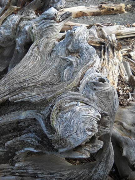
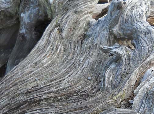
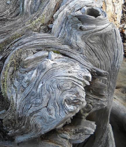
I worked with another photo last night, and I didn’t have nearly the success with adjustments and filters as I did with the first photo. Now I need to think through why that is so. Here’s the new photo – driftwood from Vashon Island in Puget Sound.
Well, crap….seems like I did it again in saving…or not saving. I need to remember to save everything as a psd file first to preserve the layers, and then save each piece individually. Okay, bottom line, nothing really spoke to me with the different adjustments, so I need to think through why that is so.
Is it because this is a fairly abstract image to begin with, mostly line and color? Perhaps that is why I am so fascinated with tree bark to begin with. The lines, shadows, differing colors to create the texture. And this picture, knowing it is driftwood, also reeks of a hidden history after being tossed in the water and then left high and dry. But how would I create some of that mystery?
What initially prompted me to take a picture of this? Probably all the smooth curved lines and the knot.
Looks like all kinds of interesting lichen within all those folds. The colors are so subtle, but at the same time I see a nice interplay of line and shadow.
I look at that knot and see a captured sea spirit. The more I look at this one, the more I am intrigued by it. The curves are so soft amidst all that hardness.
Now that I look at a couple of additional questions, I am stumped. Main idea? I like the thought of a captured sea spirit. Areas worth keeping? I can see leaving out everything else from these two crops. Other elements to add? No clue. But as I ponder, the first thought that comes to mind is to carry the lichen out into a border, and maybe the overall piece doesn’t need to be square or rectangular, maybe more oval so that the spirit seems encased and surrounded but is really still there. Don’t know if that is making sense….
How and where can more pizazz be added? Again, no clue. But…perhaps a lot of thread painting would be needed for surface texture.
I can see this going to sketches as the next step and seeing what develops from there. Comments?
Trying to Learn Something About Value…..
…that could also read “something OF value,” but I want to focus in on the issue of value and color in design….something I know I am really weak on. I’m choosing a couple of pics that I really like for design composition and playing around with Photoshop filters to see what they tell me about the composition. This is different from how I usually approach working with Photoshop….play around until I get something that says Wow. This time I’m looking at the elements of the picture and trying to see how they change and why I like – or don’t like – the design.
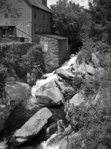
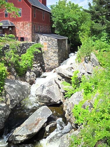
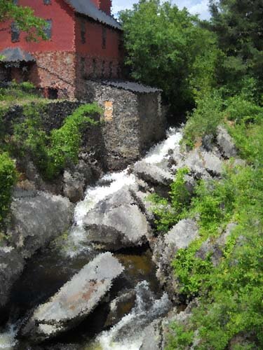
Here’s my first photo, taken in Jericho, Vermont two summers ago, at the Old Mill, which houses much of the history of hubby’s family.
I love everything about this picture: the greens, the mill red, the flowing water, the fact that I’ve got it composed in thirds. And you can’t see that right behind me is very busy Route 15. So what did I learn from this exercise?
Primarily I am much more aware of the basic lines in the composition. The lines don’t change, but the focal point does, depending on the filter or effect I used. There is one example that I would consider making up in cloth, as I find it intriguing, and I’ve never tried anything like that. The others are just interesting to analyze. Here goes:
I love black and white. After three weeks in Seattle this spring, I developed a whole new appreciation for shades of gray (no, not the book……). I want to take this photo and play around with a few sections of rock to see what I might be able to sketch.
This is the “sponge” filter, and it’s one I really like. Shadows and subtle colors really come out in this filter. Once again I am amazed at all the shades of green there are. There’s more shading in the mill, as opposed to the original, but the movement of the water is lost.
This is the “find edges” filter. Interesting to see where basic pieces of fabric would be. I think I can also see the dark, medium, and light of the photo.
Accented edges filter. More of a pattern to follow if I wanted to recreate this. I did a small cropping that I could see in a 12 x 12 piece. I’m liking the shadows.
This is the “patchwork” filter, and I could see making this up as a larger wall quilt. The filter allows you to make the squares larger or smaller, but I am really curious to see how this would work up in piecing. I need to print this out larger and use my little red rectangle and look at the values closer.
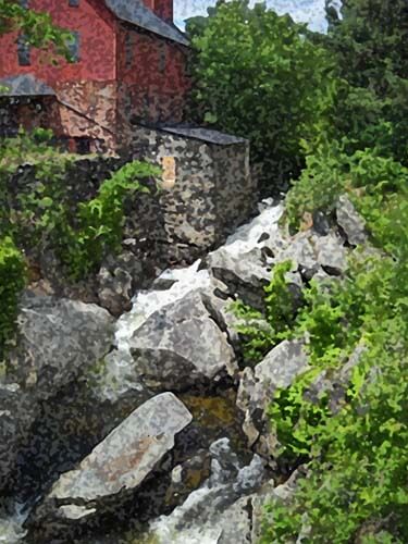
Well, I have managed to lose my original with all the filters listed on it, so c***. What I like about this above photo is the additional shading that is present in the rocks, and in the red portion of the mill. Lots more texture, and I could see using some colored pencils to enhance the fabric pieces.
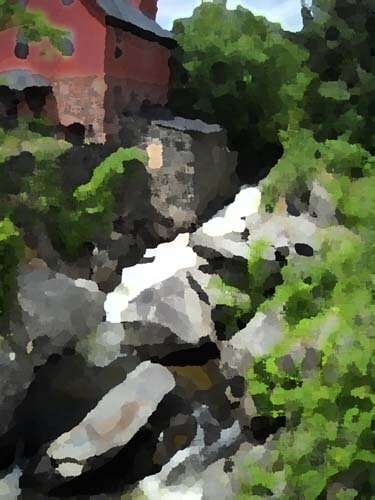
I believe this is a watercolor filter, and I like it. I can see looking for specific fabrics for this piece, rather than trying to do lots of little pieces togather. I could see just cutting pattern pieces and fusing them into place. I like the softness.
Palette knife, I think. I like the general clumps of color, and as I reflect on this, I could see making this into a small abstract. The image is still recognizable, and I like how you can see an actual pattern to follow in putting this together.
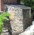
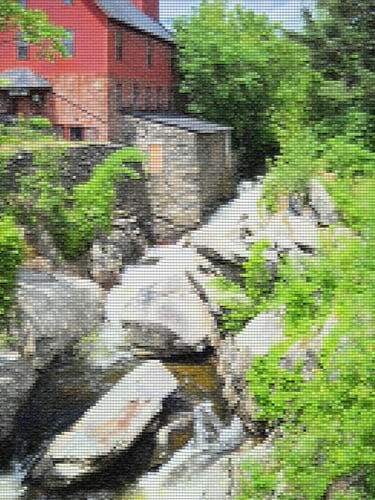
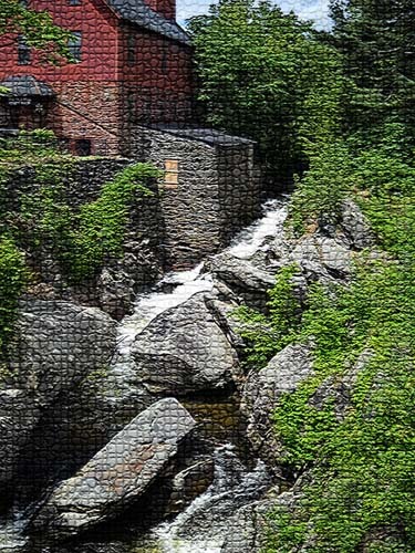
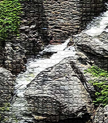
This is mosaic tiles, and I like the effect better than the patchwork photo above. I’d have to spend some time thinking about how to get the “grout” effect…..maybe a mottled gray color with texture in it as the background piece, and then the tiles cult at somewhat irregular edges so the grout shows through. I cropped a piece to see….
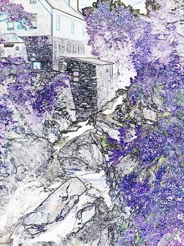
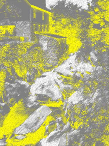
This is an inversion adjustment, and I like these because I always see something different when the colors are completely different. The yellow accents the shape of the edge of the mill in a way you don’t notice in the original photo. The rushing water doesn’t show up at all.
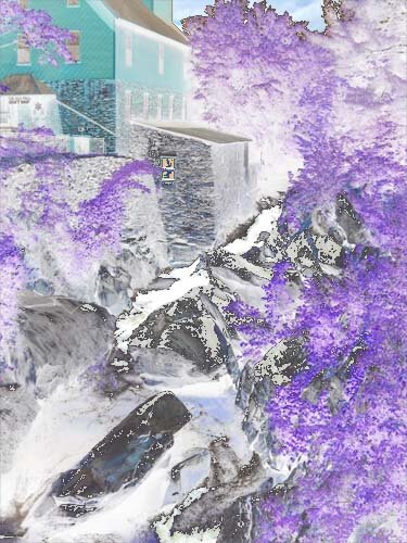
Forgot the adjustment, but the amount of purple really accents the amount of green in the original photo. And I like the way the shapes of the rocks are accented.
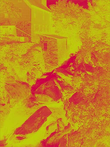
This is a red/yellow gradient, and I like playing around with gradients. Very other-worldly, but I don’t see taking this piece any further.
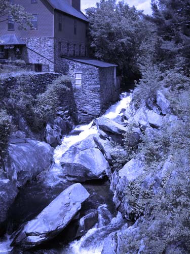
I saw some quilts a while back that were based on Joen Wolfrom’s color tool. People chose a color and then worked solely in the range of that color. Results were pretty dramatic. This is a color filter in a deep blue. I think I would print this out and take it fabric shopping and see just how well I could pick out various blues and other shades that have a blue cast to them.
That’s my first study, and I definitely need to do more of these. I feel like I have a better understanding of the composition of the original picture. Next up, my wrought iron photo….
New Work and Progress….
![]() I have been participating in the Free Motion Challenge this year sponsored by SewCalGal, and it has done wonders for my quilting skills. Each month a different machine quilting instructor, and I now have a variety of patterns to use. Part of my goal for this second year of retirement is to complete some of the unfinished projects over the last few years. Now I feel like I have way more tools than just stippling. I am working on a quilt from Stripper’s Club of three years ago at my LQS (Quilter’s Market), and it is looking amazing. I anticipate being done by the end of the weekend, as the quilting really doesn’t take that long. I just need to take breaks every half hour or so since my neck and shoulders are tightening.
I have been participating in the Free Motion Challenge this year sponsored by SewCalGal, and it has done wonders for my quilting skills. Each month a different machine quilting instructor, and I now have a variety of patterns to use. Part of my goal for this second year of retirement is to complete some of the unfinished projects over the last few years. Now I feel like I have way more tools than just stippling. I am working on a quilt from Stripper’s Club of three years ago at my LQS (Quilter’s Market), and it is looking amazing. I anticipate being done by the end of the weekend, as the quilting really doesn’t take that long. I just need to take breaks every half hour or so since my neck and shoulders are tightening.
In spite of feeling pretty lethargic over the last two months, I finished a small green color study, the June and July free motion lessons, completed the samples and wrote the pattern (which is now being tested by my new pattern testers), started work on my forest quilt, and completed a small piece called Desertscapes.
Desertscapes started as seven separate pieces that I knew would go together, but I wasn’t sure just how that would work. I just started with some free motion to accent the idea of geodes, as well as desert landscape. I loved the use of microstippling to mimic sand.
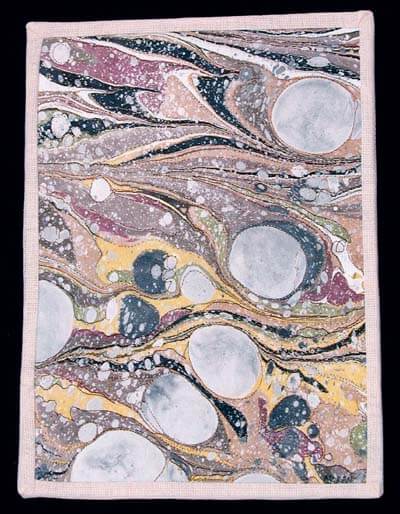
Here’s the finished piece, which already has a home. It looks so much better – and straighter – on the wall! Loved the way the marbled ribbon brought everything together.
Free Motion Quilting for July
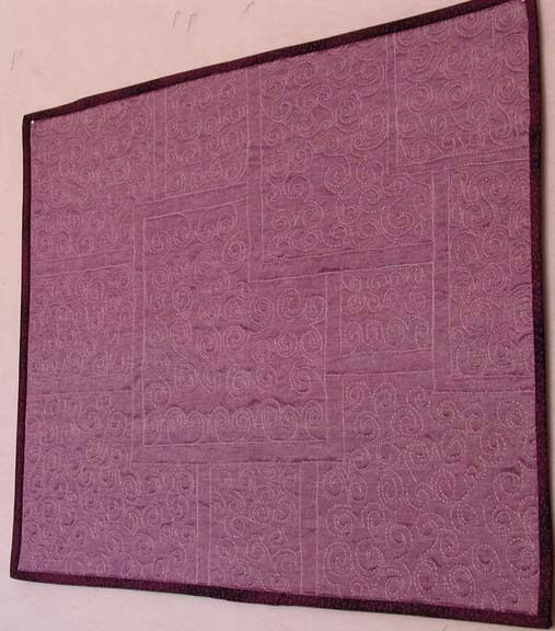
So I told myself I had to complete a couple of table runners for a pattern I am working on before I let myself get involved in the July Free Motion challenge. In one respect that was a good decision, because I got to see what other folks were doing, and it gave me some ideas. I really studied the swirl pattern from Angela Waters, and I think I started to get it, but as I think about it after the fact, there are a few things I would do differently. I noticed a couple of things: my stitch length is way more consistent, and I am getting better at moving back and forth across the quilt sandwich by doing the patterns upside down.
This is progress for me, because normally I read about something, try it out, and then feel satisfied. That’s how I’ve always been, even though I know about muscle memory. This time I made myself stay with the one pattern, and it truly made a difference in completing the piece. Much more comfortable with the pattern, with the hum-purr (thanks, Cindy!) of the machine, and my stitch length.
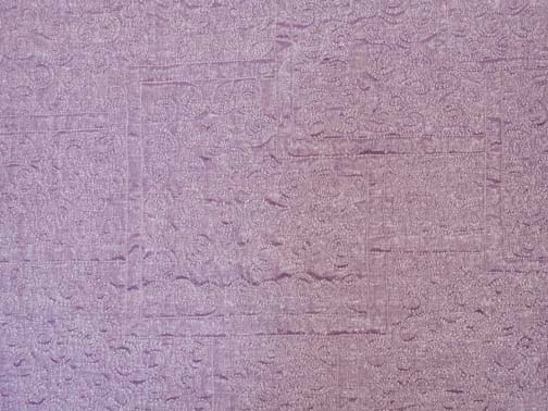
That said, I used a cotton lame on the top, a cotton on the back, Bottom Line in the bobbin, and an Art Studio light purple from Superior Threads for the top. My batting was some left-over Quilter’s Dream, low loft. I found the absolutely perfect binding in my stash. This will be a great table topper for some of my plants.
It looks so much better in person! The colors are truer – and it’s really shiny!
Thursday Thoughts – The Rise of Incivility
It has been an interesting 24 hours in terms of comments I have received. Now, I am still, at 64, a pretty naive person. I believe in the good in everyone until I am proven wrong. In the past I’ve only had one situation where I was backstabbed in a job. Most times I can ignore unpleasant people, and I can work with just about anyone. Part of this ability, I am convinced, is the result of an alcoholic parent. I’m an adult child of an alcoholic, and as such I have always been concerned with keeping people happy.
Over the years I have come to see that this has been an asset for me in working with teachers. I listen to what people want and then try to make it happen, while always taking their needs into account. That said, I know that incivility is rapidly o the rise in this country, and I have been slowly eliminating blogs and such where the message is one of hate or discrimination or just plain nastiness. I was doing pretty well…
…until yesterday. Wow, I was confronted with two situations that really troubled me, as this is becoming the norm in dealing with people. Situation 1: I had sold a small art quilt in a specialty auction on Tophatter. I debated putting this piece up on line, as I really liked it, but I am trying to bring in some additional money. I put this piece up, description was accurate, price was good ($30 plus $5 in postage). I know a number of people would say price was way too low, but hey, my decision and I needed some money. And…the piece sold. I was thrilled and it went in the mail to its new owner.
Yesterday I went online to schedule some new items for auctions on Tophatter to find that I couldn’t schedule anything until I took care of negative feedback. Huh? We’ve sold on Ebay for 8 years and have 100% feedback. The closest we came to negative feedback was a neutral, and as it was, we refunded the money without even asking. Here’s what I read:
“What a waste of money! Don’t buy from this seller unless you want to just waste your hard earned money. I’ll make something 100X nicer. All he sent was a 9′ by 12″ piece of lousy fabric, hand sewn with metallic thread in a few spots, and had the gall to charge $35.00 for it. We, quilting night at my house, just laughed, and burned it. Must be VERY lazy. I will NEVER buy a thing from him again. What a RIP OFF! You should be ASHAMED to call yourself a quilter…what a joke.”
That “lousy fabric” was a piece of hand-marbled denim, which no one does that I’ve been able to see. This was a small art quilt, and it was billed as such. They burned it!
This was just vicious. Never emailed and said they didn’t like it. We would have refunded the money. We have an “on the wall” policy for folks who buy our art quilts. Put it on the wall for a week to be sure you like it. If you don’t, it comes back to us for a refund.
I have asked for resolution from Tophatter to get this feedback reversed. I had to respond to the person, and I did, nice and sweet…well, at least rational and no name calling. Over the years I have become less PMS-y when it comes to dealing with most people, except for politicians. If I call, they get the full brunt of my sarcasm. But I would NEVER even consider responding to someone this way.
So I pulled an item from an auction for today, same auction that the person bought from last week, as I just don’t need to deal with this.
So as I was slowly getting over this yesterday, I get an email with a returned newsletter that had just gone out. We use MailChimp, and every newsletter has a place to unsubscribe, and you are only getting a newsletter because you opted in for one. Here’s the email with this one:
“I am so disgusted with your narrow, small-minded attitude about GUN CONTROL that I never want anything to do with you or your products. Take me off your email list. NOW. “
Okay……..You can certainly boycott me; I don’t have a problem with that. But I wasn’t aware I had this attitude. I have been very careful to keep my political posts as balanced as possible in this climate. The posts I do tweet or share are as reasoned as I can find. Such was the case with the gun post over the weekend. I can only assume that was what she was referring to. Other than that, I’ve never said a thing about gun control. Now, I am not a fan of Jason Alexander of Seinfield fame, but I thought his post over the weekend was well done and had good points. That’s what I shared.
A couple of months ago I posted in another Thursday Thoughts that I would really try to look for balance in politics. I am reading some hateful things in blogs in an attempt to understand what people are thinking. I’ve had to stop a number of those blogs, because they are just ugly. This also applies to both sides of the political fence. I found an article from Addicting Info that would have been so much better had the sarcasm been eliminated.
The headline is antagonistic, and it doesn’t need to be. A better, less inflammatory headline might be “20 Lies That Will Shock You.” You’ll probably get more people reading the article. Here’s a paragraph from the article, as is:
9) You don’t have a “right” to anything that other people have to pay to provide for you. Then you do not have the right to police protection, a fire department or even a 911 emergency line. You do not have the right to clean air or safe food. You do not have the right to a military to protect you from foreign invasion. You do not have the right to a single thing that is government-run. Oh? What’s that? You pay taxes so you deserve all of those things?
Exactly, you stupid bastard. If everyone else was not chipping in, i.e. “paying to provide for you,” you would not be able to afford all that nifty stuff. It’s called “socialism” and only very stupid people think they are completely self-sufficient.
Pretty inflammatory. I would rewrite this:
9) You don’t have a “right” to anything that other people have to pay to provide for you. That includes police protection, a fire department or even a 911 emergency line, clean air or safe food, a military to protect you from foreign invasion, or any single thing that is government-run. If everyone else was not chipping in, i.e. “paying to provide for you,” you would not be able to afford all that.
Probably would not sell as many articles, but a lot more civil.
So I will continue my own campaign, despite nasty, vicious people and all. I have to believe that the actions of one can make a difference. Thoughts? And be civil about it, or I will delete you…..
Not Again…..
Jane Goodwin, Mamacita of The Scheiss Weekly, says it best:
Read the full article here.
May our thoughts be with the families in Aurora, Colorado….and perhaps we might still learn something……
Top Ten Tuesday – New Art Blogs
 It’s been a while since I’ve written about some of my daily go-to blogs. I’ve discovered a lot of new ones over the last year, both art-related and not, so here’s an update of blogs you don’t want to miss.
365 Project – aside from the fact that there are amazing photographs each week, the site has you start your own daily photo journal.
Elizabeth Barton writes a blog with tips, inspirations, art work, and wonderful pondering thoughts on your own art. If I could choose a mentor for a few months, it would be Elizabeth.
The Art Biz Blog is essential. Alyson Stanfield gives you spectacular advice for managing and promoting your art business. Start reading her if you aren’t already.
I love Larkin Van Horn. Not only does she create amazing work, but she likes using our fabrics! I had a chance to reconnect with her this past March at StashFest for the La Conner Quilt and Textile Museum.
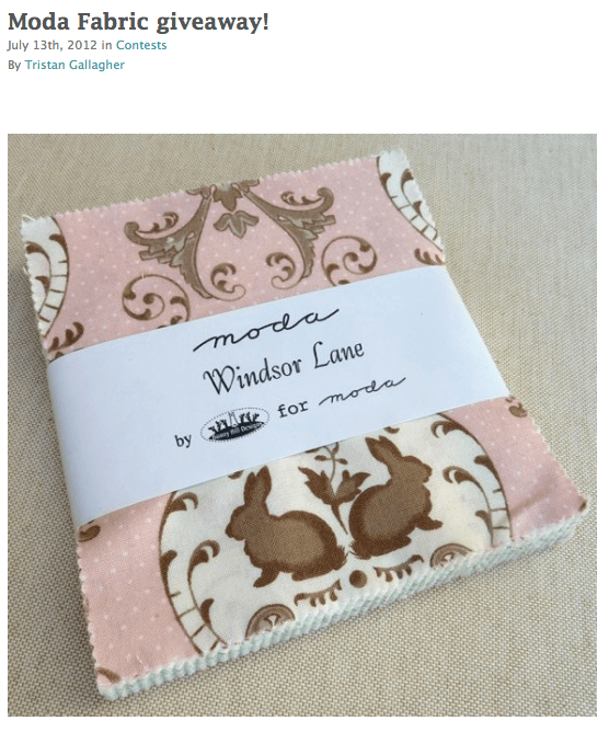
I follow the C&T Publishing blog for two reasons: I like to see what’s new….and they do giveaways, and one time I actually won! If you’re in the business, you need to keep up with trends,
Dale Anne Potter got me started last year on positivity and the Law of Attraction. She is a great artist, and she has been helping others achieve their dreams.
Vicki Welsh does some of the most amazing hand-dyes, with color gradations to dye for (pun intended)!
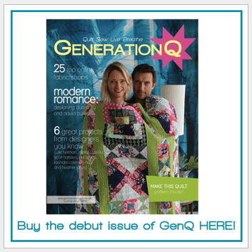
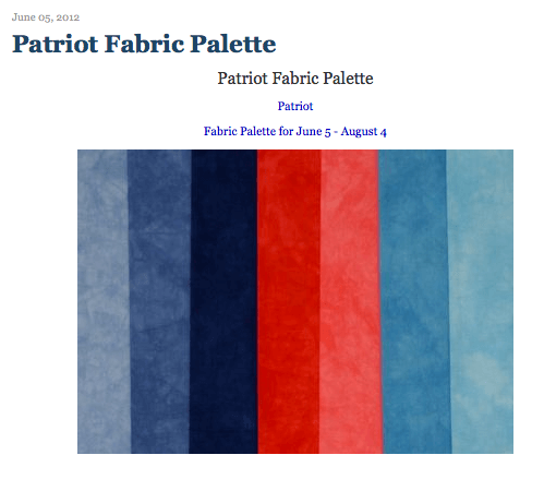 Generation Q Magazine just made it into print, after a year of online articles and features. Lots of potentially great stuff here!
Insights from SewCalGal is my go-to site this year for machine quilting. My skills have improved tremendously, I did a tutorial for Darlene, and there are great giveaways – fantastic site!!
And last, but certainly not least, the Textile and Fiber Art List, a group of over 300 artists from 30 countries. Amazing eye candy! Take a trip through blogs and Etsy stores for artists in everything “textile and fiber” you can imagine! A wealth of awesome information.
Monday Marketing
 Still a pretty fallow week in terms of getting things done. I am slowly plodding through some projects to eventually go up in the Etsy store, but i’m not really thrilled with any of them. they’re good, but not wowzers, to my thinking.
Anyway, in terms of marketing, we were asked again to participate in StashFest up at the La Conner Quilt Museum next March. Last year we said yes because we wanted to go on a trip to an area we’d never been before. This year we knew we had to make a very pointed look at the expenses to make the trip. So if you’re thinking about doing a show and never have, here’s the process we went through.
One, we knew from our record of expenses last year (we wrote down EVERYTHING in a notebook for the whole trip, complete with every receipt) that Seattle and back to Tucson would be $3000. That’s accounting for the five nights free on the road, between friends and freebie points toward rooms. That’s gas, rooms, food, admissions, some gift/art buying. Not a whole lot of extravaganza, but the whole trip back through the Oregon Coast was part of the enjoyment of the trip.
Two, we had a new percentage cut to work with this year. We would get 65% of what we sold. If we sold $6000, we would get $3900. that would cover the expenses of the trip, but it wouldn’t cover what we would need to lay out for expenses to make the fabric. We looked at what we would need to have in inventory to take $6000 worth of product up to La Conner. Once we had this inventory, we cost out supplies, which came to about $3000. Marbled fabric has a very low profit margin….and this would mean every spare piece of change would go to supplies, with no additional trips between now and March.
Three. we based our new inventory on what we learned last year. New, deeper colors, especially grays. Lots of specialty fabrics, as they were a last-minute addition to our inventory, and we sold out in lass than an hour. Pattern kits using marbled fabric. Ribbon and silk flowers. Based on our experience last year, we had a good idea of price point. Our basic cotton fat quarters need to sell for $8. We could have sold a lot more last year if price and color choices had been different.
Four, up-front expenses would be everything, and about two weeks after the show before we would receive our monies. That’s $6000, up front.
Five, hubby is facing some surgeries this fall, one of which is very up in the air. We didn’t want to commit and then have to back out of the event.
As much as we want to do the show, all of this added up to our saying we couldn’t participate. We were bummed, as we had a great time last March. So we emailed our regrets…..
…and got an email right back inviting us to send up fabric that a volunteer would sell for us. As much or as little fabric as we wanted. The organizers knew with the new percentages that it probably wouldn’t work for us, but they wanted our fabric anyway.
Absolutely! This is something we can definitely do. Now there are a number of things to consider:
1. Shipping costs to and from, approximate amount of inventory
2. What gets sent to support the fabric – a few less quilts, more business cards and care codes, specific instructions, a revised portfolio.
3. Time line for creating, and deadline to have everything completed (March 1, ship March 15….)
I’ll keep you posted.
Sunday Stories – Misfiring Synapses
I’ve had a couple of people come by and see my “Misfiring Synapses,” a piece I did on depression. It’s getting mixed reactions. Some people don’t get it because it’s fiber and doesn’t look like their mental picture of fiber – which is a typical quilt. Some don’t get the imagery in the abstraction, and that’s okay. But most people who do get it love it – they say it’s exactly what they figure their mind is going through. Which is what I was aiming for in its creation. I think if you’ve suffered from some form of depression, especially situational, you get the idea that something is ultimately not right in your brain.
When the call for this show came up, I spent a lot of time trying to think 1) how I would interpret it, and 2) how I would do it in marbled fabric. We had done some black satin a while back for a different piece, and it was pretty organic in form. As I was going through fabric, I happened on the piece and thought it looked quite a bit like a nerve ending. Very dendritic. So I went with that piece, and I wish I’d taken a picture of the satin without anything done to it.
I wanted the effect of an irritation, like an itch that just wouldn’t go away. As I was checking through my threads, I saw a Rainbow thread from Superior that was a red/purple/black, and I thought it might work. When you look at the above photo, you can see that the red shows, and then it looks like there isn’t other thread. It looks like an irritated part of a nerve. Just what I wanted.
So I had the center of the piece, but I wasn’t sure how to develop the “looking inside” aspect – I wanted it to feel like you were looking deep into the brain and seeing just this one little piece of irritant. I had two different types of red fabrics, both satins, and both with some freeform designs, again very organic.
I did a lot of the same type of quilting, following the black, this time with a variegated series of reds. Lots of bubbling texture resulted. I did the same thing with the second piece of red. What I seemed to have were two different areas of the brain, both pretty irritated.
I also had some more great black satin, this time in more formal marbled patterns, and I figured this would work really well for the outer shell of the brain, all the “gray matter.” I continued with the curved pieces that overlapped each other, much like I would imagine the parts of the brain does. Each of the curved pieces had serged edges with the idea of the gray matter and all the wrinkles you see in the surface of the brain. There were a lot of issues in connected these pieces. I had to work from the design wall to the flat table, and then to the sewing machine, hoping I could get all the pieces of the puzzle together. My intriguing back of the piece started to look really messy, so before it travels at all, I will add another backing to it, to make it a lot neater.
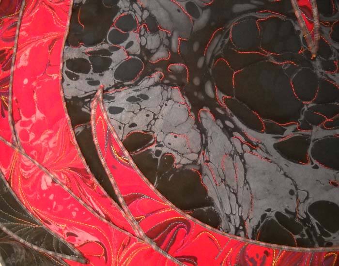 You can see a lot of the overlaps and edging in the above picture. What I particularly love about the piece is that it works both from a distance and close up. From a distance you see this really interesting organic shape, and the colors are somewhat disconcerting and upsetting. Close up it looks like it is undulating.
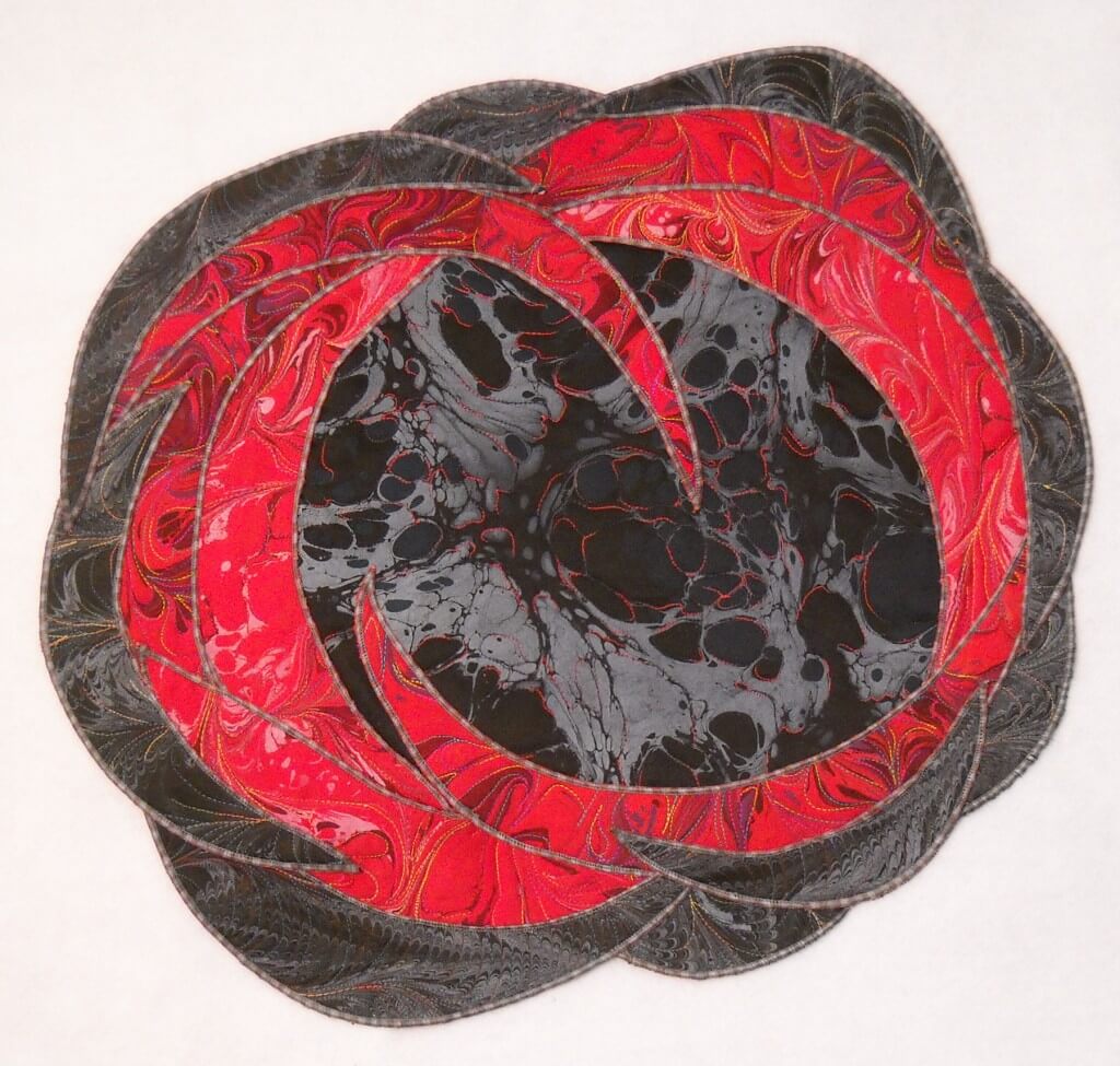 I left it nice and big for you so you could examine all the various parts of this.
17 by 20 inches, available for sale.
Comments?
Works in Progress…..
 …yeah, I know, I’m still behind….but I have been working.
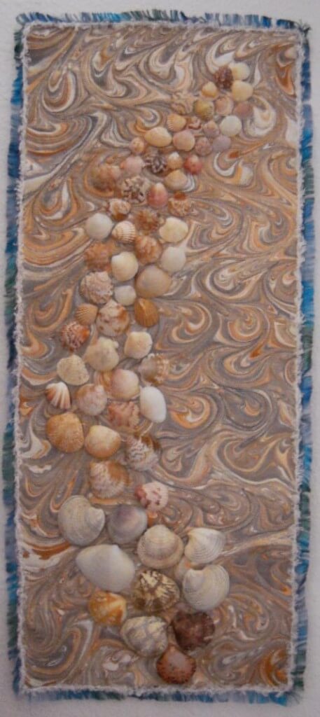
There are a bunch of things going on, one of which is finished and waiting to go up in Etsy, and the other two in various stages of completion. The completed piece started in a traditional clam shell pattern that I put aside in my stash. Since most of the small quilts i have done as practice pieces have all sold in Etsy, I figured to do a few more. This is a great piece of fabric, and it reminded me of the few times I went clamming on the Eastern Shore of Virginia and the Outer Banks, especially the bay side. So I just let the design guide my free motion quilting.
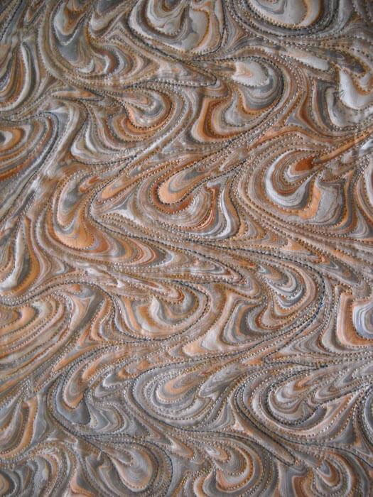 Quilting pieces like this is so zen-like, and I love the effects.
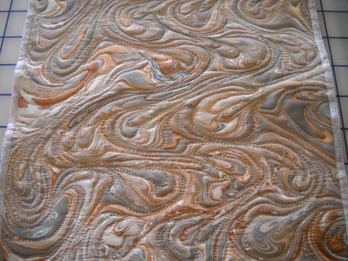 I serged the edges in a fine stitch, just shy of being a rolled edge. I knew I was going to add some yarn to the outer edge to simulate the foam of waves receding. But the piece also needed some focal points. I was looking around to perhaps buy some small clam shells and not having any luck (had no idea that there are so many packaging types labeled “clam shell”). It finally occurred to me to go to my second mom, who is a fanatic when it comes to shells…..she has LOADS of clam shells, so I had my pick, and then hubby added clear nail polish to bring out the subtle colors.
Problem was I still felt I needed some blues for accent, so I spent about an hour sewing on a variety of blue seed beads…..and it looked terrible. I pulled them off, only to realize I shouldn’t have any problem with beads coming off other pieces I do…they were secure. Went to get the white yarn and saw some cool blue yarn I have used in the past to simulate water. So…….got the fabric glue and went to town on the edges. I like the final result – don’t love it, but I do like it, and since it’s really a practice piece, I know someone else will like it too. Here goes:
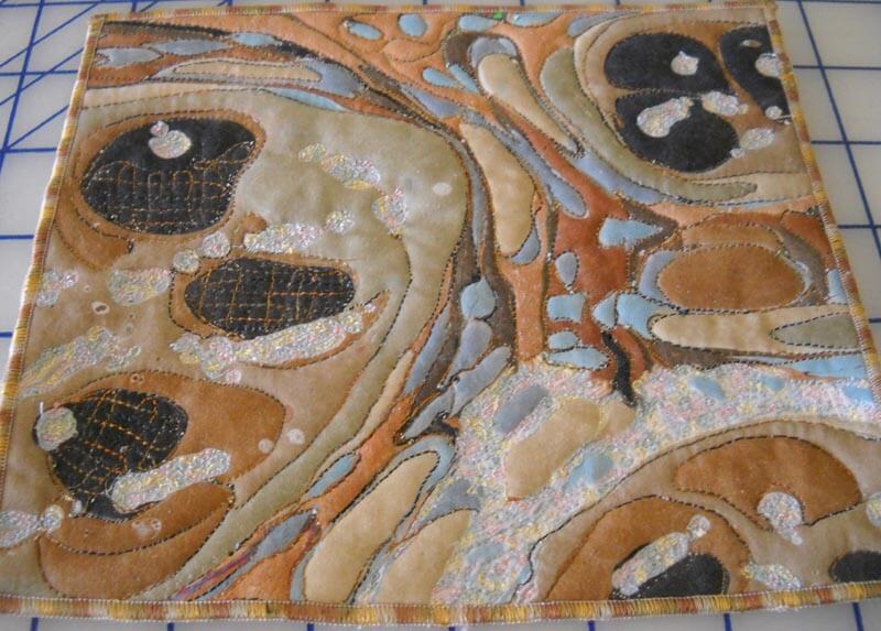
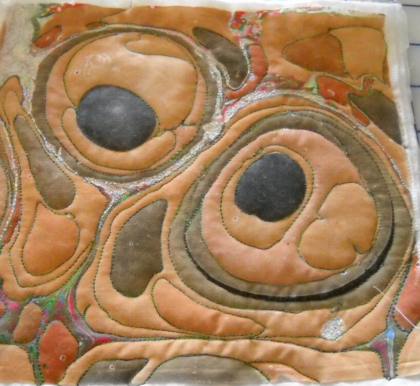
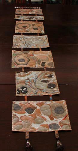
Next up are some small squares and rectangles from about 10 years ago, as I wanted to do something with geodes. I pulled these out again to see about small Etsy pieces. I laid them out and realized I had kind of a cool wall hanging developing.
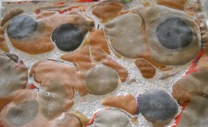
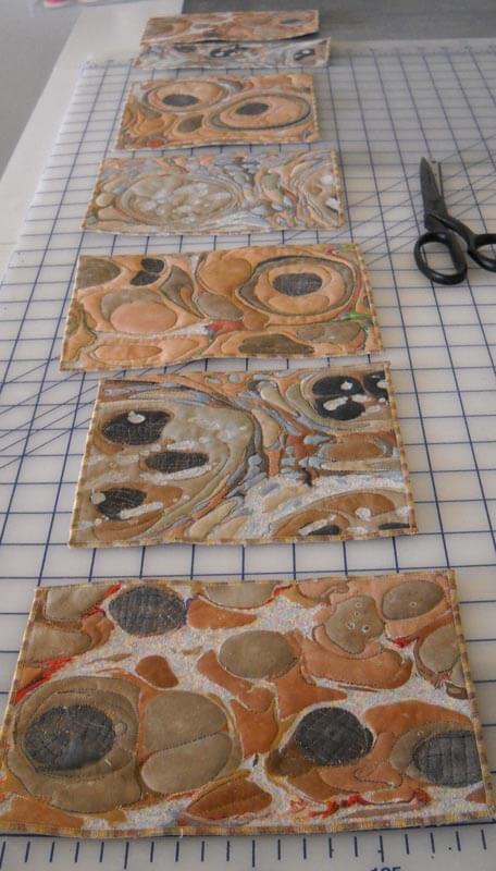 The quilting is completed on all seven, and the serged edging just kind of fades into the background, just like I like it. This is the basic stone pattern in marbling. What I discovered with them this time is I used a “micro” stippling for the white spaces, and all of a sudden I had a great sand effect.
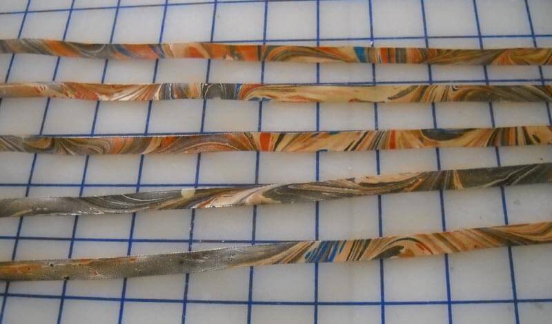
I was thinking originally to connect the pieces with beads, but then I found some beige Offray ribbon that we marbled. Gorgeous!! What I don’t use will go up in Etsy or Tophatter.
And then I decided to look through the beads and stones to find something for the very bottom. Lava and some tree agate…..
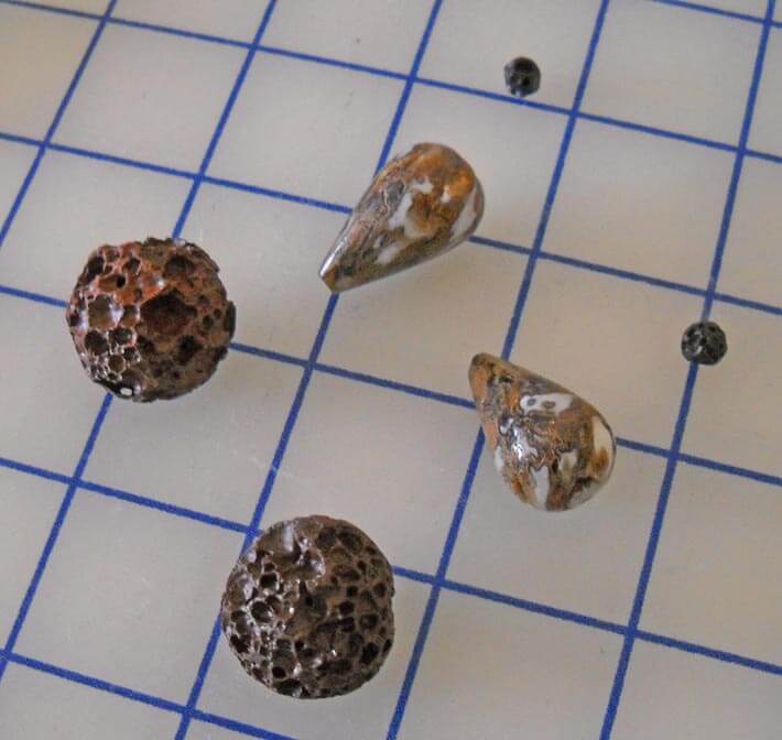 Hopefully by next week I will have a finished piece.
And then…as I am trying to work on some patterns, I started free motion quilting another piece of stash fabric. I used some Superior blue silk, with Bottom Line in the bobbin. I like the effect of not too large thread just outlining the design.
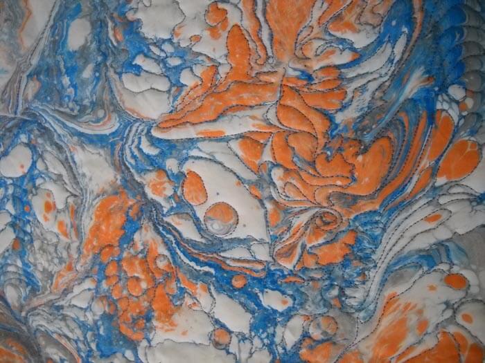 I have decided to go with an orange Rainbow for some of the piece.
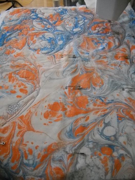 Again, hopefully, a finished piece for next week, along with a completed pattern. Lots to do!
Top Ten Tuesday
![]() I missed last week, and it is taking me a long while to get through everything!!
I missed last week, and it is taking me a long while to get through everything!!
Dominos and Vincent Van Gogh – very clever!
A new marketing blog I discovered last week – some very interesting ideas that I need to reflect on, as I am in a very dry, inactive period right now.
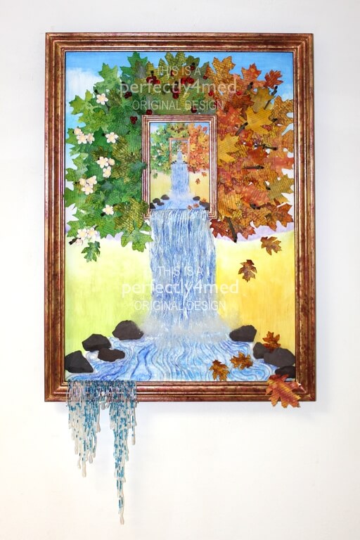
 Perfectly4med is an interesting blog of work – either zentangle patterns or work completed for a certificate. This is a detailed look at how this piece went together – very interesting.
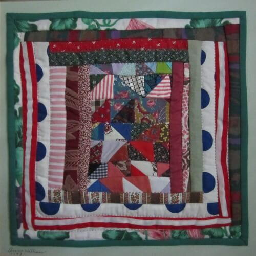
My introduction to Gee’s Bend quilts happened when I went to the International Quilt Market and the quilts were at the Houston Museum of Fine Art. It was quite the experience. Here’s an article about one of the women.
I’m interested in Helen Keller – always have been, and especially more so since the Zinn Education group has been showing us materials about Helen that are left out of the history books – kind of sanitizing this amazing woman, so we don’t know she was a socialist and women’s reformer. So here’s an interesting letter from Letters of Note to Mark twain.
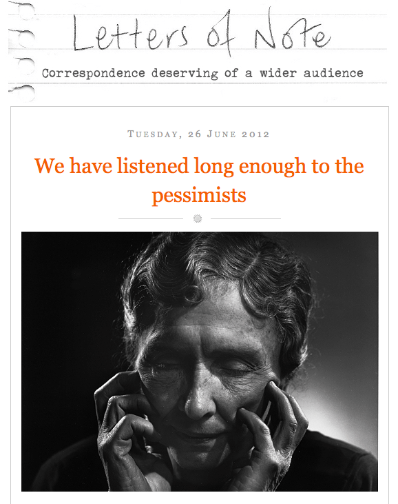 Also from Letters of Note – a look into the development of Star Trek, from the point of view of Gene Roddenberry and….Isaac Asimov. Very interesting.\
 From The Best Article Every Day comes two clever take-offs on Sunday in the Park with George. Here’s just a peek…..
From Brain Pickings comes a very clever series of graphics illustrating some pretty obscure words. If you enjoy words, you’ll love this!
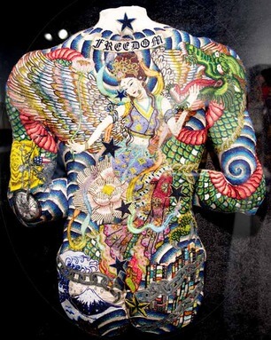
From Cool Hunting comes some very interesting art: Taboos, Tatoos, and Native American Beadwork from Eri Imamura. “… marries disparate elements of mythology, Native American beadwork and tattoo culture to create life-sized textile sculptures. Collectively, they deal with man’s delicate relationship with nature, his propensity for materialism and Japan’s collective suffering following the 2011 earthquake.”
And, finally, from TED: How a Lonely Girl Earned 1.6 million friends:
Have a good week – let me know what you find on the web!















![redshift8_thumb[2]](https://www.marbledmusings.com/wp-content/uploads/2012/07/redshift8_thumb2.jpg)


