Quilting Like Crazy
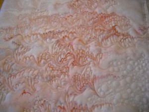
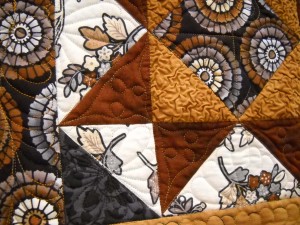
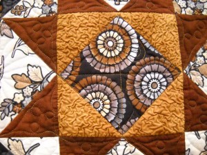
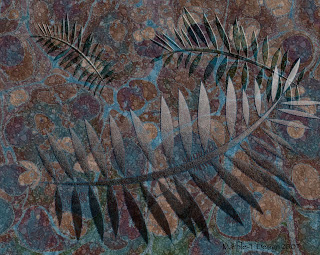
There is a show I enter each year, and I have been juried in four out of four times I have entered. This year I didn’t have anything in mind, until I took out a piece of fabric and tried some thread changes. Well, all of a sudden the sunrise piece became Salmon Sunrise, as the quilting started to look like scales.
I stopped with the quilting until I went to the School of Threadology. I got help not only with threads, but in how I do my free motion quilting. All of a sudden I was able to do all the tight quilting, and on Saturday, I spent time – about four hours, on the piece.
I wasn’t sure at one point last week that I would be able to get the piece done in time for photos and email for entry. But four hours on Saturday and three hours on Sunday convinced me I just might make the deadline.
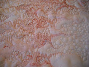
I am really pleased with the quilting. The only concern is too much? I have over half of it quilted, and I love the bubbles. I have some decisions to make on the top half, and I think I will decrease the amount of quilting with the darker threads, as there is quite a bit of light design at the top. Maybe just a few rows, but I want the “sunrise” effect to really show through. The bubbles have worked out well.
As I look at the finished portions, there is an extra layer of texture that is visible when the light is right. I am going to have to rein my quilting in, as not every line has to have thread. Ths can be fish jumping from the water. I need to keep the top third less “heavy” than the bottom, watery fishy part.
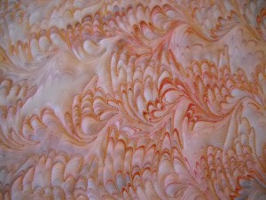
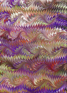
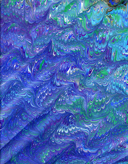
This has been so relaxing. It has been a very long time since I have done this kind of art quilting. In fact, it took about 5 years for this piece to speak to me again. Initially it was just a sunrise, with a few wavy lines, but I didn’t like the way it hung on the wall – too much emptiness. I had a suggestion to change the border frame from a maroon to blue, and use some light blue thread on the piece. Once I started there, it just took off. The bubbles are not an original thought – I saw something similar done on quilts when I was in Utah, and that got me thinking about bubbles. It helps to break up the amount of quilting done on the marbled pattern.
All in all, an extremely productive three days of quilting – even though it took five years to get to this point.
Thread Painting
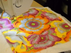
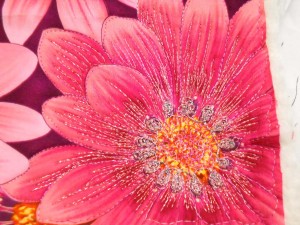
One of the activities I had a chance to do was thread painting. I’ve wanted to do this for a while but really had no idea how to start. As part of our Open Thread Bar at the School of Threadology, we were encouraged to try any threads we wanted. We had some fabric sandwiches prepared, as well as some large-prints that would be perfect to embellish with thread. I took more pictures of others’ work than of my own. I will definitely try this again, as I have a couple of Southwestern pieces that would be perfect with thread to made it more textured like pottery. Enjoy…
Another activity was working with Texture Magic, which ends up “crumpling” fabric with steam for a really interesting texture. I made a small purse, definitely not me, but I certainly have a few ideas for some pieces of marbled fabric. Take a look at the puffy feel to the fabric. Our instructor, Annie, is quite the creative person with her patterns, especially the purses. I can see a few of them in my future!
5 Things I’ve Learned About Thread Play
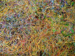
One of the things we got to do at our conference was look at samples of thread work, particularly creating “fabric” from just threads of all kinds. Heather, fondly known as Mother Superior, had two spectacular vests created just from threads. Cindy taught us how to use Dissolve to make a sandwich of threads and then stitch over them and run water over the Dissolve, which would do just that. She made it look so easy.
Well, mine wasn’t nearly as gorgeous as this top piece – part of one of Heather’s vests. Mine is about three inches square, with loose threads all over, and barely staying together. But I did learn a great deal:
1. Don’t do your first piece with nothing but shiny threads. Those shiny threads are incredibly slippery and ease out all over the place.
2. Don’t try to be so structured when you stitch on top of the Dissolve to hold everything together. I tend to be so linear sometimes, that when I was done, the grid holding everything together was way too noticeable.
3. Refer to your references when choosing your thread, bobbin, and tension. My lessons were not lost on me when I pulled out my reference sheet from Cindy’s class to check what to use in my bobbin (Bottom Line) with Glitter in the top, and to be sure to set my bobbin tension at a one to start.
4. Check the needle size. I can remember the very first time I worked with some metallics (not Superior’s) – I had no idea a) the thread had to come off the spool a certain way, and b) I had to use a larger needle. I do now, and it was flawless.
5. I need to let my inner artist loose. Try something with lots of different threads on top of the Dissolve – like trying some bobbin work – which I’ve only done twice, and I do plan on doing lots more.
Welcome to My New Home!!
Thanks for joining me here, as I move everything over from Blogspot and Blogger. I have learned that I don’t own my content on Blogger, and I want to protect my work and images, so now I have my own new home, thanks to Suzan at Saltwater Systems and WordPress. Please follow along on these adventures. I have LOADS of art-related posts coming as a result of a busy March and April.
Suzan and I decided in November to treat ourselves to the School of Threadology, hosted by Superior Threads. We spent the next few months in anticipation, never realizing what an absolutely AMAZING time we would have. These three days in April are the BEST education I have had in my art career, and by far the best educational conference I’ve attended (and there have been many!).
There were so many wonderful moments, and I will just do a lot of blog posts with wonderful art quilts, and lots of Japanese philosophy (kaizen – continuous improvement) which permeates everything Bob and Heather Purcell do at Superior Threads.
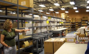
I’ll start with the first morning, and a tour of the warehouse, where we had our own labeled boxes for easy shopping (better than a candy store!).
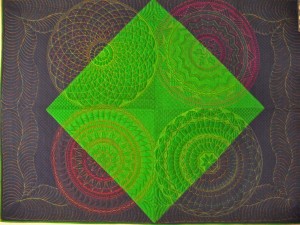
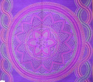
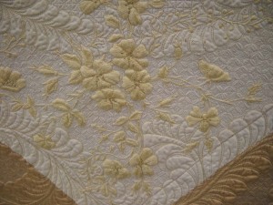
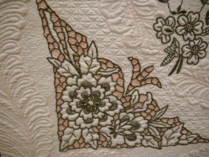
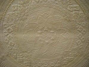
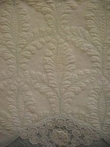
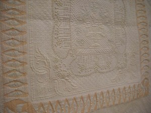
Cindy Needham was our first instructor, and does she do amazingly beautiful work. She quilts on silk (yummy), as well as on antique linens. I’ll let her work speak for itself. Be sure to click on the pic and see some of her incredible detailed quilting.
This doesn’t even begin to scratch the beauty we were exposed to. Many, many more quilts and closeups of thread work to come. Truly an amazing experience!
Mt. Lemon Part 2
I do miss snow. I’ve been a desert rat for 16 years now, and I miss the snowfalls, where you could just watch the silent snow falling to the ground, covering everything with such a pure white blanket. ‘Course, I like it even better when I don’t have to drive in it.
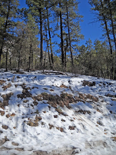
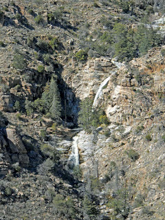
We had our share of snow on the mountain this winter, even down to the 3000 foot level. We would wake up and look out at the mountain, to see a snow line across the face of the mountains, almost as though drawn by a ruler. Quite spectacular. But Sunday was up close and personal! I threw a few snowballs, laughed at the bikers in their shorts, sitting among the snow drifts, and ooh-ed at all the waterfalls created by the snow melt. Rocks glistened everywhere, and there were unexpected sounds of water running all over the mountain.
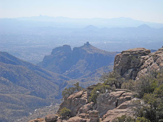
There are quite a ew spectacular views as you head from the valley floor up to the top of Mt. Lemon. At one point you can look back to Tucson in the distance, with Thimble Rock almost in front of you. This is the “back side” of Thimble Rock, and you can see the “front” side when you take the tram into Sabino Canyon, almost on the desert floor. Sabino Creek will have water running for the next few weeks, which will make for a wonderful spring.
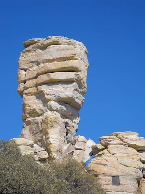
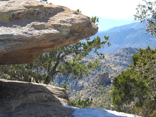
The stone formations, while not as spectacular as Zion or Bryce, nevertheless are quite striking in their own right. You can see how the wind and water have etched wonderful monuments, that from some angles look as though they were going to topple at any moment. I love the hint of blue sky showing in the lower crevice.
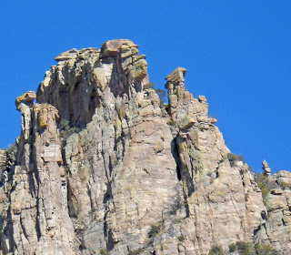
Everywhere you look at amazing rocks, which is one reason why Mt. Lemon is a mecca for rock climbers.
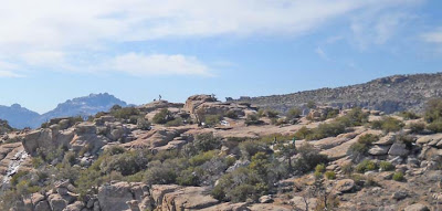
And sometimes you just climb the mountain to be alone. If you enlarge this next photo, look for the man and his dog out all alone on the rocks.
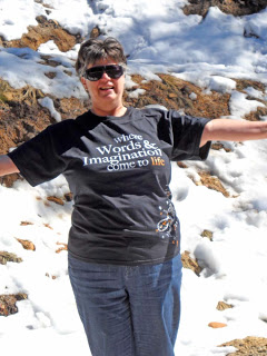
And finally, the pure joy of snow! Somehow the t-shirt from the Festival of Books seems appropriate!
Up into the Snow
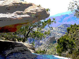
Mt. Lemon is an 8,000-foot high Sky Island right in the middle of the desert here in Tucson. It’s a 45-minute drive to the top, where there has been a LOT of snow – for Tucson, that is! There is a pull-off called the Seven Cataracts, which in 16 yeas of living here has never been running with water. Until this weekend – 70 degrees at the bottom, snow at the top and 60 degrees, and all seven waterfalls flowing. It was really beautiful, and unfortunately the camera setting was blurry and I couldn’t get all seven falls. But it was great just standing there for almost 20 minutes, watching the flowing water, and enjoying the lovely weather. There were hints of snow left on the ground, and we decided to go a little further up the mountain. Bike riders in their bike shorts, surrounded by snow. Shirt-sleeved children throwing snowballs. A great time! I did a bit of hiking to one of the look-outs and found an interesting camera angle. The colors were even brighter than the picture, with a marvelous blue sky.
I tried a posterize filter on the pic and like the results. Seems to have a little more depth. I’ll post more as the week progresses. Life is incredibly hectic at school right now, with grades due on Friday. There’s not much time for art to feed the soul, and I am really missing it.
Art and Math
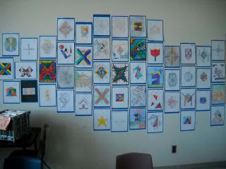
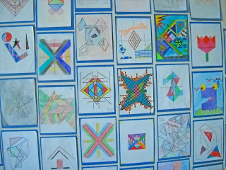
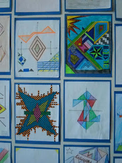
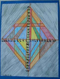
I have a much nicer back wall in my classroom now, since I had a few minutes to finish mounting the art work and stapling it to the wall. This was an art project to use straight lines to create a design, as well as give the linear equation for that line. Not everyone turned the assignment in – should have had 80 drawings, and ended up with 51. Some are carelessly done, and some are really quite good – would make good quilt designs. Aside from writing the equations, the only other requirement was the addition of color to accent and balance the design.
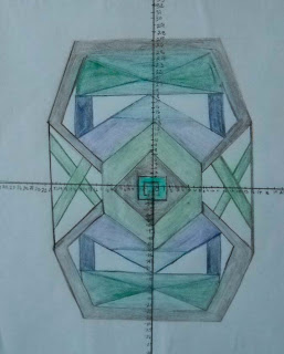
I will do this assignment again but earlier in the unit next year, when they are first learning to write linear equations. Now I have some examples of student work, so I can show good designs and poor designs and how they are graded through the rubric.
I love discovering kids with hidden talent!
Marbling on Paper
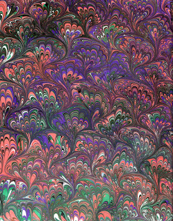
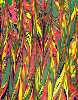
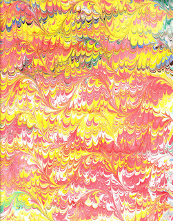
Readers of this blog already know this is my favorite piece of marbled paper. We made it in our marbling class last spring – a tough pattern we can’t always replicate. I have been marbling more paper, and I do enjoy it. There is less prep work than with fabric, but the pretreating is a tad trickier.
We started out marbling on fabric, with no real interest in marbling paper. But we decided to try it once. It was a disaster. We pretreated the paper by soaking the whole sheet of paper. Big mistake…..the paper just basically decomposed. We have since learned to just sponge the alum on the paper, not soak it. Duh – you would’ve thought that was obvious.
But when we started marbling, there were not a lot of books (and certainly none of the YouTube videos) available, and much information was kept pretty close to the chest. Nowadays the sharing is much freer. So I have some things to work on, but I like the 9 by 12 size, the ease of the paints, and usually the finished product. When I improve my pretreating with alum, the pattern won’t wash off the paper.
This work is still fairly traditional, and I am a LONG way from doing work like the Turkish masters and their flowers. But it’s still lots of fun and very satisfying. The patterns and color combinations are just endless. Enjoy – and comments welcome! But don’t even think about “borrowing” the images….
Art Show Pics
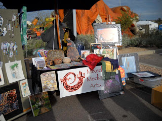
We survived the art show yesterday, and we had today off because of a bad winter storm moving through the area. Snow in the mountains to complement my sunburn. We started set-up really early – cold! Supposed to be 70 during the day, but the desert is cold at 45….we kept waiting for the sun to come up!
Getting Ready for a Show
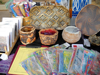
This is so different from the one other show we did, way back about 14 years ago. We didn’t have a clue – just put out art pieces and wondered why no one bought anything. Much more thought went into next weekend: types of items (lots of little, impulse buys), some small fabric pieces, stationery, larger fiber pieces, digital art, clay pots, water colors, semi-precious jewelry, and books. Really do have something for everyone. We’ve got change worked out, schedules worked out, displays worked out…I do think we are ready.
Pima Cimmunity College Northwest (7600 North Shannon, Tucson), Saturday and Sunday if you can make it!
And from the email this past week, a few tips on marketing….
• Set aside a specific day and time each week for marketing.
• Create a quiet office space for your business.
• Start collecting names for your mailing list.
• Call five to 10 art world professionals each week.
• Spend one day visiting local galleries.
• Subscribe to an art publication for one year and read it.
• Enter a competition.
• Sponsor a community event.
• Host a studio party.
• Donate time to some charity. Let people know you are an artist.
• Barter your art for services.
• Support your statewide arts organization by buying an art license plate with your art-business name on it.
• Try to get an interview on your local radio station.
• What interior designer could you take to lunch?
• To what local business could you lease your artwork?
• In what cafe could you hang your paintings?
• Give out coupons with a Valentine’s Day e-mail blast.
• What special offer could you make on a postcard to your clients?
• What storyline can you create for the local art writer?
• What previous client would be able to give you a useful referral?
• What sign could you put on your car to advertise your work?
• What bumper sticker could you create to give to your clients?
• Create an e-mail newsletter to send to clients.
• How much would it cost to put up a billboard at the entrance to town?
• Create an unusual, catchy name for your new group of paintings.
• Apply to the next local art fair.
• Start saying, “I am an artist.”
• Provide a specialized service that no other artist provides.
• Get a phone number that spells out something (or figure out what your current one spells).
.
• Be friendly with a competitor.
• Place your artwork in model home displays.
• Work with a local chapter of American Society of Interior Designers—give a talk at one of their meetings.
• Contact your local International Furnishings and Design Association chapter affiliation.
• Place a display of your work at the local library, associated with a talk you will give.
• Find a Realtor’s office that will let you exhibit. Offer agents a commission on sales.
• Create a gift certificate form.
• Check out your local doctor, veterinarian, optometrist, emergency room, hospital, medical facilities office. These venues often do have a budget for “decoration.” If they are not in the position to buy, offer a lease option.
• Smile at everyone today.
This is from artmarketing.com, with their book Art Marketing 101. I need to review this list on a regular basis, as I try to build my business. But at the same time, I have to remind myself that I already have a full-time jub teaching, so I have to be judicious in my time. I’m interested in hearing from you – which ones have you tried that really work?
Playing Around with Photoshop
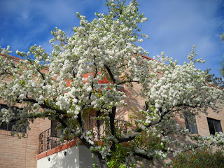
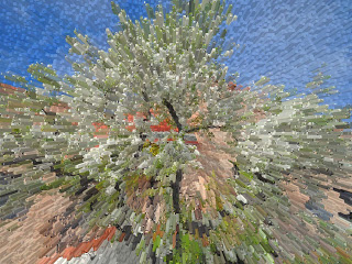
On the way to the chiropractor’s yesterday, there was this beautiful tree in bloom with all these gorgeous white blossoms. No idea what the tree is, but it reminds me of the ornamental pear trees in Maryland, that would always signal spring was finally here. Well, this is the desert – white trees, genista in bloom, and African daisies started in many yards.
One of the joys of the new camera is the ability to snap a pic whenever I want to – like this tree. Since I haven’t done much with Photoshop later, I figured it was time to try out a few filters and see what I liked.
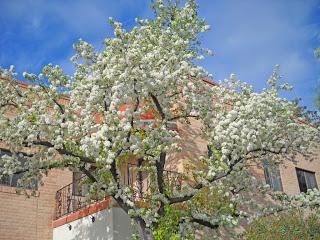
This was the basic shadow adjustment – I like what it does to the bark – lightens it considerably, so it seems truer to what the tree actually looked like.
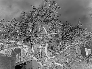
This is an inversion filter. For some reason I am really taken with the inversions and the black/white effects. This makes it look very stormy.
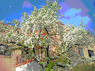
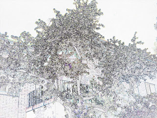
This is the “find edges” filter, and I like the drawing effect of this one. You can see all the line elements in the photo. I’d like to try coloring this one, or using some gradients on it.
Cupids, Cupcakes, and Champagne
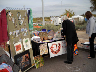
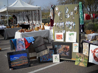
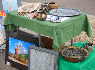
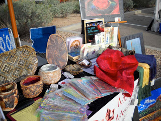
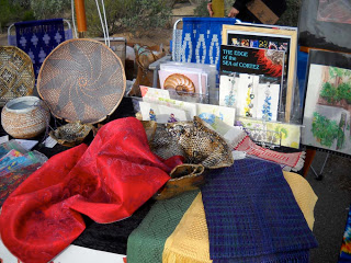
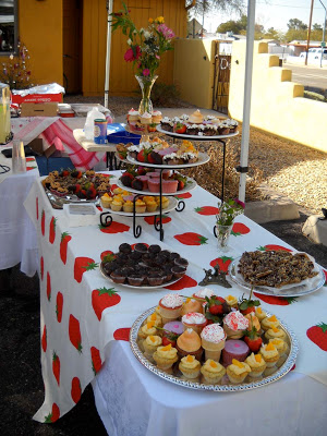
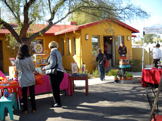
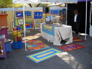
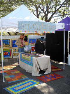
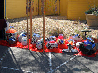
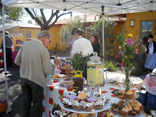
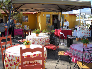
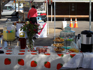
Nice way to start for Valentine’s Day! We were driving around yesterday, trying to find a small art gathering we had gotten an invitation to, called “Cupids, Cupcakes, and Champagne.” They did have quite a spread. This was a group of 13 artists who set up in the parking lot and offices of an interior design firm to sell their wares. It was done very well, and located close enough to the main street to get drive-by traffic. Not a lot of parking, but I think people would go out of their way to park and walk back to the group.
Our small mixed media group has talked about finding venues for our work, as opposed to doing the show circuit. We are doing our first show on March 6th, which will be the first for most of the members of the group. It will be interesting to see how we all do, how each of us does, and overall how the event goes.
So here’s shots of Cupids, Cupcakes, and Champagne.
Ansel Adams Exhibit
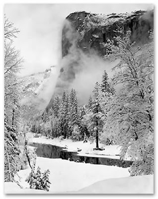
The Tucson Museum of Art is winding down its exhibit of Ansel Adams, and we headed there today. First, let me say I think the Tucson Museum of Art is a really ugly building and gallery, and the lighting of the exhibit was (I think) appalling. It was really hard to see the photos, as all the gallery lighting was reflected off the glass of each photo. I got to see myself reflected in El Capitan and lots of aspen, and it detracted overall from the exhibit.
That said, these photos are absolutely amazing. One thing I was struck with was the commentary with each picture, mostly in Adams’ own words – and he was quite expressive, quite poetic in his description of the scene. The pictures of Yosemite are spectacular, and we have started planning a trip over spring break. Amazing we live so close and haven’t yet been there…yet we live seven hours from the Grand Canyon and let 20 years go by before visiting again.
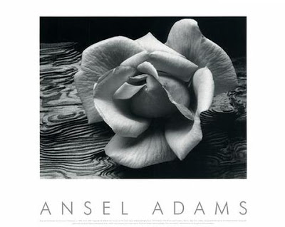
I have some favorites…like this one of the rose with a backdrop of plywood. The texture of the plywood adds to the scene, and who knew plywood could be so expressive. This was an unusual photo, in that Adams rarely contrived the photos; he just let them happen.
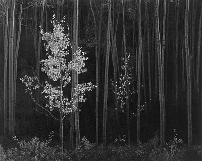
This next was taken with a long exposure, and no wind, otherwise, as Adams says, it wouldn’t have been possible.
There is such glory in black and white photography. And such masterful work in photo developing, which seems like a lost art, thanks to the digital revolution. To think Adams had one chance at a photo…he was a genius at the foreshadowing of a picture to come…wait and it would happen, and he was ready for it.
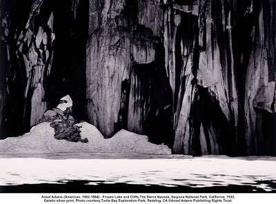
This next is considered one of his “abstract” photos – a frozen lake. If you look really closely, you see the water, the ide, the cliff, and the morain right at the water’s edge. Really beautiful.
Gems from the Bead Show
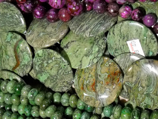
Went to one of the big bead shows also in town with the gem shows and saw lots of great goodies, only one of which I had to have…these stones at the right. Don’t know the name of the stone, but it is gorgeous. Bought one strand – with 60 percent off because of my wholesale license, it was 19 dollars for the eight stones. Somewhere, somehow I will get at least a pendant necklace out of these, and then some lucky piece of fiber art will have the rest included in it. I have learned over the years that when I see stones I fall in love with, I better get them then and there, because it seems I never find them again.
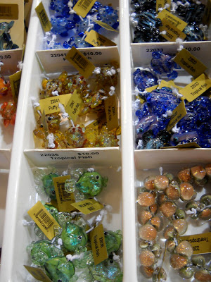
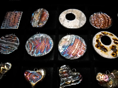
There were lots of other goodies, like these gorgeous glass fish. I was sorely tempted, but I really don’t haave a project in mind for these – they certainly won’t fit the “glacier” piece that hopefully gets finished this year. But I have the card…
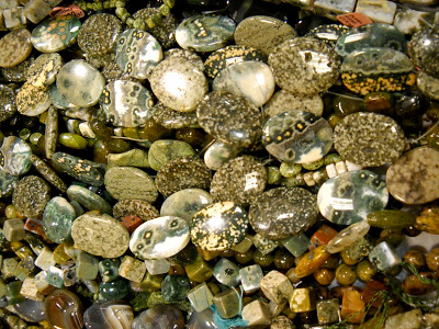
Lots of other stones with great textures:
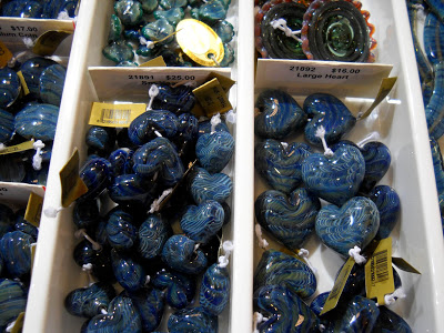
These are glass hearts, and if you look closely you can see various marbling patterns in them Really gorgeous patterns and a great blue color.
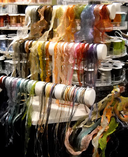
I saw this wire lace “ribbon” a year ago and went specifically looking for some – but out of my price range (I still have the card…). Many widths, would be great in a fiber piece, let alone jewelry….
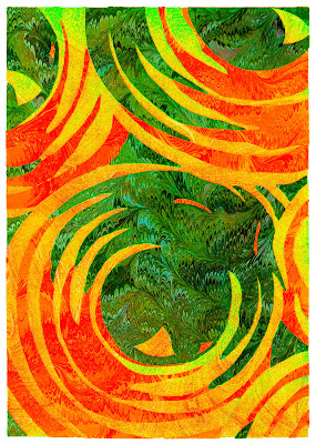
I really love this piece – taken from an Art Deco design, and then marbling added for textures.
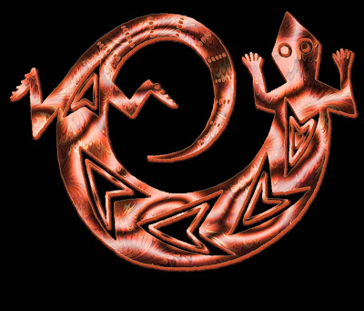
One of my absolute favorites – not only cards, but I am using this for our Mixed Media Arts banner.
This is another favorite, done about three years ago. I did a little more work yesterday with some filters.
Lots of productivity, and even more today!!
Market Research in the Art Buying and Selling Business
I am spending time this week really analyzing what I want to do with this blog and with my art – and the art of those of us in our Mixed Media Arts Tucson group. I am working through BlogMasters Club with David Risley and learning a huge amount of information. Part of me is getting discouraged, but another part of me is extremely excited. For those of you interested in building your art business, let me show you what I’m learning.
There is so much information available on line if you are interested in marketing yourself. Knowing what to look for – and the whole issue of key words – has really confused me. So I am taking this step by step. I went looking on Amazon in the categories of buying art and selling art. No magazines in the buying art, becoming an educated art buyer, but there were a couple if interesting books that could be used as resources to round out my own knowledge. The magazines under “art” tend to be “make it yourself” kind – quilting, scrapbooking, sewing – many of the same magazines I tend to buy. But nothing on how to know what and how to buy art. One magazine, Flaunt – $60.00, 10 issues – is supposedly a trendsetter (their words), but had lousy reviews – magazine was just taking money and not delivering. I keep telling myself not to be discouraged, I really do think this will be a potential market – I will need to tweak things.
The two books I found that look really interesting are “The Art of Buying Art” by Paige West and “The Art of Buying Art” by Alan Bamberger (you can click through to Amazon to purchase). The interiors looked helpful.
From here I went to Google to check out what kinds of forums are available to follow buying and selling art. No question there is traffic here on line, as opposed to strictly magazines. There are about 132,000,000 forums available, I found several within the top fifteen that had potential. They all seem to be focused on artists getting their work out for others to buy. Foundmyself.com is on the honor system for selling, with a first glance of some nice-looking work. I especially like the opening graphic – “artsy” and eye-catching. Emptyeasel.com had a great article on helping buyers find your work. About three years ago my digital partner and I were talking about an online site to sell art. I think this is going to remorph itself into something within the blog. Given the number of forums, I do think there is market potential. But – I want more than just places to list your art. What about the actual selling – and driving buyers to want to purchase the art? Those are the big questions. Off now to start looking at the keywords.
Now to make some art this weekend! Need to marble some paper, follow up on a wholesale order, get a few fiber pieces ready for a show in March, start planning our new blog Mixed Media Arts Tucson. mark papers, finish the geometry quilt, and get some good walking in. Should be in the 60’s!
