A New Business Card….
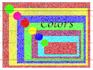
This week’s lesson has as its project making a business card. Now, I love the business cards we already have – a small piece of our fabric, and nice, clean, crisp information. But this lesson has loads of ideas I have been wanting to try for YEARS – really. But I had a heck of a time getting started on this lesson, because once again it was scanning fabric and determining sizes. I think now I am finally starting to get pixels and sizes.
I also realized I can’t change the opacity of something unless it’s a copy of a layer.(Ask me how many times over the years I have tried this…..) I copied the background layer and then clicked the original off so I could change opacity. I love how the type automatically appears on a separate layer. No wonder I could never change part of previous business cards, as I didn’t realize about the different layers. And I enjoyed working on the different effects of the layers.
Overall I am pleased with what I learned in setting this up this card. I need to try another one so I can work with bullets and rulers, but that will be at the end of the weekend. I have a baby quilt to finish!!
Lesson 4 – Eye Painting
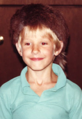
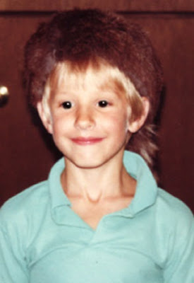
I’m finishing up lesson 4 in Photoshop from myJanee.com. This is on red-eye and pet eye. The iPhoto program on my Mac has a red-eye function, but my CS doesn’t, so I went to the painting way of fixing the red-eye. Interesting, to say the least. I think this would have beeen neater, had I not already done some adjusting on the photo over vacation before I knew about preserving layers and saving as psd.
Here’s the son of a very close friend, with typical red-eye.
And here’s Tucker with the eye correction.
This is an interesting process. I had trouble controlling the brush with all the pixels zoomed in. I’m thinking it’s because the photo was already a jpg and missing details. I can also see other uses for this process.
Now on to lesson 5!
Lesson 4 – Wowza!
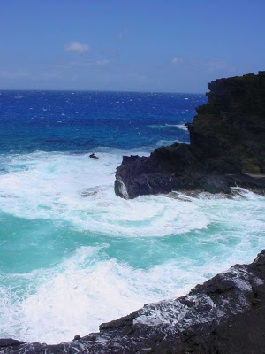
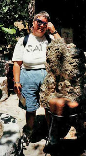
Lots of stuff in this week’s lesson! I decided to use a photo from the Hawaii trip that Suzan and I had originally played around with. Here’s the original of the Blow Hole on Oahu:
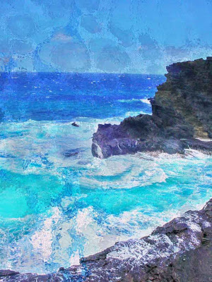
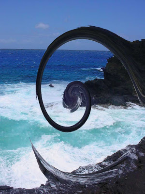
This seems to be a great photo as it is. When Suzan and I were doing our Tag, I started with this, and then Suzan added a marbled piece as a new layer. I thought that was too distinct a layer, so I added the ocean ripple filter – without doing a new layer, because I didn’t know any better at the time. Doing a destructive edit – now I know! Ths is what we ended with:
I ended up putting this photo in Betty’s Christmas book (done with iBook from iPhoto – what fun that was!) And it was a hit as a present!! I still am quite taken with the results of this one. The underlying layer is a piece I did for Betty’s 75th birthday, called Sonoran Tidepool, marbled just for her and then quilted to emphasize the tidepool effect.
So I took the original photo and started playing around for this week’s lesson, using the polygonal lasso tool – which I kept having to redo, because I would go too quickly and then not select enough of the area. I enjoyed trying different filters – each on a different layer – I am learning! Tried all kinds of filters – love the effect of wooly mammoth horns (twirl) – or the sea monster’s tail as he heads for a meal…..Here’s the results:
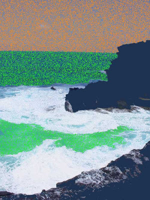
Then I read further and discovered the Magic Wand – wow, does that make a difference! Selections in no time!! So I played around with each of the sections, and with the fill feature and different colors, using the dissolve. And the results:
A great Rodeo weekend – lots of productivity on my part, the baby quilt is coming along – all in all a great creative few days!
Adventures in Marbling
We spent yesterday setting up to marble (which always takes so long, with pretreating and actually setting up the liquid bath), but then today we got to play – marbled about 6 yards of fabrics, and once again everything went really well. It is so nice to be back in the large tray again – we actually feel like we are creating art again, not just little pieces to sell. Yet again today we were talking about how much of a void there was in our artistic lives when we couldn’t create large pieces of fabric. When you define your art this way for over 14 years, it really is distressing to lose the skills.
Especially nice is the fact that we are working with other fabrics. Tried some larger heavy-weight silk that worked wonderfully, as well as some faux suede pieces, and the velveteen also worked. I still need to treat the velveteen to soften it up, but overall extremely pleased. Still haven’t been able to do the chiffon again – those people who bought that two years ago certainly have one-of-a-kind pieces!
We want to marble more often now that things are working again. It is SO GOOD to be creating fabric again! We even are revisiting marketing and revving up the business end because we are turning out really great fabric. The disadvantage is that our bodies have changed enough that we can no longer go for six hours straight, not including clean-up. There was a time four years ago when we could do 60 fat quarters in a day. Can’t do that any more, and we also discovered we don’t like turning out fabric that way – we would just as soon do a smaller amount and have a chance to play on each of the pieces.
We are still looking for a particular fabric that we used for so many of our art pieces – we used a poly-satin that kind of worked, but not to the detail we would like. I found an old piece that we’ll use in checking around fabric stores. All the really great pieces are from bridal fabrics, so we just have to shop around for those.
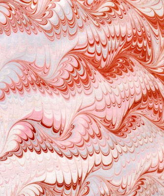
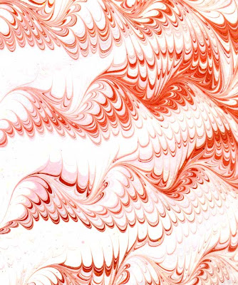
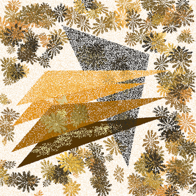
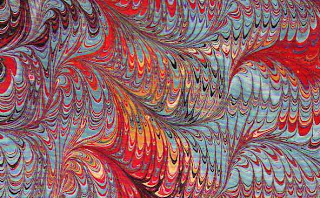
This piece that I’ve scanned shows the incredible detail you can get on the poly fabrics.
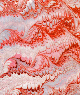
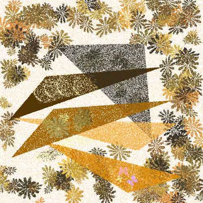
Then I started playing with some of the new tools from the Photoshop lessons. This next is with the Shadows and Highlights adjustment. I particularly like the neon effect on the orange.
This next is playing around with the eye dropper tool and the white space. Each gives a different feel, which is why I have wanted to learn Photoshop for so long. I want to be able to take a really great piece of fabric and use it to create lots of other images, so the particular piece doesn’t have a short shelf life till someone buys it.
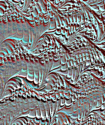
And finally – the joy of playing with filters in Photoshop! Take a look at what happens with the emboss filter with the same piece! Reminds me of maps of the Continental Shelf.
All in all, a great way to spend a day off from school (Rodeo days here in the Old Pueblo)!
Finally – Lesson 3 Redux
So I played some more today to try to come up with something that does more with linking and gradients. I must confess gradients are still a puzzlement – I keep getting weird colors. I am pleased, however, with the sky gradient in this piece. And I am having trouble with getting the grass brushes to be the greens I want instead of a series of mottled colors.
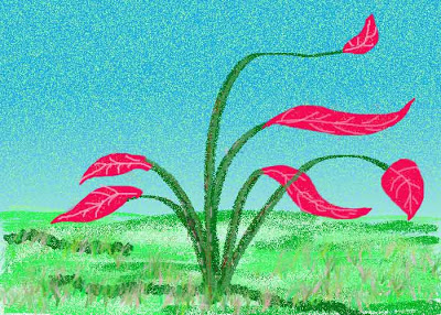
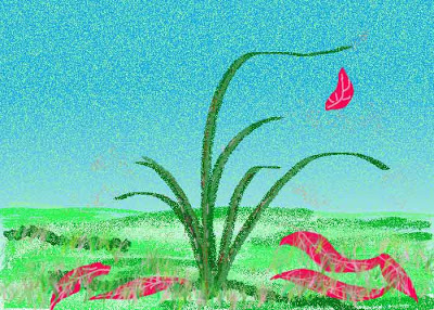
With this piece – Ocotillo – an abstract look at the almost dead-looking cactus that doesn’t bloom until rainy season – seems to be a cross with autumn. Oh well, it’s my vision! I linked the veins with the flowers – mostly. I had each flower (mostly) on a separate layer – except for the one falling, which got connected with one of the others. I do have a better sense of how this stuff works. I am enjoying just creating little pieces to work with the tools.
Reminder to me: LABEL LAYERS!!! Here goes –
Brushes again…..
I had fun last night playing again with the brushes and trying to create different layers and link them – still need to work on that – need to reread the linking stuff. I’m getting better at adding the layers each time I try something new.
I am drawn to geometric shapes – I think in the analysis it’s because they “always look like something,” so I can’t really mess them up. I do need to scan and play with one of my own sketches, to see what I can do with the brushes. But – here’s the new work:
More Brushes
I’m continuing to play around with more brushes as part of this week three lesson. For this portion we were to work on layers, and then move one of our objects. So here we go –
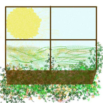
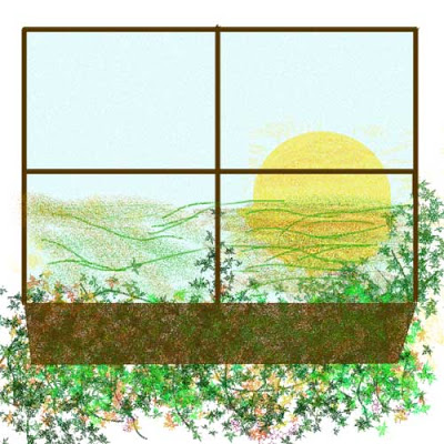
I would like to figure out how to make the shadows of the sun better, as well as crop the sun for the second one. But for a freehand, not too bad. I had watched Sewing With Nancy about landscape quilts, and part of what was included in that episode was tips on shading. So I wanted to do more with the window frame – but it needs to be larger – the scale seems all right for this, but not for more shading.
This just means I have to do more work…ahhh, too bad!
Using Brushes
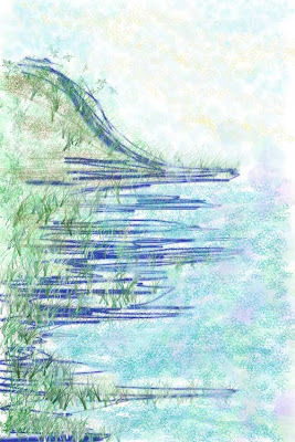
This is week 3 of my Photoshop class from myJanee.com. We are working with brushes, which is something I discovered a few months ago, when I needed to make a feather. We are to paint, using the brushes, and my background started me freaking about the “painting” having to “look like something.” Hmmmm….remnants of early grades art classes! So I decided I was just going to start learning about the various brushes – trying each set of brushes on a different layer with different colors, till I found something I liked.
Finally, after about 20 brushes, I discovered a small one that had some jaggedness to it – I was on blue as a color at this point, and as I was scribbling, I liked the horizontal effect of the brush, as opposed to the curve or vertical stroke. As I was working with this brush, I got the sense of the edge of water, and so I decided to continue with that.
I also am fascinated with the little grass brushes, so I started experimenting with them and started getting some nice depth. Then I wanted some sky, and I went with the star brush, the “dissolve” setting, a medium opacity, and a very pale yellow. Started looking like a sky, and I used the same brush with a blue to increase the sky. I was very happy with that effect.
The water – not as happy, but I still need to experiment. I am overall pleased with the piece, for just scribbling. We’ll see what happens with it in the rest of the lesson.
Some More Adjustments…
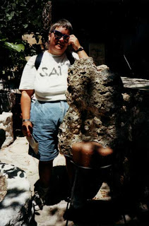
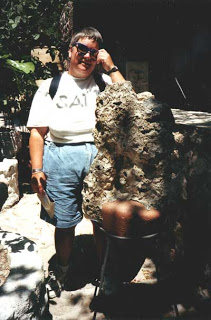
So I took the suggestions of the Photoshop gurus and tried Shadows and Highlights. Voila – just bringing this up did a major change on the photo. And then I cropped the right side to eliminate the weird white line. But you can certainly see that there’s an art shop or something in the background.
Here’s the before and after:
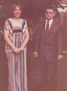
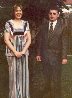
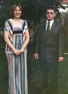
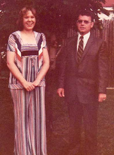
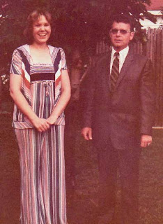
Then I also tried eliminating some unwanted color with the wedding photo of friends. I used the eye dropper on one of the gray stripes in the dress.
Here’s the before and after:
This week’s lesson is on brushes – but…I have to do grades for progress reports before I can play – darn…..
Week 2 Lesson – Adjustments
It’s amazing how many photos I scanned and “adjusted” over the holiday without knowing anything! Now I need to go back and redo some of them, based on what I’ve learned through lesson 2.
First is my dear friend Alison, taken on one of her European trips. This is the original.
Then I adjusted for brightness, as the upper right corner is extremely dark – no idea what’s there!
Now at least we can see Alison’s face. Then I tried the original with Curves, and I’m pleased with the result. The foliage in the picture began to pop out.
So next I decided to take one of our wedding pictures – 30 years old and very faded. Photo developing in the 70s leaves a lot to be desired. This picture is of a dear friend, Tom, who died this past year – he sang, along with another Allison, the chorus teacher at my middle school. Here’s the original:
Now I tried Auto Contrast, and I was pleasantly surprised! This is the best of the bunch! Janee said that sometimes Auto Contrast works,and sometimes not. Sure did on this one!
Now for levels, which I find absolutely fascinating….
And now for curves:
This has been absolutely fascinating! Three simple tools that make a world of difference!
2 Ecstatic Artists…..
We marbled in our big tray today – first time in two years. What a great time – after running into all kinds of chemical problems two years ago when the water boiler in our complex went, we have been fighting the marblng process, trying to figure out why – literally overnight – we couldn’t do what we had been doing for 12 years.
But we are back! And thrilled – we can do large pieces again!! It just seems that we are really back to being “artists” again, and not just sellers of small remnant pieces on eBay.
So why is this blog called Marbled Musings?
See just one of our creations from today….
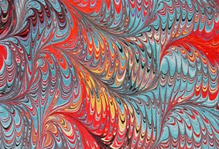
Now a question for the Photoshop gurus – the top photo was scanned directly to Photoshop. The bottom photo was from the digital camera, downloaded into Photoshop. The top photo has all the “lines” of the fabric, a heavy-weight cotton. We lose those lines when it is not directly scanned. Can you explain that?
Week 2 Photoshop
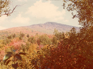
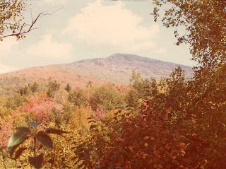
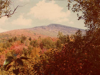
I couldn’t wait for school to let out so I could come home and work on this week’s lesson. I chose two photos, but I have started working with the one of Mt. Mansfield in Vermont taken from the Underhill side of the mountain. This goes way back to when we were dating, and the picture has started to fade with age. Plus, it just hints at the vibrancy of a Vermont autumn. Here’s the original:
The first thing we had to do was apply the Auto Contrast – which did give some improvement to the clarity of the photo.
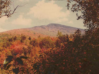
Then we worked with the Levels. I was able to get the reds of a New England autumn really pop out. Moving the sliders – I had a spot on each end of the histogram that was empty, so I moved the slider on each end. Then by moving the middle slider I was able to get the reds.
The final thing I did was work with Curves, which I am used to as a result of touching up eBay photos each week.
Overall, a good effort. I need to work with a lot more photos to get really good at this, especially being able to read the histogram for all its information. I did notice that all the pictures I “restored” over the winter holiday look pretty good, so I’m thinking that Curves adjustment is a good one.
We are marbling in the big tray tomorrow – send good thoughts – it would be great if it worked!
The Mathematics of Photoshop
Okay, you’re probably thinking – math? I’m done, no need to read further. But I gotta tell ya, this new lesson by myjanee.com for Photoshop starts us out reading some information about scanners. And now I not only understand pixels (among other things), but the use of the powers of two and RGB and creating the millions of colors available is absolutely fascinating. None of this would have made sense to me even 10 years ago, but as I teach and learn more math, I begin to see it everywhere. I just had no idea there was so much of it within the program itself. I shouldn’t be surprised, because computer programming is all mathematics, but actually seeing it – and having it make sense – is just too beautiful.
Waiting……..
I am hooked on creating with Photoshop. I cannot wait for the new lesson to arrive tomorrow in my inbox. I’ve had a lot of fun practicing, deleting, trying new things. I still see myself as very ordered in what I put together, but I am learning to see that it isn’t a bad thing. I like what I create, and if it’s ordered, okay. The fact that I can get something pleasing to me, making decisions along the way, trying to expand how I look at things, is ultimately good. I am no longer worried about what the finished project will be when I start.
The nice thing about this, I just realized, is that when I start my fiber work, I do have a finished idea in mind. With these little creations, I just let the shapes take me where they might. Kind of like letting the characters start talking and control the story when I am writing.
This particular picture let me play with some of the dissolve aspects of the filters. And I continued to work with the eyedropper to match my colors. Then I decided to look at the text function, which I hadn’t tried yet – I remember trying to work on a logo for the website and not being able to get anything into the letters. But that was also an older version of Photoshop – or else it was me with absolutely no knowledge about what I was trying to do – which is far more likely!
Spent a couple of hours Sunday at the gem show – dropped my money at the Chinese ladies from Dallas – discovered the beauty of tree agate – kept thinking about some marbled trees and these stones spread throughout the design. That will be a fun one to create.
Speaking of marbling, we are setting up the big tray on Saturday – first time marbling in the large tray in two years – ever since the water went and the chemistry of everything we did changed significantly. Fingers crossed – it would be so wonderful if we can get large pieces again. But I look at the two years of not doing this – we did do some nice things in the smaller tray, and we started experimenting with different designs. So not all lost – but I want to make big pieces of cloth again. Somehow I will feel like an artist again!
New class comes through tomorrow – now I just have to get tests scored and lesson plans ready and I can play for the next few days!
Study in Grays
I am so hooked on abstract pieces from my Photoshop class. If you are at all interested in learning Photoshop, check out myJanee.com. She is wonderful!!
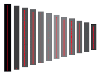
So this next piece is as a result of learning how to use the eye dropper to get the exact color replicated when I need it, rather than having to write down numbers. I had another row, but while it was pleasing, it was boring. I had to add some color, and I am amazed at just how different the same shade of red looks throughout the piece.
I know that one of the things I will do this week is read more about color from the links in our lesson. If I just didn’t have to do lesson plans, I could play all night!!

