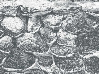
Creating – Part 1
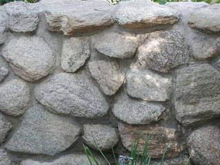
I’m going to start out trying to document the process I am going through to create some of these “garden fantasy” images. You have a basic stone wall, much more interesting in person. I have been fascinated with walls and the interplay of textures, so I want to see what I can do to make this a more interesting image. I usually start with basic adjustments, and what you see below is the application of shadows and highlights – which I only discovered a few months ago. You should see that the cement mortar holding the rocks together is now light enough to see.
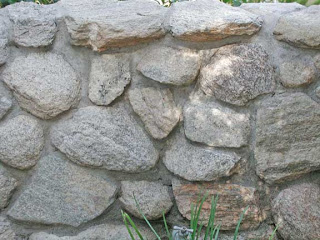
From here I usually look to balancing any color issues. I ended up with adding to the blue tint, as it makes the rock wall have some more depth. PLus, it’s more appealing to me, and it seems more like the actual wall on the day we were at the gardens.
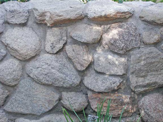
This next is intriguing – I tried a hue filter, and it looks as if a few of those rocks are bottom-lit – it’s somewhat intriguing.
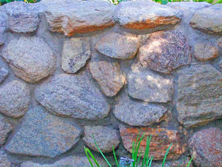
I love gradients. When I finally started to work with them, I discovered interesting effects. This one looks like underwater, with bioluminescence on the rocks – or are they shells of some underwater life form?
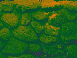
This is another gradient that reminds me of satellite imagery from space. I can see snow, and the popping up of land forms – which seems like it should be reversed, but now I feel like I’m in the “definitely intriguing” area.
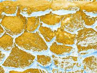
Oohhh, dinosaur eggs! Looks fairly menacing – from yet another gradient.
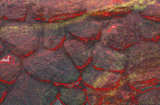
Now I feel like I am really in the realm of fantasy. I added a marbled pattern after selecting the rocks and adding them to another layer. I also cropped out the grass at the bottom. I used a stroke in a fine orange, and now this wall looks like a volcanic eruption, with the magma just below the surface. This is where I’m going to continue.
Comments welcome – what else would you suggest?
And – check out our contest!
