Trying to Learn Something About Value…..
…that could also read “something OF value,” but I want to focus in on the issue of value and color in design….something I know I am really weak on. I’m choosing a couple of pics that I really like for design composition and playing around with Photoshop filters to see what they tell me about the composition. This is different from how I usually approach working with Photoshop….play around until I get something that says Wow. This time I’m looking at the elements of the picture and trying to see how they change and why I like – or don’t like – the design.
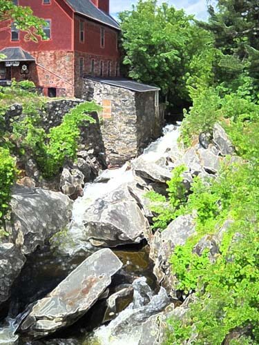
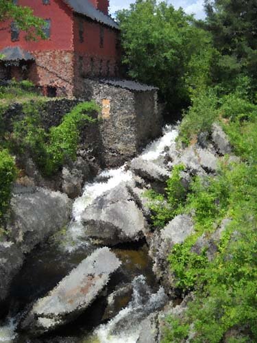
Here’s my first photo, taken in Jericho, Vermont two summers ago, at the Old Mill, which houses much of the history of hubby’s family.
I love everything about this picture: the greens, the mill red, the flowing water, the fact that I’ve got it composed in thirds. And you can’t see that right behind me is very busy Route 15. So what did I learn from this exercise?
Primarily I am much more aware of the basic lines in the composition. The lines don’t change, but the focal point does, depending on the filter or effect I used. There is one example that I would consider making up in cloth, as I find it intriguing, and I’ve never tried anything like that. The others are just interesting to analyze. Here goes:
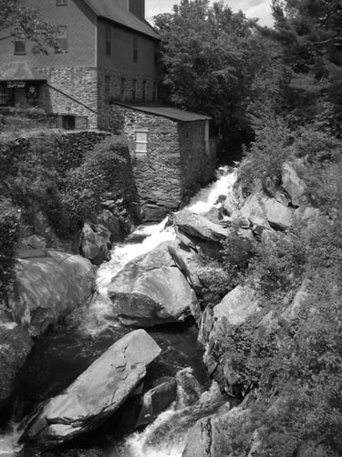
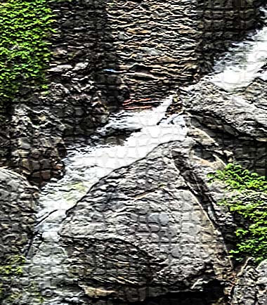
I love black and white. After three weeks in Seattle this spring, I developed a whole new appreciation for shades of gray (no, not the book……). I want to take this photo and play around with a few sections of rock to see what I might be able to sketch.
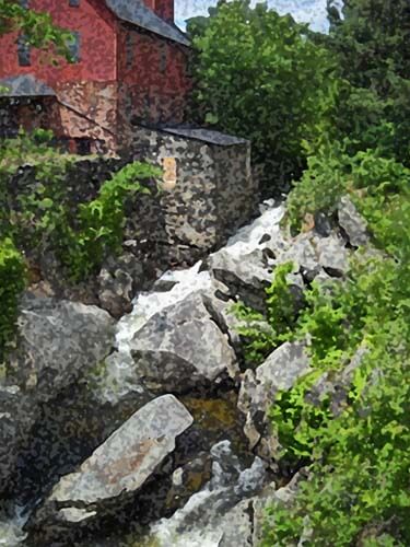
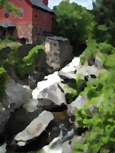
This is the “sponge” filter, and it’s one I really like. Shadows and subtle colors really come out in this filter. Once again I am amazed at all the shades of green there are. There’s more shading in the mill, as opposed to the original, but the movement of the water is lost.
This is the “find edges” filter. Interesting to see where basic pieces of fabric would be. I think I can also see the dark, medium, and light of the photo.
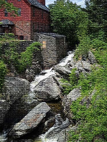
Accented edges filter. More of a pattern to follow if I wanted to recreate this. I did a small cropping that I could see in a 12 x 12 piece. I’m liking the shadows.
This is the “patchwork” filter, and I could see making this up as a larger wall quilt. The filter allows you to make the squares larger or smaller, but I am really curious to see how this would work up in piecing. I need to print this out larger and use my little red rectangle and look at the values closer.
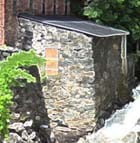
Well, I have managed to lose my original with all the filters listed on it, so c***. What I like about this above photo is the additional shading that is present in the rocks, and in the red portion of the mill. Lots more texture, and I could see using some colored pencils to enhance the fabric pieces.
I believe this is a watercolor filter, and I like it. I can see looking for specific fabrics for this piece, rather than trying to do lots of little pieces togather. I could see just cutting pattern pieces and fusing them into place. I like the softness.
Palette knife, I think. I like the general clumps of color, and as I reflect on this, I could see making this into a small abstract. The image is still recognizable, and I like how you can see an actual pattern to follow in putting this together.
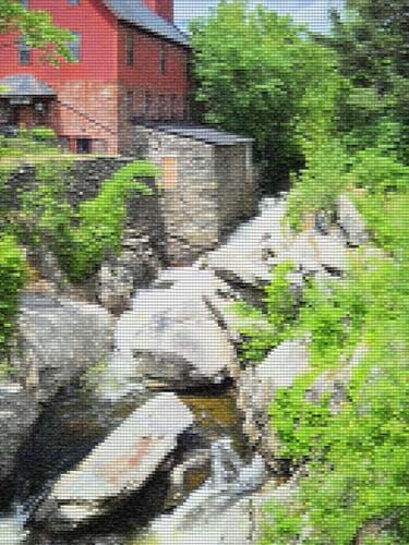
This is mosaic tiles, and I like the effect better than the patchwork photo above. I’d have to spend some time thinking about how to get the “grout” effect…..maybe a mottled gray color with texture in it as the background piece, and then the tiles cult at somewhat irregular edges so the grout shows through. I cropped a piece to see….
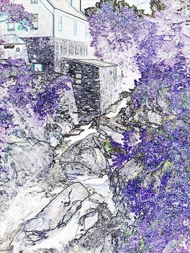
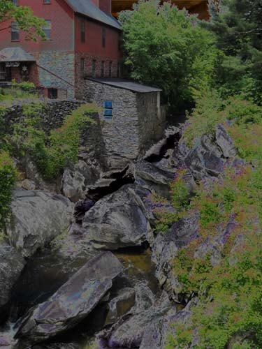
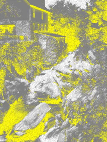
This is an inversion adjustment, and I like these because I always see something different when the colors are completely different. The yellow accents the shape of the edge of the mill in a way you don’t notice in the original photo. The rushing water doesn’t show up at all.
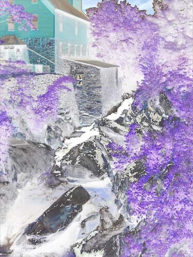
Forgot the adjustment, but the amount of purple really accents the amount of green in the original photo. And I like the way the shapes of the rocks are accented.
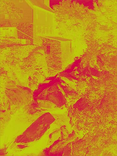
This is a red/yellow gradient, and I like playing around with gradients. Very other-worldly, but I don’t see taking this piece any further.
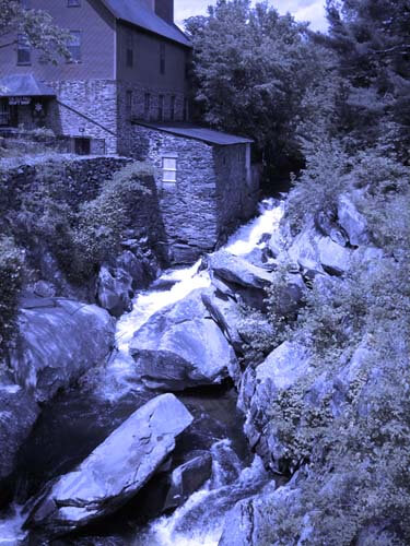
I saw some quilts a while back that were based on Joen Wolfrom’s color tool. People chose a color and then worked solely in the range of that color. Results were pretty dramatic. This is a color filter in a deep blue. I think I would print this out and take it fabric shopping and see just how well I could pick out various blues and other shades that have a blue cast to them.
That’s my first study, and I definitely need to do more of these. I feel like I have a better understanding of the composition of the original picture. Next up, my wrought iron photo….


