Posts Tagged ‘color tools’
Lessons from the Coloring Books
I received two “adult” coloring books for Christmas and have been enjoying myself immensely. Once I got past the old bugaboo about what this would be, I realized I could learn a lot about color theory from these pieces. And learn I did….
First, I discovered why I thought coloring was boring when I was younger. Sheesh, crayons and a picture. No challenge there. Just like I found Barbies incredibly boring. Plus I didn’t have great crayons – I lusted after big boxes – and I do have many colors of sharp pointed crayons now.
Second, I love symmetry and working with color within the symmetry. These pics have been perfect for that. I’m using markers – very unforgiving as a medium, but then so much of my earler work was pen and ink – even more unforgiving.
Third, I learned a lot about color. I like color. I like bright color. I need me my white space – a challenge on some of these designs. I need a variety of color items. Marker – yes, bought a bunch more. Also, love me my Pigma pens from my zentangle work.
Here are my discoveries – love being self-taught! The odd-numbered ones are from a book on zen coloring. The even-numbered ones from a book called Mendhi – very different in approach. I do them alternately – learning from each type and applying lessons learned from the one before it.
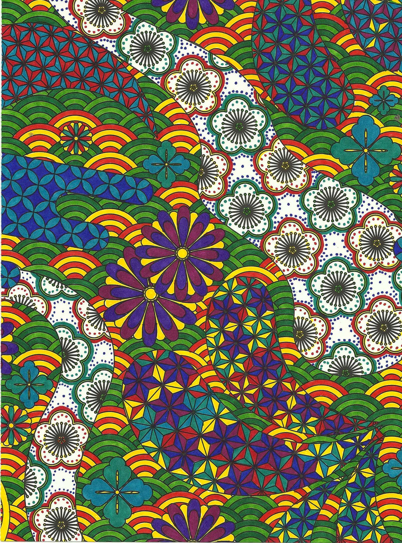
The amount of white space really through me. The colors are very saturated and I opted to leave nothing blank…but the two paths going through the design were way too white and off balance. So I took a few ideas from my zentangle work – aura and echoing, along with dots. Really like how it came out.
I opted to keep some spaces white for balance. I happened to see samples of the designs in the front of the book but didn’t use any of the examples. I’m enjoying making my own decisions, which in most cases work out for the end result. You’ll notice the same color families appearing in the designs. Added the dots to frame the design.
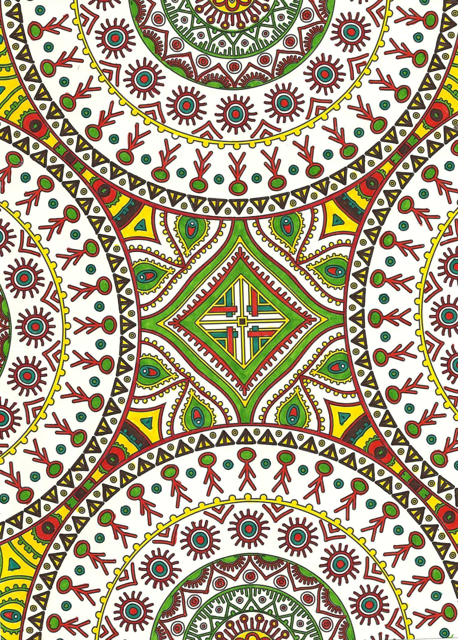
Left a lot of white space on this one. I have some solid sections separating the main designs, and this kind of threw me. I used a brown that was much darker than the surrounding colors, and it drew my eye immediately to it. Did not like that, and part could be my bias as the designer. So I attempted to spread out the brown throughout the whole design. Much happier with the overall effect.
Love this one! There were a lot of very skinny outlines throughout this, so I went for my black Pigma pen, which I discovered made everything very crisp. Yellow, purple, green, but I think the orange works well on the outside. Really like how this one developed.
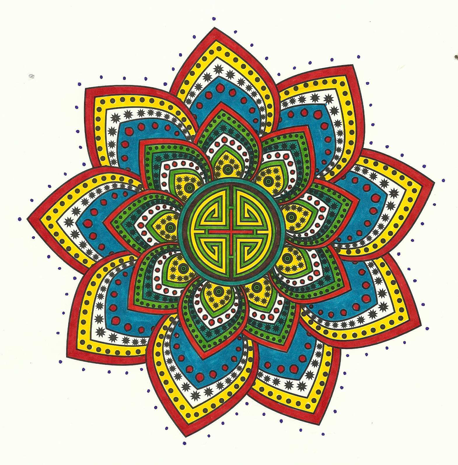
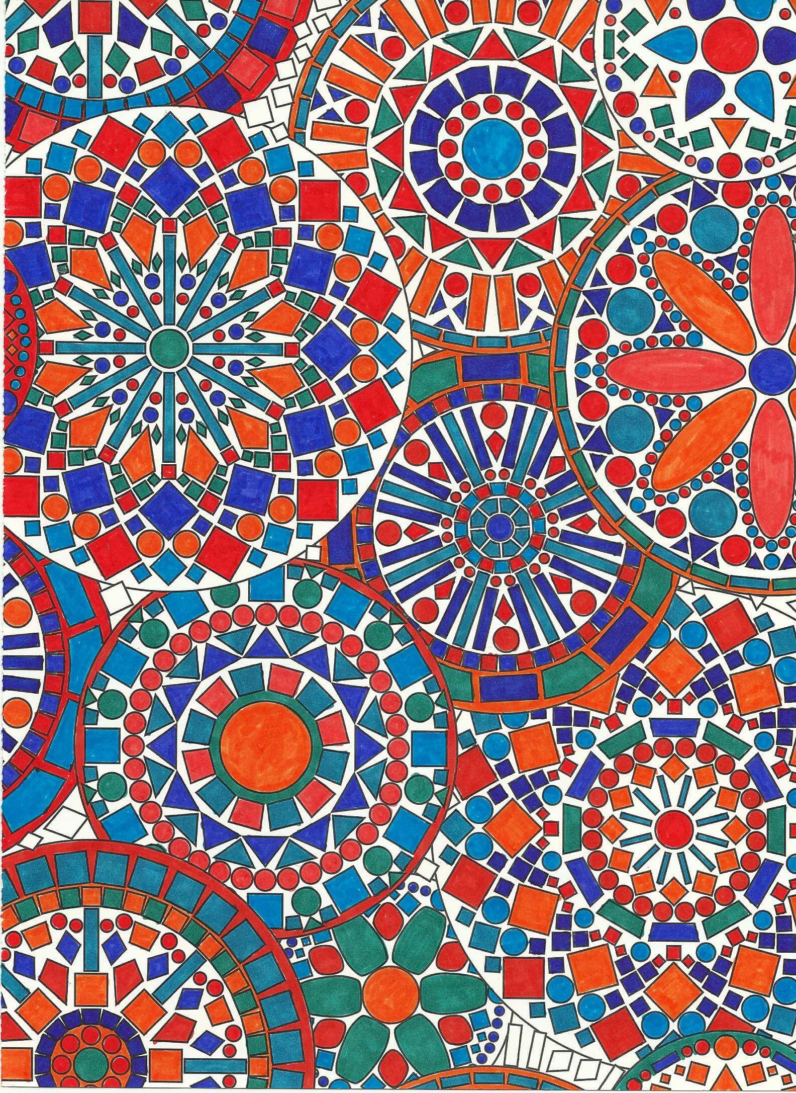
Blues and oranges – shades of them. Have never really worked in this color family before and I like it. Depending on color placement, some of the oranges look red – interesting to me, although it shouldn’t be because we deal with that all the time in marbling. Some of the blues looked green. Overall, I am planning on doing a mandala quilt using some of these designs, as I really like how it all worked out. Great balance, and I LOVE the geometry of it all.
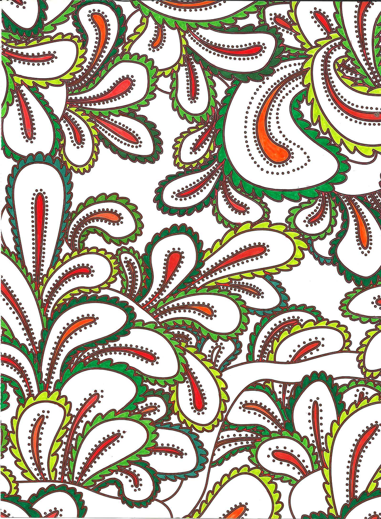
A lot of red Pigma pen outlining – nicely enhances the design. Greens and oranges, and even with the red, doesn’t look too holiday for me.
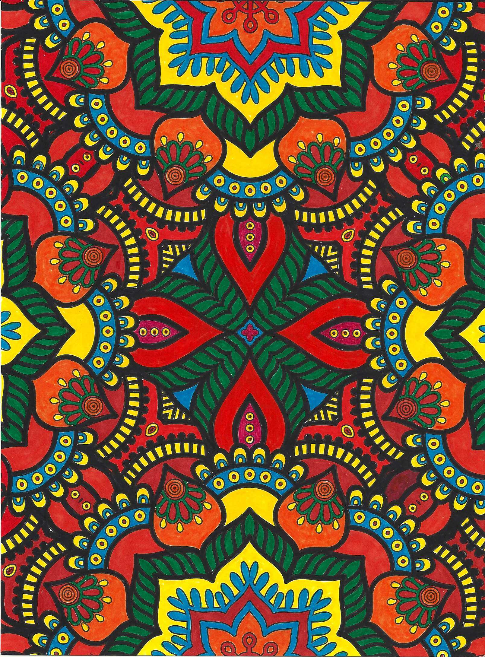
Again very saturated, primarily reds, yellows, and oranges. I didn’t want to leave the white space of the outlining – wasn’t sure I would like it. So I opted to go with a mosaic look, using black. I completed the center first and really thought I had made a mistake with that amount of black, but I am learning to make decisions as I go along and not worry about it partially done. I am very pleased with how it all came together.
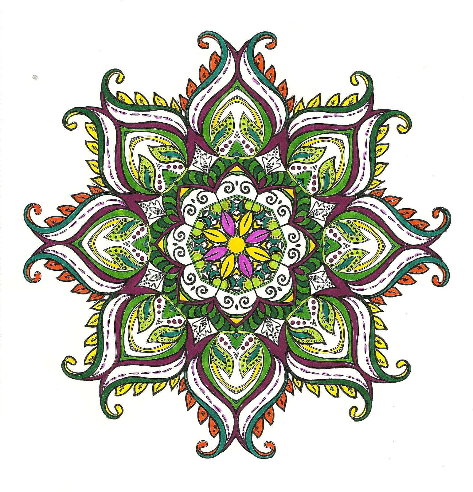
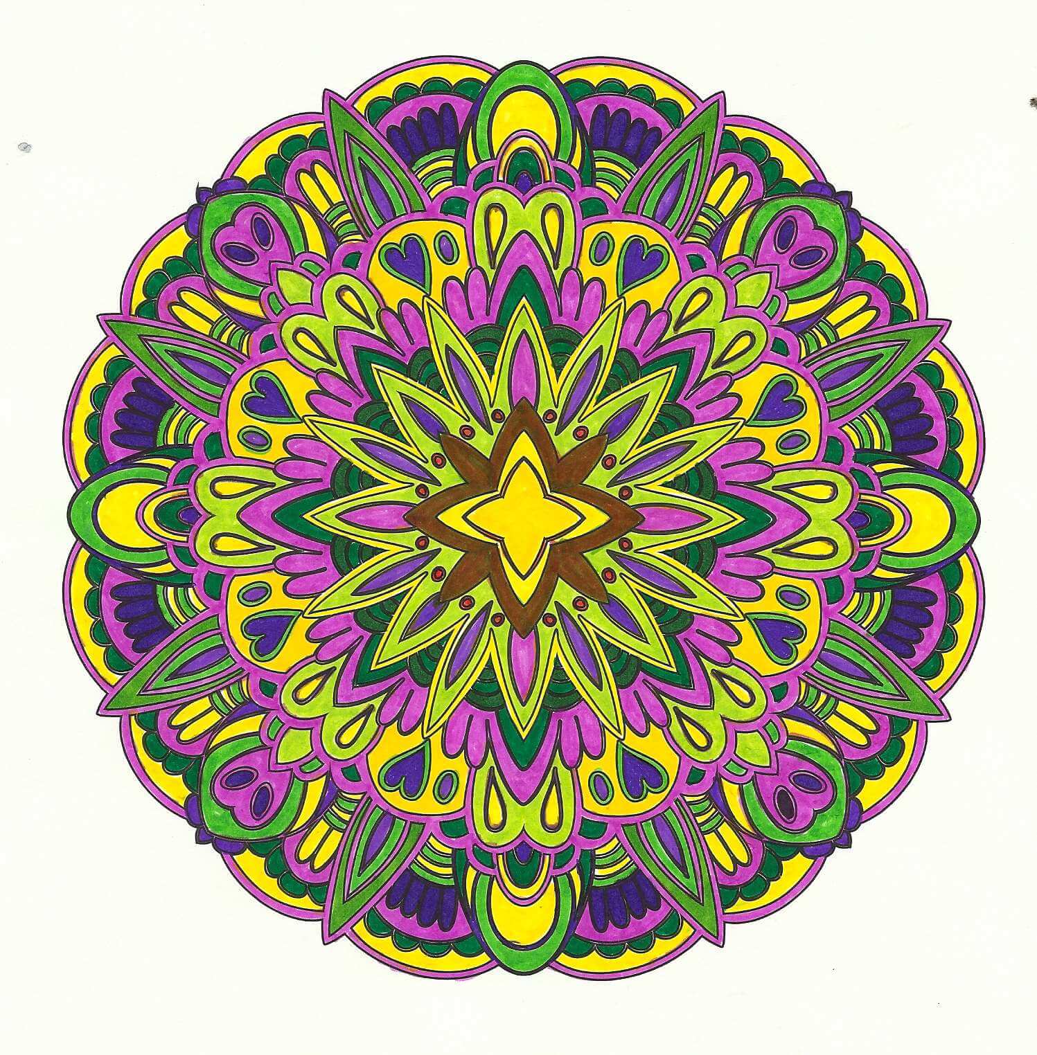
Purples, yellows, and greens. Glad I had a variety of markers. I originally put an orange around the yellow center, and my eye kept getting drawn to it. Didn’t like that, so I thought I would see if I could add green over it – turned brown, and I wasn’t happy. However, the brown fades into the background and throws the eye outward in the design. Interesting lesson learned there.
Lots of new skills,lessons learned, and enjoyable hours – there are more coloring books in my future!
